As for more about the kitchen color change, although you guys know we love grellow with a passion, it has been notoriously impossible to photograph (remember a hundred different phases of the kitchen project with “ahh, this color looks so much more subtle in person but is reading as lime green/bright yellow/neon slime for some reason”). And although that’s sort of definitely a dumb reason to repaint a room, I can’t tell you how annoying it is to not be able to share what you see in front of your eyes when you’re a home blogger.
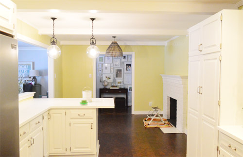
But the main reason for the change wasn’t that the color was hard to photograph, it was that over time we realized that the grellow didn’t let the other things in the room shine as much as they might have with a different choice. Take the white cabinets and counters for example. They looked little yellowed thanks to the wall color reflecting on them – and even the cork looked a little orangey-yellow (especially at night) instead of rich and mocha.
So here’s how we reasoned our way to a new color pick in five bullets or less:
- we worried that other tones of yellow and green would have the same yellowing-ish issue (say that three times fast) since they’d reflect on the counters, cabinets, and cork – even if they were deeper or lighter, so we nixed those options
- we wanted something deep enough in tone to provide a little more contrast, so the counters and cabinets would pop more (but nothing too dark since the room is windowless)
- we have gray backsplash tile and a few adjoining rooms are gray, so we didn’t want to go with more gray on the walls (dark, light, or schmedium) for fear of grayverload
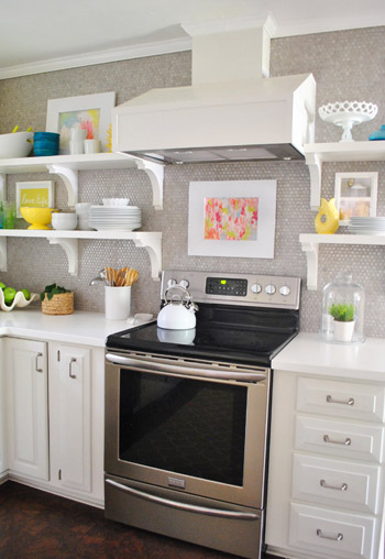
- we wanted an actual color on the walls (since we chose such safe things everywhere else like: brown floors, white cabinets, stainless appliances, white counters, and gray backsplash tile)
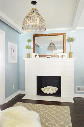
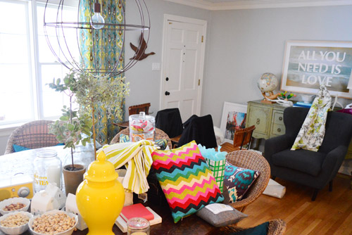
- we wanted a color that would tie the kitchen into the four spaces (yes, four!) that the kitchen opens up to – without getting too matchy-matchy (when a room adjoins so many other rooms, the wall color should work with those rooms since you’ll see them together all the time – it’s sort of like very carefully picking a hallway color that works with all of the rooms off of it)
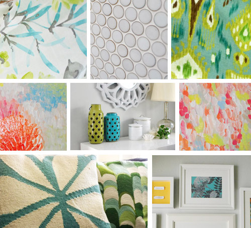
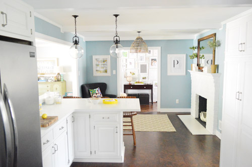
We definitely loved having a soft blue kitchen in our first house, and we actually don’t have any blue on the walls in this house except for the deep teal in the guest room and on the back of the dining room built-ins, so it’s nice to bring in a mid-tone blue that’s sort of in the middle of the guest room and our first house’s kitchen.
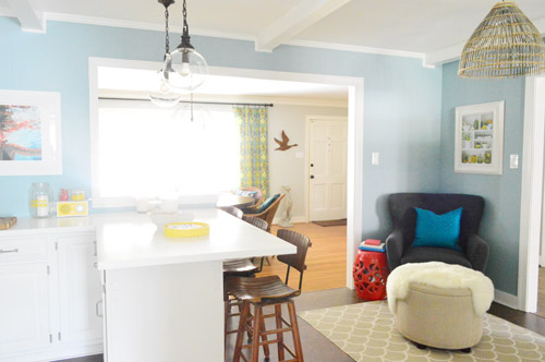
The funniest thing about this whole repainting escapade, which we realized while applying the second coat (we’re always loopy by then) was that in our first house we repainted every single room except for our kitchen and our master bedroom. And in this house we’ve only repainted two rooms: the kitchen and our master bedroom. Hilarious.
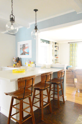
And if you count the time that we painted the fireplace area a different color for book photoshoots (only to repaint it back to normal a few days later) some parts of this room have seen four different paint jobs.

- it’s definitely an actual color (there’s nothing neutral about it)
- it still feels sophisticated (even though it’s not gray or navy or chocolate or taupe)
- it allows the white cabinets and counters to really pop (without yellowing them)
- it’s a great balance to the warm tones in the room (like the cork floors, the wood stools, the rustic cutting boards on the counter, etc).
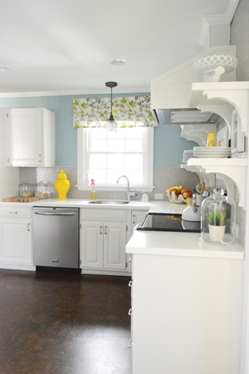
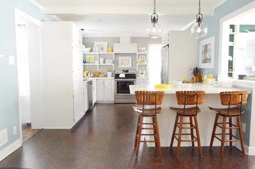

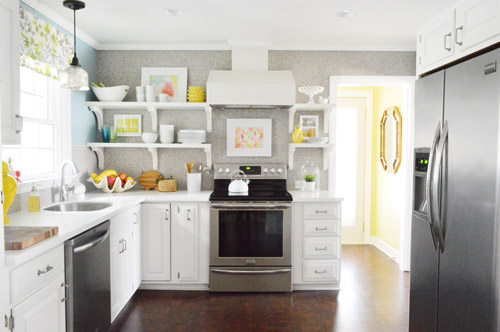
Not gonna lie though, the star of this room is still that wall full of penny tile. Picture me having an as-soon-as-the-show-ends bachelor breakup with the wall paint to run back to the penny tile with open arms. And it’s not that I don’t love the wall color – I just love the penny tile more than a person should love any inanimate object.


Jessica says
Love this change! I’m typically not a fan of blue in kitchens but it looks so much better with everything than the grellow! Much more mature and grounding. Way to go!
Beth says
LOVE IT! Sometimes you don’t get it right the first time. Colorado Gray (or Blue), FTW! :)
Kim says
I LOVE LOVE LOVE that color! I am dying to repaint our guest room at the next chance I get. As soon as we finished painting it I regretted it! Soon it will be getting a much more sublte color.
Dannielle says
I love painting! I’ve painted my kitchen 7 times , my daughters room 4 times and my bath 4 times!! Right now I’m painting my bedroom and next will be the living room. Do you have any suggestions for a gray/blue living room?!
YoungHouseLove says
Quiet Moments by Benjamin Moore is a favorite gray-blue of mine!
xo
s
Jenny says
Congrats, looks great! I’m a little sad because I loved how awesome the old color was and totally different from my kitchen…whereas ours is a color pretty similar to this, similarly with lots of white trim. At our house, I love the way it tones down some really busy granite that was there when we moved in — it’s just a really well-grounded color. And we don’t get much sunlight, since it’s a north-facing space, and this color seems to roll with that (as you clearly know).
Anyways, congrats on making a long-discussed switch!
Samantha says
It’s beautiful! That’s one of the colors we’re tossing around for when we can eventually remodel our very sad kitchen. White and the calming blue colors always remind me of Wedgewood china. Classic.
Susan says
Love it!!!!!
Amazing how a simple thing like paint can change a room.
Love it sooo much!!
Miriam says
Looks fantastic!! I love how perfectly it works with everything you already had in there. Almost like your kitchen was always meant to be blue :)
It’s interesting to me how the past few room-painting projects (Clara’s new room and this one) are using colors that would have worked so well at your old house, but the textiles and accessories are keeping things bright. Do you think you went from the beachy-neutral extreme to the Sue-the-napkin extreme, and have ended up somewhere in the middle?
YoungHouseLove says
Yes! I totally think we went to bright/modern for a hot second and then tossed in things with more texture (basket pendant, wooden stools) and other beachy-ish colors that could have lived in our first house. But thanks to the bolder textiles and accessories here, it still feels happier and more casual than our more monochromatic first house I think!
xo
s
Christina says
Winner! I understood the idea of the grey-yellow but I wasn’t in love with it- this? This I love. It looks awesome ;)I love the down-to-earth sharing of mistakes/mind changing.. keeps you real, which in my opinion, is why you’re SO successful.
Reenie says
Oh WOW!! I thought I loved the grellow ~ ~ I really LOVE the blue ~ great choice!! :)
Robin now in Gulf Shores says
A million times better. Yay! Good job!
Vikki says
This looks great. I love yellow kitchens, but in your kitchen it didn’t seem to fit the tile wall. This is so much better and all the little yellow touch plates, vases, and bowls seem to pop so much more against the blue. Love. Love. Love.
Stacey says
OMG! That’s a helluva suprise! I actually thought the first photo was ‘shopped :) I look through pics of your house so often it’s going to take some getting used to a blue kitchen. It’s lovely, though. I’m going to be painting my guest loo a subtle grey-purple soon inspired by John’s gran’s recent makeover.
Lindsay J says
Lady Marmalade! (the song/title) I love the blue. Good choice. It does just what you needed it to do. The master bedroom in our current house it tempting me to paint it a fourth time. I’ve picked a color but I’m exhausted just thinking about it.
Meredith says
I LOVE it.
Also, I think maybe instead of calling the paint $herdog Blue, we could start calling you “Blue $herdog” (like Beyonce and Jay-z’s offspring)?
YoungHouseLove says
Hahah! Please make that catch on.
xo
s
lauren says
It looks great! I’m a HUGE fan of blue in the kitchen to make white cabinets pop. We have the most beautiful midnight blue kitchen walls and it looks amaaaazing juxtaposed with the white cabinets.
Diane @ Vintage Zest says
I adore this change! I read somewhere that you should never plate food on blue plates because it makes it look less appetizing. However, blue on the kitchen walls? I love it! I’m not sure how much I agree with those hard and fast rules anyways, especially because there are so many shades of one color, just like this “gray.” By the way, your renamed colors are just classic. :)
Maria says
Love it!
Wendy says
This totally reminds me of the love/hate relationship I had with our family room color. In certain lights I loved the sage green color, but at night and in photos it came across as a gross shade of mint chocolate chip ice cream. (Fun to eat, not so fun to look at.) I finally bit the bullet and repainted it in a warm creamy neutral, and I think everything in the room looks better, including the furniture and rug. http://www.oldtownhome.com/2011/5/26/Its-Not-Easy-Being-Green/ Funny how paint can do that, eh?
YoungHouseLove says
Haha, I love that post!
xo
s
Jennifer M says
I love the blue! I actually like it a lot better than the grellow, which I was never a huge fan of but I try to abide by the whole if you don’t have anything nice to say… I love how everything in the room looks different with just a different paint color on the walls!
Karen Lee says
It looks fantastic!
Cassie says
Great move! I think the new blue is a huge improvement. I’m wondering if you guys have considered painting the beams gray like they are in the living room? I think that would look amazing!
YoungHouseLove says
They run the other direction (and you can see them both from certain rooms) so we thought that might be too chaotic (to see them going one way in one room and the other way in the next room). So leaving them white in the kitchen helps them blend while the living room ones stand out :)
xo
s
Shelley @ Calypso in the Country says
I love the new color and the way it brings out the other colors of the kitchen. In fact, I prefer this color over the last one! Great job!
-Shelley
Lauren says
Love it!! I’m a big blue fan! I wishhhh we could paint our walls, but alas…we’re renting, and our landlords would kill us. Do you have any tips on how to spice up a home that has all white walls? Like a renter’s guide to decorating? Curtains, art, etc I know…but anything else?
YoungHouseLove says
Rugs, painted furniture, art, curtains, pillows, and accessories make a huge difference! If you scroll back to the post before this one it’s a house crashing with lots of white walls but pops of color in other places that warm it up :)
xo
s
Kristin says
I love the transformation! My husband and I just decided to paint our kitchen/dining room a shade of blue. It took us a long time to make this decision, as we have so many rooms that connect to it. A huge smile just came to my face when I opened your blog. This solidifies our deicision for sure!! Thanks :-)
Heather says
I LOVE the blue against the cork floors as well as the white cabinets and shiny appliances. Good choice!
Janelle @ Two Cups of Happy says
You sneeeeaky Petersiks. (Hoping you get this reference – Hint: Jimmy Kimmel/Halloween) This looks fantastic! I knew a cooler tone would mesh well with the tile. It’s bold, but not compete-y at all. Our bedroom is a similar colour but with more of a gray/green undertone.
YoungHouseLove says
Haha, totally got the reference!
xo
s
Sarah says
LOVE. I think the whole kitchen got an upgrade, although it certainly wasn’t bad to begin with! Just BETTER. We painted our kitchen about a year ago (I think it was BM Palladian Blue, and it’s a little dark for the space), and now I want to go back and do it over with $herdog Blue. Looks awesome!
rachael says
We painted our kitchen Palladian Blue too, but a few years ago, and I ended up hating it, our kitchen is north facing and it had like a green tone to it. but this blue-grey is beautiful!!
Heather W. says
Looks great!!! I love it both ways I must say… I am curious though I know you said you didn’t want to go darker because of the lighting but are you completely opposed to painting a room dark that doesn’t have a window.. My husband really wants to paint our 1/2 bath navy but it doesn’ have a window. I am worried it will be to dark or it could be dramatic and beautiful… HELP!! We do have white trim and cabinets in there…
YoungHouseLove says
I totally think it works in a bathroom (making it into a moody jewel box) but for a room you’re in all the time for major food prep like a kitchen, I just thought that dark feeling would be better served somewhere smaller like a bathroom as you mention :)
xo
s
Heather W. says
Thanks… I think we are going to go for it.. We can always repaint right? hahaha.. Also, I must say even though the green ended up not working for you in the long run. I used the same color after you painted your’s seasame and we absolutely love it! However, I do have big windows in my kitchen and it gets a lot of light but thanks for the inspiration and the vote of confidence on the navy!
Sarah Kate says
Absolutely love it!! I was never a fan of the grellow (though as you said, maybe I wasn’t getting the “real” view of it) but the blue is awesome. So bright and looks great with all the white :)
Taya says
LOVE IT!!
Courtney says
The blue looks fabulous! I’ve been touching up/patching walls before we sell our house to move into a rental until we move next year. Yay military, haha.
Cristina says
Mocha chocalata ya ya! Creole Lady Marmalade!
*ahem*
I love the blue in the kitchen so much better than the previous yellowish color. Maybe it’s because blue is my favorite color, and I’m just automatically drawn to it. Either way, I think it looks phenomenal. Well done!
YoungHouseLove says
Wait is it Creole Lady Marmalade? All this time I thought it was real lady Marmalade!!
xo
s
Melanie says
Currently in the middle of painting our dining area/living room/hall for the second time!
I had never painted a wall anywhere I’d lived until we bought our house. We should have lived with the original color until we bought some furniture and decided what we really wanted the room to look like. Instead, we quickly chose an olive color that I was never happy with. Now painting with Benjamin Moore’s River Reflections, and I’m super happy with it!
And I love your new kitchen color!
Jennifer says
Oh my goodness! I really liked the grellow, but this is so… peaceful. Great choice. It really seems to bring all of the adjoining rooms together.
KiTX says
We’re about to tackle our entry hall for the second time. Why? Because the home improvement store who shall remain nameless that mixed our paint (no names, but it might rhyme with Schmoes) gave us two slightly different colors in the two gallons we bought originally- NEITHER of which was the color we asked for- and you couldn’t really tell til the whole thing was completed and dry. Arg. So, time to redo, and then we can finally install our DIY built-in mudroom/drop area. And after that, it’s time to tackle the spare bedroom and turn it into a nursery in time for September! =)
YoungHouseLove says
You can do it! Good luck with everything!
xo
s
sara says
It looks really, really great and lets the rest of the kitchen shine!
I’m actually in the middle of choosing paint colours. Mostly I suck at it! Although I just fell in love with Horizon. And stumbled upon Puccini Pink for my room – a subdued pink, almost nude and I’m not really a pink girl. And funny enough, I went in for a gray purple but remembered your Pinch Of Spice rec. so grabbed a pint. I’m still trying to decide if I love it or not. Happy I tried it though, Im not used to such bold colours, maybe that’s the problem.
Alison says
Wow, that’s alot of work. I hope you also got to visit with your Mom. I don’t care for blue. But I am glad you are happier with it. We are in the middle of painting our office green. And all the adjoining rooms are a mess. Paint makes such a difference. You two are sure worker bees.
Julie says
Yay! I really wanted to like that grellow, and it was probably just the way it photographed, like you said, but I like this soooo much better. Perhaps because I, too, have a blue kitchen with white cabinets (BM woodlawn blue – love). Love it guys!!!
KC says
The new color looks beautiful in the kitchen-great choice!
littleoakcreations says
I LOVE IT! I will admit, I was not a fan of the grellow, although like you said, it probably was pretty awesome in person. I like the blue with the brown of your floors much better. Most important thing is that you guys love it! :)
Ellen says
Yes! I love the blue – good choice! Yellows are very hard to do right. And even if you got it right (which I’m sure you did), it probably would always look off on a computer screen.
I need to tackle our bedrooms again. When we bought the house the rooms were girl peto-pink, too-boy blue, and seafoam green. So we made them all Olympic’s Almond paste. I never loved the color but it was enough to get us moved in. Time to do over!!
Rachael says
I love it you guys!! I always thought the yellow looks so sunny and cheery, but the blue works even better! Not to mention blue is my favorite color. Haha and I love all your Bachelorette references, $herdog!!
Carrie says
Looks great!
I’m ready for you to knock the chimney through to the living room! I know its on your list. That will be amazing! How far away is that project, ya think?
YoungHouseLove says
It really depends how much it costs (we’d have to price it out with a mason since it’s structural- but if it’s not as much as we think it could get bumped up the list!
xo
s
Sara S says
Where did the awesome light fixture in the open area by the fireplace come from?!! I must’ve missed that post. It’s awesome:)
YoungHouseLove says
That’s a basket we found at a thrift shop! Here’s that post for ya: https://www.younghouselove.com/2012/08/total-basketcase/
xo
s
Debbie says
The new kitchen color looks amazing, and I think you may have inspired us to switch from Sesame in our kitchen (we had that before we even knew who you were!)to something similar. Quick question(s) for you – how do you decide where and whether to use satin or eggshell or semi-gloss, etc? Keep in mind I know NOTHING about paint and that I have 3 toddlers under 5 in my house!!!
YoungHouseLove says
Here’s a post about paint finished that will hopefully help! https://www.younghouselove.com/2010/06/picking-the-right-paint-finish/
You probably can’t lose with eggshell or satin.
xo
s
Barb says
It’s magically delicious. :)
Ashleigh says
Love it! We went for blue in our kitchen though so I’m a bit biased!! xox
monika says
$herdog blue. Insert snicker sound. You so funny. I gotta paint my kitchen and am dreading it ‘cos I gotta do a TON of prep work–like rip out the ceiling and re-sheet rock. Pain. I’m envious of your ‘quickie” makeover… Nice job.
YoungHouseLove says
You can do it Monika! Good luck!
xo
s
Laura says
My kitchen/eating area is blue with white cabinets, too! Though the official name is Wedgewood Gray, it’s definitely a blue. I LOVE THE NEW COLOR! (but my whole house is blue/gray/mint/aqua, so I may be biased).
YoungHouseLove says
Oh yes, I love that color! and it’s totally blue!
xo
s