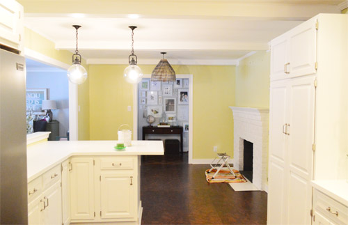
As for more about the kitchen color change, although you guys know we love grellow with a passion, it has been notoriously impossible to photograph (remember a hundred different phases of the kitchen project with “ahh, this color looks so much more subtle in person but is reading as lime green/bright yellow/neon slime for some reason”). And although that’s sort of definitely a dumb reason to repaint a room, I can’t tell you how annoying it is to not be able to share what you see in front of your eyes when you’re a home blogger.
But the main reason for the change wasn’t that the color was hard to photograph, it was that over time we realized that the grellow didn’t let the other things in the room shine as much as they might have with a different choice. Take the white cabinets and counters for example. They looked little yellowed thanks to the wall color reflecting on them – and even the cork looked a little orangey-yellow (especially at night) instead of rich and mocha.
So here’s how we reasoned our way to a new color pick in five bullets or less:
- we worried that other tones of yellow and green would have the same yellowing-ish issue (say that three times fast) since they’d reflect on the counters, cabinets, and cork – even if they were deeper or lighter, so we nixed those options
- we wanted something deep enough in tone to provide a little more contrast, so the counters and cabinets would pop more (but nothing too dark since the room is windowless)
- we have gray backsplash tile and a few adjoining rooms are gray, so we didn’t want to go with more gray on the walls (dark, light, or schmedium) for fear of grayverload
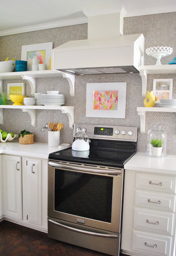
- we wanted an actual color on the walls (since we chose such safe things everywhere else like: brown floors, white cabinets, stainless appliances, white counters, and gray backsplash tile)
- we wanted a color that would tie the kitchen into the four spaces (yes, four!) that the kitchen opens up to – without getting too matchy-matchy (when a room adjoins so many other rooms, the wall color should work with those rooms since you’ll see them together all the time – it’s sort of like very carefully picking a hallway color that works with all of the rooms off of it)
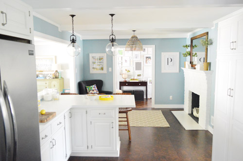
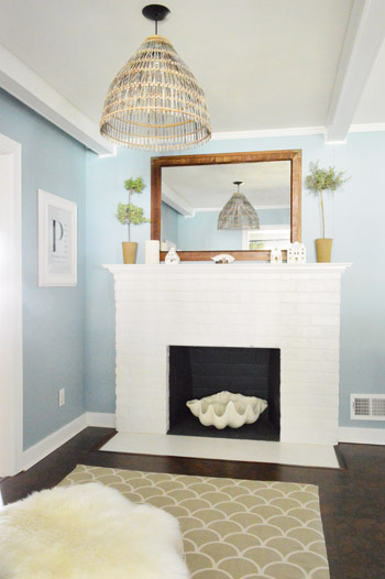
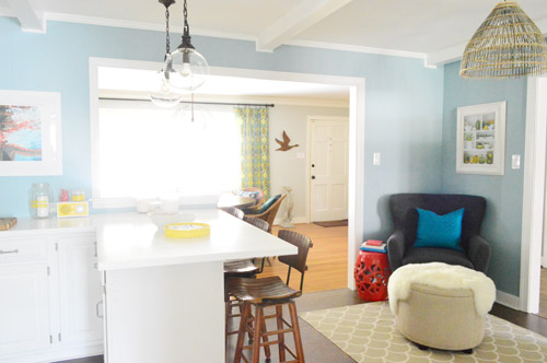
We definitely loved having a soft blue kitchen in our first house, and we actually don’t have any blue on the walls in this house except for the deep teal in the guest room and on the back of the dining room built-ins, so it’s nice to bring in a mid-tone blue that’s sort of in the middle of the guest room and our first house’s kitchen.
The funniest thing about this whole repainting escapade, which we realized while applying the second coat (we’re always loopy by then) was that in our first house we repainted every single room except for our kitchen and our master bedroom. And in this house we’ve only repainted two rooms: the kitchen and our master bedroom. Hilarious.
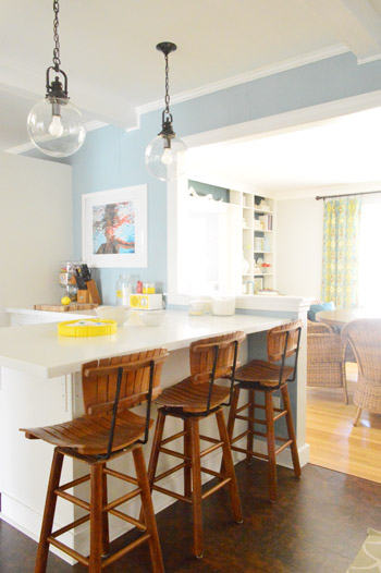
And if you count the time that we painted the fireplace area a different color for book photoshoots (only to repaint it back to normal a few days later) some parts of this room have seen four different paint jobs.

- it’s definitely an actual color (there’s nothing neutral about it)
- it still feels sophisticated (even though it’s not gray or navy or chocolate or taupe)
- it allows the white cabinets and counters to really pop (without yellowing them)
- it’s a great balance to the warm tones in the room (like the cork floors, the wood stools, the rustic cutting boards on the counter, etc).
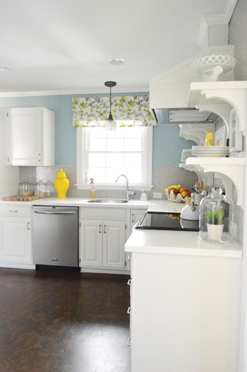
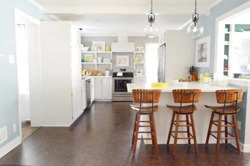

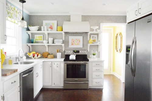
Not gonna lie though, the star of this room is still that wall full of penny tile. Picture me having an as-soon-as-the-show-ends bachelor breakup with the wall paint to run back to the penny tile with open arms. And it’s not that I don’t love the wall color – I just love the penny tile more than a person should love any inanimate object.


Whitney Dupuis says
I have to say that I was a big fan of the grellow, but the blue looks amazing and I can now see what a huge difference it makes on the rest of the room!
Kirsten says
Guess I am one of the few who like the grellow more. It made the kitchen look way more warm. The blue is too cool for me. But glad you’re happy with it!
Clementine says
This is just the kick in the pants I needed! I painted my kitchen MSL-Bamboo (which is extremely similar to BM-Sesame) and, although I love how bright and chipper it is, it has never worked with the other elements in the room. But part of me feels guilty for buying more paint, even though I know the kitchen would look so much better with a coat of Bedford Gray. Thanks (as always!) for the inspiration!
Tina says
SO MUCH BETTER!!!!!!
Katy says
Oh my goodness! I’m in love and I totally see what you mean about the grellow bouncing off the walls and floors – the blue brings out the best of that beautiful kitchen. Again & again, thanks for sharing your amazing home with us!
BridgI S says
I am in love with that color! I always used to say I will never paint a room blue, but I just painted my parents guest room blue, and, my apartment has all gray-blue walls…. Loving it! And i love that kitchen! (And, it’s okay sherry, if I was in your kitchen, I would hug that penny wall too)
Bridgi
Yodgi.com
Bean Wagner says
Okay, it looks (IN THE WORDS OF GUILIANA RANCIC)…AMAZEBALLS. Such an improvement! The light fixtures really stand out now. Nicely done, y’all!
Bean
YoungHouseLove says
Haha!
xo
s
Kristin says
Sooooo much better. The grellow was just not my thing.. perhaps you are right.. it was more so about how it was photographed.
The blue.. however.. is beautiful. Perfect choice!
Emily says
Well, I wasn’t sure about the grellow but it totally grew on me. Fun and bright!
That being said, the blue/white combo feels like a big “ahhhhh” relaxing sigh :) I can’t tell you why, but I like it.
Jules says
Awww, I loved the grellow :( Although, I’m a sucker for a blue kitchen (mines blue), so I like that too. Good for you guys, picking a blue you like on the first try! I went through 3 test pots before paiting, loved the colour, hated it in my kitchen, another test pot and then repainting a few days later. The old colour I loved is going to go in the bedroom now, so hopefully I won’t have to go through any paint picking or changes in there!
theresa says
WOW I love it!! It’s awesome how you just- oh yeah, we painted the kitchen- on us lol. :)
Mrs.Ronso says
L-O-V-E the new color. Perfect choice. I am super jealous of your ability to always find just the right color. If you ever feel like working your magic elsewhere, please come to my house. :)
Kim says
WOW! Love the colour so much! It looks so great with the white cabinets. Funny story. I read the last couple of paragraphs of the post out loud because my children were distracting me and I was having a hard time reading it in my head. When I was done, I turned around and said, “I love you guys” to them. My three-year-old looked at me and said, “Well I don’t love a whole tiled wall.” lol Guess he was listening in and he doesn’t share your love of inanimate objects, Sherry!
YoungHouseLove says
Hahaha!
xo
s
Sarah says
so!much!better! Love it.
Jessi says
Beautiful!
I spent the weekend painting my kids’ room yellow – all by myself. And now I’m kind of sure I don’t like it. The soft lemony buttery color of the wet paint is perfect, but it dried a shade or two darker, and it’s not quite what I expected. Totally should not have skipped the paint sample step.
I keep telling myself “the middle makes no sense” (I’m really just halfway through with their room) and “paining a room is the easiest, cheapest way to change up a room”. So my questions is, how do you know if you made the wrong choice with a paint color? I’m planning to live with it for a while, bring in the rest of the fresh white linens I’m planning for the room, and see. But I have a feeling I might be going yellow to blue too sometime soon. :(
kristin says
Ohhhh I love it! It feels like that’s the color the kitchen really wanted to be, you know? Just seems to tie in with everything else you have going on. It’s perfect!
Gem says
Oh, I love it! It’s fantastic. I really liked the grellow but it’s nice to see how your style has changed since you moved in, and watching the whole house come together.
Crystal @ The Hollidays at Home says
I LOVE the new color. It’s calming and pretty, without being to girly. It really does the space justice.
Wrenaria says
Beautiful! It’s a very nice change. I didn’t mind the grellow, but you’re right about the cabinet reflection. Never noticed it before, but now it seems obvious, ha.
Amazing how wall paint can so drastically change the feel of a room. Good work, Petersiks!
Pam the Goatherd says
Love the new blue/grey! I never was a big fan of the grellow, even though yellow is one of my favorite decorating colors.
The Sherdog Blue just seems to flow a lot better with the rest of the surrounding spaces and makes a lovely backdrop for the pops of color in the room.
Jessica M. says
It seriously looks so good – I Love it (with a capital “L”)!
Christiane says
OBSESSED.
(And LOOOOVE the post title. Early 2000’s- why were you so great and awful all at the same time?!)
sally says
LOVE it. I think that it has grey undertones (thus the name) and is probably why it goes so well with the penny tile! Just beautiful – and REALLY lightens up your kitchen. ENJOY!
amy c says
i LOVE, LOVE, LOVE the new color! the grellow was fine, but i’m much more into cool colors. which is odd, because i definitely just picked warmer colors for our dining, kitchen, and living rooms, but that is what went with everything. they will be the first walls we’ve ever painted (we’ve been living with builder white for 5.5 years and i’m really sick of it) just waiting on my dad to help me get started (make sure i’m doing it right).
Yadira Batres says
Wow!!
That shows you how much of a difference paint makes, it looks like a whole new kitchen. I love the blue, and you know they say blue makes you less hungry, so if ya in a diet (not that ya need to but, hey it will help) hahah!!
It looks so crispy clean and while, I just love it.
Great job guys
Elisa says
The blue is so light and heavenly. I love the switch up!
Kristen @ LoveK says
Love the new paint color! The cabinets really shine now!
Tina Bland says
LOVE IT, it’s all I never knew I always wanted…in your kitchen;) Lovely!
Mamaw says
Love, love, LOVE the new kitchen color. Definitely makes a difference showing up in the pics. Good job!
Scott Mineart says
I usually only comment on contest posts (this is my third non-contest comment in the 3+ years of reading) but I had to congratulate you on the excellent painting decision. It really makes the rest of the room pop.
While I have your attention. Do you have any plans to visit near Des Moines, Iowa in the future (you’ve been here in the past)? I ask because I live there and would love to be house crashed but want to make sure all our house projects are done and ready for it.
YoungHouseLove says
Thanks Scott! You’re so sweet! My best friends family actually lives about 2 hours from Des Moines (so we fly into that airport and drive). We don’t have another trip planned, but if we do I’ll email you so you can have a heads up! Haha. You know we love House Crashing!
xo
s
cosima says
lady marmalade! i love that song and i also love your blog!! the kitchen looks great! :) greetings from germany
keri says
Oh $herdog. J-Boom. This is gorgeous. I definitely liked – and respected – the grellow, even though it wasn’t my cup of tea – but this is very similar in color to my kitchen/living room/dining room and seeing yours the same hue makes me swoon. Seriously, my heart is going pitter-patter all over that $herdog Blue.
Gabbi @ Retro Ranch Reno says
I love the change!! It looks fan-freakin-tastic. And you know me {well maybe not hehe}, but I loveee me some blue! I think it works so well with your space!
And painting things a couple times?!? Yup, happened to our master bedroom…three times. HA!
Angela N says
We just moved into a brand new house in November and I’ve already painted the whole house. I am totally ready to repaint my girls’ bathroom. It was one of the first rooms I painted. I love the color in there (BM Coventry Gray) but it matches our whole house color a little too closely (SW Aloof Gray.) I have a bright multi colored shower curtain (Kate Spade Brightwater Ave) in there and the gray works for it, but I am craving something a bit more fun for that room. Not sure yet what color it is though.
Megan @ Rappsody in Rooms says
LOVE the blue. I have a blue love affair in our house. One bedroom, bathroom, and a giant basement are all blue. It’s just a happy color to me. And I am really digging this shade you picked! It really brightens up the rest of the kitchen like you were hoping!
Brandy says
Oh man, leaving the laundry room grellow is kind of like having your cake and eating it too! :) Best of both worlds and it looks amazing! So light and bright and cheery.
Kim says
Love Love Love it! And this from a girl who is typically drawn to yellow kitchens. This makes me want to start painting!
Cheryl says
Hah. We were beginning the kitchen painting process (not done yet…) while you all were up here in NoVa last weekend and I was thinking about you all. Ours will be an aquaish blue…hope it turns out as well as your kitchen!
Tirsa says
Nooooo! Why did you take away the beautiful grellow???? :-) I loved it so much! It was so happy and pretty. Ok, I’ll stop now. I know it’s Your house and you love the new color, but sniff, sniff. :( (yes, I’ll get over it. :) ) How does Clara like the new color?
YoungHouseLove says
Haha, she called it gorgeous (a word I think she learned at school) and “wonderful” which made me melt. Haha!
xo
s
Katja @ Shift Ctrl ART says
Wow that looks great. And such a great tie in to the adjacent rooms. Great make over!!
Today, I posted our tween boy room make-over with 8 DIY projects. This is my second makeover of this room in our house. Before he had more of a big boy room. I would love for you to check it out if you have time.
YoungHouseLove says
Would love to drop in and check it out!
xo
s
Katja @ Shift Ctrl ART says
I so appreciate that! Thanks so much!
Stephanie says
I love it! It’ s so much better than the yellowish color you guys had in there. Job well done! Makes me want a blue kitchen again!
Brittany says
It looks SOOO good!! All the white really pops now. Great choice!
Melissa @ Loving Here says
I love it!
Our kitchen is yellow, which I love since it’s my favorite color, but honestly, it isn’t working for me that much since it’s very blah with our yellow oak cabinets (which will be white one day!… so I’m waiting for now). I may have to give in and repaint if the walls still aren’t awesome at that point, though. And after seeing this, blue will be my next choice, for sure!
In the meantime, I’ll focus on wanting to repaint the guest room, since I am not loving the medium brown with light blue accent wall in there. (I scored some free paint right after we moved in and I didn’t want to waste it, but I’m just not in love with how it turned out…)
Sarah R. says
Yay for repainting! The blue is soooooo much better than the grellow! Glad you guys decided to go for the change.
Benjamin Moore names their colors really oddly sometimes. We have a so-called green in our open pantry that is most definitely blue.
Margaret says
Love it!!! I have been waiting…dying really for 2.5 yrs to get my kitchen painted ever since we moved in. This makes me so envious that you guys did your twice, lol! I really hope we are not that couple who ends up on one of those home improvment shows saying they’ve haven’t done the thing they wanted to do for last 15 yrs!!
Katie says
I LOVE it!!!! That looks so much better. Not that the grellow didn’t look bad, but it definetly looks like that blue/grey was meant to be.
Diana P says
I LOVE this! We were actually in the process of painting our kitchen/dining room a very similar color, along with painting the cabinets white and a few other updates. Unfortunately our process was interrupted when a sewage backup flooded the kitchen and we had to move out (still working through repairs), but I am excited to resume the job, now with new floors too :-).
YoungHouseLove says
Oh no, hope it’s all smooth sailing from here!
xo
s
Kristin says
I am so glad I’m not alone in my painting escapades. My mom always makes fun of me because some rooms I have painted several times in the 5 years since I bought my house. I’m currently DIYing my kitchen on a dime so this will be the 3rd paint job. And then I’ll just have to repaint the adjoining computer room, which means I’ll have to repaint the living room…
krys72599 says
Isn’t that funny? I liked the grellow but I didn’t know I liked it less than I thought I did until I saw the blue!
LOVIN’ the blue kitchen!!! We’re putting in a new kitchen in our lake house – will HAVE to pull a swatch of Colorado Gray to see if the lake reflection coming in the wall’o’windows distorts that blue – I love it!!
Katie C says
I love it! Somehow it makes the walls look like they’re sheetrocked rather than paneled, but maybe that’s just me? The walls look much smoother under the blue color than they did before.
YoungHouseLove says
Yes, it’s a less glossy finish (I think the grellow was satin or semigloss and this is eggshell, which we love!).
xo
s