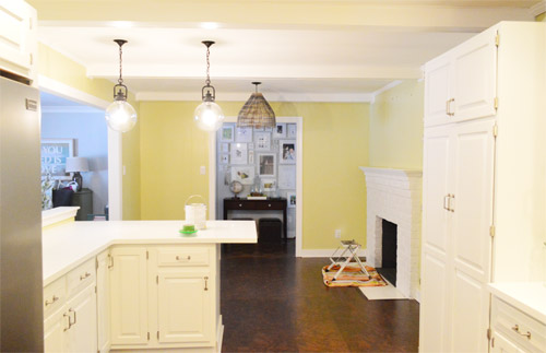
As for more about the kitchen color change, although you guys know we love grellow with a passion, it has been notoriously impossible to photograph (remember a hundred different phases of the kitchen project with “ahh, this color looks so much more subtle in person but is reading as lime green/bright yellow/neon slime for some reason”). And although that’s sort of definitely a dumb reason to repaint a room, I can’t tell you how annoying it is to not be able to share what you see in front of your eyes when you’re a home blogger.
But the main reason for the change wasn’t that the color was hard to photograph, it was that over time we realized that the grellow didn’t let the other things in the room shine as much as they might have with a different choice. Take the white cabinets and counters for example. They looked little yellowed thanks to the wall color reflecting on them – and even the cork looked a little orangey-yellow (especially at night) instead of rich and mocha.
So here’s how we reasoned our way to a new color pick in five bullets or less:
- we worried that other tones of yellow and green would have the same yellowing-ish issue (say that three times fast) since they’d reflect on the counters, cabinets, and cork – even if they were deeper or lighter, so we nixed those options
- we wanted something deep enough in tone to provide a little more contrast, so the counters and cabinets would pop more (but nothing too dark since the room is windowless)
- we have gray backsplash tile and a few adjoining rooms are gray, so we didn’t want to go with more gray on the walls (dark, light, or schmedium) for fear of grayverload
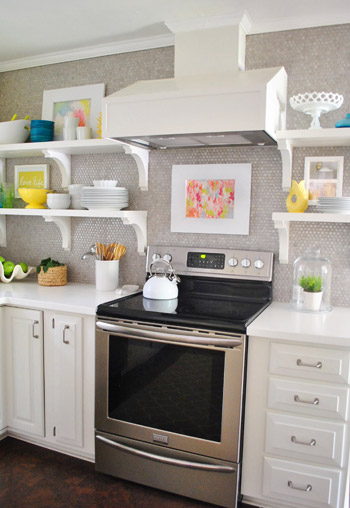
- we wanted an actual color on the walls (since we chose such safe things everywhere else like: brown floors, white cabinets, stainless appliances, white counters, and gray backsplash tile)
- we wanted a color that would tie the kitchen into the four spaces (yes, four!) that the kitchen opens up to – without getting too matchy-matchy (when a room adjoins so many other rooms, the wall color should work with those rooms since you’ll see them together all the time – it’s sort of like very carefully picking a hallway color that works with all of the rooms off of it)
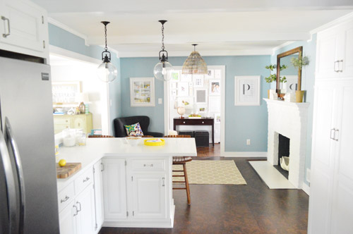
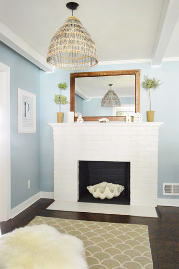
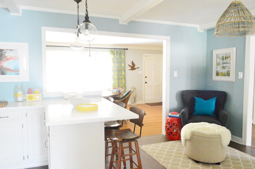
We definitely loved having a soft blue kitchen in our first house, and we actually don’t have any blue on the walls in this house except for the deep teal in the guest room and on the back of the dining room built-ins, so it’s nice to bring in a mid-tone blue that’s sort of in the middle of the guest room and our first house’s kitchen.
The funniest thing about this whole repainting escapade, which we realized while applying the second coat (we’re always loopy by then) was that in our first house we repainted every single room except for our kitchen and our master bedroom. And in this house we’ve only repainted two rooms: the kitchen and our master bedroom. Hilarious.
And if you count the time that we painted the fireplace area a different color for book photoshoots (only to repaint it back to normal a few days later) some parts of this room have seen four different paint jobs.

- it’s definitely an actual color (there’s nothing neutral about it)
- it still feels sophisticated (even though it’s not gray or navy or chocolate or taupe)
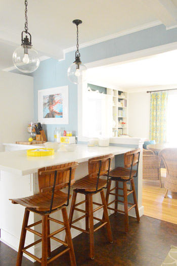
- it allows the white cabinets and counters to really pop (without yellowing them)
- it’s a great balance to the warm tones in the room (like the cork floors, the wood stools, the rustic cutting boards on the counter, etc).
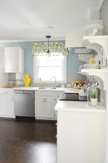
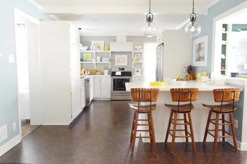

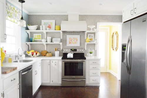
Not gonna lie though, the star of this room is still that wall full of penny tile. Picture me having an as-soon-as-the-show-ends bachelor breakup with the wall paint to run back to the penny tile with open arms. And it’s not that I don’t love the wall color – I just love the penny tile more than a person should love any inanimate object.


Megan says
Love the new color! Blue is one of my favorites. I totally just repainted our kitchen too! I love the new change!!
Ashley says
Wow, that color looks terrific and looks so much better!! Sorry, but that grellow looked gross.
Anne says
GREAT improvement!
Kristin ~ Bien Living Design says
This is a fabulous update to the kitchen!
Kirstin says
Good timing. I took Monday off to get started on spring projects, which included taking down the wallpaper backsplash in my apartment. Yesterday I repainted the area and this morning I was putting back switch plates and all the stuff on my counters. It looks so much fresher without the country motif! I’ve de-wallpapered the bedroom and bathroom and it was so great to get this small bit done and now live wallpaper free!
Susan says
Absolutely Beautiful! I like this so much better than the yellow, much more calming and sophisticated!
Joy says
Your kitchen looks beautiful! I love the color, but admit that I, too, love that penny tile a bit more than the new color.
I haven’t repainted a room recently, but two years ago I repainted a room because the sage green I was going for ended up being a mint green and it bugged me every day until I took the time to repaint it. The new color makes me so happy and was worth all the effort and time.
Jeanna says
OMG, it looks just great…………… I liked the pop of color in the grellow, but this I love! It’s so much better!!! Easier on the eyes, plays well with others :) The only thing is, now the super bright neon yellow accessories don’t look right to my eyes. Ya know how when ya change one thing, sometimes other things seem to need a change? Would you consider changing those a wee bit? I don’t know, maybe leaning more toward a green tone still in line with the laundry? So hard to know true color on a monitor!!!
YoungHouseLove says
I think they just look bolder on certain monitors, in person they’re just yellow like a lot of other accessories throughout our house (pillows in the guest room, items on the dining room console, etc) so they seem to fit right in :)
xo
s
Lea says
I love the new blue too! But I agree, I guess my monitor or whatever is popping all the yellow accessories to neon yellow. If they were soft, pastel yellows then they’d match the softness of the blue I’m seeing. Either way, great color change! Definitely makes the room more inviting.
YoungHouseLove says
Oh yeah, must just be certain monitors maybe? In person they’re not pastel but they’re not neon either – they’re just yellow, like the colors in the painting above the stove and the fabric on the window :)
xo
s
Shelly says
S&J…WOWZA! I love love love it! They yellow was nice but this took it to another level…great job you two! I’m totally going to paint my yellow kitchen blue now.
Shelly says
hahaha they yellow…ugh “the” yellow. I’m from Kentucky, sorry. ;-)
Christy Niebaum says
Get it right. Get it right, get it tight. *dancing a jig to Bubba Sparx’s “Ms New Booty”*
YoungHouseLove says
I found you miss new booty!
xo
s
Kelly L says
It’s weird how you don’t notice certain things (like how yellowy the floors looked BECAUSE of the paint) until you change them! This is good inspiration to nix the taupe in my living room to tone down our awkward yellow/orange tile!!
Lovin’ the blue! (and the Lady Marmalade reference)! and YOU GUYS!!
Kate C says
Yes! I have never said anything, because it’s your house and you’ve gotta love where you live, but I’ve never liked that grellow! Never. I couldn’t understand why you defended it and I thought the floors looked off too. I now see that it was the paint! Good choice on it’s replacement.
Katrina says
Loved your original kitchen color, but agree it never looked quite right in pictures, however I’m digging your new room color much much more! Love the power of paint :)
Lindy says
LOVE the blue! So calming, which is perfect for a kitchen.
So I gotta say, every time I see the side of your (pantry?) cabinet, the one left of the bar if you’re standing at the fire place, I think it would look awesome if converted to a chalk board. Just a thought. :)
YoungHouseLove says
Yeah, we just walk through that doorway 12 times a day and don’t want to get chalk on us if we brush against it – not sure what we’ll do there :)
xo
s
katherine says
I love it. It looks so much more updated, clean and fresh. Maybe the grellow looked fine in person but it always looked dated and claustrophobic in the photos, especially because of the lack of natural light. It looks fine in the laundry room pic though! Great change.
harlie says
Hah! We used Colorado Grey for our bedroom in our last house. We LOVED the color and we plan to paint our current bedroom either the same or something similar. The color looks so different in your kitchen! It’s still sophisticated, but it seems so much brighter and less moody. I would never have guessed they were the same color.
YoungHouseLove says
So funny! It’s definitely a bold and bright blue in our kitchen – I wonder if natural light and lots of windows (assuming your bedroom had those) changes it a ton!
xo
s
Anne says
LOVE IT! We painted our kitchen/living room (they’re open to each other) a blue/gray/purple color (Valspar Cincinnatian Hotel Linder Blue). It scared me at first, but now I love it, especially how our white cabinets and plantation shutters contrast with it.
Kate F. says
We painted our garage. Meh, in hindsight we should have drywalled and not painted the cinderblock, but we’re making it work. We’ll be epoxying the floor this weekend and I have come plans to re-purpose some ikea kitchen storage solutions out there so that things are up off the workbench and onto the walls in an organized way. John’s basement upgrade has been an inspiration.
YoungHouseLove says
Aw, that’s so sweet! Happy garage pimping!
xo
s
Bethany says
Lady Marmalade!!!! I just watched Moulin Rouge last night :) Kitchen looks fresh and fab!
Colleen says
so much better!!!!! the greeny yellow wasn’t quite doing the new kitchen justice! I love the change
Laurie says
I LOVE the blue and you were right about everything. The white cabinets and molding really do stand out and seem so crisp and bright. I want to re-paint my kitchen. My walls are a mocha color and while I do love it, I am starting to realize a true color can still work as a neutral. I believe all colors go together if you put them together. Thinking about blue because it opens to my living room and dining room and I have pops of blue accents in there. But I have commitment issues. As for current painting projects, I just re-claimed my childhood dresser from my Mom’s house for my 10 year old’s tween room. It was a yellow French Provincial that I painted white years ago. At least I would have told you it was white until I put it in her room that truly has white furniture in it. The dresser is definitely a yellow-y cream color so I will be re-painting it this weekend. Not sure if I should do white, kind of leaning towards gray or metallic silver to play off the gray in her bedding and the brushed nickel hardware throughout the room.
Jen @ Domesticated Nomad says
I’m on the third color in three years for my living room! I think, hope, this one is the winner.
I miss the grellow, not gonna lie, but the contrast with your new color looks really great. You have lived with a blue kitchen, so I guess I don’t need to warn you, but for your readers, blue is an appetite suppressant. People with blue kitchens tend to eat less; they have really studied it. (Red enhances appetites which is why it’s the most common restaurant color.) Blue kitchens can help those who want to lose weight, but for me it just made bad eating habits. I inherited a blue kitchen once and I couldn’t stand to eat or even cook in there. So, then we started eating out all the time. It was bad. Most people have no idea how much a color can affect their choices, so I always find blue kitchens risky.
YoungHouseLove says
So interesting! Our first kitchen was blue too and we cooked and ate in there a lot. Maybe with a ton of white cabinets and light counters (to temper it, which we had in both spaces) makes it less potent?
xo
s
Lindsay says
So great, you guys!! A really nice compliment to everything else you have in there. Don’t forget to update your kitchen shots on your House Tour page! :)I was looking at that today and still saw grellow. Also, I’d love to see a shot of your kitchen after dinner on a given night, or after company comes over for dinner. :)I would give my left arm for my kitchen to always look as immaculate as yours does! I know it HAS to get dirty every now and then, right?
YoungHouseLove says
Oh yeah, gotta update those!
xo
s
Xanthe says
I love the blue! I really liked the grellow as well but the blue makes your cabinets pop more. You are so good at choosing colours. We made a mistake with our living room it was the first room we tackled. Its white with a black sofa and a red carpet, so stark and bachelory. What colour could I paint the walls temporarily until we change the sofa and carpet? The rest of the house is soft blues greens and greys. X
YoungHouseLove says
Ooh something warm in there like Ashen Tan by Benjamin Moore would be gorgeous!
xo
s
Kara says
LOVE the blue. So much softer than the yellow. Spa like kitchen.
JoAnn in NJ says
while I love the blue color (sitting in a pretty blue room right now) I have to say I think blue is cold for a Blue kitchen. Maybe I’m just a holdover of the whole warm pallet of red/gold/green? I know that’s so 2000 and not new millenium, but it feels chilly to me to see blue in your pretty kitchen. I’m also feeling that for the gray as well (and I love gray, just painted my whole outside house that color last year).
Jen B says
Love the switch! Loved the old color too though. I just love your light and bright home! Quick question for you painters, repainters, and um re-repainters? We’re getting ready to repaint the exterior of our first home. Scared much? Why yes! We’ve been told to go with a semi-gloss so it will wick water away. Is that true? I don’t exactly want my house looking like the shiny lipgloss on the rest of the face, err street. What do you guys recommend?
YoungHouseLove says
I have never painted the exterior – anyone know? It sounds like it might be shiny with semi-gloss. I’d love to hear from folks who have done it!
xo
s
rachael says
Our neigbours painted their house two years ago and it was definitely not semi-gloss, it was cloesr to a flat finish. Is this what the paint store is telling you?? I would research it more, try looking at thisoldhouse.com and the diynetwork.
Nichole K says
I believe our exterior paint is either satin or semi-gloss (the builders painted, not us). It doesn’t look very shiny. Even in direct sunlight it doesn’t scream GLOSSY paint. Do NOT use flat. It won’t repel moisture and it will be a pain to clean, especially if you have a tendency for mold or moss in your area.
Nichole K says
PS: If you can get your hands on a paint sprayer, DO IT! Then you can “back roll” (i.e. load a roller with a bit of paint and go over everything you spray) to get rid of lines and drips. This is how we painted out last house’s exterior and it held up well. We used satin on our last house.
YoungHouseLove says
Sounds awesome! Thanks for all the tips guys!
xo
s
Lindsey says
Looks great! I actually just bought some chalkboard paint this morning to paint the area above my kitchen cabinets, so hopefully that will be accomplished this weekend! The wall comes out flush with the cabinets, so there’s about 2′ of blank white wall up there begging to feel important. So I thought chalkboard paint with a few of my most-used recipes would be great up there, or the menu during a dinner party, or something like that.
Also, it’s funny you picked blue, because I have been trying to decide what color to paint my 2nd floor hall bathroom, and I was leaning toward blue. But literally the entire rest of my house (sans kitchen and 2 bathrooms) is painted light blue. At least the contractors picked a color I like! Maybe that’s part of the reason this house appealled to me when I bought it!
Amy says
I love it! I may need to pick up this color to paint my bathroom. Speaking of paint colors…any suggestions on what colors look good with tan couches (I also have brown curtains)? I’ve had green walls for almost 7 years and am ready for a change. I have a lot of green accents in the room (the wall color is called “celery green”) but change up the other accent colors according to season- red in the winter, more blue in the Spring, some coral in the summer, orange in the Fall so green has treated me well all these years. Suggestions?
YoungHouseLove says
Hmm, Quiet Moments is a pretty blue gray that’s almost a neutral (so airy!) so I think that would look gorgeous. You could also go with something like Elephant Gray (the soft purple tone we did in our hall bathroom) – it’s really pretty too!
xo
s
Annie says
Gorgeous choice! *applause*
The grellow was nice but never a “wow” choice. Even though blue is a more common wall color choice, it makes the kitchen shine much more. Also, better flow from room to room!
Rebecca S says
I actually loved the grellow…but this new blue is gorgeous! It looks very similar to the blue in our main bathroom (paired with lots of white trim and white subway tile) and it is such a calming color. I love pops of colors with accessories, but I do really prefer soothing, calm wall colors. A+!
Patti says
Lovin’ it YHLovers! Quick question Sherry … when you have warm wood tones in the room (say a dining room table and chairs), do you think it’s best to stick with a warm paint color? Or would cool tones work just as well?
YoungHouseLove says
I love mixing! The balance from warm things (like our cork, stools, the basket pendant, the mirror over the fireplace) along with the cooler choices (blue walls, white cabinets and counters) is a nice not-too-cold-and-not-too-warm result :)
xo
s
Karen W. says
I’ll just come right out and say it- what a great decision! I love you guys, love your house, love the blog- but, there were two things that I didn’t quite “get”. One were the stools in the kitchen, the other the grellow.
All of a sudden with the blue walls, the kitchen feels airy and kind of beachy while still being sophisticated, and FINALLY THE STOOLS MAKE SENSE TO ME, lol!! They look so good to me now!
I love the grey-to-blue-to-yellow from the dining room to kitchen to laundry…kind of like a proper beach day ;-)
YoungHouseLove says
Haha, thanks Karen!
xo
s
Carla says
Oh, man!!! The Kermit diarrhea is gone!! Yahoo!!!
That blue is GORGEOUS YUMMINESS!!!!!!!!!
What a HUGE improvement. So, so beautiful!!!!
Nicole @ Liberty Belles says
yup, looks awesome. LOVE the change!
MK says
I can’t believe just changing a paint color makes such a huge difference. The new color looks amazing. It almost reminds me of being at the beach.
sarah says
I looooove it!! Especially since blue is my absolute most favoritist color of all time. It makes me miss my blue kitchen.
Jennifer I says
I like it! The grellow wasn’t terrible, and definitely seemd your style, but this makes so much sense. I think yellow is hard to work with. Good for you to recognize it wasn’t working and fix it!! I would never repaint again, I’d just live with, vaguely dissatisfied without knowing why. Like I am with my living room, and the shade of yellow that I’m not too happy with in there…but I’m not going to repaint. Oh, well.
Grace says
I LOVE IT!!! My husband & I actually just bought our very first house last December & let’s just say, the colors didn’t match with our personality. We love the color blue but we weren’t sure how it would turn because I didn’t want it to look granny-ish. Here was our living room inspiration post ( http://smile2grace.wordpress.com/2013/02/03/living-room-inspiration-light-blue-walls/)
We ended up with Valspar Signature Seaside and it looks amazing! Our living room went from mustardy yellow to calm & breezy blue. PS: I thoroughly enjoy your book. Whenever I’m in need of some inspiration, your book never fails :)
YoungHouseLove says
Love those inspiration pictures! Drool.
xo
s
Lauren says
It looks great! I was trusting you with that grellow and I did like it, but the blue looks phenomenal. As a fan of the grellow, I’m happy it lives on in the happy laundry room! Ahh, now you just have the best of both worlds. It looks super and still manages to tie in with all of your accents that worked so well with the grellow.
Jessie says
Hi Jon and Sherry! Not sure if this is the best place to post a question, but here it goes anyway (it is paint related, at least)! My fiancee and I live in an older home that was built in the 1950’s – we are dying to repaint some of the interior doors, trim, and walls, but a couple of doors have tested positive for lead paint. Some of these doors have many layers of paint on them and there are places that are showing dings and scuffs along with paint peeling off; however due to the lead paint, we can’t really sand them. I would love if you could do a post sometime about repainting vs. replacing things in an older home and if you do choose to repaint, how you deal with the lead paint factor (if you’ve ever had to).
Thanks! Love you guys!
YoungHouseLove says
That’s definitely a toughie since you never want to sand lead! I would ask for a lead expert to come out to your house and quote you for how much it would be to repair and de-lead the doors you have (it might be as simple as bringing them outside to a blocked off area, sanding them while wearing protective gear, and then repainting them so they’re as good as new). And I think that method would definitely be cheaper than replacing everything. Then you could just replace the trim – or they might even have a solution for saving that which is cheaper than replacing it! Hope it helps!
xo
s
A. says
Yay! It’s gorgeous! :) And to be honest, I think it looks way better than Sesame did. Still like that color in the laundry room, though.
Hannah says
Bom chicka-wow-wow!
Hello I’m a wood tone and I look yummy. Really lets the woods and white cabinets pop, whilst also being breezy, beach house-y.
And this may also be your best post title yet.
YoungHouseLove says
Haha, thanks Hannah!
xo
s
Whitney says
I LOVE IT!!!!
HoH's Bestest Sister Ever says
So, I absolutely loved the grellow, but you’re right, the cabinets pop so much more with the blue! There’s nothing I love more than bight white pieces, and your white kitchen looks so crisp now. *Crisp is my favorite word and design* I’m not really a blue-lover, but it looks nice. :) Also, I’m not a commenter either, I pretty much stick to being a reader, so that’s saying something!
Penni McNamara says
GORGEOUS!
Christine @ Little House On The Corner says
Love the blue-grey colour! Love it so much in fact, that we painted our living room a similar colour!
Katie says
I may just have to pick up a sample of this paint color – love it. We painted our kitchen (with white cabinets and countertops and (fake) brick floors) blue over a year ago, but it’s a little more ‘baby boy nursery’ than I intended…might be time for an update! Great job!
Megan says
LOVE IT! It is so calming and serene, I want to live in that room even more now!