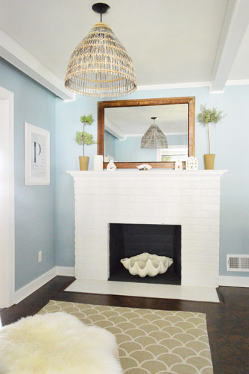
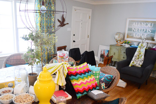
As for more about the kitchen color change, although you guys know we love grellow with a passion, it has been notoriously impossible to photograph (remember a hundred different phases of the kitchen project with “ahh, this color looks so much more subtle in person but is reading as lime green/bright yellow/neon slime for some reason”). And although that’s sort of definitely a dumb reason to repaint a room, I can’t tell you how annoying it is to not be able to share what you see in front of your eyes when you’re a home blogger.
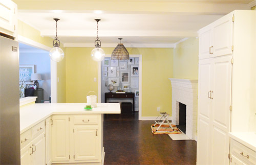
But the main reason for the change wasn’t that the color was hard to photograph, it was that over time we realized that the grellow didn’t let the other things in the room shine as much as they might have with a different choice. Take the white cabinets and counters for example. They looked little yellowed thanks to the wall color reflecting on them – and even the cork looked a little orangey-yellow (especially at night) instead of rich and mocha.
So here’s how we reasoned our way to a new color pick in five bullets or less:
- we worried that other tones of yellow and green would have the same yellowing-ish issue (say that three times fast) since they’d reflect on the counters, cabinets, and cork – even if they were deeper or lighter, so we nixed those options
- we wanted something deep enough in tone to provide a little more contrast, so the counters and cabinets would pop more (but nothing too dark since the room is windowless)
- we have gray backsplash tile and a few adjoining rooms are gray, so we didn’t want to go with more gray on the walls (dark, light, or schmedium) for fear of grayverload
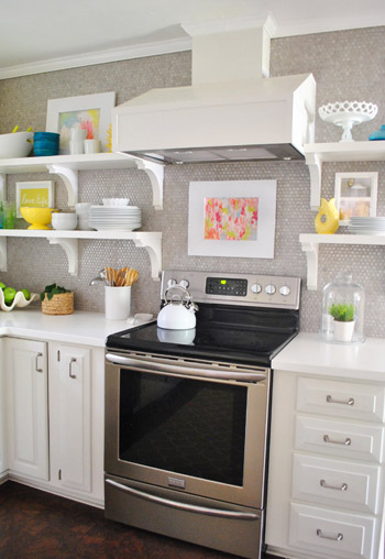
- we wanted an actual color on the walls (since we chose such safe things everywhere else like: brown floors, white cabinets, stainless appliances, white counters, and gray backsplash tile)
- we wanted a color that would tie the kitchen into the four spaces (yes, four!) that the kitchen opens up to – without getting too matchy-matchy (when a room adjoins so many other rooms, the wall color should work with those rooms since you’ll see them together all the time – it’s sort of like very carefully picking a hallway color that works with all of the rooms off of it)

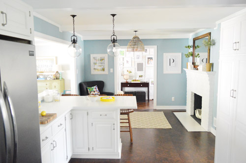
We definitely loved having a soft blue kitchen in our first house, and we actually don’t have any blue on the walls in this house except for the deep teal in the guest room and on the back of the dining room built-ins, so it’s nice to bring in a mid-tone blue that’s sort of in the middle of the guest room and our first house’s kitchen.
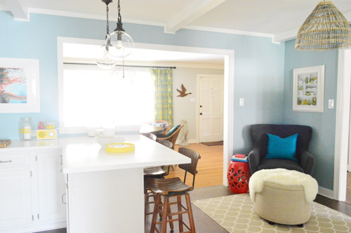
The funniest thing about this whole repainting escapade, which we realized while applying the second coat (we’re always loopy by then) was that in our first house we repainted every single room except for our kitchen and our master bedroom. And in this house we’ve only repainted two rooms: the kitchen and our master bedroom. Hilarious.
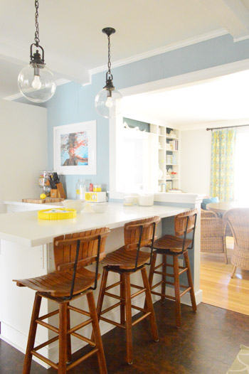
And if you count the time that we painted the fireplace area a different color for book photoshoots (only to repaint it back to normal a few days later) some parts of this room have seen four different paint jobs.

- it’s definitely an actual color (there’s nothing neutral about it)
- it still feels sophisticated (even though it’s not gray or navy or chocolate or taupe)
- it allows the white cabinets and counters to really pop (without yellowing them)
- it’s a great balance to the warm tones in the room (like the cork floors, the wood stools, the rustic cutting boards on the counter, etc).
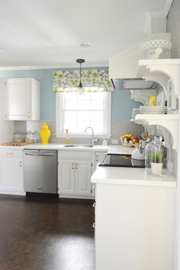
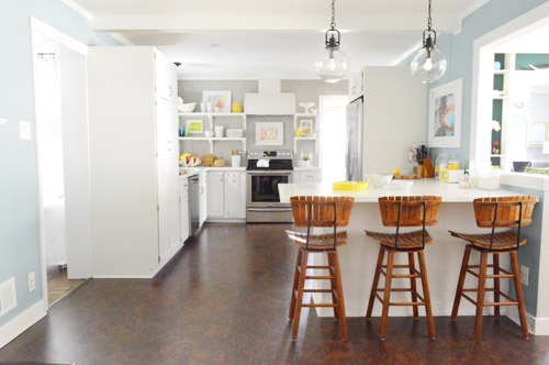

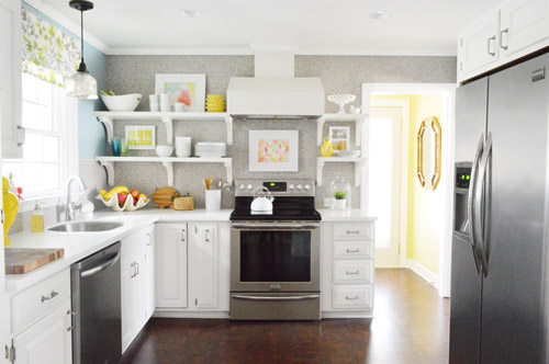
Not gonna lie though, the star of this room is still that wall full of penny tile. Picture me having an as-soon-as-the-show-ends bachelor breakup with the wall paint to run back to the penny tile with open arms. And it’s not that I don’t love the wall color – I just love the penny tile more than a person should love any inanimate object.


Kay says
Mocha Chohca Latta Yaya! I LOVE THIS.
It’s amazing that all of your accessories would fit so perfectly into both rooms. They definitely look different but man, that’s impressive!
Emily says
I definitely LOVED the grellow, but Colorado Blue is so serene and beautiful.
I need a clean up post from you guys. How do you do it? Magical elves that wash out paintbrushes whilst you sleep? Or do you stick used paintbrushes in the refrigerator and forget about them until a major holiday and have a relative find them and then awkwardly wash out paintbrushes from 3 months earlier while preparing Thanksgiving dinner?
Hypothetically.
YoungHouseLove says
Haha, I WISH we had magical elves. Oh man, that would rock! There’s actually a full section on cleaning and organizing on our Projects page with lots of details here. Hope it helps!
xo
s
Jill says
Ha, well to add to the confusing cacophony, I think this is a huuuuuuge improvement on the kitchen half of the kitchen, but I preferred the grellow on the fireplace half of the kitchen — the mirror frame and the basket light fixture looked so great with that, and I don’t think they super-go with the blue now.
I am also still rooting that you’ll add a skylight in this room at some point. It would just make the whole room GLOW, which would be so charming for both a kitchen and what is the heart (center) of your home.
Nicole says
The new color is gorgeous and really makes the kitchen even more pretty!! Love the choice and it ties so nice with the rest of the house too! LOVE!
Nicky says
I actually loved the grellow but when looking through the pictures I can see what you mean about the yellow reflection on the cabinets and the floor. I have to agree about the penny tile though! I think this will be the first thing we install in our future kitchen one day. My boyfriend isn’t very much interested in blogs about but when I was reading the article about the penny tile, even he marvelled at it. That means a lot!
YoungHouseLove says
Aw, that’s sweet!
xo
s
Laura says
Holy cow I LOVE IT!! It’s the perfect light blue – not too baby but not overpowering/dark. And surprisingly it coordinates well with your window valence. I just love it so so much! It’s amazing how a wall color can transform a room!
hena tayeb says
Absolutely gorg. I love the blue, love your light fixtures, the white trims.. everything.
We’re currently not painting anything.. we’re currently hunting.. for a house!
Stephanie B. says
I have to tell you I said: “WHAAAAAAT?!” out loud at my desk at work when I opened up YHL to read with my chicken and rice soup at lunch! Super awesome surprise! The color is great – it looks great with the curtains and the tile and everything! Love that homes are never finished! What does “finished” mean anyway?!
Rachel says
Love the change – it looks so clean and crisp! We are re-painting our kitchen and dining for a again this upcoming weekend (its been three colors in three years). Its funny how a change in one room can make the paint in an adjoining room look so wrong. I am definitely learning the value of having colors that tie adjoining rooms together, and your choice of Colorado Grey accomplished this beautifully.
Monica C says
I will be the first to raise my hand and say I wasn’t a huge fan of the grellow at all, and I’ve complained about all the grey in the house but you guys totally outdid yourselves with this color change. I LOVE IT. Best thing you guys could have done to this space and really, to the rest of the house. This is why I love keeping up with your blog because although I might not initially agree with all your choices (and really, who cares about my opinion?…) you guys always seem to show all of us how taste/styles evolve and how it’s OKAY to change. GREAT JOB !!! i love it.
Ashley says
Loveeee ittt! It looks so awesome – I loveddd the grellow but I really love this blue! It really does make everything else pop in the room especially the cabinets and even the trim!
Erin Jones says
I love the color change in your kitchen! I especially like how the laundry room stands out more against blue — looks like a new room too!
I have been hating our living room color for over year now, and I’m determined to change it this year. It’s currently Martha Stewart’s Lemon Ice (voila: http://diysquirrel.blogspot.com/2012/04/our-cozy-living-room.html), which translates as green in our space (we have it upstairs in another room, where it actually looks more yellowy). I’m craving greige for the living room, possibly Martha’s Bedford Gray (as seen here on our newly painted hallway doors: http://diysquirrel.blogspot.com/2013/02/its-taupe-ally-grey-right.html). My friends think I’m crazy for repainting a “perfectly good color”, but I can’t stand it anymore!
Anna says
This is an awfully clever post title :) I’m diggin’ it. I can’t believe the difference a little (or a lot) of paint can make! It really looks wonderful and I am glad you kept the laundry room that grellow color. It’s a great contrast to look at it. AIR HIGH FIVES!
Claire says
Ahhhh… so much better!
Mary says
Love the pendant lights over the eat-at bar! Where are those from?
YoungHouseLove says
Those are from a local lighting outlet here in Richmond called The Decorating Outlet (but Shades of Light sells them for full price if you can’t find them elsewhere).
xo
s
A says
I rarely comment, but just wanted to tell you it looks great! This color works so much better. It’s really pretty. I am just not a big grellow fan, I guess!
YoungHouseLove says
Aw thanks A!
xo
s
Beth says
I loooovvveee it! It makes the room with the fireplace look so homey and awesome!
Starr @ The Kiefer Cottage says
The color is beautiful. But I gotta say I would never consider it bold–and I might even label it a neutral. Perhaps your photo editing took away the punch?
YoungHouseLove says
Maybe it’s just your monitor? Everything reads differently on every computer, but in person it’s definitely a lot bolder than our blue-gray kitchen in the first house (it’s sort of the mid point between the dark teal on the built-ins and our first kitchen).
xo
s
Meghan says
I love the blue! Could you post a before and after pic (same view different colors)
YoungHouseLove says
We’d love to whip one of those up for ya soon!
xo
s
Rachel B. says
This looks a million times better than the yellow. I was never blown away by the kitchen reveal and I think it’s because of that yellow wall color. The blue is perfect! And this is coming from a girl who has painted every room in her house a shade of gray.
Lesley says
I knew something would get painted, how could you not after sifting through the entire BM paint deck to pick out your 2013 colours…? I actually thought it might be the living room trim that was getting the brush when you showed the teaser pictures with the ladders set up in there.
Have you used any of those colours?
Really like the blue you picked. Went to the BM color palette to see the actual colour as I was having a hard time seeing the teal-iness of it. Lovely!
YoungHouseLove says
Haha, seriously it’s dangerous to look at that many colors! As for the ones in our collection, I’d say we’ve used around 50% of them ourselves (either at home or on book projects) and seen 25% others in action at a friend’s house or in a store, and the the other 25% were just swatches we LOVED!
xo
s
caryn says
LOVE LOVE LOOOOVE the new color with the penny tile too. i’m in the midst of choosing colors for our remodel, ahhhh exhausting. we’re doing knights armour by olympic with white cabinets. hope it looks as great as your kitchen! #seriouskitchenenvy
YoungHouseLove says
I’m sure it’ll look awesome! Good luck Caryn!
xo
s
Andria says
I have to admit that I wasn’t a fan of the grellow (probably because it didn’t photograph as well–I’m sure I’d love it in person). Love the new color though!
magpie says
“Kitchie kitchie ya ya da, Mou-lin rouge!” Love it.
Okay but seriously, your new color is fantastic. And your penny tile still trumps the game.
Courtney says
I love that you kept the laundry room the grellow. the two colors side by side look great!
cc says
I love a good blue in nearly any room, especially if it comes off as serene and sort of beach-house-like… maybe it’s because I live in a decidedly land-locked area? Hmmm. Whatever my deal is, well done, guys!
Kellie says
I loved the grellow, but I am swooning over the gray/blue (and yes, to those of us in Colorado, that is about as gray as we get).
I just painted the inside of the closet for our future foster child / adoptee – a mid-tone gray that seems soothing and safe. Since it’s a double closet, I’ll keep half of it for clothes and turn the other half into a “safe place” for our child, complete with pillow, blankets, books toys, etc. Like Clara’s closet! Plus I got a free quart of paint from Ace Hardware last weekend with a deal they were running, so this is filed under the $0 category!
kara @ launching our life together says
I already commented on how much I looooove this color & the new look, but I just came back to see if you had posted for a second time today and I sang the title to this post without even thinking of it! DUH! This morning it didn’t click, and I even read it out loud a couple of times to see if I heard any hidden tunes. Thanks for the brain teaser today. I’m sure my boss is thrilled you’re using up some of my brain capacity ;)
YoungHouseLove says
Haha!
xo
s
Johanna says
Amazing what a difference the color makes! No idea if it was the same in real life, but in my eyes, the grellow looked much more like it was a room full of “artificial light” and somehow enhanced that there are no windows in the photos you shared whereas the blue looks way more natural and like the room is flooded with daylight. I guess due to the reflections you were talking about … but I could not have put it in words before seing the direct comparison. Great choice!
YoungHouseLove says
Yes, that’s a great explanation! Love it.
xo
s
Susan says
So bright! So fresh! Looks great with the white cabinetry and the penny rounds. Nice work!
Susan
simplymodernhome.com
Elise S. says
Hi Guys!
This is a bit unrelated, but I wanted to ask… Where did you find your extra long shower curtains? I tried to look through your site, but the one link I found seems to be broken. I’m looking for a white waffle 95incher to tone down a 1956 Pink and Teal bathroom in my new apartment. I’ve looked on all the regular websites I could think of and haven’t had much luck. Thanks in advance!
YoungHouseLove says
We went on amazon.com and searched for 95″ curtains and extra long curtains (they were sold by Target through amazon.com if that helps).
xo
s
Laura C says
looks so pretty! I love it!
Deidra D says
Love it. It is very similar to the color in my living room and kitchen- Glidden Icy Teal.
Amber says
I love it! I think it’s so much better than the grellow although I liked the grellow also…just this is better! :)
Meg says
I like how the blue makes all the yellow accents pop.
We started what we thought was a small makeover in our boys room and it ended up being a huge project. We had to peel off a NASCAR wallpaper border that the previous owners had put up. But it wasnt just the border that had to come down. The bank (our house was a foreclosure) paid to have painters spackle over the border instead of taking the time to peel it.The spackle had started to crumble and paper started to peel so it all had to come down. AND since the room was already a mess I tackled the popcorn ceiling too.
It has been a week and today I finally get to paint. I never want to see sandpaper again… at least until my next project :)
jen says
Who knew you “needed” to paint?! Cause wow, I love the result!
Karen F says
LOVE it! Perfect color choice! I just realized, my kitchen is blue too – although it’s a lighter blue (more like a sea glass) and I love it.
We’ve repainted my daughter’s room 3x. Hopefully the third time’s the charm! :)
andrea @ my kinda perfect says
i’ve gotta be honest, the first picture had me thinking…”really?!? light blue?!”
but after seeing the whole room, the accessories, the adjoining rooms…it looks so cozy. the yellows (in the art, curtains, etc.) pop so much more now. and i can see how the grellow walls contributed to ‘yellowing’ of the entire room. the cool blue was an unexpected change, but now, i like it!
Cara says
Last month I painted our bedroom Behr’s Florida Mango. Ahem. (I have a different definition of a ‘bold’ wall color choice than you do. That blue would be considered a very safe color here.) It’s not for everybody, but this Florida girl loves it and my (Eastern European so who knows where he gets it from) husband is right there with me. Then again, we painted our living room a dark lilac and didn’t realize it was an unusual choice until people started commenting on it in the background of photos of our daughter. Of course, its not an unusual choice in my family. We realized later than my mother and my sister had almost exactly the same shade of purple in their living rooms – and we lived in three different cities.
Stacy says
I love the blue and it seems to make the yellow accents and the white really pop! Very exciting changes you’ve made! You guys are all about painting and I’m way too nervous to even begin but seeing how many times you have made changes and painted and how fresh it looks makes me want to break out a paint brush.
gemma@thesweetestdigs says
Ooooh I love it!! I thought after you painting out the light blue in your bedroom, that you might re-introduce a similar shade somewhere else in your pad.
On the topic of gray-named blues, I used something called “Gray Leaf” in our living/dining room… that is CLEARLY blue. Maybe they aren’t testing out these bad boys before giving them their names?
http://thesweetestdigs.com/2012/09/12/the-living-room-version-4/
YoungHouseLove says
So funny! That could be it!
xo
s
Juliet says
I’m waiting for you guys to come up with a reboot that isn’t a great choice….or I should say my husband is, because I think I will be co-opting the new shade for our living room! So fresh and so clean!
YoungHouseLove says
Haha, thanks Juliet! Hope you love it!
xo
s
Avone says
So stinkin’ glad you guys chose a cooler color. I love it!
I just finished repainting my kitchen again, but I went with more gray. Can you really overdose on gray? Its this decade’s beige. :)
YoungHouseLove says
Haha, it’s true! I just think if you have a giant focal wall of gray tile it might be overloading if you did it on all of the other walls, but I’m sure it can be done, I might just not be able to pull it off. Haha!
xo
s
Mia says
Good decision, it looks fantastic!
deb says
Looks “gorgeous”! Lady Marmalade…
katie says
I love love the new paint color! I agree that the name is a little off, though :)
We just repainted our entry way and family room (to a light gray from a bright yellow), and I’m on a painting rampage — think at least half of our house will get painted for the second time (in 10 years) very soon.
Aubrey says
First time commenting here, but I just had to say now much I love the change. It makes me want to paint my kitchen blue and paint the cabinets white. Looks awesome!
YoungHouseLove says
Aw thanks Aubrey!
xo
s
Aubrey says
*how much not “now much.” that is what I get for commenting on the iPad while nursing my baby
YoungHouseLove says
Haha, I knew what you meant :)
xo
s
Shannon says
It looks awesome. Of course I’m a sucker for blue and gray. I’m in the process of thinking about new paint in our dinning area, master room and bath and hall bath. That blue would look amazing in our hall bath. And for the other rooms…white. Which is actually out of my normal wall palette choice.
agustina says
I love the color, great choice!!!! it goes with almost every color I like…if you´re a matchy person… or if you´re a contrast lover, like me! I´m about to paint my “old walk in closet into home office” and I was dreamming about some minty, greyish, light teal or similar ; but now I´m loving it for the master bedroom!
deb says
Love the Colorado Blue! I have to be honest, I was never a big fan of the grellow. We have pretty much the same blue in our kitchen and I love the way our white cabinets pop. Your kitchen looks gorgeous!