Remember we mentioned the show house that we’d be working on to benefit Habitat For Humanity over the next ten months? Well, we’ve been itching to give you guys an update but we haven’t broken ground quite yet. It’s not that we’re behind schedule (the goal is to be under-roof by Christmas) but it turns out there’s a whole lot of prep before a house is even built. So as people who have never built a house or been part of that process before, it has been really interesting to see what goes into it.
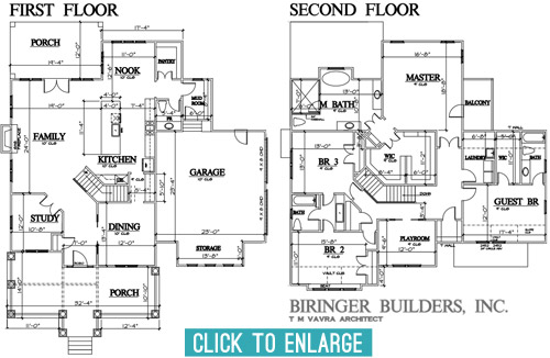
Over the last few months we’ve been having lots of planning meetings and have even made some site visits to look at some finishes/materials (more on that in a sec). So we thought it would be fun to share an update on the floor-planning front. After about five rounds of revisions and tweaks, we’ve arrived at this: the final floor plan!
Getting here was a process with lots of cooks, so the final plan is by no means one person’s sole influence. The builder, John Waters, and his architect, T M Vavra, originated the plans, but they also had to factor in requirements from the neighborhood’s review board. To make sure it fits nicely within the look of the larger community, they require specific things like a certain square footage, and can even veto features on the front and inside the house if they don’t like them. There’s also input from the Homearama show team (to make sure it’s not too similar to other homes in the show, since the goal is for each house to have a variety of features). So lots of it was set before our eyes ever laid on it, but we were welcomed into the process early enough to still make some suggestions to help achieve some of the ideas that we had brewing. So here’s a quick rundown of some of the tweaks that we made to the floor plan, with the help of the builder and the architect after we all put our heads together.
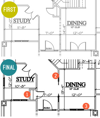
- Moved the coat closet. To make the foyer feel more open and provide an unobstructed view into the family room when you walked in the front door, we borrowed space from the study for the coat closet instead of putting it under the stairs (which cut into the line of sight a lot more than being a door in the hallway that would be flush with the wall when closed). It wasn’t a perfect solution (we actually debated scratching it entirely at one point) but as we’re learning – this is a process of collaboration and compromise.
- Hello pocket doors! We upgraded the doorway to the dining room to include glass paned pocket doors with a transom window across the top (like this) to make that space feel a little more special.
- Goodbye french doors. As much as we love french doors, the original set of ’em planned to open into the dining room from the porch, which felt a bit impractical. It would cramp the dining room unless we picked small furniture, and we figured that access to the porch from the nearby foyer made it easy enough to get out there while allowing for more room, flow, and a larger table in the dining room.
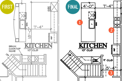
- A simpler island. The original had a raised, curved bar top and columns to the ceiling, but we all agreed that a big open, rectangular island would probably be more functional and less visually busy, especially if the architect could devise a way to lose the columns that would have obstructed the view to…
- The star of the kitchen. We wanted to achieve that quintessential view of the kitchen with a beautiful exposed hood as the centerpiece. This meant shuffling around some of the appliances so the range could sit centered across from the island. Now when you look in from the living room you won’t see a fridge one one side and an oven on the other side – the fridge will be more tucked into a built-in cubby further down, and the backsplash and range hood will be center stage.
- A bigger butler’s pantry. That appliance shuffle also accidentally earned us more space between the kitchen and the dining room for a larger dry bar area. Plus, by moving it to that wall we’ve earned another pantry/closet under the stairs.
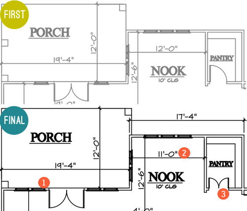
- More windows, please! We first considered turning this whole wall between the family room and the porch into french doors, but Builder John reminded us that it would cut into the function of the family room to make clearance for all of those swinging doors. So instead we just added large fixed windows beside the original french door for the appearance of a wall of glass without all that stuff swinging out and hitting potential furnishings.
- A built-in breakfast nook. This is the hardest change to see based on the floor plan (since it looks like we just made it a foot smaller). But that’s actually because we’re planning an awesome built-in breakfast table with a feature window behind it. Something sort of like this, but with a big interesting window in the back like this. More on that table in just a moment…
- Pantry door tweak. We thought it’d be fun to make these two frosted glass doors instead of just one (like this). But enough about that, let’s talk about the table for the breakfast nook…
Remember when we mentioned making a site visit to source some materials? Well, Builder John and Justin from Homearama introduced us to this place just down the road from us called Dreaming Creek Timber & Frame, where they craft incredible stuff from all types of wood. And they’re going to custom make a raw-edge table (kinda like the in-progress one that we saw during our visit, shown below) to contrast against the otherwise crisp and white breakfast nook that we’re envisioning.
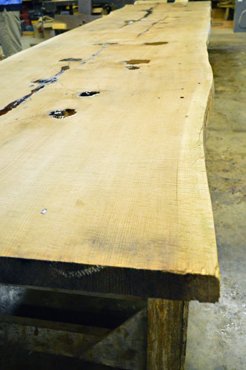
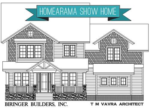
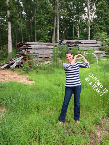
They’re also going to provide some other focal points to the house, like the open A-frame rafters on the front porch, which you can see in the rendering of the facade at the top of this post. If the color had been right, we totally would’ve ask to used these boards they snagged from Coney Island. That’s the old wood boardwalk just chillin’ in the Virginia countryside. Sherry was feeling the NYC love.
Okay, back to the floor plans. Let’s go upstairs, shall we?
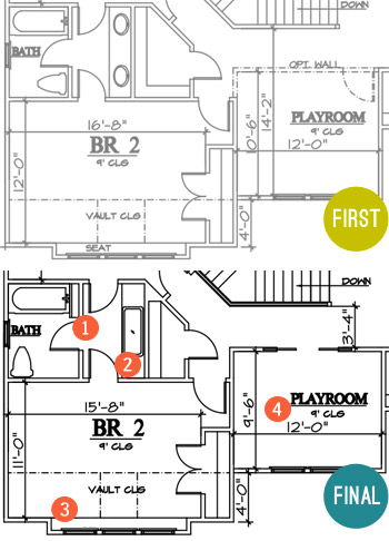
- Some fun towel storage. Since the jack-and-jill bathroom between the kids’ bedrooms didn’t really have (nor did it need) a formal linen closet, we made room for a narrow vertical cubby (for some casual rolled towel storage).
- Go big or go home sink. Again, since it was a kids bathroom we thought it’d be fun to put one big trough sink in there instead of the traditional setup of two smaller sinks. It’ll still have two faucets so it’s easy for two people to use at once, it’ll just be extra wide for some added fun. I think Clara would play for hours in there.
- Light-filled homework spot. Rather than the bench seat that was originally planned for this spot, we decided that a built-in desk would probably get more use and give the room as much function as possible.
- Defining the playroom space. We’re actually thinking of this room as a “Kids Reading Room,” so it will have more of a quiet, curl up with a book (okay, or maybe video game) kind of feel. So we opted to close it off with a wall, but still give it an open feel with pocket doors. We’re envisioning something kind of like this.
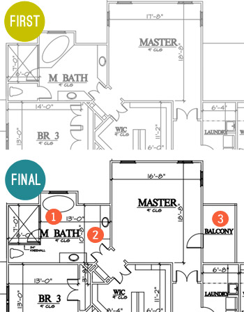
- Freed the tub. We thought the tub would have more presence if it was centered under the back window and freestanding (instead of built into the corner), so we changed its angled placement so that it didn’t block the shower as much (which also allowed for the entire front of the shower to be glass, instead of being walled in with just a small glass door for entry).
- Freed the vanities too. We also thought the twin vanities would be nice and stately if they felt less like angled cabinets with granite on them and more like pieces of furniture set in the room, so we squared them off and are hoping to find some cool dressers or something to convert.
- Balcony, baby! When the builder realized there would be unused roof space on one side of the main bedroom (the breakfast nook is below it) we all thought it would be awesome to add a private balcony up there. We originally had one off the front of the house (attached to a kids room) but the placement off of the main bedroom made a lot more sense.
There were a few other changes not mentioned, but those are probably the easiest to show at this stage. But I can’t believe we spent so much time talking about the inside without even addressing what happened outside. I don’t have the original version, but here’s where we ended up.
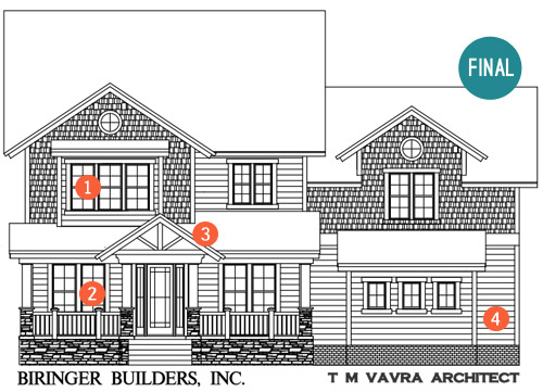
- Ix-nay on the alcony-bay. As I just mentioned in that last bullet, the original plan had a balcony with a pergola on this front window (incidentally, it was the presence of this pergola that helped us know that Builder John was the right partner for us). But the neighborhood’s review board killed the pergola, which made us reconsider the presence of a balcony on a kid’s bedroom anyway (for safety and mischief reasons). So it became a regular window, but that’s where our built-in desk is going to go, so we’re cool with the swap.
- Fake frenchies. Remember how we got rid of the french door in the dining room? Well, we’re going to try to capture the look of french doors with big floor-to-ceiling windows on both sides of the front door instead. That way both rooms get lots of light and easy access to the porch through the entryway door, but they don’t need to account for the clearance of swinging doors (which would impede on the size of the furnishings and their placement in those rooms).
- Open frame. We suggested an open frame look right above the front door. Builder John was all about it and was the one who suggested that we get the Dreaming Creek Timber guys to get us some really awesome accent beams to top things off out there. We think a big hanging glass pendant will look so great shining through that framed detail over the front door.
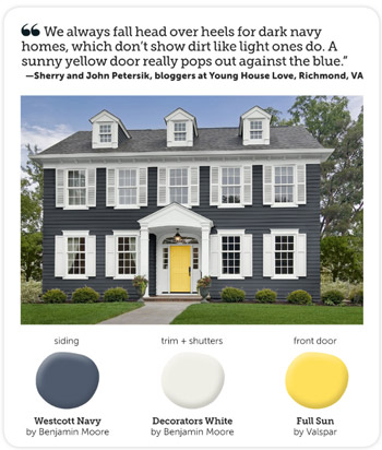
- Go navy! We said early on that we were leaning towards the idea of a navy house with crisp white trim and cool gray-toned stonework around the foundation. Builder John said “dude, I just sold a house that was tan and the realtor said if it was navy she thought it would have sold faster. Say no more, I’m sold on navy!”
We still need to settle on an exact navy color, and we’re actually meeting this week to look at a few options along with choosing the exact stone and brickwork that will make up the exterior. We’re also thinking of going glossy red or bright yellow for the front door, maybe bringing to life the exterior color combo that Sherry told HGTV magazine she was crushing on a few months ago?
Sorry there aren’t more real pics to share at this point. All of this talk of the house is really making us excited to see it come to life in person! Have any of you guys built a house, or been involved in the process through a relative, friend, or work project? It’s amazing how much there is to think about, but insanely exciting to think that scribbles on a piece of paper can actually become rooms that you can stand in someday.
P.S. While we often take on side gigs like this to help pay the bills, this one is a purely creative endeavor for us. Homearama compensates their designers for their year of planning and work, but we’ve opted to donate our entire fee to Richmond’s Habitat for Humanity, a cause that Homearama will also be supporting in other ways throughout the event.
Update: Wanna see the finished showhouse? Click here for Our Full Showhouse Tour, which includes final pictures of every room, the floor plan, budget info, a video walk-through, and shoppable showhouse furniture & accessories.

Jessica says
You mentioned that in your own home, you like to live with things for awhile before you make major changes (like a kitchen reno). So how hard is it to make these changes without living in the space and only seeing it on paper??
YoungHouseLove says
YES! I think a lot of things we’re waiting to actually pull the trigger on buying (appliances, finishes, etc) until the house is at least framed in so we can stand in there (even without drywall) and try to picture things. I’m a fan of taping things off on the floor to, just to get a sense of things.
xo
s
Crystal says
Love the house overall, someone is going to be extremely lucky to live there. I am confused about a few things, I noticed a lot of the rooms shrunk by 1ft somewhere just wondering where ask those feet went, also I absolutely love the big sink in the Jack and Jill bath but after living everyday of the past few years of my life hearing “he spit in my hair” “she spit on my toothbrush” I would seriously think about hurting someone ( not really) just to get a double sink where there is some seperation. Have you looked into those amazing one piece counters with the built in sinks that angle back to the drains? That could be pretty amazing. I don’t see kids/teens of any age benefiting from one sink, waiting for someone to finish brushing their teeth so I can wash my hair or hands. Maybe you could put the big trough sink in the guest room? You guys are so talented and it has to be said that if this whole blog thing doesn’t work out you probably have about a bazillion things to fall back on ;-)
YoungHouseLove says
Aw thanks Crystal! I think those small square foot changes are neighborhood developer mandates (he controls the square footage, so he might have asked to shrink the house a little overall, so a foot came out of each room?). As for the sink, that’s a good thought! Maybe it will end up in the guest room. I think we just assumed since it’s going to be double wide with two faucets, whether the water went into the same big sink or two different ones it wouldn’t really change the function of the room (and might make for a good place for baby/dog bathing, haha!) but who knows where we’ll end up!
xo
s
Carmen says
I second Valerie! I’m a residential architectural designer (no license yet) and it’s amazing how few people understand how to read architectural plans. A “how to read a floor plan” post is a great idea!
On a purely design related note – are you sure you want to mix stone and brick work on the elevation?? I really think it would look best as all stone instead of the mix of materials. I usually think that mix comes out looking like a mistake. For example the contrast in visual appeal of the blue house with the wrap around porch you just toured vs. the others. The blue house really stood out as a winner!
YoungHouseLove says
We agree! We’re debating that exact point right now! It might come down to a budgetary necessity, so maybe we’ll go with all grayed-out brick instead of some of each if we can’t win the “all stone!” battle. Haha!
xo
s
Tori says
What a great floorplan. I love all the tweaks you guys made, too. Especially moving the coat closet! Totally makes more sense to have it off the study, rather than eating up a chunk of the main hall. I have a degree in architecture, mainly so I can someday design my dream home. :) This inspires me to finally put the plans I have floating around in my head onto paper. Looking forward to seeing the evolution of this house!
Jamie says
I’m very excited to be able to see something like this from start to finish! Can’t wait for the updates! With regard to the exterior house colors, though, I’d love to see something a little more unexpected than blues and greys with yellow/red doors.
Breanna says
This house is so cute! I love the floorplan and it looks very light and open.
I did have one question though, in the kitchen the pantry is basically in the other room! It’s tucked back there in the breakfast nook and while I can see there’s not a better space to put it in the actual kitchen (especially not at that size) it just seems like that would get irritating walking back and forth to get things while cooking.
Didn’t know if that was something y’all noticed, maybe that’s just my cooking style! I have a tiny pantry but it’s right near my island so forgetting something I need is only a couple of steps.
YoungHouseLove says
That closet under the stairs is an optional second pantry right within the kitchen, so there’s that larger one by the breakfast nook, but a closer one that’s easier to reach everyday staples if that makes sense! Wish we could have fit the bigger pantry right in the kitchen, but we just couldn’t make it work without moving something else to that corner like the fridge, which we thought would be even weirder.
xo
s
Jen says
thanks for sharing! I didn’t know tweaks like this could be made to a floor plan. Maybe I should send you over ours ;) Can’t wait to hear more!
Dina says
Hi Sherry and John,
Just wanted to drop you guys a quick “thank you” for donating your earnings. As a regular Habitat volunteer, I just wanted to let you know that it means a lot to the volunteers and the home owners. Big thanks for supporting such a great organization!
YoungHouseLove says
Thanks so much Dina! Habitat is such an amazing organization who is making a real difference for deserving families right in our town. It’s our pleasure!
xo
s
Marianne in Mo. says
I like that the door to the commode is gone…if I may be crude, those small w/c rooms hold odors longer! EEWW!
We’ve built two homes, our first as newlyweds who had no clue what was involved. The second was 7 years ago, and my hubs stressed over it so much that he ended up with a heart attack and I got shingles the week after we moved in! We both recovered, and last year helped with another build. My daughter, husband and her uncle bought 5 acres together and built a main house for daughter and family, with a carriage house for her uncle. It was fun, because the decisions were not ours. We did most of the designing for uncle Bill, because he had no clue how to go about it. They are all very happy with the finished product but say never again! I say, never say never! Love being a part of how my home functions, instead of dealing with someone else’s ideas. It’s my home, not theirs!
Jess @ homevolution says
We’re nearing the end of our build now, and it has been a slooooow process! All the county permits and approvals took forever for us – The actual house building has been moving a lot faster than all the red tape we had to go through before it! It’s so exciting to see everything coming to life now though! That house is going to be amazing – I love the floor plan and the exterior looks so cozy & inviting!
YoungHouseLove says
That’s so exciting Jess! Congrats!
xo
s
Christine says
I posted yesterday that you guys have such good ideas! And this house is a great repository for those creative, practical, smart notions. Hope you keep doing this! Have you thought about helping Habitat with the design of the homes that they build? Or designing a line of something house-related with proceeds going to Habitat?
YoungHouseLove says
Thanks so much Christine! We’d love to continue working with John Waters or team up directly with Habitat in the future! It’s definitely something we’re having a lot of fun with, and would love to help people in the future as well as this time around!
xo
s
Jess says
I really love this floor plan! My favorite parts: breakfast nook, trough kids sink & free standing tub in the master. Totally going to steal those ideas for our next house. Haha! Can’t wait to see how it all comes together.
Laurie says
Man, the details make such a difference! My mind boggles with the possibilities. Kudos to you guys for having such a solid vision. This looks like hard work!
Navy is my new obsession color. Am I trendy yet?
YoungHouseLove says
Oh yeah, baby. You’re trendy.
xo
s
stephanie says
Love that you got rid of that corner tub!! As an architect I never understand Builders obsession with putting in corner tubs, we are constantly ripping them out of remodels. I think they must get them on special since they haven’t been cool since 1989 :)I can’t wait to see the finished project.
Sara Guza says
Love it! Looks like it’s gonna be a beautiful house :) Only thing I would personally change is having a little half bath on the first floor so you don’t have to have guests that are just there for a visit go all the way upstairs. Unless there is one and I’m just blind haha. But seriously, awesome job! I have no design sense at all so no way could I do that!
YoungHouseLove says
Thanks Sara! There’s a half bathroom on the first floor across from the pantry (sorry it’s sort of hard to see since it’s tucked in there). I totally agree that it’s helpful for guests to have a place to go without going upstairs!
xo
s
Amy Mason says
Great house! I agree with another commenter, I would never buy a house again with a master toilet not in it’s own room. (we have a 2nd home with the toilet open to the room) And here you can see it from the shower! Can’t imagine my hubby in there watching me have a pee while he showers…
The house we are in right now we built from scratch, and it was so much fun! Enjoy!
Aimee says
Yeah, the fact that the shower has so much glass could be intimidating for people with *shy bladders*! I personally would not like a glassed-in shower because I am all about low maintenance. Who wants to get up 10 min earlier so that they can stand there dripping and squeegee-ing all that glass in the morning? I’d prefer a large walk-in/roll-in shower with a standard curtain rod.
Has this house been designed to be ADA-compliant, BTW?
YoungHouseLove says
Yes, I believe it’s an ADA-compliant house! As for the shy bladders thing, we certainly don’t expect people to shower and pee at the same time! We have them next to each other in our bathroom without a toilet door, but if the bathroom door is closed, the other person just waits or uses another bathroom. There are lots of them in this house so we thought there wouldn’t be any sort of “oh no I have to use the toilet but Bill’s showering and I can’t access any other bathrooms” situations since there are so many. Now I’m thinking we have to do a poll because it’s funny how many people have strong door opinions on either side!
xo
s
Ashley says
The ADA requirements tend to be more lax in residential work than commercial, for example in FL you just have to have an accessible route to one of the bathrooms. The assumption is a guest should be able to use a bathroom, but if a homeowner is in need of ADA they will make more extensive changes to the home.
Rebecca says
We had the deliema with opening French doors into our only eating area from the back porch. We previously had really old sliding glass door but we so wanted the French door look. We learned that there are Exterior French doors that swing out. We ended up using one from Marvin windows and they look awesome, while still allowing us to have a decent sized table.
YoungHouseLove says
Great tip! Thanks Rebecca!
xo
s
Lee says
Yes, my parents’ house has exterior French doors that swing out from the breakfast room to the patio. I was wondering why you didn’t just do that!
YoungHouseLove says
Even if they swung out we realized it would mean no porch furniture could go there because it would be blocking them, so nice big windows meant there could be living space on the porch and room for furniture in the dining room too.
xo
s
Lee says
Makes sense – thanks for satisfying my curiosity! :)
Stephanie P says
We built our current house 3 years ago and it’s interesting to see the differences in layout/design as our house is also approx 3400 sq ft. What I do love is the room sizes in your home. We live in GA and it’s much more common to have the Master on the main level – we also have a guest room on the first floor (plus 3BRs up) and the ever popular bonus room over the garage. The one thing about building is that you’ll always find something that you wished you had done differently when it’s all said and done. Because ours was totally custom, we had to pick everything – doors, knobs, paint colors, trim, outlet placement. It was quite the ordeal, especially being pregnant at the time.
Julianne says
Wow…How exciting! All I need to know now is, “when can I come pick up the keys???” :0)
Tashi says
Hi, there!I’m so thrilled about this project as it is closer to the situation we’re living…We started building our house from scratch and finished enough to settle in, but have at least half to go + details!
So, keep posting about this other house :)
Roxine says
Three things I love about you —-
Thank you, thank you for changing the master tub. We have a built in corner jetted tub and in 15 years it’s only been used a few times. It takes the whole hot water tank to even begin to fill it up and it’s a pain to clean that far corner. I have to plank over the edge or climb in it in order to clean it :-(
Thank you for not having a massive 2-story vaulted entry way. It eats up an entire room on the 2nd floor. Such wasted space and who wants to climb a 2-story ladder to change those lightbulbs anyway.
Thank you for not having a million doors to the outside. I love the floor to ceiling windows that create the look of French doors and provide wonderful light. I always worry that with that many doors, I would forget to check a lock and end up with strangers in the house in the middle of the night. :-)
Is it possible this builder would sell these plans? It’s a beauty!
YoungHouseLove says
Aw thanks Roxine! We’ll have to ask if the builder would sell these plans. Didn’t even think of that! Would be so cool if he would!
xo
s
Cali says
PLEASE keep a door on the master toilet! I love being able to brush my teeth without someone sitting right there!
Also, will there be a window in the laundry room because its an exterior wall? I love natural light to make laundry more fun.
Also, Also, why not swap the pantry and the powder room? Then the powder room could have a small window and the pantry might be a step of two closer to the kitchen? Maybe plumbing is an issue?
YoungHouseLove says
All good ideas, and a few are things we tried for ourselves! As for the toilet door, we’ve heard from folks on both sides of that right here in the comments, so it really seems to be a “different strokes for different folks thing.” I think we talked about moving the toilet and the pantry but couldn’t due to a plumbing thing (where it is now lines up with everything upstairs). As for the laundry room, and you can’t tell from these layouts, but the drawing of the back of the house shows why we couldn’t get one (the slope of the roof on that side of the house prevents a window from working in that spot – boo!).
xo,
s
Tawnya Marney says
Y’all have created an almost perfect home here! The front porch is huge. The kitchen is spot on and I am coveting that island already. The place just needs a giant game-room, with a media room opening off it, upstairs. But, we like things big here in Texas!
YoungHouseLove says
Someone else mentioned a gameroom and said it was a Texas staple! So funny!
xo
s
Kimberly @ Turning It Home says
We, a family of 5, are currently rent a 700 sq ft home from my in-laws. We’re actually working to get our credit up so we can buy it and if we do, my father in law would enclose our run down front porch and move our door to give us more livable space. That means we would get to pick where our front door would go and what shape to make the portico. I was thinking something like this (http://www.pinterest.com/pin/193091902746631300/) but that exposed rafter idea is sounding pretty sweet, too! The possibilities are [almost] endless!
YoungHouseLove says
That picture is GORGEOUS! Congrats and good luck Kimberly!
xo
s
Vickie says
While I love most of the house plans there are definitely some changes I would have made (who wouldn’t, right?)
First change,I really dislike Jack and Jill baths with all those doors to contend with so that would have been converted to a bath with one door to the hall.
Second, while I understand the convenience of having the laundry on the floor with the bedrooms (as is mine) I have also lived through the washer not shutting off one night and having it flood half the main floor and half of the finished basement. BIG pain to rip up wet floors and tear out walls 3′ up from the floor to fix the water damage.
Third, again just my personal preference, I don’t like booths too much as it’s a pain for everyone to scoot out in order for the inside person to exit the table for whatever reason.
But the rest …. LOVE IT!!!
Megan says
YAAAAAY! Love this update!!!! I commented the other day regarding how things were going and this post more than satisfies my curiousity! Ha! Thanks for all the amazing details. You really made some smart adjustments that blend style and function beautifully. Well done. The exterior color choice is spot on as well. I totally agree navy and really deep brown houses are on trend, but also have timeless appeal. I have to say the square footage would be considered very large and expensive in our market. Is this an upscale neighborhood? Can you give us a price point (range)? I’m certain it would be mid to upper 400’s here! I think lovers of this plan could easily modify it to make it more affordable though! Nix the dining room and upstairs game room and turn the study into a play room. With young kids, I feel any flex room on the main floor is automatically converted to a play room…they want to be close to you!
YoungHouseLove says
Oh yes, these showhouses are more of an “aspirational” thing for most folks (we definitely could never afford this house) and they’re put on in upscale neighborhoods. They usually sell like hotcakes to people who can afford them once they’re built though, and for everyone who gets to walk through them, they’re just really fun to see and get ideas and pet the pretty tile. Haha! I love that they’re for a good cause so there’s this fancy neighborhood that everyone gets to explore in the name of raising money for a great local charity. And I love your ideas for adapting this plan to be smaller/more affordable! So smart.
xo,
s
Alexi says
Love the floor plan! My favorite part is the huge island that’s open to the living room. I can’t wait to see what you guys do with it!
Kelly says
Love the house color combo! If you had a garage door on the front of the house what color would you make it with that combo? White? Thanks!
YoungHouseLove says
Hmm, either white or charcoal/gray I think! Might look nice with the stone foundation if you pick a color from the stone like medium to dark gray.
xo
s
Katie V says
Did you guys see that you’re #10 on this Buzzfeed list of Pinterest boards to change your life? Super awesome!!
http://www.buzzfeed.com/readcommentbackwards/65-innovative-and-creative-pinterest-accounts-that-dmjk
YoungHouseLove says
Um, that is crazy talk.
xo
s
Beth says
Y’all even beat Martha Stewart!! WOOT WOOT!! Way to go YHL!
YoungHouseLove says
Crazytown! It must be Opposite Day!
xo
s
John says
The plan looks good. Just a few comments from an architect.
Perhaps the windows to the rear porch could be fixed doors, for a total of two swinging doors and a fixed door on each side. Any time you have porch you are losing some light. Did you consider a door from the mudroom where the rear window is now. This would allow easy access without going through the garage or family room and perhaps remove the mudroom door to the kitchen.
Could the hall storage to the right of the playroom open into the playroom instead of the hall, this would give added space for toys and the playroom could be an additional bedroom in the future. You will still have a hall linen closet.
Perhaps move the washer and dryer towards the rear wall away from the guest bedroom and insulate the walls around the laundry room.
Like the large bathroom sink, easy to bathe a baby in it
YoungHouseLove says
Thanks John! We thought about fixed doors but we thought big windows would help us place furniture better whereas fixed doors might not allow for anything to be put in front of them without looking like they’re blocked. As for the mudroom change, that sounds interesting! Will have to see what the builder’s team thinks. I love the playroom closet idea and the washer dryer move! Will bring that up in our meeting today to see what they think!
xo
s
Emiles says
That just seems like too much fun to get to play around with money that’s not your own! Really like all the changes you made…except for one…put the door back on the master toilet! That is almost a requirement around here anymore. When planning our remodel I originally went without one to keep it open, but rethought it. While it’d close off part of one shower wall, you’d still have the other open, and you wouldn’t have to look down to see your sweetie doin’ their biznass!
YoungHouseLove says
It’s so funny how polarizing that is! Some people have commented to say they prefer it open (we do as well) and others say close it rightthissecond! The funny thing I’d like to make a distinction about is that we don’t expect that anyone would be using the toilet while someone else showers right next to them. Ours are in the same room, and we just wait for someone to be done or use another one since we have three toilets and two showers to choose from. When the bathroom door is closed, you just use another bathroom- there’s no barging in and doing stuff next to each other. Haha!
xo
s
Cali says
I agree with the door. I guess why its more of an issue for us is because we have a split-floor plan. So if the bathroom door is closed, we have to treck across the house to get to the other one.
We are actually really spoiled and have his and her master bathrooms. He has his own room with a sink, toilet, and stall shower. I have my own vanity, toilet, and tub/shower. We thought we would reno it when we bought the house and make one larger one but now we would never share in a million years! I guess its actually starting to be a new trend in house designs.
Kate Mc says
So now that you are on the inside of Homerama, may I ask what happens to the furnishings without being rude? Cincinnati does one too, and in high school my friends moved into one of the houses that had been on the tour, but when I visited it didn’t have any of the furnishings I remembered from Homerama. I didn’t know if that was just their personal preference or if it was sold unfurnished but I felt like it would be impolite to ask.
YoungHouseLove says
Ah yes, here’s the inside scoop for what happens at ours. A lot of the furniture is for sale during those open houses. So a vendor will offer that the builder can furnish the house with that stuff on the condition that people walking through know it’s for sale. People usually buy it all and the house sells without furniture while others who walk through buy a chair or a sofa here and there until it’s all “spoken for.” It’s smart because then they get to show houses that are furnished without builders buying/getting stuck with all that furniture, although some builders buy some things and keep them to use in their models and other showhouses over and over again.
xo
s
Jeanette says
This is such great timing! We`ve just started building our home this week after drooling over our house plans for almost a year before we were ready to move ahead. Now that we`re finally building, things have taken off at lightening speed! We`re the general contractors so, needless to say, it`s been super busy but will definitely be worth it in the end!
YoungHouseLove says
Ahh! That’s so exciting!
xo
s
Melissa @ Loving Here says
It’s amazing!! I plan to come back to this when we/if we ever get around to our dream of building our own home. The only problem is…any worries you’ll start to yearn for details in this house while working on your own house? I know it’s a different project, different budget, and different location…but I’d be worries about confusing my heart by falling in love with a place I know I could never have! It’s an awesome opportunity, though, and I’m not at all jealous you have 2 homes to play with right now…so to speak. :)
YoungHouseLove says
I do think we’ll love this house like it’s our baby, but to us we’re so in love with our neighborhood and all of the potential/projects that we have planned here that our current house will thankfully always be #1 in our DIY-loving eyes.
xo
s
Annette says
Dude. Someday when we buy some land, can we buy these plans? This is seriously beyond perfect for our family. The play room would be a school room.
YoungHouseLove says
Aw thanks Annette! Someone else asked if the plans would be for sale so we’ll have to ask the builder! That would be so cool!
xo
s
Jen says
I can’t wait to see the exterior! A new house down the street from us is being built with a dark grey exterior with grey shaker shingles. I am SO in love. I keep alternating my route home to drive by it. Obsessed!
Deb says
We have tons of single and double pocket doors in our house (which I love) including the double doors to my girls playroom. They’re great – EXCEPT for the fact that the kids tend to be not so careful when opening and closing them and they can sometimes come off their tracks if they are pulled too far. Since they are huge, heavy, solid, 6 panel wooden doors they are a bit of a hazard so when the kids were younger we had to create a lock of sorts so they couldn’t open them. Even adults have pulled them too far out and off the tracks (we have double pocket doors between our family room and dining room too) :) The standard line in our house is “Watch the doors!” so everyone knows to be careful. But I absolutely love them and wouldn’t change them for anything though!
YoungHouseLove says
Haha, I love it! We had a pocket door in our first house that was finicky but we loved that thing too!
xo
s
Traci says
I love the changes you made to the floor plans! They all really make sense. The table you are thinking of for the dining nook reminded me of a table I had made for a client a few years ago. It is tulip poplar and I had them make 2 iron “boxes” for the legs.
Just changed over from a website to a blog, so bear with my “directional” abilities. It is here http://66.147.244.136/~tracirau/gallery/living-spaces/. It’s in the first couple rows.
YoungHouseLove says
Gorgeous! Love those Traci!
xo
s
Leslie C says
Just wanted to say that I have a dark blue house and I love it! However, dark colors fade faster if they’re exposed to full sunlight for long periods of time (i.e. no trees to offer shade), so it has had to be repainted more often than it’s lighter hued neighbors. Just something to consider.
Love you kids!
YoungHouseLove says
So interesting! Never heard that Leslie! Thanks for the tip!
xo
s
rachel says
I JUST had my house painted navy this week with a yellow door! I’m in love! I used “Night Tide” by Behr and it has some grayish tones, but looks fantastic. I posted a small sneak peek on instagram (ilikewhatimherring), but I’m waiting on a big reveal until I can get the pictures edited for a bloggie post! I can’t wait to see how the show house turns out!
YoungHouseLove says
Sounds amazing Rachel!
xo
s
Alan says
This is a fantastic floor plan! I can’t wait to see the finished house.
Reese says
I love to see you stepping out into a new world of design with this project!! This is what I do for a living, interior design for model homes. I love it and it’s exciting to read about your experiences so far. Very different from working on your own home (as I am learning too with renovations on my first home this past summer)! What’s your next step with the project besides exterior finishes?
YoungHouseLove says
I think then we’ll start looking at interior finishes and they’ll break ground and start building! Ahhh!
xo
s
Karen says
Our house was tan when we bought it a year ago. So boring. This summer we couldn’t wait to have it painted…navy! We chose “Quiet Peace” by Miller which is on the warm, bright side of navy if that makes sense. With fresh white trim and a warm red door it really pops and the house does look like it’s worth $10k more.
YoungHouseLove says
Sounds amazing Karen!
xo
s
Maggie says
I really wish you’re my sibling/cousin/family-related coz your ideas will help me building the home of my (& hubby) dream. We’ve changed our plans for the 15th time, 2 architects, and 10 years (while saving money). And still doubtful about it :(
You’re both amazing!!
YoungHouseLove says
Aw thanks Maggie! I know how you feel- we keep changing our minds and second guessing things. I think that’s what most people go through, so you’re not alone!
xo
s
Diane says
Why so many penis chandeliers? These have been out of style for years, for good reason.
Sammi says
Ooh, Sherry I usually love what you guys do but that navy blue and yellow screams tacky football team colors to me. Be very, very careful in picking a shade of may that isn’t too royal…. my uncle just repaintted his house and it looks like Wolverine Stadium now. I’d hate for you guys to make the same mistake.
YoungHouseLove says
Thanks Sammi! With so many folks on the team I think we can all put our heads together and make sure we find something great! Many commenters have offered up navy blue exterior colors they’ve used and loved, so that’s helpful too!
xo
s
MonW says
I like your colors for the show house. That yellow door is eye-catching.
For your decor for the show house, will you be doing any makeovers on pieces from the ReStore and other similar stores?
YoungHouseLove says
Yes, we’d love to work some DIY in there with some homemade art and curtains and even some furniture conversions (ex: dresser turned into a sink cabinet, etc). Really depends on what kind of pieces we find and what areas of the house need certain things!
xo
s
Nicole says
Ok, I’m not sure how you did it but this is the EXACT house we want to build, down to the Jack & Jill kids’ bathroom plus the guest with attached bath. I’m saving my pennies to build this in Illinois. Starting right now. I can’t wait to see more of it as it goes up!
YoungHouseLove says
No way! Send us pics when you do!
xo
s
Meg says
I can’t wait to hear more about this project – and I think it’s amazing this is a donation you are doing. I and a general contractor (yeah girls in construction) and build restaurants so i’ve seen may things go from a sketch and pile of dirt to something amazing – enjoy the journey! and take lots of photos to look back on (and time laps!)
YoungHouseLove says
Aw thanks Meg! Holy cow, a time lapse would be amazing.
xo
s
Fara says
What a fun project for you guys! And such insight into how rooms are used. I think your changes were well thought out and practical. I love the navy, and might even talk the hubs into painting our front door navy. We have brick/siding, so the door is about all I have to work with on the exterior. I can’t wait to see how everything comes together.