Remember we mentioned the show house that we’d be working on to benefit Habitat For Humanity over the next ten months? Well, we’ve been itching to give you guys an update but we haven’t broken ground quite yet. It’s not that we’re behind schedule (the goal is to be under-roof by Christmas) but it turns out there’s a whole lot of prep before a house is even built. So as people who have never built a house or been part of that process before, it has been really interesting to see what goes into it.
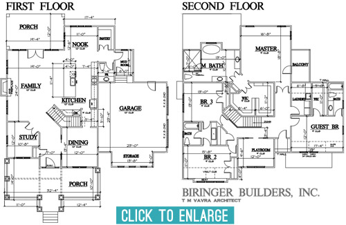
Over the last few months we’ve been having lots of planning meetings and have even made some site visits to look at some finishes/materials (more on that in a sec). So we thought it would be fun to share an update on the floor-planning front. After about five rounds of revisions and tweaks, we’ve arrived at this: the final floor plan!
Getting here was a process with lots of cooks, so the final plan is by no means one person’s sole influence. The builder, John Waters, and his architect, T M Vavra, originated the plans, but they also had to factor in requirements from the neighborhood’s review board. To make sure it fits nicely within the look of the larger community, they require specific things like a certain square footage, and can even veto features on the front and inside the house if they don’t like them. There’s also input from the Homearama show team (to make sure it’s not too similar to other homes in the show, since the goal is for each house to have a variety of features). So lots of it was set before our eyes ever laid on it, but we were welcomed into the process early enough to still make some suggestions to help achieve some of the ideas that we had brewing. So here’s a quick rundown of some of the tweaks that we made to the floor plan, with the help of the builder and the architect after we all put our heads together.
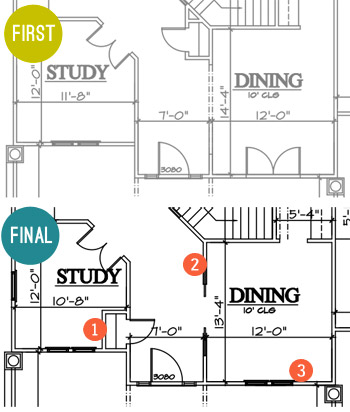
- Moved the coat closet. To make the foyer feel more open and provide an unobstructed view into the family room when you walked in the front door, we borrowed space from the study for the coat closet instead of putting it under the stairs (which cut into the line of sight a lot more than being a door in the hallway that would be flush with the wall when closed). It wasn’t a perfect solution (we actually debated scratching it entirely at one point) but as we’re learning – this is a process of collaboration and compromise.
- Hello pocket doors! We upgraded the doorway to the dining room to include glass paned pocket doors with a transom window across the top (like this) to make that space feel a little more special.
- Goodbye french doors. As much as we love french doors, the original set of ’em planned to open into the dining room from the porch, which felt a bit impractical. It would cramp the dining room unless we picked small furniture, and we figured that access to the porch from the nearby foyer made it easy enough to get out there while allowing for more room, flow, and a larger table in the dining room.
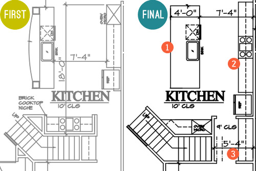
- A simpler island. The original had a raised, curved bar top and columns to the ceiling, but we all agreed that a big open, rectangular island would probably be more functional and less visually busy, especially if the architect could devise a way to lose the columns that would have obstructed the view to…
- The star of the kitchen. We wanted to achieve that quintessential view of the kitchen with a beautiful exposed hood as the centerpiece. This meant shuffling around some of the appliances so the range could sit centered across from the island. Now when you look in from the living room you won’t see a fridge one one side and an oven on the other side – the fridge will be more tucked into a built-in cubby further down, and the backsplash and range hood will be center stage.
- A bigger butler’s pantry. That appliance shuffle also accidentally earned us more space between the kitchen and the dining room for a larger dry bar area. Plus, by moving it to that wall we’ve earned another pantry/closet under the stairs.
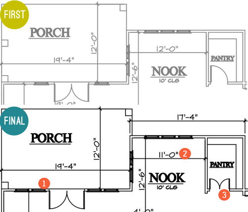
- More windows, please! We first considered turning this whole wall between the family room and the porch into french doors, but Builder John reminded us that it would cut into the function of the family room to make clearance for all of those swinging doors. So instead we just added large fixed windows beside the original french door for the appearance of a wall of glass without all that stuff swinging out and hitting potential furnishings.
- A built-in breakfast nook. This is the hardest change to see based on the floor plan (since it looks like we just made it a foot smaller). But that’s actually because we’re planning an awesome built-in breakfast table with a feature window behind it. Something sort of like this, but with a big interesting window in the back like this. More on that table in just a moment…
- Pantry door tweak. We thought it’d be fun to make these two frosted glass doors instead of just one (like this). But enough about that, let’s talk about the table for the breakfast nook…
Remember when we mentioned making a site visit to source some materials? Well, Builder John and Justin from Homearama introduced us to this place just down the road from us called Dreaming Creek Timber & Frame, where they craft incredible stuff from all types of wood. And they’re going to custom make a raw-edge table (kinda like the in-progress one that we saw during our visit, shown below) to contrast against the otherwise crisp and white breakfast nook that we’re envisioning.
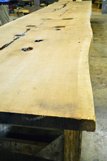
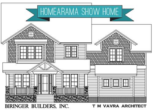
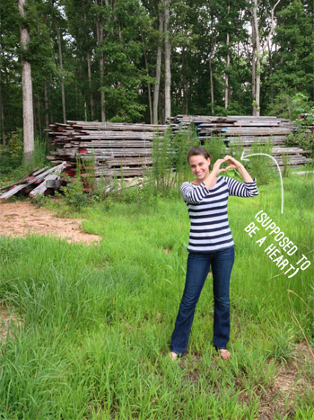
They’re also going to provide some other focal points to the house, like the open A-frame rafters on the front porch, which you can see in the rendering of the facade at the top of this post. If the color had been right, we totally would’ve ask to used these boards they snagged from Coney Island. That’s the old wood boardwalk just chillin’ in the Virginia countryside. Sherry was feeling the NYC love.
Okay, back to the floor plans. Let’s go upstairs, shall we?
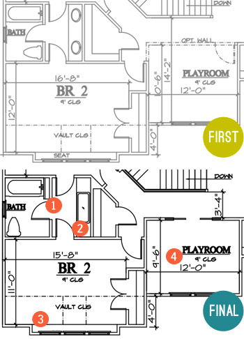
- Some fun towel storage. Since the jack-and-jill bathroom between the kids’ bedrooms didn’t really have (nor did it need) a formal linen closet, we made room for a narrow vertical cubby (for some casual rolled towel storage).
- Go big or go home sink. Again, since it was a kids bathroom we thought it’d be fun to put one big trough sink in there instead of the traditional setup of two smaller sinks. It’ll still have two faucets so it’s easy for two people to use at once, it’ll just be extra wide for some added fun. I think Clara would play for hours in there.
- Light-filled homework spot. Rather than the bench seat that was originally planned for this spot, we decided that a built-in desk would probably get more use and give the room as much function as possible.
- Defining the playroom space. We’re actually thinking of this room as a “Kids Reading Room,” so it will have more of a quiet, curl up with a book (okay, or maybe video game) kind of feel. So we opted to close it off with a wall, but still give it an open feel with pocket doors. We’re envisioning something kind of like this.
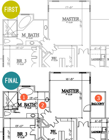
- Freed the tub. We thought the tub would have more presence if it was centered under the back window and freestanding (instead of built into the corner), so we changed its angled placement so that it didn’t block the shower as much (which also allowed for the entire front of the shower to be glass, instead of being walled in with just a small glass door for entry).
- Freed the vanities too. We also thought the twin vanities would be nice and stately if they felt less like angled cabinets with granite on them and more like pieces of furniture set in the room, so we squared them off and are hoping to find some cool dressers or something to convert.
- Balcony, baby! When the builder realized there would be unused roof space on one side of the main bedroom (the breakfast nook is below it) we all thought it would be awesome to add a private balcony up there. We originally had one off the front of the house (attached to a kids room) but the placement off of the main bedroom made a lot more sense.
There were a few other changes not mentioned, but those are probably the easiest to show at this stage. But I can’t believe we spent so much time talking about the inside without even addressing what happened outside. I don’t have the original version, but here’s where we ended up.
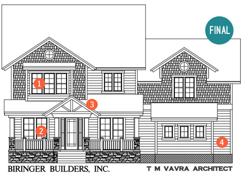
- Ix-nay on the alcony-bay. As I just mentioned in that last bullet, the original plan had a balcony with a pergola on this front window (incidentally, it was the presence of this pergola that helped us know that Builder John was the right partner for us). But the neighborhood’s review board killed the pergola, which made us reconsider the presence of a balcony on a kid’s bedroom anyway (for safety and mischief reasons). So it became a regular window, but that’s where our built-in desk is going to go, so we’re cool with the swap.
- Fake frenchies. Remember how we got rid of the french door in the dining room? Well, we’re going to try to capture the look of french doors with big floor-to-ceiling windows on both sides of the front door instead. That way both rooms get lots of light and easy access to the porch through the entryway door, but they don’t need to account for the clearance of swinging doors (which would impede on the size of the furnishings and their placement in those rooms).
- Open frame. We suggested an open frame look right above the front door. Builder John was all about it and was the one who suggested that we get the Dreaming Creek Timber guys to get us some really awesome accent beams to top things off out there. We think a big hanging glass pendant will look so great shining through that framed detail over the front door.
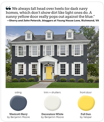
- Go navy! We said early on that we were leaning towards the idea of a navy house with crisp white trim and cool gray-toned stonework around the foundation. Builder John said “dude, I just sold a house that was tan and the realtor said if it was navy she thought it would have sold faster. Say no more, I’m sold on navy!”
We still need to settle on an exact navy color, and we’re actually meeting this week to look at a few options along with choosing the exact stone and brickwork that will make up the exterior. We’re also thinking of going glossy red or bright yellow for the front door, maybe bringing to life the exterior color combo that Sherry told HGTV magazine she was crushing on a few months ago?
Sorry there aren’t more real pics to share at this point. All of this talk of the house is really making us excited to see it come to life in person! Have any of you guys built a house, or been involved in the process through a relative, friend, or work project? It’s amazing how much there is to think about, but insanely exciting to think that scribbles on a piece of paper can actually become rooms that you can stand in someday.
P.S. While we often take on side gigs like this to help pay the bills, this one is a purely creative endeavor for us. Homearama compensates their designers for their year of planning and work, but we’ve opted to donate our entire fee to Richmond’s Habitat for Humanity, a cause that Homearama will also be supporting in other ways throughout the event.
Update: Wanna see the finished showhouse? Click here for Our Full Showhouse Tour, which includes final pictures of every room, the floor plan, budget info, a video walk-through, and shoppable showhouse furniture & accessories.

Kathryn says
Things like a review board with veto power make me really sad/creeped out. Are these homes or Stepford wives? I get a ‘neighbourhood association’ to help keep things tidy and safe, but that sounds a little… fascist-y. But then, I don’t have to live there!
Thanks for sharing this very interesting process with us. And props for donating your fee!
Natalie says
So funny how many of the elements of these floor plans are very “you guys”. I feel like this is the house you would build for yourselves if you were building a house for yourselves. Wait, are you? :P
I know you’re all happy and potential forever home in your new digs but I totally wouldn’t be surprised if this ignited the desire to build down the road…
Lpypy says
It would be cool to have saloon doors for the pantry since it swings both ways! Could be a cool way of having a great and contrasting wall colour that peeps out through the top of the saloon doors.
The floor plan looks good! However, I like a straight-through (and open) staircase and open living space more so if it were my house, I’ll probably switch the dining room and study, and open up the entire living space while separating dining space with a shelf divider or just leave it open.
YoungHouseLove says
Never even thought of the saloon doors thing!
xo
s
Laurie says
Hi, I’m a big fan of yours, love how you work together and make things beautiful! On this house, you may want to consider pocket doors in the kids jack n jill bath. I grew up with this same bathroom and there are just doors everywhere and in the way. Just a thought :). Thanks for the daily eye candy and inspiration!
Laurie
YoungHouseLove says
Thanks Laurie! That’s definitely something to consider! We’ll have to see how the team feels about that!
xo
s
Lpypy says
Folding doors for the entryway to bathroom entrance?
Reese says
There is actually enough room to do sliding barn doors in each bedroom as the bathroom doors into the sink area. Then you have a lot of options for style and accent colors. And definitely a space saving solution!
YoungHouseLove says
Oh yes, we wondered if parents would like kids to have sliding doors though (they can bang and pinch fingers, etc) so we weren’t sure those were our first choice if younger kids would be in there. They’re awesome for older kids though!
xo
s
Claire O'Connor says
Sherry & John,
Wow! What fun you must be having on this!! So happy for you — and warmly envious, too!
I know it’s likely too late to pipe in with this now, but I wanted to sahre this with you both anyway.
I am a HUGE fan of the book A Pattern Language by Christopher Alexander, et al. Perhaps you’ve heard of this book, but if not, no doubt you may find a copy at your library (or on inter-library loan). I predict you both will positively SWOON, as I do, over the concepts in this book.
The book is a compilation put together by a group of brilliant architects and environmental psychologist of UC-Berkeley in the 1960s. Even more popular today than when it came out, the concepts in the book have influenced some big names in current architecture, namely Sarah Susanka, the author of the Not-So-Big-House series. (Another fab resource you would LURVE, too!)
Anyway, the researchers of A Pattern Language essentially studied patterns in the built environment over time and across cultures to distill what is common in successful spaces… what really makes our bodies/minds/spirits feel fed by a space. It names the component parts, or patterns, and explains each one in detail, and in the context of the other interlocking patterns.
Absolutely BRILLIANT stuff.
One example of a pattern is “Light From Two Sides”…
“When they have the choice, people will always gravitate to those rooms which have light on two sides, and leave the rooms which are lit only from one side unused and empty.”
– A Pattern Language (page 747)
See these references for more info…
http://www.houzz.com/ideabooks/620334/list/A-Pattern-Language–Light-From-Two-Sides
http://www.patternlanguage.com/apl/aplsample/apl159/apl159.htm
http://onelessbrickinthewall.com/2011/04/07/a-pattern-language-intro-light-on-two-sides-of-every-room/
Love following you, and I’m really looking forward to watching the show house come together — as well as YOURS!!
Enjoy, and take care,
Claire
YoungHouseLove says
Sounds SO INTERESTING! I can’t wait to check it out. Thanks for the recommendation Claire!
xo
s
Lisa in Seattle says
Claire, I’m reading that right now!!! Currently on 123 – Pedestrian Density. Don’t you wish it was required reading for every architect and town planner? I didn’t know about this book until I read “Happiness at Home” by the author of “The Happiness Project.”
Just a heads up to anybody who is thinking of giving it a quick scan: It’s over 1,100 pages, and many of the patterns are connected, so it’s hard to skip bits – you really want to read all of it (except maybe road placement!). But Petersiks, I predict that the final pattern, 253 – Things From Your Life – will make you tear up a little.
Erin says
Hey there! It’s funny that you posted about this today since I just started a blog to document our adventures of building a new house and posted about some of our selections today :)
You guys are such a big inspiration and have taught me not to take things to seriously and have fun making this house into a home we love!
http://www.4halls4walls.wordpress.com
YoungHouseLove says
That’s so much fun Erin! Happy building and happy blogging!
xo
s
Debbie says
Great ideas! I wonder how the J&J sink will turn out. I put in a double sink in our bathroom and it take a lot of space. We had to turn the door around so that the door swings out of the bath. We have so much more space that way. At bath time there’s 2 adults and 2 small children in the room sometimes.
My favorite house is the last one. There’s something classic about the federal style, but now one want to buy them anymore.
Lesley | Artsy Forager says
What a fun project! I love so many of the changes you’ve made, you’re really thinking about how a family would truly live in this home and that will make all the difference to the design!
Totally on board with your decision to nix french doors in the front rooms ( love the floor to ceiling windows instead! ), but as for the doors off the family room, did anyone consider french doors that open out instead of in? We have them in our current rental and love them! The ones we have actually lay almost completely flat against the exterior wall when fully opened. Just a thought!
YoungHouseLove says
Those are an awesome option Lesley!
xo
s
Kim says
I’ve never done a single-family project, but I’ve had my hands on a fair share of multi-family projects working at an architecture firm. I’m an urban designer, so I hit the very early stage of the design process, but I’m quite familiar with being a CAD monkey ;).
Interesting house! I can’t wait to see it come to life. The staircase in the middle of the house is really intriguing! One thing that you may have picked up on or justified during the revisions is that the pantry doors swing in. My natural instinct would be to have them swing out so you don’t block any precious ingredients behind the door. The picture you linked for the pantry has the doors swinging out.
YoungHouseLove says
Great catch Kim! We agree they should definitely swing out!
xo
s
Brenda says
When I was a kid my mom’s friend built a house. She wanted something interesting in regards to the driveway, and she ended up with the dumbest, hardest to navigate driveway ever. Practicality should be first, because there’s a lot you can do to add interest afterward, but once you’re stuck with a dumb driveway you’re just stuck.
Jenny J says
I love your color scheme for the exterior of the house. In fact, we just did the same colors on our house. We painted the house Needlepoint Navy by Sherwin Williams, the front door Peace Yellow by Sherwin Williams, and did all our trim in a bright crisp white. We even brought in red accents by spray painting our lamp post, house numbers, and mailbox Colonial Red by Rustoleum. The color choices have definitely been the talk of the neighborhood, and the house looks fab! I can’t wait to see how yours turns out.
YoungHouseLove says
Thanks for sharing the colors Jenny! Sounds so pretty!
xo
s
Andi says
I can feel your excitement! My husband and I spent the last 2 years designing our dream home and we’re about halfway through the building process now. It’s such a feeling of accomplishment to look at that and think, “Hey! I did that!”
Looking forward to seeing this project in action!
-andi
Dayna says
Woah. Very exciting on all fronts but, I must say, my favorite part of this post was the very end. I’ve not a clue what your fee would entail…however, the fact that you are donating such to HFH should be applauded. Be proud. What a wonderful gift to give!
YoungHouseLove says
Thanks Dayna! We love the local folks who work at the Richmond branch of HFH. They’re doing such amazing things for our city!
xo
s
Maura says
…And there it is! A spot by the microwave, with easy fridge access, for people to get a snack without bothering me, uh, I mean, *someone*, working in the kitchen!
Please don’t apologize for the lack of pictures. I know I am not the only floor plan geek who is salivating over this post.
Finally, the bathtub. We’ve lived in this house with no decent bathtub for a year, and at least once a week I wish I could sink into a soothing warm bath. When we finally get to remodel the master bathroom, the budget will be 1) tub, 2) everything else. From my perspective, 5k sounds about right! (The hubs might disagree…)
Laura says
I know you guys often mention how Home Depot/Lowe’s will cut wood for free if you don’t have a saw. We did not have that experience last night at Home Depot. We had several boards we needed cut down to size/to fit in our car and they only do two cuts for free and then charge 50 cents after that which I think is ridiculous! We refused to pay the fee and didn’t get the lumber. We went to Lowe’s where they graciously cut all the wood we needed at no cost!
YoungHouseLove says
No way! I wonder if that’s a new thing or a regional thing? Never heard of that! Glad you got Lowe’s to do it for free.
xo
s
krys72599 says
That’s what it is in NJ… 2 cuts for free and then you’re charged…
Britt says
I hope you guys can find a way to DIY some art using these plans, that would be a cool piece for the potential owners to have!
Will you guys be slipping any notes into the home for renovators in 2027 to find?! (Not that they would need to renovate such a boss layout.)
YoungHouseLove says
OH MY GOSH WE NEED TO DO THAT! Done.
xo
s
Barbara says
http://www.oprah.com/own-supersoulsunday/blogs/Young-House-Love-on-Super-Soul-Sunday-The-8-Room-Makeover-Secret
Your own page on Oprah!!
YoungHouseLove says
Ahhhhhhhh!
xo
s
krys72599 says
All we did was add a second floor onto our lakeside ranch, and reconfigure the rooms on the first floor by taking out a couple of walls, adding new doors, moving a staircase and adding sliding doors onto the deck.
We worked with an architect who was highly recommended and had apparently done a lot of work in the area.
I don’t have a first floor coat closet.
I also don’t have a linen closet on the second floor.
The other little oddities we didn’t think of and she didn’t point out are small potatoes and not worth mentioning, but no coat closet and no linen closet???
I was so excited at the prospect of a separate shower and tub in the new upstairs bath I never noticed there wasn’t a linen closet.
And there had never been a coat closet on the first floor so I didn’t miss it when it wasn’t on the plans, but you really need one…
We’re looking for a coat rack now, and we built freestanding window seats to fit covered baskets I found and that’s my upstairs linen closet. (We have sort of a large one I created on the first floor by closing in a kitchen pantry and opening it into the bathroom, so we do have some storage for towels, etc., just not upstairs.)
My free advice: think of everything and don’t assume anything.
Joanna says
There are a lot of doors in the Jack and Jill bathroom. I think pocket doors from the bedrooms would make more sense.
Mary says
I love all the tweaks you’ve made to the original plan, especially the french doors with lights in the dining room/hallway. I also see a potential use for the dining room as a bedroom if you have a family member that can’t negotiate stairs. The pantry could easily be converted to a closet. I think the big sink in the shared bath is good, too. When our kiddos were little we often washed dirty feet in a big bathroom sink and then later it was great for hair coloring, in a pinch hair washing and hand laundering. You could splash a lot without making a mess!
Judith says
Love, love, love y’alls attention to all the little (and very important) details! I too, love design, and have studied this plan quite a bit! One thing I noticed…in the front elevation view the double window in the playroom doesn’t look centered over the dining room windows below. However…when looking at the actual floor plans and the few dimensions given…the windows appear centered (from the inside) in both rooms. Just thought I’d point that out!! I can’t wait to see the plans come to life!
YoungHouseLove says
Thanks Judith! We’ll have to ask the architect about that!
xo
s
Michelle @ A Healthy Mrs says
So neat to see the plans! Can’t wait to see it actually come together!
Patti says
I find it so funny that so many people share a bathroom at the same time! That is the only room I want absolute privacy, no matter what I’m doing in there. In fact, I think his and her master baths would be ideal! Awesome post YHLovers!
Katie says
Love the plans! That’s is a beautiful house. Do you know how many total square feet it is. It looks big, but at the same time, really manageable and livable.
YoungHouseLove says
The neighborhood developer has the final word on square footage so ours is around 3400 right now. They wanted a basement too but we said “ahh – too big!” It is neat to see how much function the builder and his team can squeeze into every corner though! We’re learning so much!
xo
s
Misha says
I am loving the plans for this house so far! It must be so awesome for you guys to be involved in this process as it is so different than buying an existing home and doing remodeling work. My hisband and I are in the design stages of a huge house remodel – lifting our Craftsman and finishing out the basement – and are surprised how much goes into this process. We aren’t even to then point of picking out finishes yet! The process if choosing the layout for our new basement had been really exciting though! Thanks for sharing!
YoungHouseLove says
What a cool project! Best of luck with everything!
xo
s
WendyMI says
I’m another building plan nerd, too. Love seeing these.. and seeing the changes that you’ve made.
Are you guys not fans of the sliding doors that look like french doors? I love the french doors so much that I think a slider would work in the dining room and still give the appearance that you originally wanted. Plus, I just simply like the functionality of being able to go right from the dining room to the porch rather than having to walk in the foyer. Not that I don’t like your thought process….
YoungHouseLove says
Great question! We considered those too but just wondered if people would ever walk to the porch from the dining room anyway. And if those aren’t doors we can place porch furniture there to get more “living area” on the porch without worrying about blocking doors, so that was something we weighed too.
xo
s
Sarah says
Long time reader, first time commenter. I LOVE this project you guys are involved in. I can’t wait to see more, I had been wondering how far this project had gone and what you get to weigh in on during the planning phase. This is so cool!
Just one question – did you guys consider pocket doors for the entry from the bedrooms into the jack-and-jill bath? If I remember correctly, Katie from Bower Power recently removed a door into her jack-and-jill bath. Seems like a lot of doors for a relatively small space. You definitely have the necessary floor clearance space in this bathroom for the current door configuration, but pocket doors could streamline the space and allow for more art where the doors that you would only see with closed doors in the current floor plan. Just a thought, and I’m guessing you guys have probably have hashed this out with the builder already but my curiosity got the better of me! :) Thanks for sharing this new project, I’m really enjoying it!
YoungHouseLove says
We did consider pocket doors but worried that kids could bang them and pinch fingers (builder said there were past experiences about people regretting them in kids spaces) so he showed us another model he did with regular doors in the same layout and surprisingly when they’re all open they’re out of the way and don’t interfere with each other, so seeing them in person helped to sell us on them!
xo
s
KatieV says
Soooo interesting! I love looking at floor plans!
Nicole says
Very exciting! We just finished painting our house Sherwin Williams “Naval” and all white trim and love it. I actually just picked up three test pots of yellow for the front door too. :)But now I have to decide on a shutter color. Any suggestions? Grey, black, white, I just can’t pick!
YoungHouseLove says
Sounds awesome! I think some sort if gray would be pretty! Maybe darker in tone so it doesn’t fight with the Naval?
xo
s
Sarah Mc says
As someone who has worked for a large public homebuilder for the past 10 years, I appreciate the glimpse you and others are getting into how tedious the process is from start to finish on each house. I can’t wait to follow you guys through the process. Enjoy it!
Laura & the Shell says
Wow, that’s the longest I’ve spent on a blog post in a while!! I seriously just spent an hour pouring over every detail! Overall I love it. I even pinned a few images! One tiny concern that jumped out at me was the freestanding tub. I agree that it’ll look much nicer the way you guys have changed it, but is it going to be a nightmare to clean around it? Since it’s kind of tucked into a nook? Is that even a concern? Of course it occurred to me that a person living in a house that nice probably has a cleaning person to deal with things like that, but I’m just wondering if that was a consideration.
YoungHouseLove says
Aw thanks Laura! That’s a good question! We’ve seen freestanding tubs in a few other show homes and just fell in love with the look, but hopefully just like you can clean around a toilet it wouldn’t be too hard to clean around the tub in the same way.
xo
s
Amanda says
I feel so hip! I literally have painters at my house right now finishing up with our exterior. It is a 2 story Craftsman and we went with a navy (Bunglehouse Blue by Sherwin Williams), white trim and a bright yellow door (very similar to the one in the photo, but its a discontinued Ace Hardware paint color called Smiley Face). It looks so good and now I feel like I have YHL validation to boot! I saw another commenter also mentioned SW’s Outerspace color – that is also another great navy color but our HOA told us it was too dark :( Great job on the floor plan!
YoungHouseLove says
Haha I love that!
xo
s
Alicia says
Oh I love the big sink for the kids bathroom idea. Wouldn’t it make a great baby/toddler tub??
YoungHouseLove says
That’s what I thought! Good for bathing small dogs/babies!
xo
s
Shauna says
I so debate saying anything to add to your long list of commenters. But…well, reading your blog was how I survived the planning and building of our home in the U.S.A. (while living in Europe). Thanks for your solid advice and upbeat blog. I think you guys are total naturals in this project. Enjoy it all!
YoungHouseLove says
Aw thanks so much Shauna!
xo
s
Nina says
Completely unrelated to this post – but I just got my mail, was flippin’ through a copy of American Lifestyle and landed on a page with a picture of a room with oddly familiar polka dot curtains and a dog that looked like Burger…. wait a minute… That IS Burger!! Nicely done John and Sherry, nicely done…
YoungHouseLove says
No way! Never saw that one!
xo
s
Maggie says
I love the “small luxuries” like the butlers pantry, second floor laundry, and transom windows. However, I kind of wish the first floor powder room was closer to the front of the house- by the dining room and “guest” areas. Having a formal guest go through the kitchen to get to the bathroom would embarrass my grandmother- I know you guys and other young families are pretty casual but for resale to more formal people, I think it’s traditional to have a powder room near the front of the house!
Ashley says
I actually really like how the powder room is tucked away… no one hears the toilet flush in the middle of dinner.
Emily @ Life on Food says
Your color choice on the house is just like the one we bought minus the yellow door. I really want a yellow door though! I want it even more now seeing in all together.
Fiona@Jackadaw says
I love seeing the process you are going through with the floorplan. The attention to detail and function that you’ve put into it is great and very practical. I love free standing baths like you are planning to use in the master but so many times I see them pushed into a corner or against the wall which makes me wonder why bother with a beautiful bath that you can’t even see the detail of, and how on earth do you get in to clean around and behind it? I’m sure you’ve considered this too but if not, something to think about perhaps?
YoungHouseLove says
That’s a good question! I think we’ve seen freestanding tubs in a few other show homes and just fell in love with the look, but hopefully just like you can clean around a toilet it wouldn’t be too hard to clean around the tub in the same way.
xo
s
Nicole says
Obviously you’ll do whatever fits in the end, but I VOTE RED FOR THE FRONT DOOR!
Mary | Lemon Grove Blog says
What an awesome learning experience for you guys! I’m a total sucker for blue prints / floor plans – so I absolutely loved this post. When I was a kid, I used to get graphing paper and sketch up dream houses. he he. Love it!
YoungHouseLove says
Aw thanks Mary! That’s a good question! I think we’ve seen freestanding tubs in a few other show homes and just fell in love with the look, but hopefully just like you can clean around a toilet it wouldn’t be too hard to clean around the tub in the same way.
xo
s
Ashley says
Oh man, I’m clutching-my-chest-and-swooning in love with this house. We’re in an apartment and saving our money to build one day. I hope the nerd factor isn’t too high when I say this…but we’re printing out your floorplan and hanging it on the fridge. Love that you all are doing this for charity! Can’t wait to see the finished house.
YoungHouseLove says
You’re so sweet Ashley! That made our day.
xo
s
Chrissy says
Wow, what a cool project to be part of. I really admire you taking on the challenge.
I’m just wondering about french doors that open toward the outdoors rather than into the room. I live in New Zealand and the french doors we build with here mostly seem to work that way. Means that furniture placement doesn’t have to allow for the swing of the doors. Perhaps it’s just an antipodean thing though!
YoungHouseLove says
That’s so smart! Almost all of them here open in, so the style choices of the ones that open out are limited. We also thought if those were doors that opened out, we couldn’t put any porch furniture in those areas where the doors are- but if they’re windows there can be more furniture/livable space out on the porch, so we weighed that too!
xo
s
Diana says
I am amused by comments wanting a door blocking the toilet from the rest of the bathroom. We only have one tiny bathroom in our house and only shut the door to it when we are using it and people are over. At least once a day we are in there at the same time. Having enough space to block off the toilet seems like such a luxury!
Kimberly says
I love that there is no wasted space. Who really needs a living room and family room anymore. Once we get out of the military and put roots down somewhere I hope I remember this project of yours. It is the perfect floor plan for our family of 5. Thanks for sharing!
Aimee says
I think it’s weird to have a *non-public* room like an office/study at the front door. When guests enter that way, they have to trek to the other end of the house to sit down instead of the LR being right there as one enters. A LR should be close to a DR for entertaining. Guests shouldn’t have to go through the kitchen to access the DR, which is what they’re going to want to do, despite the hallway access, because it’s a shorter walk that way and the K is open to the LR so it seems like a more natural route to take. I’m really not a fan of having the K open to the LR. Kids won’t be toddlers than need to have an eye on them forever, and in this design, they’d be more likely to be upstairs in the playroom anyway. I currently live in an open floor plan, the first one I’ve ever lived in, and I don’t like having people come in and see almost the whole thing in one fell swoop. Too much maintenance when there are no doors to close! I liked when I had a large LR right off the foyer but everything else was down a hall.
Emilee says
We are in the process of building our house right this minute, and I am search for bathroom sinks this week. Have you by chance found a lovely trough-style sink that you plan to use for the kids’ bathroom? I love that idea, but I haven’t found anything I love yet.
YoungHouseLove says
We haven’t started sourcing it yet. Maybe try overstock? They seem to have a lot of sinks/fixtures.
xo
s
Meghan says
This is seriously my dream house – I am pinning it as such :-)
I also vote for the toilet to be enclosed – that is a dream of ours :-)
Kayla says
love it all, great changes, can’t wait to see it done. between red and yellow door, my vote is for RED! it will look so classic.
Sara says
Totally unrelated (but cool houseplans!)- did you see that Emma at A Beautiful Mess has one of your lamp designs in her living room? :) It looks so awesome!
http://www.abeautifulmess.com/2013/09/home-tour-emmas-living-room.html
YoungHouseLove says
NO WAY! That’s awesome!
xo
s
Larissa says
Random question for you… Is there a name for your decorating style? I know each of your houses’ look is different, but if you were going to classify it in a general way, what would you call it? Thanks!
YoungHouseLove says
Hmm, that’s a good question! Maybe happy casual? We love natural textures, pops of color, and clean lines.
xo
s
Dani says
Ohhh I was so confused. I thought your closet was a toilet :p the WIC on the plan looked like W/C (water closet, technical name for toilet) and in Australia we call them WIRs (walk in robe) so I totally didnt click. Thought holy cow, they have a big toilet…and where do they keep their clothes?
Speaking of the loo, how come you chose to take the door off it?
With the two bathrooms (kids and guest) will it be a shower-over-the-bath situation or just a bath? Is there a reason for having three baths in the house (not something we do in Australia, in a house like that here it would be one or maybe two)?
What do you have in a “mudroom”? (DO you have anything? Or is it just a kick off your shows and leave your umbrella thing? Again, not something we have here lol)
And is the bit between the playroom and guest room a linen closet? Is it big enough?
(Sorry, I dont meant to sound judgy at all, it’s just I’m at the same point with building my first house so I’m genuinely curious about all this stuff!)
I love the playroom door idea, and the big windows along the front. You can never have too many windows!
YoungHouseLove says
So funny about the WIC/WC thing! Walk in robe is a fun term – so exotic. Haha! There’s still a door to the bathroom, we just thought a more open shower instead of one that’s walled in to make a toilet cubby would be nice, but it’s totally a personal preference thing. In our house if someone’s in the shower or on the toilet the main door is closed and someone uses another bathroom, so it’s not meant to encourage going to the bathroom right next to someone showering at the same time, haha! As for three baths, that just seems standard in houses of this size (guest bath will only be a shower, kids and master bath will have tubs and showers). A mudroom is a place for muddy shoes and coats and hats and gloves – sort of like a cubby for each family member and their gear, which is located right off of the garage so they can drop their stuff when they come in. As for the closet near the playroom, we just changed that to be in the playroom so it can store games instead of being accessed from the hall.
xo
s