Remember we mentioned the show house that we’d be working on to benefit Habitat For Humanity over the next ten months? Well, we’ve been itching to give you guys an update but we haven’t broken ground quite yet. It’s not that we’re behind schedule (the goal is to be under-roof by Christmas) but it turns out there’s a whole lot of prep before a house is even built. So as people who have never built a house or been part of that process before, it has been really interesting to see what goes into it.
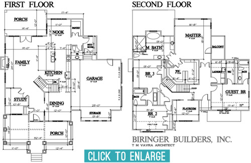
Over the last few months we’ve been having lots of planning meetings and have even made some site visits to look at some finishes/materials (more on that in a sec). So we thought it would be fun to share an update on the floor-planning front. After about five rounds of revisions and tweaks, we’ve arrived at this: the final floor plan!
Getting here was a process with lots of cooks, so the final plan is by no means one person’s sole influence. The builder, John Waters, and his architect, T M Vavra, originated the plans, but they also had to factor in requirements from the neighborhood’s review board. To make sure it fits nicely within the look of the larger community, they require specific things like a certain square footage, and can even veto features on the front and inside the house if they don’t like them. There’s also input from the Homearama show team (to make sure it’s not too similar to other homes in the show, since the goal is for each house to have a variety of features). So lots of it was set before our eyes ever laid on it, but we were welcomed into the process early enough to still make some suggestions to help achieve some of the ideas that we had brewing. So here’s a quick rundown of some of the tweaks that we made to the floor plan, with the help of the builder and the architect after we all put our heads together.
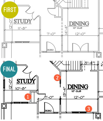
- Moved the coat closet. To make the foyer feel more open and provide an unobstructed view into the family room when you walked in the front door, we borrowed space from the study for the coat closet instead of putting it under the stairs (which cut into the line of sight a lot more than being a door in the hallway that would be flush with the wall when closed). It wasn’t a perfect solution (we actually debated scratching it entirely at one point) but as we’re learning – this is a process of collaboration and compromise.
- Hello pocket doors! We upgraded the doorway to the dining room to include glass paned pocket doors with a transom window across the top (like this) to make that space feel a little more special.
- Goodbye french doors. As much as we love french doors, the original set of ’em planned to open into the dining room from the porch, which felt a bit impractical. It would cramp the dining room unless we picked small furniture, and we figured that access to the porch from the nearby foyer made it easy enough to get out there while allowing for more room, flow, and a larger table in the dining room.
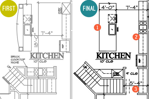
- A simpler island. The original had a raised, curved bar top and columns to the ceiling, but we all agreed that a big open, rectangular island would probably be more functional and less visually busy, especially if the architect could devise a way to lose the columns that would have obstructed the view to…
- The star of the kitchen. We wanted to achieve that quintessential view of the kitchen with a beautiful exposed hood as the centerpiece. This meant shuffling around some of the appliances so the range could sit centered across from the island. Now when you look in from the living room you won’t see a fridge one one side and an oven on the other side – the fridge will be more tucked into a built-in cubby further down, and the backsplash and range hood will be center stage.
- A bigger butler’s pantry. That appliance shuffle also accidentally earned us more space between the kitchen and the dining room for a larger dry bar area. Plus, by moving it to that wall we’ve earned another pantry/closet under the stairs.
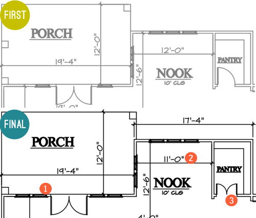
- More windows, please! We first considered turning this whole wall between the family room and the porch into french doors, but Builder John reminded us that it would cut into the function of the family room to make clearance for all of those swinging doors. So instead we just added large fixed windows beside the original french door for the appearance of a wall of glass without all that stuff swinging out and hitting potential furnishings.
- A built-in breakfast nook. This is the hardest change to see based on the floor plan (since it looks like we just made it a foot smaller). But that’s actually because we’re planning an awesome built-in breakfast table with a feature window behind it. Something sort of like this, but with a big interesting window in the back like this. More on that table in just a moment…
- Pantry door tweak. We thought it’d be fun to make these two frosted glass doors instead of just one (like this). But enough about that, let’s talk about the table for the breakfast nook…
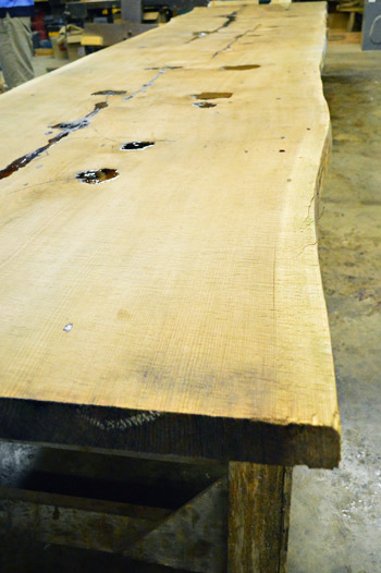
Remember when we mentioned making a site visit to source some materials? Well, Builder John and Justin from Homearama introduced us to this place just down the road from us called Dreaming Creek Timber & Frame, where they craft incredible stuff from all types of wood. And they’re going to custom make a raw-edge table (kinda like the in-progress one that we saw during our visit, shown below) to contrast against the otherwise crisp and white breakfast nook that we’re envisioning.
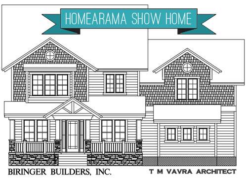
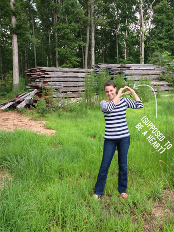
They’re also going to provide some other focal points to the house, like the open A-frame rafters on the front porch, which you can see in the rendering of the facade at the top of this post. If the color had been right, we totally would’ve ask to used these boards they snagged from Coney Island. That’s the old wood boardwalk just chillin’ in the Virginia countryside. Sherry was feeling the NYC love.
Okay, back to the floor plans. Let’s go upstairs, shall we?
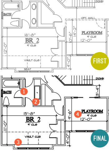
- Some fun towel storage. Since the jack-and-jill bathroom between the kids’ bedrooms didn’t really have (nor did it need) a formal linen closet, we made room for a narrow vertical cubby (for some casual rolled towel storage).
- Go big or go home sink. Again, since it was a kids bathroom we thought it’d be fun to put one big trough sink in there instead of the traditional setup of two smaller sinks. It’ll still have two faucets so it’s easy for two people to use at once, it’ll just be extra wide for some added fun. I think Clara would play for hours in there.
- Light-filled homework spot. Rather than the bench seat that was originally planned for this spot, we decided that a built-in desk would probably get more use and give the room as much function as possible.
- Defining the playroom space. We’re actually thinking of this room as a “Kids Reading Room,” so it will have more of a quiet, curl up with a book (okay, or maybe video game) kind of feel. So we opted to close it off with a wall, but still give it an open feel with pocket doors. We’re envisioning something kind of like this.
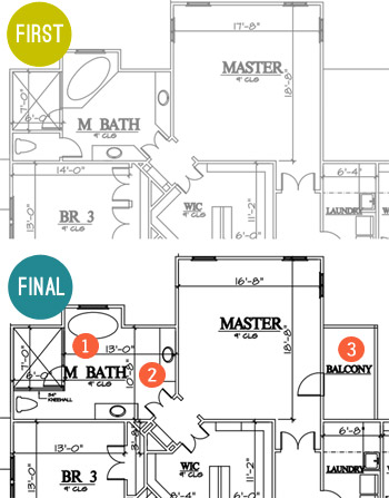
- Freed the tub. We thought the tub would have more presence if it was centered under the back window and freestanding (instead of built into the corner), so we changed its angled placement so that it didn’t block the shower as much (which also allowed for the entire front of the shower to be glass, instead of being walled in with just a small glass door for entry).
- Freed the vanities too. We also thought the twin vanities would be nice and stately if they felt less like angled cabinets with granite on them and more like pieces of furniture set in the room, so we squared them off and are hoping to find some cool dressers or something to convert.
- Balcony, baby! When the builder realized there would be unused roof space on one side of the main bedroom (the breakfast nook is below it) we all thought it would be awesome to add a private balcony up there. We originally had one off the front of the house (attached to a kids room) but the placement off of the main bedroom made a lot more sense.
There were a few other changes not mentioned, but those are probably the easiest to show at this stage. But I can’t believe we spent so much time talking about the inside without even addressing what happened outside. I don’t have the original version, but here’s where we ended up.
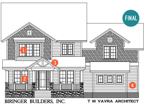
- Ix-nay on the alcony-bay. As I just mentioned in that last bullet, the original plan had a balcony with a pergola on this front window (incidentally, it was the presence of this pergola that helped us know that Builder John was the right partner for us). But the neighborhood’s review board killed the pergola, which made us reconsider the presence of a balcony on a kid’s bedroom anyway (for safety and mischief reasons). So it became a regular window, but that’s where our built-in desk is going to go, so we’re cool with the swap.
- Fake frenchies. Remember how we got rid of the french door in the dining room? Well, we’re going to try to capture the look of french doors with big floor-to-ceiling windows on both sides of the front door instead. That way both rooms get lots of light and easy access to the porch through the entryway door, but they don’t need to account for the clearance of swinging doors (which would impede on the size of the furnishings and their placement in those rooms).
- Open frame. We suggested an open frame look right above the front door. Builder John was all about it and was the one who suggested that we get the Dreaming Creek Timber guys to get us some really awesome accent beams to top things off out there. We think a big hanging glass pendant will look so great shining through that framed detail over the front door.
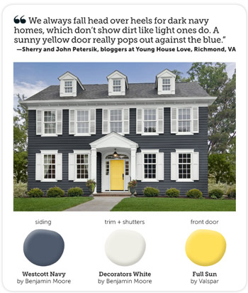
- Go navy! We said early on that we were leaning towards the idea of a navy house with crisp white trim and cool gray-toned stonework around the foundation. Builder John said “dude, I just sold a house that was tan and the realtor said if it was navy she thought it would have sold faster. Say no more, I’m sold on navy!”
We still need to settle on an exact navy color, and we’re actually meeting this week to look at a few options along with choosing the exact stone and brickwork that will make up the exterior. We’re also thinking of going glossy red or bright yellow for the front door, maybe bringing to life the exterior color combo that Sherry told HGTV magazine she was crushing on a few months ago?
Sorry there aren’t more real pics to share at this point. All of this talk of the house is really making us excited to see it come to life in person! Have any of you guys built a house, or been involved in the process through a relative, friend, or work project? It’s amazing how much there is to think about, but insanely exciting to think that scribbles on a piece of paper can actually become rooms that you can stand in someday.
P.S. While we often take on side gigs like this to help pay the bills, this one is a purely creative endeavor for us. Homearama compensates their designers for their year of planning and work, but we’ve opted to donate our entire fee to Richmond’s Habitat for Humanity, a cause that Homearama will also be supporting in other ways throughout the event.
Update: Wanna see the finished showhouse? Click here for Our Full Showhouse Tour, which includes final pictures of every room, the floor plan, budget info, a video walk-through, and shoppable showhouse furniture & accessories.

Gina, book dragon says
Love this floor plan and can see myself moving in with only a few changes!
Wondering if the red door would make the house too patriotic? I really like the navy, white and gray theme and can’t wrap my head around a door color other than red or yellow. Guess I’m not imaginative enough. Does teal or an ocean blue go with navy?
I’m looking forward to seeing more of the project.
YoungHouseLove says
Someone else said a stately wood door (like a craftsman style) would be pretty too, so we’re between those three choices I think!
xo
s
Anna A. says
The exterior looks eerily similar to our home here in Alaska!!
Steph Reiner says
Okay I’m actually really excited to see how this turns out mostly because I can’t understand a thing going on with those plans. So it’s like a mystery to me that I’m looking right at… Gah, you guys are so smart! :D
Shay says
My Husband and I have started talking about our “someday” plans which would likely involve building our own house – our area doesn’t typically have enough rooms for us to have our own offices and that’s not something we’re willing to give up if we decide to have a second kid someday!
I look forward to seeing all the details of this huge project and learning as you go along. I’m a lover of pocket doors and feel like it’s their time for a comeback! And eat in kitchen nooks! So exciting to see it all.
Christine says
I totally love reading your blog! I love watching you change your house into a light and lovely home. We plan to built a house in 2 – 3 years, so it’s really great for me to see all the floor plans you show and how everything looks in reality. I’m so looking forward to see how this house is going to look like when you’re done.
Genevieve says
This is totally unrelated to your post (congrats on house plans btw, look fab!) but did you see your gorgeous “shades of light” lightshade in this house tour?
Stunning!
http://www.abeautifulmess.com/2013/09/home-tour-emmas-living-room.html
YoungHouseLove says
We think it is! Isn’t that sweet?! Love their blog!
xo
s
Danette says
Looking great. We have just renovated and our house is dark blue, colour is Colourbond Ironstone (we are in Australia)with white windows and I wanted a yellow door…but we ended up with timber and glass, which is gorgeous with our timber deck “runway” leading to the front door. Just wanted to share… ;)
YoungHouseLove says
Sounds so pretty!
xo
s
andrea says
my husband & I are also in the process of building a house. just got our final set of plans, and are hoping to break ground at end of october. we’ve got a great lot to build on, but were initially a little sad that we would have to take down a few 100 year old oak trees in order to place the house, but we found a sawmill that is willing to turn our trees into lumber for us! we’ve already got plans to use it for beams in the great room, fireplace mantel, sliding barn doors for the master closet, and to build our own dining table.
the process has been stressful but exciting so far – can’t wait to see how your house comes out too!
YoungHouseLove says
That’s amazing Andrea! Congrats and good luck with everything!
xo
s
Sally says
It looks amazing!! I can’t wait to see more as it develops. All the changes were great and made perfect sense. I love the idea you have for the kitchen nook, and the doors for the pantry!! It’s going to look beautiful:) I also love the navy house and yellow door combo!
Doug K says
Looks great, and congratulations on diving in head first. This is my first post and I will be short and to the point. As an Architect there are many poor design decisions that really bug me in these floor plans. The architect you worked with should have caught these.
P.R.- please flip the wc, no one wants to enter next to the toilet, let alone use it right next to the door.
Kitchen- 5’4″ is a lot of space between the island and counter. 4’6″ is optimal otherwise your taking an extra step..and it turns into dance-cooking.
Master- PLEASE enclose the wc, That is too large of a space to have it open.
Guest bath- Flip the tub filler- I under stand handle access.. however plumbing should not be on an outside wall- no matter your climate zone.
BR 2/3- Please put a small sink inside the wc/ tub area.. no one wants to open a door to another area to then wash there hands after using the restroom…
Just my 2-cents as an architect… Hope it all works out well.
YoungHouseLove says
Thanks for all the suggestions Doug! In the half bath on the first floor, the toilet is there because we want to do a big accent wall with floor to ceiling tile in that half bath (that you see when you enter). We think it’ll be a much nicer view than gazing at the toilet when you walk in, haha! As for enclosing the toilet in the master, we’re going to have to take a poll on that – had no idea some people were so pro door and others were so leave it open!
xo
s
Carolyn says
Love these notations!
Aimee says
As long as the door of the powder room is kept shut when not in use, having one right at the entrance that will likely be the most used isn’t a bad idea. I’d separate the mudroom from the nook area with some sort of door, though, because having a toilet right. off. the. kitchen. isn’t that great of an idea. Imagine guests needing to use the facilities while you’re cooking and unpleasant odors wafting in! Needs another layer of barrier.
I didn’t notice the width – I could lie down on the floor between the counter and the island, and fit! That is too far, especially for smaller people with short reaches and legs.
Master toilet use scenario – you wake up, hubby’s in the shower, and you REALLY gotta go. You’re NOT going to do the *pee pee dance* down a hallway and across the width of the guest room to get to a toilet when that sort of urgency happens – especially if you need to get dressed first to do it! If you have guests in there, you’re dashing to the opposite end of the house to the J & J; hopefully your kids aren’t in there or you’re running downstairs to the powder room now. Just sayin’.
Agreed with no plumbing on exterior walls if at all possible.
Doorknobs are things people just don’t think to clean all that often. Germs galore. And there’s no storage in there for extra TP. One of those narrow, shallow space saver vanities would work in there.
YoungHouseLove says
Love all the suggestions Aimee! Thanks to everyone sharing their thoughts!
xo
s
Rachael says
Just wanted to say “thank you” to you both for donating your fee. I know this is a fun project but it’s still work that takes time and effort.
YoungHouseLove says
You’re so sweet Rachael! We love Habitat – it was our pleasure!
xo
s
Chloe R says
I love it! It has so many great features. I particularly love the changes you made to the kitchen. Do you know what kind of stove you’ll install yet? I’d highly suggest researching that right now, since it looks like a 36″ is planned. We just finished (well, almost) a kitchen remodel & installed a big stove, and had to plan for make-up air, which you would want to know about in the planning stages. Gardenweb’s kitchen forums have a lot of info on that, which was very helpful. It would also be good to have the exhaust hood wider than the stove since steam expands horizontally as it rises. And I would absolutely 100% suggest a remote or inline blower for the hood, for noise control (please!!). And check out ModernAire hoods – pricy but gorgeous, and made in the USA, and maybe they would give you a deal for the cause!
Also, I read the comments about the master toilet door. I am also absolutely 100% begging you to keep the door! We have one in our master, and it feels like a little cozy nook that’s private for doing your business, and I would be so sad not to have it. (Ok, complete first world problem, but still!) with a master bath of the size in the plans, it just makes sense. It helps that ours has a skylight in it so it feels bright. It also definitely helps to have an exhaust fan in it for odor control. But google what happens to germs from the toilet when you flush, and that definitely illustrates an added health benefit! (Really – completely disgusting.)
And (sorry for the length of this comment!), since you can’t have a window in the laundry, I would suggest a tubular skylight – are you familiar with those? Google solatube and check out the pics – it’s great for adding natural light. It’s all so exciting – glad you’re having fun!!
YoungHouseLove says
Thanks for the tips Chloe! Will definitely look into both of those!
xo
s
Sarah T says
When you are designing a house from scratch, how do you come up with a color scheme for the interior? Do you decide on tone (warm, cool, natural, etc.) or do you have an inspiration piece?
We have slowly remodeled our entire house and I am worried about the colors flowing from room to room. Especially with kids’ rooms!
YoungHouseLove says
I think once we choose materials (like floor tile and hardwoods and counters and backsplash and bathroom finishes) that might inform some of the colors on the walls and then we’ll find some big pieces (sofa, big art for the bedrooms, rugs, etc) and we might draw color ideas from those as well! We don’t want anything we choose to be too crazy/polarizing, but we also want it to be fun and inspiring to everyone walking through, so it’s going to be our goal to do a few unexpected and interesting things while not going over the top or doing anything just to be wacky so it gets noticed. Haha!
xo
s
Catherine says
Wow! Thanks, John, for putting these details together. I am impressed that you are both donating your time to this huge project, especially given the tremendous effort you put into your other endeavours :) It is very generous of you!
I am wondering if it was difficult for you to visualize things 3D, or whether you used some sort of app to go from 2D to 3D? My husband and I recently completed a renovation, and I found my Interior Design for iPad essential in helping me to visualize the structural changes to the space.
YoungHouseLove says
The single most helpful thing for us when we can’t visualize something in the floor plans has been to visit other models with something similar going on so we can better get a feel for it, or to get on Pinterest or google images and try to find a photo of something that’s done in a similar way that helps us see it in 3-D. It’s definitely a challenge sometimes!
xo
s
Patti McHugh says
I love everything about this house! The floor plan changes are creative and makes use of the space. I would love a home like this one day. Looking forward to your furniture and decoration picks. Keep up the great work!
Sam G says
What a fun and exciting project to get to work on. I can’t wait to see the house evolve. I emailed you a picture of a house being built in our neighborhood with navy siding, brick and white trim. If you get a chance I hope you’ll check it out. I love that combination!
YoungHouseLove says
Sounds awesome Sam!
xo
s
John says
How about adding a front porch swing? Everyone loves them.
Do you get any say in the landscape design?
YoungHouseLove says
Wahoo! That’s actually on the agenda! As for the landscaping, there will be some experts that we consult, but we’ll get to give some feedback and choose some stuff too (after being sure it works for that zone/placement thanks to the experts, because we’re terrible at that! haha!)
xo
s
jbhat says
LOVE the floor plan changes–such good calls, you guys. The future owners will really appreciate those changes. It was already so great, but now it’s even better.
It’s going to be so exciting to see what you do in the Homearama house and in your own home. I cannot even tell you how thrilling it all is.
!!
jbhat
YoungHouseLove says
Aw thanks Jbhat, you’re always so sweet.
xo
s
Lauren says
Congratulations guys! This looks awesome and I can’t wait to see how things come together. It is great to see you two working on a project like this – my husband and I just started working with a builder for our first house and we are almost done making tweaks to the plans so I understand how exciting this is! Your project is giving me some great inspiration so thank you!
And my vote is for a yellow door :)
Alicia says
Just a thought…a door from the backyard to the mudroom would be awesome for a family who plays hard outside where they could take off their dirty clothes and not track mud throughout the house!
YoungHouseLove says
We were just talking about that idea in a meeting yesterday! We think it’ll depend on the grade of the yard (if it’s 8 steps up to the door we think it’s a bit much, but if we can keep it 6 or under steps up from the yard, it could be great.
xo
s
Sam says
Great colors!! Our house is blue-grey with white trim, and we just painted the front door a bright yellow (sun-kissed yellow by Benjamin Moore). We LOVE how it turned out!
Cristina S. says
Very sweet of you guys to be lending your skills and TIME to a great project and putting back your fee to your community resources. Very, very nice of you. Kuddos! :)
YoungHouseLove says
Thanks Cristina! It’s our pleasure. We love Habitat and all that they’re doing for our city.
xo
s
Lena says
I really like the floorplan adjustments you made. Especially the kitchen changes. They are functionally so much better and esthetically a hundred times better too.
The only ones I’m not hugely fond of are pretty minor, but to many people would be really nice to have.
1. Don’t remove the door to the toilet room. It is really nice to have the privacy in that large of a bathroom and to both be in there without having to smell somebody else’s business. I think around here for selling it is a negative if you don’t have it.
2. The double pantry doors – I agree it would look really nice, but functionally I’d hate to have to open both doors to get in there and that one of the doors blocks the closest access where I would put the everyday stuff as to not have to walk all the way in to get a box of cereal.
BTW have you guys considered built-ins for the pantry? Like drawers on the bottom with shelves above and a counter to put small appliances that could also be plugged in.
I’m really looking forward to follow along on your build.
Lena says
Oh and not matter what if costs allow I would put a frosted window over the toilet to get some more light into the bathroom.
YoungHouseLove says
Love all the ideas! Thanks Lena! We’ll share them with the team for sure!
xo
s
Morgan says
Hello! LOVE the idea of a navy house! My husband and I just painted our house in Benjamin Moore Mysterious, with a trim of mountain peak white. Before we bought the house 2 months ago it was the ugliest, dull brown. The navy really makes it pop and is such a crisp clean color! Definitely a good navy to consider! Very deep, and rich with charcoal tones. Good luck on the hunt for the perfect blue, its tricky for sure!
YoungHouseLove says
Sounds so pretty!
xo
s
Cindy says
Bring back the two-level kitchen counter! When the sink is in the island I prefer a higher counter between the rooms. If there are dishes, etc. on the counter then you can’t see the mess from the family room, especially since that is the only living room space.I also vote for a toilet room in the master bath. That is a must in my book for many reasons!
Kristin says
We’re nearing the end of our construction process. It’s been a roller coaster ride for sure. There are things I would’ve liked to do differently if money wasn’t a factor. The rooms sure feel different than you imagine from looking on a piece of paper. It would be fun to see what you’d change on our floor plan.
Julie S says
You made a lot of good changes, but I just wanted to say that you totally saved the master bathroom from a fate of horrid tract home dated styling. Thank you. :)
Kobie says
Just had to have my vote on the toilet…ha! Door all the way. And an exhaust fan in there if no window. I don’t even like having to look at the toilet so the more closed off it is leaving the rest to feel very day spa, the better.
Carolyn says
Love everything BUT the sink and stove across from each other. That’s how my house is, and I hate it. It’s dangerous too. Filling a pot of water and carrying it across is a pain, and haulinghot things from stove to sink is a hazard…people are always walking through, and there may be kids or pets underfoot. Please please please put the sink somewhere along the same counter top as the range top. It will save messes/drips on the floor too.
YoungHouseLove says
Never thought about that Carolyn! Thanks for the tip! We’ll definitely bring it up to the team and see what they think!
xo
s
Angel says
What about one of those cool pot fillers behind the stove? On my wishful-thinking dream home list for sure.
YoungHouseLove says
Those are fun too!
xo
s
Carolyn says
Yes! On doors to toilet areas…but also little sinks in them for washing OR touch-free foot pedals to open them. Yes to fans, skylights, and frosted glass s well.
Ashley says
While I love the updates and changes you’ve made, I think the pantry doors need to be re-looked at – with the double doors, you will always have to walk in and shut one-half of the doors to get to the closest items in your pantry which will most likely be your most-used items. Does that make sense? I think even the doors swinging the opposite direction would fix any problems. And if you’re afraid of the doors eating into the space or no one ever closing them you can do what my mom did – make the light automatically turn on when the door is open, and to turn it off you just shut the door!
YoungHouseLove says
Oh yes we love that idea! Others mentioned it too! Thanks for the tip!
xo
s
Jessica says
I’ve been anxiously awaiting posts about the new construction house! We are about 7 weeks away from moving into ours. I have a love/hate relationship with building. There are SO many decisions that I feel like I can’t make well-thought out ones. The budget is also a drag…it seems like everything I want costs more! :)
By the way, your family was in my dream last night! We were in a wedding together. No idea where that came from. haha
YoungHouseLove says
That’s so funny!
xo
s
Lindsay C says
Hi guys!!
What a beautiful home!!! I was wondering what the date is for the Homearama? Sorry if this has been answered already, I Breezed thru the comments quickly looking :)
It was around my birthday last year, and I was thinking it might be nice to finally visit Richmond and get to see you masterpiece all in one trip.
Thanks, and keep up the good work!!
YoungHouseLove says
Thanks Lindsay! It’s scheduled for the first week of May! Wahoo!
xo
s
Lindsay C says
YAY!! maybe we can get our butts out of South Jersey and spend some time in VA :)
Adrienne says
I love this floorplan! My comments:
1. My preference is to have an island without a sink. Real life means that some dishes/pots are hand washed and then left to air dry, at least in my house, which always looks messy on an island. I wish I was better at drying and putting things away right then but I’m not:) IF I HAD to have a sink in the island my preference is two “bowls” rather than one large. The one large always looks awesome but functionality wins out here for me since I like to rinse the pot/pan/dish prior to placing it into the soapy water and you can’t do that with one large sink.
2. I’m with the put the door back on in the master toilet… I love the guy but I don’t need him to hear me and vice versa when it’s not a numero uno;)
3. I like the large storage closet next to the playroom. I could see holiday decorations stored here- great to not be in the garage and easy to get to.
4. LOVE the large walk in master shower!
5. What’s the plan for the large area in the jack and jill toilet/tub room behind the door? That looks like an area for some sort of cool furniture like storage thingy.
6. Between the guy and me we have 5 teenage kids with LOTS of sports equipment. For us I would extend the mudroom and have wall of deep closet like storage for things that need to be in the house and not be out in the cold (MN peeps here) like golf clubs, bats, etc but then I could shut the doors and make the room look pretty.
Ok- this was a looonnnngggg comment, thanks for reading it. Looking forward to seeing the progress you make.
YoungHouseLove says
Love all the tips Adrienne! Will definitely run everything by our team! That spot behind the door in the jack & jill toilet/tub area is where we hope to put a big cabinet for storage and some fun pops of color/display stuff – like bins of kids toys. Can’t wait to be standing in an actual house instead of staring at the floor plans! Haha!
xo
s
Amy says
We’re building a house, so this was fun to look through and get ideas from! But I have to ask…are ya’ll SURE you want to remove the potty room door in the master bathroom?? I think people really want privact there. That is the ONLY change I would make…other than that, it looks like a beautifully functional house to me!
YoungHouseLove says
We’re going to add a poll since so many people have strong opinions!
xo
s
angela says
You’ve eliminated some builder home stale standards which is nice. My question regards the formal dining area. As an architect I am getting away from those for since they are generally outdated (not used). I find that many of my contemporaries are doing the same. The idea is to open the dining area to the living space. Was this a topic of conversation at all?
YoungHouseLove says
Interesting! I think that might be regional. Here in Richmond there are a bunch of formal families who still love a formal dining space (John and I don’t always put them to use very often, but we seem to be hugely in the minority).
xo
s
Miranda says
Love!!! This is the exact color of my house!
http://distilleryimage3.s3.amazonaws.com/f557953650cf11e384b41234a283bd02_8.jpg
Had to grab the photo from Instagram. haha Also, it was taken at night, so not the greatest choice of photo to show the color. BUT now you can see what it will look like in the dark? lol
YoungHouseLove says
So cool!
xo
s
Beth G says
My husband and I JUST moved into our newly-built home! I picked out the floor plan, made some tweaks, and we picked out every single detail – it’s definitely a little overwhelming! I laughed when I got to the bottom of this post, because your exterior color scheme is EXACTLY what I wanted (I’ve seen very few navy houses here in the Midwest, so I liked the idea of ours being different), but we had to do vinyl siding and couldn’t find it in navy :-( We went with yellow accented by gray stone, which still looks great. I absolutely adore all your choices so far and wish I could have them in MY home!
YoungHouseLove says
Aw thanks Beth! Yellow with gray stone sounds gorgeous!
xo
s
Mairi says
Hello!
I am in the process of selling our first home and looking to upsize. We are thinking of potentially building and just wondering what the budget would be for a house like this?
I love the layout of this house!
Thanks,
MAiri
YoungHouseLove says
This house will most likely be priced in the 500K range since it’s fully loaded (full of upgraded appliances, tile, finishes, etc) but house price tends to vary a lot by location, so even different neighborhoods in the Richmond area might cost more or less for the same house, depending where it’s located. Hope it helps!
xo
s
Mairi says
Do you have final version of the plans you’re using??? We’re starting to look into building and I’m loving this layout! Thanks
YoungHouseLove says
I believe they’re on the builder’s website (called The Clover). His site is biringerbuilders.com.
xo
s