This week we dove into the struggle to find light fixtures that feel related without being too matchy-matchy or boring (the discussion kicks in around the 20-minute mark of this week’s podcast) and I promised to link to some lighting combinations that I liked in the show notes, but then I promptly fell into a mood board making wormhole. When I regained consciousness in this reality, I had way too many mood boards for the show notes, had inexplicably eaten two pop tarts, and this post was born.
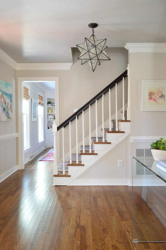
Whether you’re dealing with an open concept floor plan where you can see your kitchen pendants, dining room chandelier, and living room lights all from one vantage point – or you’re just trying to keep your whole house feeling cohesive from room to room, our main tip is to try to make your lighting relate in era, style, shape, or finish/material. Note that it’s an “OR” and not an “AND” situation. In most cases, as long as you check one of those boxes, your lighting will relate nicely to one another. Bonus points if other elements in the room tie into the light in some way too, like the dark railing and runner on the stairs of our foyer that relate to our oil-rubbed bronze chandelier (pictured above).
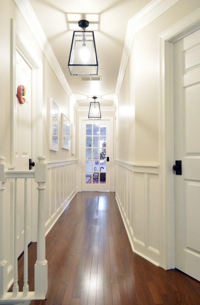
Another good example of tying light fixtures into their surroundings so they look right at home once they’re hung would be our upstairs hallway. All of the doorknobs up there are oil-rubbed bronze with rectangular back plates. So hanging some oil-rubbed bronze lanterns down the hall with an almost-rectangular shape definitely relates to the hallway’s hardware.
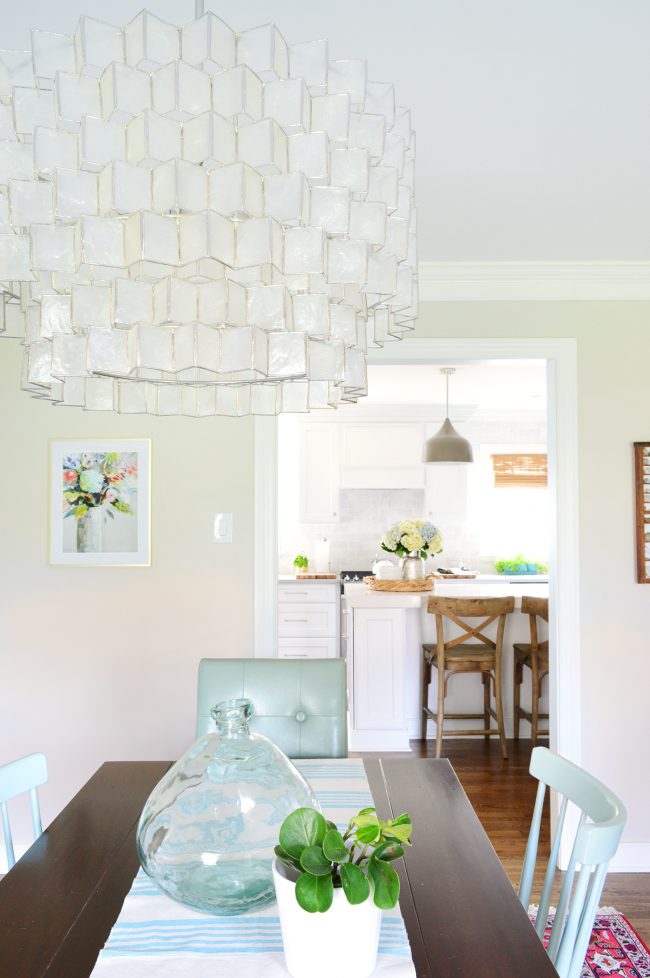
But let’s get back to the task at hand: coordinating light fixtures in adjoining rooms. That big star light in our foyer has cloudy seeded glass that’s similar to the tone and texture of the capiz chandelier in our nearby dining room, so although the metals are different, the repetition of the glass-like material (and the fact that they’re both geometric, and framed with metal) helps make them feel related without being too predictable or matchy-matchy.
Meanwhile, the metal pendants in our kitchen relate to the capiz chandelier in the adjoining dining room because they both have polished nickel stems and canopies. So although capiz and painted metal have nothing to do with one another, they still have another material (in this case it’s polished nickel) that ties them together. Polished nickel and satin nickel are different, so make sure you’re double-checking your finishes.
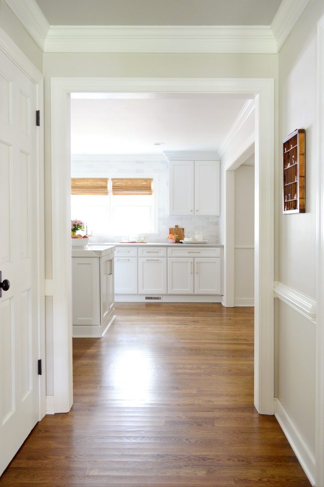
Now, it could be argued that we’re breaking our rule between the foyer (dark bronze star pendant) and the kitchen (three large metal domes with polished nickel stems) since they don’t share any common finish, shape, etc. So they might qualify as a more “eclectic” pairing to some, but we find that since both make sense in their respective rooms – and the rooms flow together nicely due to other elements that relate (paint color, wood accents, seamless flooring, etc), it means the lights don’t feel like a jarring juxtaposition. They just easily fit into their surroundings. I’d show you in a picture, except it’s pretty much impossible to get them in the same line of sight – which might be another reason these guys don’t have to be super similar, since they never actually have to compete visually. Here’s a shot of how the rooms connect (I’m standing under the star pendant here).
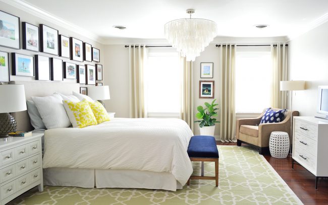
There are also instances when you have multiple lights that need to coordinate within one room. Take our bedroom for example. The bedside lamps, the floor lamp, and the chandelier work together within the same room thanks to various commonalities: similar neutral shades on all of the lamps, the chrome finish on the floor lamp and chandelier, the tiered triangular shape of the artichoke lamps and the chandelier, etc. Other things in the room also help these fixtures work well in the space (the lamps share the same tone as the curtain rods and the hardware on the dresser, while the chandelier’s finish ties into the floor lamp and the silver knobs on the nightstand).
Ok, now that we have that out of the way – onto the mood boards! I used a few of my favorite lighting sources where we purchase lights (places like West Elm, World Market, Wayfair/Joss & Main, as well as some of our own lighting designs with Shades of Light) and I did my best to include a mix of pendants, chandeliers, flushmounts, and even sconces so a range of applications are represented (things that would work in dining rooms, kitchens, even hallways and bathrooms). I also tried to keep things budget friendly, so although a few are $350 splurges like our own dining room chandelier, many others are under $150 or even $100).
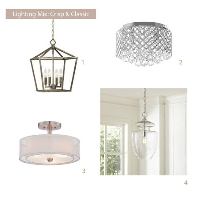
Crisp & Classic
In this board we have four lights that all feel somewhat traditional or transitional and they’re all in the silvery-finish family. So they’re similar in both style and/or finish. The two pendants both have chains, which is another detail that ties them together, and the semi-flush mount shade (#3) and flush mount fixture (#2) both have clean round canopies at the ceiling. This might seem obvious, but tiny details like these can really go a long way in uniting fixtures that otherwise aren’t super similar. Even the subtle diamond shapes in #2 echo the pointed framing on the top of #1, and the cylindrical metal bulb bases in #1 tie into the same cylindrical bulb base in #4.
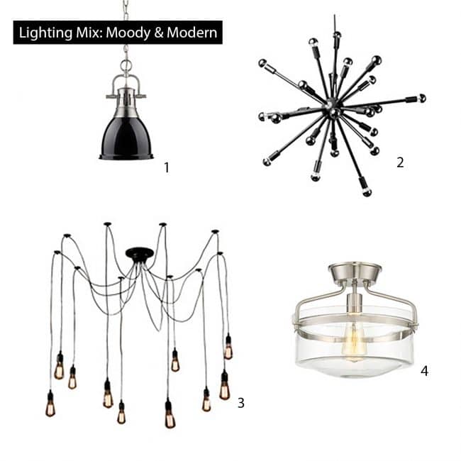
Moody & Modern
In this little pairing, you can see how fixtures with mixed finishes can be “bridges” for other lighting options. Picking something like #1, with both black and chrome, means all black choices (like #2) and all chrome picks (like #4) look totally at home in the mix. This grouping of lights also has some shape commonalities that help. See how #2 and #3 both have “arms” while #3 and #4 both have similar Edison bulbs going on.
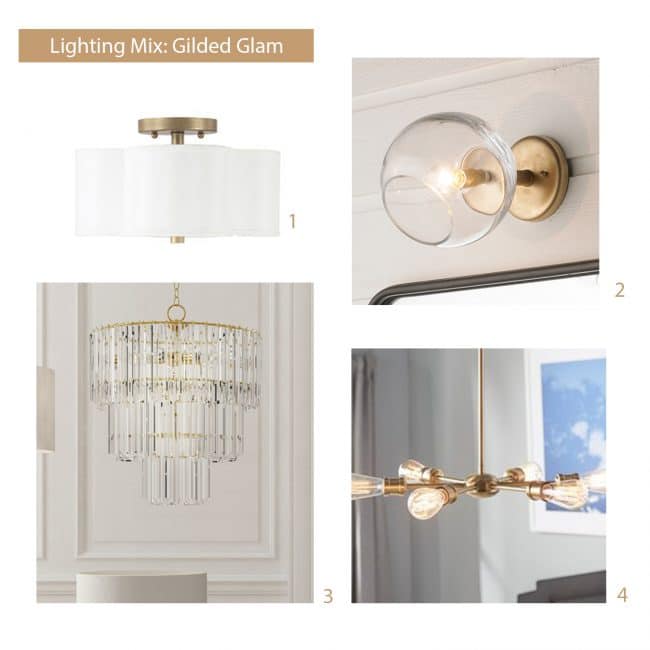
Gilded Glam
In this board, I went with the whole brass/gold finish that ties things together, along with pretty classic shapes like a quatrefoil shade, a tiered chandelier, a glass globe, etc. But since #1 and #3 felt like updated takes on traditional fixtures, I had some fun incorporating a few more modern fixtures too (#2 and #4). But again, since I kept such a tight palette in the finishes and materials, that allows for more flexibility to mix styles or eras.
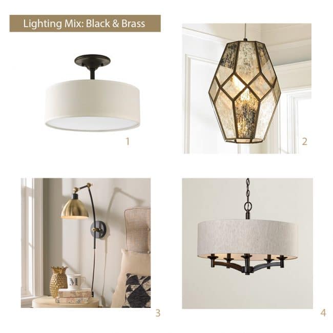
Black & Brass
In this board I had fun mixing metals, just because that goes on a lot at our house, and is also pretty common in light fixtures these days (there are tons of mixed-finish ones out lately). The semi-flush mount shade (#1) and the chandelier (#4) seem extremely related thanks to chunky dark metal and the shades they both have. Meanwhile, the sconce (#3) which features a black and brass combo, acts as the bridge to the antique brass and mercury glass pendant (#2), which shares some similar tones.
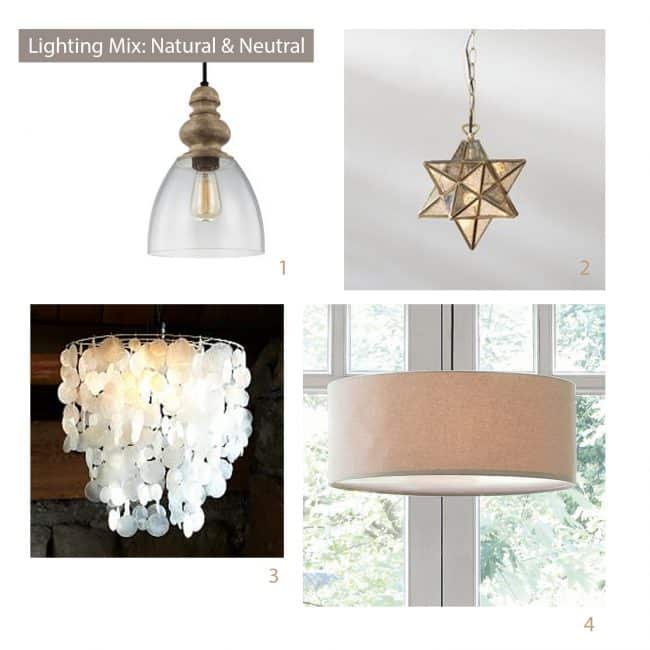
Natural & Neutral
We’re always fans of natural textures and interesting shapes, so enter this mood board stage left. The neutral tones in capiz, wood, antique gold, glass, and even the soft woven fabric of the shade all easily relate and feel soothing and layered without feeling too matchy or similar. There are also lots of curves and round shapes to keep everything in the family (round glass pendant, round capiz shells, round drum shade). The exception to that one point would be the star of course, so would I hang it right next to anything else? Probably not. But would I use it in the foyer with the glass pendants in the kitchen with the capiz chandelier over the eat-in table and the fabric shade over the dining table? Heck yeah I would.
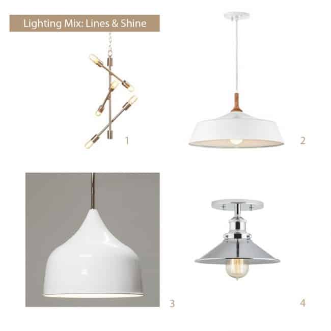
Lines & Shine
This board was fun because it sort of has a coastal-meets-modern vibe. You can see a lot of chrome and white going on (so beachy and nautical) and the fact that there are many angular lines and high gloss finishes also helps them relate. You’ve also got a lot of domes that aren’t identical, but feel similar (they’re more like cousins than twins), and all of these fixtures have exposed bulbs, so choosing one type of bulb – like vintage Edison bulbs or chrome tipped modern bulbs – could be a fun way to further tie them together.
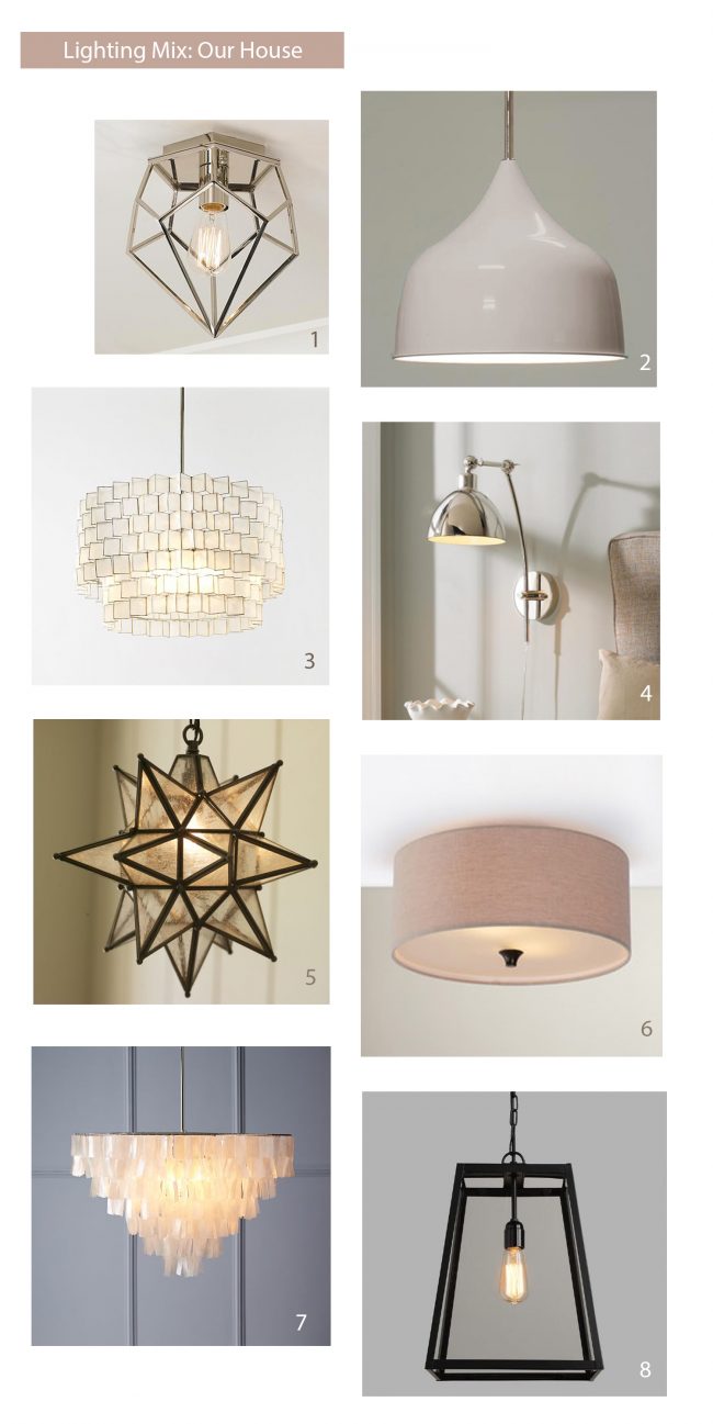
In Our House
And now for the final mood board. This one is a pretty good representation of our house (not every light is in here, but it’s pretty close). You can definitely see the mix that we’re drawn to – capiz, geometric shapes, neutral colors, and shiny silvery metals along with the occasional oil-rubbed bronze fixture.
1 (laundry) / 2 (kitchen) / 3 (dining) / 4 (guest room, similar) / 5 (foyer) / 6 (office, similar) / 7 (our bedroom) / 8 (hallway)
Want more words and explanation? We dropped a little podcast player right here in the post for anyone who’d like to listen (the light fixture discussion starts about 20 minutes in). There’s definitely some other stuff in there that should help. Note: if you’re reading in a reader and don’t see the podcast player right here, just click through to the post.
And with that I bid you a good night light. May the odds be ever in your favor. (Are Hunger Game references from a few years ago proof that I’m an old lady or what?! Pretty soon I’ll be trying to bring “bling bling” back).
*This post contains affiliate links
