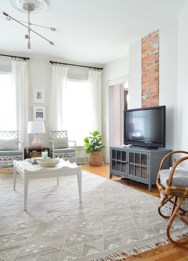
Just when you thought the duplex was getting all the action, we snuck in some beach house updates. The backyard is slowly starting to come together (shed! patio! fence! I CAN’T WAIT to show it to you once it gets a little further along!!) but today we’re diving into our lightener & brighter (and much beachier) living room.
Now this place actually looks like it’s a few blocks from the beach! And the bonus is that everything is sand and popsicle friendly – which is a must for us (we pack this place with family and friends and all the kids). So our goal was never to make it too precious. In other words, we were going for a light and airy look… but it had to be durable, wipeable, and as close to worry-free as we could get it!
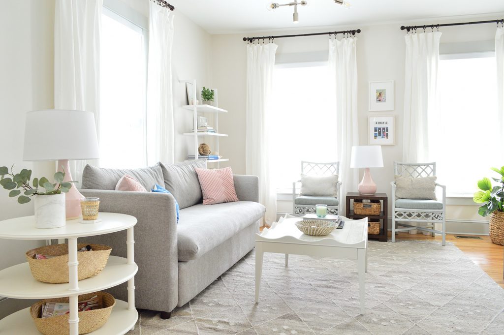
We wanted to use some of the furniture we designed, including one of our new sofas (performance fabric = all the yesses). So we started with our Mellow sofa. It’s sold out right now, but our other two sofas – the Pivot and the Spiffy – are discounted just for the next few days thanks to a Joss & Main’s flash sale (they’ve got different names on J&M for some reason). A lot of things are at the lowest prices they’ve ever been ($699 for the sofas!) so if you’ve had your eye on one of our designs, it’s a pretty great time to check it out.
Sadly, our trusty old Ikea sectional (Karl the Karlstad, remember?) was ready for retirement (aka: donation). The problem with moving a sectional from house to house to house (we moved it from our second
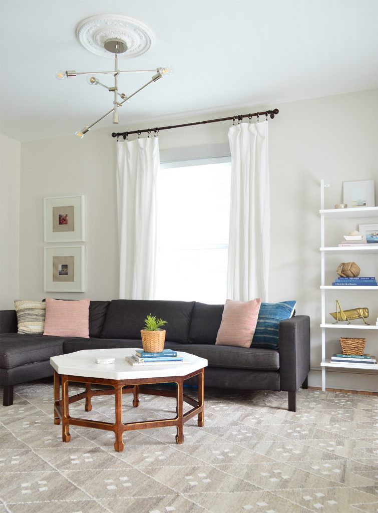
We could kind of make sense of it it photos, but in real
So as we mentioned a few weeks ago on the podcast, after eight awesome years with Karl, we donated him to a local charity that we love, and he’s living it up with a sweet new family. His legacy lives on. (*cue that Celine Dion song from Titanic*).
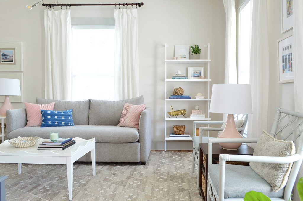
Another way that we tried to make this room feel lighter and airier was the patterned gray rug that we bought to replace the vintage one below (which happily lives in a bedroom at the duplex now).
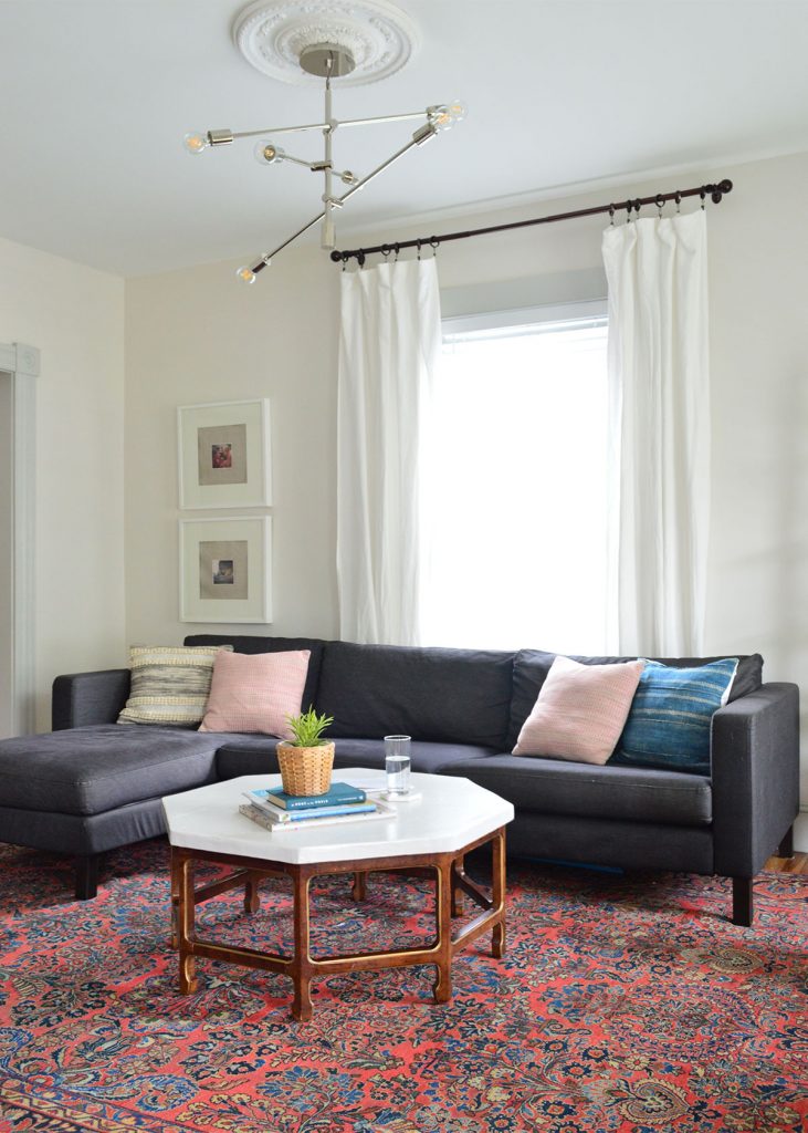
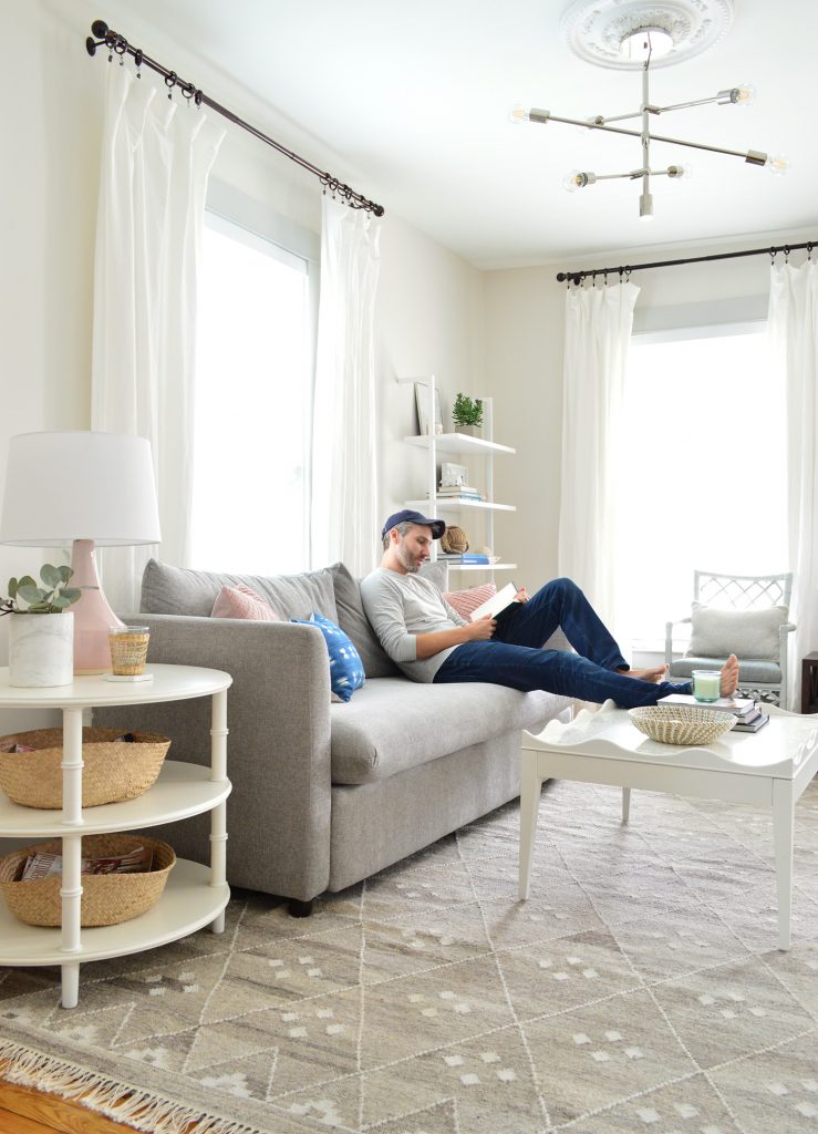
Along with our rug switch, the new sofa is a HUGE step forward in lightening things up. Plus its smaller footprint meant there was room for a few more functional furnishings. Like, momma finally gets a side table on her end of the couch.
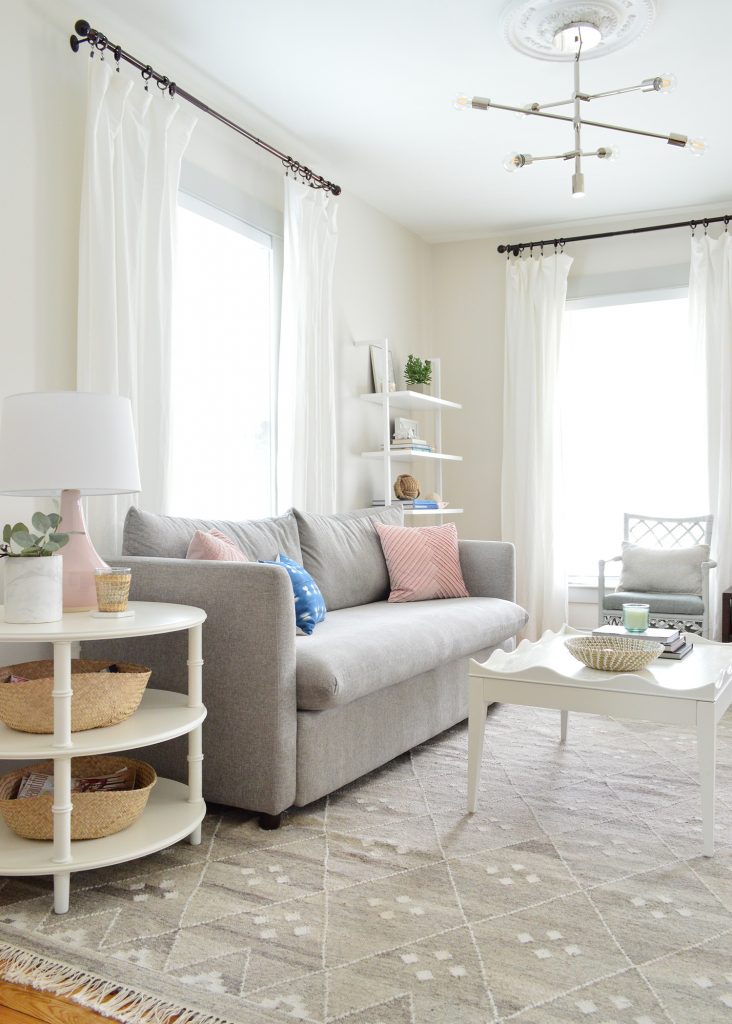
Also, a word about white wood furniture: it’s a GREAT WAY to achieve a lighter look that’s still livable (it’s all wipeable, but it looks so nice and bright). So if you’re staring at a space you’d love to lighten up, sometimes it’s as simple as a $15 quart of white paint with primer built in (we recently tried Behr Marquee and it had great coverage) and you can redo your coffee table and your end tables – or even a bookcase or a shelving unit in an afternoon. Light walls and white (gloriously washable) curtains help too!
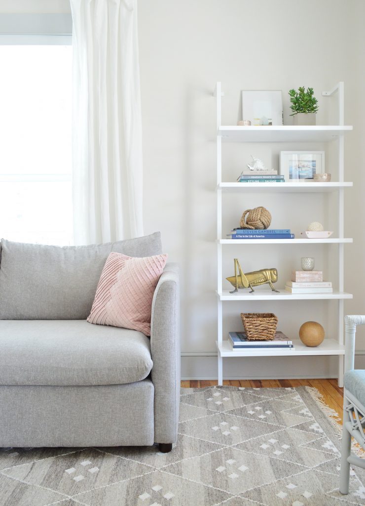
The three tiers on our side table = all the spots for magazines, a basket full of legos, or whatever else you like to keep at arm’s length. We actually ordered two more of the same side tables for the duplex because we love it so much. It also comes in a smaller version (which is super marked down right now) and you know I want to make a coffee table version, so stay tuned!
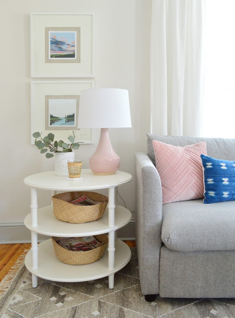
I also hung some new art that I bought through an artist I found on Instagram. Her name is Sarah Madeira Day and her stuff is just beautiful and so well priced. These two 8 x 8″ canvas prints were $25 each! Printed on canvas with gorgeous vibrant colors! I just love them – and I framed them in simple Ribba frames from Ikea that I already had (with linen-like fabric behind them, which adds some really pretty texture and a double-mat effect).
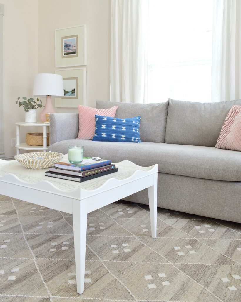
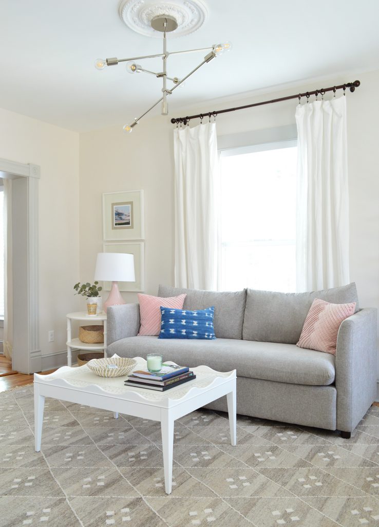
And as much as we liked the coffee table we DIYed last summer, the dark wood legs started to feel pretty busy – especially as the room got lighter. So we carried over one of these coffee tables that we ordered for the duplex. I’m liking how visually airy it is and the size is better for the space, so I may end up ordering another one to make up for the one I yoinked from the duplex.
Also, John and I burst out laughing when we realized that we basically recreated this photoshoot set-up in our beach house. Even the rugs are similar!
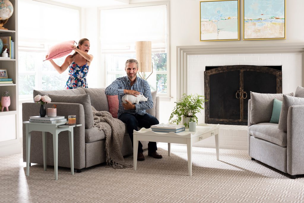
It kind of makes sense that it would happen that way, because we chose some of our favorite stuff for that photo… so I love seeing it living together at the beach house now. Especially mixed with other stuff that we love (that CB2 ladder shelf is so glossy and gorgeous in person, and I feel a deep and meaningful connection to our pretty pink lamp from Target).
Funny story about this coffee table. A couple weeks after that photoshoot, John shot up in bed nervous that the scallops around the outside were a terrible idea. His concern was that it was going to prevent people from kicking their feet up on it (to which I said: “but not everyone puts their feet on the coffee table, right?”).
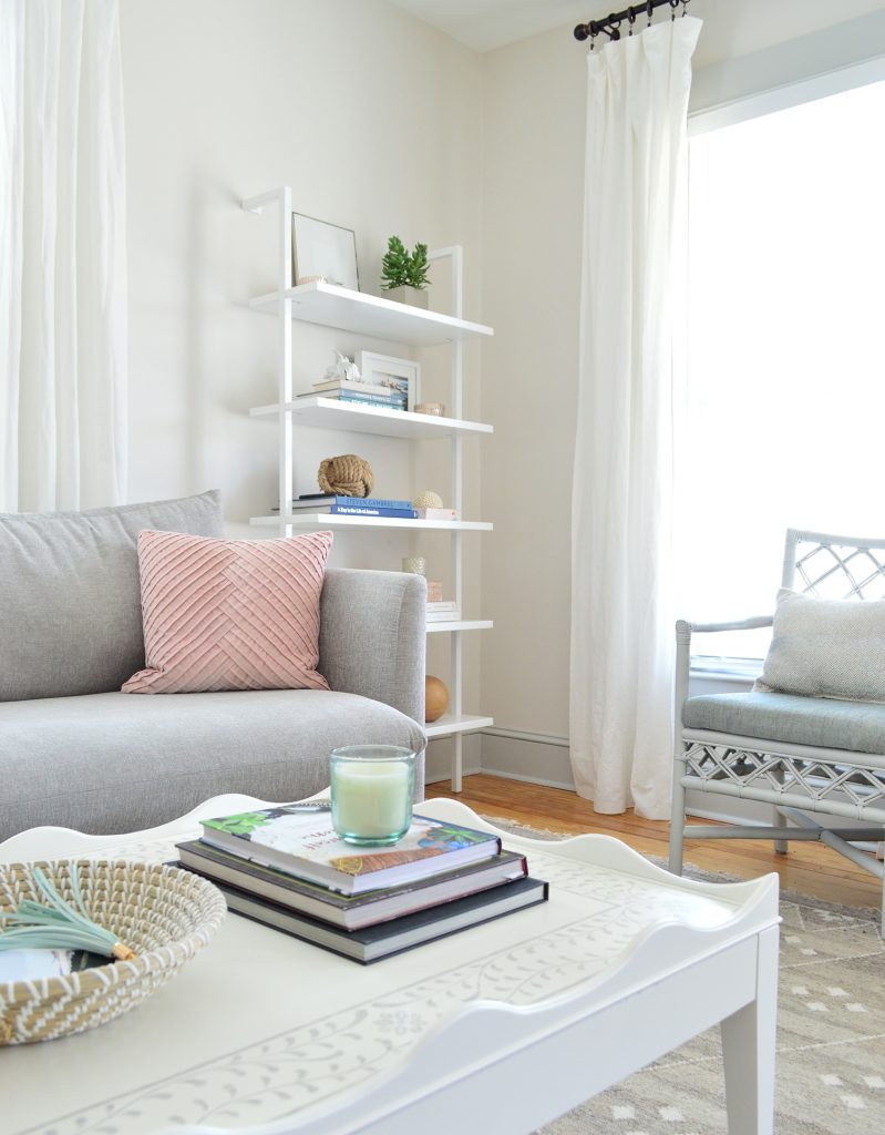
So imagine his palpable relief when he realized that his legs easily fit between the
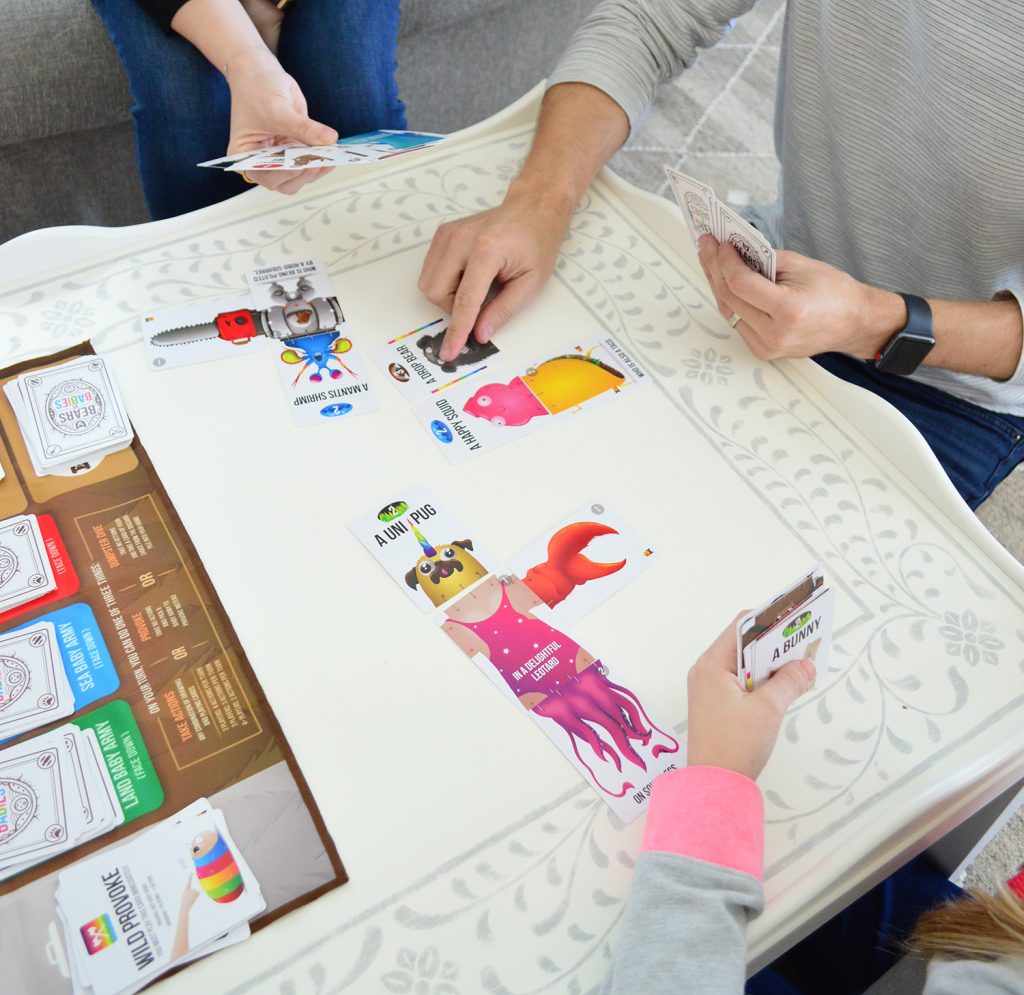
We’re also happy to report that the edge doesn’t get in the way of other tabletop activities like board games (you know we LOVE OUR BOARD GAMES). Actually the border does a nice job of corralling things. You know, if one of your crazy bear creations gets out of hand or you’re rolling dice and don’t want them flying all over the place. So if you DMed me about that, here’s your answer: works great for family board games – the scallops aren’t nearly tall enough to block your arms or anything like that.
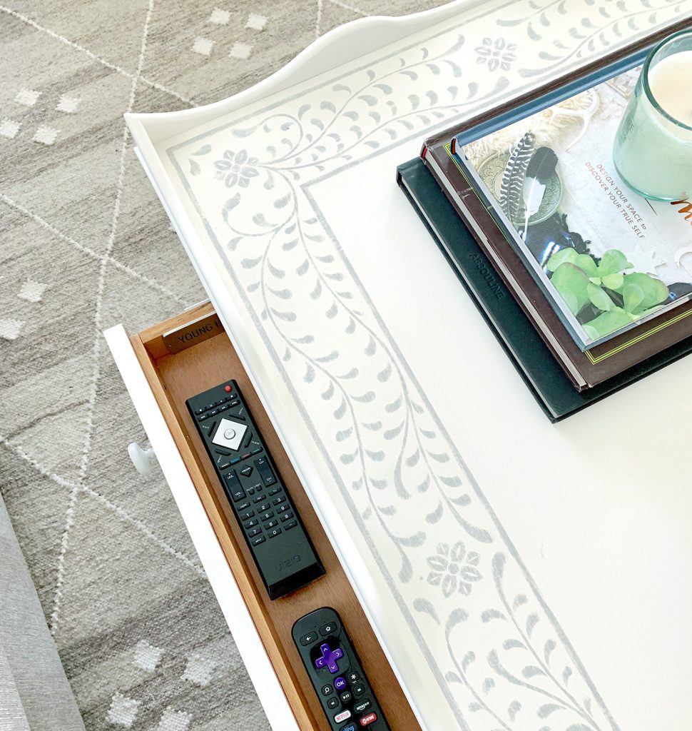
I also had someone message me to say “be sure to put a shallow little remote drawer in your next coffee table design!” and the good news is that this one already has one! I love a little hidden drawer to keep that stuff contained.
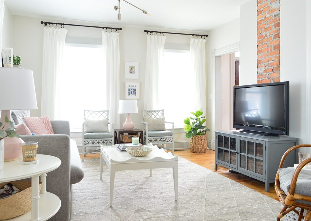
One of the reasons that living room layouts are tough is because we make assumptions about the way we live or the things we want and then we’re too nervous to try something else. So it’s hard to unlock a fresh solution if we’re stuck in the same thought patterns. Like for example, it sounds counterintuitive to say getting a smaller sofa can create more seating, but we learned last summer that trying to cram all of our guests onto a sectional wasn’t always the most comfortable or the most conducive to conversation.
So we decided to try to “break up” the seating options a little more. With the chaise gone, we could also tuck a chair into the corner by the TV. So the sofa seats about three adults (the four of us fit on it just fine since the kids are smaller), and there are three other chairs in the room now, too. So even though your brain wants to believe that a sectional = the most seating, it’s not always true.
We’re still on the hunt to find some bigger / more relaxed feeling chairs for the window wall, but these
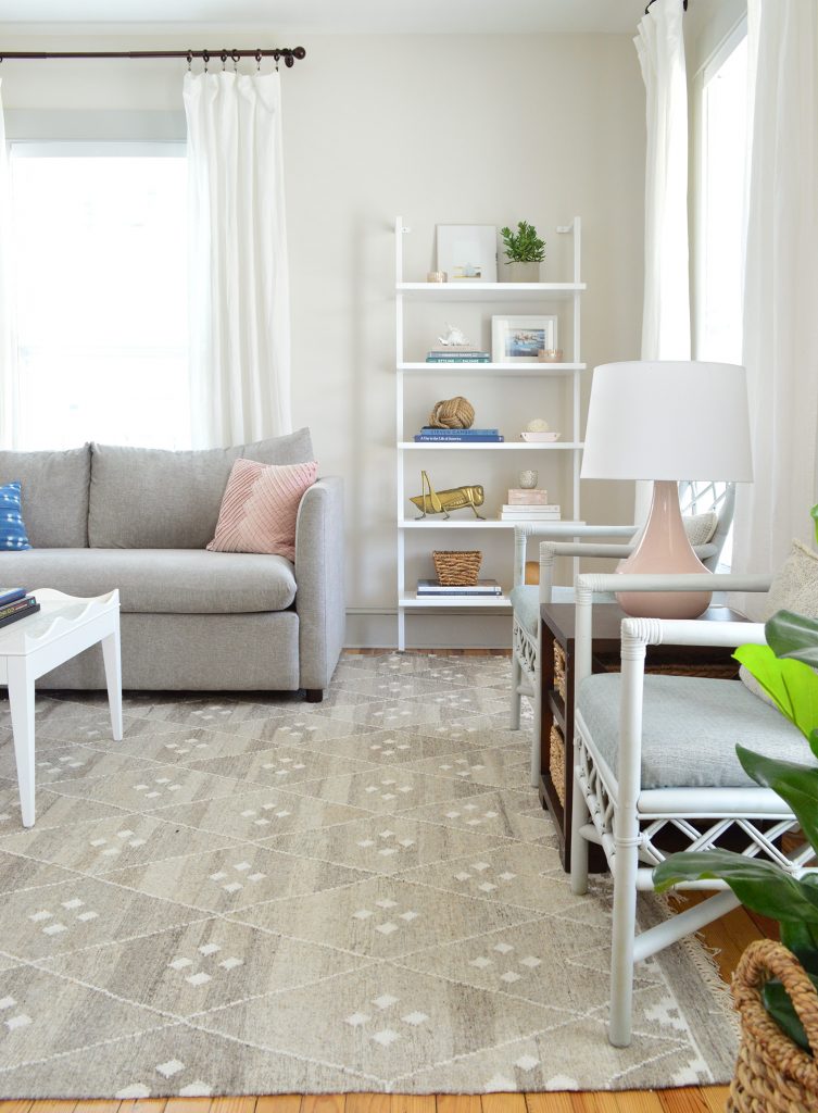
Oh and the rug. Let’s talk about that for a second. We recently had a slime incident. Not just a “slime got on the rug” issue, but a “slime sat on the rug for months under the chaise and I only discovered it when we switched the sofa out and it left a huge grease stain that everyone could see thanks to no longer having a chaise” issue. ARGH!
But…. I got it out! After a lot of googling and some tips from people on InstaStories, the winning removal method was pouring white vinegar on the grease spot, letting it sit, scraping it with a spoon (to remove some leftover slime – it was actually “Thinking Putty”) and after it dried I dabbed it with nail polish remover. That was key in lifting the grease stain and you can’t even see where it was! Plus it gives me a new appreciation that this rug has such a variety of gray tones! Those lighter and darker areas make it much more forgiving.

Between that AND getting an immediate chocolate stain on the new sofa (which came right out dabbing it with water – thanks again, performance fabric!) – we feel like this room can take anything that these kids throw at it – both literally and figuratively. I mean… they might prove us wrong, but they’re gonna have to try harder than slime and chocolate…
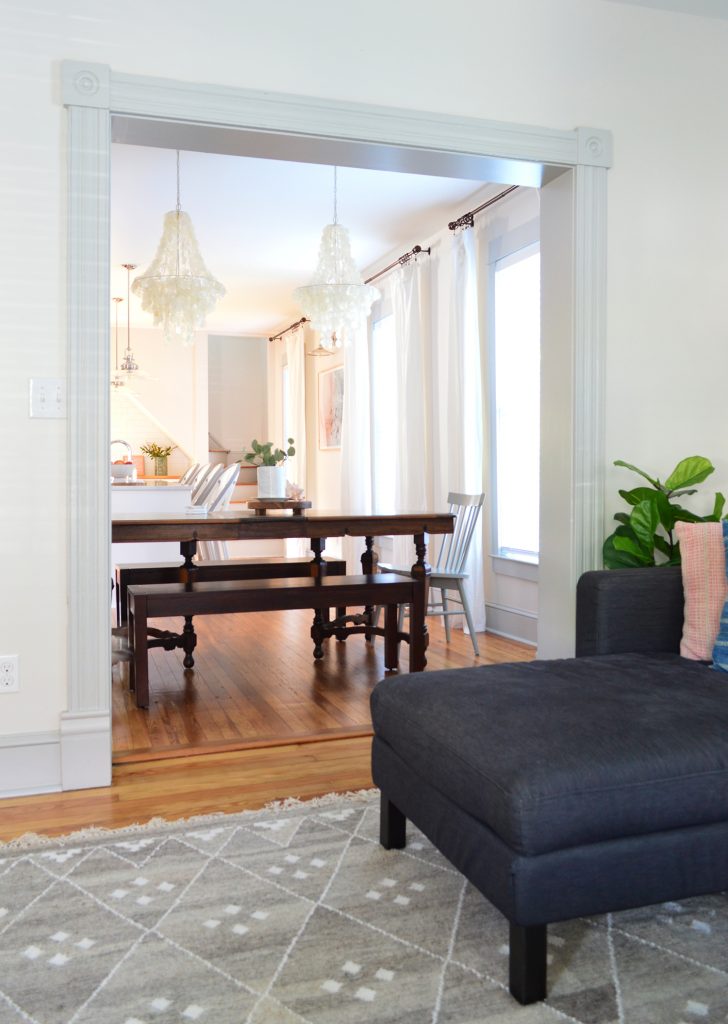
The last thing I’ll mention while we’re on the topic of updates at the beach house is our dining room chandeliers. A few months ago in our email newsletter, we showed how we swapped out the old capiz chandeliers for these from our lighting line, but I’m not sure we ever shared a picture on the blog. We love that they’re a little more substantial and the polished nickel details tie into the other light fixtures throughout the living room and the kitchen. You can see our entire collection with Shades of Light here.
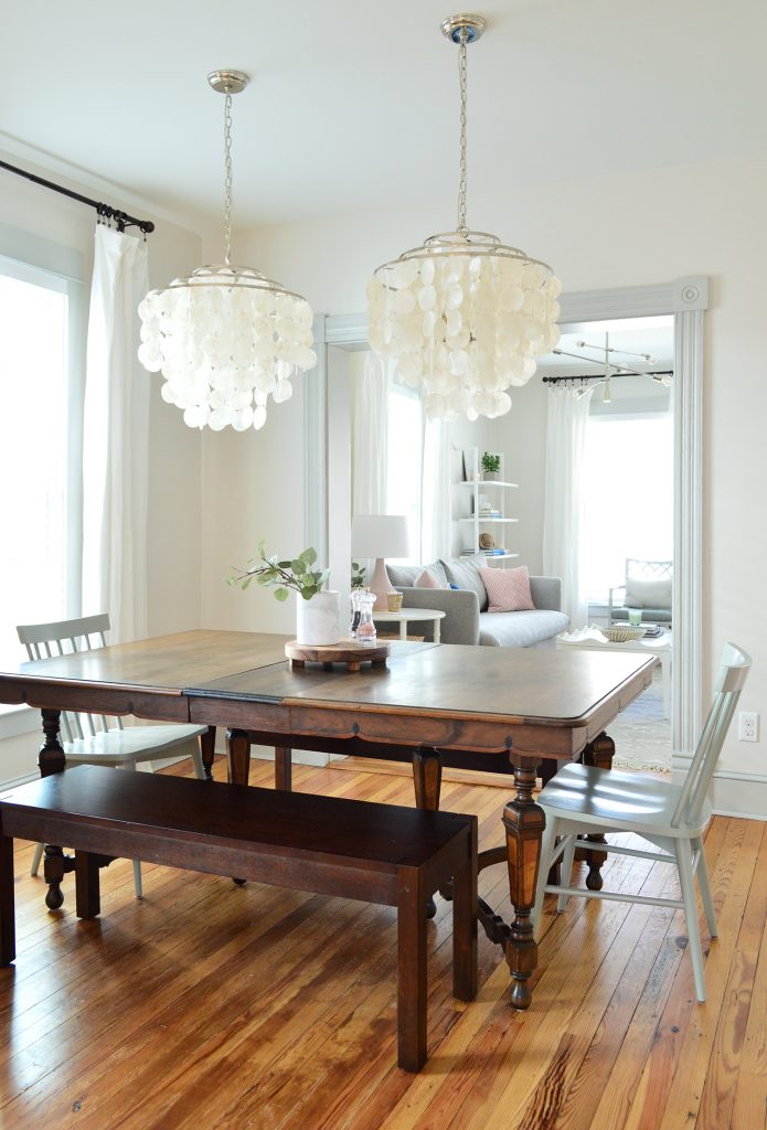
The previous chandeliers are now hanging in the master bedrooms at the duplex because it’s basically in the Sherry Petersik Decorating Handbook that every house we fix up must have a capiz fixture somewhere. And you know I love playing musical furniture & light fixtures! (p.s. this is a TV concept, I just don’t want to actually be on tv – but someone please make a series about switching things you already have around like that old show on HGTV called Freestyle and I’d be SO INTO IT! It goes back to my love of staging houses and being scrappy with things you already have on hand).
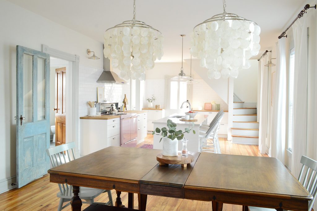
So there are our latest beach house updates – and I hope it’s comforting to hear that sometimes rooms take a little while to figure out, and it’s totally not a failure to move things around and keep experimenting and trying new things. Even in our very first
If you want to catch some of our furniture while it’s on flash sale, it’s only on Joss & Main this week (actually, like only 3 more days). And if you want to learn more about the whole furniture designing process, here’s a post we wrote all about that. And for more on our (well, mostly John’s) idea of painting the living room walls a new color, that’s on this week’s podcast. We tried out some trendy online paint companies to see if they really would make picking paint colors easier…
P.S. In honor of our new chandeliers over the dining table being our designs from Shades of Light, we’ll drop a link to our entire collection for anyone who wants to check it all out. We LOVE seeing them in your homes too – so send us photos on Instagram if you use them!
*This post contains affiliate links*
