Ding dong, the bare spot above the TV is dead.
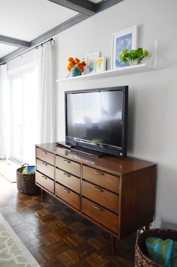
Remember how it used to look like this for a few years?
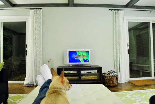
And then we graduated to a bigger tv and kept an eye out for the right media cabinet for another year or so.
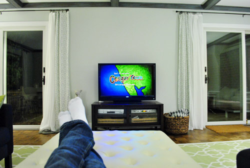
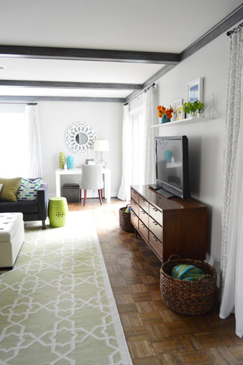
And then we finally got here with the help of a $59 cabinet that we found at a thrift store…
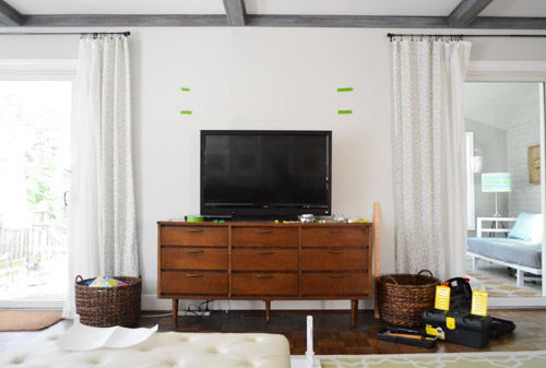
Whew. So glad it’s NNM (nekkid no more). Don’t mind that power strip on the ground, I’ve since shoved it behind the media cabinet to hide it.
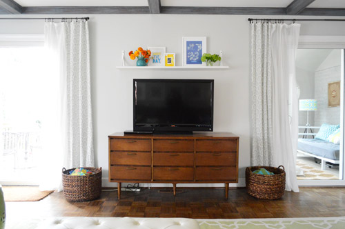
Dang it feels good to be a gangsta have a shelf there.
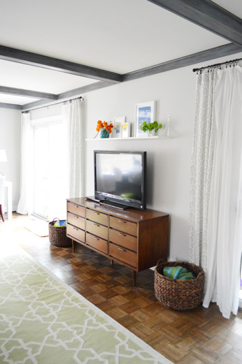
We actually debated a bunch of options for above the TV (hanging frames/art, something 3D in the “wall decor” category, hanging a ready-made shelf, making one of our own so we could pick the length, depth, and the brackets, etc). The last idea won out thanks to keeping an eye out for anything in any of those categories for the last few years, not finding anything that worked/we loved, and finally taking matters into our own hands and making something that fit the wall perfectly.
The good news? It only took us a few hours and around $20.
As for how we made it, we picked up a 10″ wide poplar board from Home Depot and just cut it to length and supported it with some store-bought brackets, also from Home Depot. Oh and the overall finished shelf length is 56″ since the media cabinet under it is 60″ (we thought that was a nice compatible length).
When it came to the color of the shelf and the brackets, we primed and painted them both white (the brackets were originally silver), just because we didn’t want the shelf to be bold/contrasty (we wanted it to layer into the room like the white frames over the sofa, the white mirror over the desk, etc).
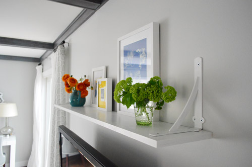
We also decided that putting the brackets on the top of the shelf instead of under it would keep everything on the same plane – instead of having potentially distracting brackets poking out from the bottom of the shelf and encroaching on the TV. It’s totally one of those to-each-his-own things, but we like the brackets up top in here since we have brackets under the shelves in the kitchen (Ikea sells some shelves with brackets on top, so it’s apparently a pretty common thing).
We just didn’t want the shelf itself stealing any attention from any zombies, white walkers, or dignified Brits that we might be watching on the TV below it (feel free to guess what three shows we just referenced). #nerdsforlife
Then we just used heavy duty anchors that were guaranteed to support a lot more weight than we’d ever put on that shelf to secure each of the brackets. We also added some extra strength adhesive to the bracket bases before screwing them into the face of the shelf for added insurance. Many people screw and glue things from above and it holds nice and firmly, so it’s not necessary for the brackets to be under the shelf in order to support it. Let’s just say that at least three Clara’s could theoretically hang on it…
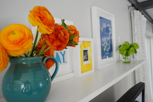
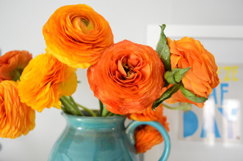
Oh man. Could you lick these flowers, or is that just me? They’re called rhinocerus ranunculus.
I can’t tell you how much better it is to sit on the sofa without having weird “ugh, this wall has been blank for years! Dude GET ON THAT!” thoughts.
Now I can just sit with my feet up and dust my shoulders off, Jay-Z style.
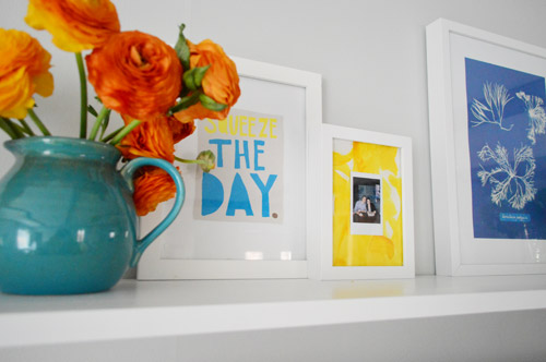
As for what’s living it up on our new shelf, I leaned a few frames that we already had up there (and even used poster putty on the base of them to keep them nice and secure). Inside of them we have:
- a “squeeze the day” page from an old Boden catalog that I’ve always loved
- a blue botanical print from Ikea a while back
- a polaroid of John and I at one of our book signings (we realized we didn’t really commemorate those in any way – and I even used some Clara art to make a cheerful yellow mat behind it)
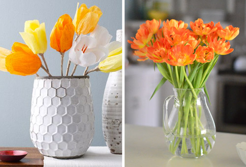
Of course there are also those pretty fresh flowers that’ll die in a week or two and then I’ll find myself sitting on the couch thinking “ugh, those flowers are dead. Dude GET ON THAT!” – but the good news is that I’m now the proud owner of pretty West Elm paper flowers (more on that here) so those’ll hopefully pick up where the real ones left off.
And then I’ll just get to sit on the sofa and concentrate on the zombies. As it should be.
Oh but before I go, blam:
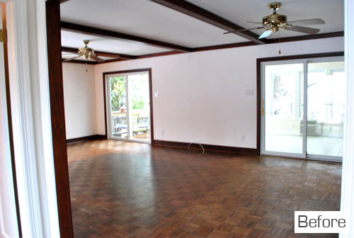
Can you believe that’s how this wall of the living room looked on the day that we moved in?
Now it’s all “look at me now.”
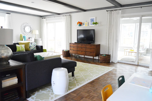
What do you guys have over your TV? A mirror? A plant? A zombie action figure (you know, to complement the real ones on TV)?

ShellHawk says
What a nice upgrade, though of course, my husband would have said to fill up the space with a bigger t.v.! Lol!
We have a 58″ flat screen and a big entertainment center that has that mission-style look to it. Since we have a young German Shepherd that still likes to chew things from time to time, we have a bunch of stuff on top of the entertainment center to keep it out of harm’s way. No great decorating there, but at least we still have our remotes intact!
Melissa @ Loving Here says
There’s nothing above our TV yet…and I still hate the cabinet below it…but we’ll get there, eventually. These small, gradual changes take time, which you guys so awesomely demonstrate for us…which helps me to keep my patience! Thanks!
Lydia says
I absolutely love that you hung the brackets above the shelf! My husband would not allow that to happen in our house, though (he is so worried about things falling – we even use anchors for picture frames!) Maybe we could rig something up where the shelf rested on the bottom part of the bracket, but the top part was still above the shelf?
YoungHouseLove says
You could probably get those little L-brackets from Home Depot (they’re like 2″ long) and use them under the shelf and you probably wouldn’t even see them thanks to the shelf coming out of the wall so much (especially if you painted them the wall color to blend them in) and then the brackets on the top could be decorative/supplemental instead of being the only ones. Ikea also sells brackets that hang above a shelf but the shelf seems to slip into them so it’s cradled from below. Hope it helps :)
xo
s
Andrea says
This is so helpful – our family room has no shelving or mantle (and therefore little opportunity for personalizing) and I had never thought of putting one above the TV! I also love the upper brackets. Thanks!
YoungHouseLove says
So glad Andrea! Good luck!
xo
s
Anne says
Let’s see the Walking Dead and Downton Abbey. What would be the second one? Sounds like a creepy show like American Horror Story.
YoungHouseLove says
Game of Thrones!
Winter is coming…
xo
s
Anne says
Ahhh . . . I’ve heard that’s good. I’m just sad that I won’t get to see Daryl Dixon for another 6 months. :(
YoungHouseLove says
Oh man, waiting’s the worst!
xo
s
Kate says
Love how the room has come together! It is SO bright and cheerful.
YoungHouseLove says
Thanks Kate!
xo
s
Jenni Bailey says
We have an empty space above our tv, too, but it is super tricky to decide what to put up there. The tv is set back in a shallow alcove next to our fireplace (it’s a corner fireplace so it juts out into the room about 10 inches). We recently remodeled the fireplace to be all the way minimal – it’s completely smooth, no mantle, just a low black firebox flush under a white wall. So while the space above the tv does look a bit unfinished, it’s hard to figure out what to put there that won’t look like it actually belongs on the fireplace (a shelf, I’m afraid, would look like a mantle that had wandered off). And a picture would look like it belonged on said missing mantle. So we’re stuck…for now. You can see what I’m talking about here: http://www.jennibailey.com/2013/02/before-after.html although there is no tv or furniture in that picture because it was right before we moved in and I haven’t taken any good pictures since. Mostly because of the tv/fireplace conundrum!
YoungHouseLove says
That’s such a pretty room! What if you hung something pretty in that corner like an old driftwood mobile or something?
xo
s
Stephanie says
We have nothing above our TV and I had never thought about filling that space…until now!
Our TV is on a console as well. I think our console and TV are both a bit bigger – thus taller – than yours, perhaps. Can you give some guidance on the height of this shelf? Seems to me a shelf should be eye level, when standing, and not higher. Thoughts?
YoungHouseLove says
We just looked at that block of wall space and eyed it with the shelf when it came to height (too high looked too high, too low looked too low, etc). I wish I had some magic number, but just eying things in each unique wall spot probably works best :)
xo
s
Stewart says
OMG. I’ve totally been wanting to do this above my TV for like a year now. And, seeing you all do it, somehow I feel validated in my creative vision. Yeah!!
Kerry says
Ranunculus are my absolute faves!
And I love that pop of color on your wall.
I keep inexpensive flowers in the house as often as I can — just in little bud vases, all around.
It’s been a long, hard winter in BOS (which you experienced on your book tour!) and the flowers help remind me that spring is coming!
YoungHouseLove says
Oh yeah it was cold!
xo
s
Henna | HENNA BLOSSOM blog says
Looking GOOOOD guys! It feels SO good when you are finally seeing a “finished” space. We’re ALMOST there with a bathroom. I can’t wait until we can just kick our feet up. Or not, it’s a bathroom. ;)
The ranunculus are AMAZING! So purdy.
YoungHouseLove says
Haha, I love the visual of kicking up your feet in the bathroom. I don’t think any of our bathrooms actually have room for that…
xo
s
Maria says
Looks awesome! Also, I’ve always thought you look like Karmin (the female part of the duo); she came to my college to perform last year, it was the greatest!
YoungHouseLove says
No way, really? She’s way cooler than me. I think her hair deserves its own fan page.
xo
s
Maria says
You reply just made my week! And it’s my birthday week, the big 2-0! Thanks Sherry!
YoungHouseLove says
Wahoo! Happy birthday Maria!
xo
s
Lauren Nicole says
1 billion points for droppin’ mad beats from Office Space in this post! #mydayismade
And since you asked, we have a framed flower print and a pair of sconces above our TV. But the TV is in an old 80s hand-me-down entertainment center, which is definitely a ‘Dude Get on That’ situation that drives me mad when I’m trying to relax and watch something.
heather says
I really like how that shelf both uses up some space and adds pops of color. Very pretty! This weekend we were working more on what would be *under* our entertainment center/tv than above it!
http://www.likeacupoftea.com/what-warms-you-three-times-in-three-different-seasons/
heather says
(pst – the flooring part is about 1/2 way down the post which is an update on a bunch of stuff)
YoungHouseLove says
Oh man, that’s looking amazing Heather!
xo
s
Kim says
Are we not mentioning the fact that this very living room was in the West Elm e-mail the other day?
YoungHouseLove says
It was?! Wait, for what?!
xo
s
Kim says
Maybe I meant Joss and Main. Ack….
YoungHouseLove says
Haha, oh yeah, that makes sense!
xo
s
Janelle @ Two Cups of Happy says
Above our TV is an off centered National Geographic print of a bear in the water that I bought the bf for his birthday last year. It’s the starting of a TV gallery wall, but sadly it’s the only frame up there right now. DUDE, I need to seriously get on that.
YoungHouseLove says
Haha, good luck Janelle!
xo
s
Tania @ Run To Radiance says
Hah three of my favorite shows as well. I love what you all did with that wall!! Our tv wall is driving me crazy- it is about 11 feet long and has nothing but a mounted television on it. LOL. We just remodeled and are now “decorating” but it just looks dumb. I’m thinking either a built in shelf or a bunch of wall art? But I have no idea.
YoungHouseLove says
I think either of those options could look great!
xo
s
Brenda says
Before I even got to the part about why you chose to put the brackets on top, I noticed how much I liked the balanced look. Looks great! And let’s be real, this post is even better for all the rap references. :)
YoungHouseLove says
Haha, thanks Brenda :)
xo
s
Kristen | Popcorn on the Stove says
Love the way the ledge looks! I’m a big fan of the brackets on the top of the shelf.
I hear you on the ‘get on it’ stuff. We’ve been in our apartment for two weeks and I still haven’t gotten around to rearranging our furniture in the living room. So much needs to be done in there!
Kate says
The second I read “Look at me now,” I had that song in my head. Hilarious!
YoungHouseLove says
Haha!
xo
s
Angela K says
walking dead, game of thrones, downton abbey! Or I could be totally wrong on all three, haha.
YoungHouseLove says
Correct on all accounts!
xo
s
Amy says
Looks great! Did you guys notice all the bike prints on this sale that’s ending soon? https://www.jossandmain.com/Pop-Art-Panache~E4204.html?utm_source=daily&utm_medium=email&utm_content=&utm_campaign=&shown_redirect=1
(I hope that link works.)
Maybe you are biked-out, but I thought you might be interested. Have a great day!!
YoungHouseLove says
Love that!
xo
s
Heidi says
Love the new look. Where did you get the beautiful pitcher that holds the flowers? Love the pitcher/flower color combo!
YoungHouseLove says
That’s from World Market :)
xo
s
Suzie says
Looks great! In love with the turquoise vase and orange flowers!
Danielle Oakey says
Love it! I did something similar above my television but used the frame ledges instead!
Christy Niebaum says
Walking Dead, Game of Thrones, Downton Abbey. #nerdsforlife
Amirite?
YoungHouseLove says
Right-o.
xo
s
Ruth says
Nice!
You’ve inspired me to start collecting ideas for a similar idea for the blank over-the-TV wall in my bedroom.
By the way, you drop enough rap references to make me think maybe this wouldn’t be your jam, but ever since I read the title of this post I’ve had Aerosmith singing in my head!
YoungHouseLove says
Haha!
xo
s
jenn says
i love seeing different angles of your house! makes it look so different and so fresh, also blows my mind cause im all really? thats there? whaaat?!
FitBritt@MyOwnBalance says
Where do you find so many white frames with white matting? I am hopeless at finding good frames!
I love your ledge idea. Above our TV is completely bare and it looks so sad.
YoungHouseLove says
Ikea and Target are our two main sources along with yard sales and thrift stores when we find things there :)
xo
s
Jess says
I love the shelf…and your whole living room actually! We JUST bought something for over our TV. After some debate, he wanted a mirror and I wanted shelves.. we found mirrored shelves! (They are basically mirrors with a wider frame on top.) They work perfectly in the room, but now I am struggling to decorate them. Your shelf decor is amazing though (I particularly love the “Sqeeze the day” print), thanks for the inspiration!
Melissa says
Personally, I love the brackets above the shelf. It really irks me though that you have to justify in your post why you hung it that way and that it is perfectly safe. And sure enough, people in the comments practically tell you that you’re wrong. First of all, it’s a personal preference. Secondly, any mention that it will surely fall is insulting since A) you overly anchor everything that can be tugged down by sweet little Clara- as if you hand’t thought of that- and B) if it does happen to fall because you made a mistake, that’s your business! lol. Everyone is entitled to their own mistakes to make. These people wouldn’t appreciate someone going through their house telling them how all of their design choices are “wrong.” It makes me wonder if they do that in real life to their family and friends or they just feel they can do that here because they hide behind the anonymity of the internet. Anyway, it really bugs me that people do that here. You guys always handle it so graciously. I would find it so difficult to bite my tongue! Love you guys!
P.S. Love your Joss & Main collection! Kinda bummed that a lot of the stuff I would buy (or could afford) was sold out by the time I realized of it’s existence. Love it anyway!
YoungHouseLove says
Aw thanks Melissa! We have a fun giveaway in the hopper for this afternoon in cahoots with the sale. Wahoo!
xo
s
Stacey @ Likes to Smile says
I love it! It looks fantastic. Meanwhile, I must say, you are exceptional at making meaningful artwork. Reading your blog for two years has made me rethink what I have on my walls and how to display personal mementos. I now love looking around my apartment and being reminded of special things. Thank you!!
YoungHouseLove says
Aw thanks Stacey, that’s so sweet of you to say!
xo
s
bekah says
Nice improvement!! I am so glad that you guys do posts like this. So many times I look at beautiful rooms and thing “but where the heck do you put your TV?”. So…thanks for that!
YoungHouseLove says
Aw thanks Bekah!
xo
s
Nikki says
This is just the inspiration I needed! We have lived in our current home for over a year now, and the spot above the TV is one of the only naked places left. We have a gallery of frames up on opposite wall, so I was feeling like it needed something a little simpler to balance. I’ve been hunting for a large (budget friendly) piece of art that I loved (and thought about DIYing it), but have found NOTHING that feels right. This seems like just the ticket. I think something like this would be perfect!
PS, ranunculus’ (ranunculuses? ruanunculi?) are my very favorite flower of all time! AND I’m on an orange kick right now. My heart skipped a beat!
Carla says
I love this! We’ve been updating our tvs home too…we kept it on a chair for a few months, haha! We just couldnt find anything that “fit”, until we saw a great looking vintage bar cabinet abandoned and all alone on the side of the road. We’re getting ready to paint it, it’s perfect for the tv so we’re super excited! The shelf looks great guys!
YoungHouseLove says
That’s awesome!
xo
s
Megan says
I was just thinking of adding some brackets-on-top shelves to one of my bathrooms….this post may have convinced me to go through with it. There is nothing surrounding our giagantic (I think the husband has pushed us into the 60″ range) wall mounted TV. It has been a bit of a decorating conundrum. The corner fireplace is immediately to the left (also, the corner mantlepiece is driving me insane as far as decorating so if you have any tips please share!), there’s not enough space above the TV to do much without it seeming crowded, and then there’s a blank wall space to the right. I’ve been thinking about gallery shelves for the blank wall but really I need to repaint the entire room before doing anything else.
[email protected] says
Love the dresser and the ledge. Looks great.
Jeanne says
Yea look at it now!! The shelf looks like it was always there. :) It looks wonderful, and dang but that girl has amazing breath control.
YoungHouseLove says
Seriously! That’s what stuns me. She must be able to stay underwater for like two minutes.
xo
s
Stephanie S. says
Oh my goodness I literally just did this project last week from one of my pins on pinterest…
http://colunas.revistaglamour.globo.com/referans/files/2011/08/lotta_agaton_sexta_inspirada_preto_e_branco_referans01.jpg
I did this over our TV rather than the couch…yours looks great
YoungHouseLove says
Love that!
xo
s
Misty says
This looks so great! Love the pop of orange from the flowers!
I have been staring at the blank spot above my TV for more years than I am willing to admit. I finally repainted my walls to this great blue-gray color in January and I thought about putting up 3 b&w family pics above the TV (or after seeing this maybe a shelf!). The only reason I haven’t is because the wall is not a perfect square, the ceiling slants up making me think anything I put above the TV won’t look balanced. Does that even make sense? Maybe I should attach a link to a pic…LOL Any advice? Thank you a million times!
http://www.flickr.com/photos/94777650@N02/
YoungHouseLove says
I would totally put a shelf up there and just use a larger frame on the tall side and some lower accessories on the other side for balance. Basically I think what we did for our shelf would work (flipped) on yours :)
xo
s
Misty says
Thank you!! I’m going to give it a try!
Sabrina says
Just had to stop in and say that I too am currently in love with ranunculus (totally had to google the spelling). I’ve never seen them in this gorgeous orange, love!!
Meg M. says
Looks fab! This post gave me an idea, one that I’m sure you’ve either had yourselves or has been suggested to you in the past, but one that I would love to see y’all do on occasion.
What if you took emails from readers with a description and photos of a “problem area”? Then y’all could make a post with the description and photos and give the person tips for the area while also allowing other readers to chime in with ideas. These could be a once-a-week thing, or every two weeks, or whatever floats your boat… I would love to see something like this on your site. :)
Sometimes when I’ve looked at a space for so long I need a fresh pair of eyes to give me a tip to get the creative ball rolling again.
YoungHouseLove says
Oh yes, we used to do those back when we had more time to go through all those email submissions and photos and then make mood boards and write up descriptions! We’d love to get back to that if we find more hours in the day. Maybe when Clara’s at school more than a few hours a week :)
xo
s
Meg M. says
And I’m seeing this very thing is happening a couple comments ahead of mine! It would great as a post of it’s own!
YoungHouseLove says
Aw thanks Meg :)
xo
s
Lauren says
Can I just say, I think that gray-washing those beams was pretty much the smartest thing ever… probably my favorite thing about your living room.
YoungHouseLove says
Thanks so much Lauren :)
xo
s
Louise says
I really like how you’ve hung that shelf! reminds me of a bridge, if you know what I mean? no? … I know, in my head lol!
love all of those progs by the way!
Winter is coming!… :)
YoungHouseLove says
Haha, winter is coming!!
xo
s
sarah says
Looks great!
sarah says
Looking great! I need to start decorating my boyfriends house and these ideas on the blog are great!
Sarah
http://www.etsy.com/shop/owleyevintage
Carla says
Hmm, I’m not a fan of the knickknack shelf. It feels too country kitchen in there. I think that room is needing some built-ins. As much as I love that mid-century dresser, it’s just too much at odds with the large, black TV.
But honestly this is such a common problem. I got rid of my TV years ago. I can’t stand seeing that big blog of technology in my home, so the few shows I watch, I watch online. But our modem/router box is semi-visible, and that bothers me. My home is filled with vintage furnishings and books, so the technology really stands out.
I”d love to see some great examples of how people are hiding all those cords and huge glossy-black TVs. I liked how you hid the cords in the dresser. That was clever. But the TV’s base is plastic and unattractive, and the whole thing kind of dominants the room.
I’ve seen TVs mounted inside recessed, framed boxes on the wall, freeing up space for books and other things on the surface they used to sit on. And the cords were run through the wall, which made the TVs feel non-invasive/intrusive. This room has been a work in progress from the get-go, so it’ll be fun seeing how things look in a year.
Dena Robbins says
Ok, two comments here –
1. I absolutely ADORE your style. I am a secret stalker and unfortunately have no idea how to get my style in action so I use you two for inspiration! I love the hardware on top.
2. Your 3 show mentions. Hello?? Is there anything better on tv? I THINK NOT..fellow #nerdami
YoungHouseLove says
I also wanted to throw a “lovable serial killer” into the mix, but it just sounded wrong. We love us some Dexter though…
xo
s
Katelyn Hickman says
Fresh flowers are awesome and the trick to keeping them fresh is to trim the stems about once a week and change out the water often. Use warm water and add a teaspoon of plain white sugar to it and seriously, those blooms will last twice as long! You can also add a splash of bleach (don’t ask me why, but that’s why my girl Martha says to do!) The shelf looks great!
YoungHouseLove says
Love the tips!
xo
s
Jeanna says
Hey guys! I always love your little updates as well as the big stuff- but I am so inspired that if you don’t find something you absolutley love that you try and make it happen yourself!
My hubs and I are getting serious about tackling our kitchen cabinets. I’ve scoured your kitchen posts and just had a couple of questions about the Benjamin Moore advanced paint. Is it all oil based or is there a water-based option? I’ve been told that oil is the way to go- but I am just not experienced with it- what are your pointers for the differences. We’ve just always used Behr paints for our walls from the home depot and I never paid any attention to whether they were water or oil based!!??
Help- what do you reccommend and why? I will take your advice as gold since I always LOVE your painting results! Thanks so much!!!!!
YoungHouseLove says
BM Advance is Aklyd (so it’s not oil, it’s water based). It’s definitely the way to go since it’s less fumey and full of VOCs but it’s made to be extra scrubbable and durable- it’s even self-leveling! I would recommend following our exact cabinet method (the same sanding, deglossing, the same primer, the same paint – in your color of choice of course) since we can’t really speak for any other products/methods but over a year later our kitchen is mint! Not a crack or a mark at all – and Clara beats on the cabinets!
xo
s
Jeanna says
Thanks! That helps a lot! (I’ve been taking notes and going through you archives all day- and there’s not a chance I’d vary on what you guys did!)
Glad to know Clara beats on them. My son Hudson is just a few months younger than Clara and every time you post a video of her I think to myself how nice and calmly she plays and imagines… whereas Hudson likes to growl, stomp and “boy it up” haha. So… needless to say, I am hoping our results (can I just tell you I just typed resluts… oi!)are as durable!!!
I love you guys!
YoungHouseLove says
Oh man, those cabinets get beat up by wooden cars, dolls, and rubber Olivia pigs from her dollhouse! Hahah!
xo
s