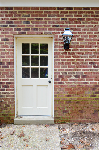
Our exterior light situation is a little ho-hum, as evidenced by this tiny fixture outside the back door on our garage (don’t mind the grimy green brick that’s screaming out for some scrubbing).
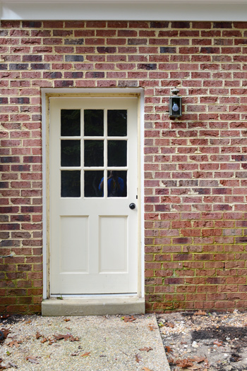
And yes, I realize the door itself is looking a little rough. It originally sported a rusty, loudly-banging storm door (not just a medium bang, this was SCARE-YOUR-NEIGHBORS LOUD) that we removed. So we’re getting ready to repair some of the trim and prime/paint it white to match the door in the sunroom veranda that we already updated.
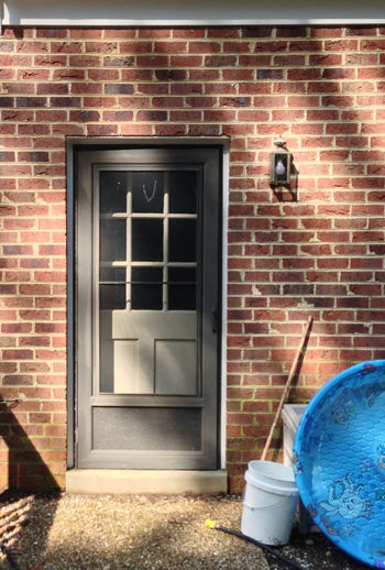
But let’s turn our attention back to the light. It was too small and very weather-worn, so we decided it was time to make an upgrade. Choosing the fixture to upgrade it with proved a bit more challenging than we expected. Maybe because we’re not really used to shopping for them. I think we might have bought three exterior lights in the course of seven years. So after hitting up a local outlet and some big box stores without anything screaming “I’m perfect!” at us, Sherry took the hunt to a few online sites to see what she could come up with. After about an hour of clicking around (and waaaay too many windows being open at the same time which led to not one, but two browser crashes) there were eight contenders:
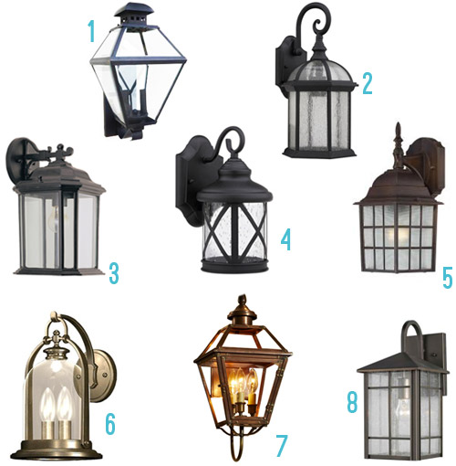
- Black lantern $69 here (inspired by the ones here)
- Seeded glass lantern $75 here
- Outdoor wall lantern $87 here
- X-Lantern $37 here
- Bronze cross-cross sconce $35 here
- Bronze lantern $79 here
- Antique copper wall light $219 here (purely just for eye candy, since it’s way above our budget)
- Bronze lantern $117 here
Making that mood board didn’t give us a eureka moment either. But what did was strolling through the lighting aisle at Home Depot and Lowe’s again, and discovering that Option #1 had gone on sale (down to $59). It had been my favorite all along anyways (Sherry was really into #6, but it was significantly smaller) and my argument for #1 was that we were looking for something large and in charge, and it was the second biggest of the bunch while also being among the three most affordable ones in the roundup. Sherry gave me one of those “hold on I’m thinking” faces and then said “ok, let’s do it.” And into our cart it went.
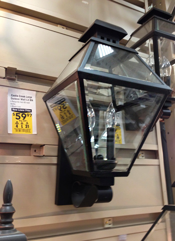
Installation was just like installing any other fixture:
- Step 1: Turn off the power
- Step 2: Remove the old one after staring at the wires to see how they’re connected (or even grabbing a photo of them with your phone if it’s your first light-switching job)
- Step 3: Connect the new one to the same wires the old one had been connected to
- Step 4: Tuck all of the wires into the backplate and use the provided screws to adhere the light to the house
- Step 5: Turn the power back on and make sure the light is connected well and working correctly
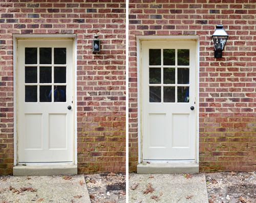
So installation went nice and smoothly, and you can see from this photo that it’s a big improvement. Well, not the door. Or that green wall. But at least the light is no longer rusty and small.
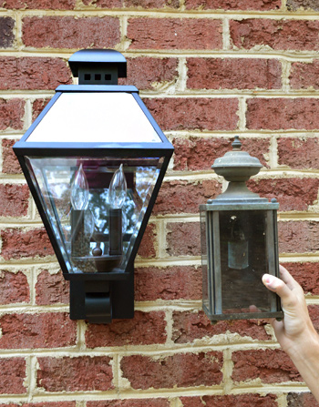
You think I’m joking about the size difference, don’t you? Here’s a side-by-side with the old fixture so you can see just how much more substantial the new fixture is compared to the old one.
We personally like an outdoor fixture that has lots of visual presence, so this guy is doing the trick for us. Just imagine this with a freshly painted door and non-green bricks and a nice welcome mat and some plants on either side. I know… that’s a lot of imagining. We have a long way to go back here.
I like this shot the most, since it helps to show the size of the light, along with the traditional shape, which we think is pretty fitting with the exterior of our house (we’ve admired it on a lot of our neighbor’s homes, and also were inspired by this photo of an outdoor space with similar ones). At one point I suggested that we put them in The Artist Formerly Known As Prince The Veranda Formerly Known As The Sunroom (we’re looking for four sconces to go on the posts in there to provide some eye-level light) but after holding them up they didn’t look right – so we’re still on the hunt for what might work in there.
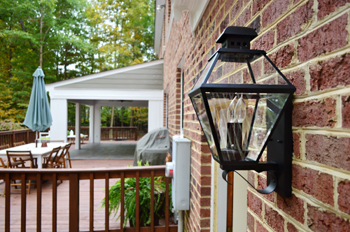
I’ll share just one more “after” photo of this guy because when I came out to take this picture I opened the door to find a herd of deer standing right outside. Of course they ran away at the sight of me.
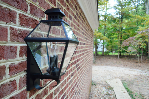
But they didn’t go far and still make an appearance in the background of this picture.
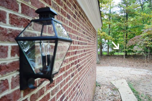
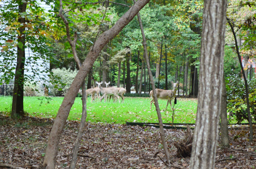
Here they are, just giving me the ol’ deer staredown, when I stepped a little closer. If you’re on the edge of your seat for more of my stellar wildlife photography (or are just a fan of Where’s Waldo: Deer Edition) we’ve got this post on Young House Life for your deer-loving pleasure.
Sorry I keep getting sidetracked. Lights. We’re talking about lights. And obviously that back door isn’t our only outdoor fixture. We’ve got one more wall-mounted one above our garage. It was also looking a bit worse-for-wear and was also on the diminutive side.
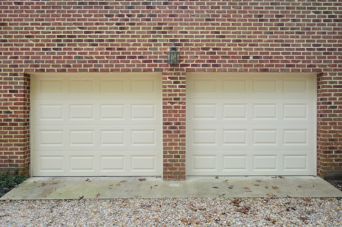
So we purchased a second one to match the one we added to our backdoor. And… the results were a little less impressive.
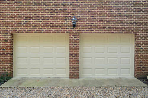
Even though it felt nice to have a sparkly new light up there – and the ORB finish commanded a bit more attention than the rusty gold – the size wasn’t reading as much of an improvement between those two giant garage doors (we’ll be painting those black or charcoal if that helps you visualize where things are going). And yes, we have more green stuff to attend to on that concrete driveway pad. Yeehaw, I smell some power-washing in my future…
But back to the light.
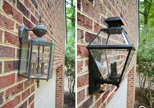
It’s not terrible, but it’s not exactly what we were hoping for. It just looks kinda lost on that big brick wall with those big garage doors. And I’ll admit we’re feeling a little defeated because of all of the lights that Sherry mood-boarded, it was among the largest of them all (it’s about 19″ high, and the biggest – and most expensive – was only 20″). Update: We also have a pergola planned for over the double garage and we want to add shutters to all of the windows on the side and back of our house eventually (as seen on Listy McListerson) so those are things to consider for this side of the house too.
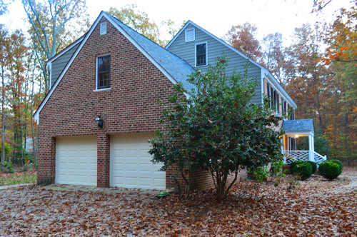
Part of us feels like we should just stick with this one for the time being and withhold judgement until we can do some other things to the garage side of the house (like the paint the doors). And the other half of us feels like we should just return it if we don’t love it there, and not settle for something that we might later end up regretting.
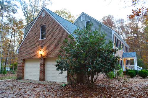
What do you guys think? Would you keep it or return it in the hopes of finding something better? Any tips for where else to look besides local lighting shops, Lowe’s, Home Depot, or Overstock?

Tina says
I’d check your local restore. There were a ton of huge outdoor lights at mine last weekend.
Leslie says
The back door looks great! This website is basically my mood board. So thanks for that!
Return the garage light if you don’t love it. It’s a totally different area and you may want a totally different look in the long run. Also, why feel “meh” when you could feel “hot DAYUM!!”? Which is obviously how everyone should feel about their outdoor lighting.
YoungHouseLove says
Haha!
xo
s
Megan @ Rappsody in Rooms says
Gosh, it might just be me or the pictures but I don’t think it looks too small. I agree with the earlier comments to try and make the other areas take on more emphasis. However, I’m a true believer in going with your gut so I say let that win.
Meredith says
$59 seems like a lot for something you don’t love, but it looks nice to me…
Also, spelling alert: it’s actually vEranda, not vAranda. :)
YoungHouseLove says
Thanks Meredith! All fixed!
xo
s
Britt says
I’m a huge fan of lights flanking garage door(s). Obviously, you guys have bigger fish you wanna fry right now, but how great would it look, down the line, to move the light (& a twin!) lower down the brick and on either side of the doors (or maybe a trio with one in between). And then build a beautiful white pergola spanning over the top, like you made at your old house! Ohhh the potential… ok I want to go home and work on my garage doors now… you see what you guys do to me?! ;)
YoungHouseLove says
Ha!
xo
s
Leigh says
I love the light at the back door, but over the garage just isn’t doing it for me! I think you need something larger, and maybe that hangs down, instead of sticking up. If you’re on the fence, I say return it and wait for something you really love, 60 bucks is a lot for a place holder, when you can add a little more money and get something that packs a punch!
Lisa says
Personally, I tend to like symmetry and consistency. If you do get a different light for the garage, you will have at least four different light fixture styles on your exterior (front porch, back door, garage, veranda). I think I’d keep the garage light so there is at least some consistency. Or, return both lights and try to find a shape/style that you like for ALL the lights, but that is available in different sizes! But maybe there is no such thing…hmmm, time for YHL to expand your lighting line to outdoor fixtures, and design your own!
Melissa Smith says
I agree with Lisa. The light is not the problem, it’s just that it looks lonely on that large wall. I think adding architectural details of some sort will help add balance. Maybe trim work around garage doors or even those iron work/ metal scrolly things flanking the light. Sit with it awhile – I know you will come up with something fabulous!
heather says
For the mossy green stuff, may i suggest wet and forget?
http://www.amazon.com/Wet-Forget-10587-Gallon-Remover/dp/B0019KSUG6/ref=sr_1_1?ie=UTF8&qid=1384528801&sr=8-1&keywords=wet+and+forget
We used it on our very old cement stairs that would take an hour of power washing to remove the algae. Within a week it had disappeared. It doesn’t hurt plants in the area, so that was a big plus for us.
YoungHouseLove says
Thanks Heather! Never heard of that! And thanks to everyone sharing links and tips today. So helpful!
xo
s
Janine says
This post really speaks to me because we had to get new exterior lights for our house (which has a very traditional, colonial look) and there just wasn’t any real choice. Everything looked the same.
(Also, $herdog 4evar! As soon as I saw light #6, I opened it in a new tab to get more info because YES. So pretty and just different enough. I’ve bookmarked it, no lie. We’re in the process of buying a new house that needs everything, in particular this light fixture.)
Anyway, I think the light between your garage doors is actually in the proper proportion to the rest of the garage. I realize that seems crazy because everything is so big over there (big doors! Big flat side of the house!) but if you went much bigger, I think it would start to look like there was a comically massive light, maybe even kind of like a mutant lantern.
Hilde says
I’d say hold on to the light outside the garage. It’s an improvement, it’s affordable and good-looking. But the brick wall over the garage doors looks huge – I’d suggest something to break it up a bit. Perhaps a portico/pergola of some sort?
YoungHouseLove says
Oh yes, pergola is on the down-the-line list!
xo
s
Donna says
I’d keep it for now, but I don’t do things nearly as quickly as you two so my “for now” could easily be a year or more! You can always put it on Craigslist or donate to the Restore when you do find the right one.
Thank you, thank you, thank you for showing us the green stuff, things piled next to the door, leaves on the ground, and for keeping it real!
Marcia says
Don’t hate me – I don’t think the placement is quite right. The light should be closer to the doors. Also, adding two more on either side of the garage doors would make it feel more substantial, but I like the light itself. Something more like this (I realize this is white and black vs. brick) http://www.pinterest.com/pin/283093526546917161/
YoungHouseLove says
Thanks for the links guys! They really help us visualize!
xo
s
MLB says
Marcia, that is the perfect link for placement of lights like that.
J&S, I have no idea what to tell you. I recently sold a house with the same problem and I never did figure out a workable solution, mostly because we had 1 tiny light centered in siding above a 2 car garage door. I didn’t feel like we would be able to patch the siding without it being obvious. Brick might be easier to repair as a mason could actually put in a few new bricks to close a hole. All that being said, I have no real advice, but I can’t wait to see how you solve this since it perplexed me for 3 years!
Justin says
I would return it, and get something more interesting like this:
http://www.barnlightelectric.com/gooseneck-barn-lights/gooseneck-lighting/the-original-warehouse-shade.html
or this
http://www.barnlightelectric.com/gooseneck-barn-lights/gooseneck-lighting/the-comanche-gooseneck-warehouse-shade.html
I’m a sucker for light fixtures (kind of like Sherry with throw pillows), and I think a big wall like that needs something a little more special and 3-dimensional.
There’s something about the current one that looks too flat.
YoungHouseLove says
I love lights like that but John thinks they don’t go with our style of house. I keep trying to find other houses like ours in our neighborhood with them to show him they could work but I haven’t seen any yet!
xo
s
Justin says
I think it’s time for some photoshopping festivities!
Amy @curlscoffee says
Do you have hanging baskets in the US? Alternative to more lights is add a hanging basket to the far ends so the doors and framed so to speak. Or I would add another light to it, either have one at each end/above each door or make it a row of three.
Amy x
YoungHouseLove says
That’s a fun idea too! Thanks for all the tips and suggestions guys!
xo
s
Gem says
I was just thinking that! If the light output is fine I’d go for some hanging baskets either end of the doors. That would also give some really nice colour in the area if you wanna stick with the white doors.
Megan says
I have to agree with Lisa and Peggy. I don’t think the light is the problem. I think its the lack of other things to balance it out. I say keep it. Worse case scenario you craigslist it. And I like it. :)
Shawna says
The light at back door is a huge improvement, but I definitely see what you mean about it feeling a bit off in the context of the garage doors. Though the size seems great, it seems like it’s much more upright, which is what leaves it feeling a bit disjointed from the line of the garage doors… From what I know of you guys and how you approach things, I’d say you’re not settlers… though you’re all about a phase 1/phase 2 approach, something like a light fixture isn’t something you wanna have to change out again, rendering the $59 (albeit a great price) wasted, even if you could craigslist it later, it’s only more work… So – all that being said, I say return the one over the garage, and maybe go for something of similar size or possibly even a bit bigger, but that hangs down, versus pointing up (i.e. in the style of #2, #3, #4, in the moodboard). Even better – take a look at the Portfolio Brayden 20-1/4-in Mystic Black Outdoor Wall Light at Lowes (came up under the ‘customers also viewed’ section for the light you purchased – here’s the direct link http://www.lowes.com/ProductDisplay?partNumber=338651-85992-LWS1204C&langId=-1&storeId=10151&productId=3822577&catalogId=10051&cmRelshp=req&rel=nofollow&cId=PDIO1) This one hangs and has a similar style to the one you purchased, without being matchy or distinctly different in style. Hope that helps!! :-)
Emily says
I think the new light is lovely in both spots. It has a great classic look. I agree that it looks lost on the huge expanse of brick but I don’t think it is the poor lights fault. I think you would be very hard pressed to find an affordable single light that would make a difference. I think there just has to be something added to the brick on the sides to break it up. Like this maybe, with the lights on the sides and another pergola http://foreverdecorating.blogspot.com/2012/04/its-all-in-details.html?m=1
I really think lights on the sides if the garage would look very nice and less like a little lost light in the middle. But that would probably involve re-wiring through brick, which sounds daunting. However you decide, good luck with this design dilemma!
Shelley says
I agree with Lisa. It’s not the light that’s the problem. Add some shutters and what about some hinges on the garage doors after you paint them (kinda like this: http://www.pinterest.com/pin/117093659031686441/ or this: http://www.pinterest.com/pin/397372367091162284/ (your doors would be charcoal, though) some plants, large pots, etc. and I think you are set!
Sooozi says
Isn’t it hard to find a decent outside light! Not sure why, but so many are really ugly and expensive. I recently was looking too, and for some weird reason the only one I liked out of about 50 choices was also heavily discounted – yey!
(PS veranda misspelt twice in entry)
YoungHouseLove says
Thanks Soozi! All fixed!
xo
s
Liz | Hogs Ever After says
I like the light itself…but I am with you that it doesn’t feel 100% omgthisisperfect right. It is like it is just a smidgen too small or too high. Your old light fixture was more hangy than standy, and I think that is why the placement of the fixture seems a little on the high side. If you added a pergolaport, it could offset that. Or maybe hang the new light fixture upside down? Jk…kind of.
YoungHouseLove says
We do have a pergola in the plan down the line over the double garage, so that’s something to think about!
xo
s
Sunnie says
I agree with Liz….I think a fixture that is more hangy as opposed to standy would look better. That’s just my 2 cents :)
Amanda T. says
I would probably return it if you don’t LOVE it. It seems I’m always settling for things I don’t LOVE and then the more I walk by them the more I start to despise them. :)
YoungHouseLove says
You guys give great advice! Thanks so much for weighing in!
xo
s
Betsy says
My only tip would be to get outdoor lights that are open at the bottom – that way you don’t have to deal with cleaning out the dead bugs that tend to collect in them! I had to switch out some old, rusty bug-filled lights on my deck, and it was so wonderful to never have to clean the new lamps out.
tasha says
Get what you love! Don’t settle this is your forever home, (that’s what I keep telling myself lol we just moved in and have been renovating our dream 60’s ranch) looked for weeks and found my perfect outdoor light from home depot, installed yesterday! LED and motion detecting we LOVE it!
http://m.homedepot.com/p/Hampton-Bay-Lumsden-Wall-Mount-Outdoor-Black-LED-Motion-Sensor-Lantern-NTSW30030LBL-MS/203830178/
Rachel says
Haha I knew that ya’ll were going to pick that one when I saw the mood board.
I’d keep it over the garage for now. It wasn’t a huge investment and it looks better (and I’m guessing provides better lighting) for the time being. If you decide to do something else within the next year you can probably sell it on Craigslist and get a little bit back for it.
Marcia says
Ok – I’m having some errors on my side of things so please ignore if I repeat myself. Don’t hate me – I think the placement of the light is off. I think it would look better closer to the doors. Also, more lights on either side might beef it up. Finally, the lower lights would also leave you room to possibly add a pergola like you did with your last house. That would definitely add interest to an otherwise expansive brick wall.
YoungHouseLove says
Oh yes, a pergola is definitely on the down-the-line list! Might make sense for us to think about that when choosing this light though, so good call!
xo
s
Colleen says
Honestly, I don’t like either. You guys have way more flair than the stodgy carriage lantern style.
Teresa says
I like the light on the back wall, not so much on the garage. If it’s already feeling like you don’t like it, it’s going to grate on you more and more in the future.
Martha says
There is a home improvement store chain in the midwest called Menard’s. It’s sort of hit or miss, but they seem to have some larger outdoor lights in the 25″ range.
http://www.menards.com/main/outdoor-lights/wall-lights/seagull-lighting-1-light-23-black-incandescent-outdoor-wall-lantern-with-frosted-hatch-pattern-lens-glass/p-2182997-c-7545.htm
http://www.menards.com/main/outdoor-lights/wall-lights/photon-3-light-23-black-finish-incandescent-outdoor-wall-lantern-with-clear-beveled-glass-panels/p-2181136-c-7545.htm
http://www.menards.com/main/outdoor-lights/wall-lights/photon-1-light-25-black-fluorescent-outdoor-wall-lantern-with-frosted-seeded-glass/p-2178388-c-7913.htm
Downside: Some of these lights get pretty pricey as they grow in size!
YoungHouseLove says
Thanks for the links and tips guys! So helpful!
xo
s
Mandi says
I like the backdoor fixture just fine – it’s a good upgrade. It does seem a little underwhelming between the garage doors – but I wonder if the issue isn’t so much the actual fixture (it’s a good splash of light for its spot) but that additional lights are needed. I like the idea of two more matching lights, flanking the exterior of the doors. It would give more “path” lighting to the walkway in front of the garage, too – it must get some use, when guests park there and walk around to an entry door, at least. It’ll get a lot more as kiddos “stuff” needs picking up every evening in the warmer months, too.
Tamisha says
I think you could do a big old barn light (kind of like this one, which is very budget friendly: http://www.lowes.com/ProductDisplay?partNumber=337508-76219-AAW1691AM&langId=-1&storeId=10151&productId=3822569&catalogId=10051&cmRelshp=req&rel=nofollow&cId=PDIO1). Sherry could break out her spray can of ORB and make it nice and dark. I don’t think you have to commit to a colonial style for over the garage….
YoungHouseLove says
Alas, I can’t get John on board with that style with our house. He just thinks it doesn’t go.
xo
s
Lesley Parent says
I say go for a light that is on an arm that arches up and then hangs downward to place it more between the doors instead of on that huge expanse of brick. Just my 2 cents. Love the traditional look by the back door though.
Melanie says
I can’t help you with any technical issues mentioned by other commenters, as that’s really not my area of expertese, but I can tell you if I think something’s pretty! I agree that in the first shot of the garage doors the light looks a little ho-hum, but in the next shot I really liked it. My vote is keep it for now and wait until you paint the doors and do any other updates on that side of the house and then see what you think. Also, the lazy part of me says you already bought it and installed it, so you might as well leave it…but that’s why I don’t have your job. Haha.
Catherine says
Where did you guys find the light that you hung in the carport of House 2? Maybe try there again?
I agree with Lisa, there’s definitely things to do on that gable-end. It just looks a little empty at the moment. Remember, the middle makes no sense!!! Someone who knows about these things once said that lol
YoungHouseLove says
We tried that lighting outlet, but no dice this time. Might have to make another trip!
xo
s
Dawn says
A double light like this one would give more presence at the garage. http://www.dhgate.com/product/double-slider-outdoor-balcony-fashion-wall/157311597.html
Jenna says
I think the bigger issue with the garage is the light placement. It would look a lot more balanced to have lights on either side of the doors. But, that sounds like a pain to resolve so I would just live with it, and complain every time I drove up! haha. Maybe some decorative carriage door attachments would spruce that up? I plan on doing that on my double garage. I love the look!
Angie says
Leave the light. I think once you get the doors painted it will pop more:)
Lynn says
Not that you asked, but I don’t like the one at the back door. Sure it’s larger and more in charge, but it doesn’t line up right with the door frame. If that’s the fixture that had been in place, I think it would have bugged you guys and you would be thinking about replacing it with something that created a more pleasing balance and line. And since the garage fixture was inspired by the first one, I vote to return them both.
Meghan says
I don’t think it looks bad, it just doesn’t look as great as expected. Personally, I would paint the doors, and put trim around the outside (on the brick) of the garage doors (and around that back door too). I think that will help tie in the style of the light. However, I would probably return the light and get one that hangs down, carriage lamp-style. And you could check ebay, kijiji (do you have that in the states?), and craigslist for something more suitable. Or the Habitat for Humanity ReStore.
Molly says
Just a quick note of commiseration … I had to order 5 outdoor lights for our new house on a short time line and smaller budget. Three of the 5 are on the back of the house where there is a 1-story addition, so the scale was fine. I ordered 2 sizes of the lights for the front door thinking the medium would be perfect and the large ridiculous. We ended up with the large and I still drive by and think they could stand to be a couple of inches bigger. So difficult to estimate the scale of these things!
Rachel Laree says
I would keep it for its cohesiveness! I think they look great, and to me the one by the door seems a teensy big, but really they look GREAT!!
Isabel says
I have three doors and almost identical lights, although mine have the pole thing at the bottom. We replaced the one next to the front door when we painted but since we weren’t ready to commit on the porch ones, I took the old ones down, pulled them apart (fearing the whole time I would lose ones of those ridiculously tiny round screws, they must have been a thing in the 70s!) gave it a good cleaning and ORBed them. The difference I must say is pretty significant, especially when you clean the glass. So my $.02? Return it, give ORB a try on the old one and hold out for the ONE.
Tara says
I think you need more lights by the garage doors. Most houses seem to have a light on either side of the garage doors, so in your case 3… although that seems like it might be excessive. Just a thought – maybe a little photoshop mock-up would help?
YoungHouseLove says
Thanks guys! Can hardly keep up with comments but we’re reading each one and so grateful for the ideas!
xo
s
Nayla says
I’m all for using something like that on both sides but to stick w/one in the middle you’ll be better off w/a larger, lower one. Same classic shape would be quizonel newbury (just for an ex). They have 4 sizes. The 3 light one is large. 4 is huge. Use masking tape for measurements to guide and stand back to see what size works. Big fixtures are expensive but less than rewiring costs… :)
Angela N says
I would probably return it. If I don’t find I want to look at something and ooo and aaah it then it probably wasn’t the right choice. For instance, earlier this summer I replaced our garage lights (funny but I actually used #4) and I LOVE them. I can’t stop looking at them. They make me happy. Crazy, I know. I think what stands out for me is that your garage doors only have one light. I have never seen only one light. The space is so expansive it feels like maybe you need some lights on either side of the garage door or something?
ryan says
I’m not a big fan of the light over the garage and it sounds like you’re not either. I say take it back and wait for “the one.” A pair of flood lights would be much more functional and they’re always great over a driveway. They’re not the most attractive, though. What about a gooseneck light over each door (that, of course, would require a bit more work) from Barn Light Electric? I LOVE their fixtures!
http://www.barnlightelectric.com/
YoungHouseLove says
Thanks for the link!
xo
s
Kristen G says
What if you had some sort of decorative metal base, with a hole in it? It could be solid or decorative metal. There is a house in my neighborhood with a decorative, open metal horizontally oriented *thing* with the centered garage light mounted on top of it, and it really creates visual interest and beefs up the light. Google “decorative iron plaques” and see if that appeals or makes you want to poke your eyes out.
Amanda K says
I would return it and look for something that is night sky friendly. We have one above our garage that has a light sensor, so it comes on when it gets dark and stays on all night, but only casts light toward the ground. We love it!
Crystal says
I vote for more lights on the garage–
http://www.pinterest.com/pin/255790453809005268/
http://www.pinterest.com/pin/12033123977213200/
http://www.pinterest.com/pin/8655424257677999/
I also wonder if you have considered something like you did on the carport at your last home. Or some sort of trim to frame out or create a header for the garage doors. You might also consider trying to add some detail to the doors.
Like they did:
http://www.pinterest.com/pin/247275835764020979/
For the back door, I think you can add more decorative elements beyond a light to perk up that spot. I always like a bench or chair by a door. Plants, a gardening work station, or something functional for you.
I’d look at the front of the house for inspiration– the dental molding and black shutters are gorgeous– can you add more dental molding detail over any of these doors? Full length black shutters on the back door (might mean you need to make a commitment to put shutters on all the windows in the back).
Whoa nelly, a couple lights for about $100 has sent my mind in some very expensive directions! Electrical work for more lights, shutters on half the windows of your home, trim work all over the place… Have fun!
YoungHouseLove says
Thanks for the links and tips guys! So helpful! I’m reading everyone one of them and taking notes over here!
xo
s
Heather says
We have a good handful of salvaged lights in our garage, and there is one particular one (I think that is still up there) that I think would look great. Son of a bee sting! Haha.
YoungHouseLove says
You lucky dog!
xo
s
Heather says
I totally wrote that before I finished reading the post haha. I was just flabbergasted. That said, to answer your question at the end, I would say your options depend on how strongly you really feel about this particular design choice. My experience is that there are certain things in our home I wouldn’t have bought at retail, but I like it enough on sale/salvaged, etc. that I’m cool with it (because whatever it was didn’t really matter to me to begin with or only vaguely cared). There are other items however that if I had to see them every day I would want to really love it regardless of how cheap we could get something that I didn’t like as much. Counters are one of these items for me. I really want to love my counters because I’ll be using them every day. The lights on our garage were something that were “yeah, I like those enough”. I definitely ruled out some comparable priced onces, but I wasn’t about to buy the $200 light I really liked when I got one I was totally okay with for under $50.00.
So I guess, if you don’t love it, and it’s something that you really want to LOVE to keep, then return it. If you’re okay with the balance between style and price and it honestly won’t bug you, just keep them.