There are definitely some projects that we’ve taken on (and hired out) along with a few accessories that we’ve brought home that stand out in our mind as particularly worthwhile, especially because they were all around $100 (some much less, some a bit more) and they made a heckova difference in our casa’s function and form department. Without further ado, our top ten list:
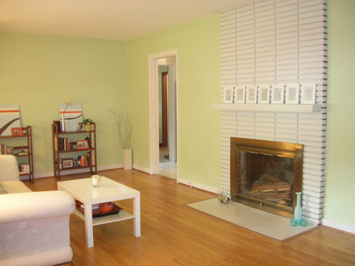
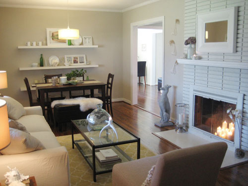
1. Widening the two doorways between the living room, the kitchen and the den (we paid a mason around $100 to help us with the den wall since it’s load bearing and had an electrician help us widen the living room wall since there were some wires in the way- also to the tune of around $100). The difference is night and day. Going from two standard 33″ doorways to over 5′ wide thresholds between all three spaces opened up our entire floor plan and allows so much light to bounce around all three rooms. Totally worth $200 (heck, we would’ve paid $500!).
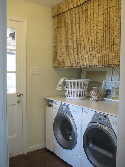
2. Adding plywood, blinds and oversized frames to our laundry nook. For under $100 we created a clean-lined plywood countertop for folding and sorting, added concealed storage with the use of two cheap Walmart blinds, and obscured ugly wires and pipes on the back wall by leaning two oversized picture frames in front of them (showcasing $1 Target wallpaper as art). It was all easy & cheap- and the result is surprisingly polished looking (you can find more details on the subject right here).
3. Getting an outlet added to our bathroom. Yup, it came without a single outlet in there. I used to blow dry my hair in the sunroom (which was pretty darn cold in the winter). But for $65 we got an electrician to add a clean little white bathroom outlet that still thrills us to no end. It’s such an improvement in the function department! No more sending guests to the sunroom to blow-dry…
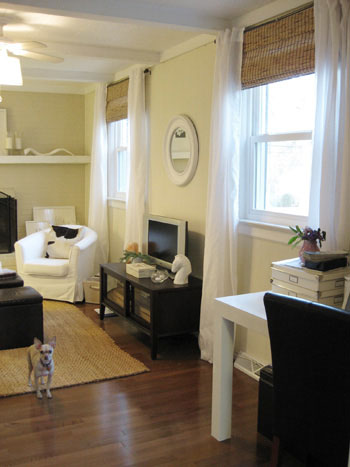
4. Curtains. End of story. Beyond painting a room, we think hanging floor length curtain panels high and wide above your windows is the quickest way to add height and airy softness to any room. Plus we only spent about $45 for the six breezy extra-long Vivan curtain panels from Ikea in our den and our living room. Can’t beat that deal with a stick.
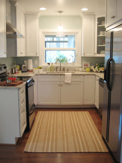
5. Tossing a jute rug down in the kitchen. After the renovation dust cleared our white kitchen was shiny and lovely, but it was missing a bit of warmth and texture. Enter a cheap little jute rug from The Company Store to the tune of $34 on clearance. Now we’re cooking.
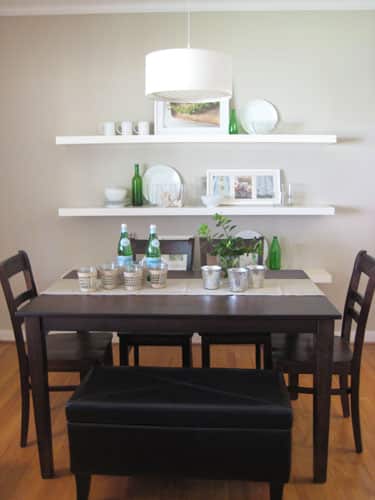
6. Popping a pendant light over the dining table for an instant “zone” that previously never existed. Again, to the tune of around $100 we had an electrician drop a fixture box above the dining table that we dragged into the corner of our living room right off of the kitchen and bam- instant dining area. It adds ambiance, even more light (which always makes a space feel open and airy) and eons of polish that couldn’t have been achieved by swagging a plug in light over the table.
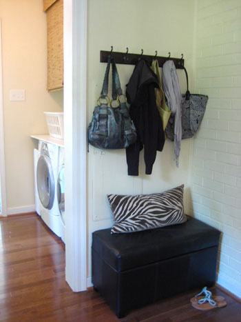
7. Storage ottomans. We can’t get enough of them. We have two leather cube ottomans in the den, a longer bench ottoman in the mudroom area, another bench ottoman at the dining table, two more leather cube ottomans under the console table in the living room and even a jute ottoman in the third bedroom. Between all of that concealed storage there’s more than enough room to hide every single file, bill, receipt, board game, printing supply, and every other unsightly item in the entire house without the purchase of a big industrial filing cabinet. And they even double as extra seating in a pinch (read more about where we stash and store everything right here).
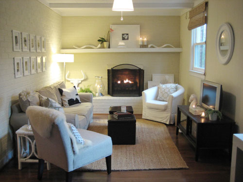
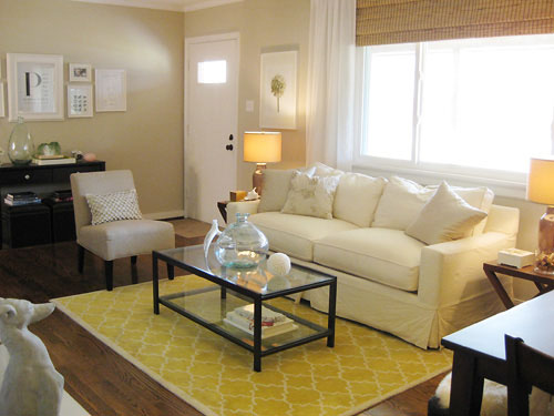
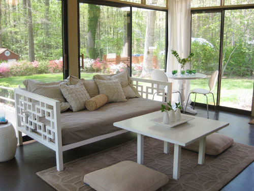
8. Trolling those thrift stores. From our living room’s $35 glass coffee table (that looks like a dead ringer for this $400 Pottery Barn version) to our $20 secondhand Ikea armchair in the den, we’ve saved hundreds if not thousands of dollars by giving thrift store finds a second life in our home. We even snagged the base for our sunroom’s pedestal table that we rebuilt (read more about that here) at a local thrift shop (check out two of our favorite local haunts here and here).
9. Adding built-in details on a dime. One of our favorite afternoon projects that seriously changed the entire feeling of our home was installing the three long Ikea lack shelves on the wall behind our dining table. They instantly added architecture and clean-lined style to a formerly blank wall (and at $29 each they’re even cheaper than DIYing them with thick lumber that you’d then have to finish to get the same look!). Plus we never have to hang anything on that wall again, leaning frames and displaying favorite items is now as easy as pie.
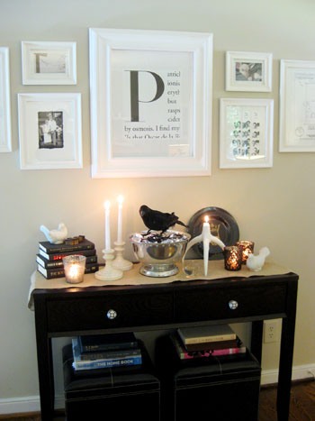
10. Whipping up cheap art. You’ll find at least a few framed pieces in each room of our house that are completely DIYed (and each one set us back less than $5 a pop). Sure, they’re not museum worthy, but they’re customized and meaningful so they still feel special. And did we mention they were cheap cheap cheap? From framed keys in a shadow box and a vintage map with pins that highlights our adventures to black and white photos we printed at CVS and framed in a grid above our sofa, we’re no strangers to stashing something behind glass and calling it art. And you know we love a customized monogram (or two) as demonstrated by the big P in our living room and the sweet little first initial monograms above our bed…

So that’s our little roundup of the ten things that seemed to make a world of difference around Casa Petersik… all without breaking the bank. Here’s hoping they spark a few ideas for you guys! And while we’re on the subject of getting more bang for your buck, we’d love to know what projects or purchases have changed your house for the better without emptying your wallets. A simple coat of paint on the walls? A jaw-dropping accessory you snagged on the cheap? A DIY project that you whipped up with your own two hands? Do tell.
Update- We finally created this Shop Our House page to help you hunt down any furniture/accessories that you see in our house, along with all of our paint colors.

Angie L. says
Your blog makes me happy!
Megan says
Love all of your cheap wall art! Question: where do you guys get all of those white frames & mats?
YoungHouseLove says
Hey Megan,
Ikea is the place that we get most of our white frames followed closely by Target (many of them come with mats). Hope it helps!
xo,
s
Barbara says
What color did you use on your living room walls?
YoungHouseLove says
Hey Barbara,
It’s Glidden’s Sand White (which has been discontinued in some stores so just ask if they can look up the formula on the computer and whip up a gallon for you). Hope it helps!
xo,
s
kelly says
I was wondering where you guys purchased all your storage ottomans. I love the idea of hiding as much as possible away! :)
Thanks for the post – lots of good stuff!
<3
Kelly
YoungHouseLove says
Hey Kelly,
Most of our ottomans are from Target with the exception of one from Bed Bath & Beyond (the long bench one at the dining room table is from there, because we needed something taller for the table and the Target ones weren’t the right height). Oh and the woven ottoman in the third bedroom is actually from Michael’s of all places. Hope it helps!
xo,
s
Marcy Tate says
All I have to say is that your house is so awesome and you made the smartest moves with everything that you do. I wish I could think up some great ideas for my home like you guys do. You have such a great natural talent!
Stephany says
Hi Sherry, love all the amazing changes in your home! Especially the framed art, can you tell me where you buy your white frames? Everytime I go out to buy them they seem to be very expensive.
Thanks,
Steph
YoungHouseLove says
Ikea! And Target too. Mostly Ikea though because they come with those great white mats and only cost around $9-19 or so. Hope it helps!
xo,
s
Katrina C. says
I went to go buy a Power Wheels off of craigslist and this man just started loading more things in my suburban than the Power Wheels. A ton of coffee table Van Gogh books. Free and I mean Free Pottery Barn Shelves that are now hanging in the dining room. A PB girl’s rug and plenty of Pier 1 plates to have the entire White House over for dinner. I love thrift stores! I found a brand new PB Bulldog bottle opener for a dollar! I almost picked up a PB chair and a half for 35 bucks, but it was already sold..argh…the one that got away..
ashley says
I just have to say that I stumbled on your blog about a week ago and I am completely addicted. I have wasted insane amounts of time browsing through all of your posts and now want to redo everything in my house. ha! I love everything you have done in your house. It’s fun and eclectic with out being over done. It just feels so light and airy.
I wonder if you would mind giving me your opinion on something. We have a really small house and have tried to make good use of our space, but the color scheme is a little too dark. I am trying to lighten things up, but I have all dark wood and I also have a sage couch, none of which I can afford to replace right now. I am trying to redo our living room, but am not very good at this kind of thing. After seeing your site, I found some bamboo roman shades on overstock for an awesome price and also got a jute rug on ikea to replace our dark rug patterned rug. Now I am trying to decide on a good color scheme. I can’t decide whether to do a colorful theme (like some orange & lime) or if I should try to stick with a neutral theme and just have a few hints of an accent color. Which do you think would work best with the sage couch and also brighten up the living room?
YoungHouseLove says
So glad you found us! It already sounds like you’re well on your way to a light and airy living room (thanks tithe new blinds and rug). When it comes to a color scheme, I’d go for tans, chocolates and sages (which you already have) with some nice crisp white (curtains, hardcover books, accessories) and some pretty pops of gold and burnt yellow-orange (pillows, accessories, art, maybe even lamps to flank the sofa on matching side tables). It will be cheerful and happy without being too intense or clashing with what you’re working with. Hope it helps!
xo,
s
Goannatree says
This post is fabulous!
I have been moving around (3 different continents in 4 years) lots lately so i am renting again which means i can’t do some of the built in details but this post has given me lots of ideas for decorating the great little two bedroom place i am moving into in a couple of months!
I love your style! I love the framed word art and creative pieces – it is what makes them perfect for you. So much more interesting than the cookie cutter “design prints.” Where do you source your frames?
YoungHouseLove says
We snag all of our frames at Ikea and Target (where they’re always cheap and clean looking). Hope it helps!
xo,
s
Pam says
Just happened to find your website when I googled granite countertop photos and came upon the blueberry incident on your kitchen countertops. Curiousity got the best of me when I saw the “our wedding” tab as I love weddings! I am totally in awe of your website and your home transformation. I love your decorating style and all of your rooms staging/colros. We are currently in the midst of a kitchen remodel ourselves and can’t decide on countertops/colors, but after seeing your kitchen, I love your colors and making a small space look big and inviting! We have already had our kitchen cabinets redone and have gone from a dark walnut to an ivory. We have a Saturday trip scheduled in April for Ikea too!! Best of luck with your new arrival!!! Your lives will be forever changed and blessed! Take care~
Karen says
LOVE your blog! I noticed that you painted the brass surround on your fireplace white. Did you use a special type of paint for that? I’ve been wanted to do the same thing on mine.
YoungHouseLove says
Nope, metal takes paint really well so regular latex paint or even spray paint would work. You can even pick up heat resistant spray paint at your local home improvement center. Hope it helps!
xo,
s
haverwench says
We’ve done several small-budget, big-impact projects like this–both indoors and out. Some of my favorites:
1. Refinishing our bathroom vanity, changing the hardware, and painting over the old laminate top. It looks like new and we spent about $35 total.
2. Replacing our old, cruddy kitchen sink with one we got on Freecycle for our favorite price, nada! (Pictures are on my blog: http://ecofrugality.blogspot.com/2010/06/score-another-for-freecycle.html)
3. Planting a whole bunch of day lilies in our front yard that we got for free from a neighbor who dug hers up. They really transformed the space.
4. Also in the front yard, planting a little cherry tree ($65) and surrounding it with a curved walkway built out of pavers that we scrounged out of our back yard (the previous owners left behind all sorts of bricks and such).
5. And most recently, repainting our shutters, going from a dingy, peeling white paint (which barely showed up against the light blue house) to a deep, rich red. The shutters really pop now and the whole house looks more striking, and it cost less than $25.
Amanda says
I discovered your blog about a month ago and have been working my way through all the posts since then and I LOVE it! I love all of your inexpensive DIY ideas and have gotten a lot of inspiration to make our recently purchased first home “ours.” The first thing we did was copy your laundry nook idea. We just completed it this morning and couldn’t be happier. A piece of plywood, a few coats of clean white paint, some leftover fabric, and a few unused frames made it a whole new room (on the cheap)! We’re actually considering not replacing the bifold doors because it would be such a shame to cover it back up. We can’t wait to implement more of the ideas we’ve found here. Keep the inspiration coming, Youngsters!
haverwench says
Our biggest makeover on a budget? Definitely our downstairs floor, originally covered (well, mostly covered–it was ripped in places and didn’t actually reach all the way to the walls) in icky black sheet vinyl. Our original idea of staining the concrete floor beneath was scotched when we pulled up the vinyl and saw what condition the underlying floor was in (stains and dings everywhere). And installing new wood, carpet, tile, or laminate would have meant adding an underlayment (since the floor was uneven), which would have 1) knocked about half an inch of vertical space off an already low-ceilinged room, 2) possibly interfered with the baseboard heaters, and 3) added up to serious bucks. So, thinking outside the proverbial box, we redid the concrete floor with a treatment borrowed from the Budget Decorator: brown paper! Yep, one big roll of kraft paper and four gallons of water-based polyurethane (and a lot of hours spent kneeling on the concrete) was all it took to give us an attractive, durable and definitely unique floor. My blog has pictures of the work in progress (http://ecofrugality.blogspot.com/2010/02/world-biggest-craft-project.html) and the end result (http://ecofrugality.blogspot.com/2010/03/coming-out-of-hibernation.html).
Janice says
Love your blog – love your style. Question: I am trying to ‘update’ and 80’s bungalow with some laminate flooring and new paint. My baseboard and trim are in good shape and are real wood pine, but they are the 80’s plain style ( 2 1/4″ everywhere). I am trying to do this update as cheaply as possible as well. I feel that the baseboard for sure should be changed to a wider style ( say 3 1/4″), but do you think that I need to change the trim as well. Just to put in new (real wood) trim ( that is still only the 2 1/4″ stuff, but a little fancier) will cost about $1000. I am wondering if I can leave the old trim, replace the baseboard with a wider style, and new paint on everything; what’s your opinion on this? (PS I would rather spend the extra money on crown molding for the extra punch). Hope you can help.
YoungHouseLove says
Agreed! There’s definitely no need to replace the trim! Crown molding will give you way more bang for your buck. Good luck!
xo,
s
Ashley says
I love your book and this site! I just bought it and I am really excited to eventually start on my own projects. My bf and I are looking to move to NC in the next few months and we are hoping to buy our first house on a very tight budget. I am sure your book will come in handy! I was wondering when you bought your first place if you kept a breakdown of cost…basically an approximate cost to renovate the house. Room by room or overall cost? How long did it take to finish it how it appears in the photos posted?
Everything looks beautiful and although I know it was on a budget, it looks expensive! You both are so talented!!!
Pointers for saving money and spending/cost when it comes to buying and redoing your first place would we amazing!
YoungHouseLove says
We didn’t keep any room by room breakdown for that house, but we did know an overall tally, which we shared here. As for how long it took, it was a 4.5 year process, so it’s a nice long learning curve. Just take it day by day! And for more saving money tips, check out our Projects page (see that tab under our header?) and scroll down to the money-saving category. Hope it helps!
xo
s