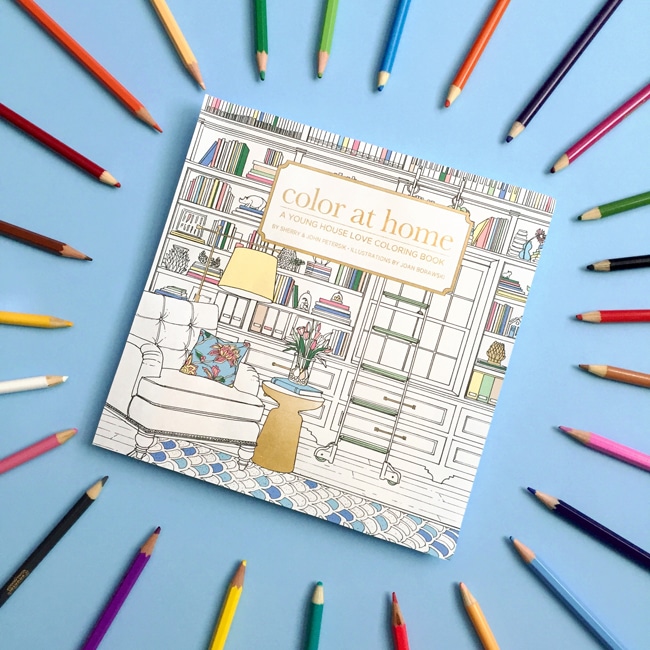
Our coloring book has been out a couple of months now, and I realized we haven’t really talked about how it got made. I can’t say we ever really thought about how a coloring book is made, so finding ourselves in the middle of doing one was quite the surprise.
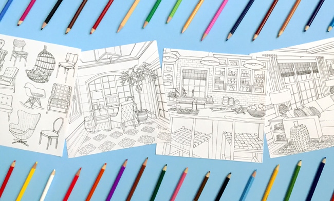
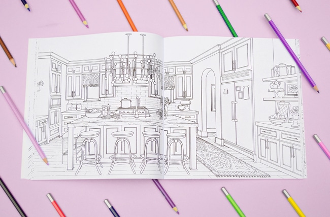
In case you missed our previous mentions, Color at Home is an 80-page coloring book for adults, filled with everything from full room drawings, decorated vignettes, design mood boards, frameable art prints, and collections of things like pillows, chairs, and lighting. It’s $12.99, but places like Amazon have it for under $10 now (stocking stuffer alert!). We’ve got some peeks at it throughout this post, but you can also browse pictures on Instagram under #YHLColoringBook, like these below. We’re loving the gold fridge. Very Snoop Dogg.
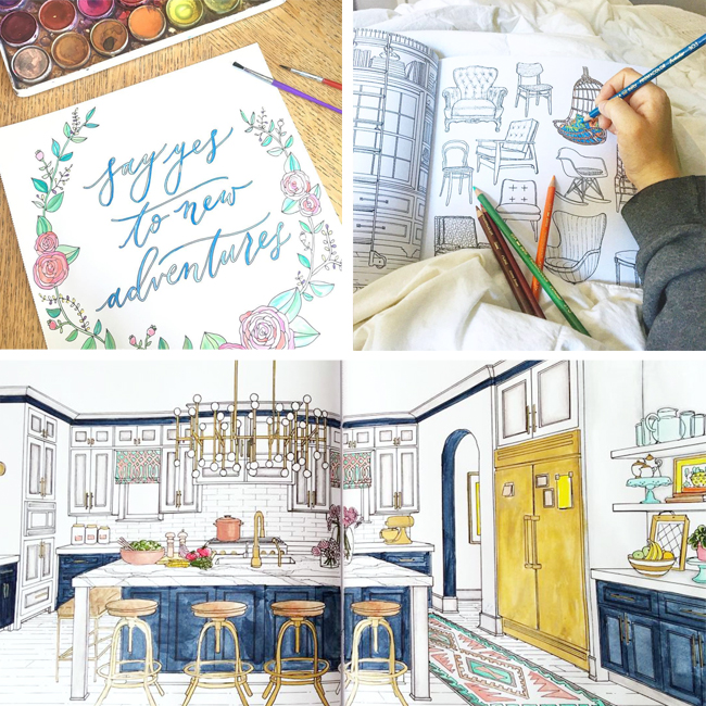
A coloring book publisher (the husband & wife team behind Paige Tate & Co) approached us with the idea and we realized it could be a cool, low-risk way for people to experiment with color (without repainting their walls or buying new furniture). It can definitely build confidence and break through paint paralysis if you try out new color combos or decorating schemes on paper before committing to them in real life. Plus it can be majorly relaxing and fun to press pause on real life and dive into a virtual world of pretty rooms you never have to dust or vaccuum.
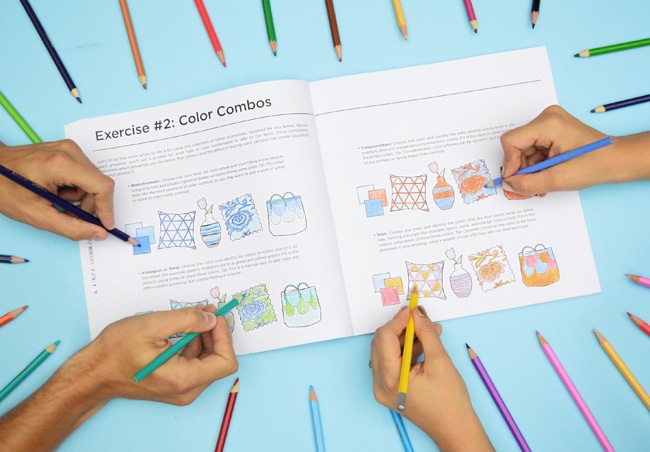
One might wonder how you “author” a coloring book, especially when you’re not the one doing the actual drawing (we left that in the capable hands of interiors illustrator Joan Borawski, who was amaaaaazing to work with). Our roles, apart from the brief written parts (including some color tips and warm-up exercises in the front, one of which you can see below)…
…can probably best be described as serving as the “art directors.” Our first task was to determine the overall outline and flow of the book so that we knew what was going on each page. That meant we had to nail down how many rooms, vignettes, mood boards, quotes, botanicals, collection pages, exercises, and other things we wanted to include. To keep it all straight we created an 80+ page master document for the illustrator that we sent back and forth with revisions, notes, and all that good stuff.
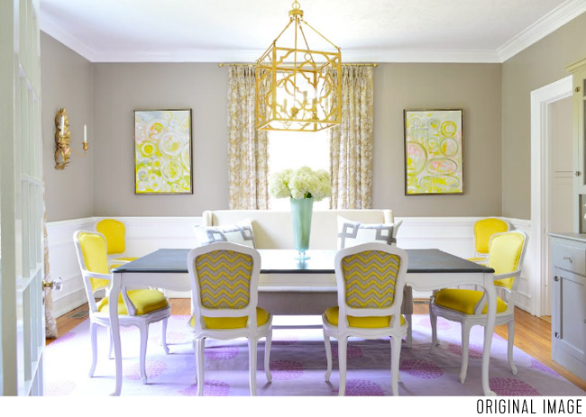
Sometimes we created mood boards or a collage of accessories and furnishings for the illustrator to render together in a room, and sometimes we began with a photo (maybe even one from our house), so there are some spaces you guys might recognize. For example, here’s a photo that we started with for a dining room spread in the book. It’s actually an alternate view of a dining room that we featured in our second book.
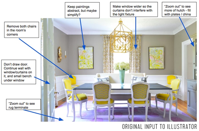
We quickly realized early on that we couldn’t assume that every photo we liked would automatically translate into an interesting black-and-white line drawing (some got extremely busy when converted to an illustration, and others looked a lot more plain without color). So with each photo we provided a second version of the picture with notes on top of it for Joan, the illustrator, about what we thought should be tweaked. Here’s an actual example of one we sent:
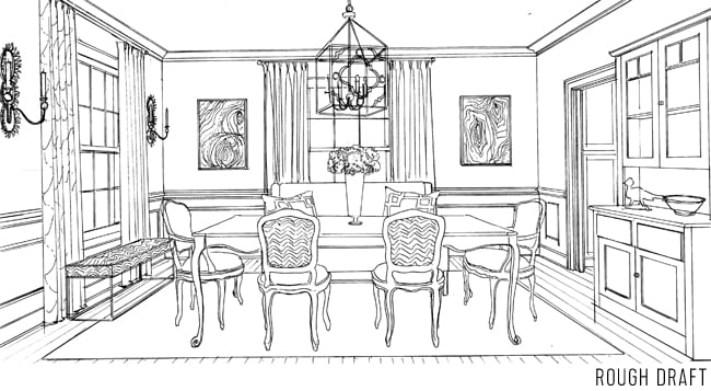
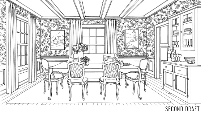
Often times Joan would send a rough sketch back before she added all of the detail (like the rug) – just so we all could figure out what was working and what else should be changed/nixed/added as the illustration came together.
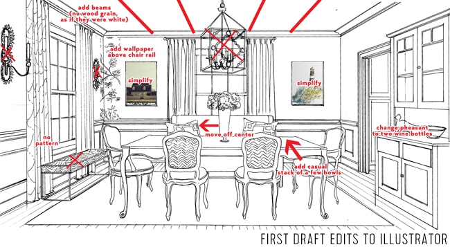
This was one of the first pages we did, so we were all still learning how to anticipate what would become problematic or hard-to-color in the final version (like the sconces or art being too ornate, or the challenge of walls and ceilings that might look too blank and boring to color). Even little things like the realization that a perfectly centered flower arrangement or chandelier would get lost in the book’s binding popped up in those early days. So we’d mark up the rough drafts and send them back to Joan with more notes:
Back would come another version. Can you believe she draws all of this stuff by hand?? It was amazing to watch these rooms come together.
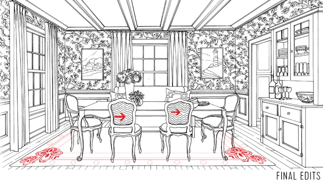
In this case we had another round of edits, like adding in the rug pattern that was intentionally left out until the final stage (we all agreed to see what the wallpaper did to the illustration before choosing how busy/ornate the rug should be). Sherry and I mocked something up in Photoshop (below) and also added arrows to indicate where we’d like the chevron on the chairs to be cleaned up a bit for the final version.
A little while later, back came the final version that’s in the book:
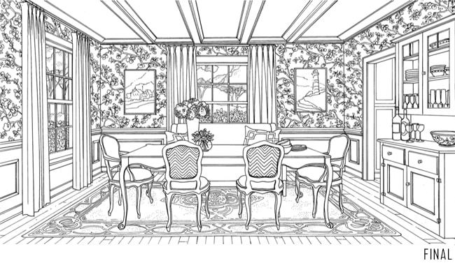
So this particular image made quite the evolution from its original photo inspiration.

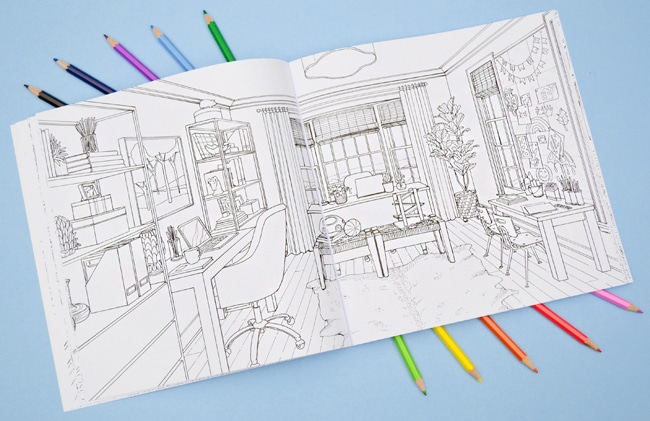
Some pages were more involved, and some were less. For instance, we included some rooms from our own house – like our living room, dining room, bedroom, sunroom, and office (below). We wanted those to feel familiar, but we still found that we need to add art or adjust a few things to make them either more detailed or less busy in line drawing form.
We are SO EXCITED for people to get this book and start filling it in. We had some folks test-color it, and it has been awesome to see everyone’s spin on things (different color schemes really can make the same rooms look so different). So please please PLEASE share your pages with us on social media. Just tag them with #YHLColoringBook so we don’t miss them.
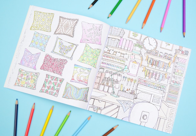
Oh, and one last thing. I know you seasoned colorers probably have your preferred markers or colored pencils for these things. But for anyone diving in for the first time: we’ve found that colored pencils (even basic Crayola ones) are pretty error proof for the whole home decor subject of the book. We’re able to make more “realistic” shading and blending with pencils, whereas markers often ended up looking too primary for us (kinda like a room Caillou might live in). Although as demonstrated from the gold fridge pic near the top of this post – pro coloring book folks can definitely make watercolors and markers work amazingly well. And even if you’re not a pro, there are plenty of pages in here to practice…
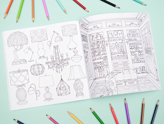
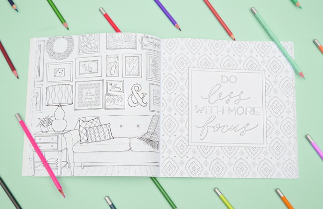
Speaking of the pages, they’re thick premium paper and they’re also perforated, so it’s easy to tear out sheets if you prefer working that way. It also makes it easy to remove some of the frameable quote pages that we included, which mimic art seen hanging in nearby full-room pages (like the “Do Less With More Focus” art you can see in the room on the left below). We thought it would be fun to include a few larger versions of the art you see hanging in a room, so you can color it, rip it out, and hang it yourself if you’re so inclined. We also have a few botanical pages that you can color and frame as well.
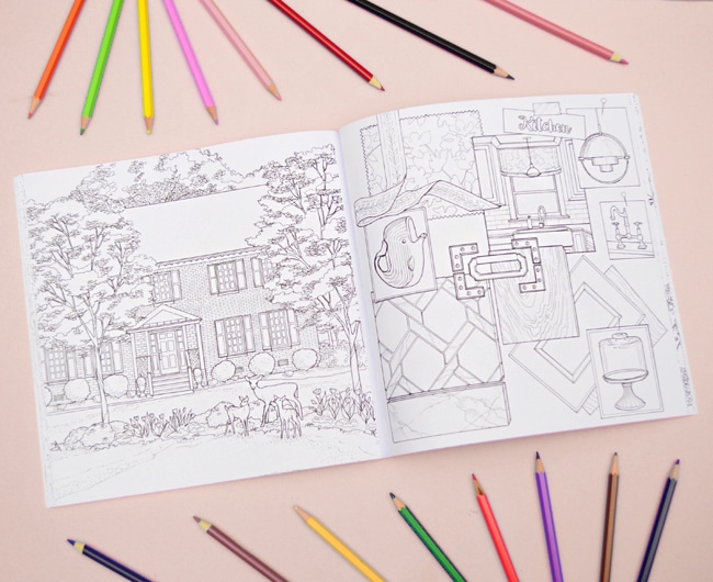
There are also some mood board pages so you can experiment with color combos and patterns that way, too. For example, if you know what accent colors you want in your kitchen, you could color the fabric swatches with those tones, and then try out some cabinet and tile colors to see how you like them with those accent colors – just to see how it all might look together.
We hope you guys enjoy Color at Home as much as we enjoyed making it. It was such a fun, random project to be part of and we couldn’t be more psyched that it’s out (all of the order links are below for ya).
Amazon | Barnes & Noble | Books-A-Million | Indigo (Canada)
Amazon (UK) | Book Depository (Worldwide) | Fountain Books (Autographed)
And a special thank you to our editors Reagan and Sada at Paige Tate & Co and our amazing illustrator Joan Borawski, who all feel more like family friends than work friends. Couldn’t have done this without you guys. #colornerdsforthewin
*This post contains affiliate links*
