We waited over 6 years to start our bathroom renovation and now, nearly 6 months later, it’s fully completed! And you know what that means – the ensuite bathroom curse that we discovered over the last month definitely seems to be in play (more on that here). All jokes aside (but really, is the curse a real thing, because it seems like it might be?!), let’s put all of this waiting to an end and get to the goods. Including a source list and a full budget breakdown at the end of this post!
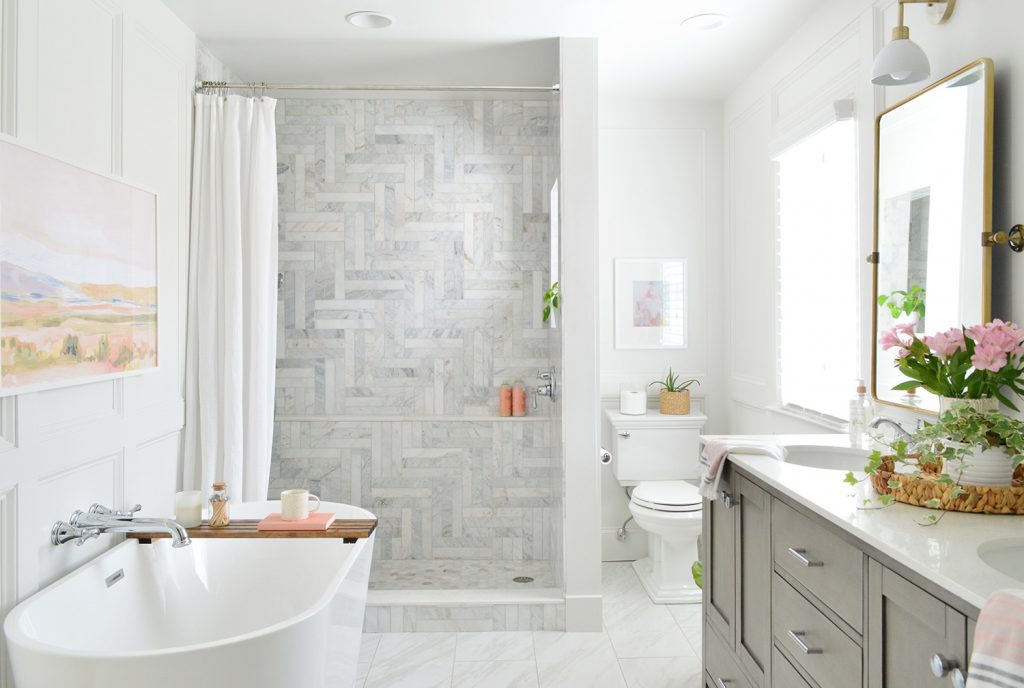
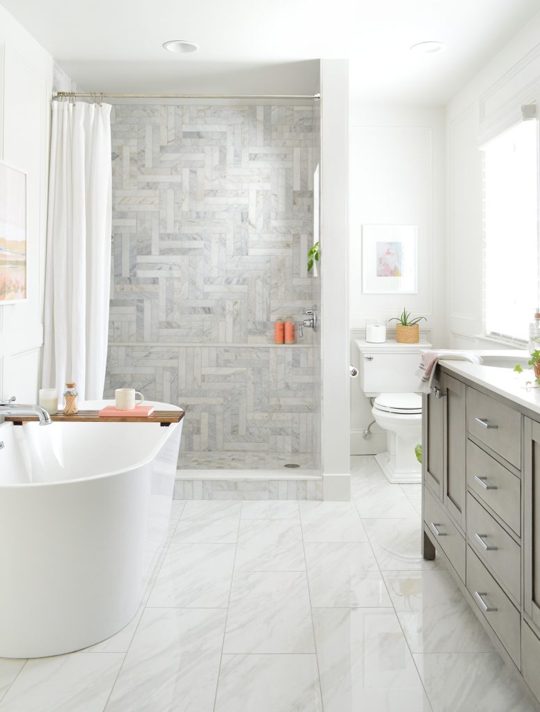
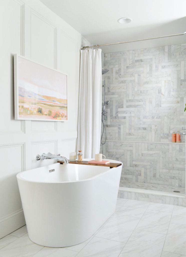
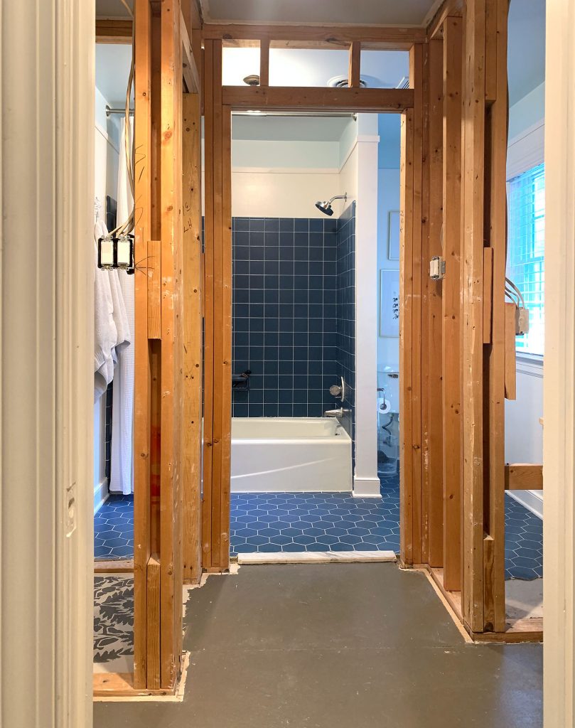
Believe it or not, the “after” photo above was taken in virtually the same spot as the “before” picture below. As we said in our kick-off post, the #1 goal of this renovation was to bring a bright open feeling to this previously dark, cramped, and overly-walled-off bathroom. It’s kind of insane how much of a difference it made to open this space up.
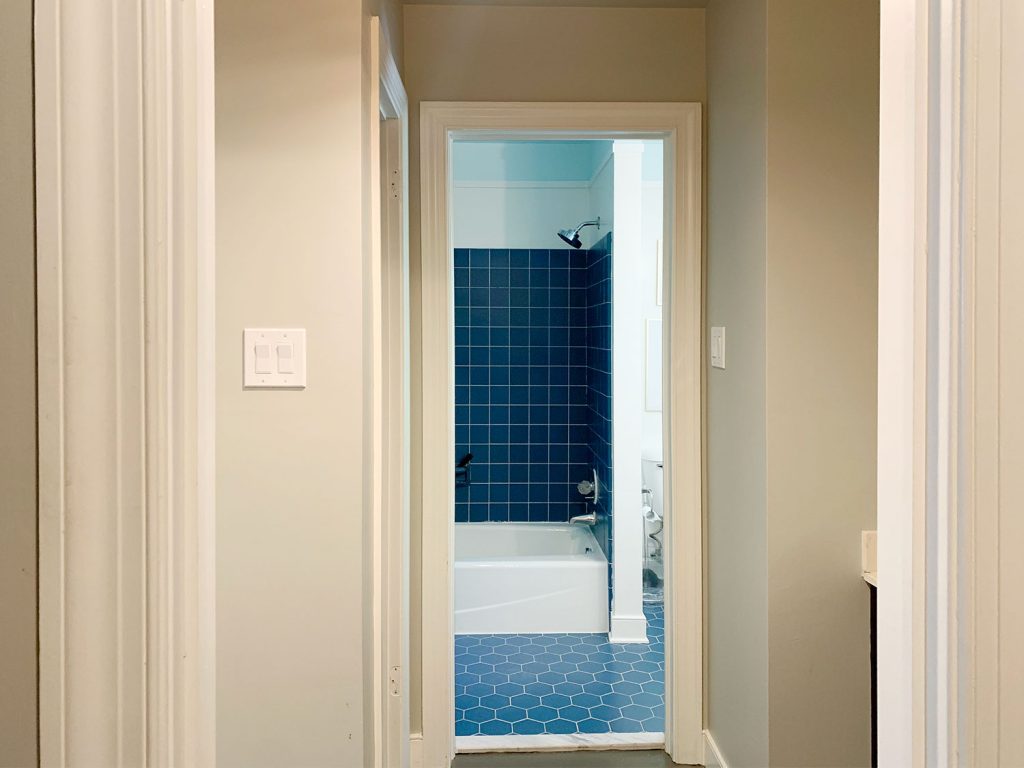
In the years leading up to this project, we schemed dozens of new layout ideas and complex rearrangements to make space for the highest priority items on our list, like a freestanding tub, a walk-in shower, and a more functional closet. So it’s funny to us that ultimately we did pretty much ZERO rearranging. The shower stayed in the same footprint. The toilet didn’t shift a centimeter. Even the double vanity just ended up where two single vanities previously existed (albeit they were separated by a wall before). You can see more in this floor planning post.
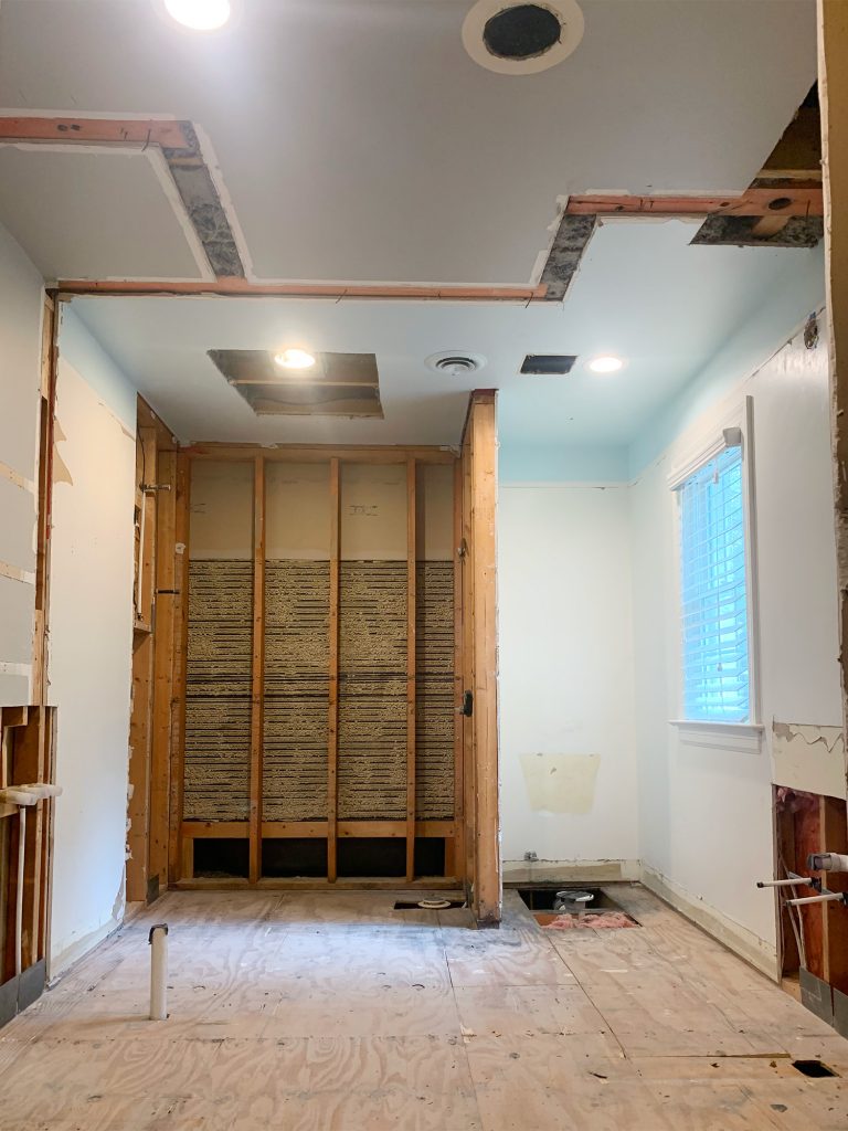
Simply knocking down the walls made us realize that we had way more space than we realized – and we didn’t need to reinvent the wheel layout to get what we wanted. We basically turned the old linen closet into a spot for the tub and VOILA! Of course, the actual process of executing all of that was less presto-change-o and still had its challenges (I’m looking at you shower tile!), hence a whopping six month makeover timeline. But using some of the stress & cost reducing strategies that we outlined in this podcast episode really paid off, meaning we not only enjoyed the outcome of this renovation but the actual process of it too.
The Vanity Area
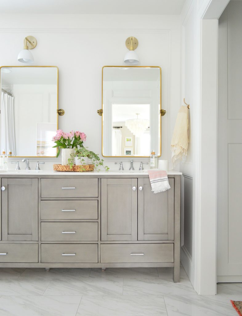
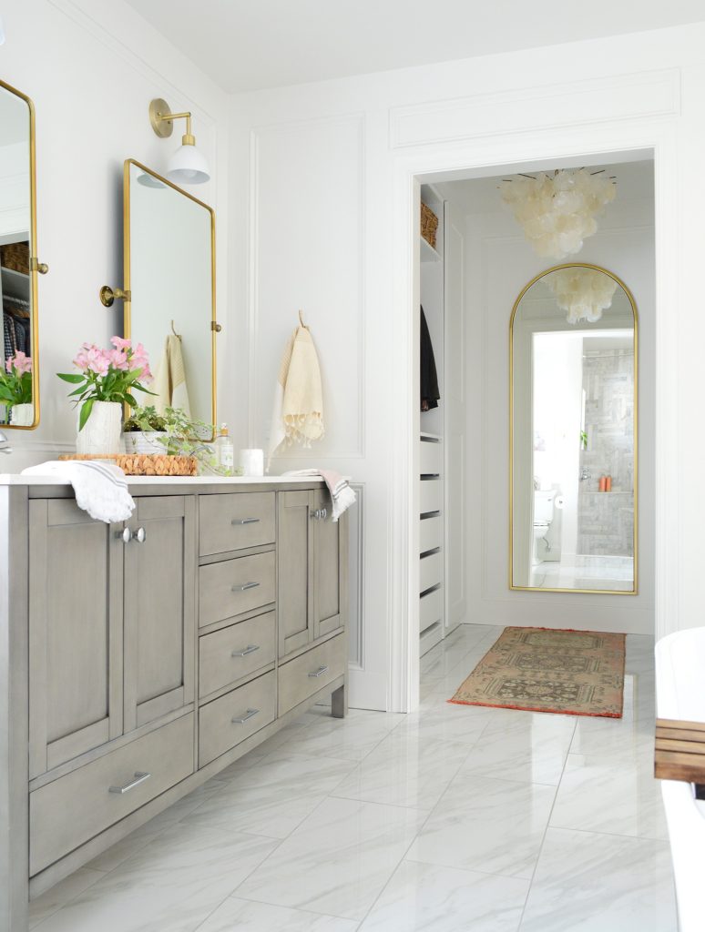
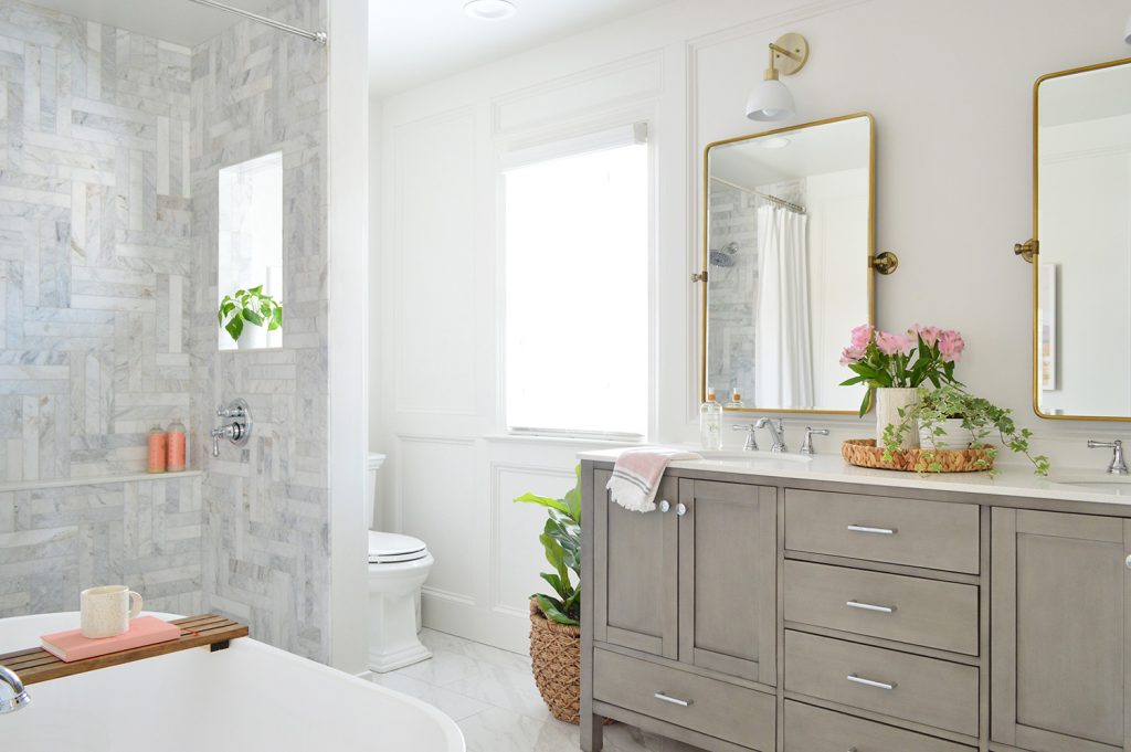
Let’s take a spin around the room and point out just a few of the decisions / sources as we go. We used a store-bought double vanity that came with a quartz countertop (it’s the “weathered gray” finish). It came with brushed nickel hardware, but we swapped it for these polished chrome pulls and knobs instead. You may have heard us debate painting the vanity on the podcast, but the original color really grew on us. And since we’re selling our house, it felt best not to cover a factory-finish just because we personally wanted to experiment with something different. We still got to pick a new color for the already-painted hall bathroom vanity, so everything felt like it worked out well.
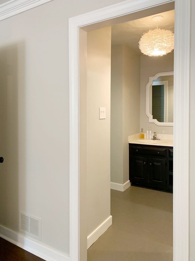
For reference, here’s a couple of previous shots from this same vantage point. The left image below is from back when we bought the house in 2012 (hello carpet in a bathroom!) and the right picture is how we lived with it for several years after a few “Phase 1” updates – like building out some vanity shelving and painting the subfloor.
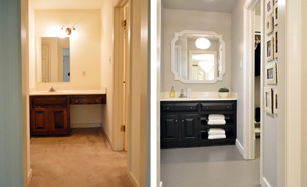
That right picture above is literally the view that we had from our bedroom for the past 5 years, so the after below feels like a pretty major visual upgrade.
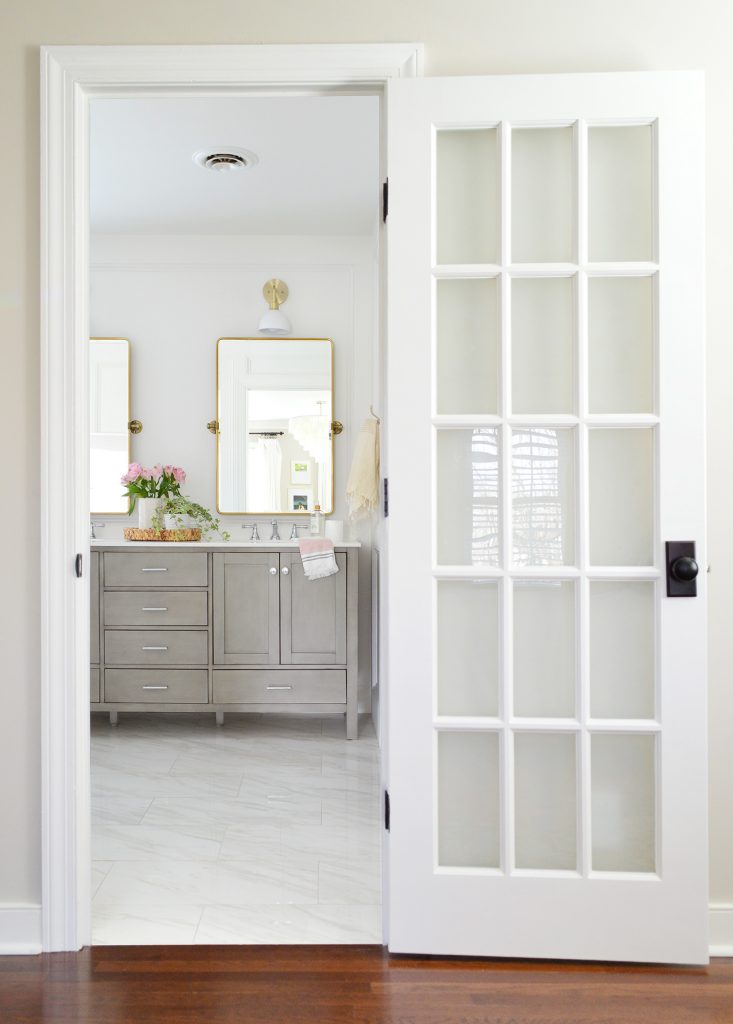
Functionally it’s also a big step up, simply because we now each have a sink to call our own. Technically we had two sinks before, but since they were separated by a wall we didn’t use them as “his and hers” sinks. The one across from the toilet was used pretty much just for hand-washing (and my beard trimming because, well, I’m a gentleman) and the other one was for everything else so we shared it.
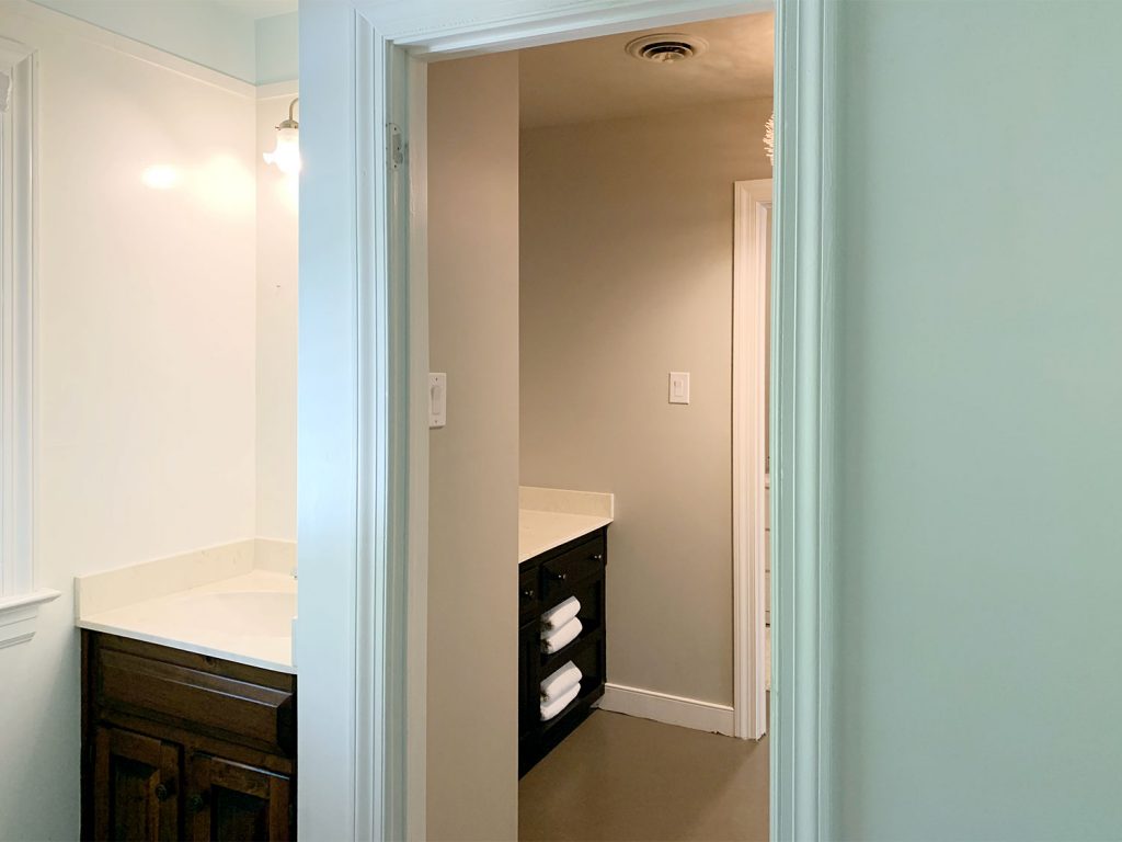
It wasn’t the worst thing in the world, but now that we each have our own sink with our own stuff located closer to that sink, it’s nice. Since Sherry does her morning face routine in the kitchen (due to it involving various food items like vinegar & coconut oil) and puts makeup on in the car, I probably spend more time than her at our bathroom sink each day. But now that we DO have separate sinks – and nothing is separated by a wall – we’re glad it was a feature that we didn’t have to give up in our renovation priorities. Fits with room to spare.
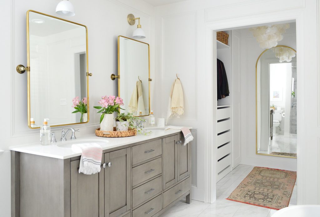
We also got a lot of feedback from our 51 house showings this weekend (!!!) that the en-suite bath & closet were many people’s favorite spaces, which was really nice to hear. More on how those showings went will be in this coming Monday’s podcast – we have a lot to tell you!
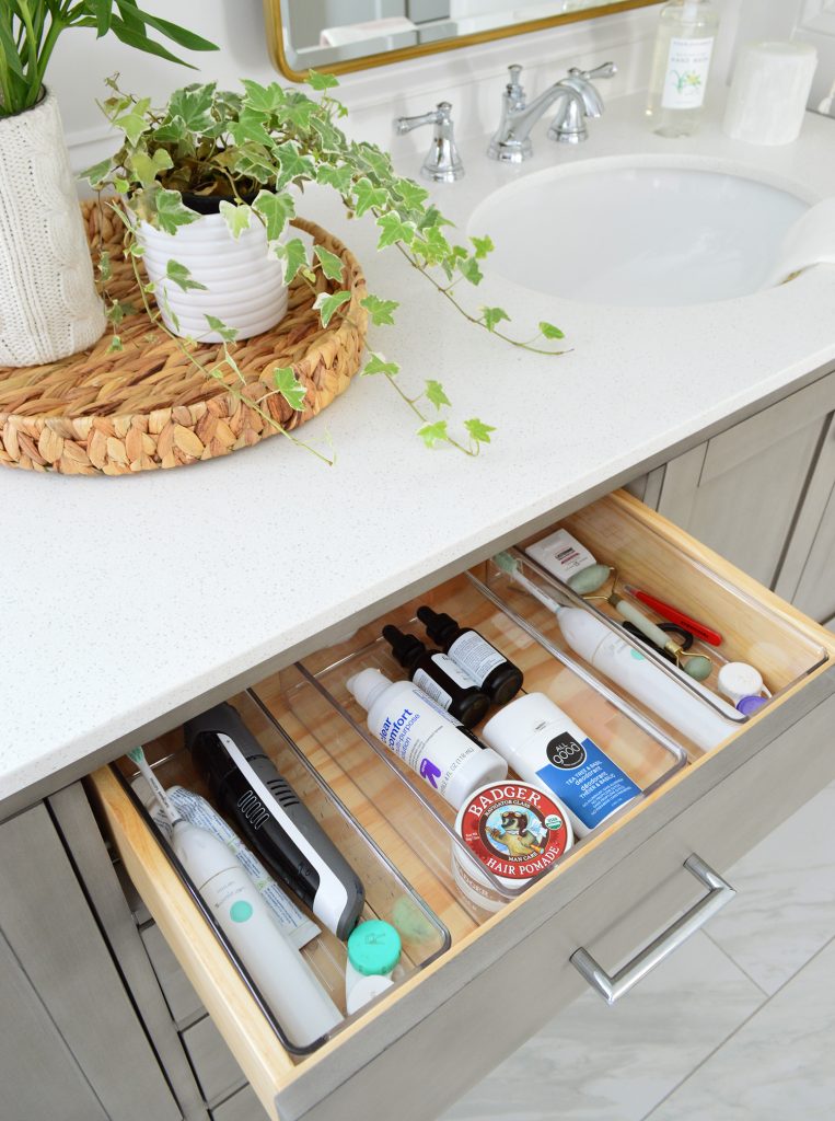
But back to the new bathroom vanity. We’re not people with a ton of toiletries, so we were able to corral all of our daily stuff together in the top drawer (the left two bins are mine, since I use that left sink, and the right bin/sink is Sherry’s). The other drawers house lesser-used items (first aid, sunscreen, etc) and the under-sink cabinets store essentials like toilet paper and, well, mostly just toilet paper.
Since the room has so many cool tones, we knew things like the brass pivot mirrors and the brass sconces would add some nice warm contrast. The lights are actually our design for Shades of Light (you can see our entire lighting collection here).
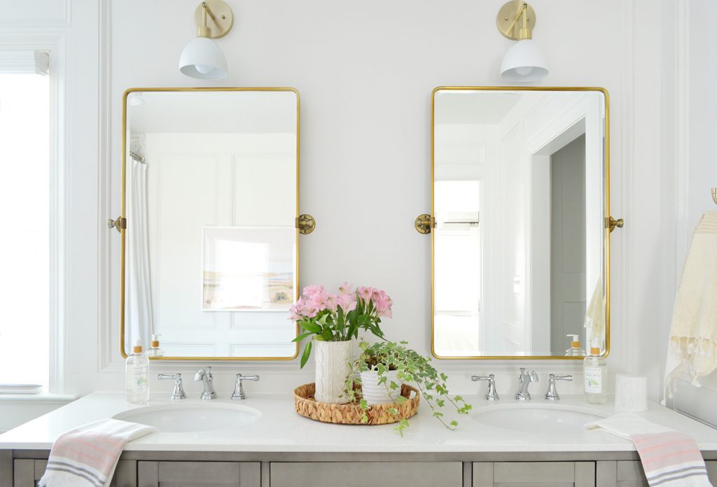
Sherry talked on Instagram a while back about a tip she heard from Shea McGee about keeping similar metals together on the same eye-line. So for this area we kept everything on the wall a warm finish (lights, mirrors, towel hook = all brass) and everything on the vanity a cool finish (faucets and cabinet hardware = chrome).
It’s not a hard and fast rule, but it looked the best when we held various things up. We tried a chrome towel hook for example, but it just looked kind of wrong to our eyes with the gold mirror so close to it. And we held up some gold hardware for the vanity, but there was so much of it that it felt like it was fighting with the mirrors for attention, so chrome fit in better down there and lets the mirrors be the focal point.

The Toilet Nook
Now let’s talk about the toilet area. Because why not? It’s a bathroom and a toilet is an unavoidable topic.
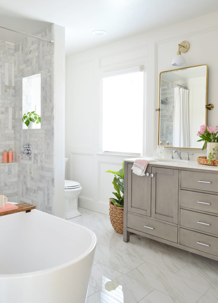
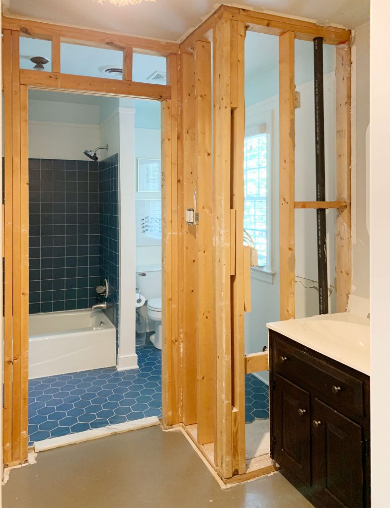
I wish I had a better “before” of this angle, but I think this mid-demo picture actually gives you the same sense of how closed off this view was previously. Not that a clear view of your toilet is important (you actually may want the opposite) but in our case, taking these walls down also meant an obstructed view of the window – which is our only source of natural light in this entire space (and it was formerly completely blocked by the wall).
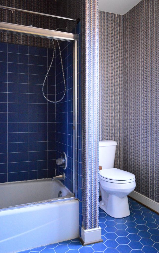
We’d already done our best during our “Phase 1” tweaks to make this bathroom feel brighter (like removing the dark wallpaper, nixing the grimy shower door, and painting (nearly) everything white. So we had already made some big leaps from where we started when we bought the house.
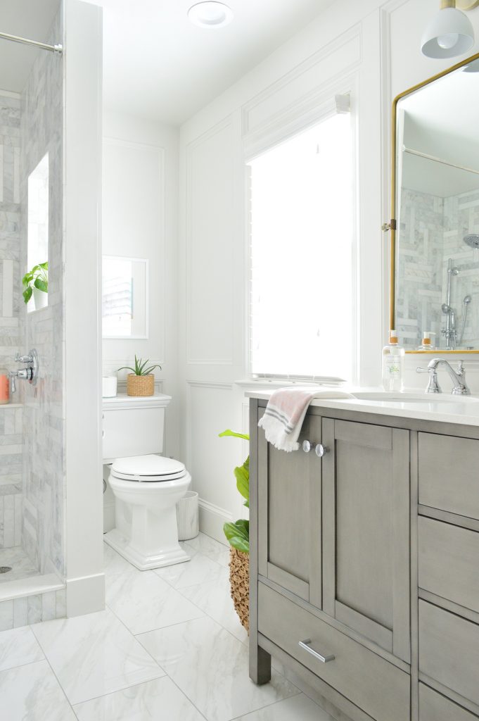
I know for some people that a private water closet (you know, when the toilet is behind it’s own door) is a must-have in an en-suite bathroom. It wasn’t high on our list (we’ve never had one in any house that we’ve owned) and whenever we tried to put one into our floor plans it either blocked all of the light from our single window in here – or squeezed out higher priority features, like the separate soaker tub. And because we would much rather have a separate soaking tub and large walk-in shower than a toilet in its own little room, it was easy for us to let go of that and stay focused on keeping the room as open and light-filled as possible.
Oh and having the closet off of the bathroom = questions about “if someone is using the toilet then can someone else not go into the closet and get ready?” This is a non-issue for us. We get ready at different times and have lived with this exact same closet-open-to-bathroom layout for 6 years and like it. But do whatever makes sense for you. If it was an issue we could have put the entrance to the closet in the bedroom instead of having access through the bathroom, but we love showering and then walking into the closet to get ready. There’s also a toilet in our freshly updated hall bathroom, which is right behind our bathroom – so in 6 years we have literally never had an issue with toilet use not being private in our house. There’s also a third potty downstairs if you’re worried ;)
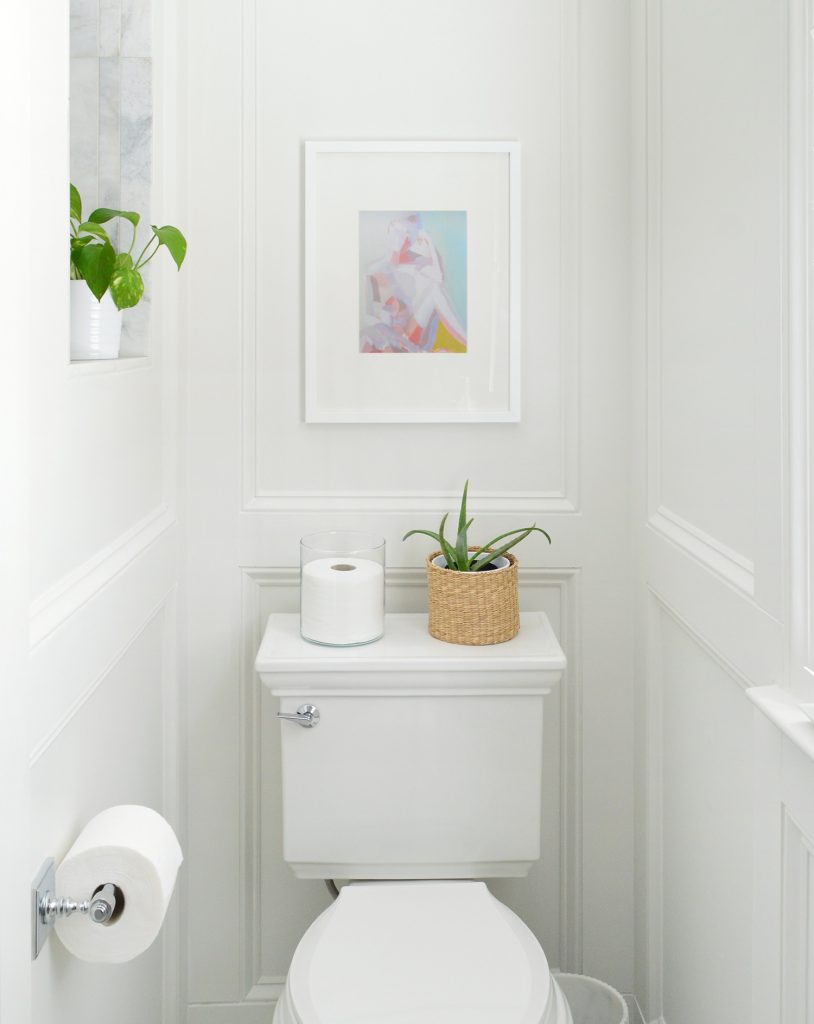
As for adding a little flair to the throne (who doesn’t want that?!), we were able to make the toilet area easier on the eyes thanks to our DIY molding treatment and our favorite toilet (which kind of mimics the molding detail actually). So dare I say we turned this zone from crappy to happy? OH, I DARE. I said it and I meant it.
Okay now let’s move on to the real stars of this room: the shower and the tub. Where to start, where to start… so hard to pick a favorite.
The Shower
That was a lie. I have a clear favorite (it’s the shower) so I’m starting there. If Sherry were writing this post she’d start with the tub and it would be 5,789 words long about how much she adores it, but I’m the boss of this post.

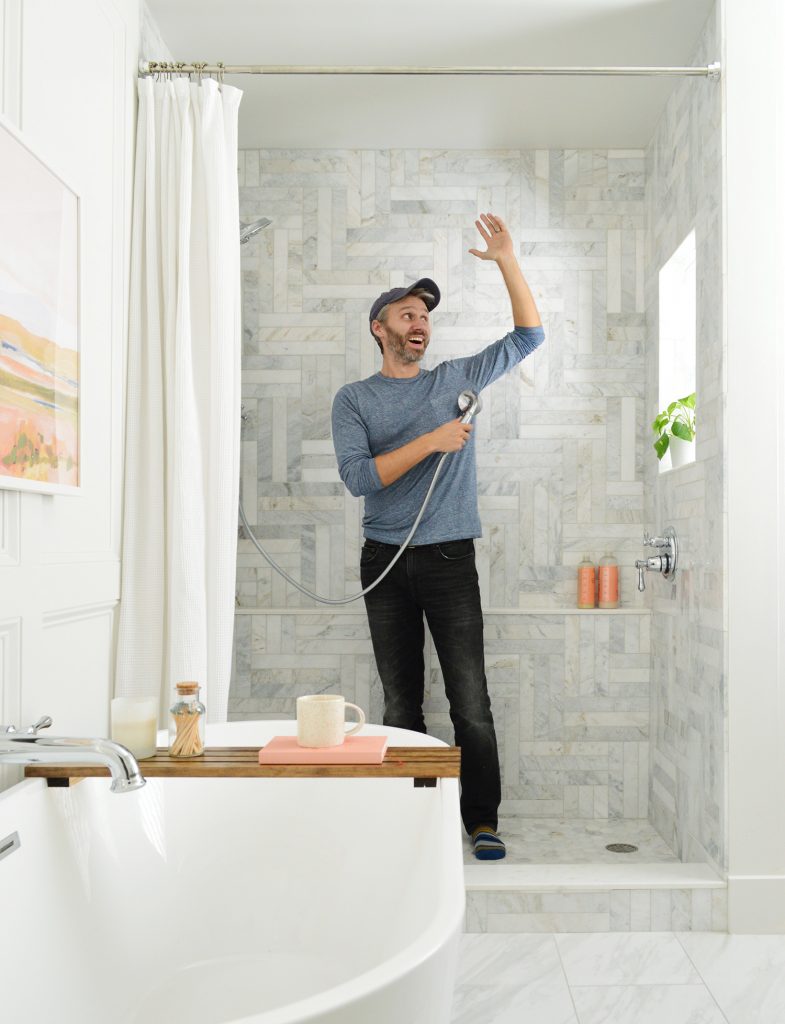
This shower occupies the same basic footprint of our old tub/shower combo. It’s only a couple of inches deeper than the 3 x 5′ tub that used to be there but somehow feels much more spacious than before. It’s probably some combo of using lighter tile and taking that tile all the way to the ceiling, but I also think no longer feeling “boxed in” by the tub at your feet helps too.
Someday I may bore you with all of the details of DIYing the whole thing because, believe me, it was A WHOLE THING. From demo-ing out the old tub and framing the new ledge and window, to carefully sloping the shower pan (thanks YouTube!) and meticulously laying the tile over the course of five days… I hesitate to call it my masterpiece, but let’s just say I’m quite proud of it. Can’t you tell by the gleeful fully-clothed showering reenactment below? I’m 6′ tall for scale. It’s a huge, glorious shower.
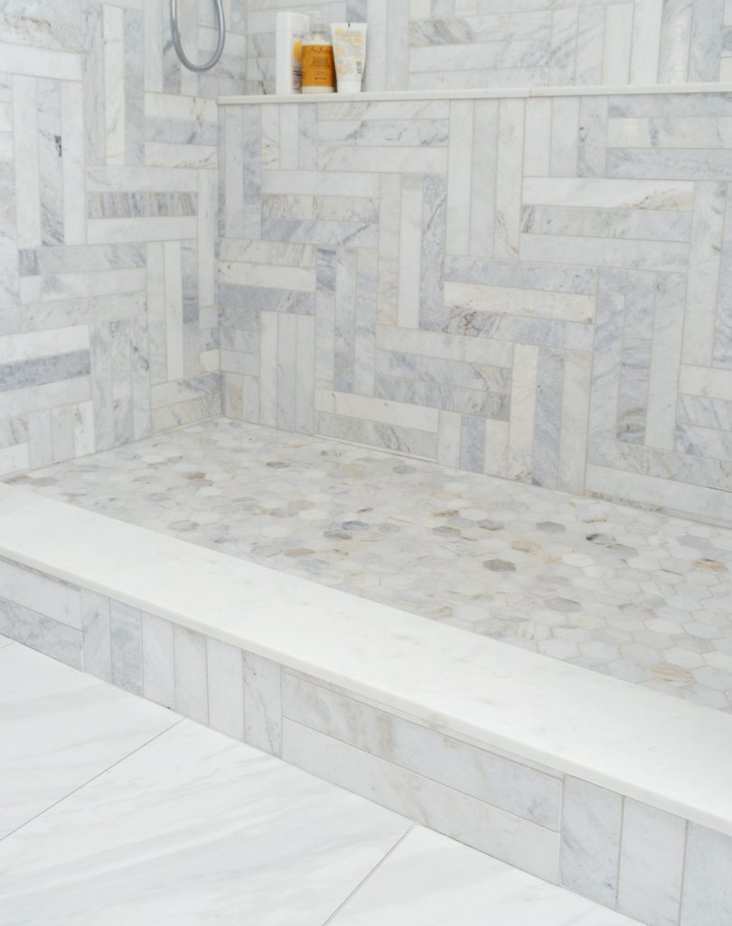
We talk more about our tile choices in this post, but the goal was to use a classic timeless material in a way that created enough visual interest to be somewhat of a focal point. We knew herringbone patterns can be challenging to lay, but this one required more focus than even we anticipated. Keeping a pattern level and evenly spaced around 3 walls and obstacles like the ledge and window were no joke!
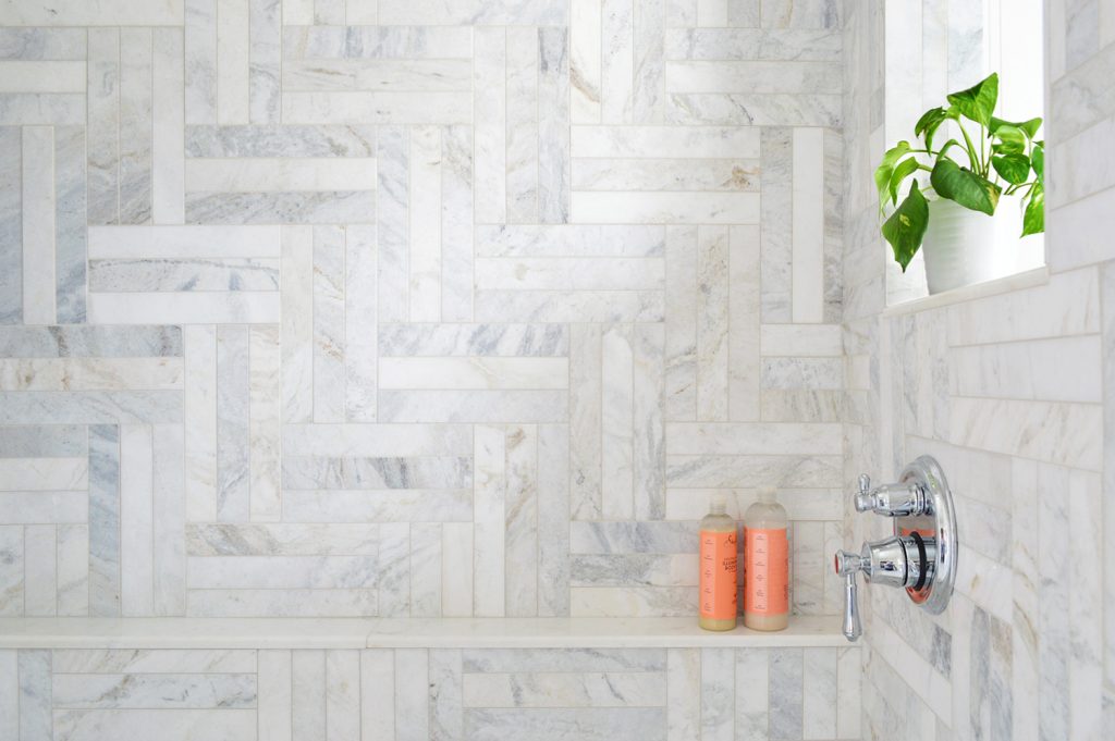
All of the shower tiles (including the marble ledges, which were technically sold as floor transitions & window sills) are from Floor & Decor, and they’re all linked in the source list at the end of this post. As you’ll see in the budget, the tile was one of our biggest line items in the room, but we’re beyond happy with it. Plus we were able to save on the floor tile throughout the rest of the room by getting a marble lookalike from Home Depot that was porcelain, and therefore extremely affordable (just $2.29 a square foot!).
We also opted to rehang our extra long white waffle weave shower curtain, instead of doing a glass door, which we definitely heavily considered. It just felt like the room would benefit from some softness & texture. There’s a lot of angular and hard stuff in here (shiny geometric tile for miles as well as boxy molding and a rectangular vanity) so it’s a nice contrast to that. Some folks worried that a curtain would “cover all that beautiful tile” but the curtain is never between us & the tile, because whenever the curtain is closed it means we’re IN the shower (actively surrounded by all of that glorious tile). And it’s open like this whenever we’re not showering, so we can still soak up the tile from literally every angle.
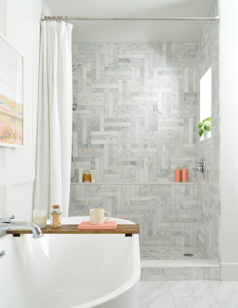
We talked about this all the way back in 2016 on the podcast, but I just think we personally prefer the privacy and coziness of showering behind a curtain – and it’s one less surface to have to wipe down and clean versus a glass shower door.

The shower and tub fixtures are all made by Delta and we purchased them through Ferguson (we linked them all in the source list at the end of this post for you). For those who haven’t heard of Ferguson, they’re a local bath & kitchen showroom here in Richmond and they have tons of locations so check your area to see if you have one too. If you ever get overwhelmed by coordinating several different fixtures and valves and sprayers and whatever I recommend checking them out. We were actually able to get a bulk discount by ordering through them, rather than individually online – so we’re glad we got a quote from them. You can also find their stuff on Build.com which has some good sales too.
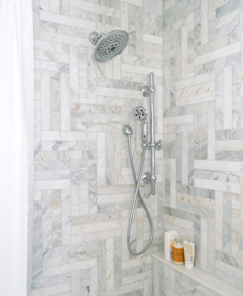
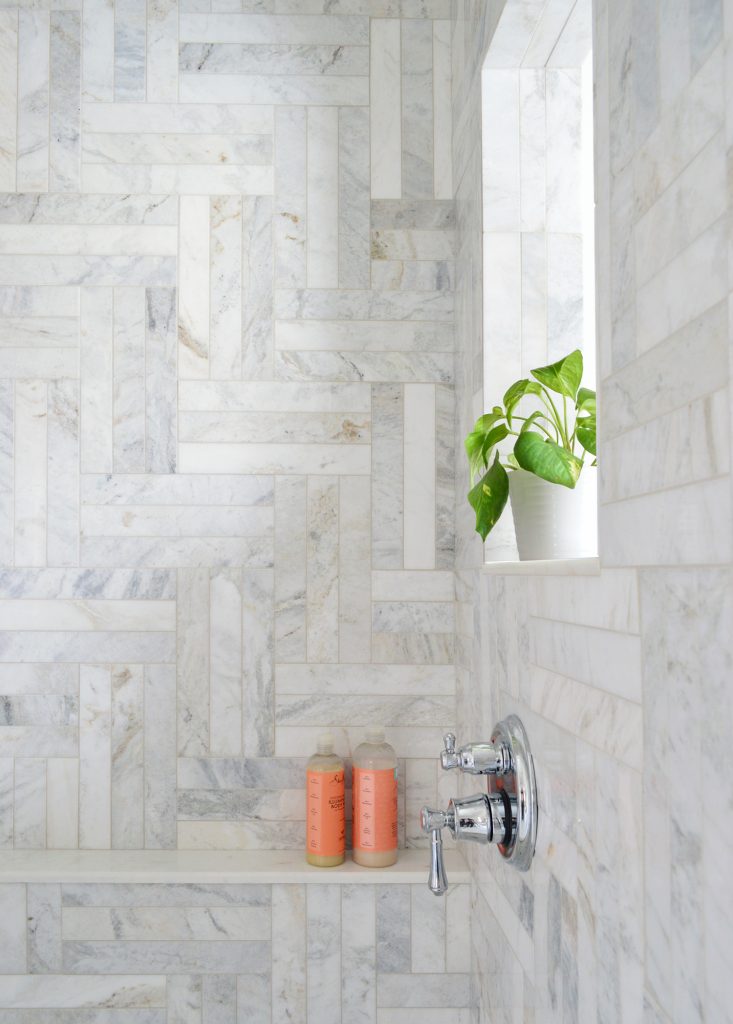
We kept the shower pretty straightforward with just a standard shower head and a hand-held sprayer on an adjustable bar. We chose to put the controls on the opposite wall so that you can turn everything on more easily before stepping into the shower (without getting sprayed right in the face like you would if the controls were under the shower head on the opposite wall). The bottom/larger handle controls the temperature and the top/smaller handle controls which sprayers are on: the main shower head, the hand-held, or both!
Oh and we always get requests to link the fan/light thing we use in the bathrooms that we remodel. Basically it’s a recessed light that looks just like every other recessed light in the room but it’s also secretly a bathroom vent fan (which is much more covert than the average large-fan-on-the-ceiling contraption). It’s also nice and quiet. We’ve used them throughout the duplex and the pink house too. The “light” that you see closest to the shower in the ceiling is actually a vent/fan combo. See how similar it looks to the other one that’s above the toilet?

The Soaker Tub
Ok now we can move to the tub. Although I have not personally taken it for a spin (I’m not really a bath person), I know it has met every bar Sherry set for it as we were planning this renovation. She calls it her BBFF (bathroom best friend forever) which pretty much says it all.
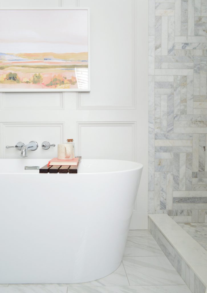
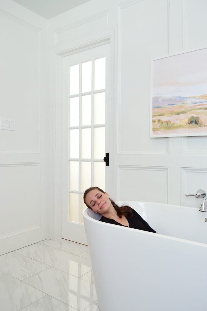
It fits the space really nicely because it’s big and deep enough for her to fully submerge (our old tub didn’t allow for that, and Sherry is a pretty small human, so that was pretty hilarious – like who was that tub made to fit if not the 5’2″ lady who tried in vain to use it?!). Meanwhile the new tub fills quickly and stays warm longer than expected (we heard a bunch of times that acrylic holds the heat well and Sherry has found that to be true). It wasn’t nearly as pricey as we expected (the price on Wayfair fluctuates, but we spent just $542), so long story short, we can’t recommend it enough.
Please enjoy this fully clothed Sherry-for-scale photo. She can finally soak more than just the bottom half of her torso. Apparently that is ideal for bath-taking individuals.
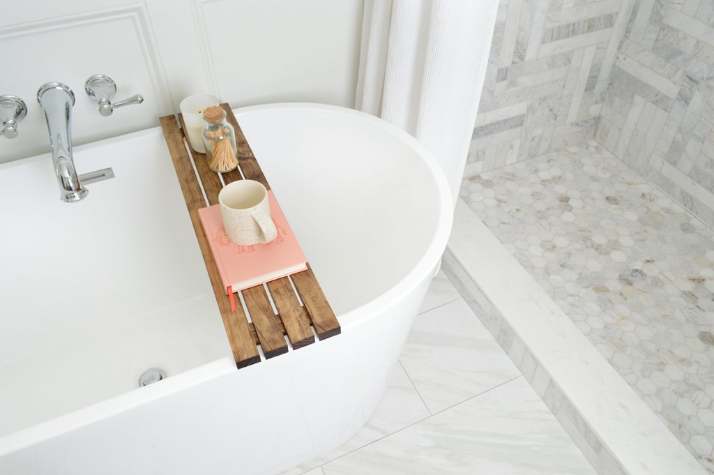
We couldn’t find a tub caddy that we liked online because so many of them had kind of an insane amount of bells and whistles (an iPad stand! a razor platform! wine glass notch!) so we constructed this simple one out of store-bought 1×2″ pine and stained it ourselves. It’s not fancy, but it was easy to make and fits the tub like a glove. And if building a ledge to soak up (pun intended) the next four months of tub time before moving is wrong, Sherry doesn’t want to be right.
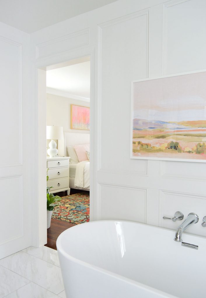
Oh and the art over the tub. So many people ask us where it’s from. It’s a print called Lowland from Juniper Print Shop that we had printed locally and then just used a large Ikea frame for it. So budget friendly – but it makes a huge impact in the room. Sherry loves how it ties into the art over our bed, which was a secondhand find that we bought right off the walls of a ski house we rented.
The Closet
We’ve already shared a full tour of our closet, so you can get more details on that side of the room in that post, but we did want to share a couple of photos of it in the context of the larger space. We’re really really happy with how it all flows together. For the last 6 years we’ve had our closet open to our bathroom and haven’t had a single issue with humidity or anything, so we felt confident that we didn’t want to add a door here to mess with the flow. We considered a pocket door but are convinced we would literally never close it so it wouldn’t be worth the expense.
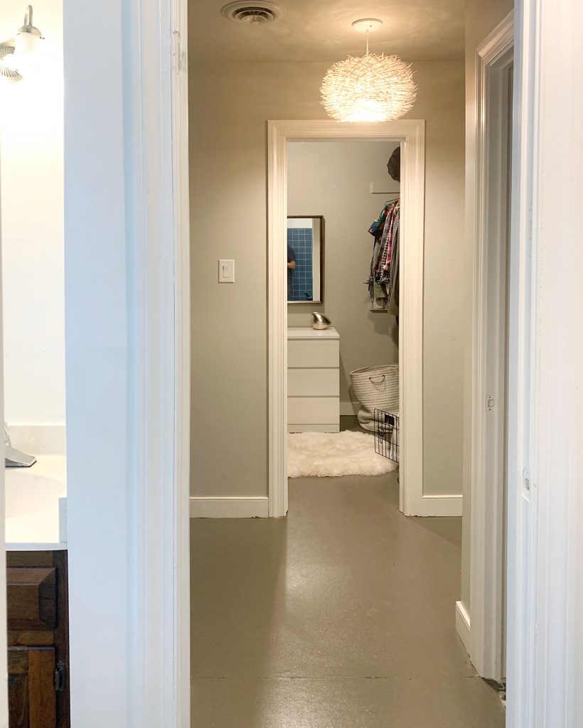
As a refresher, this is what that view looked like before. Again, can you even believe all of the walls?! Widening and centering the doorway between the two rooms was a huge improvement. The old closet doorway was just 22″ wide – which is only an inch or two wider than my shoulders – and now it’s 34″ so it’s definitely less cramped than before.
If you’ve read this whole post and asked yourself “where do they hang their towels?” I’ll say it was one thing we had to really think through in this bathroom. There’s not a lot of unused wall space, but our original plan had been hang them on the wall over the tub. We ultimately decided we preferred a large piece of art there, so our solution has been to hang them on the back of our bedroom door – which is just a couple of steps outside the bathroom.
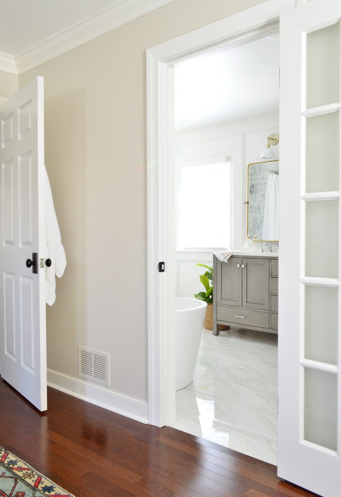
All it means is that before we hop into the shower, we grab our towel and drape it over the side of the tub (or the side of the vanity if it’s Sherry who is taking a bath). It hasn’t been a problem for us, but if the next owner prefers hooks over wall art, they could hang some over the tub, or even add one to the back of the frosted bathroom door or the fronts of the wardrobe doors in the closet. We debated all of those places, and just liked this solution best for us.
Also please enjoy how seamless our hardwood floor to tile transition is between the bedroom and the bathroom in that photo above. The wood and tile are exactly the same height thanks to us adding an additional layer of plywood under the cement board for the tile to reenforce the floor. It brings me an inordinate amount of satisfaction.
Speaking of this angle, the photo below is effectively my view from bed – and before it was ALL WALLS. So the fact that we can now see the light (literally) makes us both so happy. It’s like we added another window to the bedroom too.
And since I haven’t pointed it out explicitly, let me reassure you that we frosted the glass on the door so that it does offer privacy whenever someone is using the bathroom. Sherry likes to joke that it gives you 100% privacy unless you press your buns right up against the glass (ask her how she knows that). We chose this 15-light glass door because we have two others in the house already (one that leads to our back porch, and one that we hung that leads into our bonus room). So not only is it visually consistent with the house, we like that it feels light and airy like the rest of the room. Have I beaten the “light and bright” horse enough in this post? Oh and we have a frosted door to the bathroom at the pink house too. Apparently we love them.
Budget Breakdown
Let’s break down how much this puppy cost. It wasn’t cheap by any stretch of that term, but we feel like we got a ton of bang for our buck in here, especially when you remember where we started – and considering that EVERY item and surface was touched (unlike the quickie update we did to our hall bathroom). We ended up with a separate soaker tub, upgraded materials like marble and quartz, and a much more open layout that feels about 86 times bigger. Although it’s a pretty large room (the bathroom alone is 8 x 12′ not including the closet), we were able to keep costs from ballooning by doing a lot ourselves: our own demo, framing, shower pan, tile prep & tiling, as well as all of the molding, painting, door hanging, etc.
- Marble shower & shower floor tile, thinset, and grout from Floor & Decor: $2,043
- Porcelain floor tile from Home Depot: $277
- Framing wood & plywood for floor: $212
- Cement board & tile prep supplies: $311
- Shower pan cement, liner, and materials: $107
- Miscellaneous tiling supplies: $102
- Plumbing labor (to add new shower valves/drain along with a new tub drain/tub faucet) $3250
- Electrical labor (to add 2 vanity sconces, 3 can lights, outlets, closet lighting, & a vent fan/light): $900
- Drywall & drywall patching labor: $450
- Soaker Tub: $542
- Double vanity with quartz top: $956
- Vanity hardware & 3 towel hooks: $93
- Sherry’s Favorite Toilet (ok, it’s mine too): $352
- Shower & Bath Fixtures: $1,207 (ours were from Ferguson locally, but we found them online (here’s the tub faucet, tub rough-in valve, and the shower kit with slide bar)
- Wall Molding Treatment/Caulk/Paint: $648 (see our tutorial here)
- Two gold vanity mirrors: $550 (during Black Friday sales)
- Two sink faucets: $280
- Print & frame over toilet: $0 (already owned)
- Print & frame over tub: $83 for everything! (the $20 printable + the $43 print from FedEx, and the $20 Ikea frame!)
- Toilet paper holder: $37 (Black Friday price)
- Two Vanity Sconce Lights: $198
- New 15-Light Door: $205
- Wood to make tub tray: $11 (already had stain)
- Miscellaneous (frosting spray for door, toilet seat, truck rental to bring plywood home, etc): $66
- TOTAL: $12,880
The average higher-end bathroom reno seems to clock in around 23K so we’re thrilled to land where we did budget-wise. Like we mentioned in our closet budget breakdown, some of the numbers above include additional materials or fees beyond the bathroom (for example the floor tile, drywall, and electrical costs for the closet are also included in this budget since it was too tough to break out the cost for each space separately). If we combine our closet and our bathroom budgets, we ring in at $15,316 total for both spaces, which are 8 x 12′ and 8 x 6′ respectively. Again, by no means is it a small amount of money, but it’s a number we feel pretty good about at the end of the day for all that we gained.
And speaking of the end, I wanted to wrap up right where we started – with my favorite before & after from this project:


We love how this renovation turned out so much (it might be our favorite room makeover we’ve ever done), so it’s definitely bittersweet knowing that we only have about four more months to enjoy it before we move to Florida in June. But one silver lining for sure is that being so happy with the result gives us confidence and excitement to design our bathroom in our new house. We’re adding an en-suite bathroom to our new house before we move in (right now there’s only one non-functioning bathroom in the entire house, so we have to make that operational and add one more). So that bathroom is something we’ll be planning here in the next few months with the contractor that we met back in February who is helping us execute it since we can’t be there full time to do it ourselves until after we move. WHICH MEANS MAYBE WE CAN BREAK THE BATHROOM CURSE BY NOT SAVING IT FOR THE END! Ha. After waiting over six years to get a proper ensuite bathroom, it’s weird to think we’ll be doing two of them in less than a year. I feel like I need to go knock on wood after saying that.
Our Bathroom Sources
In an effort to try to make it easier for you guys to find this source info all in one place, here are all the links (and paint color info) below:
- Wall, trim, and ceiling color: Behr Irish Mist
- Soaker Tub
- Double Vanity
- Toilet
- Brass Pivot Mirrors
- Vanity sconces (see our entire lighting collection here)
- Vanity knobs
- Vanity pulls
- Hand towels on sink
- Towel hook
- Toilet paper holder
- Extra-long shower curtain
- Extra-long shower curtain liner
- Shower curtain rod (no drilling!)
- Shower wall tile
- Shower floor tile
- Floor tile (throughout bathroom & closet)
- Sink faucets
- Shower kit (includes shower head, sprayer with bar, valve, and controls)
- Tub filler (and valve)
- Art over tub (frame)
- Art over toilet
- Similar 15-light door (we had to special order our size in-store at Home Depot – but it came primed!)
- Doorknob
- Glass frost spray
- Closet mirror
- Closet chandelier
- Similar closet rug
- Faux fiddle-leaf fig
- Fiddle-leaf fig basket
Room Dimensions
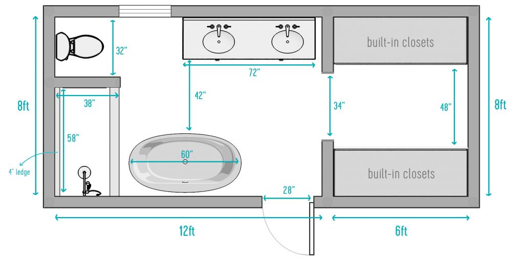
And since we often get asked for floor plans of things, here’s a little not-perfectly-to-scale-but-good-enough layout of the room for anyone interested in the measurements and stuff. Some of the measurements have been rounded to the nearest inch, etc, but it gives you a good idea:
Ok, I think that’s every last detail I can give you. Thanks for coming along for the ride, and please know that it feels just as weird as you’d imagine it would to take fully clothed photos of yourself in a shower or tub for scale.
If you want to go back in time to see every step of this renovation, here’s the very first post about this project, a tile-picking & floor-planning post, a huge update we did about 2/3 of the way through our renovation, a tutorial & cost breakdown for the decorative molding we added, and the full closet reveal (complete with a video).
And if you’re looking for bathroom lights – or lighting for the bedroom, dining room, hallway, laundry room, kitchen and beyond – you can see all of our lighting designs right here – none of which are boob lights! HURRAH.
*This post contains affiliate links, so we may earn a small commission when you make a purchase through links on our site at no additional cost to you.
