We love a DIY wall molding just as much as the next blogger, but I think we have a new favorite: the thick framing that we added to our bathroom. And it almost didn’t happen! And it was one of the smaller costing line items compared to a lot of other updates we did in there (gotta love when that happens!). We still have some finishing touches to put on the room before we’re ready to “reveal” it fully (like a bathroom door would be nice – and we’re also going to share a full budget breakdown in that big “after” post) but I know that many of you are eager to hear about this particular project, so let’s dive in.
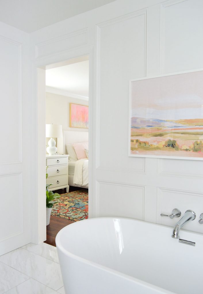
Oh, and the good news is that as long as you’re comfortable with a miter saw and a nail gun, it’s not nearly as complicated as it looks.
Picking A Molding Style
The funny thing is that Sherry and I were on the fence about adding the molding up until the last minute. On one hand, we worried that it could be overkill, especially with such an intricate tone on tone tile pattern in the shower nearby. And it would certainly be simpler and cheaper to just leave the walls as they were, right?
But on the other hand, we couldn’t fight the feeling that a wall treatment of some sort would elevate the entire room – especially because Sherry had pinned a few rooms like this when we started the renovation, which really wowed us. Here are three images that were majorly inspiring us: this image, this image source, and this image.
As you know, we ultimately decided to go for it. We’ve never regretted any of the other molding or wood wall treatments we’ve done. They add instant architecture and dimension to any space – especially an uninteresting hallway or basic boxy room. As for the links to those past projects where we used various types of wood wall treatments, there’s the faux shiplap in the duplex (only $31), and the board & batten projects in our last home’s hallway (only $57!), our current home’s hall upgrade (I think that was about $300 because it’s a super long hallway), and our beach house’s middle bedroom (which was $194 total). So we figured one way or another we’d be able to create something we liked, and we knew it would be in the hundreds, not thousands (which is a nice selling point when you’re doing a full gut job on a room, and many other line items have a lot more zeros).
Then it was just about figuring out exactly what treatment we thought would look good in here. Sorting through all of our pins helped us decide on doing something like Lindsay’s bathroom. I don’t know exactly what it’s called, but instead of a box molding, we liked the way it almost looks like recessed panels, kinda like this other picture below. We thought that detail would add some nice depth to the walls while still not being crazy busy looking. And we liked the thickness and substantial feeling of the boards.
We were under a serious time crunch to make some decisions at this point (more on that in next week’s podcast) so – and here comes some really great advice, okay? – we just kinda winged it. But in a weird way I think the tight timeline was something that helped it turn out so well because it meant that we just had to go for it and not overthink it too much.
Materials & Supplies
Our method to identifying what combo of certain boards and trim pieces made our eyeballs the happiest was just us standing in Home Depot and playing around with various combos of wood and trim that they had available. I’ll spare you the play-by-play, but we basically landed on this arrangement:
- a bunch of 8ft primed 1×4″ boards to make our boxes*
- a bunch of 8ft primed 1×6″ boards for the baseboard and crown
- a ton of primed base cap molding to frame everything out
*that’s actually a 1×3″ pictured below. We bought a bunch of it to give ourselves that other option when we got home, but ended up liking the chunkier 1×4″ boards a lot more when we held them up in the space.
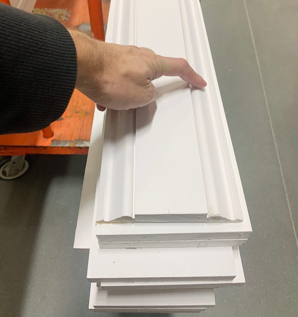
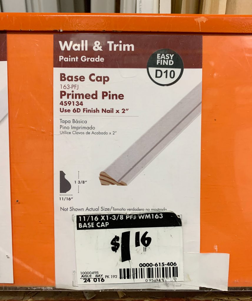
Base cap was the secret weapon of this project and if you’re not familiar, it’s often used as a literal cap to your baseboards. In fact, it’s what we have throughout the duplex. Sometimes it’s hard to find, so here’s a photo of how it’s labeled in Home Depot if that helps. My advice would be to buy more than you think you need. We ended up cleaning out our sparsely-stocked Home Depot and had to drive to another one the next day…. and still had to go back again for more a third time.
Beyond the actual wood itself, to complete the project we also used:
- Nail Gun**
- Miter Saw**
- Spackle or wood filler (we love this 4-in-1 tool!)
- Caulk (this is our new fav!) and caulk gun
- 48″ Long Level
- Tape Measure
- Stud Finder
- Spackle Knife or Painter’s Tool
- High grit sanding block
- Painter’s Tape
- Pen or Pencil
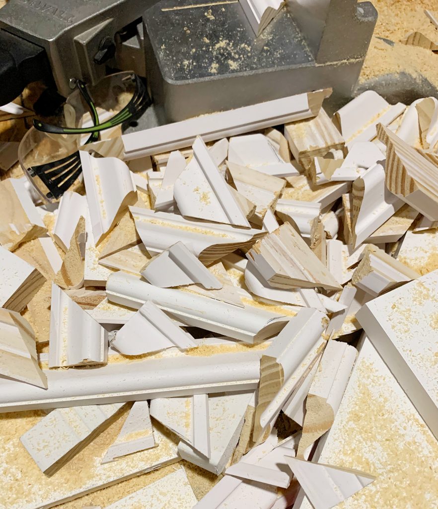
**Both of these power tools could be substituted with manual alternatives (hammer/nails & a manual miter box) but using the power versions will make your project a lot faster & less exhausting. Take our scrap pile below as proof of how much cutting is involved. And this isn’t even all of it!
Installing The Wall Treatment
Because we were working on a tight deadline before the plumbers arrived to install everything (thus partially blocking our access to the walls – which is why it was now or never) we didn’t take any progress shots during the cutting and nailing portion of this project. Well except for this strangely elegant one of me holding the first boards up so Sherry had an opportunity to speak or forever hold her peace before I started nailing stuff. I call it: Accidental Black Swan.
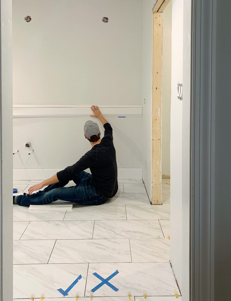
Also I should explain that we had just finished tiling the floor the day before so not all of the mortar was fully set. That meant we couldn’t walk on the first couple of rows of tile and had to basically hop into the room. We used a big painters tape check mark to mark the closest walkable tile (which meant: step here!) and the adjacent still-wet tile with a big X (as in: don’t you dare step on this one!). How’s that for a renovation reality? It worked though.
Anyways, back to the molding…
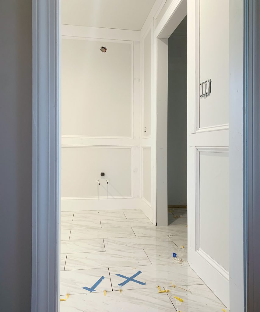
In these yet-to-be-caulked-and-painted photos you can hopefully still see how we accomplished the final look. The chair rail and vertical slats were all made of 1×4″ boards, which we nailed in using 1.5″ nails and our cordless finish nail gun.
We tried to hit studs for the horizontal boards just to be safe, but didn’t worry about it for our vertical slats since we didn’t want our studs to determine their placement. I know some people swear by glue or liquid nails for these projects, but we try to avoid using them because it will make removing them (if you or a future homeowner ever decides to) much more damaging to the drywall underneath. Plus we’ve found that the combo of finish nails + caulk + paint gives the boards a ton of “adhesion,” as long as you don’t plan to hang anything super heavy on them (like wall hooks, mirrors, or large artwork – in which case using a heavy duty anchor is a good idea).
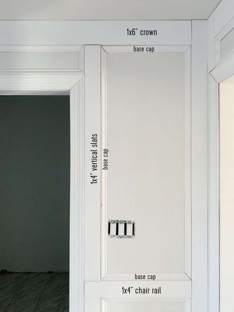
We used the 1×6″ boards along the ceiling and floor to act as crown and baseboards, respectively. And then, as you can see, we “framed” the inside edge of every box with base cap pieces with mitered cuts at the corners.
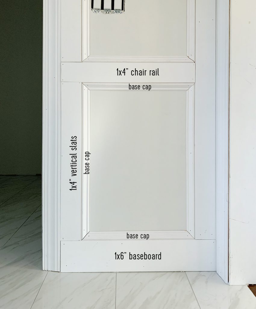
Along the way we learned the best order of installation typically was this:
- First install your baseboard and crown pieces, so those are uninterrupted
- Then install your vertical slats in the corners of the room or against door/window frames. This will create large “boxes” that you’ll start dividing up.
- Next install your horizontal chair rail
- Then add the remaining vertical slats that will create your desired final boxes
- Finish up by trimming out each box with the base cap
We didn’t follow this order every time, but this generally made for the fewest cuts/seams. Oh and we also considered adding a traditional crown molding around the ceiling but when we held some up it looked too busy (at least in our 8ft tall ceilings).
Figuring Out The Height & Spacing
I know you’re probably curious about how we determined the height of the boxes. Again, this was a wing-it moment, but two things guided our final decision. For one, we wanted it to cut the room about 1/3rd of the way up (at least roughly) because the human eye tends to like things split that way.
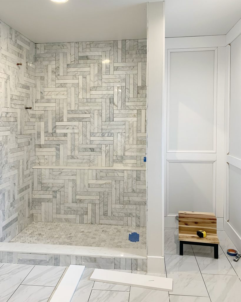
Our ceilings are 8 feet tall, so 32″ would’ve been precisely 1/3rd – but we ended up doing ours a smidge higher (about 38″ to the top of the 1×4″ chair rail). And here’s why. We also knew that we needed the top of the vanity and the chair rail to line up in a pleasing way. As in we wanted the counter to rest flush against the chair rail (since the feet would be flush against the baseboard). If the chair rail was too high or too low, we could end up with a gap behind the counter. We also didn’t want the vanity to cut off the chair rail in a weird way visually – like just a sliver of it peeking out or something.
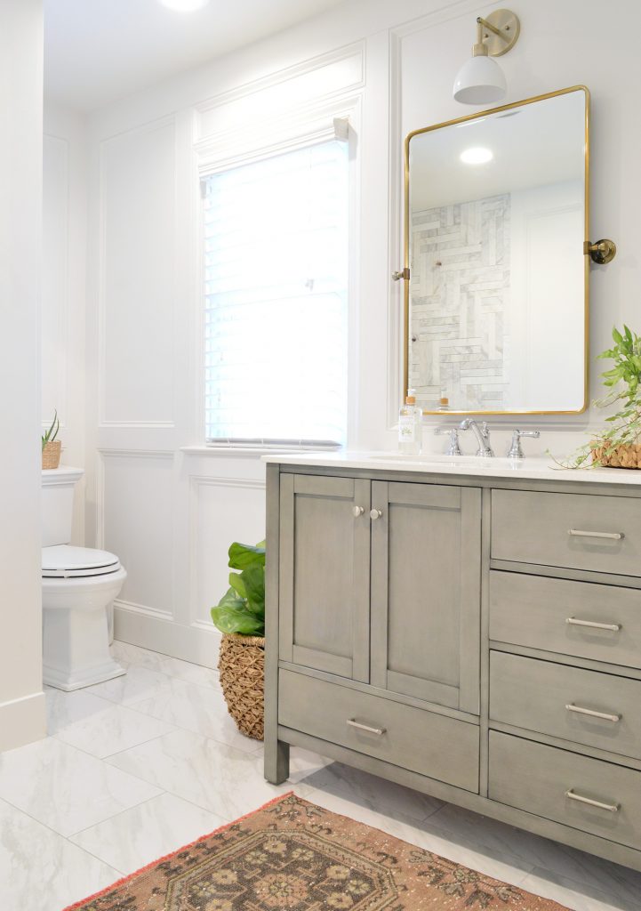
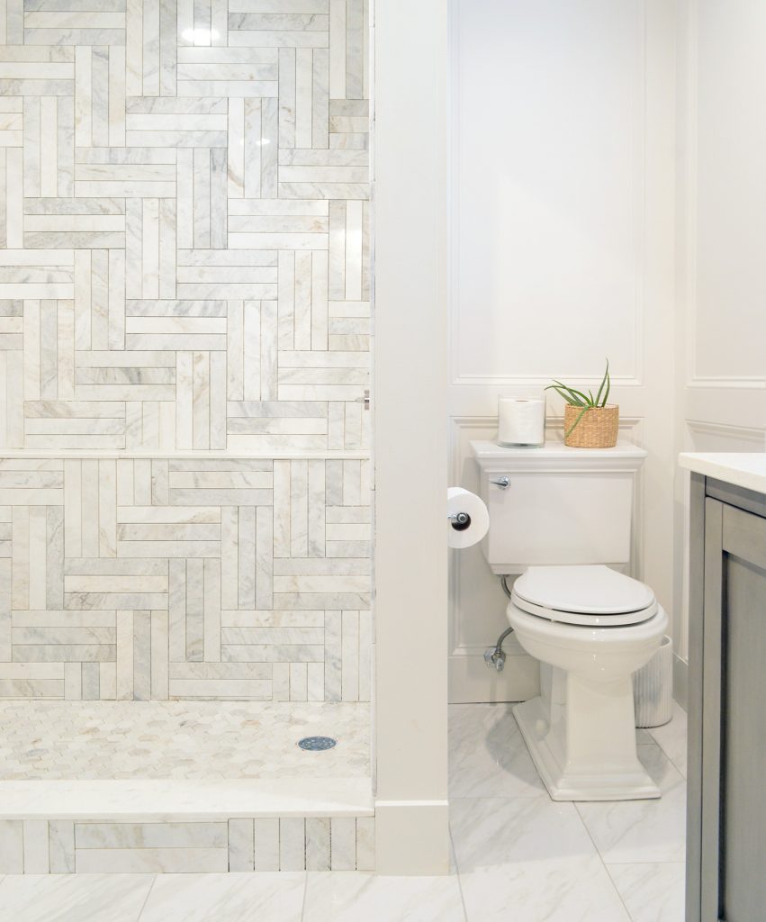
Since the vanity was yet-to-be-installed at this point, we took some careful measurements so we were sure the chair rail would hit the vanity right where we wanted it. We also double-checked this placement to make sure it would relate nicely to other objects in the room – like the toilet (which ended up being nicely framed by the bottom box) and the tub (the bottom middle box creates a nice boundary around the wall-mounted faucets).
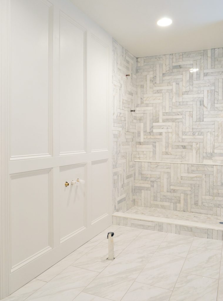
Beyond determining the height of the chair rail, we also had to figure out how to space the vertical slats. You know, how wide or narrow our “boxes” would be. Early on we discovered that the secret was NOT to create equal-sized boxes around the room. Instead we evaluated each wall individually and determined the best-looking spacing for that particular wall. So where the mirrors would go, creating one big box made sense – whereas over the toilet or on the smaller walls flanking the closet doorway it made sense to have smaller boxes.
Essentially this choice made a lot of things feel more centered and balanced and well planned – and in the end we really love this solution. Some boxes were big while others were skinnier, which worried us at first (inconsistency, ack!) but we really wouldn’t change a thing about how this turned out. It elevated the room so much and feels completely high end.
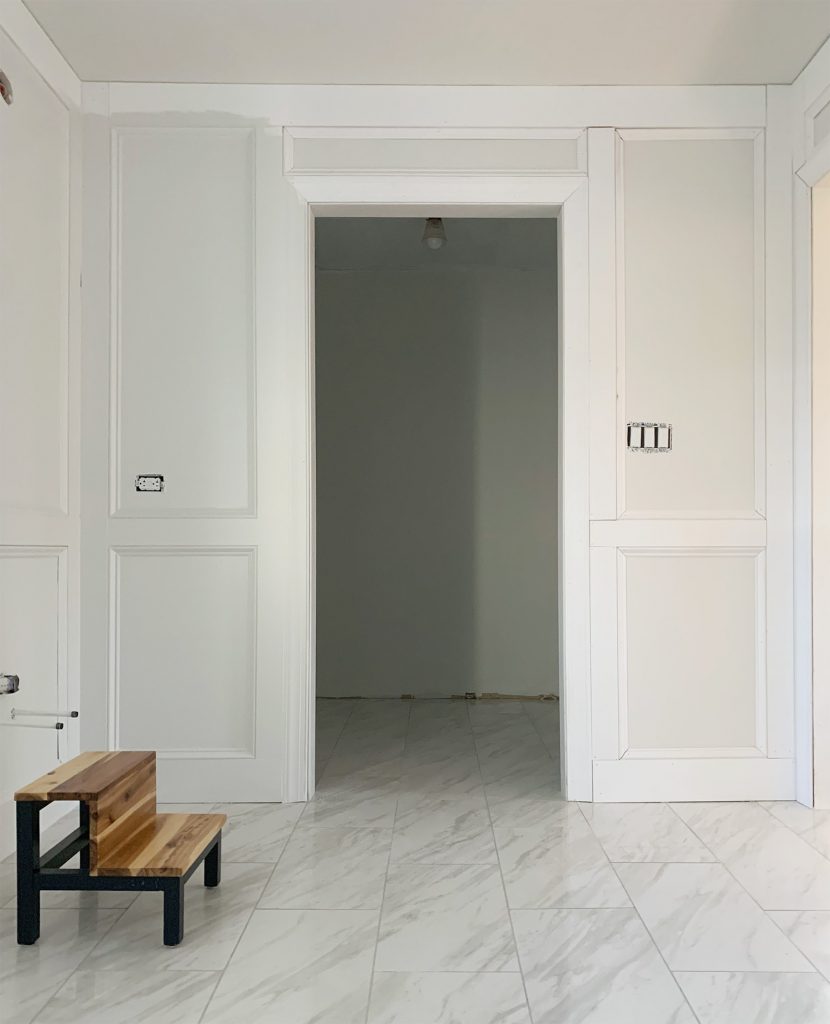
As a concrete example, if we had used the exact same spacing on the vanity wall below as is shown on the wall above (which was our first instinct), the vertical slats would’ve intersected the mirrors in a way that would made them look off-centered or askew. So instead, we created just one big box over the vanity so everything was nicely contained within it.
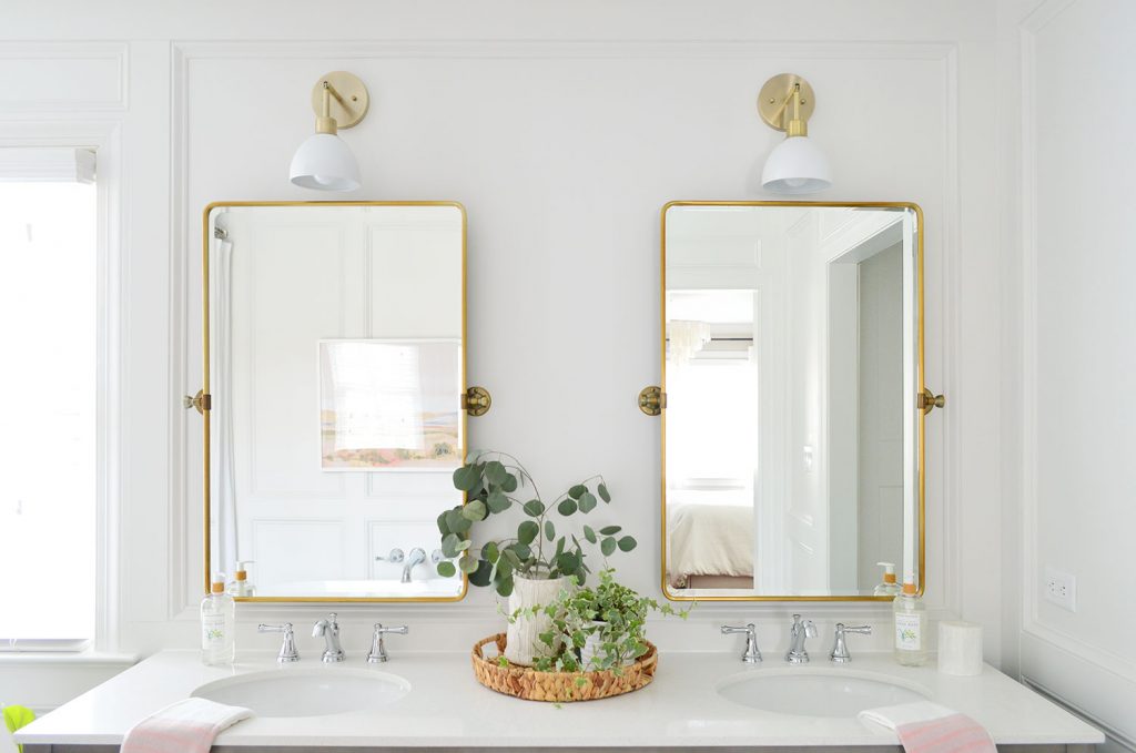
Same for over the toilet – one box. Essentially each wall and the items on it determined the box size and shape. So long story short, I encourage you to use some artistic license to adjust your board placement so it looks best in your particular space and on each particular wall.
Caulking & Hole Filling
I know it sounds like there are lots of mental gymnastics involved in this project, but it was less complicated than it sounds. This undertaking is more tedious than anything (Exhibit A: our scrap wood pile shown earlier in the post). The other tedious part of this is the caulking. OH THE CAULKING. We went through 4 or 5 tubes in our bathroom because you basically have to caulk every place your boards meet each other or a wall. Not to mention you should putty all of your nail holes (we like to use this stuff to make it fast and one-handed).
The photo below shows how much of a difference caulk makes – especially in softening that dark shadow between the flat boards and the base cap.
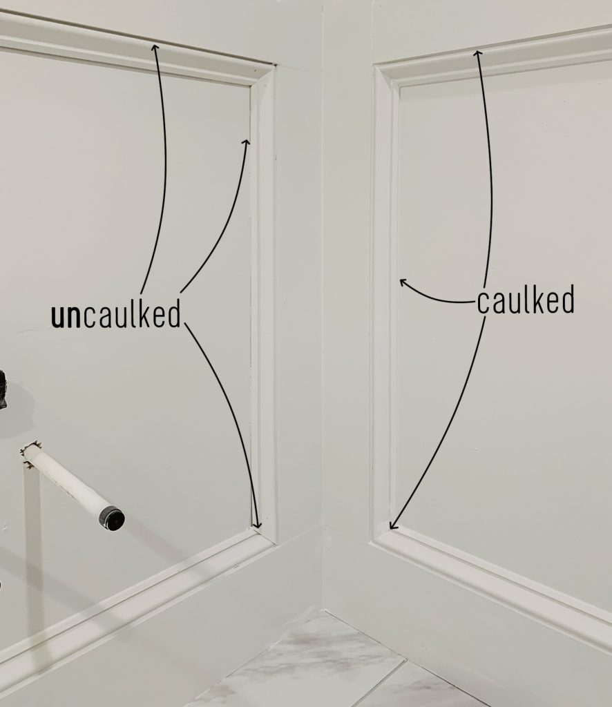
But as cumbersome as the caulking step can be, it was well worth it in the end because it really makes the whole thing look like one seamless treatment, rather than a wide variety of wood pieces nailed to the wall in a giant combo move.
Budget Breakdown
Even though this project doesn’t have a long materials list (basically just wood) – it can add up fairly quickly depending on the size of your space (ours is 8′ x 13′, minus the shower area). You can save some money by buying unprimed versions of the wood and priming it yourself, but with our deadline it was worth it for us to not add that extra step.
- 1″ x 6″ x 8′ primed boards (baseboard & crown): $118
- 1″ x 4″ x 8′ primed boards (chair rail & vertical slats): $139
- Primed base cap: $291
- Door jamb & casing: $88
- Caulk & putty: already had a ton but still needed to buy $12 worth
- Paint: already had it
- TOTAL: $648

It certainly was one of our more expensive wall treatment DIYs: our faux shiplap duplex backsplash cost us only $31 (just one wall) and our beach house board & batten was $198 for a whole room). But since it has turned out to be one of our favorite elements in the room, we have zero regrets about spending a little more for this final result.
And don’t worry, once we’ve got the bathroom all wrapped up we’ll share all of the before & afters – along with a total budget breakdown for the renovation. Nobody is more excited to finish this space than we are!
P.S. To read previous posts about how this room has come together, there’s this one all about our floor planning & tile selections, this one about a bunch of general bathroom progress, and this one about our entire closet renovation (from beginning to end, plus a budget breakdown & video tour).
*This post contains affiliate links, so we may earn a small commission when you make a purchase through links on our site at no additional cost to you.
