You guys. You’re varsity. Once again, I was blown away by the 500+ awesome and fun ideas that you shared – along with some pretty amazing photoshop skillz – for Jamie’s design roadblock last week. There’s nothing like a group brainstorming session, and Jamie’s so excited about all of the options she has to explore (and has promised us after pics when she’s done). So let’s dive right into Meghan’s dilemma, because I can’t wait to hear your take.
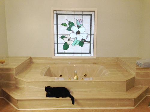
Say hello to my little friend! Yes, I have a giant Scar Face bathtub. My husband and I bought our 1987 home a little over a year ago. We have been up to our eyeballs in projects but are making steady headway in making this house our home! But this is the one place where I still scratch head and walk out of the room more confused then when I walked in – and this is our master bathroom, so that happens a lot! Note: for anyone who wants to play around in photoshop, just click this image to enlarge it – and you can share your creation in the comments by linking to it on a free photo-sharing site like Flickr or Pinterest.
This bathtub is. huge. And my husband hates it, but it’s not in our budget to tear it out. Should I tile or beadboard the front? Put shelves or bookcases on the side? And what do you put inside said bookcases? I need something to mask it and make the space more functional. Thank you! – Meghan
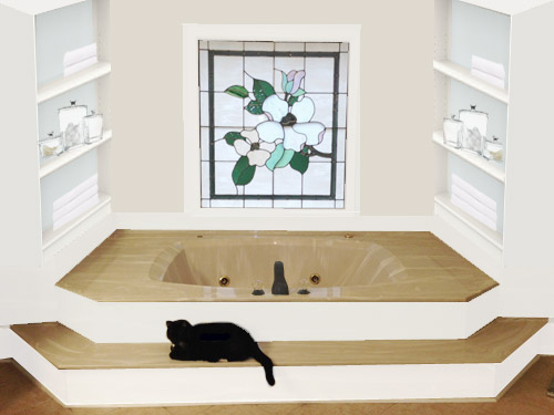
Once again, I just started off staring at that before photo, trying to picture things and work out what could go where. Then I dragged it into photoshop to test out a few ideas. Here was my first thought:

I love the idea of some white bookshelves (I don’t think I’ve ever met a built-in I didn’t like) so I brought two of those in to flank the tub. They add some nice height and draw the eye to the pretty stained glass window in the middle. I also beefed up the trim around the window a bit, just for some nice balance. The backs of the bookcases could even get a soft blue-gray paint job (like Aqua Smoke by Behr) to pick up on the tones in the stained glass window, and the walls could be painted a light sand color (like Hazelnut Cream by Behr) to tie into the existing tub and floor color. As for those shelves, bathroom-y stuff like this could be nice:
- fluffy extra towels
- textured baskets
- glass containers (like these) filled with sea sponges, loofas, or something decorative like sea glass
- pretty bottles of bubble bath or bath salts/oils
- a stack of mags to read (I can never manage to keep reading material dry in the tub, but hopefully Meghan’s more coordinated)
- some candles to burn while bathing (or those flickering battery operated ones if she’s skeered of fire on a bookshelf)
- beachy keepsakes, like jars of sand/rocks/shells – or even labeled little vacation jars like these all lined up
Oh and I really liked Meghan’s mention of redoing the front of those steps with something white to cut all of that tan tub tone. I think three fun options she could go with are:
- white subway tile
- white beadboard (they make bathroom friendly beadboard that stands up to moisture)
- white horizontal planks (they also make bathroom-safe boards to avoid rot)
Meghan could just attach the sheets of beadboard or thin horizontal planks under the lip of each step with some adhesive that’s meant to hold up in a bathroom (gotta make sure it can weather steam and moisture). Or she could tile it if she’d rather have something shinier (I think white grout would be a good choice since anything too high contrast might look busy with the pattern/movement on the surface of the tub).
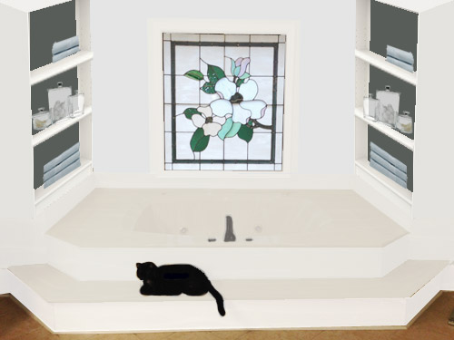
Next I tried for something a little more dramatic but still soothing: a dark green tone (like Mermaid Net by Behr) on the backs of those bookcases, light blue on the walls (like Country Mist by Behr) and a new color (a soft putty tone) on the surface of that step and the entire tub. Once again the stained glass window served as my color inspiration, so I worked from there, and I beefed up the white trim around it, just to make it feel nice and proportionate.

It’s not clear if the tub can be professionally reglazed, but getting an estimate from a local reglazing expert (we used one for our first house’s tub and loved the results) would determine if that material could undergo a color change, which is always a nice way to affordably update a tub that you can’t afford to replace. Oh and replacing the tub’s hardware with something in a brushed nickel, chrome, or oil-rubbed bronze finish would update things even if the tub ends up not being reglaze-able.
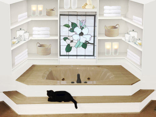
Lastly, I thought built-ins in that entire nook could be another way to go.

This photo feels a little busier, but it could just be my photoshop shortcomings. I also tried to give Meghan more ideas for what could live on those shelves since I had more space to play with (although the shelves along the back might need to be narrower, so candles and bubble bath could go there and deeper items like towels could end up on the shelves on the side). I think if she’s worried about anything feeling cluttered or busy, just keeping the items on the shelves in a soft neutral palette would work well.
Oh and a few other options that came to mind were that Meghan could…
- add glass doors to the bookcases for a glammy upscale feeling (this could be helpful if she doesn’t want items getting steamy, but less convenient if she wants easier access)
- paint the frame around the window the same deep charcoal color that’s in the stained glass (it could make that window even more of a focal point)
- hunt down some subtle gleaming tile (perhaps some small glass mosaic ones in a soft celery tone) and tile the entire back wall around the window with them for added interest
- find a tiny bathrobe to put on the cat, just so he’s feeling the luxury too
So those are a few thoughts I had about Meghan’s little friend. Can’t wait to read all of the other ideas you guys have for her – and of course to hear what she thinks!
Psst – Got a particularly tricky spot or a dilemma in a certain area of your house? Please submit at least three photos of the space along with a quick sketch of the floor plan and a short description about what has you stumped to [email protected].


EngineerMom says
This tub reminds me a lot of the one my grandparents built into a house they built themselves after they retired, complete with the stained glass window! I know it’s not the same one (the window was different), but it was nostalgic to see it.
I like option 1.
That said, if it was my house, I think this is what I would try:
1. Try the at-home reglazing product in white on the risers. If it seems like it works well, do the whole tub in white. That way, if the reglazing product doesn’t seem like a good fit, you’ve only done low-impact surfaces. If it works well, reglaze the shower as well to get everything on the same color page. $100 (?) for reglazing.
2. Paint the trim in the whole bathroom white, paint the walls a soft green or blue that respects the beige of the floor. Say $100 for paint.
3. Add two benches from IKEA on the levels: http://www.ikea.com/us/en/catalog/products/60241450/#/40241451 $80 for benches, assuming you can easily get to IKEA.
4. Add some inexpensive art (Goodwill frames filled with paper or fabric that’s been decoupaged to make it more moisture-resistant; canvases painted with oil-based paint ($25 for 10 blank canvases from JoAnn, plus about $25 worth of paint) – $50
For $320, you’d potentially get a space that’s much easier to live with. Maybe that would give you more time to save up for the remodel of your dreams, or at least get to a point where your husband’s job lets him have a bit more time to work on the DIY! And in the grand scheme of a major bathroom remodel, $320 is going to be a drop in the bucket, even if most of it is DIY. Not that money should be thrown around willy-nilly, but I tend to subscribe to YHL’s philosophy of getting a space into “I can live with this” rather than trying to live with something I hate – makes it too easy to jump the gun rather than just sit back and really think about what I want for the space while continuing to save money for the project.
And on something completely unrelated, it just dawned on me for the first time that “jump the gun” refers to runners starting before the starting gun of a race. The things you finally figure out at 31!
Caren says
I like idea number 2 with the book cases on the side and the tub glazed if possible. The third option is too busy. What about wall sconces flanking the decorative window for some mood lighting while in the bath?
Nikki says
LOL at the tiny bathrobe for the cat!
I love the idea of re-glazing the tub. It seems like a great size, but the current color would really just drive me bonkers (personal preference though.) I think the built-ins look great on the sides! I just wonder if it would look like two blank walls when looking at it straight on, or if you would be able to see the inside contents? I guess it depends on the layout of the room.
Laura says
I like the last picture Sherry did best, especially the baskets which went well with the color of the tub. That picture seems to look the least like an “addition.” Is there enough space on the back wall for shelves though? I could see a few baskets to hold bath supplies, a few easy-to-care for plants and some understated white ceramic things on the wall. You could paint some cheap items from thrift shops. Good luck, Megan. I am sure the whole thing seems daunting. That makes it hard to make a decision.
Wendy says
Have you considered a tub liner? I bought a home with a 1950’s bubble gum pink bathtub. Loved the oversized tub but the color was unbearable. We had it re glazed, and lived happily with that solution for 10 yrs, when the glaze started to fail and the pink started showing again. Guess this is common.
The permanent solution was hiring a contractor to install a tub liner over the entire tub. Each liner is custom made to fit your tub exactly, and of course, a choice of colors.
JP says
That’s a lot of shelves to dust and keep clean, especially when the steam and humidity will be baking the dust on. I like the idea of a little nook area with a big surrounded by shelves, but maybe some could be cabinets with doors — maybe even glass-front doors.
JP says
with a big surrounded by shelves = with a big tub surrounded by shelves
:)
Anne G. says
I would add wood frame or molding around the whole tub. The In My Own Style blog has an example here http://www.google.com/imgres?imgurl=http://inmyownstyle.com/images/2011/06/How-to-add-molding-around-a_thumb.jpg&imgrefurl=http://inmyownstyle.com/2011/06/bathroom-makeoverhow-to-add-decorative-molding-to-a-bathtub.html&h=417&w=554&sz=53&tbnid=pDS5Ves7f3uIIM:&tbnh=90&tbnw=120&prev=/search%3Fq%3Dwood%2Bframe%2Baround%2Bbathtub%26tbm%3Disch%26tbo%3Du&zoom=1&q=wood+frame+around+bathtub&usg=__s1ytzdJ5rfgswxir_DGfttLJhx0=&hl=en&sa=X&ei=A0iEUrozgaeKAvGJgPAJ&ved=0CCYQ9QEwAw
Anne G. says
Here are some other cool “wood skirt” ideas for a bathtub! http://www.houzz.com/tub-with-wood-skirt
Shannon says
I keep going back to the tub itself, and the shape really isn’t THAT bad – it’s the color that’s so awful. So hiring a professional to just reglaze the whole thing I think would be the best way to spend your money. Maybe a couple hundred bucks.
While I like the idea of the built-ins, I personally know what a pain it is to dust around our garden tub that never gets used. So I would consider doing a beadboard or molding treatment to help create some interest on the walls without the need to fill shelves if she doesn’t really need the storage. Something like this would look great and also help balance the window which seems way too small for the space: http://www.pinterest.com/pin/100205160431164780/
I would use those top shelves on either side against the wall for stacks of fluffy towels and a few baskets to break up all the whiteness of the newly reglazed tub. And perhaps consider adding two decent size palms on either side of the window which would probably thrive very well there.
Seaweed & Raine says
So my first question would be: Can the bottom step be removed? If so, I’d ditch it and then work on adding some tile or bead board.
My next questions would be: Does Meghan LIKE the stained glass window? Would she like to replace it? Because that could change the whole look of what she is doing. Also it would be interesting to know what kind of a feel she is going for in the rest of the house, to help with the flow of colour/style/etc.
I like the idea of shelving to the sides of the tub, deep enough to hold a basket with a few rolled up towels or something.
I don’t have photoshop, so you’d just have to use your imagination. ;)
Sheree
yobo says
here’s kind of a radical idea, but it will only work if you do not use the tub at all and intend to get rid of it entirely…
take out the faucet and cap it off flush with the deck. same for the jacuzzi switches. close off the drain by siliconing a flat piece of pvc or metal onto the drain (or do they make perma-closed replacement tub drains?), and then use some 2x4s to build a small frame that will sit flush on the floor of the tub and won’t go any higher than the decking. if you’re dead sure about never using this tub again, secure it with some loctite and predrill some holes then screw it down. take off the little piece of cultured marble that makes a little backsplash under the window.
then use plywood and build a ‘solid’ deck. add a layer to the lower step as well, and to the risers, so that the proportions of the steps all change equally. use construction adhesive up against the wall for extra security, and i would toe-nail it in to hedge my bets.
then add finished flooring of your choice.
then build in a vanity/desk area on one side, and a bookcase area on the other.
as long as you secure the 2x4s to the floor of the tub, and the plywood to the wall with construction adhesive (and to the 2x’s with some screws), it should be stable, and able to support your weight.
plus, it’s a pretty, semi-temporary fix for this area.
it can all be removed, and if you “build in” a premade bookcase and vanity/desk, those pieces can be kept when you finally get rid of the tub, and reused elsewhere.
DISCLAIMER :::
i will readily admit that this would probably be more $$$$ than you might want to spend for this area, and it would take more engineering skills than i admittedly have, (so please someone tell me if that wouldn’t work) but i think you’d get more use out of it this way. especially if you aren’t using that tub at all right now, and don’t intend to.
Evie says
You know what, I have an idea. I have read a bunch of the comments, by the way, but not every single one………just saying that I hope my idea is not a “me too.” LOL
OK, you said you hardly use the tub. Why not BOX IT IN, make the tub be GONE, and turn that nook into a platform for a charming little wood stove (with piped in fresh air!) to make your bath a cozy place to linger. Or you could BOX IT IN and make that nook into lots and lots of built-in storage, both open shelves and cabinets. Or you could BOX IT IN and make your nook into an entertainment stage for your children! With such great accoustics in bathrooms, your young playwrights, opera stars or violinists could have a great spot for performing for small groups of like minded friends and family. LOL In the BATHROOM? Sure! The room looks big and bright…..and welcoming! Put a half wall up to kind of block the plumbing, add some paint to direct all eyes to the special nook, and your children would make that room the most used in the house! Or BOX IT IN and make it a into a peacefully dreamy nook with books on open shelves and connections for tablets, with a futon mattress and tons of beautiful comfy pillows. Go ahead! Forget that this promising space is in the bathroom and use it as a secret wonderland of some sort! After all, that’s what your cat is already doing!!! :-)
Joanna Banana says
To be honest, I’m really jealous of this bathtub. No matter how dated it is, I would use this thing every day! Our bathtub is barely usable. I would reglaze, change hardware, and do the built ins on the side walls.
Dawn says
I am a contrast kind of person, so if glazing is not an option for you, #1 is my favorite. We have been working on our bathroom for 6 months now. We knocked out the adjoining bedroom to enlarge the master bath. I think that a tub in the matter, along with a shower is essential. Don’t want to use smaller tub in hall bath. My husband also only has little spare time to do this, but the end result is a real sense of pride of saying we did this ourselves! That makes it worth the extra time it takes to finish. We are going the beachy white- on- white- on- white route. We have chosen only a half dozen pieces for the bathand bedroom in a pop of Caribbean green- blue for contrast. There are many themes you can go for that would embrace a bit if that tan showing through. Like the Asian, or a country theme, beach, our my favorite suggestion on her was the Craftsman! That would go well with the stained glass that means something to you. The extra set of built-in on back wall seen busy to me, I would beef up frame around the window instead and add scones or art on either side of it.. Hope to see pictures when you decide which route to go!!!
Jill says
I really wish I knew how to do the photoshop thing, but good news- I am enrolling in graphic design classes next semester! Yeehaw! I have a degree in interior design, but have always wished I had double majored in interior design and graphic design. ? Hayyyy, bucket list!
Anyways, here are my thoughts. Above everything else, I would put my money into getting the entire tub and surround glazed white. Then I would add the built-ins on the sides (not around the window) and paint them Subway Tile white (it is a Valspar paint- a great trim color!). I would paint the wall around the window with a pop of color (Green Water by Valspar would be beautiful), and use a coordinating mosaic tile for the back of the built-ins (this can get expensive but it is something you can do in stages). I would definitely tile the risers of the stairs, glass subway tile in a vertical staggered brick pattern. I personally would not choose white subway tile because there will already be so much white with the new glazing and built-ins).
Here is a link to a color board of examples that I pinned for you:
http://www.pinterest.com/pin/131800726568476713/
Look forward to seeing the results, Meghan!
Bailey says
That first photo is gorgeous!!! That one is my favorite by far – the subtle beachy colors are so soothing.
Bailey
Nicole says
I’ve seen several people ask, but I haven’t seen a response: Do you use the tub? If not, or even if it’s only rarely, consider getting a piece of OSB and painting it a solid, non-threatening color, or covering it with tiles. Lay the board down over the tub and make a vanity area. Put your makeup on in front of the window. If the area is big enough make a big poufy pillowy area and make a reading nook. OSB is strong enough to hold a small dressing table and chair and person. The built-in shelves and painting the fronts of the risers would make it all come together.
YoungHouseLove says
I think Meghan dropped in to say that her kiddos use the tub or look forward to using the tub if it’s not quite usable yet. Hope it helps!
xo
s
Sarah Batdorf says
Black cats are my favorite.
Here I used a very pale sage green on the walls. Seascape/Landscape art collected from Goodwill priced anywhere from $2 – $10. Make the window appear twice as tall by hanging a pull down shade a few feet above the window line. Layer white draped curtains over top the the pull down shade.
Add a white fluffy rug at the bottom of the steps. Put tall glass hurricanes with candles on either side of the tub.
http://www.pinterest.com/pin/59109813833177910/