We’re reaching the point in our house where we’re finally trying to slowly upgrade the “we’ll-just-put-this-here- for-now-since-we-just-moved-in” phenomenon that happens when you unpack and just toss things anywhere (yes, we are just getting to this phase after over a year and a half of living here, haha). So we finally decided to address this old mirror that used to hang in our first house’s den, which we then popped above our fireplace mantel with a tiny finishing nail the first week we moved in. Why do we need to address it? Because it gotz to go. Why does it gotz to go? Because it’s way too small! Comically small. Here’s an older shot of it almost straight on. See how weensy he is? Poor guy.
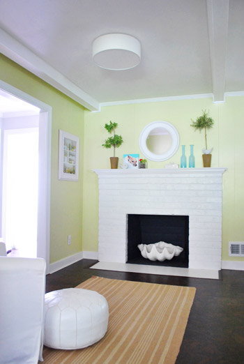
We had always meant to get something bigger and upgrade, but the rest of the kitchen kept us pretty busy and then it was onto some bedroom tweaks and some bathroom upgrades and the deck so our little fireplace mirror dodged getting the boot for a while. Not the real boot (we’ll find another spot for him) but just the above-the-fireplace boot because we wanted something bigger to:
- reflect more light
- make that soothing little zone feel expanded and more defined
- bring some of the wood tones from the cork floor up onto the wall
So anyway, long story long, we had passively looked for something at local shops/thrift stores for a while and then I went rogue while John was out getting his deck-ness on and Clara was napping. I tiptoed down the hall into the guest room (which is right near Clara’s room so I had to be all stealthy-like) and decided to try the giant mirror that we had randomly leaned above an old dresser in there about a year ago.
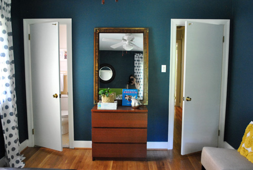
Yup, I dragged that monster into the kitchen, got my buns up on a chair while holding said beast of a mirror, and somehow managed to lean it up on the fireplace mantel to see how I liked it. The whole leaning thing wasn’t the best look (it basically leaned so much due to the placement of an outlet on the top of the mantel that it reflected the ceiling which was ugly to the max) but the color and size were actually surprisingly good. So I left it up there to mull and ran back to the office to finish some book stuff and then John came in and said “that looks awesome – let’s hang it up.”
And then I fainted.
Ok so I didn’t really faint but I made a big show out of fake fainting because 1) John is usually very “meh” about new changes (they have to grow on him) and 2) to see some random thing I did while he was off doing other backbreaking work that is sure to lead to more backbreaking work for both of us (hanging a giant heavy mirror into thin wood paneling isn’t exactly like tapping in one tiny finishing nail) isn’t usually something he’s enthusiastic about. But he was.
So after my big fake fainting show (which by the way was not met with the right level of responsive panicking if you ask me, but that could have been due to my bad acting) I stood up and we got down to the business of hanging it. We used four heavy duty 2.5″ screws, two of which we could drive directly into studs (aka: very strong) and two of which we used heavy duty anchors to secure (just for more reinforcement and so it would hang straight and centered since the studs were in odd places and necessitated two other screws to keep things hanging straight).
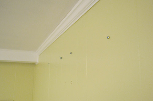
But first we had to move the hanging hardware on the back of the mirror which was screwed into the back of the frame since it used to hang vertically. Since we wanted it to hang horizontally we had to move it to the other side of the frame and then we used heavy duty picture hanging wire between those two metal holders so it could be slipped over all four of the screws that we would put into the wall to hold it up. Oh and don’t mind the crazy duct tape on the back. This mirror was a $5 yard sale score a few years back and it came all taped and crazy looking in the back, but the front is significantly less ridiculous looking and it’s all very stable regardless of the anti-confidence-inspiring effect of the tape (the thing’s not about to fall apart or anything). Thank goodness.
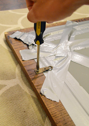
Anyway, so we moved the hanging hardware (reusing the screw that held it into the old vertical placement and transferring it over to a horizontal placement) and then added heavy duty picture hanging wire (the strong kind, not chintzy floral wire or anything).
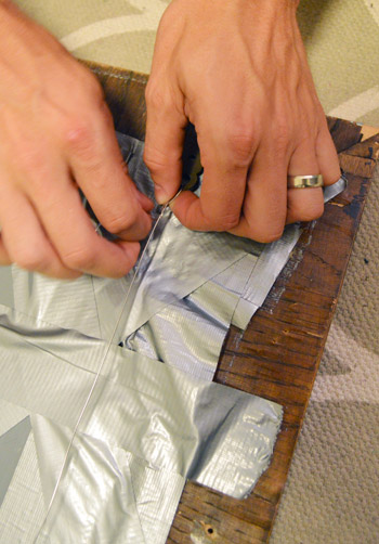
Isn’t she a beaut? Just kidding. Seriously, could there be more duct tape in this shot?
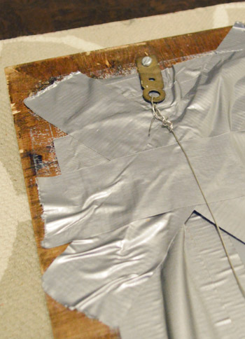
And here’s the hubs driving those screws into the stud and anchor set-up I mentioned.
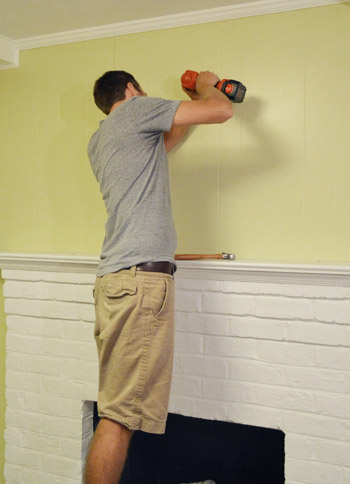
The four-screws-plus-hanging-wire process might sound complicated, but the whole thing probably took us about twenty minutes. So it wasn’t fast like hammering in a finishing nail, but it wasn’t this crazy long process involving fancy math equations or anything. And the cool thing about adding a hanging wire is that things are a little easier to get up (it just has to catch over the screw heads but it’s not maddening like little picture hooks can be when there are multiple nails or screws (getting them all to catch at the same time can make you want to stick a spork in your eye).
The difference of a nice big mirror is crazy. It’s a little more orange than the floor so I might stain it a bit more mocha to work more seamlessly with the cork, but just having that giant reflective surface is such a huge upgrade.
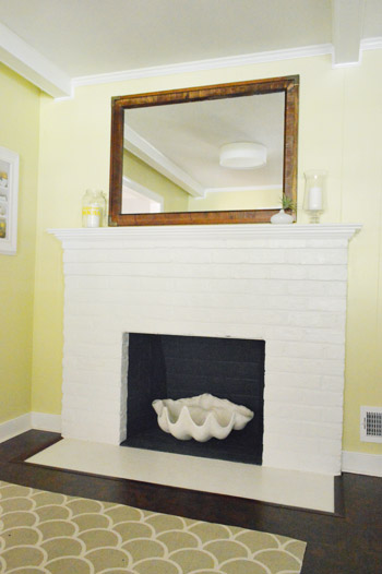
Here it is from further away. The height that it adds is awesome because it balances other tall things in the room like the pantry and even the tile that goes to the ceiling on our wall with open shelves.
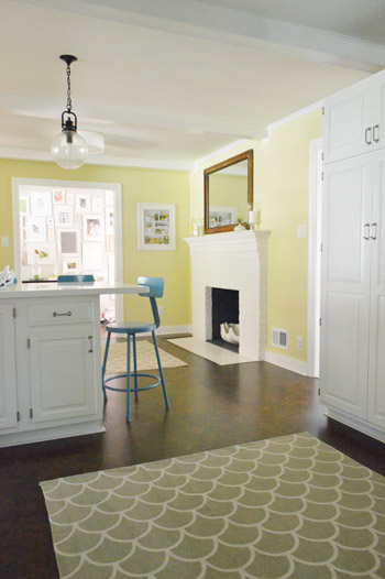
Oh and you’ll notice from that picture above that we got another cheap-o Urban Outfitters rug for the cooking area of the kitchen. First we moved our original one from the fireplace zone into the cooking area for a trial run (to make sure we didn’t get annoyed by it or drop stuff on it constantly) but since there’s about a foot of space around the perimeter (in front of the stove, sink, rest of the counter, etc) we didn’t have any issues, so we ordered it and there she blows.
But back to the matter mirror at hand…
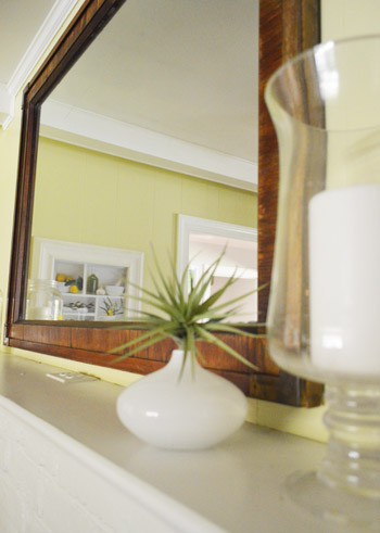
I just tossed some random things up there (like this thrift store find from Atlanta with KB). But since it’s so neutral I can basically put anything up there with it – and you know I love to change things around whenever the urge strikes…
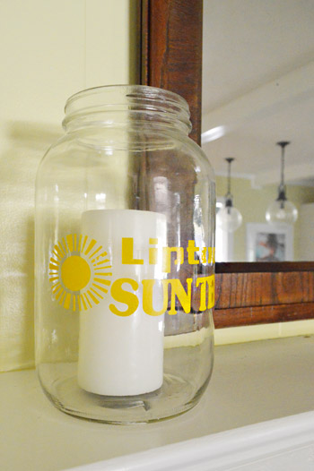
Clara photo bomb.
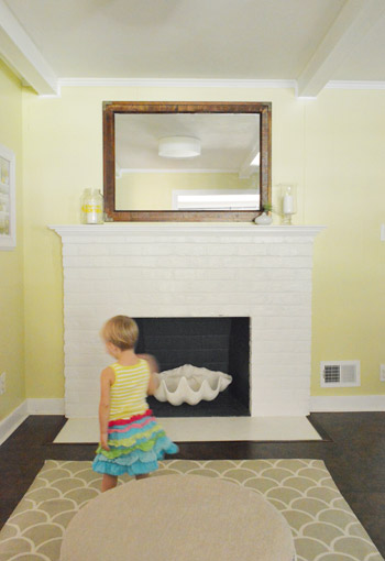
But seriously, just look at the difference from the little guy that we had before and our new guy above:
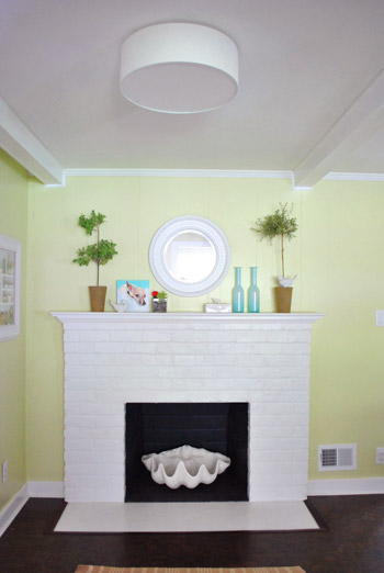
John says this side of the kitchen feels like “one of those homes in the Fan now” which is a downtown neighborhood with amazing architecture and all of this great large-scale character. It’s basically his way of saying that the ceiling feels high and it’s like one of those fancy rooms with good molding that are over 100 years old. I would simplify the description by just saying that this mirror bounces around approximately ten times more light, makes the room feel bigger and airier, and serves as an amazing focal point all the way from the front door. Sweet. So it’s totally one of those under-an-hour changes that just involved something we already owned (which kinda makes us mentally chide ourselves for not figuring it out sooner, but what can ya do). I’m just thankful we didn’t end up buying something new. The overall scale and the chunky wood frame are perfect – and the fact that we found it back in 2008 at a yard sale for five bucks is the icing on the cake. Woot!
We still have a few more changes we’re planning to make to this zone over time, so stay tuned for those updates as we inch along. In the meantime, are there any new mirror (or old mirror from another room) switches going on at your place? Any toddler photo bombs? Or weird mom-sneaking-around while your kiddo naps and you get a wild hair to redecorate something?

Melanie says
What a difference! I didn’t get a chance to comment on your afternoon post yesterday – but I agree with possibly, maybe, re-painting the kitchen. I did love the greenish/yellow walls, but just imagining other colors in your kitchen, I get all excited. Almost any color would work in there, love that.
Suni says
Looks super fantastic! So much better from the teeny mirror! Too bad you didn’t get your fainting spell on tape, would have been great to see your acting and of course John’s expression! LOL
annabelvita says
Gorgeous! I’d love to see it stained the same colour as the floors.
We only have one mirror in our flat (above the vanity), so I’m sure I go out with shoes that look silly with my outfit all the time since I can’t see them ever!
TracyZeng says
Hi,Annablevita:
I am agree :”Gorgeous! I’d love to see it stained the same colour as the floors.”
Kristen | Popcorn on the Stove says
I’m definitely a fan of this mirror’s size. Any plans in the future to paint it? Maybe a fun blue to match the stools or white?
YoungHouseLove says
I think we’re in love with the natural wood tone that ties into the cork floor, but it’s a little orange so we might refinish it with a more mocha colored stain.
xo,
s
Erin {Home Everyday} says
I’m going to be honest, I like the fireplace set up both ways! The white mirror was small, but you had everything so styled up with accessories I thought it looked cute. The larger mirror looks so sophisticated and grand, and I like that too. Long story short, I like all you guys do.
Renee says
What is that large seashell sculpture thingy in your fireplace, and where can I get one?
YoungHouseLove says
That’s a giant clam shell that we bought from a Joss & Main sale we hosted. We also have a smaller one that we use as a fruit bowl on our counter from ZGallerie. Hope it helps!
xo,
s
Cara says
A picture IS worth a thousands words. I never would have given the old round mirror any thought whatsoever but the new, bigger mirror looks so much better! It’s really sort of amazing how it changes the room, just like when you added the new, bigger rug in your TV room. Makes me think about the scale of objects in our house! Great post.
how2home says
I like the bigger mirror there as well! It fits the room better proportion wise :)
Lauren says
Just a thought, but what if you painted one row of bricks on the fireplace as an accent stripe. Might breakup all the white, which is lovely, but it might just give it that little extra something. Love the progress though!!!!
YoungHouseLove says
Fun! Always another possibility down the road!
xo,
s
Sarah says
Strictly speaking off internet photos, I like the finish as is.
Teri says
Looks great! Opens the area and makes the ceiling seem taller too! Needs a pop of color now, or maby some greenery..Topiaries would still look good placed in front of the mirror on the ends….
Eva says
The new mirror looks great.
I think you might want to use some stronger wire though. I used to work in a frame shop and the tiny wire on that big frame can snap. Some stronger “D” hooks for hardware to might help so the screws don’t pop out of the frame now that it’s hung on the wall and not propped on a dresser. I wouldn’t want it to make a suicide attempt on you guys. :)
YoungHouseLove says
Thanks for the tip Eva! That’s the heavy duty wire (it used to look thicker but it’s very strong, I think it’s steel grade or something) so we hope it’s good for the long haul. Will definitely take it down and check the wire in a day or two to make sure it’s not slipping or straining though. Good idea!
xo,
s
Ted says
My usual process for heavier items is to put two hooks on both left/right sides and string two different cables across and hang both wires on the screws. This way, if one strains and/or breaks you still have the second one. I’ve checked many years later and found one cable/wire broken, but never both. It’s easy to just replace the one wire that broke and put the hanging back up.
YoungHouseLove says
That’s really smart! Love it!
xo,
s
Cara says
Clever, Ted. I’m filing that one away.
Lori says
The color and dimensions of the new mirror work so much better now. Great choice! Some of my best projects get done while the hubby isn’t around :-)
Julia @ Chris Loves Julia says
*slow round of applause* It’s perfect. The scale makes such a big difference! We had a similar (although not AS dramatic) experience when we upgraded our entryway.
http://www.chrislovesjulia.com/2012/04/before-and-after-entryway.html
Our house felt so much bigger! Ahhh, the power of a great mirror.
YoungHouseLove says
Aw thanks Julia! Love your upgraded entry!
xo
s
Miriam says
Wow, that looks fantastic!
I’ve been meaning to do something like this with the mirror from my grandmother’s vanity– the pieces that connected the mirror to the vanity got lost many years ago. I’d love to hang it on the wall right over the vanity again, but the mirror is very heavy. Any tips for installing hanging hardware? I don’t want to end up with seven years’ bad luck!
YoungHouseLove says
I would definitely check out a hardware store for something built for a lot of weight (ex: holds 50 lbs!) and try to go into a stud with at least two screws. Hope it helps!
xo,
s
Kate says
LOVE IT! I just love “simple” changes like that. It makes you feel so accomplished, right? I found a similar mirror (a little smaller) at a thrift store a few years back and I adore it. I’ve wanted to find something like it again but have yet to stumble upon one. This post give me a kick in the pants to get to the flea market to find another one of these babies.
Samantha says
When I saw the back of the mirror all I could think of was National Treasure with crazy but loveable Nic Cage. There could be a hidden map under all that duct tape. Why else would someone put that much tape on the back of a mirror? :)
YoungHouseLove says
Hahahaha- it’s probably true! It’s the Declaration of Independence back there!
xo,
s
Paige says
one of the best things about moving is putting things in a new place using them in unexpected ways. We moved in to our home 18 months ago and I have a closet full of stuff that still needs to find a home…just waiting on it to “speak” to me and tell me where it wants to live. It’s not weird that my house and it’s furnishings talk to me is it? We have great conversations!
YoungHouseLove says
Hahah, I love it!
xo,
s
AnnMarie says
Looks great and definitely makes the ceiling look higher. I’m also loving the huge clam shell!
Kate says
What a sweet little space you’ve created there! I can’t get over how much light you’ve brought into that dark space over the last year. I also really appreciate that you’re keeping the mirror dark. A little but of natural wood and contrast have a place in every room (in my humble opinion at least)!
Adrienne says
Looks great! And I also love the giant clamshell in the fireplace – LOVE that it “mirrors” (har har) the fruit bowl. I kind of miss the topiaries, but I always think I can solve any decorating dilemma by adding a plant. Come to think of it, do you guys have any houseplants? I’m a newish reader but I guess I don’t remember any.
YoungHouseLove says
Yes, we have about ten little house plants going on randomly around the house (mainly just succulents like burro tail, a small red cactus, english ivy, ferns, those leafy vine-like plants that get huge and spider-ish and we cut them back, a big potted corn plant, and a slowly dying orchid, haha).
xo,
s
Adrienne says
Hooray for succulents! I have a ton of those, as well, mostly because we used living succulents instead of cut flowers at our wedding and I’ve re-planted all the centerpieces that people didn’t take home!
A houseplant tour might make a good post :)
YoungHouseLove says
That would be fun!
xo,
s
Allyn says
I realized when we moved into our current house just how many mirrors I’ve collected over the years. I think it has to do with the fact that in small, semi dark apartments, mirrors are crucial for making things brighter and keeping me from chewing my hair in the corner.
Of course, of of the first purchases we made for the new house was… an even bigger mirror.
It’s an addiction.
Love how much taller the room looks!
Ashley says
Love the new mirror! When I was looking at the before and after I was wondering if you guys have ever thought of adding to the fireplace? I was thinking a nice big piece of barn wood or just wood in general on top to beef up the mantel part – especially now that you have the mirror up it might give you more workable mantel space to change things up. If it was stained a dark color like your floor I think it would look awesome and break up the white-ness of the fireplace.
Just a thought! Looks great!
YoungHouseLove says
Yes, our down the road plan is actually to frame out the mantel so it’s big and chunky and then reface the fireplace with stone so it’s sleeker and more clean-looking! Should be fun down the line!
xo,
s
Ginny @ goofymonkeys says
The “new” mirror is a great choice for the space. Are you planning to switch up the color of the frame? Or keep it stained? And do you have any plans for the round mirror?
I love your blog and it’s a huge inspiration for me in so many ways!
Ginny @ goofymonkeys says
I’m such a goof – I reread the post and found where you said you might change the stain :)
YoungHouseLove says
No worries!
xo,
s
YoungHouseLove says
We love that it ties into the cork floor right now so we might stain it a bit more mocha-ish (it has a slight orange cast to it) but I don’t think we’ll paint it. As for the small round guy, I’m thinking about where he’ll go. Details whenever I crack the code! Hahah
xo,
s
Laura says
Could you switch the small round white mirror with the round one in your guest bedroom? I remember in your previous list post you mentioned doing something to him so he pops more.
YoungHouseLove says
We held him up but he’s a little too small for over the bed. I’m sure he’ll find the perfect place though!
xo,
s
Kate Leonard says
Does this qualify as a “Dude get on it?” project? Because I think it does! Hooray!
YoungHouseLove says
Haha- YESSSS!!! Wahoo! Although I only recently learned I wanted to get on it. Haha.
xo
s
Cori says
The mirror looks great! I love simple changes like that can make such a huge difference, especially when it costs zero dollars!
I’m glad to hear that John is usually “meh” about new changes, because that’s how my husband is. I get all excited to reveal my latest decorating scheme, and he just looks at it for a little while, and then says something to the extent of “Oh….well…ok, I guess.” It’s discouraging to say the least. But within a few days, he’s loving it as much as I am. Since we’ve only been married 5 months, I guess it’s something I’ll get used to.
Jess @ Little House. Big Heart. says
I like this mirror much better! It really brings some warmth up to eye level and ties into your gorgeous cork!
I can’t wait to see it completely styled!
Simon Martin says
What a wonderful project. My partner and I try to get things sorted at the weekend but time just flies- we have a old box full of old bits and bobs in our hall which still stands after 2 YEARS since moving in. Kudos to you guys standing up to the mirror!
YoungHouseLove says
Haha, that’s basically our entire playroom full of stuff!
xo,
s
Jessica D. says
Love the change! When we moved into our house there was a big heavy mirror on one of the bedroom doors (we found out it was there to hide a hole). Everytime the door was opened/closed it rattled, when we had kids it had to go. I decided to turn it horizontally and hung it on the wall in the master with an long Ikea Lack shelf under it and made it a standing vanity fr myself. It works great!
YoungHouseLove says
Love that!
xo,
s
Jordan T says
I loooove that mirror! I always get the urge to redecorate or rearrange furniture at like 3:00 in the morning when everyone in my house is asleep. Though it is funny for them to wake up and the house be changed ;)
Julie says
Jordan – I am the same way! What a riot. My husband will come downstairs the next morning and get confused. hehe
Lindsay says
I love those little campaign-y style brackets in the corners… so cool! If you end up staining the frame a little darker, maybe using some Rub n Buff to brigthen those up could create interesting contrast.
For some reason, the mirror is making me wish the wall color was a little deeper. Maybe it’s just the lighting of these particular shots, but on my monitor it’s looking more yellow than grellow. So weird/cool how one switch can totally change a room!
YoungHouseLove says
Yes, I was telling John about rub & buff for those campaign plates on the corners! Will definitely keep you posted!
xo,
s
Diane says
LIKE! Oh wait, this isn’t Facebook …
Maybe in person you see orange-ish, but in the photos it looks great as is, with some dark shadings. My vote – DON’T paint it!! How great to shop your own home.
Stacey says
I chuckled at the comment about John being ‘meh’ about new changes. My boyfriend can be irritatingly ‘meh’ about the tweeks I make although I know he appreciates me turning our house into a home.
We hung mirrors on our warbrobes recently as well as changing the hardware. The difference is amazing although it’s just one of many tweeks to come. I’ll post pictures on FB.
amybeth says
Love it! It does make your room seem SO much bigger. It’s probably partly the time of day/lighting but it also seems to make your walls a lot yellower? It almost looks like you repainted.
YoungHouseLove says
That paint color is so funny! It looks so different in photos all the time! Sometimes more green, more yellow, and even more tan in certain times of day!
xo
s
Esther says
Ok, Sherry and John , you need to help me! I love the bright yellowy green vibe I get from your kitchen walls from the pics, so much so that we will be painting the main room in our apartment (rental, the living/dining room) and I was all go for Sesame (I was just going to get a little test pot and make sure, but I thought it will be perfect for sure). Then, when I saw the little BM swatch of it in person it was TOTALLY different, all warmy and way more brown/khaki than the pics. And my HUGE dilemma that I mull over about 23 hrs out of every 24, is should I choose a warm color or a bright color?? you don’t understand, i think about it all the time! I thought loving your bright (on my computer) green/yellow kitchen had convinced me but then when I saw Sasame in person it confused me all over again. Tell me what to do, pleaeeeeeasssee!!!
Pertanent Info: It’s the main room we chill in; we live in Canada, so it’s gray outside a good half the year
YoungHouseLove says
Yes, it’s totally like a khaki color in the swatch, but on the walls of a whole room it gets a lot more greeny-yellow. It’s definitely not super bright in person (very soft) but in pics it looks so bright! Hope that helps!
xo,
s
Heather W. says
Esther I agree! I actually had been looking for a similiar color when John and Sherry painted their kitchen and I happened to have this swatch but had thrown it out as a non-contender. BUT I took a second look after they had used it and went with it and LURVE it! It is so light and cheery without being in your face like I think some other similiar colors would have been. Pictures do not do it justice! EVERYONE that has come over since I painted our kitchen/family area where we chill always say they love it! Go for it! I am shocked that Sherry even brought up repainting it I lurve it so much…. Hope this helps…=)
Heather W. says
Esther, sorry but after I submitted my comment I remembered that BM actually sells two colors that are Sesame one is 381 which is what we (me and the Petersiks) used very mellow grellow color and the other is CC638 very khaki. I bet you have the latter go check out the other swatch! Hope this helps! Good Luck!
Meg says
I LOVE this! I have a mirror project still in the basement to finish – we’re also adding a huge mirror to our kitchen – it will be placed directly across from the window over the sink to bounce some more light around. The more I look at your kitchen though – the more I think we need a recessed lighting upgrade too!
Amanda says
how fun! i would definitely stain/paint him a little darker… says the girl who just painted her new $20 yardsale mirror bright white…
http://amidawn.blogspot.com/2012/08/mirror-mirror-on-wall.html
YoungHouseLove says
Wahoo! Looks awesome!
xo,
s
Miss J says
The new mirror is definitely an improvement from the last one. However, if you’re looking for some constructive criticism, imo, when using mirrors for decor – they should reflect something lovely when you look into it. Not that your ceiling isn’t lovely (:P) here, but this is one of my biggest decorating pet peeves – getting the reflection of the ceiling when looking into the mirror. Happens a lot when people put their mirrors up high…especially on mantels. My professional advice to you would be to replace the mirror with a piece of art in a similar scale. Would be much more striking and would make your fireplace a better focal point.
YoungHouseLove says
Oh yes, we just take our photos from a lower level (we use a tripod) so in reality it doesn’t reflect the ceiling, it actually reflects the window and the pretty printed curtains in the dining room thanks to the opening that we busted into the wall! Will have to get pics from the right angle for ya!
xo,
s
Lauren says
We are nearing the 2 year mark on living in our house and we have a TON of stuff in the “just put it there for now” category. We also have an extra bedroom that rivals your playroom in the “holy moly do hoarders live here?” category. You guys inspire me to get on some of these projects! Love the “new” mirror, huge upgrade!
Carly Frates says
Am I allowed to ask an off-topic-but-slightly-on-topic-since-you-mentioned-it question? About the rugs? Forgive me if you already addressed it, but do they stay in place for the most part? Or do you use a rug pad? Is there a record for amount of question marks in a comment?
I think you guys are so cool? (Okay, question mark not needed there, but I’m going for consistency.)
YoungHouseLove says
We use a nice thick rug pad (the thickest we can find at Target) and usually try to put something on the rug like the chair/ottoman. Ours doesn’t scoot an inch, even with a zoomy dog and crazy toddler zipping around! Hope it helps!
xo,
s
Emma says
Looks great! The mirror fits perfectly. Ever think of painting the ENTIRE inside of your fire place blue (like your stools) or yellow (or something bright)? That might be fun. I know you have long-term plans for that but in the meantime, I think it might look cute. Make the clam think he’s in the ocean or something. :) Either way – that’s quite a nice nook!
YoungHouseLove says
That’s another fun idea!
xo,
s
The Mrs @ Success Along the Weigh says
The mirror looks great! But somehow my take away from this was “look how much fuller Clara’s hair looks!”
YoungHouseLove says
Haha- it’s growing! (insert maniacal laugh) It’s finally growing!
xo,
s
katie says
I love the “new” large mirror. I agree with John makes the room feel larger/taller.
Angie Lee says
Love it! I like that it broke up all the round-ness on that side of the room. I hadn’t noticed it before but the shell in the fireplace, round mirror and round ceiling light all lined up and now this breaks it up a little. I love free finds in the house. I’ve also been known to tip-toe past my boys’ rooms to keep them in a bed a little longer.
Great job!
Christina says
I LOVE big mirrors over fireplaces :) Love this change and that it was something you already had.
So what are you going to replace it with in the guest bedroom?
And did I miss something – but I guess I never noticed those beams in the kitchen area ceiling before? Did you paint them or were they already painted? And do you plan to make them match the living room beams? I am thinking dark beams in there with all the white and light colors would really help balance the floors?
YoungHouseLove says
As for the guest room- basically all the walls are bare in there so we hope to hang art, get another mirror, etc. As for the kitchen beams, if you check out the House Tour page (see that tab up under our header?) you can see the room before- basically the entire room was wood (wood cabinets, wood paneling, wood beams) so we went white with them to lighten things up overhead!
xo,
s
Sarah K says
What a difference. I love that my eye is drawn to the gorgeous beams on your ceiling now. I recently scored a gigantic mirror at Goodwill for a great price & couldn’t believe what a difference the right scale made above our dresser.
Emily Clark did a post a while back on “mirrors to the molding” and that’s what I think of now when looking for new mirrors.
YoungHouseLove says
That’s so funny. I love Emily Clark!
xo,
s
Eliza says
The larger size is nice, but I have to say I think a darker chocolate (or mocha) color would tie in much more nicely with your existing space. And honestly, I loved the white of the smaller mirror before, so you could always paint it white and then bring in fun pops of color from accessories in front.
YoungHouseLove says
Oh yes, we mentioned in the post I’m hoping to stain it a richer mocha color. Hope it helps!
xo,
s
Allison says
Love the new rug in the kitchen! I’m thinking about buying one for my house.. Would you say it’s more tan or a lighter gray? Urban Outfitters calls it “tan”, but it looks light gray in the picture.. I’m going for more of a gray color.
YoungHouseLove says
It’s definitely more gray. No idea why they call it tan!
xo,
s
Rachel says
The duct tape is totally cracking up. I imagine the previous owner being all paranoid about breaking glass and black cats and ladders or something.
YoungHouseLove says
Haha- that’s what I though! Maybe they were moving or something and they covered the back with tape in case it shattered?
xo,
s
Taya says
Love the “free” upgrade!
keri says
yes yes, give that baby a little mocha stain! it is so much better up there – and you could always swap the small white mirror back into the guest room, no? or too much circle-mirror-ness going on with the mirror over the bed?
in other news, totally had a dream last night that they by mistake shipped out my pre-ordered book – might i add, it was very nice looking, but then i posted on your facebook that i loved it, and you two were super upset because amazon shipped it to me before you even saw it. I was super excited about the book because you had a page about the comment i had made way back in dec 2010 about the new/old houses being like Barbie and Skipper…
i’m not crazy, i swear :)
YoungHouseLove says
Hahahahaha- that’s hilarious! We love the Skipper/Barbie thing. I still think about it!
xo,
s