Our master bathroom came with a mirror dilemma. Instead of having the traditional mirror-over-the-sink set up, there’s a window (seen here on this moving day pic that we snapped before we removed those bi-fold doors).
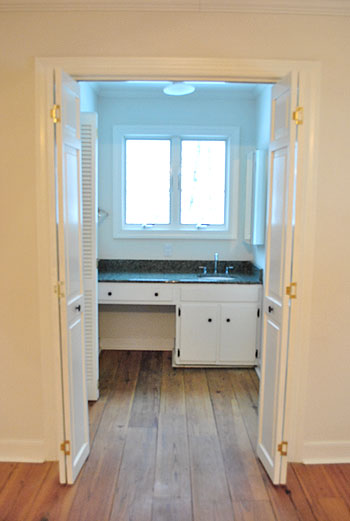
But although that picture makes the window look all glow-y and angelic, staring out at the house next door (it’s a side window) isn’t exactly ideal for brushing your teeth, shaving, fixing your hair, or walking by after a shower in the buff. Nor is that the first impression that we really want to make on the neighbors. So we knew we needed a privacy solution stat.
We also needed a functional mirror solution too. The room is (ironically) far from mirror-less. There’s a full-length one on the water closet door (yep, just broke out “water closet”)…
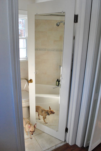
…and another on the nearby medicine cabinet (that’s two mirrors in one 4′ span of wall if you’re keeping track).
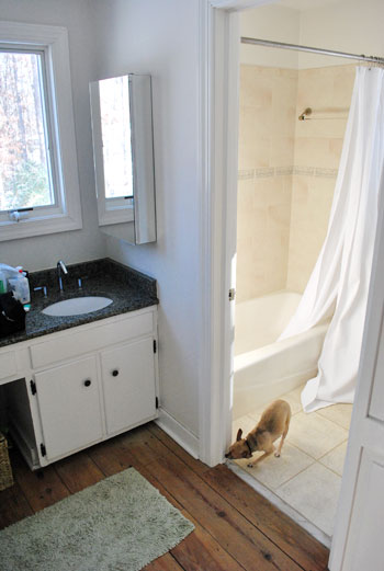
And yes, those are both shots stolen from old posts (so you don’t have to worry that Burger spends all of his free time posing for pics in our bathroom) since you know we have since removed the ol’ backsplash to yield this result:
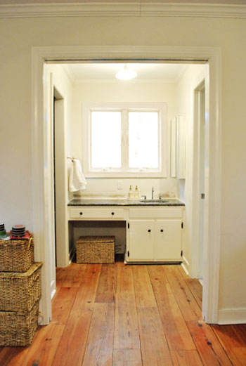
Anyway, back to the mirror dilemma. After living with the mirrors-to-the-right layout for a couple of weeks (while singing “To The Right” instead of “To The Left” a la Beyoncé), the traditionalist in us was just itching for one in front of our faces. Right smack in the middle of the window. Although we had an embarrassment of riches when it came to the number of mirrors surrounding us in the master, we just didn’t have one where it was most sorely needed. So we opted for a not-so-traditional solution. This:
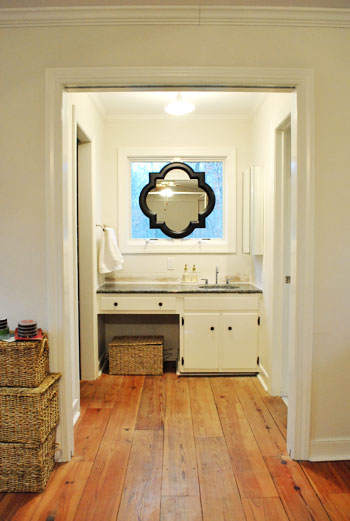
Call us crazy, but we hung a mirror right on the window frame itself. Sure we’ll miss some of the light that it let in, but thankfully we have two other huge windows in the bedroom and a third in the bathroom- so the room’s not hurting for light). And we definitely won’t miss the actual view of the house next door (and the fear that we were making quite an odd first impression by sharing so many tooth-brushing moments). And the function. Can we just talk about the function? I am a man. So that stuff is king. And I can’t even tell you how much easier it is to shave without having to keep my head at a right angle to see what I’m doing.
The mirror itself is from the Allen + Roth line at Lowe’s. After searching unsuccessfully for a perfectly sized round one at HomeGoods, TJ Maxx, Marshalls, Pier 1, and World Market we were more than happy to spill 65 beans on one with such a distinct shape and clean look (a whopping $614 cheaper than this similar version from Restoration Hardware). And all it took to hang it was one screw in the center piece of wood between the windows and a small square of velcro on the bottom (to hold it firmly in place from the bottom so it wouldn’t teeter from side to side). Bonus: the windows can still be opened and closed while it’s hanging thanks to the knob placement at the bottom of the panes (instead of the center, which would have been blocked by the mirror).
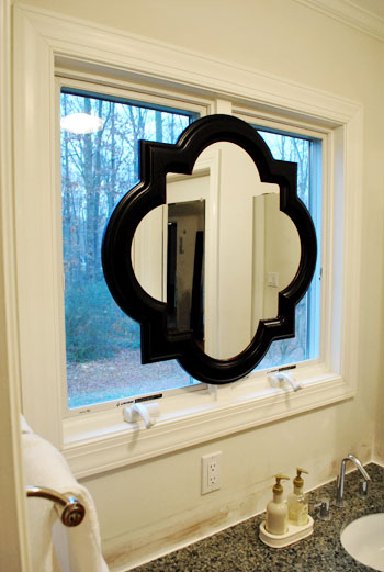
And let’s revisit the shape. We mentioned we were originally looking for a round mirror because the wife thought it would add some nice curves to those angular windows, but it needed to be huge because something that was under 28″ wide wouldn’t allow both of us to see our entire faces in it (thanks to our 10″ height difference) if it was hung completely centered (top to bottom) on the window- which Sherry was adamant about. The miracle of finding something this shape meant that there was a little extra span of reflective room on the bottom thanks to the irregular shape- which is almost like two ovals overlapping at 90 degree angles) which makes Sherry positively giddy about all that added “mirror real-estate.” Here’s a direct quote: “not only can I see my face, I can see my neck!” The girl was beside herself with joy.
Oh and for those wondering why we didn’t opt for a mirror that could be mounted on the side wall but folded out so we could look see our faces by looking straight ahead, we just thought that would look more bathroom-y, while this solution looked a lot more decorative and would read more as “vanity in the corner of a bedroom” instead of “sink across from the bed.” Plus it’s balanced, and you know we have a thing for balance.
But the project was not complete until we said goodbye to the old mirrored medicine cabinet.
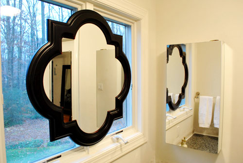
So we took it off the wall, along with the towel bar on the opposite side (we now keep a white towel folded next to the sink which seems to do the trick) and added both the medicine cabinet and the towel bar to our ReStore donation pile.
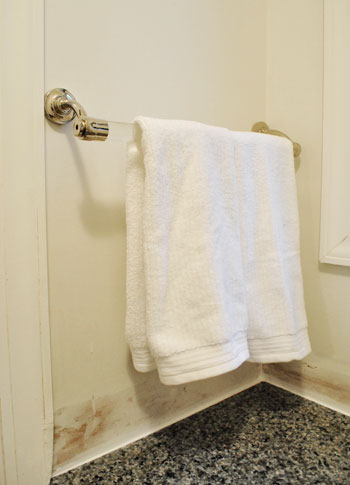
Doesn’t it look even less bathroom-sinky in there now that those two elements are gone? And we don’t mean to tease, but painting the entire bedroom is on the agenda for today or tomorrow. Woot! We also might paint the mirror frame white (or a softer color to help it blend in with the window moldings like gray) though we haven’t decided on that 100% yet… so we could go either way.
And as for how it looks from outside, it’s one big tan shape from behind (nothing too messy looking) so it just a symmetrical light brown shape suspended in the middle of the window. Which oddly enough blends in with all the colors of the tree trunks and other exterior elements. And of course frosting the window could add even more privacy when it comes to the view from outside, but since the neighbor’s house is actually a ways away, we don’t think they can make out our shapes anymore with so much of the window obscured.
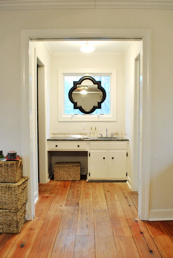
Words can’t describe how spoiled we feel to have a mirror above the sink again. Seriously, it’s rocking our world right now. And we’re not the first people to do the whole mirror in front of a window thing. Check some others out here, here, here, and here. What do you guys think of our not-so-normal solution?
Update: See how our sink mirror project turned out here.

Amy B says
LOVE that mirror! What a great idea, it has a the perfect shape for the window. I might have to go snag one of my own with the little bit of Christmas money I have left! …well, once this crazy GA blizzard passes anyways. Our house in Athens looks like the pics of yours from your moving day!
Lucy says
Too funny – I was just reading a post on quatrefoil on houzz.com: http://www.houzz.com/ideabooks/162551/list/Hot-Pattern–Quatrefoil-is-Back-and-It-s-Beautiful.
You guys are too trendy!
Gayle says
Okay, didn’t like the mirror…but it intrigued me, so I came back to look again. I do like it. In fact, I would paint the mirror frame the same color as the window trim to make it look like a cohesive structure. Between the window, the sink countertop, and shape of the mirror, the window frames themselves…and then any other features you do in the future…I think anything different from the trim color is a little much at this moment in time. I believe if the mirror frame needs to be a color, that will reveal itself as you progress in the room. Just my 2 cents.
laura says
love it…you guys have the best solutions. In fact, yesterday I was looking at my house thinking…”man, I wish I had john and sherry here to tell me what I should do with this place!”
Anna says
What a nice architectural detail. Great trade-off!
She-Ra says
To be completely opposite of everyone else… I don’t think you should paint it. I like it as a bold eye-catcher. I love the shape which is also emphasized by the dark color against the white. I also like how the dark color pulls together the countertop and the cabinet hardware. You may ultimately be planning to change all those options, but for now, I like how they all go together.
Tamara @ Etcetorize says
Oooh la la! I love this idea. I can’t wait to see how the whole room looks when you’re done~
Nancy says
Love the look of that mirror! Sorry if this was already asked/mentioned but what does the back look like from outside?
Great job!
Jenn L says
The mirror you chose is GORGEOUS! And what a great solution! Now you have plenty-o-mirrors to get ready for the day! =)
xoXOxo
Jenn @ Peas & Crayons
KarenC says
I’m all about balance and symmetry… so that medicine cabinet was driving me crazy, too! LOL
I think the mirror looks great… love the shape. It almost reminds me of looking at a stained glass window.
I agree with painting it a lighter color, and I think you should frost the window panes. That would make it stand out even more, as well as give the two of you some privacy.
Kara says
I absolutely love the mirror! It looks amazing! I’m glad to see that you said goodbye to that medicine cabinet and the towel rack.
mary W. says
I have seen that mirror a hundred times @ Lowe’s and SOO happy to see you put it to great use! I love the layers and all of the contrasting lines/ overlapping circles of the mirror on the window panes = super cool. But honestly, super stoked to see a photo of the new paint color with those floors for a total jackpot! Cannot wait!
Amanda says
This would look a lot more ‘its suppose to be there’ if it was painted white. Can’t wait to see it painted white :) (I’m hoping you go with white rather than gray!) Good luck painting such a big bed room :)
Faith says
I would paint the mirror, especially if the effect you are going for is to try to minimize the fact that you have a sink in your bedroom. The black frame is striking, but it screams VANITY, LOOK AT ME!
robin/burlington,nc says
When I first started reading the post I was a little taken back. Taking the towel bar and the medicine cabinet really helped and I am voting for softening the frame with paint. Love that you can see Clara’s weekly photos all together now. Thanks for letting us share in her growth.
Landry says
I love the new mirror, practical & beautiful! Was the medicine cabinet recessed? Ours is and I REALLY want to take it down, but I’m nervous about patching the drywall. I’m pretty handy but have never tackle drywall before. Have you guys??
YoungHouseLove says
Hey Landry,
Nope, luckily it wasn’t- but if it was we’d have to re-drywall and mud it. Google around for instructions (maybe try youtube for a video?). Good luck!
xo,
s
Snickrsnack Katie says
Neat idea, but I think the black looks rather odd against all that white. Not that I dislike black – I rather like it – but it just seems odd when you have everything else black. I see you are thinking of painting it white – I think that would look a lot better. It just seems to be out of place right now.
Cool idea, though! I think you came up with a great solution!
Laura Jeanne says
Don’t paint the mirror!!!! I love it – with the basket and wood floor – I love how it stands out and you can really see the cool shape of it! . . . then again, I am not a designer.
:)
Angela says
I love it but am curious what it looks like from outside? Great idea!
YoungHouseLove says
Hey Angela,
It’s one big tan shape from behind (nothing too messy looking) so it just looks like a big light brown quatrefoil shape suspended in the middle of the window. Which oddly enough blends in with all the colors of the tree trunks and other exterior elements.
xo,
s
Paige says
I think you guys really worked that space and chose the perfect mirror. It really looks great!
Lindsey says
Great idea! I love following your blog and seeing all that is to come with the new house.
robin/burlington,nc says
One other question: Do you think you’ll change the hardware on the cabinets?
YoungHouseLove says
Hey Robin,
Of course! Can’t wait!
xo,
s
Laura@JourneyChic says
I never would have thought of that in a million years, which is why I love you guys! I have the same mirror (or a very similar one) that I picked up at HomeGoods a while back for $50. It’s such a great shape!
andrea melberg thompson says
Oh my goodness, I love you guys make me think outside of the box! I suspect this mirror will get tweeked somehow, having read your blog for about 2 years now. I suspect someday you will change up the color… Maybe a bold color from your bedspread??? Also, if others are thinking of doing something like this… what about adding an eye hook on each side of the mirror, add a chain to the eye hooks, then have a hook above the window and hang the chain from the hook. Just a different look that some might like… so you kind of make it float in front of the window (while still using the velcro to secure it). Just a thought.
Continue to find so much use in your blog. Thank you. I admit I wondered about your life balance, and actually did wonder if you did things outside your home. I am glad you mentioned finding balance in a post a while back.
Take Care!
Becky says
I think the mirror is a fabulous idea. I would love to see it painted to match the window frame. I think from across the room it would give the illusion of a custom window. Can’t wait to see what’s next.
Lauren says
Looks great! I was thinking as I was looking at the pics that it might look kind of cool if the windows behind the mirror were “frosted” like you did to the entry door to the kitchen. Just a thought, then you wouldn’t have to see the neighbors and be in the buff as much as you want ;)
Aly says
I’m with Nancy, what does it look like from the outside? I’m not sure how your outside living space is, so you may not even see it, but it seems like it should look as great from the outside as it does the inside.
YoungHouseLove says
Hey Aly,
It’s one big tan shape from behind (nothing too messy looking) so it just looks like a big light brown quatrefoil shape suspended in the middle of the window. Which oddly enough blends in with all the colors of the tree trunks and other exterior elements.
xo,
s
court says
MUCH MUCH better! Leave it to you two to figure out a practical, but stylish solution.
annie says
a lovely idea. i have the same mirror above my fireplace and i can’t get enough of the shape. http://paiduptop.blogspot.com/2010/11/mirror-mantle-mania.html
loving it and can’t wait to see the bathroom all finished up!
annie
http://www.paiduptop.com
Melody says
I’m a fan. If you’re looking for added privacy, you could probably even put sheer curtains behind it. But I think I like the way it is now. It’s cleaner.
Reenie says
Love it ~ it would have driven me crazy too without a mirror above the sink ~ that’s where I do my makeup. Love teh shape too!
Emilie says
I’ve been lurking for a while but this is my first comment – I really love the way the mirror looks in the window, but have you guys thought about frosting the glass on the windows? I’m sure the mirror takes care of most of the privacy issue, but I’d still want the added privacy.
YoungHouseLove says
Hey Emilie,
Yup, scroll back for that info. Hope it helps!
xo,
s
Tina says
I love it! I’m currently searching for 3 mirrors for my bath remodel. Its shocking how expensive they are, but I have a few discount places to look still.
Kathryn says
LOVE IT! Nice work! And honestly, that will make for really good light when putting your makeup on, Sherry! No makeup lines!
Bethany says
@Landry: We had a recessed medicine cabinet over the sink in one of our bathrooms. We just took it out and hung a prettier mirror over the hole. It’s probably not the best solution, but it’s not on an outside wall or anything. You can’t tell there’s a hole behind the mirror! Obviously, that wouldn’t have worked in John & Sherry’s case, but if you want to hang another mirror there, it might!
Laura says
Love the mirror! Have you considered putting a frost on the window so you would have more privacy? It would also let in light so you wouldn’t lose that and I think you can buy a “frost” in a spray can!!
YoungHouseLove says
Hey Laura,
Yup, scroll back for that info!
xo,
s
Meghan says
I also have a bathroom with a ton of mirrors and I LOVE it – they make everything seem so much bigger and brighter. Personally, I really like the contrast of the black frame (even just the graphic look of it against those fabulous old floors), but I’m sure that whatever you choose to do with the color will look great. Besides, the new wall color for your bedroom might change everything, right?
YoungHouseLove says
Hey Meghan,
Absolutely! We’d like to see the bigger picture before making a decision either way!
xo,
s
JenM says
Yayy for finding a mirror you both can use! My husband is a foot taller than I am, and in the last 2 homes I didn’t have a mirror where I could see my entire face. We were able to fix the mirror issue in 1 bathroom/house, but not in the previous bathroom/house. In the Auburn house (we refer to them by street name) the previous owners went crazy with those basic crappy bisque tiles you can find at any Home Depot or Lowe’s. They tiled the shower surround all the way up to the ceiling, then up to 5 feet high on every wall, then another 2 1/2 feet above the sink. We bought a huge rectangular mirror that fit the space perfectly, but due to tile surround it had to be hung too high for short me to see myself. We considered removing the tiles but with 3400 sq ft home that had to be completely renovated in 2 years the tile removal project fell off the list.
RLB says
I love your solution, but I think you’re right that it needs to be painted. You have such beautiful floors, I’m wondering if you could find a golden-hued brown for the mirror frame that would pick up the floor color.
Laurie says
Love it. This is a fantastic example of you guys going bolder! Yet you’re still sticking to your simple, DIY roots.
Creative changes that in one afternoon can smooth your day-to-day living are the best.
Now that you’ve got the bold glam look going though that basket looks sadly out of place. Skirt? New storage? can’t wait to see what comes next.
Andrea Ludtke says
I love the solution! Perfect shape and interesting placement. Did you do anything to the back of the mirror so when you’re outside you don’t see a not so attactive back of a mirror? What was your solution?
YoungHouseLove says
Hey Andrea,
It’s one big tan shape from behind (nothing too messy looking) so it just looks like a big light brown quatrefoil shape suspended in the middle of the window. Which oddly enough blends in with all the colors of the tree trunks and other exterior elements.
xo,
s
nikki says
I really, really like it! It makes me wish I could do that in our bathroom!
CJ says
Very creative solution! LOVE the dark frame on the mirror, it goes very well with the color in the countertop. It really pops! However, I can understand if you want to paint it a more subtle shade too — sometimes a master bathroom might not be the best place to make a statement compared to every other room in the house! Can’t wait to see what you guys decide to do.
Jen@Organized-Design says
I love love love this idea, and I think it turned out great. I like how the window isn’t totally covered; it looks like it was supposed to be that way! It reminds me of how I’ve been seeing a lot of mirrors and pictures being hung on the front of bookshelves. Love the mirror too!!
Lesley H says
LOVE this solution – practical, beautiful and the mirror looks like an architectural feature. Nice work! Can’t stop drooling over the bedroom flooring – totally swoon worthy.
Stephanie says
I really love this mirror – and I love the dark frame. I wouldn’t change a thing! Now you’ve motivated me to start thinking about a full-length mirror in my bedroom. Definitely missing that component, but still wondering where to put it.
Chicago Cuisine Critique says
What a great idea! I love the look. I could see where you would maybe want to tone down the window color, yet I would stick to grey if you do as I think the white would be too much for me. The black sort of brings in the colors from the counter top. Of course you will do as you wish but had to give a little opinion with my praise. :)
Sarah (Sarah Learns) says
wow, the mirror over the window totally works. i really would never have believed that could look good! haha, nice job yet again. also, i loathe medicine cabinets, so congrats on getting rid of yours! can’t wait to see the painted bedroom.
tia says
I sort of like the black picking up the counter color. Might look really nice depending on what you do with the wall color. Also incredible difference the backsplash made. I wish I had the guts to just go ahead with a project instead of debating it to death. Sometimes it IS just easier to show the results than to try to explain the plan!
valerie J. says
Looks great! I’d be tempted to paint it the same color as the trim so it’s looks like it’s always been there and belongs there. Also, that little cubby under the sink looks like a great spot for a pleated skirt to hide a Burger den. :)