Our master bathroom came with a mirror dilemma. Instead of having the traditional mirror-over-the-sink set up, there’s a window (seen here on this moving day pic that we snapped before we removed those bi-fold doors).
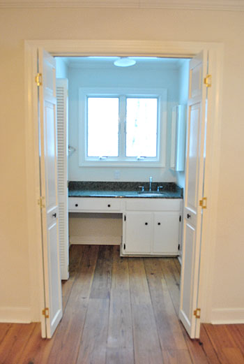
But although that picture makes the window look all glow-y and angelic, staring out at the house next door (it’s a side window) isn’t exactly ideal for brushing your teeth, shaving, fixing your hair, or walking by after a shower in the buff. Nor is that the first impression that we really want to make on the neighbors. So we knew we needed a privacy solution stat.
We also needed a functional mirror solution too. The room is (ironically) far from mirror-less. There’s a full-length one on the water closet door (yep, just broke out “water closet”)…
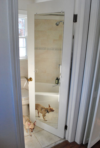
…and another on the nearby medicine cabinet (that’s two mirrors in one 4′ span of wall if you’re keeping track).
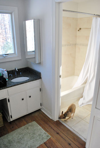
And yes, those are both shots stolen from old posts (so you don’t have to worry that Burger spends all of his free time posing for pics in our bathroom) since you know we have since removed the ol’ backsplash to yield this result:
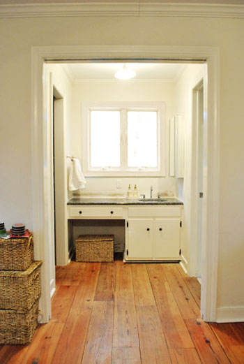
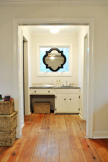
Anyway, back to the mirror dilemma. After living with the mirrors-to-the-right layout for a couple of weeks (while singing “To The Right” instead of “To The Left” a la Beyoncé), the traditionalist in us was just itching for one in front of our faces. Right smack in the middle of the window. Although we had an embarrassment of riches when it came to the number of mirrors surrounding us in the master, we just didn’t have one where it was most sorely needed. So we opted for a not-so-traditional solution. This:
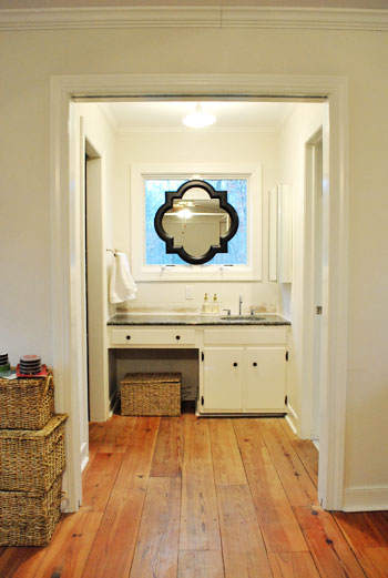
Call us crazy, but we hung a mirror right on the window frame itself. Sure we’ll miss some of the light that it let in, but thankfully we have two other huge windows in the bedroom and a third in the bathroom- so the room’s not hurting for light). And we definitely won’t miss the actual view of the house next door (and the fear that we were making quite an odd first impression by sharing so many tooth-brushing moments). And the function. Can we just talk about the function? I am a man. So that stuff is king. And I can’t even tell you how much easier it is to shave without having to keep my head at a right angle to see what I’m doing.
The mirror itself is from the Allen + Roth line at Lowe’s. After searching unsuccessfully for a perfectly sized round one at HomeGoods, TJ Maxx, Marshalls, Pier 1, and World Market we were more than happy to spill 65 beans on one with such a distinct shape and clean look (a whopping $614 cheaper than this similar version from Restoration Hardware). And all it took to hang it was one screw in the center piece of wood between the windows and a small square of velcro on the bottom (to hold it firmly in place from the bottom so it wouldn’t teeter from side to side). Bonus: the windows can still be opened and closed while it’s hanging thanks to the knob placement at the bottom of the panes (instead of the center, which would have been blocked by the mirror).
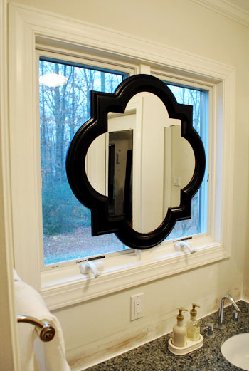
And let’s revisit the shape. We mentioned we were originally looking for a round mirror because the wife thought it would add some nice curves to those angular windows, but it needed to be huge because something that was under 28″ wide wouldn’t allow both of us to see our entire faces in it (thanks to our 10″ height difference) if it was hung completely centered (top to bottom) on the window- which Sherry was adamant about. The miracle of finding something this shape meant that there was a little extra span of reflective room on the bottom thanks to the irregular shape- which is almost like two ovals overlapping at 90 degree angles) which makes Sherry positively giddy about all that added “mirror real-estate.” Here’s a direct quote: “not only can I see my face, I can see my neck!” The girl was beside herself with joy.
Oh and for those wondering why we didn’t opt for a mirror that could be mounted on the side wall but folded out so we could look see our faces by looking straight ahead, we just thought that would look more bathroom-y, while this solution looked a lot more decorative and would read more as “vanity in the corner of a bedroom” instead of “sink across from the bed.” Plus it’s balanced, and you know we have a thing for balance.
But the project was not complete until we said goodbye to the old mirrored medicine cabinet.
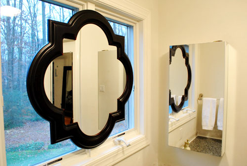
So we took it off the wall, along with the towel bar on the opposite side (we now keep a white towel folded next to the sink which seems to do the trick) and added both the medicine cabinet and the towel bar to our ReStore donation pile.
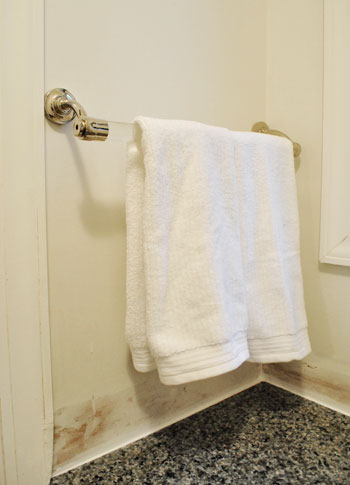
Doesn’t it look even less bathroom-sinky in there now that those two elements are gone? And we don’t mean to tease, but painting the entire bedroom is on the agenda for today or tomorrow. Woot! We also might paint the mirror frame white (or a softer color to help it blend in with the window moldings like gray) though we haven’t decided on that 100% yet… so we could go either way.
And as for how it looks from outside, it’s one big tan shape from behind (nothing too messy looking) so it just a symmetrical light brown shape suspended in the middle of the window. Which oddly enough blends in with all the colors of the tree trunks and other exterior elements. And of course frosting the window could add even more privacy when it comes to the view from outside, but since the neighbor’s house is actually a ways away, we don’t think they can make out our shapes anymore with so much of the window obscured.
Words can’t describe how spoiled we feel to have a mirror above the sink again. Seriously, it’s rocking our world right now. And we’re not the first people to do the whole mirror in front of a window thing. Check some others out here, here, here, and here. What do you guys think of our not-so-normal solution?
Update: See how our sink mirror project turned out here.

RebeccaNYC says
Really beautiful! Now I would love to see the vanity totally replaced by a “chest of drawers” that just happens to have a sink in it. I love watching what you are doing to your new house!!! What an exciting part of your lives this is. xoxo
brandt @ New House on the Blog says
“…staring out at the house next door isn’t exactly ideal for…walking by after a shower in the buff. Nor is that the first impression that we really want to make on the neighbors.”
You crack me up sometimes John because you type the things that I think when I see pictures and read your posts. Great minds think alike!
And Sherry, you’re pretty cool too. ;-)
And Burger’s just making his presence known, showing everyone that he is King of the Castle, Lord of the Manor!
Christy Panzarella says
I think you should tint the window like you did the door downstairs.
Sheena Schleicher says
Like everything you guys do.. I love it! I am interested, though, about how it would look if painted to match the window sill. Can you pretty please photo shop it to see what it would look like? :)
Camille says
For your readers- I have the EXACT mirror (three of them to be exact) that I got from Target on sale for $15 each. I don’t think they are as large as your bathroom mirror but they look great all lined up and they fill up a large white boring wall I didn’t know what to do with.
They don’t advertise them and I don’t think they are online either but I saw they still had some at my local target last weekend. They are mixed in with the other home decor mirrors/wall art.
LauraC says
like!
foo says
At first glance I did not like it, but it might just be the frame color. I’m sure once you paint the walls I’ll come around. Not that you should give a hoot what I think. ;)
If you find the back of the mirror start to bother you in the future, you could get the brown wrapping paper that has various toile patterns on it. They come in all kinds of designs and you find them often backing paintings/prints. =)
Jessica G. says
I think the mirror looks really cool! My instinct would be to paint the frame white, but maybe that’ll change after you paint the walls.
I’m 5’1″, so I can totally relate to Sherry’s joy. In my last place, the bathroom mirror cut off just above my chin so I was always on my tippy toes.
liz says
Not to overdo it on the frosted glass look, but I personally LOOOVE the way the photos you took look when the light is shining brightly enough that you can’t see the details behind the window (like the trees, neighbor’s house, etc), simulating the glass being frosted/opaque. Dig the mirror in front of the window (I had a hunch you might go that direction, for some reason), but frosting the glass would be my final touch. I also probably couldn’t resist putting something on the back of the mirror (fun pattern, splashy “HI NEIGHBORS” phrase) to make it sweet on the back side, as well.
Katie says
First, love the mirror idea. Would have never thought of that.
Second, I really am enjoying some of the recent posts because they’re about editing. I love seeing how taking away some elements is just as important (if not more so…) as adding to a space to give it the right feel for you.
Jackie says
I love the look of the mirror and where you put it. I don’t think that it detracts from the light because it reflects…great solution for an odd placing of the sink. You are doing a great job, can’t wait to see your progress.
Jacquelin Seybert says
Aaaahhh! The mirror is amazing! You two are such an inspiration. I’m loving all of these projects on your new (old) home =)
Mike Thompson says
Have you considered painting the trim of the window the same high-gloss color of the mirror instead of white? That way it tricks the eye into thinking the entire window is part of the mirror. Canadian House and Home says black trim is all the rage nowadays.
YoungHouseLove says
Hey Mike,
We have! Scroll back through the comments for more info on that.
xo,
s
Erin says
I like your solution, but the blackness of the mirror is a little offensive.
mribaro says
That’s one grand looking mirror, WOW!!!
Sorry if it’s been mentioned before (I haven’t read all the replies to this post) – for more privacy you could also frost the glass panes so they stop being see-through, but still let enough light in, as you already know :)
Chelsea says
That’s an awesome idea! Way to think creatively.
Nancy says
Forgive my eagle eyes in advance, but I noticed you had some Fruits & Passion “cucina” handsoap and lotion next to the sink. Isn’t that a Canadian-only company or is it available to you guys in the states?
YoungHouseLove says
Hey Nancy,
Wow! Eagle eyes is right! They actually sell it here at Anthropologie (we refill it with cheap-o Dr. Bronner’s soap though).
xo,
s
Caroline @ The Feminist Housewife says
It’s unconventional; and I love it! = )
Mindy@FindingSilverLinings says
Sweet! Natural light is ideal for putting on makeup, so a window is the perfect backdrop for a mirror. Love the graphic shape of it too! Loves it!
xo
Mindy
Barb says
John and Sherry:
I love it and the shape is so great in that space. You have really transformed the bathroom and when you paint it….it will have the WOW factor.
Have you thought about changing up the hinges and getting some new knobs to make it a bit more up to date? Brushed nickel? Just a wee suggestion…..not trying to tell you what to do, promise.
B.
thuy says
Awesome project as usual guys. If you’re still at all swayed by your readers, my vote would be to definitely paint the mirror gray or white as you had mentioned.
I can see why some people like the black, but I’m in the boat of the black being too “in your face” and it not blending in quite so well. I think a lighter color will definitely give a nice airy feel! Can’t wait to see what you guys decide! It will look great either way.
Barb says
Oops…forgot to add this. Perhaps knobs in the fake draswer under the sink…call me crazy. I like symmetry!!!
YoungHouseLove says
Hey Barb,
We’re suckers for symmetry too! That’s definitely on the agenda along with the other things you mentioned in your first comment!
xo,
s
Tanya says
Wow! I really like the look. And I love that you did what works for you. Also, that mirror is great. They are building a Lowe’s by my house (the first in the city) and I drive by way too often to see if its open yet. Now I am super anxious becuase that mirror would look great in my half bath! It has a stunning shape.
~Tanya
dans-le-townhouse.blogspot.com
Jasmine says
Wow! That is genius and a win-win…. mirror AND windows? *stands up and does slow hand clap*
Michelle @ Dream Home DIY says
I really love this as a solution! And the black and white mixture really is great :0)
Stephanie @ AHomeWest says
GREAT solution! Makes me wish I had the “problem” of a window in front of a bathroom sink.
Jen @ The Decor Scene says
I LOVE IT!!!! I think once you paint the walls the black mirror frame might make sense and give the area dimension. BUT I can also see painting the mirror frame white and have it blend in with the window frame. I think you can go wrong either way. You guys are such teases….I can’t wait to see what color you decided on for the bedroom. So exciting. :D
Kristen Miller says
LOVE!
Amy says
I just bought the same mirror at Target not too long ago for $15.00. It’s a smaller scale though.
http://www.target.com/s?keywords=mirrors&searchNodeID=1038576%7C1287991011&ref=sr_bx_1_1
Amy says
Oops, wrong link!
http://www.target.com/Clover-Mirror/dp/B003T2MA18/ref=sr_1_13?ie=UTF8&searchView=grid5&keywords=mirrors&fromGsearch=true&sr=1-13&qid=1294677587&rh=price%3A1500-2499&searchRank=target104545&id=Clover%20Mirror&node=1038576%7C1287991011&searchSize=30&searchPage=1&searchNodeID=1038576%7C1287991011&searchBinNameList=subjectbin%2Cprice%2Ctarget_com_primary_color-bin%2Ctarget_com_size-bin%2Ctarget_com_brand-bin&frombrowse=0
YoungHouseLove says
We love that one too! It was too small for our bathroom solution but so pretty for other spaces!
xo,
s
Tiffany says
Love it! You guys are so clever. I’m so excited to watch your journey of making your new house a home. You have so many awesome tricks up your sleeve(s). Awesome. little. family.
Barbara says
The mirror looks great! I would paint it white to match the trim because it definitely stands out. Just wondering – are you going to frost the windows for more privacy? So your neighbors can’t see when you walk by in the buff?
YoungHouseLove says
Hey Barbara,
Scroll back through the comments for more info on that. Hope it helps!
xo,
s
Melissa says
It looks great and that room already looks so much better than it did the first day you moved in.
Krissie says
Love it! I am excited to see what color you will end up with on the walls…. my curiosity is with what type of knobs you will use on the cabinet, basket or chair in the open space, and will you guys use an unconventional way to hang your towels?????? hmmmmmm….
YoungHouseLove says
Hey Krissie,
We’re not quite sure yet! We’re tackling one thing at a time as we go to keep things manageable and avoid getting too overwhelmed. Where will we end up? Who knows! Hehe.
xo,
s
katie kindness says
Loving the new look~ i was wondering though, with a window behind the mirror, have you had problems yet with getting ready with the sun shining right in your face? or do you have trees that keep out the direct sunlight?
YoungHouseLove says
Hey Katie,
Nope, no issues with sun shining onto our faces since the bedroom is pretty wide so the sun just shines onto the floor a few feet in front of the vanity in the morning.
xo,
s
Jamie B says
Hmm. I find it odd but I can also see how it sort of works. Haha, how’s that for a backhanded compliment? But I do mean it that way, I admire how you guys “think outside the box” as they say.
I think I would like it better with a lighter coloured frame (or maybe if you add other darker elements), but the shape is delicious.
carolyn says
Love It! It totally makes the space feel more like a part of the room instead of a weird sink in the bedroom. Good work!
Alison says
Hmmm..love your work, but I am just not digging this! My vote is definetely to paint it!
Mama Marchand says
Love it! What a great idea!
grace says
great solution! i too would love to see the mirror painted white–it would look much more like a built-in feature rather than a stuck-on solution (not that the dark frame looks terrible, but it is kind of jarring and is the first thing you notice in those pictures). but, maybe the contrast isn’t as harsh in real life! anyway, i love your creative solution as always!
J&JHome says
I think it looks fantastic. I love the way the nook is turning out and the mirror is a perfect addition. I’m working on a mirror right now and I need help on what color to do. It’s so hard to make a decision.
http://jandjhome.blogspot.com/2011/01/how-not-to-silver-leaf.html.
K says
Really? I think this is a terrible solution. Putting a mirror over a window? Not only are you cutting off all that beautiful light, but think about how bad it will look from the outside. I would have gone with a small standing mirror on the counter, or just gone all the way and bricked up the window and make it into an actual wall. You guys are DIY’ers, you can get more creative than this, can’t you?
YoungHouseLove says
Hey K,
Wait, so you think blocking some of the light with a mirror is a terrible solution but bricking up the window and making it an actual wall is a better option? Or shaving/brushing our teeth/putting on make-up would work with a small hand mirror on the counter? To each his own I guess! We also mentioned how it looks from the outside in past comments, so feel free to scroll back for that info!
xo,
s
Laura says
Great addition! You guys always come up with the neatest ideas. Are you going to ‘frost’ the window for more privacy.
I did that with a curio of mine, like you did your door in the laundry. Easy Peasy. Can’t wait to see the rest of your updates.
Toodles,
L
Julie M. says
I love it. And thank you for the links to how others have mounted a mirror over a window. What are your plans for the long term for this area? Do you plan on eventually redoing the entire master bath and moving the sink in the bathroom, or do you think you’ll keep this configuration?
YoungHouseLove says
Hey Julie,
We’re not sure if we’ll embark on a huge bathroom reno in a few years but so far we really like the function and the look of the small changes we’re making so we definitely won’t be rushing into anything!
xo,
s
Stephanie says
I would go crazy if I didn’t have a mirrior in front of me so this is a great solution! I think you should paint it but maybe once you paint the walls it won’t stick out so much. I anxiously await that post!
Jo says
I have done the same thing for the same reasons! I did it abt 4 yrs ago and do not regret having a mirror in the window
Jamie Delaney says
I love it! You guys are so creative. Wondering though what it looks like from the outside? I think the mirror frame would look really pretty painted white/gray, I think it would really blend well with the white frame around the window. Are you worried about privacy; having the exposed window (surrounding the mirror)? I guess you could always use that frosting film you used on your glass door. By the way, your new duvet is beautiful!
YoungHouseLove says
Hey Jamie,
Scroll back through the comments for that info. Hope it helps!
xo,
s
jennie p says
great solution!! i would paint it though.. the black seems a little stark with all the other white around it.. or just add some dark accessories!
Rachel @ The Avid Appetite says
Love love love the mirror shape. So creative to simply hang it over the window. Looks great!
candace @ thecandace.com says
A funky and cool solution – so creative! Can’t wait to see what color you paint the bedroom – yippee!