Our master bathroom came with a mirror dilemma. Instead of having the traditional mirror-over-the-sink set up, there’s a window (seen here on this moving day pic that we snapped before we removed those bi-fold doors).
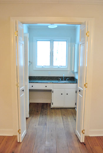
But although that picture makes the window look all glow-y and angelic, staring out at the house next door (it’s a side window) isn’t exactly ideal for brushing your teeth, shaving, fixing your hair, or walking by after a shower in the buff. Nor is that the first impression that we really want to make on the neighbors. So we knew we needed a privacy solution stat.
We also needed a functional mirror solution too. The room is (ironically) far from mirror-less. There’s a full-length one on the water closet door (yep, just broke out “water closet”)…
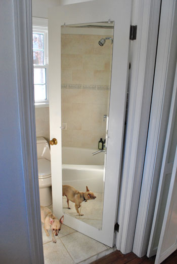
…and another on the nearby medicine cabinet (that’s two mirrors in one 4′ span of wall if you’re keeping track).
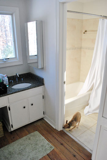
And yes, those are both shots stolen from old posts (so you don’t have to worry that Burger spends all of his free time posing for pics in our bathroom) since you know we have since removed the ol’ backsplash to yield this result:
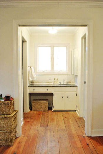
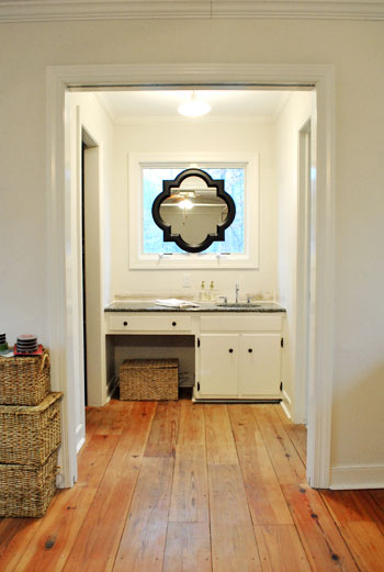
Anyway, back to the mirror dilemma. After living with the mirrors-to-the-right layout for a couple of weeks (while singing “To The Right” instead of “To The Left” a la Beyoncé), the traditionalist in us was just itching for one in front of our faces. Right smack in the middle of the window. Although we had an embarrassment of riches when it came to the number of mirrors surrounding us in the master, we just didn’t have one where it was most sorely needed. So we opted for a not-so-traditional solution. This:
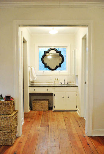
Call us crazy, but we hung a mirror right on the window frame itself. Sure we’ll miss some of the light that it let in, but thankfully we have two other huge windows in the bedroom and a third in the bathroom- so the room’s not hurting for light). And we definitely won’t miss the actual view of the house next door (and the fear that we were making quite an odd first impression by sharing so many tooth-brushing moments). And the function. Can we just talk about the function? I am a man. So that stuff is king. And I can’t even tell you how much easier it is to shave without having to keep my head at a right angle to see what I’m doing.
The mirror itself is from the Allen + Roth line at Lowe’s. After searching unsuccessfully for a perfectly sized round one at HomeGoods, TJ Maxx, Marshalls, Pier 1, and World Market we were more than happy to spill 65 beans on one with such a distinct shape and clean look (a whopping $614 cheaper than this similar version from Restoration Hardware). And all it took to hang it was one screw in the center piece of wood between the windows and a small square of velcro on the bottom (to hold it firmly in place from the bottom so it wouldn’t teeter from side to side). Bonus: the windows can still be opened and closed while it’s hanging thanks to the knob placement at the bottom of the panes (instead of the center, which would have been blocked by the mirror).
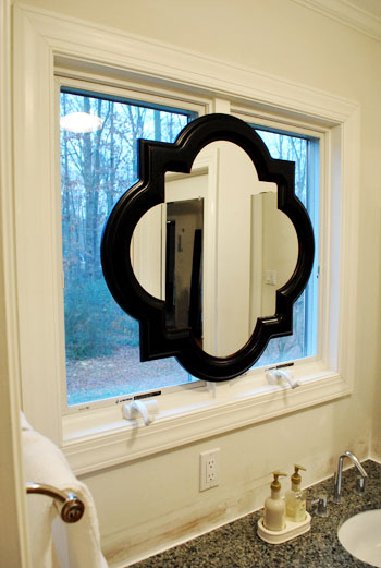
And let’s revisit the shape. We mentioned we were originally looking for a round mirror because the wife thought it would add some nice curves to those angular windows, but it needed to be huge because something that was under 28″ wide wouldn’t allow both of us to see our entire faces in it (thanks to our 10″ height difference) if it was hung completely centered (top to bottom) on the window- which Sherry was adamant about. The miracle of finding something this shape meant that there was a little extra span of reflective room on the bottom thanks to the irregular shape- which is almost like two ovals overlapping at 90 degree angles) which makes Sherry positively giddy about all that added “mirror real-estate.” Here’s a direct quote: “not only can I see my face, I can see my neck!” The girl was beside herself with joy.
Oh and for those wondering why we didn’t opt for a mirror that could be mounted on the side wall but folded out so we could look see our faces by looking straight ahead, we just thought that would look more bathroom-y, while this solution looked a lot more decorative and would read more as “vanity in the corner of a bedroom” instead of “sink across from the bed.” Plus it’s balanced, and you know we have a thing for balance.
But the project was not complete until we said goodbye to the old mirrored medicine cabinet.
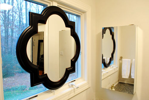
So we took it off the wall, along with the towel bar on the opposite side (we now keep a white towel folded next to the sink which seems to do the trick) and added both the medicine cabinet and the towel bar to our ReStore donation pile.
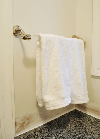
Doesn’t it look even less bathroom-sinky in there now that those two elements are gone? And we don’t mean to tease, but painting the entire bedroom is on the agenda for today or tomorrow. Woot! We also might paint the mirror frame white (or a softer color to help it blend in with the window moldings like gray) though we haven’t decided on that 100% yet… so we could go either way.
And as for how it looks from outside, it’s one big tan shape from behind (nothing too messy looking) so it just a symmetrical light brown shape suspended in the middle of the window. Which oddly enough blends in with all the colors of the tree trunks and other exterior elements. And of course frosting the window could add even more privacy when it comes to the view from outside, but since the neighbor’s house is actually a ways away, we don’t think they can make out our shapes anymore with so much of the window obscured.
Words can’t describe how spoiled we feel to have a mirror above the sink again. Seriously, it’s rocking our world right now. And we’re not the first people to do the whole mirror in front of a window thing. Check some others out here, here, here, and here. What do you guys think of our not-so-normal solution?
Update: See how our sink mirror project turned out here.

Emily Anderson says
Love it. What do you think about painting the frame white?
YoungHouseLove says
Hey Emily,
We actually mentioned that we’re debating that in the post. We have to paint the room first to look at the big picture before making any decisions!
xo,
s
gk says
just wanted to chime in and say that i like the black frame on the mirror. painting it a lighter color would look good, too, but i think the black frame ties the mirror in with the granite counter on the vanity. also think it makes sense, esp if you guys are going for a “moodier” color scheme throughout.
L.Overstreet says
I LOVE it! I never would have thought of it, but I am crazy about it now. Way to be creative!
jodi says
it looks terrific!!
karen @ our slo house says
Looks great — I never would have thought of that.
I was wondering if you were planning on keeping the frame black or if you were going to paint it? (A few comments above mentioned something about painting it…)
I just assumed you’d keep it black. I’m sure you know that many interior designers believe that there should a little bit of black in every room. ; )
YoungHouseLove says
Hey Karen,
We actually mentioned in the post that we’re unsure about painting it so we’re waiting to see what it looks like with color on the walls so we can hopefully look at the big picture before making a decision! We have heard that fun “little bit of black” theory though!
xo,
s
kelly t. says
Interesting idea! I’ve never seen the mirror on the window idea before…It’s growing on me :) I enjoy how you two think out of the box and aren’t afraid to GO FOR IT! Question: Do you two always agree on how to decorate/remodel? My wonderful, Mr. Perfect and I, don’t always see eye to eye. Tips? :)
YoungHouseLove says
Hey Kelly,
Nope, not even a little. But our rule is that we don’t do anything unless we’re 100% on board, so one of us usually has to “work on” the other one to get them to visualize things and go for it. Here are a few ways we do that. Hope it helps!
xo,
s
karen (again) says
oops — it looks like you answered my question while I was typing. Sorry for the overlap. : )
YoungHouseLove says
No worries Karen!
xo,
s
Charmaine says
This isn’t the first time I’ve admired mirrors placed infront of windows. I accually saved the pictures of the bathroom in this post ( http://www.desiretoinspire.net/blog/2010/1/28/ryann-ford.html ) as a creative idea to be used as inspiration.
Your sink area is really shaping up nicely.
YoungHouseLove says
Ooh I love that link! Thanks for sharing! John actually linked to a bunch of other rooms with mirrors in front of windows at the end of this post, so feel free to check those out as well!
xo,
s
Kate says
I know this will sound odd, but I would love to see the mirror frame AND the window frame all painted a darker color. I think the mirror looks nice in a darker color, but I think it stands out too much and screams “hey, we have a mirror stuck on top of the window because there’s no mirror in this bathroom!” Painting all of the framing the same color would make it look more built in, but still make it a really interesting focal point. Especially if the walls will be painted to not-so-white. Might sound odd, but it sounds awesome to me!
Ashley says
Love the shape, love the solution! On a totally related/unrelated note, have you guys every covered mirror with anything? We have a monstrosity of a piece of mirrored furniture. It’s a huge bar/hutch kind of thing. Horrid, yet the storage space is needed and we haven’t found anything to “replace” it yet. In the meantime, any suggestsions? We sampled some wallpaper yesterday (maybe something that mimics white wainscoting), but I’m worried it’ll look cheap. But, it would be better than looking like part of the Columbian drug cartel, yikes!
YoungHouseLove says
Hey Ashley,
Haha, we know what you mean! The wallpaper to mimic white wainscoting actually sounds like an amazing solution! We say go for it!
xo,
s
Nikki G says
Wow! I never would have thought of any of the changes you made in there (from removing everything to the mirror change), but it really does make it look so much less bathroom and so much more “spa/vanity”. Love it!! Way to think outside the box! And I had been looking for a whimsical mirror that’s less than $100 for our nursery. Then I read this post and see that you found the perfect one! Just ordered it :) Thanks for the constant inspiration – keep on doing what you do – love it!
Andrea says
I agree – now I just want to paint that window trim (the outer perimeter only) black! Have you thought about putting window film on the window to also create privacy around the edges?
YoungHouseLove says
Hey Andrea,
We chatted about that (and painting the frame black) back in the comments so feel free to scroll back for those deets. Hope it helps!
xo,
s
karen says
I do like it! I think if the size of the mirror was a touch smaller..it would look better fitted. But, your idea of painting the frame lighter will probably help.
YoungHouseLove says
Hey Karen,
And I love that I can see my face and my neck! Haha.
xo,
s
Nat says
I’m not sure if someone has already mentioned this, but some blinds behind the mirror will make it less in-your-face. And I loved the comment to paint mirror and window frame the same colour. I think some blinds this look could grow on me.
PS. great mirror :)
Caitlin @ Desert Domicile says
LOVE LOVE LOVE that mirror AND the mirror in front of the window idea!
Quick question: how’d you take down the medicine cabinet? I’m DYING to remove mine but it’s recessed into the wall and I wouldn’t know the first thing about filling or covering the hole it’s going to leave behind :(
Any advice?
YoungHouseLove says
Hey Caitlin,
Ours wasn’t recessed so it was really easy, but maybe googling around (or even checking youtube) for a drywall patching tutorial will help? Good luck!
xo,
s
Patty Reid says
The mirror solution is AWESOME! I love it! I would have closed up the windows and never thought of the mirror in this way. Your way ROCKS! Now I almost wish I had windows at my sink :)
Lilly says
Thanks for answering my question. I thought about buying two also because of that but but I think it might look weird because mostly everything else in my living room is asymetrical. I’ll figure something out but thanks for helping me. Can’t wait to comeback and see what color u guys chose for the room. Have fun painting.
Jen says
I never even noticed that there wasn’t a mirror there, strange! I love the solution, the mirror looks great with the counter. Will y’all be painting the bathroom in the future? I bought a new house and can’t decide if I should paint my small bathroom or leave it white for a sleek look.
YoungHouseLove says
Hey Jen,
Right now we’re thinking that we’ll paint the bedroom but leave the bathroom white until we decide what we’ll go for in there. The bright white looks nice with the white shower curtain that we hung super high, but who knows where we’ll end up!
xo,
s
suicide_blond says
love love love…..cant wait to see the paint
xoxo
Irina@CanDoGal says
At first, it didn’t even register to me that there was a mirror missing from the usual over-the-sink area. That is a very cool solution. It doesn’t look like much of a sink area anymore at all. And by the way, I’m crazy about those floors.
Chelsea in Richmond says
At first, I wasn’t so sure about this but I think if you paint it to match the trim, it will look great. Right now, I think the black frame stands out like a sore thumb. Can’t wait to see what you end up doing in that space!
samantha owens says
i can TOTALLY see where yall are going with this. i love it!!! so often i have something going on and it’s in the begininng stages and no one seems to ‘get it’ until it’s complete. i can tell this is going to be one of those things and the end result will definitely be amazing. people will be wishing they had windows to hang a mirror in front of :)
YoungHouseLove says
Haha thanks Samantha! We can totally picture it being pretty darn sweet looking when it’s more finished – and of course we can’t wait to share final after pics! But since any “after” pics are a ways away when it comes to the new casa, we hope people “get” our in-progress photos at least enough to withhold judgement until we slap some paint on the walls and get more of the big picture thing going on in there! Either way we love how it’s shaping up! Burger included. He’s hanging out near the sink more than ever. Haha.
xo,
s
Emily @ Merrypad says
So nice that the back is tan and blends in! I know that sometimes they can be a strange color (or more often, a weird material) and how it looks from the yard (or to your neighbors) is definitely worth considering. Thanks for sharing!
Ashley says
I was hoping, when I started to read this blog, that you were going to say you hung a mirror over the windows! I’ve seen that in a few places before, and I’ve been a little obsessed with the idea ever since. Thank you for giving me some more ‘mirror over the window’ eye candy! I was also thinking it needed some paint in order to blend in a little better, and I cannot wait to see the finished product. AWesome!
GreenInOC says
Wouldn’t frosting the window in additional the fantastic mirror in the middle, add more privacy but allow that wonderful light?
YoungHouseLove says
Hey GreenInOC,
Yes! But we don’t think we need to go that far. Scroll back for more details.
xo,
s
Sarah K. says
Hey guys, did you ever consider pocket doors for this little area to section it off from the rest of the bedroom? I just saw a tutorial on DIY network on how to make pocket doors.
YoungHouseLove says
Hey Sarah,
We did! They would be super sweet but also require a ton of in-wall construction, so who knows if we’ll tackle them someday. We also like the idea of glass french doors a while down the road.
xo,
s
Dena says
After reading through the comments, I am choosing to step away from the crowd and admit that I don’t really like it. I totally understand the desire for a mirror in front of (not beside) the sink. The mirror itself is beautiful and the vanity area is starting to take shape nicely, but the combination of the two doesn’t work for _me_. I do, like others, love and appreciate your willingness to think outside the box and come up with a creative solution.
That is what decorating is all about, right? Making decisions that _you_ feel good about and express _your_ style. Thank goodness we all like different things…it keeps the world interesting!!
Jennifer says
Great idea!
Not that this is a poll or anything, but I vote to paint the mirror to make it even more fab.
Congrats on the awesome house!
Jane says
2nd time commenter here —
Thanks for sharing this! I look forward to your daily doses of inspiration, and I admit, when you started to describe removing granite from the sink area, I was a bit skeptical about how exciting this change was going to be… But now, after the mirror addition, this has got to be the most excited I’ve been about seeing a sink area renovation. Sheesh.
Can’t wait to see the trimmings painted! Woot woot!
Cait @ Hernando House says
@Landry (and anyone else wondering), we recently removed a recessed medicine cabinet in our guest bath and replaced it with a mirror. It was a fairly simple process: http://hernandohouse.wordpress.com/2010/08/04/seeing-the-light
Sandy says
It would be so awesome if yall (sorry, I’m from Texas) hung a chandelier where your fan was, so your new mirror would capture a chandelier in its reflection.) I LOVE THE MIRROR!
YoungHouseLove says
We’re definitely looking forward to bringing in some pretty sweet light fixtures (when we find some that we can afford- hehe). Can’t wait!
xo,
s
Mary says
I have that exact same set-up in my Master i.e., the sink is visible from the bed and the toilet and tub are in an adjoining room. I was just getting ready to ADD french doors, and now I see you have removed your doors. I would be very curious on your thought process. Maybe I should re-think adding doors and focus on the space itself.
YoungHouseLove says
Hey Mary,
We’d love to add french doors down the line (even though we’d always have them thrown open) just for the architecture and polish they add). Although since they’re not exactly cheap it might be a while til we go for that…
xo,
s
Jordan (the2seasons) says
Wow great look I would of never thought of doing this but it looks excellent. The style of the mirror is amazing!
GreenInOC says
Ahh, I figured that it would be somewhere in the comments but I was too lazy to look through 200+ of them! My laziness gets me again!!
YoungHouseLove says
No worries at all GreenInOC! We know there are a ton of comments to go through!
xo,
s
Alisa says
I LOVE it!
suki @ [Super Duper Fantastic] says
love the clara photo page!!! too adorable.
i’m not sold on the mirror yet. i looked at the other links, and the mirror to window ratio is a little high here. i think painting it white would make it pop a lot less.
jess says
am ooozing with jealousy right now… i’ve always wanted a mirror in front of a window in my bathroom. The natural light makes for an easier (and more accurate) makeup application process. however, the layout i currently have makes mirror-in-front-of-window impossible. (in fact, i don’t get much natural light at all, as i have the same bathroom layout as your previous one in “skipper” and it faces the front of the house, arrrgh.) anyway, gorgeous gorgeous gorgeous! and the proportion/balance of the whole arrangement is perfection. LOVE IT!
Hilary @ My So-Called Home says
You guys just don’t quit with the creativity, huh? I LOVE the mirror and you’re so right about turning that nook into a less bathroom-y sink in the bedroom. I’d prefer that mirror’s shape to a circle any day. Do you have plans to fill in the vanity area with open shelving or something?
YoungHouseLove says
We’re not quite sure what else we’ll add to that area (we’re just trying to make one small change at a time and then take a step back and reevaluate). But of course we’ll blog about any and all tweaks as we go!
xo,
s
C says
I love the way it looks from the inside, but I wonder what the outside view looks like? Probably pretty weird…..but I’m guessing this window is on the side of the house, not the front, so maybe it’s not a big deal. Can’t wait to see what the new paint will look like! You guys are on a roll for only being in your house several weeks!
YoungHouseLove says
Hey C,
Yup, it’s a side window-and we actually mentioned what it looks like from the outside right in the post. We got lucky that it’s such a nice view from the back as well!
xo,
s
Teresa says
Can I just say….marvelous!!!!! Love the creativity and functionality on this one. Who needs a window looking into the neighbors house while you are exfoliating?! Come on doubters….think outside the box! :)
Tessa says
LOVE! I’m going to have to consider Lowes for mirror shopping now… I’d also vote for painting it a lighter color. It would look much more natural.
mickie says
Love the mirror placement — was thinking that would be the perfect solution as I was reading the post.
Another vote for painting the mirror to match the window trim (white I guess for now). Think that it would give it the look of a fancy mullioned window– fool the eye a bit. Just my two cents. =)
Emily (EmilyAnnPhotography) says
Love the mirror in the window frame idea – looks fantastic! Just out of curiosity, did you guys ever consider putting some of the frosted film paper on those windows behind the frame?
YoungHouseLove says
Yup, we actually mentioned why we chose to forgo that extra step in the post. Hope it helps!
xo,
s
Sherri says
Love it! What a great idea that solved so many problems in one fell swoop.
Carly says
This is a great — dare I say it, perfect — solution. Someone mentioned that it looked Photoshopped, and that was what I first thought when I saw it. Could you use photoshop to see what the mirror would look like in white? Sorry if someone has already mentioned this…I read the first few comments and stopped. :) Thanks again for sharing your home improvements with us!!
YoungHouseLove says
Hey Carly,
If we have a spare moment we’ll definitely give it a shot! We might get lazy and just wait until the wall’s painted and then just make a final decision and go for it!
xo,
s
Jenn from The Mustard Seed Blog says
I love your solution! If I were in your position, I might still feel compelled to frost the window, but I think this is an awesome “after”. I think the mirror painted in gray or another soft color (depending on what you decide on for the bedroom walls) will be delish!
Thanks for the “outside the box” idea.
Kathy says
I know you’re not too concerned about privacy because of your neighbor’s distnace but I definitely agree with some of the other comments: frost it! I think it would make it see much more intentional. I also agree that you should paint it white or another subtle neutral ASAP. It will really tie the room together a la The Big Lebowski.
Nice work!
Casey says
Awesome idea!! My vote (if you do decide to paint it…it actually looks really good as is) would be the same shade you’re going for in your bedroom. That way it’s not too matchy with the white and gives some extra dimension, but still ties in nicely with your room. Good luck…whatever you guys decide will be perfect, I’m sure.
KCatGU says
I love it! Actually I think hanging mirror center some how makes the window look bigger because you don’t see the diving wall.
Kimberly says
Have you considered fogging the glass on the windows, just like the laundry room door?
YoungHouseLove says
Hey Kimberly,
We touched on that in the post. Hope it helps!
xo,
s