Our master bathroom came with a mirror dilemma. Instead of having the traditional mirror-over-the-sink set up, there’s a window (seen here on this moving day pic that we snapped before we removed those bi-fold doors).
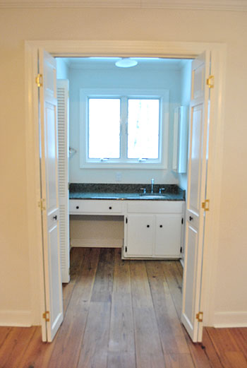
But although that picture makes the window look all glow-y and angelic, staring out at the house next door (it’s a side window) isn’t exactly ideal for brushing your teeth, shaving, fixing your hair, or walking by after a shower in the buff. Nor is that the first impression that we really want to make on the neighbors. So we knew we needed a privacy solution stat.
We also needed a functional mirror solution too. The room is (ironically) far from mirror-less. There’s a full-length one on the water closet door (yep, just broke out “water closet”)…
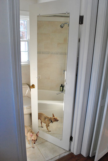
…and another on the nearby medicine cabinet (that’s two mirrors in one 4′ span of wall if you’re keeping track).
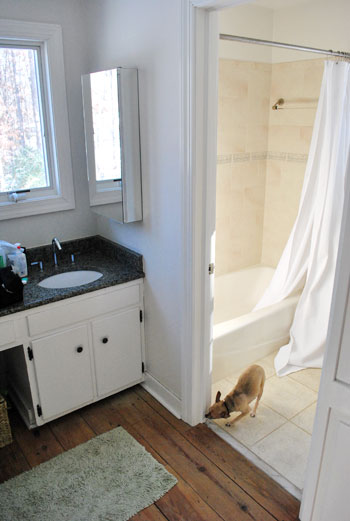
And yes, those are both shots stolen from old posts (so you don’t have to worry that Burger spends all of his free time posing for pics in our bathroom) since you know we have since removed the ol’ backsplash to yield this result:
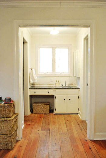
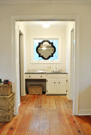
Anyway, back to the mirror dilemma. After living with the mirrors-to-the-right layout for a couple of weeks (while singing “To The Right” instead of “To The Left” a la Beyoncé), the traditionalist in us was just itching for one in front of our faces. Right smack in the middle of the window. Although we had an embarrassment of riches when it came to the number of mirrors surrounding us in the master, we just didn’t have one where it was most sorely needed. So we opted for a not-so-traditional solution. This:
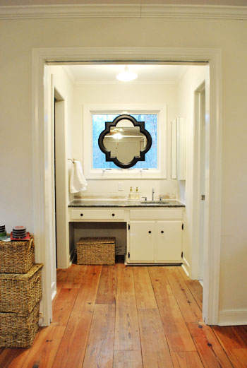
Call us crazy, but we hung a mirror right on the window frame itself. Sure we’ll miss some of the light that it let in, but thankfully we have two other huge windows in the bedroom and a third in the bathroom- so the room’s not hurting for light). And we definitely won’t miss the actual view of the house next door (and the fear that we were making quite an odd first impression by sharing so many tooth-brushing moments). And the function. Can we just talk about the function? I am a man. So that stuff is king. And I can’t even tell you how much easier it is to shave without having to keep my head at a right angle to see what I’m doing.
The mirror itself is from the Allen + Roth line at Lowe’s. After searching unsuccessfully for a perfectly sized round one at HomeGoods, TJ Maxx, Marshalls, Pier 1, and World Market we were more than happy to spill 65 beans on one with such a distinct shape and clean look (a whopping $614 cheaper than this similar version from Restoration Hardware). And all it took to hang it was one screw in the center piece of wood between the windows and a small square of velcro on the bottom (to hold it firmly in place from the bottom so it wouldn’t teeter from side to side). Bonus: the windows can still be opened and closed while it’s hanging thanks to the knob placement at the bottom of the panes (instead of the center, which would have been blocked by the mirror).
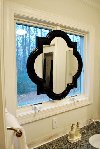
And let’s revisit the shape. We mentioned we were originally looking for a round mirror because the wife thought it would add some nice curves to those angular windows, but it needed to be huge because something that was under 28″ wide wouldn’t allow both of us to see our entire faces in it (thanks to our 10″ height difference) if it was hung completely centered (top to bottom) on the window- which Sherry was adamant about. The miracle of finding something this shape meant that there was a little extra span of reflective room on the bottom thanks to the irregular shape- which is almost like two ovals overlapping at 90 degree angles) which makes Sherry positively giddy about all that added “mirror real-estate.” Here’s a direct quote: “not only can I see my face, I can see my neck!” The girl was beside herself with joy.
Oh and for those wondering why we didn’t opt for a mirror that could be mounted on the side wall but folded out so we could look see our faces by looking straight ahead, we just thought that would look more bathroom-y, while this solution looked a lot more decorative and would read more as “vanity in the corner of a bedroom” instead of “sink across from the bed.” Plus it’s balanced, and you know we have a thing for balance.
But the project was not complete until we said goodbye to the old mirrored medicine cabinet.
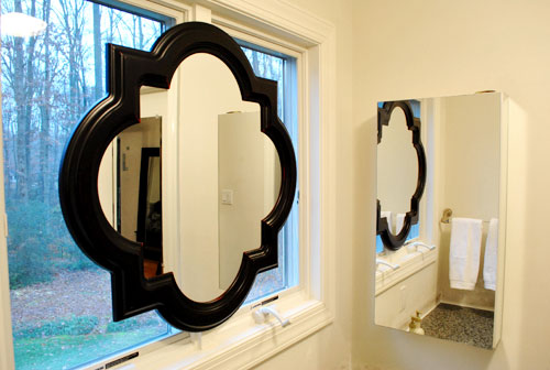
So we took it off the wall, along with the towel bar on the opposite side (we now keep a white towel folded next to the sink which seems to do the trick) and added both the medicine cabinet and the towel bar to our ReStore donation pile.
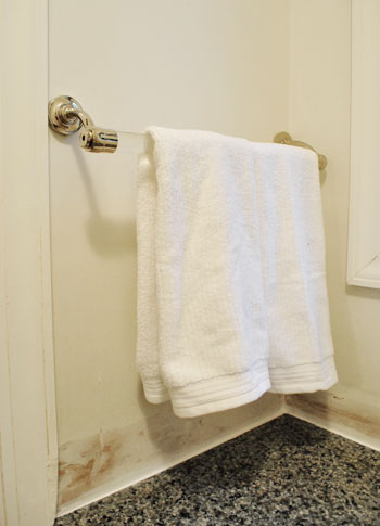
Doesn’t it look even less bathroom-sinky in there now that those two elements are gone? And we don’t mean to tease, but painting the entire bedroom is on the agenda for today or tomorrow. Woot! We also might paint the mirror frame white (or a softer color to help it blend in with the window moldings like gray) though we haven’t decided on that 100% yet… so we could go either way.
And as for how it looks from outside, it’s one big tan shape from behind (nothing too messy looking) so it just a symmetrical light brown shape suspended in the middle of the window. Which oddly enough blends in with all the colors of the tree trunks and other exterior elements. And of course frosting the window could add even more privacy when it comes to the view from outside, but since the neighbor’s house is actually a ways away, we don’t think they can make out our shapes anymore with so much of the window obscured.
Words can’t describe how spoiled we feel to have a mirror above the sink again. Seriously, it’s rocking our world right now. And we’re not the first people to do the whole mirror in front of a window thing. Check some others out here, here, here, and here. What do you guys think of our not-so-normal solution?
Update: See how our sink mirror project turned out here.

jen says
I love it. Absolutely love it. Brilliant!
Julie says
I have & love this mirror! Mine is hanging over my fireplace (which we painted a warm white using your tutorial…)
I also bought a smaller version from Target to put somewhere, but right now it’s stowed away until I find it a home. :) I really love the “Quatrefoil” shape!
Heather says
I have been obsessing about this mirror for a while. Like today for example. Going mirror shopping at Lowe’s and I know I will stand there looking at it for a while trying to picture it SOMEWHERE in our house and wondering if the husband would still love me if I bought it and figured out a place later. :)
Ali Elam says
The mirror looks awesome! Great idea! I love your ps with additional links to pics of mirror over windows! I have never seen it before but, I know love that look! :)
I’m excited to see the after pics after you paint!
Happy painting today to the two of you!
~ Ali
Amy says
John – Your post is hilarious! Can I just tell you how much I love some of your phrases? ‘Embarrassment of riches,’ ‘mirror real estate,’ and just how excited you both get over improving small things in your house (can we talk about function for a minute? – ha). I love it! I come to your website daily not only for the fabulous DIY tips, but also because your posts are cheerful, well-written and are fun to break up the work day with. Thank you!
Stephanie M. says
Wow! Great idea! I actually wondered about the mirror “problem” the other day when I was reading the post about the backsplash. I know for me personally, that would drive me crazy craning my neck sideways! I didn’t know if it bothered you or not so I didn’t say anything! Ha – obviously you had a brilliant solution! Also, I would definitely wait about painting the mirror a lighter color until you know for sure the color of the walls etc.. I think I like it dark as it adds some depth and visual interest instead of blending in. Although, like I said, you may just have to wait to see how everything else comes along!! Looks great!!
Gretchen says
Ooh! i definitely like it! Seems like the perfect solution to me.
ruth says
I love the idea of hanging the mirror in the window frame. And it looks great.
Chels says
I like your bold “mirror over the windows” solution. I would, however, put frosting on the windows, just like you did on your side door in the kitchen. Not only would it ensure privacy, but it’d make the windows look more like a wall and less like…you hung a mirror over the windows.
Of course, your house = your tastes, but I think it’d be a more clean and dramatic-looking solution nonetheless.
penny says
Whoo hoo, I feel so cool. I have the same mirror. Painted it white and hung it over the mantle.
Korie says
Love the ingenuity! And definitely love the choice of mirror, it really does make it look less bathroom-y.
I know lots of other people have said this, but I keep thinking about seeing those windows behind it frosted. Not for privacy’s sake (since you mentioned that it’s not an issue) but for the mirror itself..it might look like it’s not trying so hard to compete for the front and center. Granted, I’m no expert, I just think it would look a little more flow-y to have the windows frosted and the mirror frame painted a softer gray (maybe pick up a color from the counter tops?).
Love your new house, by the way. I’m totally living vicariously through your blog :) :)
Melanie says
I love the floors in your bedroom/bathroom. So jealous :) Keep up the great work- you all are so creative!
Jackie Smith says
I almost bought that mirror for my bathroom, but bought the Live Laugh Love big rectangle one instead.Will send a pic if that project ever gets done ;-)
Jill says
I love it. How will you make it look nice from the outside of your house? Love your blog!
YoungHouseLove says
Hey Jill,
Check out the post for info about how it looks from the outside. We got lucky there. Hope it helps!
xo,
s
angelp says
I love it. Of course, I think it would be a more interesting look to paint the window trim black so that it would pop. The counter looks black so it should flow nicely.
Yvonne says
I see you needed a mirror over the sink. Who would want to have water dripping from ones mouth while the walk through the bath to look in the mirror?
But I’m not such a big fan of the mirror you chose.
I would have picked two mirrors. I don’t know what they are called in english. Mirrors you find in the beautydepartment of a store. You know where one side is a regular mirror and one side makes your pores huge like a vulcano :) Perfekt for make up by the way! And you wouldn’t lose so much light.
Greetings from Germany
Melissa @ HOUSEography says
Great solution as always. I don’t mind the black and I think it makes it look not bathroom-ish which I know that’s what you are goign for. What about painting the window frame black, or paint both to match but something not white (dark teal blue perhaps)? You could always tie it all in with the paint color an the stencils that everyone seems to be doing. (Sorry if this was already mentioned in the comments above!)
Shelley @ Green Eggs & Hamlet says
Genius! What a great solution. I love that you guys always do what YOU want and what makes sense for you rather than what is considered “right.”
julianna says
I thought I would hate it, but it actually looks pretty good. I haven’t read through all the comments, so I don’t know if anyone has already suggested this, but I think it would look better with a thinner, plainer molding around the window. The proportions just seem a little off to me now. Maybe you could mock it up in Photoshop and see what you think.
Val says
Y’all crack me up! I love how patient you are about answering things that you clearly stated in the original post. Reading skills, people! I guess it is uber-flattering that people are so eager to see the finished room.
Thanks so much for the links–that adds a lot to a post to help people visualize the choice with difference shapes and layouts. I think it was a brilliant solution!
Vicki S says
I think your mirror in front of the window is better then any of the links of other examples that you provided. The shape is just fantastic. Love it.
leah says
I kind of think of you guys as geniuses now. This is pure brilliance! But I’m just throwing it out there that I love the mirror as is, and all that dramatic contrast that screams for attention!
Tovah says
I get the best ideas reading this blog! I don’t actually have a situation where I need to hang a mirror in front of a window but I probably wouldn’t have ever considered it before reading this. Your master suite bathroom is looking great, can’t wait to see what else you do.
Amanda says
Love, love, love! I love the idea and I absolutley love that mirror! When I saw it my first thought was, “where can I hang that?”
Sadie says
Looks fantastic! I love that you guys always include geometrical shapes in all your rooms. Since the old bedding has been replaced by the softer lines of the floral bedding, I like that you found a way to still include it in this room. Cannot wait to see how this room progresses!
Janet says
I think I would frost the windows behind for a softer look as well as reducing the contrast of the black mirror frame.
Lise says
Hey guys,
Any tips on how to remove a mirror from the bathroom wall that the builders installed? It is a rectangle mirror with those metal clips attached to the corners and I’m guessing it’s glued to the wall behind it. How do I remove it without breaking the glass? Thanks! Great progress with the new house!
YoungHouseLove says
Hey Lise,
We plan to post about removing one of those in the next few days! Stay tuned…
xo,
s
Susan @ sweetimaginations says
I never would have thought of that…but it looks brilliant! And the bonus…GREAT lighting for putting on makeup so when you go outside, you’ll know you look great in the natural light! ;o)
jja says
“And I can’t even tell you how much easier it is to shave without having to keep my head at a right angle to see what I’m doing”
LOL Indeed strange position for mirror and actually too much now with having new mirror, will you remove the right one?
My second idea would be to use small side mirrors and keep the window clean:
http://images.infos2010.de/ss-003/images/ss-003-020.jpg
http://baederland-berlin.com/.media/512755273209.png
YoungHouseLove says
Hey Jja,
Yup, we already removed the medicine cabinet. Couldn’t wait!
xo,
s
Sharie says
I can’t wait to see the room painted, it is going to look amazing!
The ‘vanity in the bedroom’ look is really growing on me thanks to all your changes, they look fantastic.
Lauren says
It looks like that mirror was made just for your space! The whole sink outside the bathroom thing is so strange to me….looking forward to seeing what else you have in mind for making it feel more like part of the room!
Julie at Velvet & Shag Vintage says
I would have done the exact same thing. It’s so weird to have a vanity without a mirror! Beautiful mirror, too. It really reminds me of something that you would find at Ballard Designs.
Megan says
I like the black. It ties in well with your countertops. I’d leave it that way until you paint and then decide. :) Love the changes – especially that awkward medicine cabinet that stuck out from the wall. :)
Januarysgirl says
I love it! I think it would look great if the window frame was painted black as well.
Big Boops says
I love this solution. But I have to add one little itty bitty idea that hit me when I was going through the pics. Did you consider getting a really large framed mirror that would cover the window??? I LOVE that mirror and it IS a great solution. But my eye is just begging for a clean slate behind it. Maybe even a mirror that appears to be setting on the counter (a la floor to ceiling framed mirror type thingy that I think you did in your old house)???
Anywho, love the mirror, will probably buy the mirror myself. Keep up the wonderful work!
YoungHouseLove says
Hey Big Boops,
We did consider that for a little while but we really wanted some of the light to stream through (and we didn’t mind the layered look, especially since the mirror sort of fits right into the window frame). Thanks for the suggestion though!
xo,
s (& j)
leah loo says
Love the mirror, love the placement, love the frame color! And I really like the high contrast of the black mirror frame against the white window frame – it lends such a richness and sophistication to the space, and relates so well to the black/dark flecks in the granite. That last photo totally sells it – lovely. I can’t wait to see the whole space as it develops…
Erin says
I think it would look STUNNING with the frame painted white like the window frame! That way it looks more integrated with the window from a distance. I have to say I am so jealous of all the amazing projects you get to do with your new house–it makes me want to move immediately!
rhiannon says
it looks odd to me… but that’s the beauty if america, right? we can think differently and do our own thing.
Nancy says
Awesome idea and it looks fabulous!
Shannon says
I love it! I think it’s the perfect solution. Hey, where did you find those awesome covered baskets? I need some nice storage bins. I just scored a nice covered bench for $15 to store all my blankets in and double as an extra seat in my livingroom but I need more stuff like that. Thanks!
YoungHouseLove says
Hey Shannon,
Those are from Michael’s for 50% off. They always have basket sales so I stock up!
xo,
s
Brandie says
I’ve been loving that mirror at Lowe’s for at least a year. It looks perfect in your space – a very nice fit. :)
Linda says
I love the mirror but think the black is too strong…maybe silver-leaf it or another color.
erin says
I like the idea after I saw your links, but it looks odd. I kept looking at the pictures wondering what it is I don’t like. Its the window. It looks really fitting with a original rustic window but, this updated window makes it look out of place. I LOVE the mirror though. ITs a great find.
Emma says
I like the dark frame on the mirror, I think it balances well with the countertop.
Allison says
Hi, I love the mirror, it looks great!! I have a question, was your towel bar easy to get off? I have one that I would like to remove except it seems if I pull it off there will be marks where it used to be, and I might even rip the wall… I am not sure how to go about it. :) Any tips would be appreciated if there’s time.
YoungHouseLove says
Hey Allison,
Ours left two small screw holes in the wall where it was secured but spackle did the trick. Hope it helps!
xo,
s
Christina says
I love the placement of the mirror on the window and I love the shape of it. I think if it was mine- I might like it better if it was white, but all that matters is that you love it!
YoungHouseLove says
Hey Christina (and others chatting about mirror painting),
It’s definitely still a possibility as we mentioned in the post! We’re just waiting to slap some paint on the walls before making any decisions, just to try to see the big picture before we get our paint on!
xo,
s
Amy says
LOVE this look! So creative, unique, and original!
michelle says
Totally random thought but all through this post I kept wondering if your neighbors read your blog. Wonder how they feel about the mirror?? :P
YoungHouseLove says
Hey Michelle,
We’re not sure that they do. They’re a sweet retired couple with an old hound who barks at Burger. But if they do, hi guys!
xo,
s
Liz says
It’s unique! I like it!
Melissa says
It’s gorgeous! It reminds me of a stained glass window shape (without the stained glass) if that makes sense! lol