If you tuned in last week, you saw us very excitedly reveal the before & after photos of the first four rooms that we completed at the duplex. SO MANY EXCLAMATION POINTS! There isn’t much rhyme or reason to the order of the things we’re sharing – we’re just rolling things out as we complete & photograph them… so today we have FOUR MORE SPACES THAT ARE DONE DONE DONE!
Can you tell how thrilling that is for us to proclaim after over a year and a half of working to get this house put back together and ready for renters this summer?! (The listing will go live on Airbnb once we’re done with all the rooms & have ’em photographed. We’ll make a big announcement when we get to that point, so don’t worry, you didn’t miss it!).
Let’s start with the back bedroom on the left side of the duplex – aka the side with the pink doors.
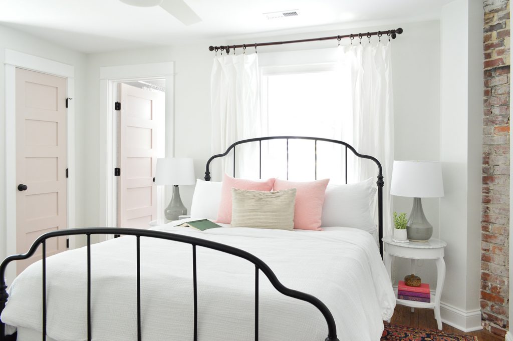
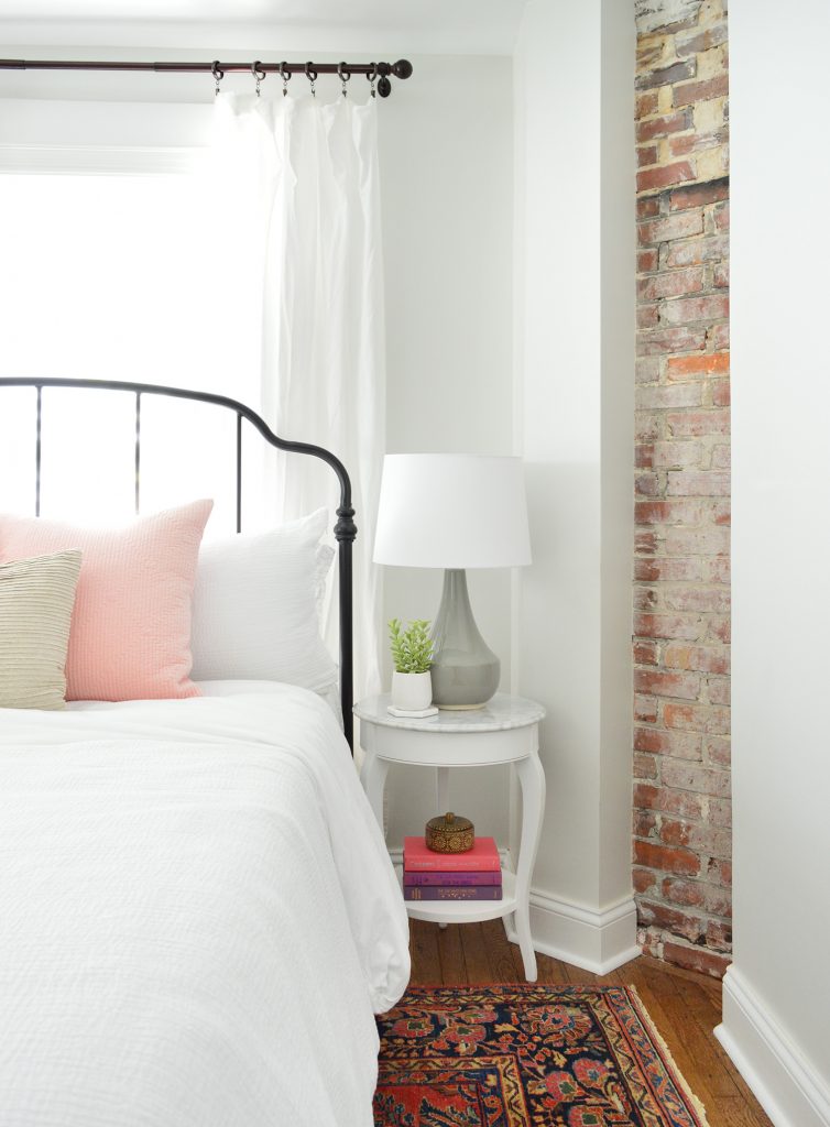
This room’s twin on the other side was in last week’s post and we mentioned that the back bed wall was a little bit narrower on the other side, so we used wall sconces instead of table lamps (every space is slightly different on each side just because 100 year old houses are quirky like that). But over here the bed wall was wider, which allowed for some larger quartz topped side tables (so shiiiiiny – and hooray for a material that won’t stain like marble).
We also got to top them with these sweet gray lamps, and once again we planned the outlet placement so they’re located behind each nightstand, so we can plug in those lights and still have an available outlet for charging phones (we’ve rented more than a few places that led to us crawling around under the bed or pulling out dressers in search of those ever elusive phone charging outlets).
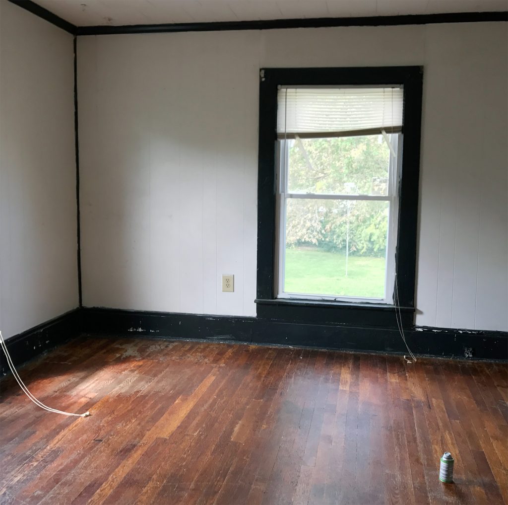
Here’s a before shot of the room as it looked when we bought the duplex, which had drop ceilings to hide some ongoing roof leaks and painted plastic paneling to cover up the mold in the walls. Where that window is below is pretty much where we placed the door to access the full bathroom that we added on, which made this space into a true main bedroom with an attached bath. We also added the double closets to flank the window on the left wall, so if you scroll back up and you look at the window behind the bed, that’s one that we added to the bedroom since this one essentially turned into the door to the bathroom.
The before picture below was taken with our backs to the corner above. I’m including it because guess what was hiding behind that odd black slanted wall in the corner?
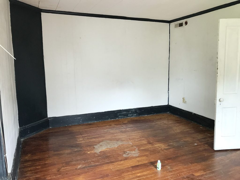
Yup, it was the gorgeous brick chimney that we exposed on both sides! It adds so much charm and history to the space. And yes, that’s a roach fogging can sitting on the floor above. Before our first walk through of the house, someone set off a fogger in every room and then didn’t come back and remove them… so there were foggers on the floor and a whole bunch of dead roaches belly up everywhere. It wouldn’t be on my house staging checklist, but it didn’t scare us, so… maybe it worked?
But back to the after pics. Once again we did an airy and open metal bed in front of the window, to let the light stream in (and feel less like a wall of furniture that’s blocking the pane of glass). Our round quartz tables fit nicely into that angled corner – and they soften the corner in a nice way. Who doesn’t love the mix of polished quartz & weathered old brick? They go together like rama-lama-lama-ka-dinga-da-dinga-dong (that was harder to type than you’d think, btw).
This before shot was taken with our backs to the brick chimney, so that window on the right below is where we built out the double closets to flank that lovely view that looks out on some huge all-summer-long flowering trees (giant pink crape myrtles).
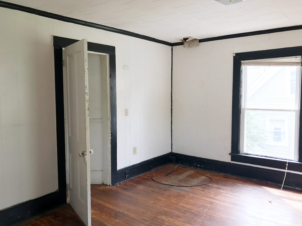
Oh and do you see that trap-door looking thing in the corner of the ceiling in the photo above? That’s where a leak got so bad that it eroded the original ceiling and then went through the drop ceiling and collapsed it in that spot. After we removed the drop ceiling it was clear that a LOT of the roof was failing – so we changed the pitch of the roof to be a bit steeper so water would run off of it more efficiently and not cause this issue again down the road. But yeah, rebuilding the whole roof was a doozie (you can see the entire house completely roof-less and wall-less here).
Here’s the after from the exact same corner. You can see that we have those cute pink-doored double closets now that make that window shine (they’re painted White Truffle by Sherwin Williams). And we shifted the doorway over to make sense of the upstairs layout a bit more. You can see our before & after floor plans a little later in this post to picture all of these layout changes more easily.
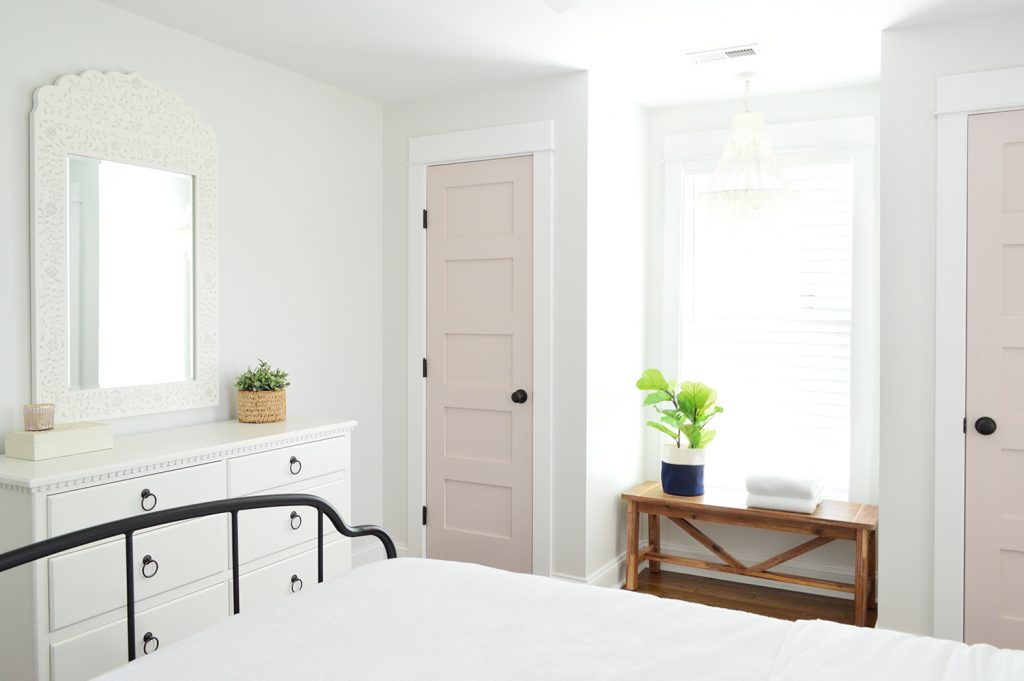
We also added a dresser for addition clothing storage (it’s the same dresser we have in our bedroom, but in the crisp white color instead of the gray one). Then we hung our favorite stenciled mirror over it for that inlay look (we LOVE how big it is, this is a room-making mirror you guys). We love that it basically creates an additional window in the room by reflecting the light of the other one (see the picture above).
This is one of the two closets in the room (remember they flank the window) so they each provide space for hanging clothes, storing suitcases, etc. And our eyes love the symmetry so much of having two in the room – I’m so glad we did it, because it feels like they were meant to be here.
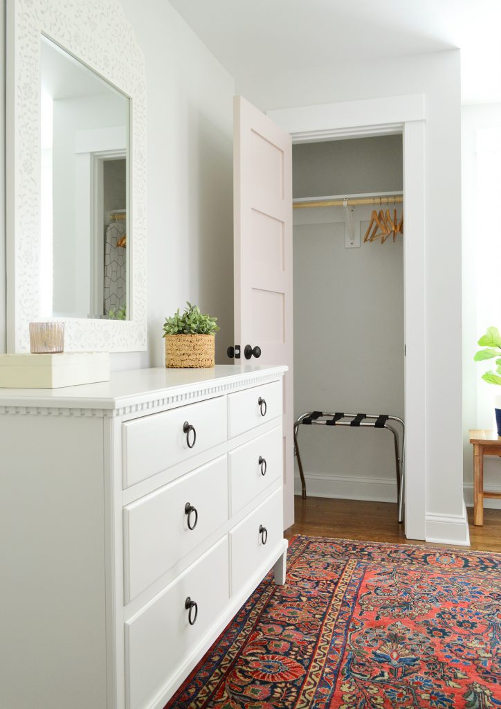
And yes, we are going to add more wooden hangers. There were people who worried the ones that they saw in our previous post weren’t enough, so more are coming. DO NOT WORRY. Buying those = the easiest thing on our list right now. Ha!
This is what you’d see if you stood with your back to the bathroom, and you can see that we reused the rug that we had in the beach house living room a while back. And it was clearly meant to be in this bedroom with the pink doors and the dark oil-rubbed bronze accents (in the drawer pulls, curtain rods, bed, and the door hardware). It fits the room perfectly, which makes me so happy – and on a sunny day it takes on a pinker watermelon tone, which is pretty cool (you can see that here). It was a secondhand find, so I can’t link to something identical, but this rug is pretty close (and the price is good!).
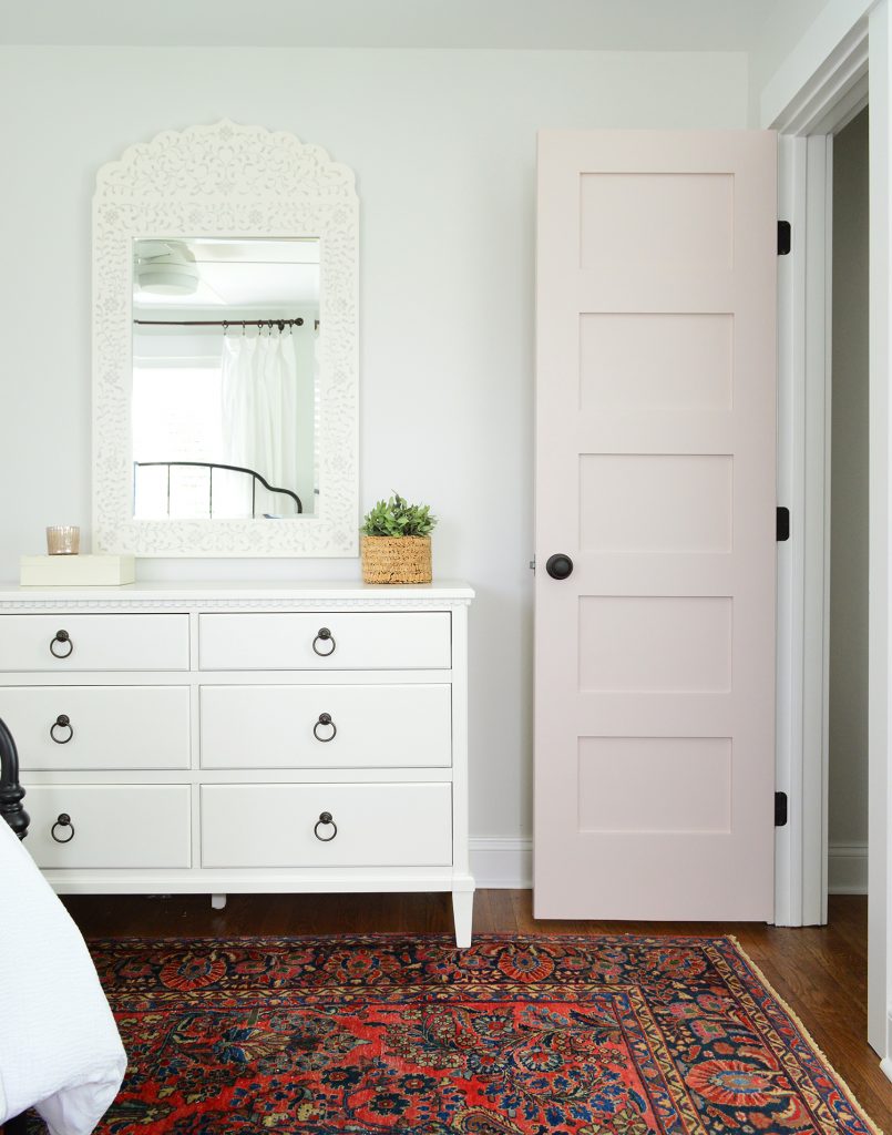
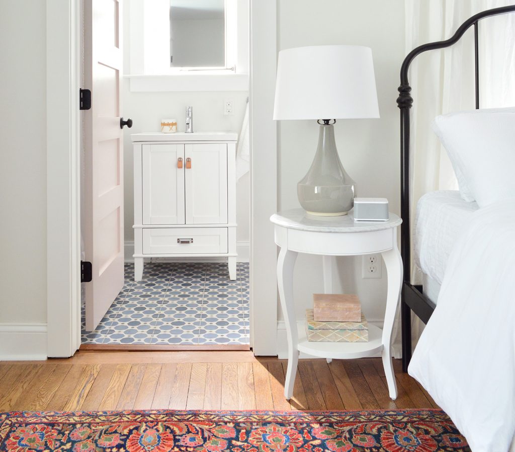
If you stand with your back to the dresser above, you see the doorway that leads to the new attached bathroom that we added onto this room. So much more functional, and we had fun with that bold floor tile and all white tile and wall paint everywhere else (except for the fun pink door).
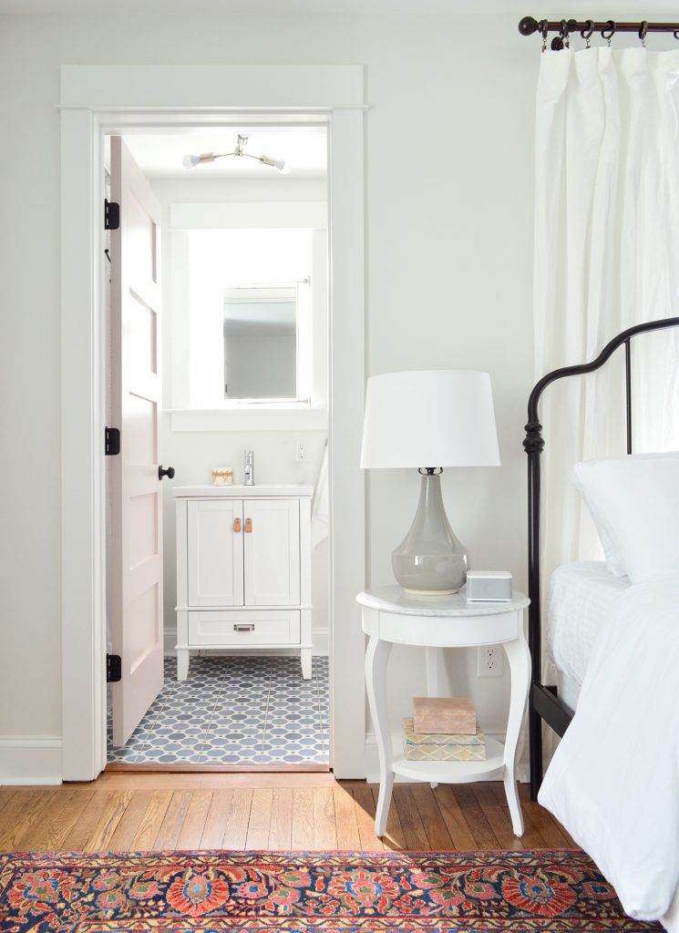
The bathroom feels surprisingly serene for having such a colorful patterned floor tile, mostly thanks to using other colors sparingly, adding some calming touches like a faux succulent, some muted art (this print and another print by this artist) and some natural touches in the woven cup and the leather vanity pulls (this is the vanity we bought – and we just swapped out the hardware).
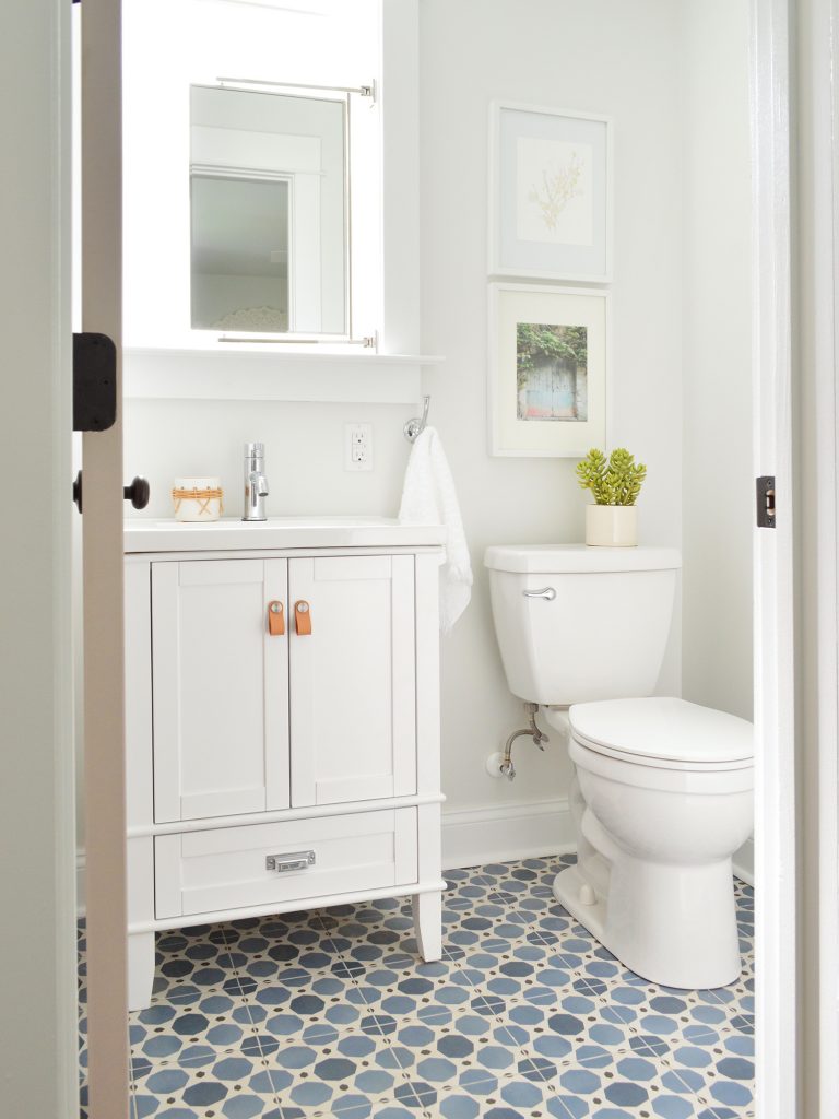
You can also see above that we mounted a mirror above the sink that’s functional and hinged to fit within the window frame, but still allows a lot of light to stream in. We frosted the glass so nobody feels like there isn’t privacy in here – but it thankfully doesn’t affect how much light floods this space.
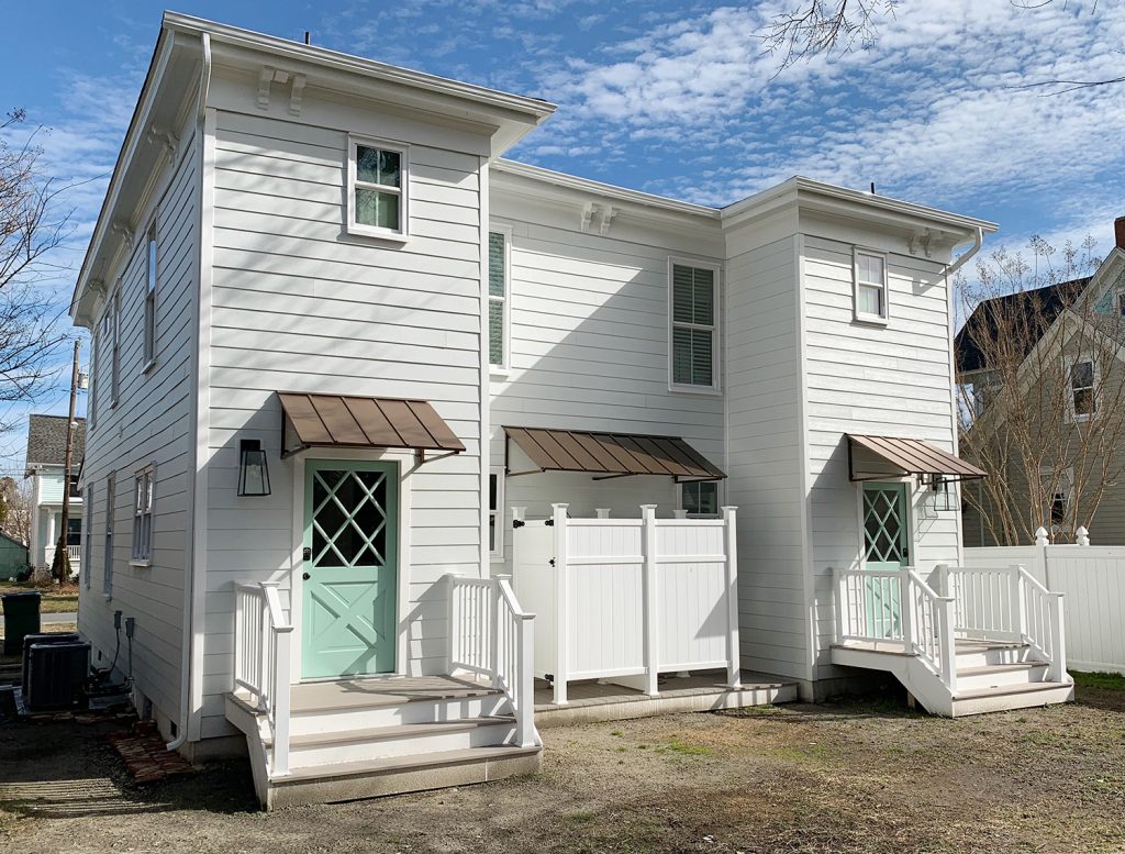
Oh and a few people asked in the last post why we didn’t just put the window over the toilet – but from the back of the house it would have looked super odd to have a window right on the edge of the addition instead of in a more centralized placement. The historic review board has to approve things like additions and new window locations, so I doubt they would have gone for such an off centered window since the original back windows were in a central-ish spot too. (You can see more shots of the back of the duplex here – we LOVE how it came out!)
I also have to admit that I love a mirror in a window! We did that in our second house and the make-up-friendly natural light was never better! Ha!

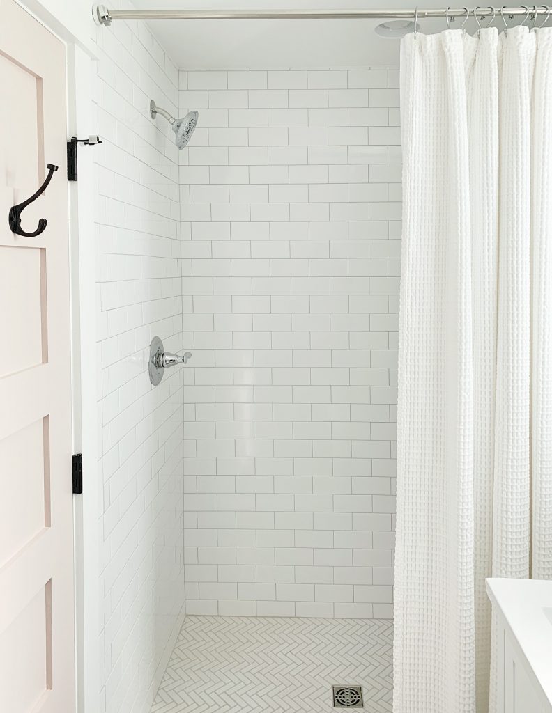
If you stand with your back to the wall to the right of the toilet, here’s what you see: a simple all-white shower (the key to a bold tile on the floor = non-demanding tile everywhere else), a soft extra long shower curtain, and some handy towel hooks on the back of the door. For anyone wondering how we feel about mixed metals – we’re into it! Just have each one occur a few times in each space and you’re golden. For example in here we have chrome on the shower fixtures, the shower curtain rod, and the sink vanity’s faucet while the door’s hinges, knob, and hooks are all oil rubbed bronze. Looks just fine! All metals are sort of like a neutral if you layer them into the room a few times each.
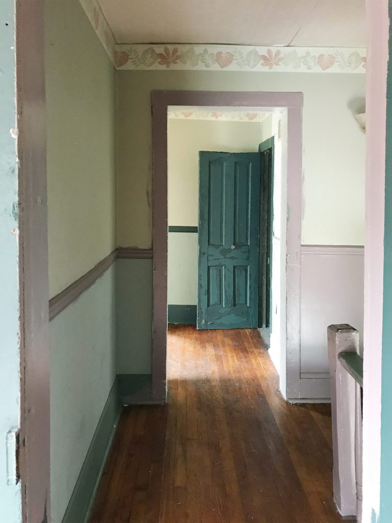
This is one of my favorite before shots of the bunch. Check out that mauve trim and the leafy wallpaper border. The crazy thing is that we restructured the landing upstairs so much that the after isn’t very parallel at all. We actually moved the access to the bedroom over to the right (where you see that corner of a sconce peeking into the photo below) and that open doorway that you see became a nice big hall linen closet. We also pushed the doorways back, so the landing at the top of the stairs is about twice as big – so you don’t feel nearly as closed in or crowded.
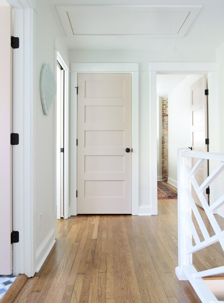
Here’s basically the same angle now. See how the doorway shifted over and the landing is a lot bigger and more breathable? Oh how I wish we had taken a photo of the linen closet open because it’s a work of art. We added chunky white shelves that are so functional for towels and extra bedding, and we even have a tiny ironing board and an iron. It’s gorgeous. Yes, a closet can be gorgeous. We need to share that in a video tour soon I think!
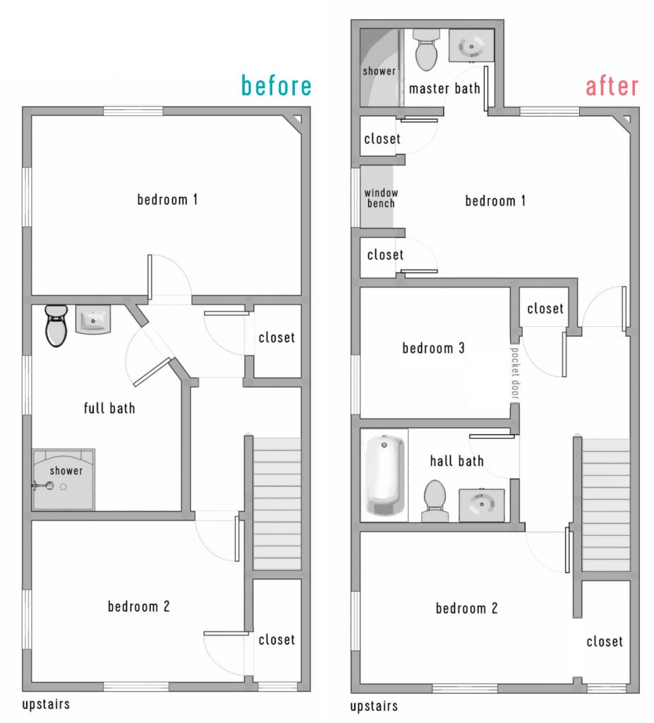
I mentioned we’d include a before & after floor plan for you guys to better understand the layout changes. Remember that each side of the duplex only had one full bath when we bought it, and a very odd diagonal hallway that was not original to the house (it had been restructured probably in the 70s or 80s). So we enjoyed bringing it back to the more classic and traditional layout without any triangular hallways – it just feels more fitting and less cobbled together. Plus two and a half bathrooms per side feels a lot better than one!
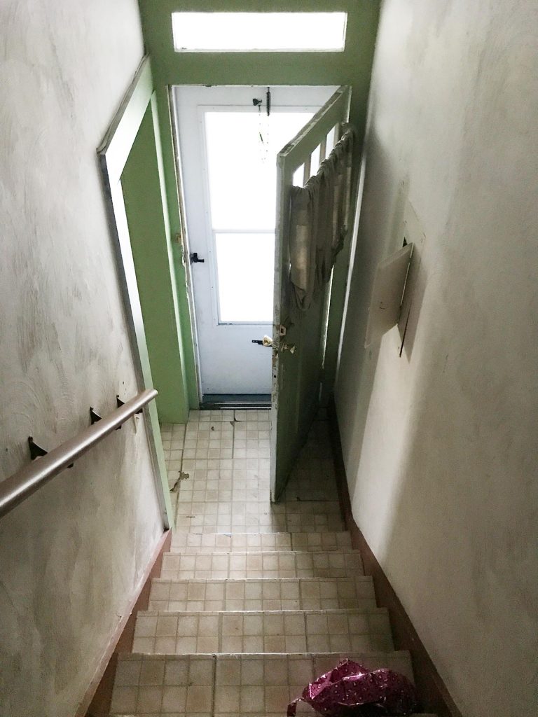
One of the hugest changes we made isn’t something you can see on a floor plan though. The original steps on each side of the duplex were like a dark closed-in tunnel. They were completely drywalled on each side from the very bottom step, all the way up to almost the top step. Yeah… like no light passed through that space at all, as you can see below:
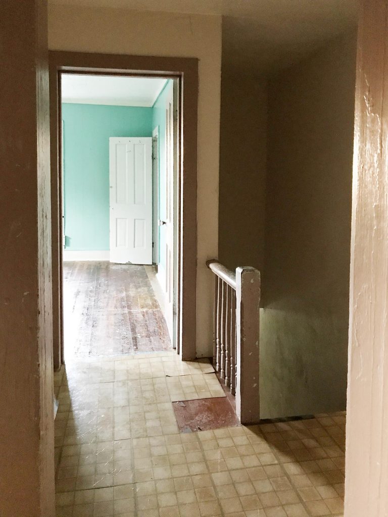
So when we restructured things, we opened a bunch of the bottom stairs up with a railing (more on that in a second) and we moved the bedroom doorway at the top of the stairs back a bit too, which meant instead of just having a short little railing up top, we flood the top 6 stairs or so with light.
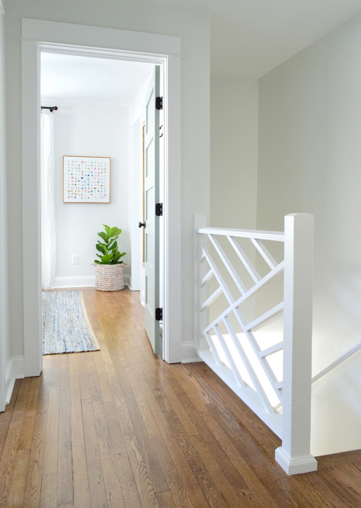
If you don’t remember the story of the railings, they’re the original railings from our front porch at our home in Richmond, and they fit PERFECTLY into the duplex at the top and bottom of the stairs. COMPLETELY MEANT TO BE! We’re so glad they got to live on here (more on The Sisterhood Of The Traveling Railing here & here).
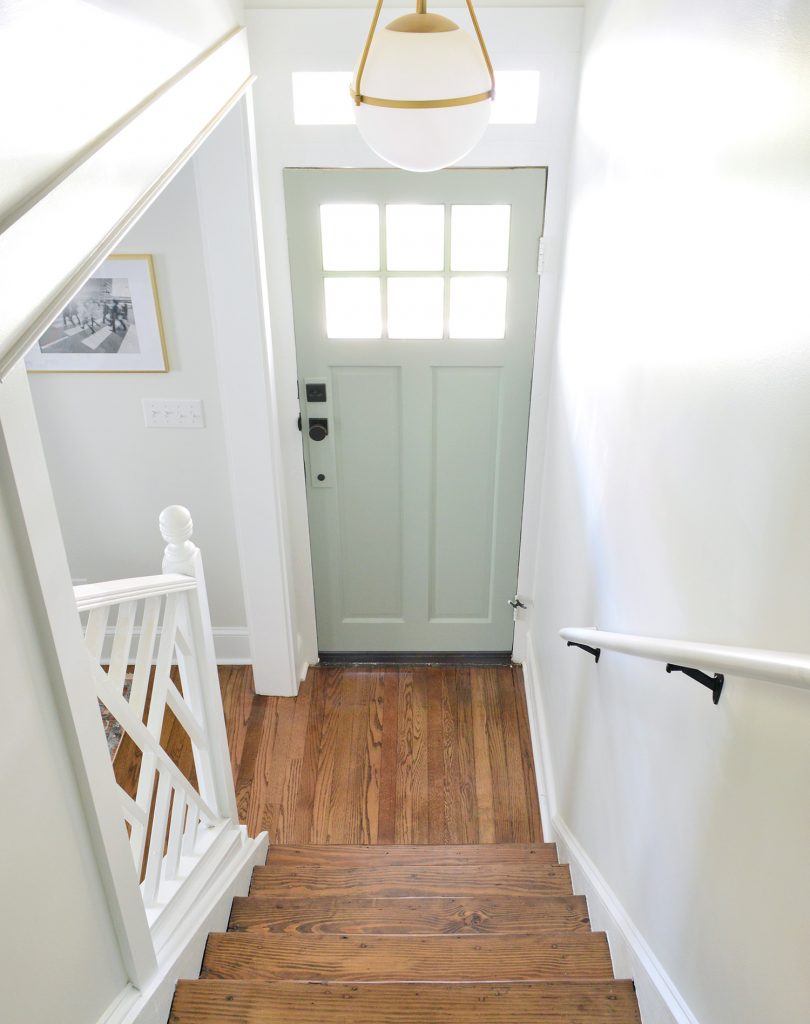
A few seconds ago I said that we opened up the bottom of the stairs, so here are some before & afters of that update. This is what it looked like when we bought the house – all closed in completely by a diagonal hallway of drywall with just a tiny doorway to enter the living room from the front vestibule, which felt VERY CRAMPED.
Now it looks like this, thanks to creating a much wider doorway into the living room, and an open railing that lets in tons of light & adds some great architectural interest. That gold globe light is a space-maker too guys, and the price is so good (it’s huge). The ceilings on the first floor of the duplex are 9′, so it allowed for some fun large-and-in-charge fixtures in a few spots (so if your ceilings are 8′ and you want that light, measure to see if it’s too low, and if so you could place it over a table or a bed – ooh it would be so good in a bedroom.
But back to the upstairs. This is the view of the front bedroom on the right side from the hallway.

We revealed the front bedroom on the left side of the house in last week’s post, and a few things are similar in this space (we chose the same wooden bed and the same art for that back wall as well as the same rug ).
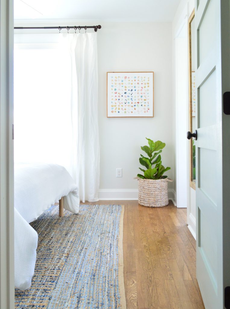
But a few things we did differently over here are that we oped for slightly wider nightstands (they fit in here and wouldn’t in the other front bedroom! The slight measurement differences from side to side are so funny). We also did table lamps in here instead of wall mounted sconces, which add some nice texture.
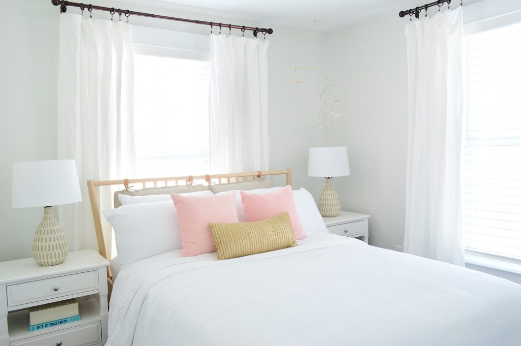
We also hung a breezy little mobile above the bed on the right (it’s hard to see in the photo above for some reason, but you can see it a lot better in person and in the picture below. The gold hardware on it with the white wood seagulls are so perfect for the beach. It’s actually a mobile we’ve had in our bonus room at home for years, but we knew it would be perfect at the beach (it’s no longer sold, but here’s another mobile I’m loving).
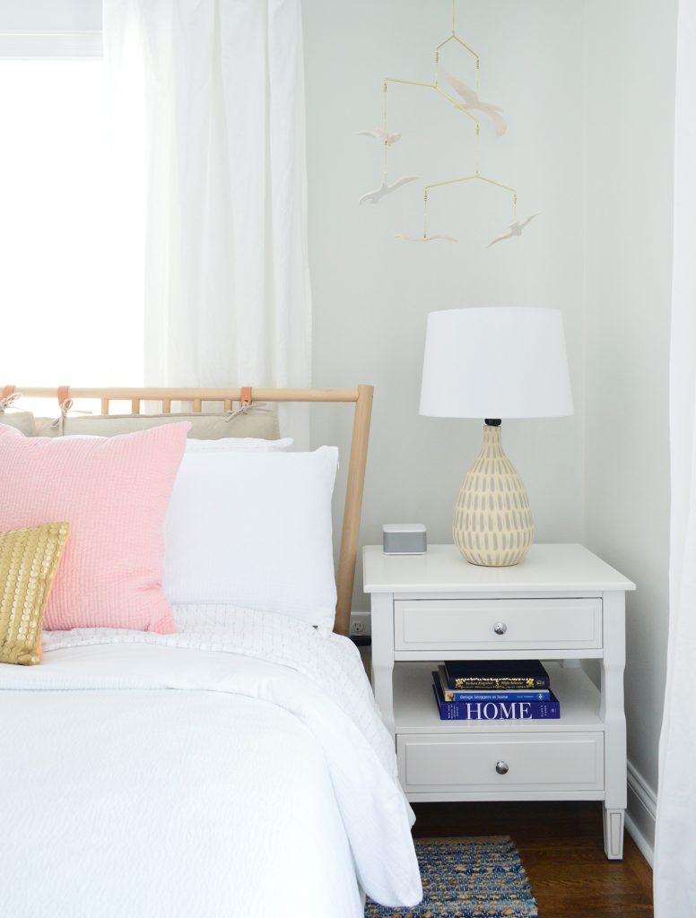
The bedside tables are SO NICE. They were a bit of a splurge for me (compared to the cheaper mint ones I got for the other side’s front bedroom) but I just loved that there were two drawers and that pretty display space in the middle for books or magazines. They look really well made in person – and the added width (they’re 24″ wide) feels great too. So if you’re looking for some classic white nightstands, these are good. Oh and we put a sound machine in each bedroom because we did that for the beach house and it’s SO NICE. Our kids love a sound machine and we’ve found that when people come to stay with us they appreciate having one too.
Below is a shot of the wall that’s across from the head of the bed, where we mounted a great wood-framed mirror (the price is so good you guys! we have one of these in the beach house too). It’s nice to have a bedroom mirror for people to check themselves out before leaving the room when they don’t have an attached bathroom to use for that. And that doorway you see with the diamond grilled window beyond it (my VERY FAVORITE HOUSE FEATURE!) is the cute little closet for this room.
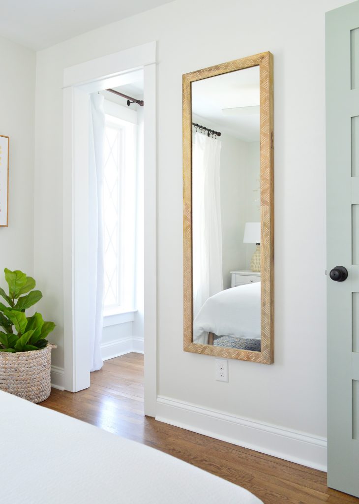
The curtain panel that you see next to the diamond window is blackout lined, so it blocks light that would stream into the bedroom when you pull them closed. All the other windows in the duplex have white faux wood blinds to block light and for privacy, but I couldn’t bear to put them on the diamond windows.
And across from that window is a diamond fronted dresser that we designed (can you tell we love diamonds?!) as well as a hanging bar for additional clothing storage. I love the little white honeycomb pendant light that we have in there too. We also used that light in the laundry room downstairs as well as over the kitchen sink. So classic looking. Five stars, would recommend.
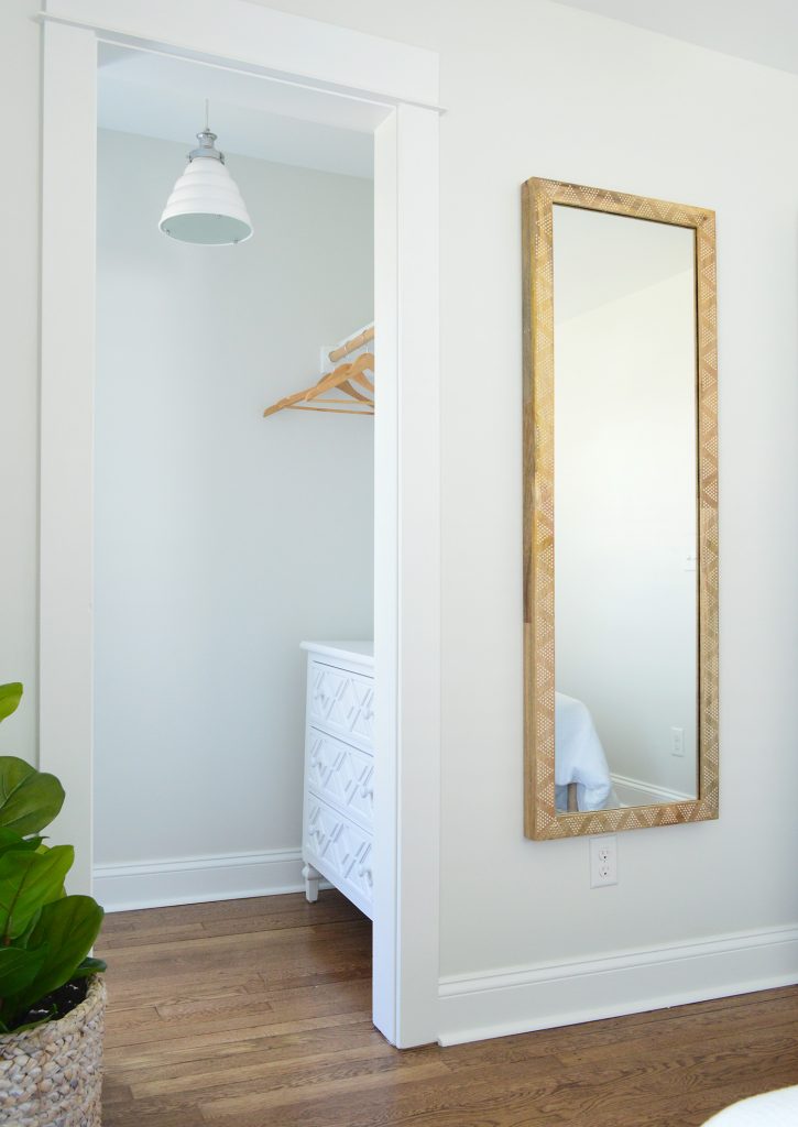
I gotta say I love that the wood in the mirror and the bed and even the hangers is all that warm medium tone, so it feels really earthy and calming in here. Especially when you compare it to this before shot, which once again has a drop ceiling and plastic paneled walls that were covering various water and mold related issues:
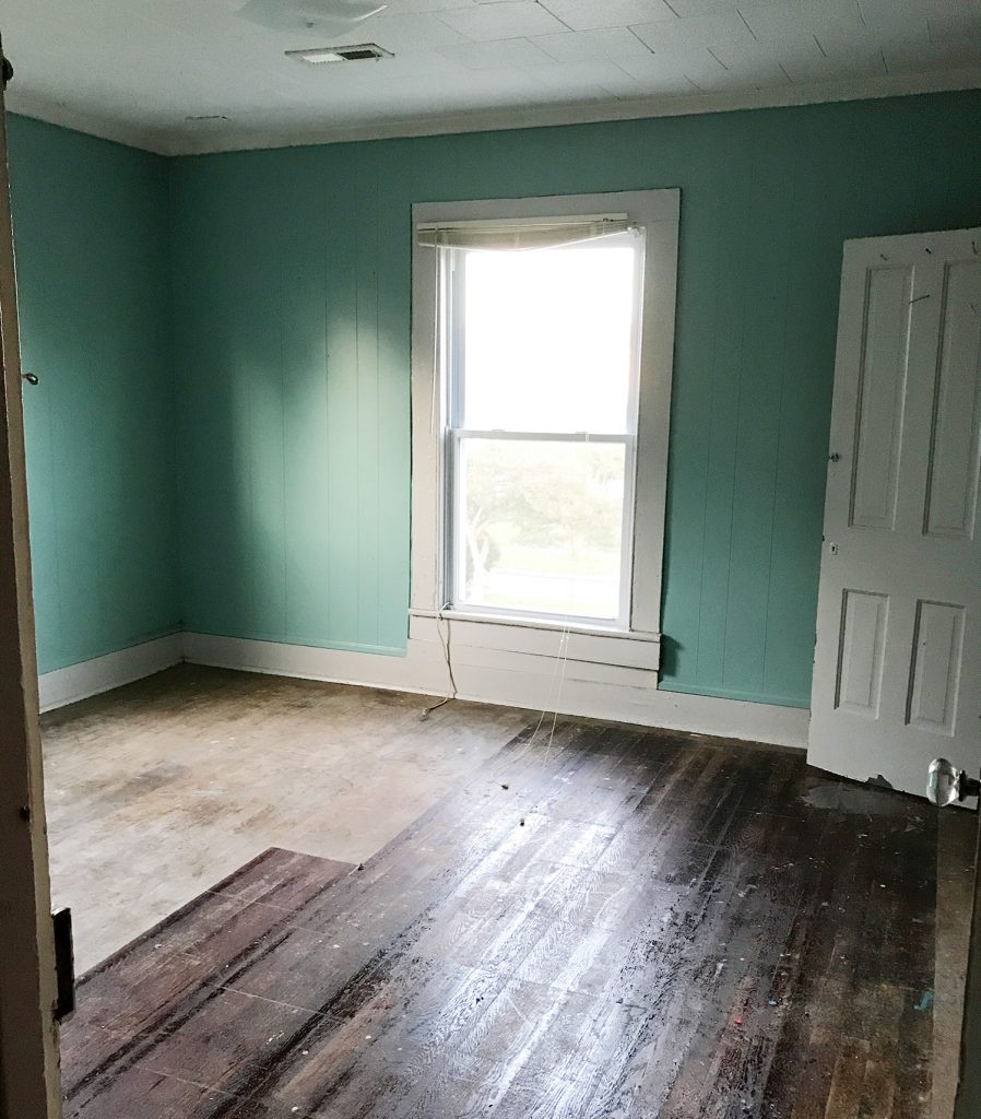
Also this floor. OH THIS FLOOR. I hated it with every fiber of my being, because someone had put peel & stick tile all over half of it and then ripped it up before selling. But all the glue from the sticky tiles STAYED ON THE FLOOR. I am not exaggerating when I say that when I walked in with my flip-flopped feet for the first time, my flip flops came off of my feet and stuck to the floor as I tried to take another step. I literally had to pry them off with my hands in order to move. It was like a human-sized sticky trap.
Thankfully after refinishing the floors, they’re glorious and guaranteed not to steal your flip flops. Still gotta steam the curtains in here (remember we use these Ikea curtains and hack them to look like this) so I guess it’s not 100% done, but it’s very very close, which feels very very good. Also I love this rug. We bought it twice (it’s also on the other side) and it’s casual and beachy.
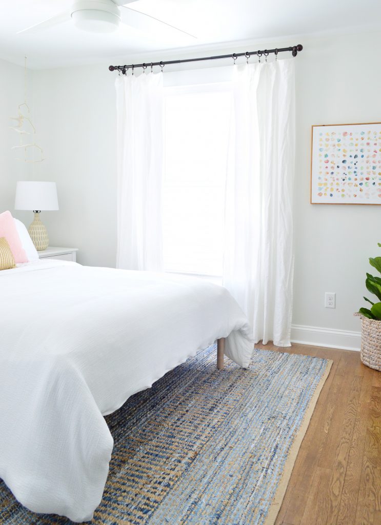
So there you have it. Four more spaces in the duplex that we’re thrilled to have fixed up and filled with as much charm and function as we could muster.
Oh and while we’re on the subject of function, we went with SIX CEILING FANS in here because we know lots of people who love sleeping with a fan on, and although we have central air, that breeze feels beachy and calming. So yeah…. design-wise we love a light fixture, but it just felt right to do crisp white fans for the beach.
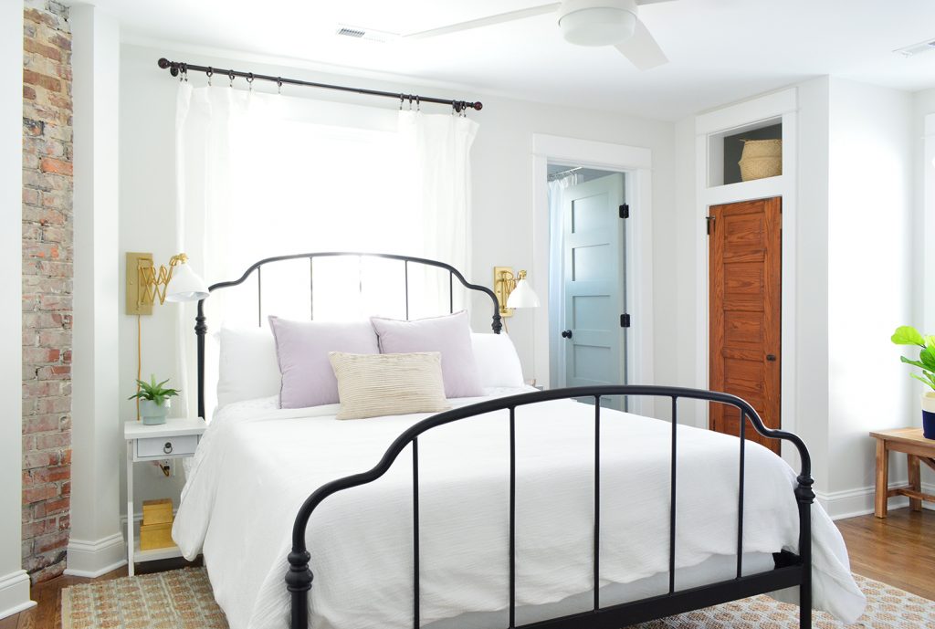
We’ve been really happy with them so far (you know we turn them on when we’re working away in each room – ha!). We did these larger ones for the four larger bedrooms (as seen in the back bedroom above). And these smaller versions for the two smaller twin bed rooms (which we have yet to finish & reveal – but soon!).
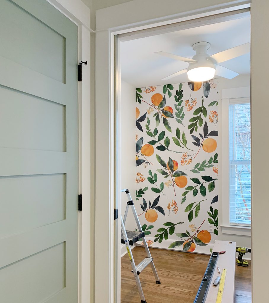
Speaking of those twin bed rooms, after they’re done we’re switching our focus to finishing up the two living rooms, two dining spaces, two kitchens, and two laundry rooms! AND THE TWO BACK PATIOS! Still plenty to do, but we’re getting closer every day!
P.S. You can see the entire process of bringing the duplex back to life here From a complete “before” video tour, to planning the floor plan & the style vibe, to tiling it all and revealing the before & afters of the front and the back of the house, it’s chock full of info & pics.
*This post contains affiliate links*
