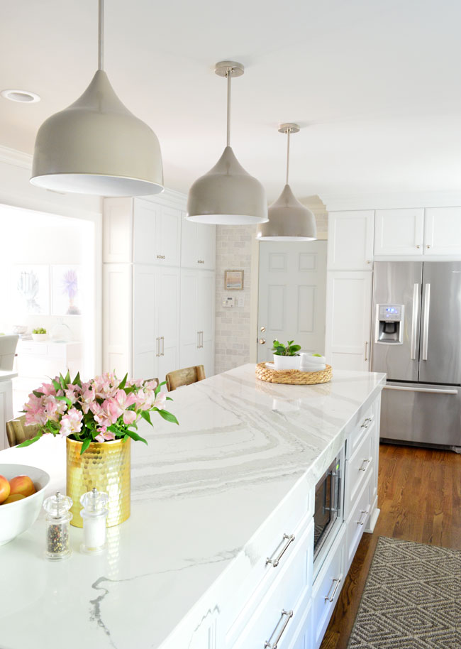
Back when we revealed our kitchen makeover, we mentioned that we worked with Shades of Light to design our pendant lights (below). But those were just one of a whole slew of new designs that we’ve added to our lighting collection over the last year-ish. So in addition to sharing some of our latest designs with you guys, we also wanted to take you behind the scenes and show you some of the tricks that catalogs and websites use when it comes to photographing stuff (including how we turned an armchair into a headboard, all in the name of getting the shot).
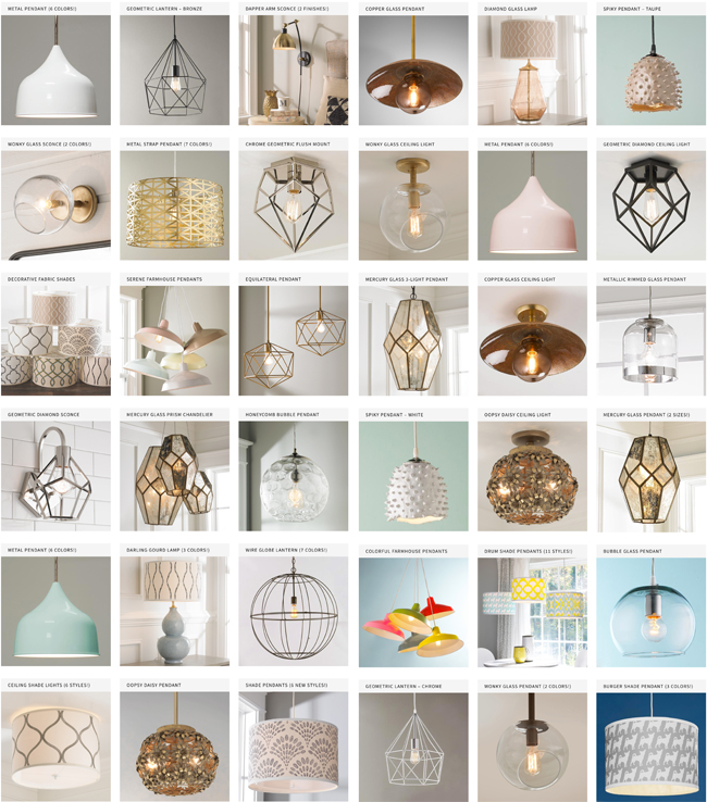
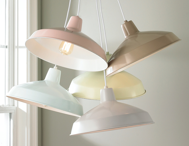
After launching our initial collection back in 2013, we added a few new pieces over the years (like the geometric flush mount that we included in our laundry room remodel) but this whole batch of new designs was kicked off by wanting to use one of our $69 farmhouse pendants in a spec house kitchen that we were designing. The only problem was that all of our existing colors were too bold for the look we were going for. So when we asked Shades of Light to custom paint two of them in a softer blue so we could buy that version, we all sort of said “why don’t we refresh all of the colors so everyone can buy them?!”
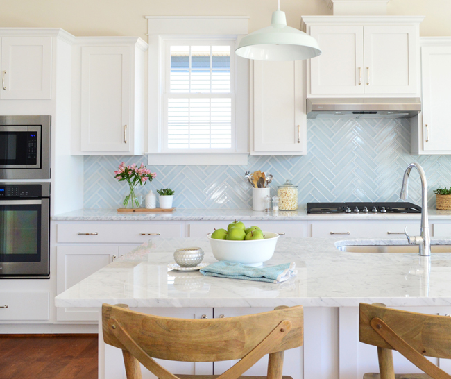
So now there are neutral options like a soft gray and a warm brown as well as subtle pink, green, and blue. And all of the original colors are still there too if you’re more in the mood for teal, red, green, yellow or watermelon pink (and all of them are just $69).
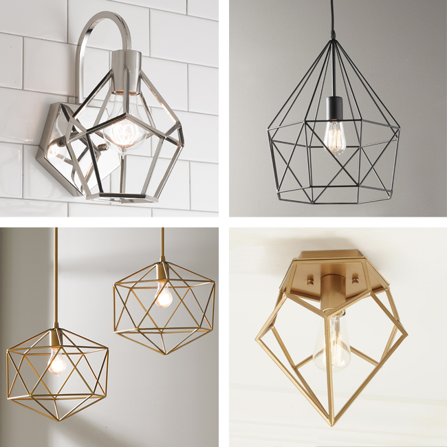
Those new color choices for our farmhouse pendants sparked some other ideas for new designs, so we continued to play with geometrics and open frame designs, while introducing some new finish options, like the brass/gold look. (clockwise from the top left: diamond sconce, diamond lantern, diamond ceiling light, equilateral pendant)
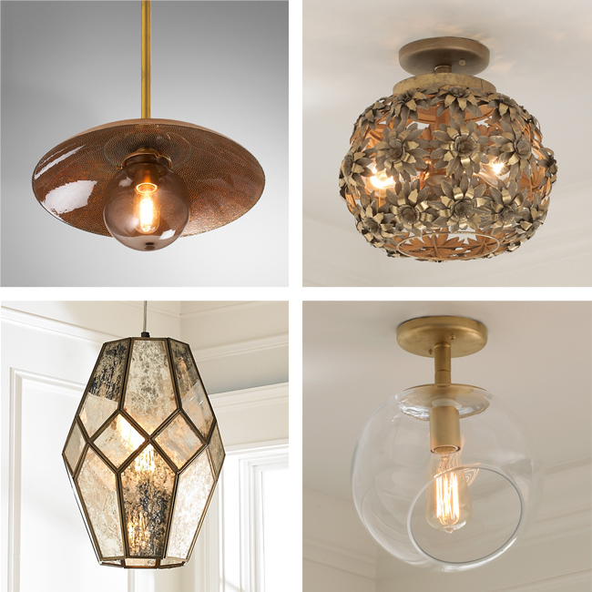
We had fun diving into the world of gold and copper, making sure that we had different hanging options. So whether someone needs a flush mount light, some sconces, a ceiling light, or a pendant, we did our best to cover all the bases. (clockwise from top left: copper glass, oopsy daisy, wonky glass, mercury glass)
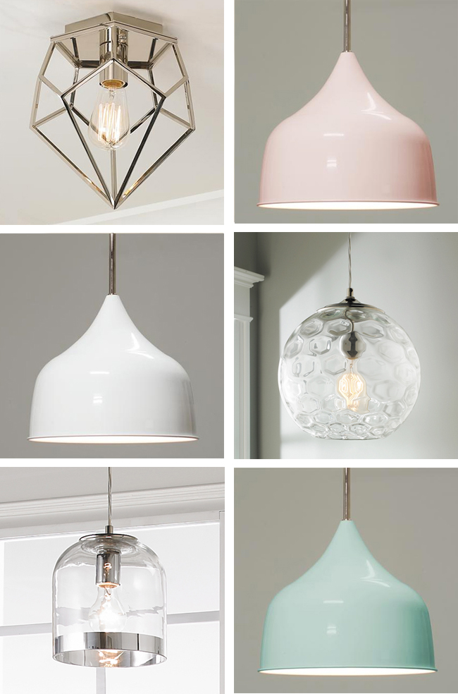
We also made our metal pendants from the kitchen in a bunch of colors (there are 6!) and one cool thing about them is that they’re “convertible fixtures” meaning you can just choose not to use the hanging rods that come with them to make them semi-flush mounts instead – so they would work down a hallway or in a bathroom, closet, or mudroom (anywhere you don’t want a long dangling pendant). You can also see a few glass and chrome pendants and flush mounts that we played around with too. (clockwise from top left: diamond ceiling light, metal convertible pendant, honeycomb bubble pendant, metal convertible pendant, metallic rimmed glass pendant, metal convertible pendant)
We also added a bunch of new fabric shades, and each of the patterns come in multiple colorways (a couple of them – like the stitched helix sitting on top of the pyramid below – have a slight texture to them too).
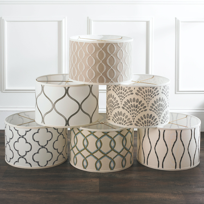
They’re all available as a pendant with a diffuser or a flush mount with a diffuser (which are great for halls or bedrooms where you don’t have high ceilings), and each of the shades also comes alone (in case you want to retrofit an existing lamp or DIY your own pendant or flush mount fixture).
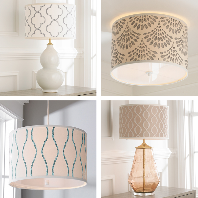
Many of our new pieces still fit within the $99-and-under price point from the first collection, but we did expand beyond that price cap for some so that we could create larger sizes or use materials that had been ruled out for being “over-budget” before. For example, we couldn’t add diffusers to many of our lights from the first collection – or make multi-bulb fixtures instead of just single-bulb ones with that price cap – but most of our new stuff is still $150 or less.
In fact, one of our favorite new pieces is this $90 adjustable arm wall sconce which comes in a mixed finish (black & aged gold) as well as a sleek all-chrome version (might use that one in the beach house). And the fact that it’s a plug in sconce makes it SO EASY for anyone to add these to a bedroom without needing an electrician to hardwire it.
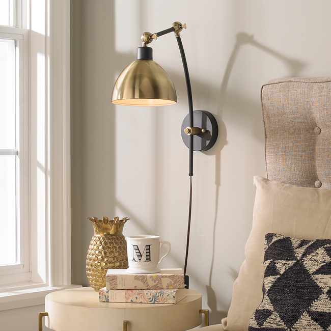
That photo above actually brings us to the topic of the photoshoot. Last spring, once enough of our finished pieces and/or prototypes had arrived, Shades of Light invited us to help photograph everything for their catalog and website. They had just moved into a huge new facility here in Richmond, and they now had a dedicated photo studio (we had shot the first collection in our old house). It was ridiiiiiculously cool to peek behind the curtain to see how these things are styled and photographed in a studio.
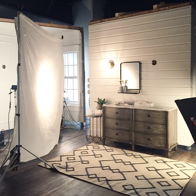
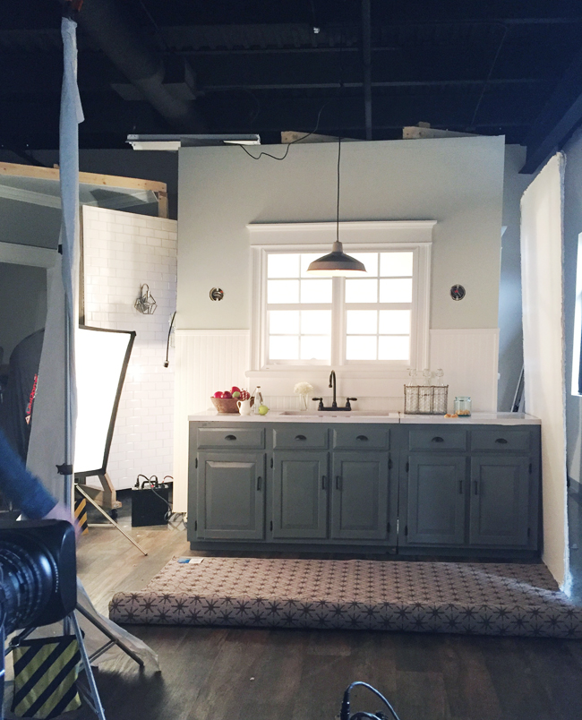
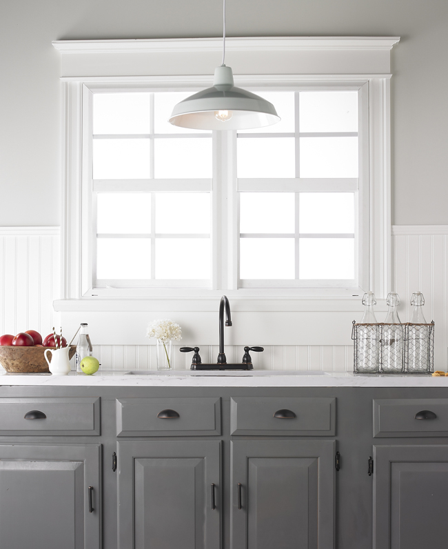
They had constructed all of these fake, movable walls (all on casters) and each one had a different wall treatment (tile, beadboard, shiplap, etc) or a different paint color – and many had windows or some other architectural detail. This created the look of many different rooms, all without having to go to multiple locations. For instance, the set-up above yielded the final shot below:
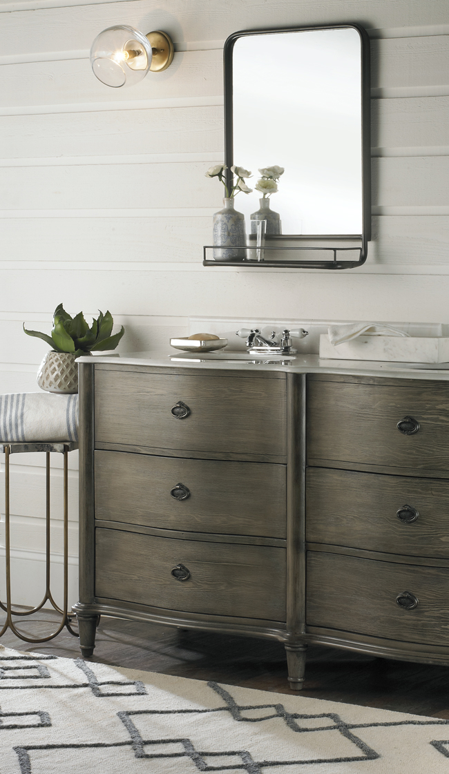
If you’re like me you’re thinking “how did that gap where the casters are on the bottom of the wall disappear and turn into thick white baseboard?!” Well, they had strips of baseboard around that we slid into place in front of the wall to cover the gap and make everything look seamless. So smart, right?
They even had some cabinets that we could put together to stage a kitchen scene.
Once we got a scene all set up and styled, we swapped in every variation of that light (sometimes altering the styling as we went) and the photographer snapped away.
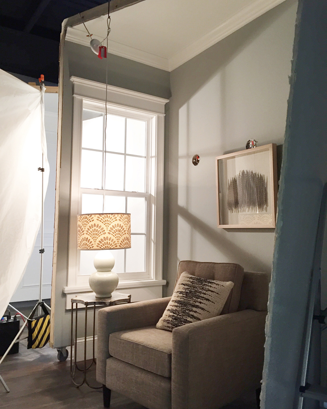
They had literally JUST moved into the facility a week or two before our shoot, so we got to help break in the studio (this was their first shoot in there). Some of our lights were still being finalized, so there was a certain amount of ingenuity necessary to make everything work. For instance, the lamp base below hadn’t been wired yet, so in order to take a pic with the light on, we had to wire it from above and they’d just photoshop the cord out later.
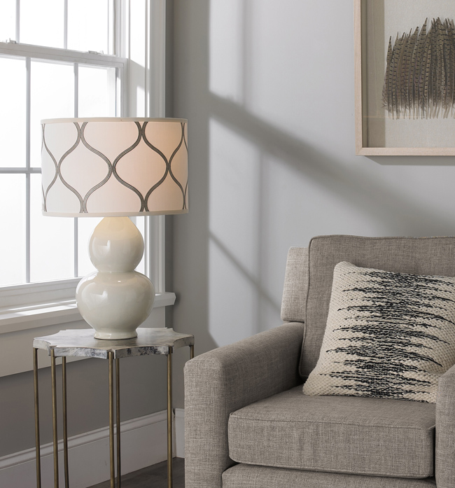
Here’s one of the final shots (with an alternate shade on it). Look ma, no wire.
I also mentioned we had to fake a headboard using a chair (actually, it was the chair shown above) because some of the prop furniture hadn’t been delivered quite yet. So Sherry and I used the tufted back cushion in place of a tufted headboard, found a bolt of fabric to use as a “bedspread,” and just crossed our fingers that some careful cropping would do the trick. From afar, it was MAJORLY JANKY…
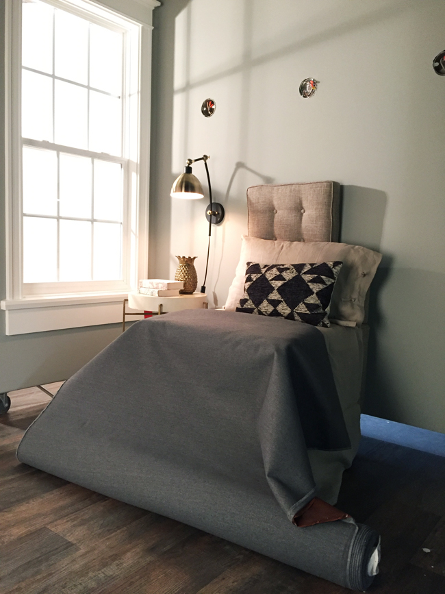
… but up close you’d never guess that wasn’t the corner of a bedroom! Here’s the final shot (it’s the one we took with the chrome version of the sconce, so some of the styling had been swapped).
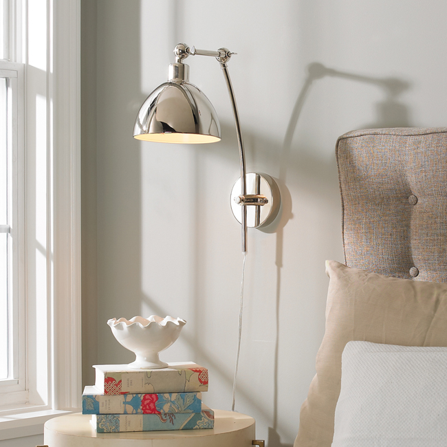
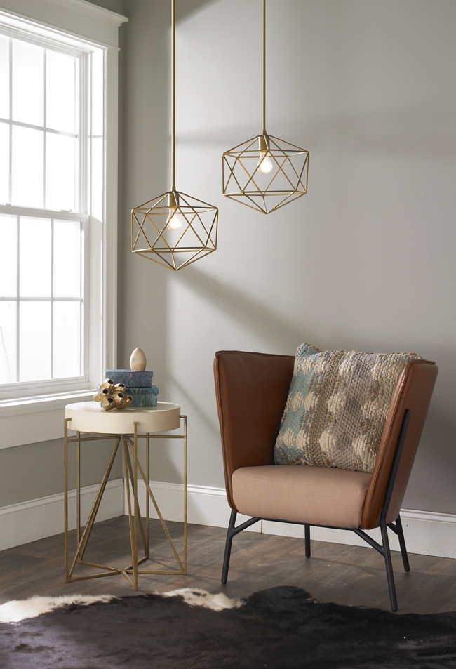
It was oddly fun to create different “scenarios” that showcased our lights in a few fantasy environments. And it was fun to rifle through their furniture props. John kinda loved that chair because it was super comfy and “felt like a hug” (did I mention I married a big weirdo? but he’s my weirdo).
You can browse everything directly on Shades of Light’s website. Again, many of the items come in different finishes, colors, or configurations (sconces/pendant/flush/etc) than the ones we showed above. And since some of this stuff has been out for several months already, feel free to send us a picture (or tag us) if you’ve got one of them in your house. We love seeing this stuff in its natural habitat!
PS: Speaking of things we did last year, some of you have already heard that last fall we shot some videos for a free do-it-yourself app called DIYZ. We did six projects that each take five steps or less to complete – and they’re available to watch by searching “YHL” in the app. We covered stuff like making a paneled headboard, an outdoor house number plaque, a twine wrapped shelf with leather brackets, a wall-hanging photo & recipe display, a wood centerpiece box, and even a wood frame to upgrade one of those old cheap bathroom mirrors that hangs with plastic clips (make sure you snarl at those plastic clips one last time before you gleefully cover ’em up).
