Inspiration really is everywhere, so when John and I were picking up a friend at the spa (we’re that fancy, we loiter in spas without actually getting massages) I couldn’t help but snap a few photos of some gorgeous packaging with some pretty amazing color schemes. Yeah I was that girl, taking pictures of the soap and candle display in the lobby. It was all in the name of decor though, so it was time well spent. Anyway, the point is that it’s so easy to find everyday objects that you love (like a favorite painting, a meaningful necklace – even a scented candle) and design an entire room- heck, an entire house- with that color palette in mind.
For example, take this pretty scented sachet and soap packaging that has gorgeous ethereal charm:
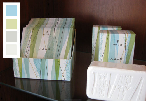
We love the idea of layering sea-glass-ish greens and blues with moody grays. So for anyone looking to recreate a whole house palette with this in mind, try painting a few rooms in Benjamin Moore’s Paradiso 717 (which is similar to the brightest blue square), a few in Benjamin Moore’s Sesame 381 (which is similar to the green square underneath), a few in Benjamin Moore’s Silver Sage 506 (which resembles the gray square underneath) and Benjamin Moore’s Springview Green 491 (which is close to the soft green square on the bottom). And of course instead of using this palette for your whole house you can easily adapt it for one room (picking one tone for the walls and grabbing bedding or upholstered furnishings and accessories in the other colors). And we should note that white definitely plays a big roll in this scheme, so breezy white curtains or even a white slipcovered sofa (or fluffy white bedding) would fit right in with this look.
Oh and remember that you can pick up each of those paint chips (for free) at your local Benjamin Moore store and have them color matched at Lowe’s or Home Depot to save money by buying Behr, Valspar, Olympic, or Glidden paint instead of Ben Moore (all the lower cost brands that we named are ones that we personally love and have used in our own home after having them color matched).
Next we have this playful and punchy palette that we think would look charming in any modern home full of crisp white tones and sophisticated inky blue accents (just like the bottom square in our color palette- which was inspired by those blue candle boxes):
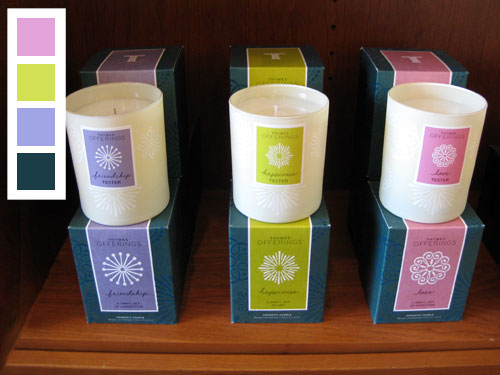
Sure the pink, lime and purple hues are fun- so they’d definitely work in a nursery or a playroom- but we can also picture this scheme in a chic family room with stark white walls and a clean-lined dark peacock blue sofa with breezy curtains in the same hue. Then the purple, lime and pink tones could be brought in sparingly with bold accents, like a large lime vase on the center of a white lacquered coffee table, and two pink ceramic based gourd lamps that could be placed on either side of the sofa (which might be accented with lime and purple pillows). Oh and if you’re looking for similar paint tones to those pictured above, try Benjamin Moore’s Blue Viola 1424 for the purple color, Benjamin Moore’s Artichoke Hearts 382 for the lime tone and Benjamin Moore’s Angelina 1376 for the pink hue.
Next we have a simple three color palette (again with a lot of white worked in, so be sure to include that to mimic this effect) along with a dark evergreen tone, a softer lime color and a pretty pop of blue (see how subtle the hints of blue are in the packaging?).
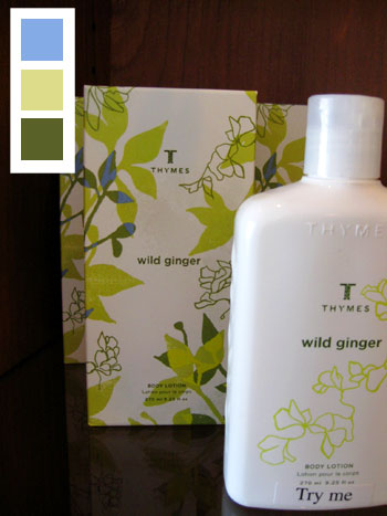
To get this look, try Benjamin Moore’s Northern Air 1676 for the blue, Benjamin Moore’s Sesame 381 for the soft lime tone and Benjamin Moore’s Oak Grove 489 for the deep green tone. And here’s a tip on that blue color. It’s probably best used for accessories and even painted furniture pieces since it could be a bit much on the walls (we like our blues to be slightly muddier on the walls so they don’t look like a little boy’s bedroom). Unless off course you’re planning to use this scheme in your little boy’s room, in which case we say, by all means, use it on the wall.
Our next palette is a nice demonstration that three colors (two of which are similar to each other) don’t have to be boring.
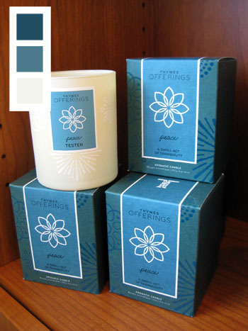
A room with cream walls (like Benjamin Moore’s Winter Wheat 232) and dark inky blue accessories in two different tones (like Benjamin Moore’s Lakeside Cabin 1658 and Spellbound 1659) would feel high contrast and elegant- not flat and boring even though there really are only blues and creams being layered in the space. Of course texture would also be key here (see all those tone on tone designs on the candle boxes?) so printed pillows and a nubby textured rug would really tie a room with this color scheme together for a high end effect with interest to spare.
Next we have a more feminine palette with deep plumb, medium pink, metallic-y gold, and whisper soft pink:
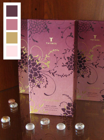
The light and subtle pink would make a great wall color (try Benjamin Moore’s Wild Aster 1240) while bedding, upholstery, accessories, and even a stunning painted furnishing or two could make up the rest of the palette. For the metallic gold, try bringing in actual hammered gold accents like a gold-toned tray on the coffee table or a sleek brass lamp on each side of the bed. Meanwhile the deeper pink (try Benjamin Moore’s Victoriana 1263) and plum tones (try Benjamin Moore’s Ruby Dusk 1267) can be used for other accessories like pillows, throws, vases and art. Extra credit: painting a large dresser or table in that luxe plum color would definitely make for a stunning feature in the space.
Then there’s this modern yet classic color scheme which includes cream, persimmon, and two tones of that same inky blue that we’ve seen a few times already. We love how crisp and saturated this palette feels, although it’s still not too overwhelming thanks to that cream which tempers the other more high-contrast colors.
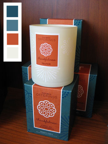
We could actually picture this scheme in a dark home office or moody den with the lighter of the two inky blue tones on the wall (try Benjamin Moore’s Lakeside Cabin 1658) and a slew of accessories and accents in cream (try Benjamin Moore’s Winter Wheat 232), dark blue (like Benjamin Moore’s Spellbound 1659), and persimmon (try Benjamin Moore’s Pilgrimage Foliage 2175-20). Oh and handsome dark wood furnishings would fit right in (along with some cream upholstery which is derived right from the palette).
And lastly we have a super soft and serene scheme with beachy blues and greens and a dash of sweet pink.
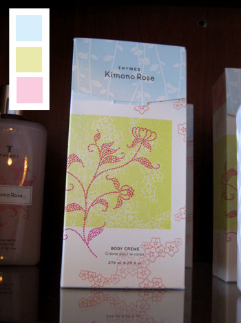
Again there’s a fair amount of white in this packaging, so bringing in white bedding or upholstery along with crisp white curtains will really help the soft and subtle green, blues and pinks pop. And when it comes to hunting down similar colors to those shown in the palette above, try Benjamin Moore’s Paris Romance 1262 for the pink, Benjamin Moore’s Sesame 381 for the soft lime, and Benjamin Moore’s Blue Haze 1667 for the blue.
Oh and just in case you’re wondering how offering up these paint chip colors will help you design an entire room when you can only pick one paint color for the walls, grabbing all the swatches will come in handy because you can bring them with you when you shop for accessories- so selecting lamps, art, pillows, bedding, even an upholstered chair will be even more foolproof thanks to your pocket sized color guide that you can hold up against any item to see if it’ll work.
And so ends our trip to the spa where we left without any hands-on treatment but lots of home decor inspiration. Have you guys ever gone somewhere or seen something that has nothing to do with paint chips or home decor and thought “I could totally decorate an entire room around this”? Do you and your partner have a favorite accessory or piece of art that you can use to settle a pending decorating dispute (hint: if you both love it, use those colors in your home since you can both agree on them!).

The Virginia House says
I love all the colors! Amazing how you can find inspiration in a couple of colored jars and boxes.
Melissa says
My daughters room is similar to the colors with the green/purple/pink. I have the blue/green combo in my office but have been wondering what color to paint the walls. A lighter gray tone might actually look great. Thanks for the inspiration.
Jessica @ How Sweet says
I WISH I have thought that way before! I usually go places and see things decorated and wish I could do my home like that!
Babs says
What great inspiration and beautiful packaging!
Kasey at Thrifty Little Blog says
I’d love to see more of these types of posts. What a great way to look at decorating!
Jessi says
Duffy & Partners in Minneapolis is responsible for the packaging design for Thymes. It is beautiful and has been winning awards for years. Thanks be to designers for selecting perfect color palettes!
YoungHouseLove says
Amen!
xo,
s
Rachel says
Yeah they are a Minneapolis company (where I live), I have always loved their packaging! The wild ginger smells amazing!
Mallory says
I think it’s really smart to look at packaging and advertisements for color inspiration. Those companies spend a lot of money figuring out the right way to market and sell their product. It’s a wonderful place to look for inspiration. Great post!
Sunny's Life in Rehab says
Love the seaglass shades. Thanks for the paint colors, I’ll have to check those out for the bedroom makeover!
Ashley @ Mutschler Family, Dallas Edition says
What a great idea! All of those packages are created by artists and designers who know their elements!
And, I am going to find Benjamin Moore’s Lakeside Cabin for some of my house!
Katie says
This is such a fun, creative post! The only problem is that I love so many of these- the top 2 and number 4 are my favorites. Do you have a strategy for choosing which color schemes would work best in a space?
YoungHouseLove says
Nope, we just say go with you gut. Why not go grab the swatches we recommended for all three of the palettes that you love and hold them up in your space to see which ones catch the light and work the best in your home? Hope it helps!
xo,
s
Bethany says
OMG~ I love the purple/ pink inspiration. I have been looking for inspiration for an ultra- feminine closet makeover. I think I just got it! THANKS!
candace says
I’m IN LOVE with the first color palette! So yummy!
jess says
I love these ideas for color palettes! Do you have a suggestion on which palette would go best in a very, VERY small bathroom with no natural light? The only lighting is bright vanity bulbs. Keep in mind this is a guy’s bathroom…. any suggestions would be greatly appreciated!
YoungHouseLove says
Hey Jess,
Just bring home a bunch of the color palettes that we suggested here and hold them up in your space to see what works best (lighting varies from house to house, so some will probably appeal more than others). Good luck!
xo,
s
Danielle@Newlyweds Paradise says
What a great post! Color inspiration is always what starts me off for a project. I never thought to look at packaging for that inspiration!
saundra says
Love these. We’re moving soon, and I was already thinking of using those first colors in our bedroom and the blue/persimmon (though I think of it as terra cotta) in our living room. We’ll also be using some earthy browns and whites to ground the colors.
Jenny says
I love it! What a great way to find colors that already “go” together.
We haven’t done this in our house (yet), but my fiance and I used a green glass necklace of mine (all different hues of greens) as the inspiration for our wedding colors and centerpieces. We’re not sick of it yet, so maybe we’ll try it out in our home.
Laura says
The Thymes Offerings candle color palette was the exact scheme we used for our wedding!
sara says
The 3rd one down with the white, blue, green and dark green is the pallete of my kitchen. It’s SO wonderful. I already painted the walls in my mudroom the sky blue color and I I’m going to take ur advice and do punches of white, light green and gray (from the first pallete). Thanks! I’ve been looking for some inspiration to bring the outdoors in and now I have it!
Carrie says
Love the inspiration colors! We recently painted our room Glidden’s Gentle Tide/Cool Cucumber, which in a large room like ours is very much like the sea glass inspiration. With our white woodwork, neutral bedding/carpet, and white painted dresser, it’s beginning to look a little like a child’s room. Any suggestion on what color to paint an old dresser that needs updating in order to get away from the pastel/baby-ish theme?
YoungHouseLove says
Bring in some dark chocolate. We have the same colors in our bedroom (Gentle Tide on the walls, Cool Cucumber on the ceiling) and we also have crisp white trim and curtains around the room. But the furnishings (like the bed, a large thick-framed floor mirror and a leather chair) are all deep brown. It really cuts that baby-ish look for something sophisticated yet airy. Hope it helps!
xo,
s
Rachel says
Great post, Sherry (though I won’t even ask why you were picking a friend up at the spa). :) I am so loving the palettes from the Wild Ginger and Azur products; sea-inspired blues and greens are always my favorite though. I immediately thought of these colors for not only the home, but as great inspiration for wedding colors – I guess commenter Jenny and I were on the same page. :)
Dana @ House*Tweaking says
Sherry, I am ALWAYS ‘that girl’ taking pictures of random inspirational stuff. I’m afraid people think I’m crazy and feel I should explain myself but never do.
Thank you for referencing paint chips along the way. This is a great tutorial! Looks like I need to pick up BM’s Sesame paint chip…it grabbed me in each color scheme it was in. I especially like the last combo and think it would look nice with our already airy gray walls.
BTW…’nice package’ and ‘stairporn’…those last trimester hormones must be kickin’ in! Hehe.
Mandy says
That first palette is the exact color scheme I want to use in our kitchen/family room redesign. Love it!
Jennifer says
When ever I see beautiful things like this, I also note the background color – which makes things totally pop (i.e., the dark brown wood behind the pkgs).
Also, no matter the type of store, I check out the paint color on the walls. Many stores (especially small, privately owned stores, and furniture stores) will tell you the exact color of the paint on the walls. Never hurts to ask!
Kay says
I love all of the match-ups, particularly the first. I actually will be using it as inspiration for my wedding. You guys are the best!
christy says
Wow, those really are some beautiful color combinations. It’s the true sign of an artist to find inspiration everywhere! Love it! …And LOVE your blog!
Joy says
I love those purples! I might save those for my daughter’s next bedroom! Her dresser is white so I was planning to build her a white bed when she moves out of her crib but dark purple sounds fun too!
Ana says
I spotted a beautiful Stig Lindberg platter online (http://www.retrohome.se/sl/sl.htmdoc/s_2030.htm) and I’m planning to use the colors in my kitchen/den area since it’s all open. I haven’t figured out exactly how, but maybe I’ll wake up early and buy one of your mood boards and get your help. But first I have to pull down all the damaged paneling and ’70s flowered wallpaper.
Jess B says
I will admit to decorating my entire bedroom based on a placemat I found at Walmart. I already had a green duvet and fell in love with these pumpkin colored sheets, the striped placemat brought them all together for a cohesive color palate which I love. I agree that inspiration is everywhere!
Mrs S says
I love Thymes – they have amazing packages indeed. They sell their products Paper Affair in GA, IL and TX (as far as I know). :)
Jenny says
This is great! I have a CK duvet in our master BR whose colors fall in the “deep plumb” category you listed. It’s nice to have some ideas for what to coordinate with it and other colors to use also. TVM for this post!
Emily says
I’m curious about how you generated the neat little color palette in the top left-hand corner of each of your photos.
I’ve been trying to find a palette generator online for a long time (the kind where you upload a photo and it automatically spits out the colors/palette in the photo), but can’t seem to find a good one. Do you guys use this kind of tool, or did you manually match the color boxes to the colors in your photos?
YoungHouseLove says
Hey Emily,
We just opened the photos in Photoshop and looked for colors that were similar (sometimes using the color sampler tool- although that was a bit faulty occasionally). Then I just whipped out my trusty Benjamin Moore paint deck and selected colors that were closest to the little palette that I made in each corner (so I guess you can say we “did it by hand”). Hope it helps!
xo,
s
Tara says
LOVE this post! I would really like to find some bedding that have the Benjamin Moore’s Lakeside Cabin 1658 and Spellbound 1659 blues in it. If you come across any will you please let me know.
HUgs
Tara
YoungHouseLove says
We’d check out places like Bed Bath & Beyond and TJ Maxx/Home Goods/Marshall’s since they have a variety of bedding at great prices. Ebay might be a good place to look too!
xo,
s
Louise @thedaythatusa says
The color punches are so stunning, incredible! Great inspiration.
Sandy says
Have I got a palette generator/paint match method for you.
I have a great palette generator that I love to use, and a way to convert that to actual paint colors in just two steps. Go here:
http://www.cssdrive.com/imagepalette/index.php
Then enter the URL of an image you like. For example, I went to the Thyme website and found one of the products you posted – the “Azur” line. Here’s the URL for the picture:
http://www.thymes.com/Images/CollectionPatterns/az_pat200x100.jpg
Put that in the URL line in the palette generator, and it gives you a display of all the colors, and the best thing is, it shows you light, dark, and medium ranges of the colors. Mouse over the colors, and you’ll see the exact Hex numbers. In this example, the Hex # is e3efed. THEN (and I know, this sounds more complicated than it really is) you go here:
http://www.easyrgb.com/index.php?X=SEEK
Where it says “Or your HTML color here” enter “e3efed.” Then select a target color collection (I always select “Benjamin Moore Color Preview” and hit “Start.” Voila! It shows you the closest matches in Benjamin Moore. In this case, it’s “SeaFoam” or “Palest Pistachio.” I LOVE THIS TOOL!!! Enjoy!
YoungHouseLove says
Wow, thanks for the tip! We’ll have to take this method for a test run soon.
xo,
s
Laura says
Thymes “Kimono Rose” smells fabulous! You should have gotten some, the body wash and lotion are soooo nice :)
Elisa @ whatthevita says
WOW this is great – thanks!! saved away some of your ideas for future rooms… and future homes!
r8chel says
I received a pump bottle of the Thymes’ Wild Ginger lotion as a gift several years ago, and it was the primary inspiration for trying to make my bathroom look like a spa. I had never heard of the brand before, so I had no idea that it was sold at spas. How fun to see it featured here!
Gretta says
Not to be Debbie Downer, but if enough people “color-match” Ben Moore paint colors, they’ll go out of business and then we won’t have them anymore
YoungHouseLove says
Hey Gretta,
I wouldn’t worry about that! Benjamin Moore paint has a cult-like following and we know a ton of people (including my best friend) who refuse to paint with any other brand since it’s such quality stuff. It’s totally a case of “you get what you pay for” – we just like to offer affordable alternatives to those of our readers who (like ourselves) don’t mind rolling on that extra coat of lesser quality paint to get Benjamin Moore-esque coverage while saving a few bucks.
xo,
s
Ivana says
Sherry, I love your blog and your beautiful house.
I’m a brasilian girl and my dream is that you take a look at my apartment and bring me some inspiration!
(Sorry about my english… I’m still learning!)
xo,
Obrigada!
misty says
Hi Sherry! Still in LOVE with your blog. My son, 9, says “Mommy, are you reading THAT blog again?” lol, kinda cute.
Anyway, I have a question for you. I am in love with your living room color (Glidden Sand White???) But I cannot find anyone who carries it, and was told it is discontinued? In any case, I was told by Lowe’s and Home Depot that if I could get the formula from someone who already has the paint can, they could whip me up a gallon of it. So…would you mind helping a sister out? lol
Thanks!
YoungHouseLove says
Hey Misty,
This should be that formula for you: 30YY58/082 (Glidden’s Sand White). Hope it helps! We also heard that all the computers at the Home Depot paint counters should have that info as well (perhaps the people you talked to didn’t know that they carried discontinued paint formulas, but according to the folks at Glidden they’re all intentionally kept in the system even when the swatches are no longer offered on the wall). Hope it helps!
xo,
s
Sandy says
You’re welcome. I forgot to state the obvious, for the person who had asked the original question about a palette generator — the site also lets you upload a photo you have on your own computer, and do the color analysis from that.
Do I win “Tip of the Week?” ;)
YoungHouseLove says
You sure do. I hereby award you 1,000 bonus points!
xo,
s
Nancy@marcusdesign says
Love these packages! Have you ever come across a line of perfumes/moisturizers/candles called Pacifica?? Gorgeous packaging similiar to what you have shown here! The colors are incredible, when I bought a perfume I couldn’t throw away the box!!
YoungHouseLove says
We haven’t seen those yet but we’ll have to keep an eye out for them. They sound amazing!
xo,
s
Jennifer says
Great post! I’d love to see more like it! I can’t decide on my favorite. :-)
Jules says
It’s all in the packaging and it gets me every time. I buy things just to to dress up my house, I thought I was the only one.
misty says
Thank you Sherry! I’m pretty sure they didnt know that by the looks they had on their face when I asked. I hope you dont mind, but we are stealing your color for our livingroom! I have one more quick question for you..Does it lend itself to more neutral? More warm neutral? More cool neutral? It looks different in some of the pictures (Im sure from light, etc.)…
By the way, John may have some competition…My 9 year old son, Jake, said to me the other day “That girl is pretty mom, even if she IS pregnant”. LOL…thought you might find that kinda cute..
John…better step up your game! lol
YoungHouseLove says
Haha, your son just made my day. That’s too funny. I’m sure John’s sweating right now just reading about it. And as for Sand White, it really looks amazingly different depending on your lighting situation, so we would recommend painting your room and then seeing how it “reads” in your space. The great thing about it is that it usually works well with warm and cool neutrals (or a mix of both) so you’d probably be safe bringing in either (or both) of those tones… but perhaps waiting for it to fully dry and evaluating it in your space will help you definitively see which tones work best with it. Good luck!
xo,
s
Tiffany says
You’re not the only one who snaps pics of displays. I sometimes try to replicate the prettiness by wrapping my own soaps at home.
Struggler says
Great stuff, as usual, many thanks.
I really love the first color scheme, but I also have a room which could definitely benefit from a bold, plum armoire… the question is, do I have the courage?? :)
ilse says
I love the ginger theme –
I currently have to paint my wall, because my baseboard heater turns the wall/paint brown over a few years. Next week is spring break, so i may try to get it done during that time. And what a perfect time to get some new drapes as well.
Do you have any hints on how to prevent walls from turning brown from heaters?
YoungHouseLove says
We haven’t even heard of this issue. Does anyone have any tips for Ilse?
xo,
s
Amanda says
Hi YHL,
I love this post! My girls’ room is like the package with blue, green and pink — and I love it. I found some cute shabby chic valances at Target that work perfectly with it. As for radiators turning brown, my husband (adorable Contractor) acknowledged this problem and said to try paint specially made for radiators. He said Rust-o-leum makes a product also. Thanks guys!
YoungHouseLove says
So good to know! We have heard of radiator or heat resistant paint, we just thought your walls were turning brown, but since it’s just your radiators the Rustoleum paint should work like a charm. Good luck!
xo,
s