Yup, after months of working on a little behind the scenes blog makeover (not kidding, this stuff literally takes us months) we’ve FINALLY let ‘er rip. Like any project, there were unexpected delays: mysterious coding glitches, inexplicable site crashes (thanks for your patience on those, btw), an earthquake and even a hurricane to round things out. But before we let another excuse get in our way, we decided to just go for it. It’s not 100% done. It may crash the site again. There could be a blizzard next week. Who knows.
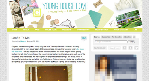
It’s actually surprising to us that we haven’t done this sooner. We’ve had the same exact blog look/background/layout since the spring of 2008 (if you can believe it). It seemed silly that we’ve been through so many room re-paintings, furniture re-arrangings, and even a move to a whole new house… but hadn’t so much as changed the background pattern for three whole years. So it was definitely time. It just sort of felt like we were wearing old clothes that didn’t quite fit anymore. So although we know there are probably folks out there who will miss the old look (we’re sentimental creatures too) we’re excited to finally put on a fresh new outfit.
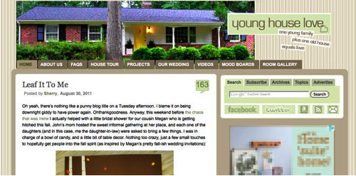
Here’s a little bit of what we were hoping to accomplish with the new design:
- Update the look (colors/patterns/typefaces) to be more reflective of our design choices in the new house
- Make the header more inclusive of the things we blog about (folks kept saying it just represented the “house” part of our name)
- Lighten up a bit, since the old color scheme was feeling a bit dull & heavy at moments
- Improve navigation and help you guys discover content more easily
- Overall just make the site feel fresher, more 2011 and less 2008
So this is what our amateur web designing skills came up with. So far we really love it, even though there are definitely things we’re still trying to finesse. We’ve been tweaking it for the past several weeks, so we’re kinda used to it by now – but we understand if some of you are still skeptical of the change. Think of it like rearranging a room or painting a wall – you might just need to give it a few days to get used to it.

When it comes to the actual header, we photographed a collection of objects that had special meaning to us on white cardstock outside (you know we love keeping things personal). In case you can’t figure it all out on your own, here’s the meaning behind each item:
- Photostrips have always been something we’ve enjoyed, hence their appearance at our wedding
- Clara and Burger are as much a part of this blog as any DIY project, so their picture was a must
- A little wooden “C” block for Clara and a small bone-shaped dog treat (on the other side) were another way to tie them in
- Sherry and I met in 2004 when we lived in NYC, so the little wooden skyscraper and taxi cabs remind us of those early days
- We’re cheap. So we save our pennies. Hence the change, which actually adds up to seven cents – which is a lucky number of ours (plus the dates on each of the pennies are 2007, which is when we started this little ol’ blog)
- We live in (and love) Richmond. So we tossed in a little Richmond magnet. Represent.
- Paint swatches and fabric samples = our idea of a good time. So we picked a few that felt like our current house/style
- There’s not a much more sentimental object than the key to our house (although we altered the tip of it in Photoshop because we’re paranoid)
- Of course we also squeezed in a photo of our current house (had to have that happy yellow door in there somewhere)
- A white ceramic rhino is kind of our mascot at this point (at least behind Burger and our dearly departed ceramic dog).
When it comes to the background, we actually created that as an homage to our previous logo (you know that little YHL heart? the background is actually just a gazillion of those laid out at all different angles to make an abstract-ish pattern). And as for the actual functional changes that we made, here they are:
1. We added a new side-deal called Young House Life (see the “Life” title under the header on the right?) to serve as sort of a “mundane everyday happenings area” where we mostly share Clara & Burger pics/videos along with behind the scenes blog stuff and other odds and ends that aren’t beefy enough for a dedicated YHL post over here (you know we love to over-share). But don’t worry, it doesn’t mean Clara, Burger, and other life stuff (vacations, anniversaries, etc) will suddenly be gone from the main site. Those things have always been a huge part of who we are, so they stay. Just think of Young House Life is a little “bonus footage” spot. Oh and it has a separate feed address for you to subscribe to as well (if you’d like to get those updates on your reader).
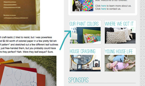
2. We finally made a paint color page about all of the ones we’ve used in this house and linked to it from our sidebar (like this one that we made for our first house).
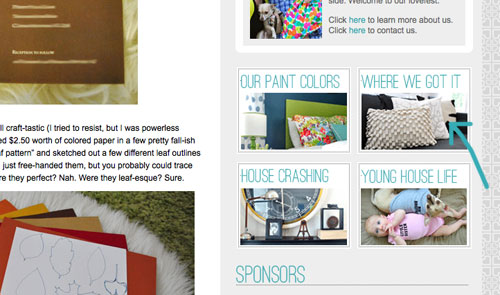
3. We also made a dedicated source list for where we got nearly everything in this house (like this one that we made for our first house) and also linked that up on the sidebar.
4. We tossed in a Fav. Posts button, also on the sidebar (with little thumbnails and links). We intend to update it every month or so with new faves (since we’re fickle folks and because we’ve also heard from a bunch of readers who’d love to see more archive stuff, but aren’t sure what’s worth digging around for).
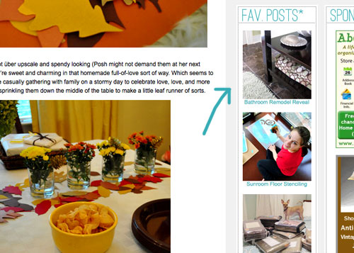
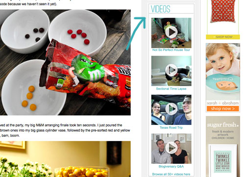
5. We also added a Videos button on the sidebar, which shows thumbnails of a few of them. All of our videos used to be accessible from the bar under the header, but we moved some other stuff up there and thought videos could breathe better down below – so now you can access them all by clicking the link at the bottom of this button.
6. We added a Giving Back button to share the love for three charities that we’re thrilled to support, each of which were chosen because they represent stuff we love (homes, kids, & dogs). We make an annual donation of $1,000 to the Richmond Habitat For Humanity along with $500 to St. Jude Children’s Research Hospital and $500 to the Richmond SPCA (and we definitely encourage others to check them out – you can donate here, here, and here or find a local Habitat for Humanity or SPCA in your area here and here).
7. We retooled a lot of other buttons that have always been on our sidebar (like the House Crashing one) with some updated pics/type/colors. But that’s more decorative slash fun than functional. As is the new Twitter button which now goes by the name of Tweetersiks. Oh yeah, we officially out-punned Mr. Tom Petersik (my dear old dad).
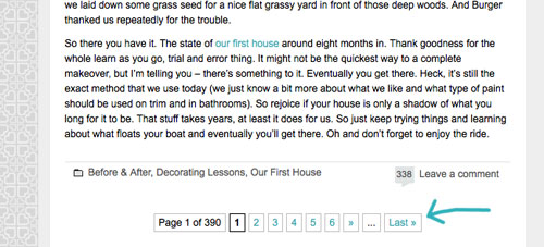
8. Oh and we were inspired (by Kate over at Centsational Girl) to add a nice thorough pagination capability (so you can click back to the very first post in our archives, you know in case you have a year to spare reading 2,000+ of them).
So there it is. Of course we still have a bunch of stuff on our blog-to-do list, so here are just a few things that we’re hoping to roll out in the next few months (or years, you know how long these things can take us, haha):
- Completely “renovate” our Projects page so it has some images instead of just a ton of crazy links (can you believe we’ve tackled over 500 projects?)
- Update the designs/header on the Mood Boards and Room Gallery pages (since they’re still rocking the old tan stripes)
- Add about 100+ other makeovers to our Room Gallery (we have so many amazing Reader Redesigns in our archives to toss in)
Should keep us busy for a while. And we do have our $6 cabinets to finish. Might switch back over to DIY for at least a little bit. Web stuff is kind of fun (when you’re in the zone), but there’s nothing like paint under your nails and sawdust flying. Hope you guys like the new look. Has anyone else done a little site tweaking lately? Any new color schemes or functionality that makes you giddy in that “it’s 2:52 am and we’re still working on this post way?” Not that we are. That would be irresponsible parenting.

Jenny @ Words On Wendhurst says
Hehe, I thought I went to the wrong place this morning. At first I was all -“what? they changed stuff? why?” but as I browsed around I really like all the changes. It’s updated and fresh and really seems to reflect your current style. :-)
YoungHouseLove says
Aw thanks Jenny!
xo,
s
Sara says
Me too!! I opened the page and thought the link had moved!! LOL! I was having a crummy morning and thought I’d sneak in a little blog time and seeing this fun new arrangement to explore cheered me up!!
I totally agree with your changing it up!
YoungHouseLove says
Aw thanks Sara! That’s so sweet.
xo,
s
Brittnee says
I thought the same as well! I love it though. It does really show a lot more of what you guys blog about. I am having trouble with everything loading right now, but I hope it smoothes out soon!
YoungHouseLove says
So sorry about the trouble with the header loading. We’re trying to figure it out as I type this. Fingers crossed…
xo,
s
threadbndr says
yep, me too. As the page was opening, I thought, “somebody hacked John and Sherry!!!!!”. I like the new, lighter colors, though I miss the heart logo in the header (and love it on the background).
mariela says
I love it!! So fresh and modern! Funny thing…I was reading your blog the other day and I thought to myself ‘they should makeover their banner, background, etc.’ And here it is!!
YoungHouseLove says
Haha- seriously! It was so overdue my hates-change mom was saying things like “have you ever thought about changing things up since you always redo things at home…” – ok mom! We took the hint! Haha.
xo,
s
cheep3r5 says
Can you post the color numbers for your old blog format? I always loved them, but did not want to duplicate the color combination while you were using them. Thank you!
YoungHouseLove says
Sure thing. We used a lot of variations on the same tans and green, but most of the tans were somewhere in this family (darkest to lightest): #a59a88, #c6bba9, #e8e2d4, and #f1eee7. And the greens were usually these (darkest to lightest): #5d6b1e, #c2ccaa, and #dfe9c4. Then we also threw in a grey at #666666.
-John
Ellen says
FYI, there’s a great Firefox extension called “ColorZilla” that turns your mouse into an eyedropper to “sample” any color off of any page on the web to get the color codes. Find it here: http://www.colorzilla.com/firefox/
YoungHouseLove says
Love that!
xo,
s
Erin says
The redesign looks amazing! Great job, you guys! As always :)
Meg says
Looks FANTASTIC! I thought that I had somehow clicked the wrong link… I didn’t recognize it at all. I love the new design. It feels lighter. Can a blog feel lighter?! Can’t wait to take some time and explore.
YoungHouseLove says
Haha- it’s a facelift. We took ten years off – er, three years.
xo,
s
Tiffany says
Everything looks so great! I love all of the changes, I can tell you guys put in a lot of work! Keep up the blogging awesome-ness :)
Jackie says
I was very confused for a moment until you put this post up! Wow it looks amazing, it’s like you’ve moved virtual house!
Michelle says
LOVE! I will definitely miss the old layout, but this is like a breath of fresh air. Nice job!
YoungHouseLove says
Aw thanks Michelle! That’s how we feel – we’re nostalgic for the old look, but it was time for a change! Especially for two color/pattern- changing folks like us! It’s so crazy that we didn’t change a thing in over three years!
xo,
s
Maria @ Orchard Bloom says
The new site looks great! I love the header.
YoungHouseLove says
Thanks Maria!
xo,
s
Laurel says
Love the new design! You did an amazing job recreating your blog!
One glitch: To access your house tours, old and new are flip flopped…
YoungHouseLove says
Thanks for the tip Laurel! John got in there and fixed that, so hopefully it works now (if it takes a few more moments, it might be a cache-ing thing, but clearing your browser’s cache should do it).
xo,
s
Adrianne says
I LOVE love LOVE the new layout! It looks fantastic! I was so excited to see it this morning when I checked for a post before heading off to work. Can’t wait to explore it some more to check out the new details! Excellent job with the blog makeover! Hope you guys are still enjoying having power back. :)
YoungHouseLove says
Oh yes- we’re reveling every time we turn on a light or open the fridge! Life is good with electricity!
xo,
s
Elizabeth says
No header here either with IE.
YoungHouseLove says
We think we have it figured out! Might take a few hours to “update” but then it should (fingers crossed) work for everyone.
xo,
s
Katherine says
Hey guys, loving the new colours on the blog but the blog header itself isn’t showing up on any of the pages I look at. Not sure if something’s wrong at my end or yours but thought you might want to know. LOVING the turquoise!
YoungHouseLove says
Oh man – so sorry it’s not showing up (you’re the second person to say that). The only thing we can think of is that maybe it’s a cahce-ing thing. What browser are you using? Maybe clearing your browser’s cache will solve it?
xo,
s
Brigid says
Same here – but I figure it might be my work firewall or something. If all else fails, I’ll scope it out in more detail when I get home tonight. Loving the fresh new colors and the abstract background is amazing!
YoungHouseLove says
Oh that’s something I didn’t think of- hmm the dreaded work firewall. Here’s hoping it just needs some time to “catch up” and then it’ll pop up!
xo,
s
Katherine says
I hate to say it but I cleared out my cache a couple of times and all I have at the top is a (beautiful, I must say!) bright turquoise box. I’m using Internet Explorer at work so it could be that, I’ll try having a look on Google Chrome later to see if it works on there.
YoungHouseLove says
Booo! So sorry Katherine. We can’t think of much else that it could be – other than something that just needs time to “settle” on certain browsers. Definitely let us know if it’s not there for you by tomorrow! Fingers crossed that it’ll work itself out soon!
xo,
s
Emily says
I can’t see it either!! I was just gonna come back by later today and hope that it magically appears!
Dina says
I have two browsers on my computer… the header works for me on Firefox, but I get the turquoise box on Explorer, so I think it’s just an IE thing. Clearing the cache didn’t help. Hope that sheds some light on the issue!
YoungHouseLove says
Oh man – thanks for the info! Here’s hoping we can crack the code…
xo,
s
Jamie says
I could see it when I first came to your site through facebook but once I started moving around in the site I got the turquoise box. (I’m using IE as well.)
YoungHouseLove says
Oh man- here’s hoping we can figure this out.
xo,
s
Rachel says
Ditto. I cleared the cache in IE (mandatory work browser, blah), and it’s not showing up. Will definitely check back tomorrow!
I love the colors, the header, and especially the new Young House Life section! Very cool guys.
Betsy says
I’m on IE (Windows XP) and I can see the header just fine. Looks great!
YoungHouseLove says
Thanks Betsy! For some reason it’s really inconsistent. Still hoping to get to the bottom of it!
xo,
s
julianna says
Love the new look — but I can’t believe you didn’t include your muse, Sue the Napkin up there!
YoungHouseLove says
I know! We thought it might be an issue if that design is copywrited by Merimekko or something – so we stuck to more general items while taking a lot of color scheme cues from sweet old Sue!
xo,
s
sarah says
I have super old internet explorer at work and the header doesn’t show up but when I run firefox it’s totally fine (and gorgeous btw – awesome job!)
Sarah says
I was thinking the exact same thing
Heather says
Looks great! Love the change it’s more you. I am not sure if others are having this problem but the header isn’t showing up.
YoungHouseLove says
Oh no – anyone else having any issues seeing the header? If so, what browser are you using? Have you tried emptying the cache?
xo,
s
Robin @ Our Semi Organic Life says
I’m using chrome and can see it fine – the sponsors have never shown up at home for me in chrome though.
YoungHouseLove says
I think what happens with sponsors not showing up is that you have some sort of ad-blocking software that’s running, so if you turn that off they should pop up (if you’d like to see ’em).
xo,
s
Stacy says
I have the same problem. Maybe just like how I can’t view videos because I am on my work computer?
YoungHouseLove says
Oh man – here’s hoping it pop up eventually. Maybe it’s just a delay for some folks while things “percolate”?
xo,
s
margaret says
I am having issues with the header too – it’s showing up, but the colors are SO LIGHT – really hard to read.
Love the idea of a fresh look though!
YoungHouseLove says
Hmm- anyone else having a hard-to-read so-light issue with the header? No idea what that could be (since things usually just load or don’t load). Oh man, hope it magically fixes itself!
xo,
s
Robin @ Our Semi Organic Life says
wow thanks for the ad blocking tip! Never knew why I couldn’t see your ads, but now I fixed in in chrome-tools-extensions. Weird how I actually want to see the things you’ve put ads for; they’re all on my wish lists!
YoungHouseLove says
Aw you’re sweet Robin! We love our sponsors and we love you too.
xo,
s
Kristin says
You both did an amazing job! I absolutely love the new look and it really freshens everything up! After a horrible morning, you guys made my day :-)
YoungHouseLove says
Aw shucks Kristin. All these nice comments are making ours too.
xo,
s
MissCaron says
LOVE IT! Very fresh and new. Plus, I love the “life” section. :-)
susan says
Pretty amazing all the bells and whistles you added. You should teach a course on blogging and charge admission…really. Love the new header. Have you had McDonald’s as a sponsor for awhile or am I just noticing it with your updated site? susan
YoungHouseLove says
Thanks Susan! The McDonald’s ad is probably just showing up via Google Ads, so they’re not a direct sponsor of the site (like those folks listed under “Sponsors”). Google just places ads that it thinks are relevant to each visitor up in that spot (usually they’re home improvement related, so McDonalds is a funny one). Hope that makes sense!
-John
Pip says
Woot! Looks great – love your header collection of sentimental thingamies. Your site was so easy to navigate – great new improvements!
YoungHouseLove says
Haha- sentimental thinamies is the word of the day.
xo,
s
Karen L. says
Love the new design, feel and ease of the new ways! Great job—of course, for me, I have no idea how you did it the first way, let alone the new one–ha! I just know that the work is worth it; well done. Now I can do some “catch-up” reading more easily as I only just discovered your blog a few months ago when I saw your powder room redo in a mag source section. (I shared it with my daughter in Tampa who is also redoing her 50 yr old ranch—–your blog is so helpful! Her boyfriend is doing a lot of the “muscle” work of tearing down walls, etc.) One more thing…..I nursed my two kids back in the 70’s when it wasn’t very common so I esp liked that popular blog post. Made me remember those sweet, long ago times with my kiddoes. Thanks again for the fun, informative and even “crazy” posts. :)
Erin G. says
:( Something must be wrong with my browser b/c the header doesn’t load at all. All I get is a very large turquoise rectangle :(
YoungHouseLove says
Oh man- we don’t know why that’s happening to a few of you guys but we’re sadddd. Maybe try clearing the cache of your browser? We hope it’s just one of those glitches that will solve itself when things “catch up.”
xo,
s
Amber says
It’s not showing up on mine either but I’m gonna chalk that up to me being at work using a crummy old IE browser.
YoungHouseLove says
Oh man- here’s hoping it “catches up” and shows itself soon! Please let us know if it’s not up by tomorrow. Fingers crossed that it is…
xo,
s
crystal says
I like it!!!!! I think it reflects y’alls personality, as well as your home very nicely.
Julia @ Hooked on Houses says
Love the new look! And I’m impressed that you did it yourself. Nice job, guys! :-)
Sherisa D says
Congrats! It’s a really awesome facelift! Bravo. :)
Julia says
WAY TO GO, Petersiks ! Your home on the internet is looking tres chic. Love it !
Robin @ Our Semi Organic Life says
I (like many others) was a little confused when first logging on – Who has hacked YHL for a hot second??… now I love it. Esp the background and the fonts! Amazed you did it all yourself!
YoungHouseLove says
Aw thanks Robin!
xo,
s
Jamie says
I LOVE IT!!!!! BTW, How are your neighbors doing? Glad you all made it through the storm unscathed.
YoungHouseLove says
They’re doing great! Staying with a relative for now (the tree is still on their house- along with many other homes in our neighborhood- I’m so amazed how long that recovery stuff can take) but they have such a great attitude about it. We’re all just so thankful they weren’t hurt!
xo,
s
Kristen @ Popcorn on the Stove says
haha I thought I was on the wrong website! I love the new background and everything looks so nice! When I saw your comments highlighted in blue yesterday I thought I was going crazy – now I know it was for the change!!
YoungHouseLove says
Haha- John leaked that change too early! He thought he had turned it back to green but somehow forgot. Haha.
xo,
s
Dina says
Haha I thought I was going crazy too! I kept clicking back and forth between the comment pages trying to make it go back to green… then I saw $herdog’s comment about the header and I thought something might be up. :)
YoungHouseLove says
The Petersik blog elves always have something up our sleeves. Haha. Well, actually we usually don’t change a thing for three years. Haha. What’s wrong with us?
xo,
s
Elizabeth says
YES I saw the same thing and was wondering why it was blue!
Laurel says
Very Very nice….now can you help a Newbie fix hers…LOL
YoungHouseLove says
John would actually love to put together a little basic code post during our blogiversary for anyone else with a blog who would like to learn his trial-and-error methods. We didn’t think folks would be interested in that (which is why we haven’t blogged about that stuff thus far) but a bunch of readers commented to request it (and the comment thread grew with more folks asking for some tips) – so we’re excited about it. Hope it helps!
xo,
s
Robin @ Our Semi Organic Life says
agreed! I’d love it!
Kristen @ Popcorn on the Stove says
I third that! A coding guide would be awesome!!
Melissa M says
I’d love to see what programs/code/template/themes you guys used to build your new, super rad blog. I totally dig the <3 background!!! Who knew home-DIYers could code so well!! Love your blog!!
YoungHouseLove says
Thanks Melissa! We’re planning a post about that stuff for our upcoming blogiversary!
xo,
s
Lydia says
i would love that too. one of the things that everyone does that i am sure is considered super simple is linking to other sites within your blog post. just typing that makes me sound old fashioned but i really really want to know how it is done. (in typical YHL over explaining :)
Holly@loveoflifeblog says
You guys this new site is FABULOUS! Oh, so very fabulous! I’m so excited about the new features. This doesn’t help my obsession, haha
Katie says
LOVE the new look! Im impressed!
I can barely figure out how to get pictures where I want them on my blog, nevermind design the entire thing!
Hats off to you guys :)
And glad youre ok after the hurricane!
~Katie
Punkin’Heads and Dooda Loo’s
Jess @ Little House. Big Heart. says
Whoa! It’s deja-vu all over again! I did a similar update/header last Wednesday!
I love, love, love it! It’s so much lighter and brighter and you (and that picture of Clara and Burger is adorable)!
YoungHouseLove says
Love all the meaningful things you photographed too!
xo,
s
Danielle B says
Love it! It feels light and airy! Are the ‘life’ posts going to show up in the RSS feed? Because I will never remember to click over to the other tab…
YoungHouseLove says
There’s a separate subscribe button over there (since if they show up in a feed, they’d pop up on our main YHL page too – and we wanted folks to have a choice whether to read those extra tidbits or not). Hope it helps!
xo,
s
Ashley @ A {Blonde's} DIY Life says
It’s looks so fresh!! I love the new look!! Good job on the face lift!
annabelvita says
Awww I heart the tesselating YHL hearts in the background. That and the Tweetersiks pun are my two face new bits. And of course the Young House Life subsite… Good job, Petersiks!
I keep meaning to move my blog over to wordpress so I can get more hands-on with it. Posterous is just so easy that I’m scared to make the move, but I know I need to take the plunge soon.
YoungHouseLove says
Wow- 500 YHL points to Annabelvita for the word tesselating. My math teacher dad would beam with pride if I worked that in. Haha.
xo,
s
annabelvita says
Yeah, YHL points! Your sponsors accept those in lieu of dollars, right?
YoungHouseLove says
Haha, I wish!
xo,
s
Delaney says
I’m totally loving your new look!
Loren says
At first I was all ‘Why’d they change it!’ But the longer I’m on the page the more I am loving the new look. It is much more open and lighter feeling. And the new header is SUPER cute.
Erin C says
I love it!!! So happy and fresh!
Stephanie Handy says
My husband and I are actually in the midst of prettying up our site. One issue we’re trying to figure out how to get around, however, is wanting to know what code and such will look like without wordpress making it active (thereby presenting readers with a rather blotchy frightening mess). Is there a way to preview what you’re doing that you’ve found?
YoungHouseLove says
Yes! John learned about this thing called “creating a test site” where you basically reinstall wordpress on a new “secret” url (that others won’t look for/see, so you have some freedom to play around and fine tune the theme). Once you like how it looks, just transfer the theme back over and trouble shoot a little bit (we underestimated the timing part of that, hence finally getting to bed at 3am- haha).
xo,
s
Karen says
I love it! It feels light and fresh…. and happy. I really like the colors and the background with the little hearts. Great job, y’all.
Seeing the white rhino up there reminds me that I picked up one last weekend at Kohl’s. It’s carved wood… but when I picked it up and saw it had been marked from $35 to $5, I looked at it and thought “I can spray paint this sucker white” LOL
YoungHouseLove says
Woah! Five dolla rhino = woot. I’m jealous.
xo,
s
Michelle@decorandthedog says
It screams the 4 of you!! Nice work! I can only imagine how much pressure designing your new look was…fun pressure at least!
YoungHouseLove says
Haha, it was pretty fun! We got in the zone and there was no turning back. Well, except when the site crashed and we had an earthquake and a hurricane. Hahah.
xo,
s
Trish says
Love the new site layout! It is very bright and fresh! I esp. love the LIFE section. Just watched the video of Clara’s first haircut…how funny!!
YoungHouseLove says
Poor girl was not having it! Haha.
xo,
s
Maryea @ Happy Healthy Mama says
I love the new look! I’m so impressed that youre able to do so much all on your own. It makes my head spin thinking about it!
Abby says
Loving the new design! So fresh and clean. Keep up the great work!
Logan says
At first I thought I went to the wrong site (I went before the post went live). Love the new look – lighter, brighter, and fresher. and I love the color. Great job guys! Doesn’t look amateur at all!
YoungHouseLove says
Aw thanks Logan! We stared at everything for so darn long that we got to that is-this-crazy-looking-and-we-cant-tell point. Hahahah.
xo,
s
Meg says
Love it! Really enjoyed the ‘Life’ part. As I was watching the video of Clara saying goodbye to burger, my 4 year old says: “Oh, are you watching your friends again?” We’ve watched 1 or 2 or 7 of your videos…..so Congrats! Love the new look. Looking forward to spending more time with my friends… :)
Jen says
Love the site re-design! I love behind the scenes posts as much as I do the home/DIY posts!
Jennifer says
Ahhh!! I’m in lurve!! So great. I’m totally lovin’ young house life, as I too am a sucker for the overshare. This definitely perks up my Wednesday morning!
Sara says
Congrats!! this looks amazing. Did you guys make it yourself or did you hire someone? (I’m gonna go with DIY) but if you didn’t… please share!
YoungHouseLove says
It was all John! With a little bit of Sherry-over-the-shoulder nagging. Haha. You know we love a good DIY project, so John has slowly taught himself how to code just using trial and error (and a whole lot of googling).
xo,
s
Celia says
I am so impressed at how clever AND interesting the background is!
YoungHouseLove says
Aw thanks Celia- that’s all John. He is the brains of this operation.
xo,
s
Ashley F says
Looks amazing! I’ve recently (past 2 months or so) stumbled upon your blog, and needless to say you guys rock! Love the new layout, and love all your inspiring ideas! I too love to give older homes love, recently (past year and a half) bought a home and tore it down to it’s bare bones and rebuilt the whole thing with my two hands (along with 15 of my amazing family members)! Such an incredible feeling to look back at your hard work! Keep up the awesome blog, look forward to seeing more!
Cheers!