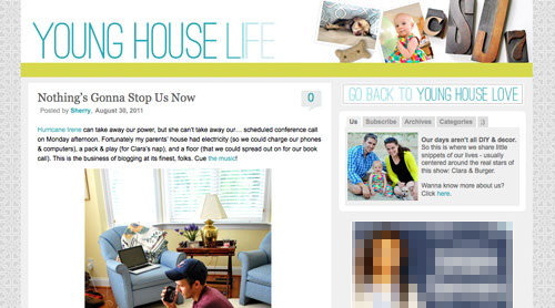
Yup, after months of working on a little behind the scenes blog makeover (not kidding, this stuff literally takes us months) we’ve FINALLY let ‘er rip. Like any project, there were unexpected delays: mysterious coding glitches, inexplicable site crashes (thanks for your patience on those, btw), an earthquake and even a hurricane to round things out. But before we let another excuse get in our way, we decided to just go for it. It’s not 100% done. It may crash the site again. There could be a blizzard next week. Who knows.
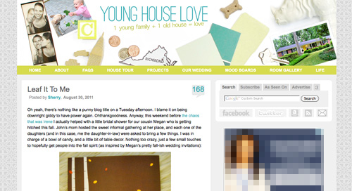
It’s actually surprising to us that we haven’t done this sooner. We’ve had the same exact blog look/background/layout since the spring of 2008 (if you can believe it). It seemed silly that we’ve been through so many room re-paintings, furniture re-arrangings, and even a move to a whole new house… but hadn’t so much as changed the background pattern for three whole years. So it was definitely time. It just sort of felt like we were wearing old clothes that didn’t quite fit anymore. So although we know there are probably folks out there who will miss the old look (we’re sentimental creatures too) we’re excited to finally put on a fresh new outfit.
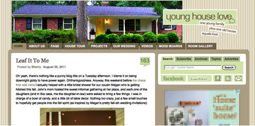
Here’s a little bit of what we were hoping to accomplish with the new design:
- Update the look (colors/patterns/typefaces) to be more reflective of our design choices in the new house
- Make the header more inclusive of the things we blog about (folks kept saying it just represented the “house” part of our name)
- Lighten up a bit, since the old color scheme was feeling a bit dull & heavy at moments
- Improve navigation and help you guys discover content more easily
- Overall just make the site feel fresher, more 2011 and less 2008
So this is what our amateur web designing skills came up with. So far we really love it, even though there are definitely things we’re still trying to finesse. We’ve been tweaking it for the past several weeks, so we’re kinda used to it by now – but we understand if some of you are still skeptical of the change. Think of it like rearranging a room or painting a wall – you might just need to give it a few days to get used to it.

When it comes to the actual header, we photographed a collection of objects that had special meaning to us on white cardstock outside (you know we love keeping things personal). In case you can’t figure it all out on your own, here’s the meaning behind each item:
- Photostrips have always been something we’ve enjoyed, hence their appearance at our wedding
- Clara and Burger are as much a part of this blog as any DIY project, so their picture was a must
- A little wooden “C” block for Clara and a small bone-shaped dog treat (on the other side) were another way to tie them in
- Sherry and I met in 2004 when we lived in NYC, so the little wooden skyscraper and taxi cabs remind us of those early days
- We’re cheap. So we save our pennies. Hence the change, which actually adds up to seven cents – which is a lucky number of ours (plus the dates on each of the pennies are 2007, which is when we started this little ol’ blog)
- We live in (and love) Richmond. So we tossed in a little Richmond magnet. Represent.
- Paint swatches and fabric samples = our idea of a good time. So we picked a few that felt like our current house/style
- There’s not a much more sentimental object than the key to our house (although we altered the tip of it in Photoshop because we’re paranoid)
- Of course we also squeezed in a photo of our current house (had to have that happy yellow door in there somewhere)
- A white ceramic rhino is kind of our mascot at this point (at least behind Burger and our dearly departed ceramic dog).
When it comes to the background, we actually created that as an homage to our previous logo (you know that little YHL heart? the background is actually just a gazillion of those laid out at all different angles to make an abstract-ish pattern). And as for the actual functional changes that we made, here they are:
1. We added a new side-deal called Young House Life (see the “Life” title under the header on the right?) to serve as sort of a “mundane everyday happenings area” where we mostly share Clara & Burger pics/videos along with behind the scenes blog stuff and other odds and ends that aren’t beefy enough for a dedicated YHL post over here (you know we love to over-share). But don’t worry, it doesn’t mean Clara, Burger, and other life stuff (vacations, anniversaries, etc) will suddenly be gone from the main site. Those things have always been a huge part of who we are, so they stay. Just think of Young House Life is a little “bonus footage” spot. Oh and it has a separate feed address for you to subscribe to as well (if you’d like to get those updates on your reader).
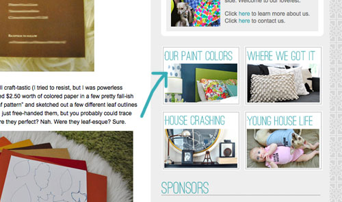
2. We finally made a paint color page about all of the ones we’ve used in this house and linked to it from our sidebar (like this one that we made for our first house).
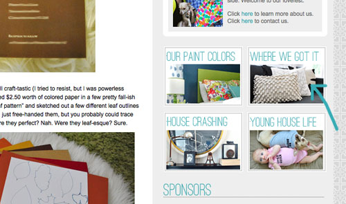
3. We also made a dedicated source list for where we got nearly everything in this house (like this one that we made for our first house) and also linked that up on the sidebar.
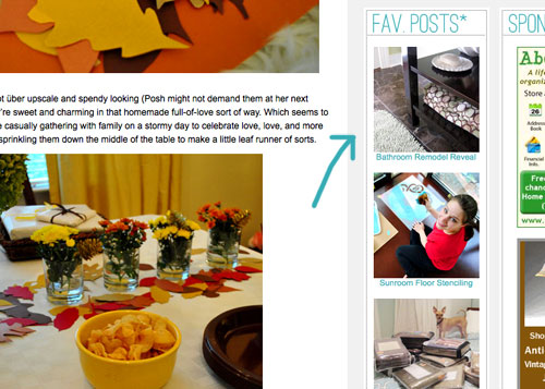
4. We tossed in a Fav. Posts button, also on the sidebar (with little thumbnails and links). We intend to update it every month or so with new faves (since we’re fickle folks and because we’ve also heard from a bunch of readers who’d love to see more archive stuff, but aren’t sure what’s worth digging around for).
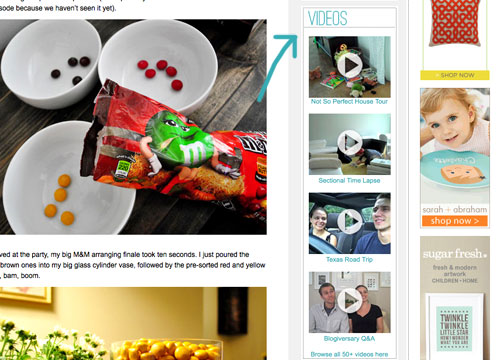
5. We also added a Videos button on the sidebar, which shows thumbnails of a few of them. All of our videos used to be accessible from the bar under the header, but we moved some other stuff up there and thought videos could breathe better down below – so now you can access them all by clicking the link at the bottom of this button.
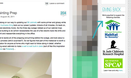
6. We added a Giving Back button to share the love for three charities that we’re thrilled to support, each of which were chosen because they represent stuff we love (homes, kids, & dogs). We make an annual donation of $1,000 to the Richmond Habitat For Humanity along with $500 to St. Jude Children’s Research Hospital and $500 to the Richmond SPCA (and we definitely encourage others to check them out – you can donate here, here, and here or find a local Habitat for Humanity or SPCA in your area here and here).
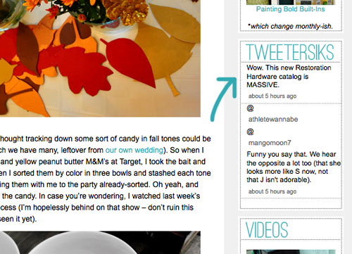
7. We retooled a lot of other buttons that have always been on our sidebar (like the House Crashing one) with some updated pics/type/colors. But that’s more decorative slash fun than functional. As is the new Twitter button which now goes by the name of Tweetersiks. Oh yeah, we officially out-punned Mr. Tom Petersik (my dear old dad).
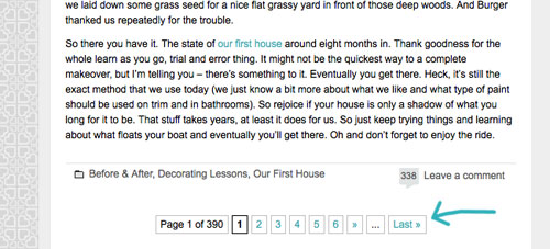
8. Oh and we were inspired (by Kate over at Centsational Girl) to add a nice thorough pagination capability (so you can click back to the very first post in our archives, you know in case you have a year to spare reading 2,000+ of them).
So there it is. Of course we still have a bunch of stuff on our blog-to-do list, so here are just a few things that we’re hoping to roll out in the next few months (or years, you know how long these things can take us, haha):
- Completely “renovate” our Projects page so it has some images instead of just a ton of crazy links (can you believe we’ve tackled over 500 projects?)
- Update the designs/header on the Mood Boards and Room Gallery pages (since they’re still rocking the old tan stripes)
- Add about 100+ other makeovers to our Room Gallery (we have so many amazing Reader Redesigns in our archives to toss in)
Should keep us busy for a while. And we do have our $6 cabinets to finish. Might switch back over to DIY for at least a little bit. Web stuff is kind of fun (when you’re in the zone), but there’s nothing like paint under your nails and sawdust flying. Hope you guys like the new look. Has anyone else done a little site tweaking lately? Any new color schemes or functionality that makes you giddy in that “it’s 2:52 am and we’re still working on this post way?” Not that we are. That would be irresponsible parenting.

Rad Designing says
Love it, guys! Great work! I was recently wondering if you guys were going to do an update. Love that the background is your hearts in a pattern. So cute!
Deanna says
Your comment about the full pagination made me laugh, because two Christmases ago when the northeast had that massive snowstorm right before Christmas, I had just discovered YHL… so I basically spent 2 1/2 weeks of Christmas break in various stages of being snowed in, reading the blog from the beginning through what was current to that time. I highly recommend it as a way of getting to know a blog!
YoungHouseLove says
Aw you’re so sweet to read all the way through!
xo,
s
Lindsay says
Love the new design! Especially the background! :) I don’t know if I’m the only one with this problem, but the words in the green bar at the top are hard to read! Makes my eyes hurt :( Other than that, I love it! Especially the new Young House Life section!
YoungHouseLove says
So sorry about that! We’re learning that it reads really differently on different monitors so we plan go keep tweaking until we hopefully get it right!
xo,
s
Bethany says
wowowowowow!!!!! new look! I heart it!
Ryan says
Way to step it up about 3 notches!!! :) The new design looks wonderful – so nice and clean, great color choices, font choices, and the header elements fit the site perfectly. Nice work!
Stephanie says
I am glad the white ceramic animals got their due. Rock on, white ceramic menagerie!
Jessica M. says
Love the new makeover!! It looks so fresh & so clean, clean! I thought the new background was a nod to your logo…nicely done you two!
You never cease to amaze us loyal fans :D
Kristi L says
I really like the new design and appreciate all the hard work you guys put into your site! My only bit of feedback – white text on yellow background is hard on the eyes. But otherwise it’s great. Nice job!
YoungHouseLove says
Thanks for the tip! We have learned that bar reads differently on lots of monitors (it’s a deeper greeny-yellow on ours) so we’ve got some more tweaking on the agenda!
xo,
s
Katie says
Love, Love, LOVE the new header, the color scheme, the Young House Life section…love it all. To quote “My Best Friend’s Wedding”: “love the bag, love the shoes, love everything” :) So just a quick random story about you guys…about a year and a half ago we bought our first house and I put together a binder with pics from magazines, paint samples, just general decorating ideas for inspiration. Well we are finally starting our basement reno and I pulled out that binder last night. As I was flipping through I came across two pages from Do It Yourself magazine about your living room and dining room from your old house-it was the spring 2009 issue. It made me laugh out loud when I saw it…I had just discovered your blog around that time (from seeing your column in that magazine) and was sooooo in love with your house! Now I feel like we’re old friends and it was like stumbling across a picture of you and a friend in elementary school or something-a blast from the past, if you will :) So just wanted you to know that your blog has been inspiring me since 2009 and will continue to inspire me for as long as you are blogging! P.S. How did your new compost bin hold up in the storm? I hope it (and the compost in it) didn’t blow away :)
YoungHouseLove says
Aw that’s so sweet. Love it. As for the new compost bin, it was completely unaffected. Thank goodness! Compost everywhere might have been a bad look.
xo,
s
tarynkay says
It looks great! I miss the smooch button though.
YoungHouseLove says
It moved and we hid it under another “name” (that’s a hint). So its still around! Haha. Gotta keep it interesting. So we’re definitely still sending you guys mega smooches.
xo,
s
tarynkay says
I found it! Thanks!
Amy says
Love the new look! I can’t believe Sue the Napkin didn’t make it in the header!!
YoungHouseLove says
Haha- she was definitely an inspiration when it came to the color scheme!
xo,
s
Katrina says
I actually work as a Senior Web Designer, and just wanted to say that I think you did a great job with the redesign! The fact that you’ve taught yourself to write code is impressive :)
YoungHouseLove says
Thanks Katrina. I’m blushing. I really just bumble my way through it and cross my fingers that I won’t delete the whole site or something crazy.
-John
Amanda says
I LOVE the new header, except I wish the picture of the house was bigger… it’s really hard to see it, and while it is just one piece of the blog, it’s an awfully large piece… I think the house picture itself deserves more header real estate!
Liz says
Love it!!
BrandyShoe says
Heart it! Love you guys, love the blog, love it all! I’ve been following you religiously for about a year now and I can’t explain why I’m hooked! I just am :) Keep doing what you’re doing!
Teresa says
I have to laugh at you guys…..I was up last night until 3:30 trying to figure out my blog – just starting out in wordpress – and I was trying to figure out how to get a comments box (with the little speech bubble with the number of the comments in it) after the post like you have it and as I flipped to your blog to take a look – voila! You guys were at it too! Great minds think alike I guess. :) Looks GREAT BTW. Absolutely love. You can keep this for a couple years too.
YoungHouseLove says
Haha- that’s too funny! Why sleep when you can mess around with speech bubbles. Haha.
xo
s
Kath says
Looks wonderful guys!!!
Kath says
We share similar taste in colors ;)
YoungHouseLove says
Haha- love it!
xo,
s
Jenna says
I noticed the changes last night (I live in Japan, so it was the wee hours in the states), and thought I must have been sleeping the past few months and not noticed! Good to know I just stumbled on it pre-announcement. The new look is definitely fresh and new and I’m loving it!
SK Bryan says
New re-design looks great….clean, fresh and current.
Great job!
Erin @ The Great Indoors says
When I first pulled up your page today, I thought someone had stolen your domain name and taken over! But it makes so much more sense now. Love the redesign! I know it took a lot of work to get it looking this way!
Ange says
I’m sure there’s a few more readers out there like me, who, at first were blinded by the brightness of the header & went “Nooooo!” But, of course, after reading the post & figuring out the details (thanks for the indepth explanation BTW saving me time to actually have to figure it out on my own!)I’m in LOVE. There are some really exciting changes & it is definitely ‘lighter’. Looking forward to some YHLife. I also had a thought that you could use your homage heart background design, to create a personalised fabric like you did with the Clara handwriting…
YoungHouseLove says
That would be beyond fun. Thank goodness for spoonflower!
xo,
s
Jess@atasteofconfidence says
Love the new look!
S leigh says
You spelled Eddie Bauer , Eddie bower.
YoungHouseLove says
Hmm, is this a response to someone else’s comment? If it’s to us, we don’t even know where we typed Eddie Bauer. Haha. Blame it on the 3am coding sesh last night…
xo,
s
Stefani says
Ahhh, I love it!! When I first saw it, the first thing that your new header reminded me of was Sue the Napkin! Great color scheme!
Samantha says
It’s AMAZING guys! I absolutely love it. SO you!
Lara says
Love the heart-patterned background. That would make a great stencil for a wall in your house…
jbhat says
Very nice! I happened to have been wondering about those old tan stripes. This looks fresh and new and fun.
jbhat
NK says
I noticed the header changer overnight and I like. Didn’t see the rest until now. Lookin gggoooooooddd. Keen for the weekend so I can fully explore the new features and not doing the sneaky read whilst at work (like I am now). Great job guys!
Jen says
Love it!
Elise says
oh its all so PURTY! I love it love it love. I especially love the new life section, (although the videos weren;t working for me – might be one of those leetle glitches, I will try back later). My little house of 8 years has finally started to make the transition from house to home since I discovered your blog and the affordable little touches I can make.
YoungHouseLove says
Those videos are uploaded to our personal flickr page (and just embedded in the site from there) so we hear that folks on a smart phone (and maybe even an ipad) have issues with them? We did include the link over to flickr, which usually works for folks (they just head over and push play and for some odd reason they play over there without a problem). Sorry for the trouble!
xo,
s
Nedra says
Lovely!! Good job!
Abby says
I love it! I hate change but it took me 2 seconds to fall in love. Great job!
Megan says
I really like all the changes as I started looking around. It’ll make finding my favorite posts really easy! I like the idea of the header and how you could change and/or add items as you add them to your house (or seasonal like Pioneer Woman’s site). Change is good!
Emma Braford says
I absolutely LOVE the new site design. So much more you…not that I know you, but I kinda feel like I do a little from reading your blog. Anyway, I <3 it.
Judy A says
Love the new look but I can’t believe you didn’t include the n”NAPKIN” in your favorite things!
YoungHouseLove says
Haha, we definitely thought about it! We actually worried it might be an issue if the designer of it (Merimekko) ever got upset that we used it in our header (since it’s kind of a logo of sorts) or something. Probably just us being paranoid, but you never know…
xo,
s
Holly Austin says
Love the new look!!! At first I was a little skeptical about it (I’m kind of anti-change when I get good and confy with something) but I really do love it! Kind of like when you guys changed the name – I thought TYH was just perfect, but now that I’m used to YHL I totally and completely love it – even much more than the old name!!
Ashley E says
LOVE it!
deena says
LIKE! Hey don’t post this if you think it’s spam (it’s not, I follow you!) but take a look at the pioneer woman site, she retooled hers awhile back and I like the way you can scroll through different categories. She said she paid someone like $2500 to do it I think? It’s been awhile since that post. I found her before she was famous, same with you! Anyway thought you might like how hers is done for your NEXT GO-ROUND. ha!
YoungHouseLove says
Oh yeah, her site is amaaazing! Definitely waaay over our heads coding wise, but certainly something to aspire to someday when it comes to the amazing function and all that content. Mmmm.
xo,
s
Jenny says
Love the site redo! The only suggestion I have is maybe incorporating a hover image over the numerous internal links in your posts. I am constantly opening new tabs so I can read what I’ve missed, but still want to finish reading the original post! You could probably add a hover image of the link using just CSS or javascript. BTW, I am obsessed with ORB, too.
YoungHouseLove says
That would be so cool if we could figure it out down the road. Thanks for the suggestion!
xo,
s
jennie says
absolutely love it! did the old page say tweetersiks? because i kind of think that’s hysterical.
YoungHouseLove says
Haha- nope. It just said “Tweet Nothings” – which was also punny, but not as personal. You know we like to make things personal. Haha.
xo,
s
Christeen says
Hi
I opened your blog and while it loaded I let the cat out. When I got back I thought for a second I was in the wrong blog. But I have to say it looks GREAT. Good work Guys!
Kristen says
Ooooh…ahhhh : )
Kelsey says
I really like the header with the photostrip and the magnet.
Tracy says
First I would like to say that I love your new house and old one as well. I have followed you and you have inspired me in alot of my decorating ideas… I live in an apartment and I am looking to “freshen up” after signing a new 1 year lease. I would like to paint my cabinets in the kitchen… I believe they are formica?? I know you probably get alot of questions but I would really appreciate any ideas?? Thanks!!!
YoungHouseLove says
Hmm, we heard that painting formica is really hard (they tend to crack and peel pretty quickly) but I think it would be cool to cover the cabinets with something like thick grasscloth (so it can take a beating) or even a thin chocolate faux-leather fabric so they’re kind of fun and upholstered (you could use some fun oil-cloth too). Good luck!
xo,
s
Anna See says
This looks GREAT! I love all of the new features. You are inspiring!
Lindsay says
I saw the new changes earlier this morning, but have not had the chance to come back and comment until now, and can I just echo all the other comments saying how much we LOVE the new look? And especially Young House Life! Great job!
Erin says
I love the new lighter layout. Very nice – I was thinking the other day how the color scheme was more your “old” house, versus your “new” one. I am glad that you told me that it was a rhino in the corner, though – on my browser (or maybe it was just my eyes) it looked kind of like crinkled toilet paper. :)
YoungHouseLove says
Haha- he’s definitely the mystery man of our header. Some folks said he’s the first thing they saw and other said they thought he was something else- like an old diaper. For some reason we find it hilarious that he reads so differently on different monitors.
xo,
s
Anna says
Lovely refresh. Especially love the background colour (am currently painting my walls pretty much the same colour!) and the little smiley face waiting for me at the bottom of the page?!?!? Or am I just going loopy and seeing things now…
The level of thought you went into in your header blew me away (NEVER would have got the 7 reference on my own). I love everything about your header except the by-line. The slope is jarring to the eye (well, my eye). I feel like there are too many diagonal lines cutting through the header at different slopes (photos, swatches etc) and to not tie the angle of the by-line in with any of them makes it feel too disjointed. Anyway, small point, possibly just me thinking that, but I thought I’d put it out there.
Oh and it is showing up perfectly in Safari (Mac).
YoungHouseLove says
Haha- yes that smiley face is for tracking our stats. Isn’t he cute? As for the slopes in the header, we played around with keeping things more straight and then going casual with some slants and some less perfect lines- I guess we’re happy to embrace imperfection for now, but who knows where we’ll end up! Haha. We’re definitely having fun with some little tweaks here and there…
xo,
s
Annalea says
The new blog design is awesome. Love it! I especially like the heart-tastic background. It really appeals to my design aesthetic. :o) It also reminds me how amazingly blessed we are here in the US, that we can worry about things like blog design.
I just read something you guys might like to mention in a post, if you’re up for it. There’s a blog I read, written by art teacher Kathy Barbro, called Art Projects for Kids. She just returned from a service visit to Haiti, where she worked with orphaned children through art. She’s now starting a homemade dress drive for the girls she worked with. The pattern is a super simple sundress, (a free Oliver+S download), and her goal is 30 dresses by December. I was thinking you guys are so generous that you might want to mention her dress drive and kinda knock her socks off with your readers contributing some dresses. ;o) Who knows? Maybe you’ll get an itch to sew one of these, Sherry. They’re darn cute, and super-simple. So, if you want to check it out, her post is here.
Have a great week!
YoungHouseLove says
Wow- such an amazing project! I’m going to post about it over on Facebook and hopefully even figure out how to make a dress of my own to send over! What a great cause!
xo,
s
Leigh Ann says
I like it! The abstract heart design background would make a great custom fabric (like Clara’s 1st birthday yardage), that you could incorporate into some throw pillows or something! You deserve an homage to your blog visible in your home!
YoungHouseLove says
Isn’t that the truth?! Don’t think I’m not already begging John for us to get a yard or two from spoonflower…
xo,
s