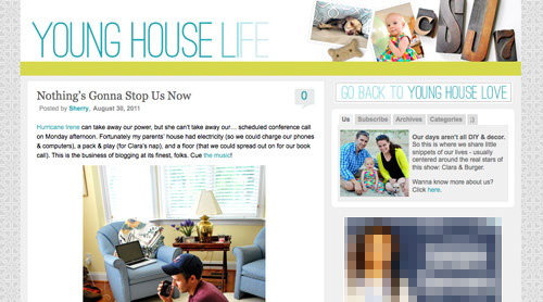
Yup, after months of working on a little behind the scenes blog makeover (not kidding, this stuff literally takes us months) we’ve FINALLY let ‘er rip. Like any project, there were unexpected delays: mysterious coding glitches, inexplicable site crashes (thanks for your patience on those, btw), an earthquake and even a hurricane to round things out. But before we let another excuse get in our way, we decided to just go for it. It’s not 100% done. It may crash the site again. There could be a blizzard next week. Who knows.
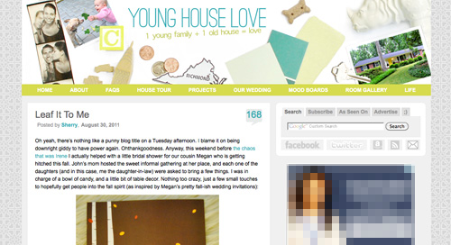
It’s actually surprising to us that we haven’t done this sooner. We’ve had the same exact blog look/background/layout since the spring of 2008 (if you can believe it). It seemed silly that we’ve been through so many room re-paintings, furniture re-arrangings, and even a move to a whole new house… but hadn’t so much as changed the background pattern for three whole years. So it was definitely time. It just sort of felt like we were wearing old clothes that didn’t quite fit anymore. So although we know there are probably folks out there who will miss the old look (we’re sentimental creatures too) we’re excited to finally put on a fresh new outfit.
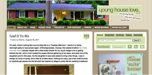
Here’s a little bit of what we were hoping to accomplish with the new design:
- Update the look (colors/patterns/typefaces) to be more reflective of our design choices in the new house
- Make the header more inclusive of the things we blog about (folks kept saying it just represented the “house” part of our name)
- Lighten up a bit, since the old color scheme was feeling a bit dull & heavy at moments
- Improve navigation and help you guys discover content more easily
- Overall just make the site feel fresher, more 2011 and less 2008
So this is what our amateur web designing skills came up with. So far we really love it, even though there are definitely things we’re still trying to finesse. We’ve been tweaking it for the past several weeks, so we’re kinda used to it by now – but we understand if some of you are still skeptical of the change. Think of it like rearranging a room or painting a wall – you might just need to give it a few days to get used to it.

When it comes to the actual header, we photographed a collection of objects that had special meaning to us on white cardstock outside (you know we love keeping things personal). In case you can’t figure it all out on your own, here’s the meaning behind each item:
- Photostrips have always been something we’ve enjoyed, hence their appearance at our wedding
- Clara and Burger are as much a part of this blog as any DIY project, so their picture was a must
- A little wooden “C” block for Clara and a small bone-shaped dog treat (on the other side) were another way to tie them in
- Sherry and I met in 2004 when we lived in NYC, so the little wooden skyscraper and taxi cabs remind us of those early days
- We’re cheap. So we save our pennies. Hence the change, which actually adds up to seven cents – which is a lucky number of ours (plus the dates on each of the pennies are 2007, which is when we started this little ol’ blog)
- We live in (and love) Richmond. So we tossed in a little Richmond magnet. Represent.
- Paint swatches and fabric samples = our idea of a good time. So we picked a few that felt like our current house/style
- There’s not a much more sentimental object than the key to our house (although we altered the tip of it in Photoshop because we’re paranoid)
- Of course we also squeezed in a photo of our current house (had to have that happy yellow door in there somewhere)
- A white ceramic rhino is kind of our mascot at this point (at least behind Burger and our dearly departed ceramic dog).
When it comes to the background, we actually created that as an homage to our previous logo (you know that little YHL heart? the background is actually just a gazillion of those laid out at all different angles to make an abstract-ish pattern). And as for the actual functional changes that we made, here they are:
1. We added a new side-deal called Young House Life (see the “Life” title under the header on the right?) to serve as sort of a “mundane everyday happenings area” where we mostly share Clara & Burger pics/videos along with behind the scenes blog stuff and other odds and ends that aren’t beefy enough for a dedicated YHL post over here (you know we love to over-share). But don’t worry, it doesn’t mean Clara, Burger, and other life stuff (vacations, anniversaries, etc) will suddenly be gone from the main site. Those things have always been a huge part of who we are, so they stay. Just think of Young House Life is a little “bonus footage” spot. Oh and it has a separate feed address for you to subscribe to as well (if you’d like to get those updates on your reader).
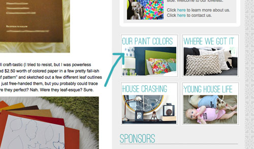
2. We finally made a paint color page about all of the ones we’ve used in this house and linked to it from our sidebar (like this one that we made for our first house).
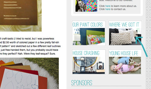
3. We also made a dedicated source list for where we got nearly everything in this house (like this one that we made for our first house) and also linked that up on the sidebar.
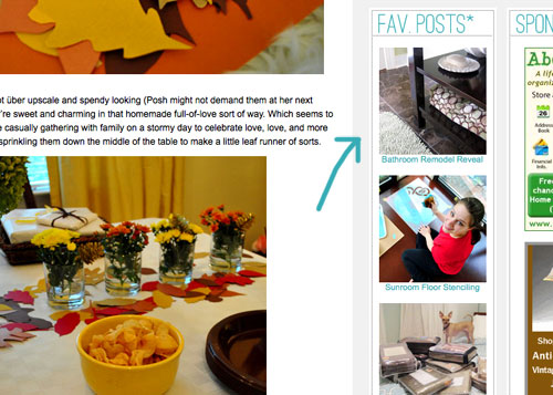
4. We tossed in a Fav. Posts button, also on the sidebar (with little thumbnails and links). We intend to update it every month or so with new faves (since we’re fickle folks and because we’ve also heard from a bunch of readers who’d love to see more archive stuff, but aren’t sure what’s worth digging around for).
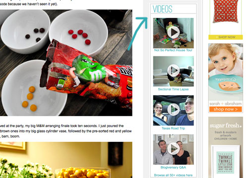
5. We also added a Videos button on the sidebar, which shows thumbnails of a few of them. All of our videos used to be accessible from the bar under the header, but we moved some other stuff up there and thought videos could breathe better down below – so now you can access them all by clicking the link at the bottom of this button.
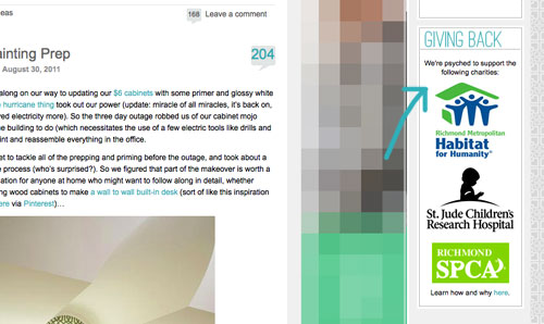
6. We added a Giving Back button to share the love for three charities that we’re thrilled to support, each of which were chosen because they represent stuff we love (homes, kids, & dogs). We make an annual donation of $1,000 to the Richmond Habitat For Humanity along with $500 to St. Jude Children’s Research Hospital and $500 to the Richmond SPCA (and we definitely encourage others to check them out – you can donate here, here, and here or find a local Habitat for Humanity or SPCA in your area here and here).
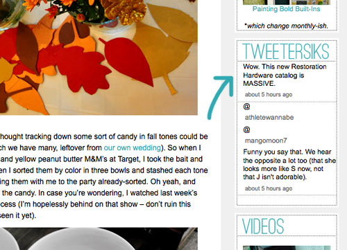
7. We retooled a lot of other buttons that have always been on our sidebar (like the House Crashing one) with some updated pics/type/colors. But that’s more decorative slash fun than functional. As is the new Twitter button which now goes by the name of Tweetersiks. Oh yeah, we officially out-punned Mr. Tom Petersik (my dear old dad).
8. Oh and we were inspired (by Kate over at Centsational Girl) to add a nice thorough pagination capability (so you can click back to the very first post in our archives, you know in case you have a year to spare reading 2,000+ of them).
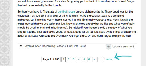
So there it is. Of course we still have a bunch of stuff on our blog-to-do list, so here are just a few things that we’re hoping to roll out in the next few months (or years, you know how long these things can take us, haha):
- Completely “renovate” our Projects page so it has some images instead of just a ton of crazy links (can you believe we’ve tackled over 500 projects?)
- Update the designs/header on the Mood Boards and Room Gallery pages (since they’re still rocking the old tan stripes)
- Add about 100+ other makeovers to our Room Gallery (we have so many amazing Reader Redesigns in our archives to toss in)
Should keep us busy for a while. And we do have our $6 cabinets to finish. Might switch back over to DIY for at least a little bit. Web stuff is kind of fun (when you’re in the zone), but there’s nothing like paint under your nails and sawdust flying. Hope you guys like the new look. Has anyone else done a little site tweaking lately? Any new color schemes or functionality that makes you giddy in that “it’s 2:52 am and we’re still working on this post way?” Not that we are. That would be irresponsible parenting.

Jen @ The Decor Scene says
LOVE IT!!! Fun, Bright, so 2011 of you guys!!! Though I did like the old format as well, but that is because we are creatures of habit. ;)
I’m at work right now, so I can’t see the header for some reason, but I can see the image you took of the header. Love it. Though I can see the header for the new “Life” tab. Weird. I’ll have to check it out at home tonight. Weird because they just updated our Internet Explorer to 7 and I was able to see so much more when that happened. lol.
Thanks for keeping it fresh YHL!!! Can’t wait to check it all out. :)
Dina says
I LOVE it! I love the lighter colors – the blog pages seem bigger and more open now somehow. Refreshing! I can’t imagine how much work this must have all been!
I feel kind of guilty making a request after such a huge overhaul, but since you posted your to-do list, I’d like to mention something I’d love to see on your blog at some point in the future. Could you have a place where you organize all your posts according to room? Like, a “nursery” link that will link to every post about the nursery, etc. I know that would be a ton of work, buuuut…. maybe someday when things are “quiet” and you have nothing else to do… haha.
YoungHouseLove says
We would love to do that someday! It would take a ton of time, but would be oh so worth it … someday! Haha.
xo,
s
John@OurHomefromScratch says
I like it. It definitely feels cleaner and lighter.
jodi says
it looks fantastic!! off to explore a bit . . .
Abby K says
Looks Great! So clean, so crisp and so easy to navigate!!! Great job!
erin says
it’s beautiful and fresh! love it!
great job on all the fun new additions :)
Laura says
I love the new look and the meaning of all the items in the header!
Tiffany says
Love the changes! Can’t wait to “play” around and check out all the fun stuff.
Ally says
I LOVE LOVE LOVE it! The top header is so awesome- I love that you got the ceramic rhino in there :-)
Melissa Irvin says
Wow – that is quite the undertaking! Great updates. I’m surprised you didn’t put the infamous C&B napkin in the header. Though, I can’t see the new header except in the post. I don’t know if it is me or the blog – I updated to IE8 yesterday and I’m not seeing several blog headers.
P.S. I love the charities y’all support!
Melissa Irvin says
Oh! Just read a few comments up about the Sue omission!
YoungHouseLove says
I think it’s one of those things that might just take time to pop up. At least that’s what we’re hoping! Please let us know if you can’t see the header tomorrow. Fingers crossed it’s solved before then though!
xo,
s
Ryan says
The redesign looks awesome! I was wondering if you’d update it to reflect the big move. I think it’s a major improvement!
Kayla says
Loving the new look! I think I especially love the new heart “wallpaper”. But it’s hard to see the Rhino in the banner! I didn’t even notice him until I read through the post – you gotta give him some background color (maybe a another paint swatch?) so he can shine with the rest of your meaningful mementos!
Loving the new Young House Life tab too. Congrats on all the changes – they look great!
Ashley says
Luh hu huv
Kate says
I love that you guys added the pagination capability! I found your blog through some friends about a year ago and have clicked back through to some of the older posts through your projects page, but really wanted to see where things all began and couldn’t figure out a way to get there! Looking forward to catching up on some of the older posts and seeing how things have evolved since then! THANKS!
Ashley says
Really love the new look! Especially love the young house life section! So fun!
Andrea H. says
I’m one of those people who take a long time to get used to new fashions, car styles, music… and new blog designs! ;) But I always come around, so I am predicting in a week I’ll love it! Already appreciating some of the new navigation features. Well done!
Lindsey says
Our blog colours match now :)
Wanted to let you know that I’m using a crappy version of Internet Explorer on my work computer and the top banner won’t load. Hopefully most people are I tried it on Firefox and it worked just fine.
Looks great, guys!
Lindsey says
Oops, I mean to say:
“Hopefully most people are using better computers and browsers than mine! I tried it on Firefox and it worked just fine.”
YoungHouseLove says
Haha, I knew what you meant.
xo,
s
YoungHouseLove says
Thanks Lindsey! We’re hearing from other folks on Explorer who can’t see it either. Not sure if it’s going to “catch up” soon or if it’s something we’ll have to change. Fingers crossed that it fixes itself!
xo,
s
Leslie Ann says
I like change just as much as the next girl, but this new layout feels a little “busy” to me… :-/
YoungHouseLove says
No worries! We knew we couldn’t win ’em all! We think it feels lighter and less high-contrast (aka: less busy) than the old one, but it’s definitely one of those personal preference things!
xo,
s
Kristen says
The updated site looks great! I really love the Young House Life area and the overall feel is just so fresh and fun! Good job!
Karen says
Love the updates, the page looks great!
Marie says
Hey Guys- looks GREAT, so fresh and a much better reflection of your current content – well done! Particularly love the clever repeating heart pattern. John – A teeny tiny little thing I noticed – your footer text still has the old brown colour, if you go to line 374 on your style-petersik style sheet you can change it there : )
YoungHouseLove says
Thanks so much Marie! We’ll have to update that asap!
xo,
s
Katie says
I also like the use of the nickle… gotta get ol’ TJ in there, too! ;-) Love the new look!
YoungHouseLove says
John totally snuck that in there. Haha.
xo,
s
kelly says
light, fresh and in love!
Elle sees says
I totally giggled when I saw the white ceramic rhino!
And when I first saw the dog bone, I thought it was a reference to $her-dog! Sup, $herdog!
YoungHouseLove says
Haha- that too!
xo,
$
Chrissie says
This is delightful! I love how fresh it looks :-) The old blog design suited your old house, but this is a lot more representative of your new house.
Janelle says
Two thumbs up to the new look! It seems airy, fun and is definitely more representative of your style. The little hearts in the background are the best part! YoungHouseLife is also a great idea! I’ll definitely be checking it out.
Take care!
AliP says
I love it! So fresh and light!
I’m wondering what happened to the links that used to be on the side of the page for “Clara’s Blog” and “Burger’s Blog”… is the monthly photo project still going?
YoungHouseLove says
We are still doing the monthly project, but since Burger doesn’t update his blog much (lazy dog) we decided to put the Clara button over on Young House Life (along with lots of Burger pics/musings). Felt like it belonged over there now! Haha.
xo,
s
Barb says
On your source list you call the dresser in your master bedroom a desk…
YoungHouseLove says
D’oh. Thanks Barb!
xo,
s
HeatherB says
I LOVE IT! It’s so cheerful and fun. I think it’s great! Well done!
Natalie says
As us Cuban-Americans say, “Que fancy”… love it.
YoungHouseLove says
Haha, hilarious.
xo,
s
Vane says
You guys are true professionals…I am so impressed that you hadn’t missed a post during a time which, we would have let it go unnoticed (i.e. Earthquake/Hurricane Extravaganza 2011). Then you show up this week soon after getting power back with a totally new and refreshed interface. Thank you so much for putting us at the top of your priority list but please, take a week off, go on vacation, you guys totally deserve it!
Allison says
You are such busy bees! I love the new look and feel and re-org. Especially the new short posts in “Life.” Great job!
Cate says
LOVE the new header and site changes! It looks great and so cheerful! And I love the new life section too. As a mom of a two year old boy, I know y’all are having so much fun with sweet Clara!
Meghann @ A Lovely Avenue says
I love it! Congrats on the new design. It really looks great. It really does represent the 4 of you so well, 5 if you count the house!
KAYCEE says
Great job on the site redesign!!
One suggestion is to make your background a bit darker to make your main content stand out (this middle column that i’m commenting on right now) The light gray with the white is making it a little hard on my eyes.
I work at a university making educational videos and just finished one for a Interface Usability course on “deep backgrounds.” It quotes: “consider deep backgrounds to create visual depth and to bring your content to the foreground.” It’s pretty simple :)
I love that you updated your design, actually won’t be missing the old one. But!! I did have that deep contrasting background like I am mentioning here.
Love your site, keep up the hard work
Kaycee
YoungHouseLove says
Hah, thanks Kaycee! We’re learning that things are reading extremely differently on certain browsers (the gray background is a pretty deep tone on our computers, but maybe not on all of them like the dark brown). We definitely plan to tweak things a bit!
xo,
s
Elizabeth says
I love it! The looks is so fresh and you defiantly get the vibe of your blog right off the bat! Well done Petersiks!
Rachel @ The Avid Appetite says
I absolutely adore the new look! The color scheme, the header, and especially your new heart pattern. LOVE!
Julie (from Pocketful of Joules) says
I hope you don’t mind, but I just did a blog post on how well you guys handled the launch of your updated website: http://pocketfulofjoules.wordpress.com/2011/08/31/my-2-cents/
You guys are awesome!
YoungHouseLove says
Aw thanks Julie!
xo,
s
Erin says
I wouldn’t have said yesterday that you needed an update, but this feels so much more YOU now… it looks great! I especially love the LIFE section. You guys rock!
Tyson says
Love the background (YHL Hearts). Would you consider blasting out a simple tutorial on how you did it?
YoungHouseLove says
Sure! We just used photoshop to manually position eight hearts in a ring (basically making a “flower” of them) and then “tiled” them (repeated the grid over and over again) to make the background.
xo,
s
Ashley says
This looks FABULOUS! I love it! I was pleasantly surprised when I clicked the link at work. Made my heart happy.
One thing though – when John is describing each change in the header, it says “John and I met in NY”… hehe. I definitely thought Sherry was the one writing until there was the Mr. Tom Petersik. I thought to my self “Well that’s cool, they took Sherry’s last name?” Hahahaha. Gotta love Wednesday mornings.
Looks great! I love your blog. <3
YoungHouseLove says
D’oh! I’m such a bad editor. I edited that sentence and somehow changed it from Sherry to John. I blame 3am site coding! Haha
xo,
s
Cara says
The site looks great. It definitely is more reflective of your style. Very modern.
Nice work!
Rachel says
It looks GREAT! I love the fresh new colors and style! I didn’t even realize the background was the old heart logo until you mentioned it!
Gavin S. says
So glad you explained all the changes for us because I’m not gonna lie…my first reaction was “AHHHH! My eyes!” Once I read your thought process, though, I finally came around to the “I’m sure I’ll be used to it after a couple of days” mindset. As a fundraiser for a non-profit, I’m so proud of you for giving back and adding a section about it on the site. Also love the shout out to Pinterest. Way to be!
Denice says
Love it! I normally look at your site at work on my iphone, but this required a “large screen” view!
I see Spoonflower fabric in your backgrounds future….
Also, I am a sucker for a good font – What fonts did you use for the text in the header (the lowercase stuff is fab – It has just that bit of wonky’ness, and yet is super sophisticated!)
YoungHouseLove says
The uppercase stuff is: Ostrich Sans. And the tagline is: Apple Symbols.
Hope it helps!
xo,
s
Soffia says
Congrats on the new appearance of the site, it look amazing! Plus a little makeover never hurts ;)
Just know that your guys were part of the reason that I started my own Home Improvement/DIY/various stuff blog in ICELAND ;) So thanks for the constant inspiration!
YoungHouseLove says
Aw that’s so sweet Soffia! Happy blogging from Iceland!
xo,
s
Stephanie Phillips says
It looks fabulous! I love how you’ve become a total media machine (this blog, radio interviews, TV spots, a BOOK, etc) and yet you retain the small DIY blog feel that drew us to you to begin with. Don’t ever outsource! We love your authenticity so much.
Aw, getting all teary-eyed over here. Our blog is all growed up.
YoungHouseLove says
Aw thanks Stephanie! We’re such hopeless DIYers that we hate to hand off any of the fun. We literally like to “do it ourselves.” Haha.
xo,
s
Adriane Wacker says
So cute…I loved the old one, but this one is amazing and WAY better!
Adriane Wacker says
I loved the old one, but this one is WAY better! Awesome…
Adriane Wacker says
Sorry I did not know my first one posted! ha ha
YoungHouseLove says
Haha- no worries!
xo
s
Angela says
I love it!! It seems much more you. My favorite part: the white rhino! …it made me laugh, but it’s so appropriate! I’m impressed with your coding skills… nice work!