Waaaaay back when we mentioned that we’d be converting our third bedroom into a nursery, we admitted that we loved the asymmetrical wall of frames too much to remove it. But we did plan pretty much from the start to switch out some of the randomly framed prints and pictures with more kid-friendly and cheerfully toned art that’s fitting of a little girl’s nursery. So here’s what it looked like before our big art-swap-fest:
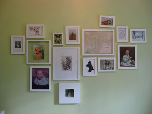
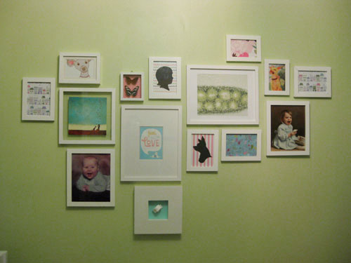
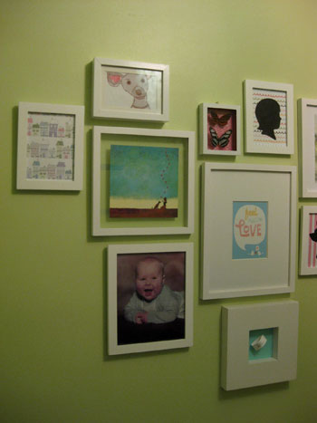
And here’s the same asymmetrical arrangement of frames after the big switch:
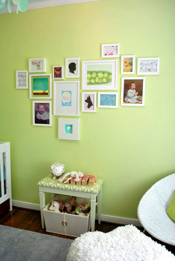
Now we’ll zoom out so you can see it in context with the rest of the nursery. Don’t the blues and pinks and greens work nicely with everything from the patterned curtains to the soft aqua ceiling? We think it’s fun and mismatched but it still feels like it goes together without anything feeling too overpowering or clashy.
And true to form we didn’t want to break the bank when it came to our little art 2.0 project. So we hit up Michael’s for some almost-absurdly-priced craft paper to repurpose as wall decor. And when we say almost-absurdly-priced, we mean that it was no more than 99 cents a sheet- and most of it was just 60 cents a pop.
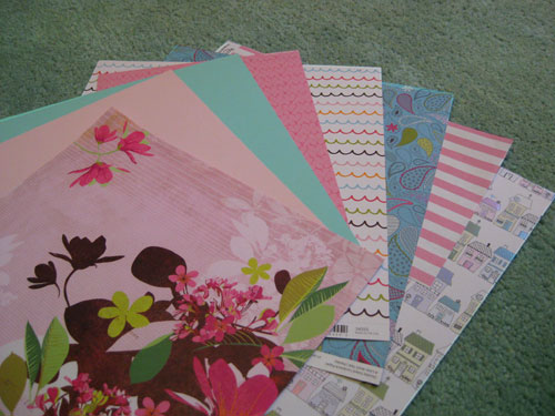
In fact we got all of the decorative paper that you see above for just a total of $4.99. And we framed some of it on it’s own (like that cute paper with house illustrations on the bottom of the pile) and used some of it to layer underneath other items that we planned to showcase- like the bean’s hospital bracelet. Of course we don’t have one yet, so I made a little paper placeholder until we come home with the real deal.
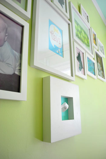
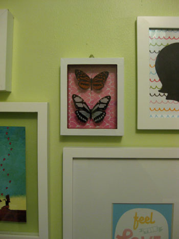
John also came up with the idea to tape some pink heart printed paper behind a glass shadow box full of faux butterflies that we already had hanging in that very spot. It definitely took them from science-y specimen-looking things to cheerful nursery decor in about thirty seconds.
We also already had that cute black cut-out silhouette of Burger (which John got me a while back) so we carefully untaped it from the white paper backing that it was mounted on and replaced it with some fun pink & white striped paper instead. It’s instantly more playful and beanette-appropriate, right? Not bad for 69 cents worth of scrapbooking paper. We also decided that we’d love to someday incorporate a similar black cut-out silhouette of Baby P, so we framed another sheet of playful squiggly line paper and whipped up a quick placeholder silhouette that we’ll someday switch out for a real one of our little girl.
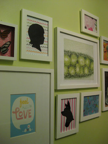
And do you see that “Feel The Love” print to the left of the Burger silhouette in the photo above? We couldn’t help getting a little DIY after we saw this adorable Skinny Cow ad in a magazine that we were reading. We loved the message, the typeface, and even the color…
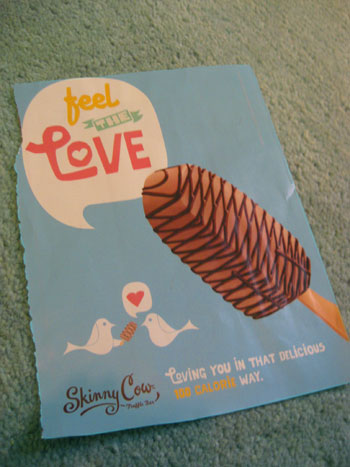
… so we scanned it and used Photoshop to remove the ice cream bar and move the cute “lovebirds” up closer to the voice bubble. Then we printed it and popped it into the frame. Voila- free magazine inspired art (check out another idea for free magazine art right here and here).

Next we trolled Etsy for affordable art that would work with our palette (we love supporting small businesses and handmade goods almost as much as DIYing things ourselves) and found that sweet aqua-toned girl & her dog print that you see in the photo below (right next to the “Feel The Love” frame). It was actually a limited edition print for just $12 and it featured a girl with her dog and a bunch of hearts floating up into the sky. We thought it was a perfectly reminiscent of Burger and Baby P’s undeniable future-friendship, and the price was definitely right so we snatched it up. Good thing we did because it later sold out (see it up close and learn more about the artist right here).
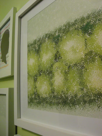
We also sprung for another print that we thought was too fitting to pass up. It’s actually a print of peas in a pod, but when you get closer you realize that the peas are made up of the letter P… as in Baby P! It’s kind of a hidden monogram of sorts- and we love that it also works perfectly with our color palette. This print actually hailed from Wall Blank and was ours for just $25. We think it was well worth the personal-ish slant that it adds to the whole arrangement. Note: Wall Blank was going to be under construction this week but they reopened their vault just for YHL readers today! Feel free to check out all the affordable art while it lasts!
So that’s how we used some 60 cent craft paper and two playful prints to give our nursery’s asymmetrical wall of frames a fun dose of color and pattern. And although it could easily cost well over $100 to deck out 15 different frames with art, we pimped ours in just $42 ($5 craft paper + one $12 print from Etsy + one $25 print from Wall Blank). And the whole room just feels infinitely more happy and fun. We keep walking in there just to look at everything. And we can’t wait to hold the bean up so she can take a gander at the wall of art that we tossed together in her honor. Especially the part where we compare her little face to our baby pictures to see who she looks more like (John’s gunning for giant cheeks like he had as a baby- which would definitely be cute).
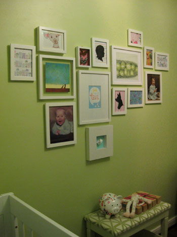
Oh and you might notice that there’s a little celery-toned upholstered bench that now lives under our art wall. We found it for $7 at a thrift store, painted, and recovered it a while back, and slid a big basket for toys that we also already had underneath it. We love that the setup worked so seamlessly with the rest of the nursery design, and we definitely welcome the added storage space and the padded ouch-proof bench top.

So that’s where we are with the nursery these days. We’re definitely rounding home plate and actually plan to share the full monty reveal next week. Time flies when you’re having fun (and having a baby apparently!). What do you guys think about our little art swap fest? Have any of you framed something that’s not necessarily art (like an ad torn from the pages of a magazine or your baby’s hospital bracelet)? Have you perused all that fun printed and patterned craft paper at places like Michael’s and Ben Franklin in hopes of gaining some cheap wall decor? Have you snatched up any great Etsy prints as of late? Let’s talk about DIY or homemade-by-someone-else art on the cheap.
Psst- Wanna see our nursery progress from the very beginning? Here’s our painting post, our big shopping spree, our crib hunting rundown, our curtain-making tutorial, our fun little chair search, our mirror-painting extravaganza, our DIY faux sheepskin project, our big dresser makeover (and subsequent drawer lining project), our closet makeover, our homemade crib skirt undertaking, our DIY mobile adventure and our shelf building project. Fun, fun, fun…

Andrea P says
Hi!
The “P” from Wallblank says its 12×12″ on the website….what size frame did you put yours in? It looks rectangular on your wall.
Thanks & let me know if you get a chance!
I am so excited for the big nursery reveal!! :)
YoungHouseLove says
We’re no strangers to cutting things down to retrofit them to a frame that we have in mind, so we did snip off a bit of the height of the print and add a mat to bridge the gab between the edge of the print and the frame (which has a 13.5 x 10.5 opening). Hope it helps!
xo,
s
Melissa says
wow, you guys are amazing! thanks so much for the wonderful ideas– & always, for the inspiration =)
E says
What a lovely nursery!
Katrina says
I’m loveing the updated artwall it fits so well into your nursery, and I’m still in love with the fun color your choose to use for it!!
laina says
Love love the nursury!! so cute! where did you get all the white frames?
YoungHouseLove says
They all either hail from Target or Ikea. We’re all about cheap white frames (which we have in every room of our house) so it’s easy to switch things around from room to room when the mood strikes. Hope it helps!
xo,
s
kitarita says
Love it! Your nursery is super cute! I have a collection of framed wrapping paper that is just too pretty to use (or toss!). Also, I recently got a super cheap print on Etsy, check out Leah Duncan, her stuff is awesome!
http://kitarita.blogspot.com/2010/03/folk.html
Erica Garcia says
I work for Dreyer’s (we make Skinny Cow), glad to see the ad recognized for the art it is. Love how the nursery is coming along.
YoungHouseLove says
No way Erica! That’s awesome. We love those ads (we’re also totally enamored with the dog and the giraffe). Too cute!
xo,
s
Christin says
Very cute ideas. Well done. I LOVE the idea for using cute scrapbook paper as art. I’ve been on the hunt for some myself to switch up the usual art we have hanging for some springier fun stuff. :)
Beth says
Hi Youngsters! I’m a somewhat newbie lurker and just wanted to say that yall are such a great inspiration!!! Love the blog and the nursery just gets cuter every step of the way! Sometimes I can’t handle the cuteness ;-)
Quick question, I love your paint color choices for the nursery and saw you had listed them on your painting post. But what trim did you use in the nursery or your whole house for that matter? Your trim color really pops! I need to copy your secret!!
YoungHouseLove says
It’s actually just the off-the-shelf base white color from Home Depot in their no-VOC Freshaire paint. It’s virtually stink free and oh so crisp and perfect. Hope it helps!
xo,
s
Maggie says
LOVE this! I especially like how it coordinates with your room, but isn’t so matchy-matchy. I’m keeping a file of future nursery ideas, and this is going in it! thanks!
{The Classy Woman} says
Awesome switcheroo for a few beans! I love your baby’s nursery, especially the fact that it’s not the typical ‘pink’.:) I hope to have a girl one day and I always thought I’d do pink and brown but because my office/guest bedroom would be the future nursery, I don’t want to have to re-paint over the soft blue I’ve come to love. I adore celery green and soft blue together with cream and taupe. Ahhhhh.
I laughed when I read the comment on yours and John’s photo facing outward. I feel the same way about photos. LOL.
Seansmom says
Great wall art! Most people don’t realize that they don’t have to spend a ton of money to decorate a wall.
I’m using old sheet music from WWI in my college age son’s bedroom. I bought these great, cheap black frames at Walmart and just popped the sheet music into them… voila!.. instant art!!
Dena says
This *kind of* makes me want to have another baby…no, scratch that…it makes me wish I had this inspiration when my kids were babies.
Ah, well…
One of the earlier posts included a brief comment on the painted ceiling. My query is this, what are the guidelines regarding painting (or not painting) ceilings? When is it ok to leave it the white or cream color? When do you go darker than the wall? When do you go lighter? I have no problem painting walls, but ceilings intimidate me.
I do like your nursery room choices, however. :D
YoungHouseLove says
Good question. And there’s no right answer. Painted ceilings are a personal preference thing, but lately we have been loving them (even just a lighter toned color than what’s on the wall) much more than flat white ceilings, which can look stark and unfinished sometimes. Some pptions are to pick a coordinating but different color (like the aqua we chose for the nursery) or just to slide a tone or two lighter on the color swatch from the wall for a lightly toned ceiling that really ties in. Or you can keep the same color on the ceiling as the walls for a totally seamless and expansive look (we did that in our small full bathroom and it really blurred the lines and made the ceilings feel taller). Just bring home a lot of paint swatches and tape them up to see what you like. Hope it helps!
xo,
s
Jo says
I made a wall similar to yours with gorgeous art prints downloaded for free through the Indie Fixx Feed Your Soul free art project: http://indiefixx.com/Feed_your_soul/downloads.html I bought 10 cent art paper 8 x and printed them. They came out amazing.
Actually, the one by Marjorie Ann Velez would tie in to your nursery deco.
YoungHouseLove says
Thanks so much for the link Jo! What a great free resource!
xo,
s
Kayt says
First of all, so cute! I use scrapbook paper a lot around my house as cheap art. I covered a lampshade with a couple of sheets once.
Second, I throw myself at your feet in love. I had meant to buy my dad the vintage Montana print over the weekend and spaced it. I was moping about it, and I just about wept when I saw that y’all got the vault reopened. So much love for YHL over here!
YoungHouseLove says
That’s awesome Kayt. So glad to be of (accidental) help!
xo,
s
Wendy says
Love it! (And just snagged a “Fall” print from WallBlank..thanks!) I’ve used scrapbook paper to be the background for some of my nephew’s drawings before, but I love how you have some great papers that stand on their own. Your mix of those with the cute prints (oh my, that peapod jumped out at me immediately.. how cool that it’s made of Ps!) is so fun!
In my bedroom I’ve framed a series of 5 Xray flower photos from a Steven Meyer calendar. I have them in those great 12×12 brown RIBBA frames from Ikea.
Natalie says
The revamped wall gallery looks great!
I love that you repurposed your thrifted bench, too! It looks great in here :)
Rachel @ The Avid Appetite says
Just beautiful! I’ve been wanting to do a big collage over my couch in the living room and just didn’t know how to start…I think it will be with copying your layout! Thanks for the tips, as always!
lauren says
i tore out a photo of brightly colored high heel shoes from a fashion magazine which i framed. i also frame pretty/cool cards people send me.
Kyley says
I don’t know if you ever heard of the website 20×200 (http://www.20×200.com/) but they offer some fabulous limited edition artwork (from some well-known artists too) on the cheap side.
I recently purchased a limited edition 8×10 print from my favorite animal photogapher, Sharon Montrose, for $20. Her ADORABLE baby animal photos would look oh-so-cute in a kids room. http://www.20×200.com/artists/sharon-montrose.html
Anyway just wanted to share the link – love how your nursery is turning out.
YoungHouseLove says
Oh yeah we love that site! Thanks for the reminder!
xo,
s
Artsy Fartsy says
Wow. You guys are truly amazing. I have enjoyed your blog forever, but seeing the “behind the scenes” in this post and being reminded of how the simplest resources can be beautiful was so inspiring. We are having a little girl in August, and I have been so overwhelmed with how to decorate the walls. Thank you for some wonderful ideas!
laina says
Hey thanks for the info on the frames! i’m all about the cheap as well :) I also had a question about making a recycling station. Have y’all made one? We want to make a three divider recycling station but didn’t have any framework or information on where to get bins or what the typical size for a home recycling station was. Anyway i would love any info you have on the subject! Thanks so much!
~Laina
YoungHouseLove says
Hi Laina,
All we have is a simple single bin under our sink that works for us (since we don’t have to sort ours). You can see it in a picture at the bottom of this post: https://www.younghouselove.com/2008/08/younghouselovedotcompost/
But if you’re looking for something more elaborate, we spotted some cool recycling station options at Bed Bath & Beyond made by Simple Human.
Hope that helps!
-John
Nikki says
I love your nursery! So colorful and creative! I’m always collecting decorative paper, even when I don’t have a use for it yet. I just love all the different patterns and textures. One of my favorite sites is http://www.paper-source.com.
Also, I’ve had that etsy shop saved as a favorite for months now…just haven’t decided which print I want yet. Beautiful artwork!
Maggie Rose says
Love how the simplest changes had such a great impact! I always eye that scrapbook paper at the craft stores but I don’t scrapbook (won’t venture toward that slippery slope). What a simple but creative way to use it! I especially like the Burger silhouette on the new striped background.
What did we do before Etsy and 20×200? And I’ve already fallen in love with two prints from the Wall Blank vault… I’ll send pics if I decide to spring for them!
Amanda says
So cute! I love seeing your nursery progress. I have a 9 mo old baby girl and went with non-girly colors too. People always asked what color we were painting her room and were surprised when I said light blue. I also had a comment about craft paper art. I bought two old wood windows for $20 each and then put different patterned paper behind the glass. They are hanging above our living room couch. I was really happy with how they turned out.
janet says
my 2 yr old loves animals. crocodile creek sells puzzles and placemats with an animal/safari theme. so i framed a couple he had as well as the placemat. they look great. you know, with my 2 kids, 2 and 4, i’ve realized that it doesn’t make sense to spend so much money on decor b/c you will find that they’re style and taste is constantly evolving. From nursery to toddler to even preschooler. My 4 yr old daughter’s room is classic style and i can see her enjoying it into her teens. but it’s come along way. all i do from time to time is change photos, books, artwork and paint. that’s about it. just my 2 cents. love what you’ve done with the nursery. it’s functional and simple. can’t wait for the baby’s arrival!!!
Kristin Eldridge says
Here are some fun free art downloads:
http://indiefixx.com/Feed_your_soul/downloads.html
AC Fitzgerald says
Love your post. I have been a big fan of scrapbook paper for years and use it often in framing projects. When putting togther my nursery a few years ago, we were using a Pottery Barn animals theme. I took the curtains, which had cute jungle animals on them, to a color copier, made copies and glued onto contrasting scrapbook paper. Once added to some matted white frames and hung with polka dotted ribbon, they were the cutest thing in the nursery! Now that my “baby” is 5 years old, we kept the frames, but changed the prints to more scrapbook paper, with various flowers and butterflies decopauged on top. They are adorable! By the way, your nursery is absolutely gorgeous!
Allison K. says
Ok, I delurked this morning to enter your give-away, but now I’ll really delurk to say that I ABSOLUTELY LOVE your blog! It’s rekindled my desire to “finish” decorating the house my husband and I bought two years ago.
So, in that vein, thank you for the link to Wall Blank, I found the perfect picture a blank spot in our master bath that needed “something!”
Melanie Beth says
I love the ideas! I usually use this kind of paper to make my frames, but I love all of the other uses you’ve come up with! I especially love the idea of displaying the hospital bracelet, I may just have to hang my son’s up in his room!
Dan says
Thanks YHL for Wall Blank! I might just pick up a few prints today.
Heather says
Love what you did with the Skinny Cow ad! I went the lazy route and just stuck mine on the fridge.
Alyssa says
I love that skinny cow ad!!!…in fact, I loved it so much that when I first saw it back in December, I cut it out immediately and framed the love bird part – it goes perfectly with the subtle love bird theme that my husband and I have throughout our house, most of which was purchased from etsy.
Kiki says
I love the peas in the pod! I am due July 1st and we are naming our little boy Parker so I just had to over to Wall Blank and snatch it up for his nursery! I love it and am so excited that it will go so well with the blues and greens in his room. I love all things monogrammed and this ia fun twist. Thanks for the great idea!!
Nancy says
I love cheap art! I have a few canvases in my house that my daughter & I have painted on…nothing fancy, just simple images or geometric patterns to coordinate with a specific room. And when they don’t work anymore, we just paint over them! I also have a framed shadow box that I’ve had hanging for many years. I just filled it with some random things from each member of the family…my hubby’s varsity letter from HS, my son’s kindergarten plaster handprint, a pair of my daughter’s satin baby shoes, and the quirky baby announcement that my parents sent out when I was born.
I love everything about your nursery! The beanette is going to be so happy there!
Samantha @ Mama Notes says
I want to do something like this in our dining “room” – connected to the family room. We have a huge wall right now that is totally frame and I want to something unique and fun with different size frames… not sure exactly what yet though. It looks great guys! :)
Lindsey says
I love all this art, but I LOVE the skinny cow ad. When I saw that a few days ago I was trying to think of something to do with it bc it’s so cute. I never thought of photoshopping a scanned image, Wonderful!
Tina says
I love the magazine picture idea! I did something similar in our living room-I found some red flower closeups in Clip Art, printed them out & glued them to wicker plate chargers. They are the perfect pop of red for the corner they hang in. Gotta love free art!
Kerist says
I am sorry to say (I’m usually a big fan of you guys!) but I personally don’t think this works at all… I get the look you were after (mismatched but not clashy) but I just think this looks random and boring. Maybe it’s just the photography and it looks better in real life!? (just my humble opinion, please don’t crucify me for it!). :-)
Siobhan says
great idea – love the cheap art idea! Might have to become a new project…..will add to the list!
Dana @ House*Tweaking says
I’m so happy you left your and John’s baby pics in the mix! I framed my two lil’ boys footprints (the ones you get at craft stores and actually press their foot into) on linen fabric and it’s my fave baby momento. They can’t believe their feet use to be that small. Your wall collage looks so eclectic yet put together at the same time – how do you do that?!
Jenny@AnythingPretty says
I loved that collage wall before….but now it is even more perfect than before. What creative ways to get beautiful (and cheap) art!
Dusa says
Don’t forget to show us what you did with the chair – I seem to remember you had some ideas that were going to be a later reveal…
YoungHouseLove says
Hey Dusa,
Here’s the post all about the chair. We basically just tested it for lead paint and then primed and painted it a glossy white color (with a brush, applying thin and even coats) for a nice refreshed look. Hope it helps!
xo,
s
CC says
I am in love with your asymmetrical wall of frames – do you have a template you could share with us on how to do that on a blank wall? or up a set of stairs? Love reading your blog!
YoungHouseLove says
Hey CC,
We actually whipped up a handy frame arrangement video full of tips and tricks for creating a bunch of different arrangements: https://www.younghouselove.com/2009/08/getting-the-hang-of-it/
Doing things like making paper templates to represent your frames and taping them to the wall to find a layout that you like should really help you transform any blank wall or stairway in your home. Hope it helps!
xo,
s
Lynda says
this has really come together, and proves you don’t have to spend to look good!
my fave etsy is belle and boo. either prints or the very economical postcards. http://www.belleandboo.com/
Lauren says
Your silhouette that Karl did of your dog looks great!
http://www.cutarts.com
YoungHouseLove says
Thanks Lauren! We love Karl and his work. That was such a sweet gift from John that I still look at adoringly. And we love it on the pink and white paper!
xo,
s
Anne says
Love it – and the crafting paper idea is inspired. May just have to take a trip there later today :)
I’ve been collecting cards (baby announcements, holiday photo cards from my 2yr old’s “best friends”, postcards from her grandparents, etc.) to do something similar in my daughter’s room, but I can’t find white frames anywhere (well, not anywhere that isn’t too spendy) – where did you get all your white frames?
thanks!
YoungHouseLove says
We get all of our frames at Target and Ikea. Hope it helps!
xo,
s
Tiffany says
So cute, I love scrapbook paper turned into art projects.
Mandi says
SO cute! I’ve done the same thing, especially in college. I took all of my scraps since them and made decopage boxes out of them for things like old love letters from my husband and such.
Another similar thing I’ve done in my daughter’s room is Wordle-I put in my blog URL and it pulls the recent, commonly used words and puts them into a “word cloud”. I used a blog I kept during my husband’s deployment so it had a lot of the basic words-mommy, daddy, love, etc. I just printed it out and framed it and it’s just another interesting piece!
Megan says
Okay Sherry- need your help!
We’re doing our nursery right now too, in fact I’m due only a few days after you (23rd).
I got all YHL this past weekend and painted a bunch of frames white (I’m super cheap like that) and I was thinking of putting a bunch of different family photos throughout the years in them (like an old war photo of my Nana, a B&W pic of my mom, color pictures of my family and my husband etc) do you think this will look too serious for the nursery? We just can’t think of anywhere to put these because I want to do a similar arrangement to yours and I really really want to use these photos. What do you think?
Keep up the great work- I love it!
Oh and while I’m here- any chance you can do some more posts on ways to revamp things you already have in your house? I love fun cheap ideas of spicing up the things I already own.
YoungHouseLove says
Hey Megan,
We definitely think that art wall will look great! We love personal and meaningful wall decor and it’ll be fun to teach your little one who all the people in the photos are. Go for it! And of course we have a lot more use-what-you-have posts and projects coming your way, but to tide you over you can always check out our How To page (see that tab under the header?) for a lot of ideas for revamping things that you already have on the cheap. Hope it helps!
xo,
s