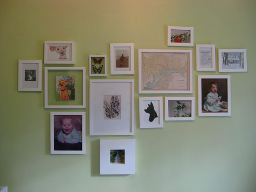
Waaaaay back when we mentioned that we’d be converting our third bedroom into a nursery, we admitted that we loved the asymmetrical wall of frames too much to remove it. But we did plan pretty much from the start to switch out some of the randomly framed prints and pictures with more kid-friendly and cheerfully toned art that’s fitting of a little girl’s nursery. So here’s what it looked like before our big art-swap-fest:
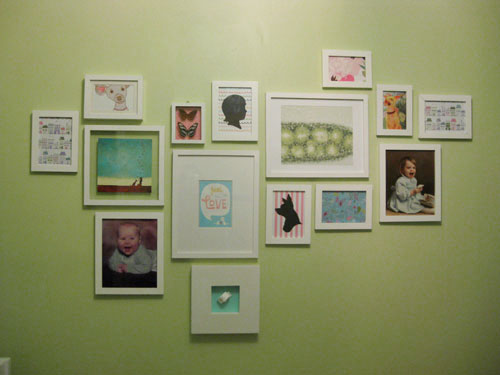
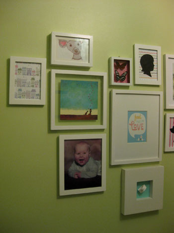
And here’s the same asymmetrical arrangement of frames after the big switch:
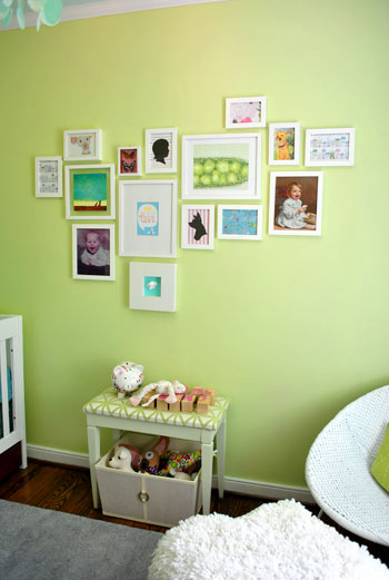
Now we’ll zoom out so you can see it in context with the rest of the nursery. Don’t the blues and pinks and greens work nicely with everything from the patterned curtains to the soft aqua ceiling? We think it’s fun and mismatched but it still feels like it goes together without anything feeling too overpowering or clashy.
And true to form we didn’t want to break the bank when it came to our little art 2.0 project. So we hit up Michael’s for some almost-absurdly-priced craft paper to repurpose as wall decor. And when we say almost-absurdly-priced, we mean that it was no more than 99 cents a sheet- and most of it was just 60 cents a pop.
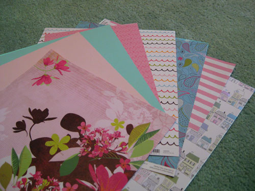
In fact we got all of the decorative paper that you see above for just a total of $4.99. And we framed some of it on it’s own (like that cute paper with house illustrations on the bottom of the pile) and used some of it to layer underneath other items that we planned to showcase- like the bean’s hospital bracelet. Of course we don’t have one yet, so I made a little paper placeholder until we come home with the real deal.
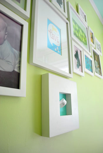
John also came up with the idea to tape some pink heart printed paper behind a glass shadow box full of faux butterflies that we already had hanging in that very spot. It definitely took them from science-y specimen-looking things to cheerful nursery decor in about thirty seconds.
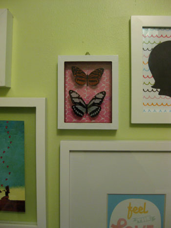
We also already had that cute black cut-out silhouette of Burger (which John got me a while back) so we carefully untaped it from the white paper backing that it was mounted on and replaced it with some fun pink & white striped paper instead. It’s instantly more playful and beanette-appropriate, right? Not bad for 69 cents worth of scrapbooking paper. We also decided that we’d love to someday incorporate a similar black cut-out silhouette of Baby P, so we framed another sheet of playful squiggly line paper and whipped up a quick placeholder silhouette that we’ll someday switch out for a real one of our little girl.
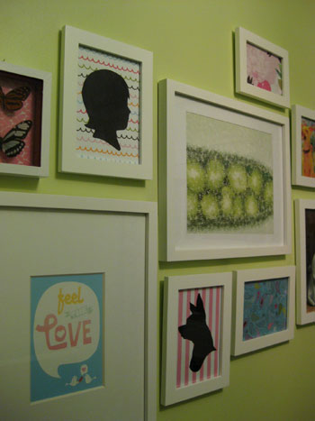
And do you see that “Feel The Love” print to the left of the Burger silhouette in the photo above? We couldn’t help getting a little DIY after we saw this adorable Skinny Cow ad in a magazine that we were reading. We loved the message, the typeface, and even the color…
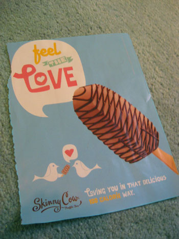
… so we scanned it and used Photoshop to remove the ice cream bar and move the cute “lovebirds” up closer to the voice bubble. Then we printed it and popped it into the frame. Voila- free magazine inspired art (check out another idea for free magazine art right here and here).

Next we trolled Etsy for affordable art that would work with our palette (we love supporting small businesses and handmade goods almost as much as DIYing things ourselves) and found that sweet aqua-toned girl & her dog print that you see in the photo below (right next to the “Feel The Love” frame). It was actually a limited edition print for just $12 and it featured a girl with her dog and a bunch of hearts floating up into the sky. We thought it was a perfectly reminiscent of Burger and Baby P’s undeniable future-friendship, and the price was definitely right so we snatched it up. Good thing we did because it later sold out (see it up close and learn more about the artist right here).
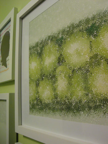
We also sprung for another print that we thought was too fitting to pass up. It’s actually a print of peas in a pod, but when you get closer you realize that the peas are made up of the letter P… as in Baby P! It’s kind of a hidden monogram of sorts- and we love that it also works perfectly with our color palette. This print actually hailed from Wall Blank and was ours for just $25. We think it was well worth the personal-ish slant that it adds to the whole arrangement. Note: Wall Blank was going to be under construction this week but they reopened their vault just for YHL readers today! Feel free to check out all the affordable art while it lasts!
So that’s how we used some 60 cent craft paper and two playful prints to give our nursery’s asymmetrical wall of frames a fun dose of color and pattern. And although it could easily cost well over $100 to deck out 15 different frames with art, we pimped ours in just $42 ($5 craft paper + one $12 print from Etsy + one $25 print from Wall Blank). And the whole room just feels infinitely more happy and fun. We keep walking in there just to look at everything. And we can’t wait to hold the bean up so she can take a gander at the wall of art that we tossed together in her honor. Especially the part where we compare her little face to our baby pictures to see who she looks more like (John’s gunning for giant cheeks like he had as a baby- which would definitely be cute).
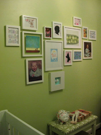
Oh and you might notice that there’s a little celery-toned upholstered bench that now lives under our art wall. We found it for $7 at a thrift store, painted, and recovered it a while back, and slid a big basket for toys that we also already had underneath it. We love that the setup worked so seamlessly with the rest of the nursery design, and we definitely welcome the added storage space and the padded ouch-proof bench top.

So that’s where we are with the nursery these days. We’re definitely rounding home plate and actually plan to share the full monty reveal next week. Time flies when you’re having fun (and having a baby apparently!). What do you guys think about our little art swap fest? Have any of you framed something that’s not necessarily art (like an ad torn from the pages of a magazine or your baby’s hospital bracelet)? Have you perused all that fun printed and patterned craft paper at places like Michael’s and Ben Franklin in hopes of gaining some cheap wall decor? Have you snatched up any great Etsy prints as of late? Let’s talk about DIY or homemade-by-someone-else art on the cheap.
Psst- Wanna see our nursery progress from the very beginning? Here’s our painting post, our big shopping spree, our crib hunting rundown, our curtain-making tutorial, our fun little chair search, our mirror-painting extravaganza, our DIY faux sheepskin project, our big dresser makeover (and subsequent drawer lining project), our closet makeover, our homemade crib skirt undertaking, our DIY mobile adventure and our shelf building project. Fun, fun, fun…

Jill says
The nursery is looking smashing. I know you’ll be revealing everything next week but I can’t resist making a suggestion for the nursery: a clock. Perhaps you have it covered, are round the clock (ha, ha) watch wearers, don’t need/want one, etc. but it’s something we didn’t have in our son’s room and I realized, after several months, that I needed/wanted one. I made sure we added a clock to our daughter’s nursery. There’s just something about knowing what time I start feeding and being able to keep track that puts me at ease. It was especially helpful during the first few weeks at home when the nights (and our daughter’s appetite) seemed endless.
Best wishes to you!
YoungHouseLove says
GREAT IDEA! We’ll definitely have to add one before Baby P arrives! One more thing for the to-do list…
xo,
s
Michelle "Chaos Caretaker" says
I love your random (well thought out) placement of recycled pictures. I recently updated a frame that we had our wedding invitation in and backed it with pretty decorative paper from Michael’s. So simple. So pretty. http://www.containchaos.com/?p=390
Janine says
Your art looks awesome guys!
For me, I framed my daughter’s preemie outfit. It’s so so tiny that I always wanted to remember how she was in the very beginning (3lb3oz) I included her teeny tiny baby bracelet with the outfit.
You’re getting so close! I have a 5/5/05 baby!
YoungHouseLove says
Ooh a 5/5/05 baby is so fun because it reminds us of our 7/7/07 wedding! We keep saying that it would be exciting if Baby P comes on 5/5/10 or 5/10/10 but we’re sure she’ll make us wait waaaay longer than that (we actually expect her to arrive at least a week after my May 19th due date). But both of our moms have b-days around then so that could be fun…
xo,
s
Bethany says
absolutely LOVELY. I can’t wait to decorate our own baby’s room — hopefully even half as cool as yours.
Michelle Kersey says
How did I miss this post this week? Looks adorable!! Can’t wait for the full reveal!
Andrea P says
Hey youngsters!
I’m curious as to what edition number your Wall Blank print is? I know there were only 100 of those made. I managed to snag one too (My last name also starts with P).
Can’t wait for it to arrive!!
:)
YoungHouseLove says
Good question! And it might remain a mystery since it’s all framed up with a mat so we can’t see the edition number anymore. Sorry we don’t have that info for ya, but we’re sure you’ll enjoy your P print!
xo,
s
Jen says
I absolutely love your picture frame arangement.
I was thinking about doing something like that in my house, except the wall i was intending to do it on is painted white.
Do you think using white frames would be a bad idea because they may blend into the wall too much, or would it work?
What color frames would you suggest?
I plan on using colored and patterened mats to add character.
Thanks,
:)
YoungHouseLove says
White frames on a white wall can look very chic indeed, especially with colored and patterned mats. We say go for it!
xo,
s
lis says
you don’t have the skinny cow image saved do you? Would love to print it!
YoungHouseLove says
Hi Lis,
Sadly we didn’t keep the Skinny Cow image saved, but perhaps a Google Image search will turn up a version you could use? Sorry!
-John
Aunt Belle says
you could try getting in touch with the illustrator, maybe he has one
http://www.davidjweissberg.com/index.php?/recent/she-be-all-like/
YoungHouseLove says
Thanks for sharing that link for Lis, Aunt Belle!
xo
s
Harinee says
I keep coming back to your old posts whenever I need ideas – you’ve literally created a treasure trove! I was looking at how you scanned and photoshopped that cute ad and wondered what kind of paper you print on? Regular A4 size printer paper? Or anything thicker/hardier or something I don’t know about in the art world? Also the mat around the ad-art looks nice and thick, how did you make that? I love the layered look and feel it gives..makes it look all posh!
YoungHouseLove says
Hey Harinee,
We print stuff on card stock (usually 100lb) which is cheap (from Staples or Office Max) and can be fed through any at-home printer. As for the mat, you can buy those (pre-cut) at a craft store or actually make them by buying “mat board” from an art supply shop and measuring and cutting the rectangle out yourself. Hope it helps!
xo,
s
Casey says
Hi, love this wall!!
I love how you incorporated those graphic prints of your Chihuahua. We have a Pomeranian dog and a Maine Coone cat, and I’d love to get some art of those breeds. Do you know where you got your prints?
Thanks!
Casey
YoungHouseLove says
Hey Casey,
A lot of them are DIY! The one hung on the top left is actually a sketch a friend of mine did on my Facebook wall with the graffiti tool (I printed it and framed it) and the silhouette is from etsy.com. Maybe check out etsy and search your pet breeds and see what comes up? Or google them to find something? Good luck!
xo,
s
Lydia says
Question on your art wall in Clara’s room. We’re expecting a little one in November and we’re trying to figure out a plan for our nursery. We love art montages and have one in our den. We’d like to do a “family tree” style art montage mixed in with some fun art elements like y’all did — but are you worried at all about them falling and shattering? We’re nervous about our little guy throwing a ball or banging the wall or something and a frame dropping and glass going everywhere. Are we crazy? Haha we’d love any advice!
YoungHouseLove says
We use 3M Command heavy-duty velcro to secure them to the wall (along with an anchor and a nail of course). The velcro is sort of like plastic sticks with balls on the end (kind of like the bristles of a plastic brush) that fit snugly into the backing (also little plastic rods with balls) so it’s really firm. You have to tug on it to get it off so it wouldn’t pop off. Hope it helps!
xo,
s
Beth says
Hello! I love reading blogs about crafty stuff people do, especially if I can copy it! :) I was browsing some other blogs and found http://textify.it/, a website/app that probably created the “P” print that you bought. I played around with it briefly, it seems fun. Thought you might like to see how your print was made!
YoungHouseLove says
So cool! I love it! Thanks so much for sharing the link!
xo,
s
parky says
thank you, what a great idea, I have a box frame sitting here on my desk and has been for months – wondering what I can put in for my twin boys – their teeny tiny bands from hospital – perfect! thank you xx
Jackie says
Hi guys,
I know you don’t mention (or even have a photo) here of the growth chart in your daughter’s room. But I remember seeing it somewhere and think how sweet it was. I believe you mentioned that it was custom made. I’m expecting my first child (a boy!) in 5 weeks and looking for something similar.
Could you please tell me where I could get this?
Thanks,
Jackie
YoungHouseLove says
Hi Jackie,
It’s from Name Your Design: http://www.nameyourdesign.com/longneckgiraffe-blue.html
-John
Haley says
Love the wall of frames…it looks amazing. I am wondering where you found the top left Chihuahua print?? I am in love with it….
YoungHouseLove says
My friend actually drew that on my Facebook wall (when they had the “graffiti wall” plugin thing). I just printed it out and framed it!
xo,
s