Pretty much from day one (even before we learned that the bean was actually a beanette) I was dreaming of painting the nursery walls a fun pear green while taking the ceiling from bland ol’ white to a light aqua color. But somehow saying “green walls with a blue ceiling” conjures up all sorts of scary Trading Spaces episodes so even my dear hubby wasn’t getting my “vision” until we broke out the paint swatches and I was able to explicitly show him what I meant. There’s a tip for you ladies: many people (especially guys who don’t speak “interior decorating”) are visual creatures. So saying something like “I want to paint the side tables black” can be a lot less effective (ie: scary for a dude) than showing your man an image of a room with black side tables that you know will calm his nerves about the whole deal.
Sure enough, as soon as I whipped out a soft celery-pear-ish tone for the walls and showed John how sweet a subtle and dreamy aqua would be on the ceiling (especially with the white crown molding between them to really set them off) he was on board. Then we just had to get into our trusty painting clothes and finish clearing out the room so it was ready for the big transformation (and speaking of big, check out that belly- it’s quite a feat with four more months of baby-carrying left).

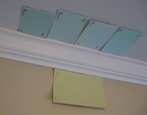
But back to my favorite subject: paint. Just like we did in this old ceiling painting post, we taped all of our potential ceiling paint chips on the actual ceiling so we could see how they would look in that light (colors look different on ceilings than they do when you hold them up to the wall since light reflects differently off a horizontal plane). We decided the swatch on the far right was too bright, the swatch to the left of that was too light and the swatch to the left of that one was juuuuust right (while the swatch on the far left was a bit too muddy). So that’s how we honed in on our final ceiling color after hunting through a bunch of swatches and taping up the ones we liked best. Oh and the winning swatch was called Regency Pale by True Value by the way.
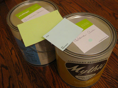
As for selecting the wall color, that was pretty simple. I’ve always loved Celery Sticks by Glidden (it has happy golden undertones and so much personality without overwhelming or sucking the light out of a small space). So of course I was giddy about finally having the perfect opportunity to use it to create a fun and cheerful nursery thanks to the little person that I’m busy growing.
We also decided it was time to take some Mythic paint for a spin- not only because I’m knocked up (and shouldn’t be painting with anything full of chemicals and VOCs) but also for the sake of the baby (since regular paint can off-gas for one to even three years after it’s applied!). Sure it’s $40 a gallon (while a lot of the cheaper Lowe’s and Home Depot stuff is around $25) but it’s known to be the cream of the no-VOC crop thanks to the great coverage, the wide range of amazing colors, and their completely non-toxic and mommy/baby friendly formula. So we hit up EcoLogic (one of our favorite local haunts for all things green) with both of our pre-selected swatches in hand.
We figured we’d hold them up to the Mythic paint deck to select something as similar as possible in both colors but we had no idea that Mythic could actually do color matching (but not with a machine, they store a plethora of other brand’s formulas in their database for easy replication- without the VOCs). The only catch was that our swatch from True Value was one of the brands that they didn’t have in their system and Celery Sticks by Glidden was too new (just introduced a few months back) so it wasn’t yet in the database. Not to worry, we actually found two extremely similar (if not identical) Mythic colors in their deck. For the ceiling we landed on Adanna Aire (in a flat finish) and for the walls we ended up with Autumn Bloom (in an easy-care eggshell finish).
When we proudly returned home after purchasing our new nursery paint we remembered that the kind folks at Frog Tape had actually sent a few rolls our way so we could give it a try. We’ve heard so many good things about their mad scientist tape (which has a patented formula that creates a “micro-barrier” on the edge of the tape when paint comes in contact with it, which seals it and makes bleeding a virtual impossibility). Isn’t that some Bill Nye The Science Guy technology? We were intrigued to see what that magical green tape could really do…
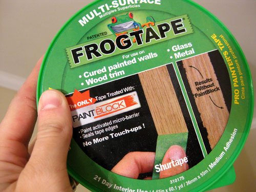
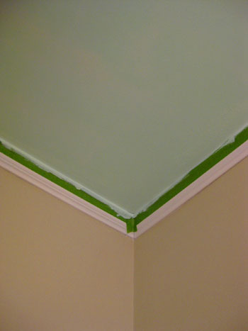
We’ve always been fans of cutting in with a brush (specifically, a special little brush that I love) but we must admit that taping the crown molding off didn’t take very long…

… and it really made painting the edges of the ceiling go a lot faster than it would have if we were carefully edging by hand with a brush.
Oh and we interrupt all the tape talk to bring you our sad little nursery closet. We’re actually very lucky to have this pathetic little enclave since this room was originally a dining room so the fact that we could convert it into a bedroom (thanks to an already existent closet) was great. Too bad it looked like this. Wop wop.
We took off the door before we started painting (we’re planning a cute little closet facelift complete with a curtain that we can push to the side since the door swings out into the room and interferes with the main door to the nursery- grrrr).
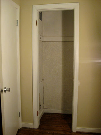
And it was actually John’s fabulous idea to take the light aqua color from the ceiling and add it to the inside of the closet for a bit of fun. Isn’t he smart? The whole time he was painting the closet I was watching in awe and telling our baby girl what a decorating genius her daddy is (yes I talk to my stomach just as often as I talk to our chihuahua).
Here’s a sneak peek of the closet in progress, but we actually have to add a ton of baskets and bars (and the closet curtain of course) so stay tuned for another closet post when we get to that stage of the ol’ nursery makeover.

But back to the Frog Tape. After we finished painting two coats of soft aqua on the ceiling and in the closet it was time to remove the tape around the molding (we’re all about removing tape when the paint is still wet so it doesn’t peel any dried paint off with it when it comes down). And ladies and gentlemen we can definitively proclaim that we saw a sincere and amazing difference between blue painter’s tape and Frog Tape. It really does create a much crisper edge with zero bleeding or stippling. Seriously, it was such a clean line that it looked like we painted the ceiling before adding the white molding (which is always the goal). In short: it definitely would have come in handy for the horizontal stripes that we added to our half bathroom a while back and we’re extremely glad we had a chance to test drive it for our little nursery paint project.
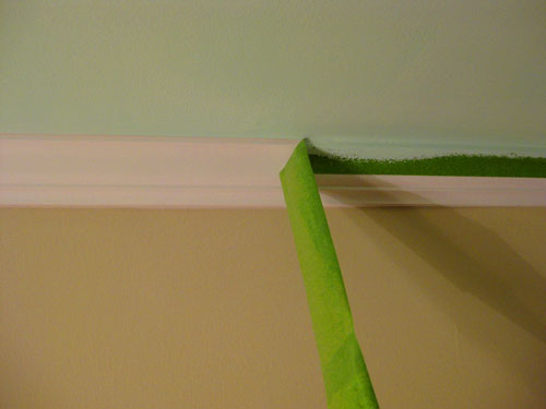
So here’s the room after we removed the tape. Isn’t the soft blue ceiling sweet? But it’s only halfway there.
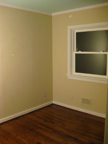
John was on a taping roll so he decided to keep going. Within about ten minutes he had taped off the bottom of the crown molding and also around the windows, doors, and baseboards. Then it was time for some warm pear green paint…
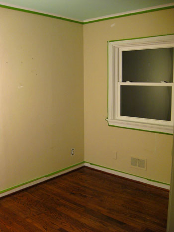
Ta-daaaa! Isn’t it a sweet and playful combination?
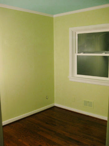
Oh and it bears mentioning that this photo was taken at night without any natural light (and wasn’t color corrected or anything)- so it’s a bit harsher and less subtle than it is in real life (especially in natural light). You’ll have to stick around for some daytime pics to really see it in all of its green and blue glory. Once we layer everything into the room (furniture, art, playful patterned curtains, a rug, a chandelier, etc) the walls will be the perfect cheerful-but-not-too-scary backdrop. And we love that it works with the rest of our home’s color palette thanks to the blue ceiling (which really relates to the soft gray-blue in our bedroom and kitchen) while the green ties into everything from our guest bedroom’s bright green headboard to our more-neutral-but-still-taupey-green bathroom. We like to think of our home’s newly defined color scheme as “sea glass inspired” since it’s full of soft creams, sandy neutrals, serene blues, and a variety of greens- all colors of old weathered glass that can wash up on the beach.
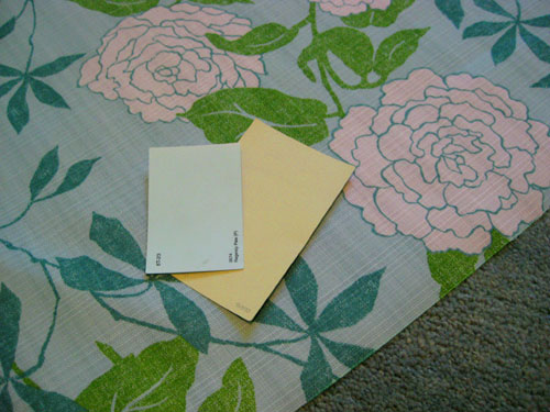
So that’s a little update on our nursery progress. And we’ll toss in this sneak peek of a few of the fun accessories (fabric and a cozy area rug) that we snagged to layer into our freshly painted space. Stay tuned for those details coming soon.
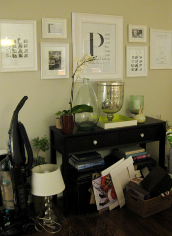
And since everyone seems to love seeing our house when it’s messy, we snapped this photo of our living room’s console table which was bogged down with everything that used to be in the nursery (namely the nursery closet). The good news is that it has all since found a new home, but we know you love seeing our house all crazy-like, so enjoy!
And while we’re on the subject of painting, we’d love to know what color you guys gravitate towards when it comes to nurseries. Whether you’ve already painted one (or five) or just dream about whipping one up someday, we’d love to know what hues tickle your fancy. Pale pink? Brown and blue? Bright rainbow stripes? Spill the beans.

Samantha @ Mama Notes says
Our kitchen is painted celery sticks :)
Amber says
Hey Guys! I love, love, LOVE your blog. I’m sure you get that a lot, but just like hearing how beautiful your baby is, it never gets old!
We live in an old house (built in 1923), and had given the ‘nursery’ a fresh paint job about a month before we knew we were pregnant. The walls in the nursery are plaster and there is a beaded board ceiling, as well as a fireplace in the room. We decided to highlight the ceiling and painted it “nouveau blue” (valspar) and kept the walls white. We also did one coat of the blue on the fireplace surround/mantle. My hubby was all to happy to hear that I didn’t require repainting when we found out we were having a girl. She is our first, and I’m all about ‘gender neutral’ colors when it comes to gear (strollers, car seats, pack’n’play etc) and, as it turns out, bedroom decor. We have yellow floral curtains with blues and greens in them, and a pale yellow crib skirt with a tone-on-tone dragonfly print. Sometimes I think the walls are a bit too white, but will address that conundrum in the future. I think my 16-month old isn’t too concerned with the wall color at this point!
Thanks for your inspiring blog posts.
PS I’m with ya on not taping when painting, but may have to give that frog tape a try after your glowing review…….
Elaine says
My son’s room is about the same green you used, but it was a Killz color, I think called Spring Bud. Or similar. I wish I had painted the ceiling a light blue to simulate the sky, but I have dreaded popcorn ceilings. I’m worried that if I remove the popcorn from one I’ll feel obligated to remove it everywhere, and who has that kind of time with a 2YO? I thought about painting over it, but I think he may be too old for that now and that it won’t allow the room to grow into a little boy’s room. Any thoughts?
YoungHouseLove says
Hey Elaine,
We’ve seen soft blue ceilings in grown up rooms so they definitely work for a growing boy’s room! Our advice would be to paint it just as it is and see how you like it. If in half a decade you want to make it white again you can probably get it done in an afternoon. It’s little things like a painted ceiling, new bedding, and patterned curtains that really make a room look fun and new for minimal effort (not nearly as much work as stripping the ceiling or repainting the walls). Hope it helps!
xo,
s
Sonja says
Love the colors, thank you for the frog tape review (it helps)but the best photo was the last one. It does my heart good…thanks!
Jessica says
Actually, the colors you chose are pretty much exactly what I would choose for a nursery (and bridesmaids dresses, and any other room in the house), as they are two of my two most favorite colors.
I’m also intrigued by the idea of a nice lavender with a grounding chocolate for a girl’s room….
Jen says
That’s a great color combination!
We’ve been using Behr paints and have found that the paint on the walls looks NOTHING like the paint on the swatches. (We have a taupe called Mochachino that is completely sage green on the wall, a warm beige called Wilmington Tan that is mustard yellow/breastfed baby turd on the wall, etc…)
We used to tape the swatches on the walls, but that started to seem pointless to us. We buy bunches of samples now. Is that less of a problem with other brands? Do you find Glidden pretty true to color?
YoungHouseLove says
Hey Jen,
We always just tape up swatches (both from Benjamin Moore and brands like Glidden and Valspar) and evaluate them in all types of light to make a final decision. It really seems to work for us so I guess you could say that the light in our house helps swatches “communicate” on the walls so that method is more effective. Perhaps your house gets more or less natural light so it’s harder to evaluate those Benjamin Moore swatches, but we would guess that will be the case with all swatches because we don’t see why one swatch card would “read” as dramatically different while other brand’s cards are dead-on. Good thing buying samples works for you and you’ve cracked the code to get the perfect colors!
xo,
s
Katherine says
I saw a photo a while back of a nursery all done in cream wallpaper with green polka dots and decorated with antique pastoral paintings. Ever since then I’ve been dying to do something similar for our in-the-future baby with a fairy-wood vibe to it – maybe something similar to that tree wallpaper from Anthropologie. It probably sounds really awful, but I’m pretty sure that the version in my head is much better than I’m describing here.
Dana says
Honestly, Sherry, I just painted the inside of a white, glass front cabinet in CELERY STICKS! I LOVE CELERY STICKS! And it looks so fresh in an otherwise boring white cabinet.
I’m lovin’ the two-tone paint treatment and can’t wait to see how the rest of your nursery comes along. We didn’t know with either of our children (boys) what their gender was, so it was green, linen, white and gray all the way. The best part is we got to reuse everything for the second one bc it was neutral! Didn’t spend a dime on decorating for #2.
And that belly is quite impressive. You are all belly/baby. I think Beanette is going to be quite the show-off… she’s already making her presence known early!
YoungHouseLove says
I know right?! It’s like she’s standing on my spine and doing a perpetual swan dive to make my tummy stick out as far as possible. Who knows what I’ll look like in May!
xo,
s
Micha B says
This is so uncanny. My daughters nursery was painted almost exactly the same. Only then I did the crazy task of adding clouds to the ceiling, as well as trees, mushrooms, hillsides of cattails, flowers, dragonflies, and a castle to the walls. Talk about work. I was sick when I ended up needing to move only 4 months later.
It looks lovely in your home!
April says
I so want to use lime green and a light blue in our playroom, but have been extemely nervous! I love your combination and will be going to get paint swatches of those colors to see if they match my Ikea window panels. We also have the lime green Ikea Mammut chairs, so I hope your color will work with them because I don’t want to do the walls as bright as the chairs.
Is True Value paint only sold at True Value stores? We don’t have any of those around here. Can you recommend a similar color in a color available at Lowe’s or Home Depot?
Can’t wait to see more of your nursery! You guys are awesome!!
YoungHouseLove says
Hey April,
We actually were inspired by the True Value paint swatch but purchased Mythic paint in Adanna Aire for the actual ceiling color so if that’s available near you it’s the best way to get an identical look. If not you might want to try grabbing a swatch of Benjamin Moore’s Fantasy Blue and having it color matched to Behr or Valspar paint at HD or Lowe’s. Hope it helps!
xo,
s
Laura says
I used a similar blue and green in our playroom. I love it because it is gender neutral, we have a 2yr old little girl and are expecting again this summer. My daugter’s nursery was actually a pale orange. We didn’t know the sex but didn’t want to use yellow and green. I’m excited to see what else you have planned.
P.S. My daughter’s new big girl room is pale blue with pink and green accents.
K (BarkingBabyMama) says
Sherry, your belly is SO ADORABLE! You are so round already! :) My little boy was born last May (due June 6th) and I had people in February asking me if I was due in March! I think when you’re short and little, there’s just no where for the baby to go but out! As for nursery’s, I went theme-y for my sons, with green on the top part of the wall, and custom-by-mommy orange and white zebra stripes on the bottom (which took forever to paint, but are totally worth it now!) You can catch a glimpse of them on my blog:
http://barkingbaby.blogspot.com/2010/01/daddywise.html
LaVincent Hooker says
First, I’ll like to say congratulation. The colors look nice you guys picked, those color give off an inspirational, creative feel to it. Wondering how long did it take you all to paint the room and do you think it would of been more efficient hiring a painter. Just wondering
YoungHouseLove says
Hey LaVincent,
We probably spent about 4 to 5 hours with all of the painting, between the ceiling, closet and walls. Hiring a painter surely wouldn’t saved us that time, but we personally enjoy painting so much – especially when we’re doing it for our future daughter’s room – that we’d never considered hiring out the job. Heck, if we can do a whole bathroom ourselves we can certainly handle a little painting. :) But to each his own, I guess!
-John
Maggie says
I just got way too much pleasure from seeing the mess at your entry way.
We have a curtain in our baby girl’s room and I LOVE it. I used a twin sized bed sheet and snipped the top to slide through a shower curtain rod. Super cheap and easy!!
Catherine @ waking up with you says
Ooh I love that green! It’s so fresh. I love that you aren’t doing a overly girly room.
Annie says
I ♥ the pear green color! I’m going to put that in my idea box :) And I’m definitely going to try the frog tape on my next paint project!
Laura says
I saw a photo recently of a very natural-inspired nursery with lots of soft whites, sheer curtains, tans, and natural fibers. It looked so serene and relaxing — just totally different from the traditional nursery. I thought I would share that idea in case anyone is not a huge fan of pastels! It looks like a neat option if you have plenty of light in the room to keep it cheery.
Katie says
I loved your comment about “showing” instead of “telling” non interior design men about your ideas. I learned this the hard way but have actually just started doing things and asking if he likes them. He always does… or least says he does so I don’t have to start over!! :)
Tina says
first off, i just want to say you guys are adorable. I’ve been reading your blog for awhile now and I really love it, you guys have some great ideas. Also, I LOVE your before photo with the two of you standing in the new nursery with Sherry’s cute belly (who looks amazing for being that far along…i hope i look that good.) :) I love the colors you picked, and it’s refreshing to see that your not doing pink or ‘girly’ colors…not that you would. It’ll be so fun for your daughter to see these photo’s when she’s older, of her mom and dad creating their home step by step. I can’t wait to see the results!!! This is so exciting! :)
Meredith says
I obviously love blue in a girl’s nursery!
The colors you picked are going to look fantastic with that fabric!
cara says
super cute room and even cuter baby bump!!
Rachel says
The nursery is coming along great!! I love you guys. So I too tried that frog tape on my office and didnt get the same results. Do your walls have any sort of texture? I wonder if that is the reason. Cant wait to see the finished product!!!
RL
YoungHouseLove says
Hey Rachel,
Our walls are totally smooth (textureless) so perhaps you’re right about that coming into play when using Frog Tape. Hope it helps!
xo,
s
Stephanie says
Beautiful! I absolutely adore blue and green together! Your little one sure is lucky!
Technical question: Sounds like you guys didn’t prime the walls? Is that right?
YoungHouseLove says
Nope, we don’t prime walls unless we’re going from a very dark color to a super light one (of course we always prime wood furniture and cabinets for better paint adhesion- but on drywall or plaster that’s not necessary). Hope it helps!
xo,
s
Jules says
The room looks great! I love that you used blue. Mikey’s crib was blue (it’s now Nico’s) and I was always secretly pleased at the idea of having a little girl with a blue crib. Alas, it wasn’t in the cards for me. :)
My main reason for commenting, however, was the use of “Wop. Wop.” in the post. I laughed out loud and long over that one. My brothers and I used to say it all the time as kids, and occasionally we will toss it out for ol’ times sake. I didn’t think anyone else said that!
Stephanie says
Wow! I’m not expecting, and I’m 20 and I want to paint my room like that! I never would have put those together, or even thought of painting a ceiling, but it looks amazing.
Oh, and your baby ‘bump’ is adorable! :)
tami says
Eight years ago I painted our landing ceiling a similar pale aqua. My sis came to help, we got rolling and something looked terribly wrong. I kept looking in the paint can and loved the color. Looked at the ceiling and um no. It finally dawned on us that we had laid a bright blue tarp on the wood floors and it was reflecting to make the ceiling look pretty bad.
I still love the color… with the wood floors.
Kristin @ Domestic Ease says
We went for a lovely pale green/blue (accented by brown, and pale pink/coral) called Piannisimo by Valspar at Lowes–don’t think they carry it anymore, but thankfully I still have the swatch!
Since this was done several years ago, we will be renovating this year to bring it into the “little girl” stage. For now, we may try to keep the color scheme in place, but things may change since I keep seeing such cute color combos out there!!
Pics: http://www.roomzaar.com/rate-my-space/Nurseries/Baby-Room/detail.esi?oid=508769
Have FUN!!!!
Kim says
Those colors look great together! What fabric is that & where did you find it? Do you have a go-to source for fabrics for interior design?
YoungHouseLove says
Hey Kim,
Stay tuned for Tuesday’s nursery update post, where we’ll spill the fabric details (the where, what, etc). Stay tuned…
xo,
s
Cyd says
This post reminded me that I’ve been wondering what color white paint you use for your trim throughout the house? I dug through the archives and don’t seem to see it mentioned in the past. There are SO many shades of white, it seems like it could be tricky to get a good shade.
Thanks! :-)
YoungHouseLove says
Hey Cyd,
We play it simple when it comes to picking white for our trim. We paint all of our trim in Freshaire’s base white paint (right off the shelves at Home Depot, no mixing) and get it in semi-gloss for easy wipeability. Hope that helps!
-John
Cyd says
Fabulous! Thanks, John!
April says
We painted our bedroom nearly exactly the same colors… hmmm. No nursery for us, though! Needless to say, I think the colors are great.
Colleen says
Sherry & JOhn,
I am Oh so impressed that your lovely light green turned out so well! We originally chose a light green (what looked simular to your color)but we had such horrible luck! Once we started painting it on the walls it was more of a tennis ball/highlighter yellow green… NOTHING like the pretty light green we picked out for our soon to be baby girl!! It was awful. I hoped it would look better in the natural night and I had no such luck! Light green is a tough color and your nursery colors are adorable :) Good luck with decorating for your bundle of joy…and enjoy being pregnant and your new baby..they grow too fast..mine is 8 months and it seems like I had her yesterday!
Amanda says
LOVE the colors! (I had to get caught up from last week’s posts still… sorry I’m late!) Anyhow – I wish you guys had textured walls so you could give some tips on spackling with orange peel-like texture. This is horrible, but I can honestly say I’d hang more pictures (or hang and consider moving) if I knew it wouldn’t be a pain to spackle the texture!
Can’t wait to see more this week – I’m sure it’ll be fabulous!
Sarah @ Breakfast at Tiffany Ln says
ADORABLE! I love the color combo and can’t wait to see the finished product!
Jen says
OK i’m a little late to the game, but i think these colors look wonderful! and i had a very important questions. how do you pick colors which seems like with such ease?
it took me forever to pick out colors for my bedroom which ended up being the right pick AFTER i did not take as much time to pick out a happy green for my sewing room and is VERY bold right now!! I’m now going to pick out a neutral sand color for my living area and am scared! colors i’ve read that are heavily recommended just didn’t look right which I think is because we have skylights all over the apartment!
Is there any trick you use other than just taping up swatches on the wall??? or do you just have an eye for it!!
YoungHouseLove says
Our tricks would be to look at a color in all lighting situations (morning, evening, night) and to compare many potential swatches at once (so it’s easier to see which one is too yellow or too bright for example). We also tend to go lighter than we think we want for colors like blue or green (they usually look a lot brighter and more saturated on the wall than they do on a tiny swatch). Our other tip would be to go for colors that feel a bit more muddy than you think you want. Super clear colors can look too pastelly or bright and a bit of a gray or taupe or golden undetone can really add sophistication and depth to the color. Hope it helps!
xo,
s
laura says
Love the green tape… find in a bit pricey. I used a purple tape when repainting my house because it was less tacky than the blue tape and it worked really well. Having trouble finding the purple tape so went with the “green Frog Tape” and it worked well… just costs more.
Jen says
Thanks sherry!
yeah i def learned that greens tend to be brighter!! i’m trying to work WITH it right now and keep everything else in the room clean and crisp. maybe one of these days i’ll send it on to you. because no one can ever say my room looks ‘normal”.! LOL
shannon says
Just an idea for the closet. You could knock out the door and frame and add an organizational system. My children love to do everything on their own. My son is part monkey and keeps breaking hangers trying to get his shirts down from his current closet system so I can’t wait to try this out myself. And currently his closet door is tucked behind the rooms entry door as well and it drives me bananas. Here is the closet that inspired me http://www.flickr.com/photos/nash_clan/3053778392/in/photostream/
YoungHouseLove says
Thanks for the link Shannon! We definitely love the idea of altering the room to grow with baby P as she gets more self reliant, but unfortunately the closet can’t be made any bigger since the back of our living room fireplace is in the wall to the right of it (and the heating ducts are in the wall to the left of it). Good thing we’re bringing in a ton of dresser storage space in the coming weeks. Stay tuned…
xo,
s
Briony says
Hi Sherry,
Just a quick painting question. Did you prime the metal vent under the window and just use the same wall paint? I thought that you needed to use paint for metal on those things. I have some cold air return vents that are metal and I am debating how to paint them. They match up with the white baseboards so I assume I should paint them white as they are not up like yours. I am not sure if I can use the paint I have for my baseboards though. Any advice would be appreciated!
YoungHouseLove says
No need to prime, just paint them with the same thin and even coats that you put on the wall. Metal actually takes paint really well, so a few coats should do the trick. Hope it helps!
xo,
s
Michelle Kersey says
Do you still have the paint chip for the ceiling color all the way to the right… that was “too bright”? It might be close to what I’m looking for to paint part of my nursery walls. I want something bright and aqua-ish… but not baby boy blue paint(I’m having a girl).
Thanks!
YoungHouseLove says
Hey Michelle,
Try Benjamin Moore’s Fantasy Blue (716). Hope it helps!
xo,
s
WhitneyG says
I’ve been reading your blog for a while now and finally moved into a place that I can paint (renting life…). I’m psyched to paint the bathroom Celery Sticks! The conversation entailed “I love the nursery color from YHL. Do you think it’s ok to copy?” “Yes dear, I think that’s part of the point.” Thanks for being so inspiring!!!
YoungHouseLove says
Wahoo! Good luck with your bathroom. We’d love to see photos when you’re done. It’s such a great color!
xo,
s
Bethany says
Hi Sherry (and John)! I love the paint colors in the nursery, and it’s all coming along beautifully!
I have a question for you about the closet. What type of paint will you use to paint the wooden shelf? We have two closets in our house with wooden shelves, and I’m nervous to just use the semi-gloss trim paint because it might end up sticky. I was curious to see what your thoughts are on that.
Thanks!
YoungHouseLove says
Hey Bethany,
To keep things wipeable we actually did use the same white semi-gloss trim paint and it worked like a charm. We had used it in the bathroom when we redid the open closet in there (each shelf was given about a week to dry and nothing was sticky and it has held up amazingly well over the years) so it was an easy choice for us. Just let it cure for about a week or so before placing bins and boxes on it so nothing gets marred. Hope it helps!
xo,
s
Jean says
The nursery looks gorgeous. Your little bean is very lucky.
How did you like the Mythic paint compared to some of the other no VOC brands you’ve tried? My husband and I spent a lot of money recently on Benjamin Moore’s Natura no VOC paint. My husband — a former professional painter — used it to paint our bathroom and found it to be too runny. We’d like to buy another brand of no VOC paint and color match it to the Benjamin Moore paint, but we don’t want to spend as much money and we’d like a good quality paint. Also, we’re thinking of painting our kitchen cabinets and want to take your advice about using an oil-based primer. Are there any low- or no-VOC oil based primers?
As always, thanks so much for all your tips. You guys are great.
YoungHouseLove says
Overall we really loved Mythic. It was actually the highest quality paint we’ve ever used (we usually use Valspar, Behr and Glidden) so the coverage and the thickness was amazing to us. Especially on the white ceiling (where one coat of flat paint went on so well we didn’t even need a second coat in most places- and we have super absorbent plaster walls). We did find that the eggshell wall paint didn’t have the same amazing coverage that the ceiling did but we were painting over a tan tone instead of a white ceiling so it took two solid coats to get the coverage we needed (which is usually par for the course in our plaster house) but it went on with a great consistency and was less runny and drippy than the paint we usually use. As for comparing it to other low-VOC or no-VOC paints, our only experience with those is Home Depot’s Freshaire line (which is thinner, requires more coats, and has a far smaller range of colors (Mythic’s color palette is unmatched). We also loved that they could truly color match it to almost anything since they had the actual formulas in the computer so it was less error-prone than trying to scan a swatch from another company (which is what they do at Home Depot and Lowe’s).
Oh and as for painting your kitchen cabinets, definitely do not opt for a water based primer (with so much grease and grime it’s destined to create a bubbly and peeling mess about a week after you complete the job). We would recommend finding a local green home store or even going to a place like http://www.greendepot.com and finding an oil-based-primer-like alternative (or even a low-VOC variety that’s still oil-based) or even opening all of your windows, using the regular oil-based stuff and then staying at a hotel (or with friends) while it cures for about 2-4 days with fans going in the room. The greenest thing is getting the job done right the first time and the last thing you want to do is have to use nasty chemical strippers to start over once the water-based primer fails you. Hope it helps!
xo,
s
Katherine Goldberg says
You did great on the color combination. The colors are quite relaxing, doesn’t hurt the eyes. Great job!
Stephanie says
In response to Jean’s Question I just saw a Kilz oil-based primer that was low odor and low VOC at Home Depot. I just posted a question under “How to Paint Kitchen Cabinets”. Was wondering if you guys thought this oil-based primer would work as well as regular oil-based primer? Thought maybe it might be watered down or not work as well. Thanks.
YoungHouseLove says
It’s a great question. Maybe the paint experts can shed some light on the subject and compare the differences? We would hope that as long as it still says “stainblocker” on the can (and not just “primer”) that it would work just as well when it comes to blocking those pesky bleed-through mishaps. If it doesn’t you might just want to bite the bullet and prime those cabinets with a gas mask on and the windows open (or any and all furnishings outside with a mask on) for the most flawless finished product. Hope it helps!
xo,
s
Jessica says
Have you used your Mythic paint for anything else besides walls? We are using it to paint our baby’s changing table and after 3 coats it has a very tacky/sticky surface. We are hoping that over the next few days of curing and complete drying that it wont be so tacky. Just wanted to know if you have had any similar experiences.
YoungHouseLove says
Good question! Nope, other than the walls and the ceiling we haven’t used it for anything else, but we have found that if you have an issue with tacky furniture after painting it, it’s usually because you didn’t use an oil-based primer (which solves that issue 99.9% of the time). So if you used any type of water-based primer we would bet that’s what caused the tackiness and not the Mythic paint. Here’s hoping it cures up really soon for you though! And if not we’ve heard that dusting on baby powder of all things can absorb the extra greasiness and help it firm up.
xo,
s
Ben says
Hey Guys,
As a painter, I often change paint colors on a corner. This can be tricky in contemporary homes where the corners are rounded.
I read in this article that you recommend Frogtape and I thought why not give it a try?
I’m impressed! I tested regular masking tape, another brand of premium tape that I have used in the past, and Frogtape. The Frogtape left the nicest lines with the least amount of bleeding.
I also like the container Frogtape comes in. My masking tape gets knocked around a-lot at work and a roll of tape with beat up edges is not much help!
Thank you for the great info!
YoungHouseLove says
So glad it worked for you Ben! We always love when the pro painters drop in with their expertise.
xo,
s
Carie says
I LOVE the green! I’ve heard green is the “new” pink :-). I was looking on Mythic Paint’s website to order a sample but cannot find “Autumn Bloom”. Can you please provide the number code? I’m dying to see it in person. Thanks for sharing.
YoungHouseLove says
Hey Carie,
According to the Mythic web site, Autumn Bloom is 079-4 so hope that helps you check it out in person!
Best,
John
robyn blaikie collins says
i painted a room for my little surfer girl… the bottom was a celery green, 3/4 of the way up i freehanded a wave pattern, then painted the soft aqua above that and across the ceiling. i’ll tell you… its so relaxing. love your color choices.
Kathy says
I (sorry) haven’t read your blog in a while and was excited to see that you are expecting!
We did my daughter’s youngest daughter’s room in black, white and red. I know, sounds weird for a nursery, but it really turned out cute. Black & white toile, red dresser, toile, red and white quilt and valance. We wanted to put toile wallpaper halfway up the wall and paint the baseboards and window trim white, but her DH wouldn’t let us do it. It still turned out cute.