It seems our excitement for the plans that we’ve been cooking up for the showhouse office has spilled over to our own office. Well, that and the fact that ours is looking pretty sad lately, having recently pilfered both its armchair and Expedit for the nursery. It doesn’t help that our chalkboard still says “Merry Christmas” on it. So basically, yeah, this office screams “I’ve got my ish together.”
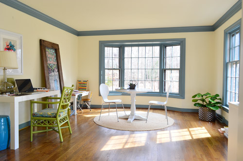
We’re excited to be thinking about the office because it’s one of our favorite full-of-raw-potential spaces in the house (so much space! so much light!). And with the baby’s impending arrival (six weeks!) we’re feeling the urge to consolidate our business life so it’s less likely to infiltrate family time. You know, like making “no more laptops on the diner table” rules. Another example of our completely not-contained work spread is that all of my accounting stuff currently lives in a kitchen cabinet because my desk wall lacks storage (but apparently not holiday cheer).
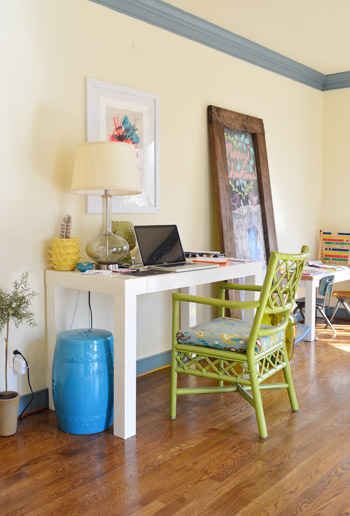
This is a room where we’ll skip the Phase 1 stuff and jump right to Phase 2 (like we’ve done in the sunroom, for instance) because it doesn’t require the amount of planning/saving/splurging that a kitchen or bathroom makeover does (no pricey appliances, new counters & tile, etc) and we’re fairly confident that we can end up with a space that works for us for the long-haul (the kitchen & bathrooms tend to take more percolation time – we’re still changing our minds everyday). Note: There’s more on how/why/when we tend to do Phase 1 updates here.
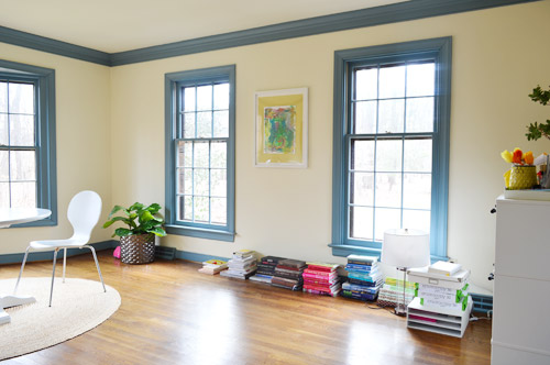
We actually think this space has a ton of potential to not only be functional, but to be beautiful, thanks to the fact that it’s one of the most light-filled rooms in our house, and it has that pretty bay window in the back.
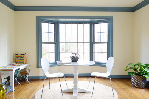
We want the bay window to remain a focal point, since it’s so nicely centered in the room – but we’ve thought it through, and officially nixed the idea of adding a built-in bench seat because:
- we don’t see a bench seat as being super functional for an office
- the window is actually really shallow so it would be a very narrow seat
- it might get in the way of our current Christmas tree spot (is that really my third X-mas mention? Geez) – although I’m sure we could find another tree spot if necessary, so the tree isn’t a deal breaker on its own

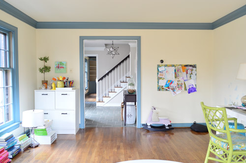
But what the room giveth with the bay window, it taketh away elsewhere. As in, we’ve got some other challenges to work around, like the less-than-centered doorway on the other side of the room. I guess we can only have so much symmetry in our lives…
The front window wall is also great for light, but not so great for furniture placement. Since the windows are so close to the floor, they really make it hard to put anything on that side of the room without blocking a lot of light (and making for a strange view from the street).
With those challenges in mind, Sherry and I brainstormed a list of priorities for our office. Some are just carried over from our last office, but some are new given the larger, more light-filled space.
- Two Desks: Duh, right? Sherry usually works at the kitchen table (more on that here), but we’d love to create a dedicated space in here for her to really spread out. And my small parson’s table could definitely be improved by more space and more drawers. So there’s a lot we can do to improve on this.
- Storage: We don’t have a ton of paperwork, but we’d love to expand our file storage. Mostly to bring in some of the stuff that we have shoved into other rooms – like tax documents and side gig paperwork – rather than having that stuff spread randomly around the house.
- A Big Meeting / Craft Table: We don’t have a ton of meetings here, but we’ve had enough recently (mostly showhouse related) that we’d like to stop having them in our kitchen or dining room. Plus, it would serve the double function of an area for completing/shooting smaller projects (with all the natural light in this room, it’d be a great spot for photography).
- Whiteboard / Pinboard / Magnetboard: We want a nice big wall where we can organize our to-do list, calendar, future project ideas, etc, etc. where we can both see everything. Right now we both keep ourselves organized on our own phones and notebooks, so some communal organization is needed to get us both in the same loop again. We’re not sure exactly what this looks like yet, but we’re already brainstorming a few options that we could implement.
- Doors: Partly because this room seems made for some nice french doors, but also because it would be great to get some added soundproofing in here – especially during conference calls or other times that one of us really needs to concentrate.
- Kid-Friendly Space: It’s been nice to have Clara’s drawing desk in here (so we have the option to “work” together during less intense moments of the day) – so we’d like to create a flexible little area that works for smaller kids but also can transition to work for bigger kids (so it’s not something that we outgrow in a few years).
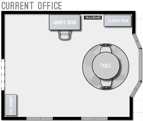
With priorities set, we started floor planning (I took a few new apps for a spin to plan the room, so I’ll share more on those in another post). Here’s a rough representation of the current furniture plan. Yes, it’s pretty sad.
We started by just expanding on our current layout to include the things we wanted and bring things up to scale for the room. We’ve liked having the table centered in the bay window, so maybe just upgrading to a bigger table and some curtains could work? And then we could wrap an L-shaped desk around that corner to give us some built-in desk storage (kinda like our last office) and make room for both of us to sit.
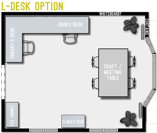
But we weren’t crazy about the corner-desk in that option since it seemed kinda cramped. And since that’s where we’d likely be spending most of our time, it felt weird to not give it more priority in the room – and to take advantage of all the windows by actually getting to see out of at least one of them.
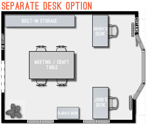
Then we went crazy and tried making the desks “the stars” of the room by keeping them symmetrical with the bay window. The most logical version of this was two separate desks sort of flanking the window. But even that attempt wasn’t very logical because it put one desk right in front of a too-low window (so you’d see the side of the desk from the street) – and it also would require us weaving around the big table every time we wanted to get to our seats.
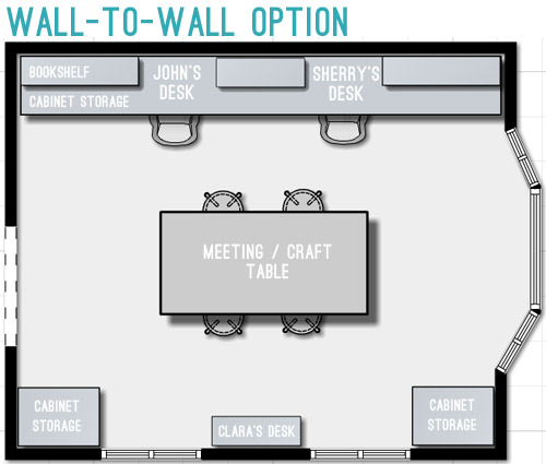
So next we tried mocking up an idea that was actually our original concept for this space. It includes office storage along the entire back wall, with desk areas that are integrated into them. Here’s our inspiration picture, complete with a friendly looking feline.
We originally discarded this idea because we thought it’d screw up the symmetry of the window – which was something we really liked about the room. But as we played around with the floor plan, we realized we could maintain the symmetry by putting something in the bottom right corner too, so the bay window still feels centered. Plus this plan would leave the middle of the room pretty open for a big table, which we could move around – or even move completely out if the need arose. We also could move our laptops to the meeting/craft table to get a nice view out the window if we ever feel too wall-locked at our desks (Sherry currently unplugs and works at the kitchen table everyday, so that shouldn’t be too much of an adjustment).
Update: We’re getting some questions about where the Barnacle will go, but Clara’s desk actually has two chairs and is long enough for two kids (we’ve even had four kids at it if we pull it away from the wall) so it’ll accommodate the bun as well as the bean.
Update #2: We’re also getting questions about window glare from working along that back wall, but John has worked there for the past 9 months without an issue (the sun streams in but the room is wide enough for it to hit the floor about 5′ from his chair – so it’s not up at screen level).
We’re still letting the concept simmer in our heads, but we’re fairly confident that we’ll start heading in that last layout’s direction since it feels like it makes the most sense for the way we work. Although “start heading” involves painting a whole lot of blue trim first (sixty six window mullions to be exact). And it takes four coats… so that’s a whole lot of painting.
What’s on your priority list when it comes to a home office? Do you have a desk tucked into the corner of your den (we totally did that in our first house)? Is there a little work area in your kitchen with a laptop hookup? Or do you have a dedicated home office? Does anyone have work stuff in the bedroom? Growing up Sherry’s dad had a computer and all of his paperwork in there, but that doesn’t seem to be something most people do anymore.

Silke says
I am probably mirroring some earlier comments, but with such a sun lit room, I wouldn’t want to be facing a wall (even though I get why you consider it). Did you also take into account the reflections of the windows in your laptop screens? I hate that at work (have a window in my back).
Also, outlets and overhead lighting are muy importante!
You’ll figure it out, but I personally am not convinced yet, neither of the L-shape nor the wall-to-wall.
YoungHouseLove says
Oh yes, glare would be super annoying! Thankfully John’s computer has been on that wall for 9 months since we moved in without any issues with that (the room is wide enough that the sun lands on the floor about 5′ behind his chair).
xo
s
Paige @ The Room Kit says
You guys are prompting me to get in gear with my own office situation. We recently did a room shuffle over here, and swapped my workspace with what will be the future nursery. So of course, there’s an explosion of stuff in both rooms now. Whoops!
I like MegaDesk (which is obviously the wall-to-wall option). The lure of that much built-in storage is strong.
Alli says
I like the last layout as well, I think it’s a much more productive/efficient layout.
I noticed Clara’s desk got less deep? If it’s to save a little space, have you thought of a fold down one like Ana White’s or something similar?
http://ana-white.com/2011/09/flip-down-wall-art-desk-0
YoungHouseLove says
That’s a great idea!
xo
s
Angelakr says
Ok, I’m so lame that once I saw Sherry’s name misspelled in the layout that I started giggling…. Somebody get me some coffee please!!! Now I need to go back up to actually see what you plan and not revert to my 12 year old self…:)
YoungHouseLove says
That’s hilarious! John and I didn’t even notice that! We must be so used to seeing my name misspelled that we don’t even “see it” when we do it ourselves!
xo
s
Reshma Sanjeev says
Since your post comes early, I am able to comment as soon as I visit you guys before I get to work….:-)
I like the L-shape and also the wall-to-wall ones. I like how you added a desk for Clara too.
Erin says
I think I am most excited for this room redo! I work from home full time and love creating home offices that work for me. A white board is always a must for me as well as a few inspiration pieces. In my current office, I’m using a round table as a desk (inspired by this pin http://www.pinterest.com/pin/133137732707413014/). I like that i can spin around the table and work on the other side if need be. Good luck!
YoungHouseLove says
That’s awesome!
xo
s
Flagless says
My main problem with space – living space in general – is where to put all my books (I’m a literature lecturer at a uni, so I’ve got … a lot of them), so I’d make this space into an old-fashioned library – wall-to-wall, floor-to-ceiling bookcases on every available wall surface, with a big desk in the middle for work. I think the window placement is perfect for it, cause you wouldn’t have to worry about furniture placement – just weave the bookshelves round the windows. I’d also add a big push reading chair in front of that bay window. My ideal space would start with something like this: http://www.pinterest.com/pin/320881542170744301/ – only I’d never use it as a dining room.
That said, your work is different, so you’re obviously not going to let your inner professor take over. Can’t wait to see what you do with the space and how you make it work for you :)
YoungHouseLove says
Holy cow, that room is amazing! It would make for such an awesome library/dining room setup!
xo
s
Arlene says
I love the last idea with the full wall desk and I love that you want to include Clara in the fun! What if you turned the wall between the windows into a full length whiteboard/message board/pin board/chalkboard? Instead of having a small desk for Clara there, you could create a lazy susan of all of her “office supplies” that could sit in the middle of the meeting table. That way, it could easily be put away into those storage cabinets for meetings but otherwise sit out and she could go to town! Also, it would allow for plenty of space as Barnacle gets older, he could join the fun! Just cover the table with some craft paper to protect it and she could have tons of space!
YoungHouseLove says
That could be sweet too! I love that Arlene!
xo
s
Arlene says
Ooh! I just thought too, what if you added a round bar on the furthest side of the table (facing the bay window) with a roll of craft paper so you could just pull it on to the table as the kiddos color/play/craft! Totally not an original idea, but would be so fun! :)
Amy Bull says
I LOVE the third option!! It would motivate me to work! I also love how you are dedicated a kid space. It’s so nice to see one integrated into the design of the room, rather than either looking like primary colors are taking over or hiding it completely. Can’t wait to see what’s next!
Lauren says
Im curious why you don’t just hire out the trim and wall painting for this room? That would free you up to get the rest of the room set up and functional before baby comes.
YoungHouseLove says
We’d much rather spend that money on a great light for over the meeting table and some storage for the room, especially since we’ve already tackled so many other blue-trimmed rooms ourselves (just two left = home stretch, baby!). I think we’re just DIY lovers at heart, so we get a very special kind of satisfaction by completing those annoying draggy jobs ourselves (when they’re done, we’re high fiving out the wazoo). Everyone would make that call differently though!
xo
s
Kristen | Popcorn on the Stove says
I prefer the separate desk option – it seems like it would be more spacious. Would you consider getting a two couches (facing each other) for a meeting space instead of the table?
YoungHouseLove says
Never even thought about that! I think the flexibility of chairs is nice (sometimes we have more than four people at meetings, so bringing in more chairs and having things we could easily shift around might be the most functional) but you never know – we might find something awesome and totally change our minds!
xo
s
Laurie says
Love the last layout! I look forward to seeing it come together!
Have you considered putting in pocket doors? I love French doors, but open they take up a lot of floor space. You can install them as pocket doors and they just disappear into the walls- it looks like you have a good setup for them. I have an older house and I love my pocket doors!)
YoungHouseLove says
We did think about that a little but the cost seems to be a good deal more than installing french doors. We’ll have to see if we think they’ll end up in the way though, in which case the added expense could make sense in the name of function!
xo
s
Tara says
Am I the only one in favor of the “separate desk option”? The down-side of the L-shaped and wall-to-wall options is two fold: you can’t enjoy the beautiful light/views and you have to turn around to keep an eye of the kids instead of just glancing up. The separate-desk option will solve these problems(and you can see the foyer area, also). I would move Clara’s desk where the plant is, though, and move the meeting table toward the upper left corner to create a little more room in front of the door. :)
YoungHouseLove says
I just think we can’t come to terms with the side of the desk being right in front of that window in that layout. If only they were a few feet taller!
xo
s
Julie says
I love the third option! I do, however, prefer a round table to the rectangle one you have in your mock-ups; I feel like a round table would break up all those rectangles and hard angles you have going. (Also, I love the look of your current round table in the bay window.)
I can’t wait to see it come together! I work from home at my dining room table (in my 643 sq ft apartment), so I’m quite envious of your dedicated workspace.
Beth Ann says
Fun! The light in the room is beautiful. Have you considered putting your desks together, facing each other? Using the L-shape option for everything else, but then instead of L desks butt yours together. On the side that bump up against the wall you could have your pinboard/magnet board?
Also, the Costco in my town had a craft table/desk area very similar to Pottery Barn’s Bedford Project Table (for $199), with the storage in the side. You could get extra storage like that for the desks by adding storage on the side that faces to the room.
YoungHouseLove says
Thanks for the tips and ideas Beth Ann!
xo
s
Becka says
Can’t wait to see what you guys end up doing with this space!
I’m curious–have you considered designing a standing desk option? It might throw off the symmetry of the long desk built against the wall in option three, but a crafting table could double as a standing station.
I know the standing desk craze has really caught on lately so I wondered if you had thought of it. I’ve been standing for a year at my 9 to 5 job and love it, though my “desk” is made of makeshift cardboard boxes. :)
YoungHouseLove says
Never even thought about that! Will have to chat John up about it and see what we think!
xo
s
Kelly {the Centsible Life} says
We have a living room we’re using as our office right now, too. It’s challenging though because we have a HUGE (and super low) bow window on one wall and two off center opening to other rooms on two of the other walls.
We have a giant table so we can all use it (the kids use it for homework, too) and a seating area that will allow us to play games or hang with our laptops as needed.
We just played around with things and I like where we’re at now but we still need some closed in storage (and paint!).
YoungHouseLove says
That sounds awesome, Kelly!
xo
s
Allyn says
Especially in an office, you can NEVER have too many electrical outlets, and you can NEVER have too much storage (bookshelves, file cabinets, drawers). Good task lighting is also essential.
Juliet says
Great plans. I can’t wait to see how it comes together. Have you thought abou using an expandable table (drop leaf or something) as your meeting/craft table? That way it doesn’t have to be this dominant piece of furniture in the room, but it can easily be larger as needed.
YoungHouseLove says
That’s another great idea!
xo
s
Vickie says
I love the idea of French doors! If I was a parent of young children I would go for the L-shaped desk. Plenty of room in front of the meeting/craft table (brilliant idea, by the way)for the kids to play while you two are working. Also, a nice comfortable chair could go in one of the two corners by the bay window to snuggle and nurse, and for now, a pack and play in the other corner for newborn naps.
Danielle says
Don’t feel too bad, my chalkboard definitely still says Merry Christmas too. And I agree, that wall to wall option is going to look bananas! Cant wait to see it get started!
Elizabeth says
I am so excited to see how this turns out. I think option 3 with the built ins will be both beautiful (as is everything you guys do) and super functional! All that storage! Could eventually work for homework space for kids as they get older too!
On another note I hope you are getting some time to rest and relax before baby arrives!
Kati @ This Wandering Life says
Aw come on just go with Japanese-style seating and put your now-short desks up to the windows, haha!
Julie says
What about a head-to-head desk option, where you face each other, like this: http://decorology.blogspot.com/2013/08/office-eye-candy.html. You are both so pleasant to look at, and I’m sure you would inspire each other! :)
While the floating arrangment might cause problems with outlets, you could have some sunk into the floor. My parents’ large living room has that, and they love it.
YoungHouseLove says
Haha, I love that idea Julie! Such a pretty space! Although I’m not sure my hair this morning would be very inspiring to John (more like scary).
xo
s
Bethany Ann says
Such a pretty room! The third layout you have will be very similar to that if you and John both decide to use the meeting/craft table as a desk sometimes. It’s nice to have options! Can’t wait to see where you end up! And I feel you on the scary morning hair, Sherry. Eek.
Sarah says
Love the third option! Nice space and it would make it so you wouldn’t have to move the table to fit in the Christmas tree– or at least, you wouldn’t have to move it as much as in options 1 or 2. :)
Nichole says
I like all your options. Of the three, I’d probably lean toward your long two-person desk with built-ins. Another idea occurred to me. What if you set it up much like the L-shaped desk option, except with a double-sided desk where you’d work across from each other? I, too, love symmetry, but I’d at least give it a thought. With that layout, you’d both have the two front windows to the side and one of you would face the bay window.
YoungHouseLove says
That could be fun too! Thanks for all the suggestions guys!
xo
s
Tyra says
How wide is the doorway into the room?
Hard to tell from the pic. Looks wider than a normal one, but would you ever consider widening it with the French doors to make it more symmetrical??
Maybe with the 3rd layout that would mean a door in the back of the desk chair though….
YoungHouseLove says
It’s around 48″ I think, but we couldn’t widen it to center it without throwing things off in the foyer (it’s centered in the foyer and would cut into the half bathroom if we moved it over at all), so we’re forced to just work with it as-is.
xo
s
Robin Grey says
Loving the third one the best too! I would just add a pair of club chairs and an occasional table in the bay. I love a cozy chair to curl up in any place I can squeeze one in.
YoungHouseLove says
Sounds so nice!
xo
s
Katie says
You have given these options so much thought, and it’s a good lesson in patience for *cough*me*cough* people how just dive in, consequences be damned.
All I can think about the whole wall desk idea is that I don’t know if I could handle facing a wall for long periods of time (your last desk had a window in the center).
What if you did 3 floating desks along that wall and faced them towards the windows? Storage in the corners of the street facing wall, and meeting table in the center of the room? Nothing blocks the windows, and you get to enjoy them as well?
YoungHouseLove says
That could work too! I think I’d just unplug my laptop and work at the meeting table (right now I unplug it and work at the table in the kitchen, so I’m hoping it’s flexible in there).
xo
s
Kevin says
Looking goood, Mr. Kotter! Two suggestions: 1. Put the craft table on wheels, so you can back it up to the shelf/desk wall as a penninsula when you want, or roll to the middle of the room, or out of the way in the bay. 2. BARN DOOR HARDWARE for the door to the foyer — then the back of the barn door can be a message board/idea board. Or cool recycled wood, or whatever. That way the doors don’t take up any room when open. We have one and LOOVE it!
YoungHouseLove says
Both fun ideas! Thanks Kevin!
xo
s
Natalie K says
I love the L-desk idea! It preserves the bay window amd limits traffic in front of it, so you can put the tree in there while you work -or- get a lot of light! Maybe a bookshelf over the desk???? Like in the corner/Jon’s side-ish???
YoungHouseLove says
That could be fun too!
xo
s
Kari says
Did you use MS Office Visio to do this diagram?? I’m a meeting/event planner and we just converted to using that in the office. Ever since, our lives have been changed :)
YoungHouseLove says
That sounds awesome. I actually used something else – and tried out a few apps for space planning – so I’m going to post about that soon for you!
-John
Nicole says
Oh I’d love to have a dedicated office. We currently have our “office” in our master bedroom, and our “guest room” is also our son’s nursery. The joys of a two bedroom 1,000 square foot house. But we are adding on late this year, and I can’t wait. It means our guest room will do double duty as our office in but will be so worth it. I actually liked the L shaped desk idea.
Theresa says
I LOVE the third option and I can’t WAIT to see it! I wish I could see it now (I’m sure you guys do, too, considering all the painting that stands between you and the completed project ;)).
Have you guys thought about how you’re going to make a space for the Barnacle in there? Initially it’s probably easier because of all of the infant apparatus required (I am due in 3 weeks, so I’m with you there), but at some point, won’t he want a desk, too? You can also choose to cross that bridge when you come to it :)
YoungHouseLove says
Oh yes, Clara’s desk is long-ish and has two chairs (not sure if you can see that clearly in the “before” pic) so it should work for the bun and the bean!
xo
s
Lauren (in PA) says
I love the wall option best. It seems to offer the most storage as well.
I really don’t care for the L option at all. Seems very cramped and lopsided in the room. PLUS…if you were talking while working, Sherry would have to twist around all the time to look at John. Really dislike that option!
And I’d probably put the idea board to the right or left of the doorway, so it’s out of sight when you’re not working, or entertaining.
YoungHouseLove says
That’s where we think it’ll work best too! So it’s sort of hidden from most people except us as we face it!
xo
s
Emily says
I think the wall-to-wall option is your best bet for the room. Why not show the french doors in your floor plan? It might help to get a sense of the balance on that side of the room. I would suggest floating Clara’s desk by the bay window and placing the white board/pin board on the wall where her desk is, it is in close proximity to the center table making it more practical and convenient to use.
I think the closed cabinet storage on the opposite walls of your desks are good, but I like the idea of floor-to-ceiling open shelves/cabinets akin to your inspiration picture on the desk side. Don’t close everything up on that side!
Also, if this was my office I would end up moving my laptop over the center table every day, but I understand wanting the dedicated space against the wall. It’s just so much better feng shui to face the windows/be able to see the doorway.
YoungHouseLove says
We’d love to add some french doors to the plan to help us picture them! There are so many awesome tips coming in that we can’t wait to regroup and share where we’ve ended up.
xo
s
JenWoodhouse.com says
I think the last option is my favorite. How about if your desks faced each other somehow, so y’all can take breaks to lovingly gaze into each other’s eyes from around your laptop screens? Would that be too distracting?
YoungHouseLove says
Haha! Someone else shared a really cool picture of a floating double desk in the middle of the room where two people faced each other (sort of like the craft table we drew, but with one office chair on each end) so that could be a workspace for us to face each other if we missed checking each other out ;)
xo
s
Rebecca says
I love the third option. As one other commenter said – I agree it will give you a lot more storage, plenty of room down at the other end for floor play or a Christmas tree. And I think the craft/meeting table running the length of that room will actually make it feel even more open and symmetrical (as well as still showcase that beautiful bay window).
Our office is in the basement and very rarely used – though its a great space and has a beautiful view out the window. The reality is that I spend most of my ‘at home’ time on the main level in the kitchen or other living spaces. I do have a dedicated desk space in the kitchen (built in cabinetry and lower counter with roll out chair)where our laptop is parked – but there is not a lot of room for storage or a printer. So even though this is where I do most of my work – it means I do a lot of climbing stairs if I am printing, and I have more piles of paper upstairs in the kitchen than I would like.
I am thinking of turning one of our street facing bedrooms on the main level into an office/craft-room/homework room – with the hopes of utilizing it more and having less mess in the kitchen. :D
So enough rambling! haha. I am always so excited to see your plans take shape! You create a lot of inspiration here. :D
Isabelle says
You definitely have your work cut out for you with this one as the room was intended to be a formal living room (with the focal furniture in the center of the room, rather than against the walls. But, I really like how you guys try to make the space work for you, as it is YOUR house after all :-) I’m excited to see how this room shapes up! The “final” floor plan you shared definitely seems like it makes the most sense. I’ll be here watching it come together! :-)
Helene says
Will Clara still need a desk once you have the craft table? Do you think she will just naturally migrate there?
Also, do you really want to be facing a wall with those gorgeous windows in back of you!? I guess it’s personal, but I hate not looking out!
YoungHouseLove says
I think it’s really smart to assume that Clara might end up at the craft table sometimes, although she has a bunch of stuff (crayons, markers, etc) that we keep out on her desk all the time, so we’re not sure we want to just keep that out on the meeting table, so having a separate kid-space might be nice to contain clutter from the meeting/craft space. I completely agree about the windows (I like to bask in the sunlight like a lizard) so I think I’ll unplug my laptop and sit at the meeting table a lot of the time (I currently unplug and sit at the kitchen table nearly all of the time, next to a nice big window in there). John on the other hand has faced that same wall for 9 months and seems to like it. Maybe he’s a vampire?
xo
s
Bethany Ann says
Hahahahaha, I love your explanation for John not minding facing the wall. Seems plausible!
Abby M says
I think you won’t like your backs facing Clara and a big table/chairs between the two of you. It will be harder to keep an eye on her that way. I liked the separate desks facing away from the bay and her desk in front of John’s plan the best… that way you could both see her easily.. plus when you have the new babe toddling around you’ll be able to see him too. Clara is more trustworthy, but that new baby will need full attention :) Just my two cents!
YoungHouseLove says
Oh yes, I think if Clara’s in there I’ll just unplug and sit at the meeting table so I can face her – and might even invite her over to the table to draw next to me ;)
xo
s
Natalie K says
Also, I’d say the wall-of-desks option if the tree would fit in there with overtaking the room. Also, does it kinda cut the room in half? Maybe forgo the middle bookshelf as well? Hang art there instead?
YoungHouseLove says
I was just chatting with John about whether we’ll need that middle bookcase. We’re definitely still piecing things together, and might start taping stuff off and using cardboard boxes to try to picture stuff! Haha!
xo
s
Jess says
Not sure if you’re taking suggestions, but I really like the L-desk option. The wall-to-wall option is good too, but with 2 young kids I would want that clear area of space for them to play in where I could just glance over and make sure they’re not eating the ficus or whatever. The wall-to-wall layout also looks a bit cramped.
Plus pushing the meeting table further to the end of the room will make the space seem larger. Whenever you put a large piece of furniture in the middle of a room your eye kind of stops there, and misses all the space beyond it, so you see it as smaller than it really is. Then again if your meeting table/chairs are Lucite or something really visually light it would lessen that effect.
YoungHouseLove says
That’s a fun idea too!
xo
s
Miranda says
I work from home as of November. We live in a single-wide, with 3 bedrooms, 2 baths. Basically, there’s no space. So, my “office” is a small desk in our room with a printer on our dresser. Fancy.
K00kyKelly says
I like the idea of changing the L-desk layout to slide John’s part of the L desk forward to be even with the doorway. Then the pinboard and whiteboard space could be behind you and it leaves room for a floor to ceiling storage unit where Clara’s desk is now. It does kind of give it a secretary look, haha.
katie says
I feel badly throwing in my two cents (you guys know what works best for you!) but we are also trying to plan the layout of an office and I am trying very hard to think of a good way for us to not have to face a wall either.
One thought would give you both a L Shaped desk if you connect the project table to the wall unit (kind of like the picture below).
http://www.houzz.com/photos/136684/Kinsman-Signature-Home-traditional-home-office-san-diego
Love all your ideas though and looking forward to seeing what you guys come up with!
YoungHouseLove says
That’s a great alternative too! Thanks for tossing out all the links and suggestions guys! We could totally change our entire plan (it’s early days for the office, haha!) so thinking this stuff through really helps us!
xo
s
bella says
That’s exactly what I was thinking about for that long wall, Katie. My parents did that in their home office (which is juts a bedroom) and they have a nice pull out sofa across from it. It’s a much smaller room that YHL’s office and yet it works perfectly.
Andrea says
This is what I was thinking too. If your desk was large enough, you might also have the option of converting it the meeting/craft table by adding extra chairs as needed.
Jen says
Sorry, but I think the table in the middle of the room will block flow and feel cramped (I agree with a prior commenter that it’s bad Feng Shui!)
I love the craft/planning table in front of the window– and the wall to the side (where the chalkboard is now) could be whiteboard/pinboard space. That could be really helpful during a meeting.
I agree the L-shaped desk plan would make for cramped workspace… how about tweaking it a little, and putting just Jon’s desk where the big L-shaped desk is now, and putting Sherry’s in the opposite corner? Admittedly, that would be much smaller space for Sherry, but since she says she uses a desk less often, it may work out.
YoungHouseLove says
That could work too! There are definitely a bunch of ways to go in here, and we love hearing from you guys about what you’d do!
xo
s
Patti says
I really like the last layout. That design looks so professional especially with the meeting table in the middle of the room. It also offers you plenty of storage on the desk wall. I would use the wall space flanking the office entry for any white boards or bulletin boards so as not to be visible from the foyer. Can’t wait to see what you do in there!
YoungHouseLove says
That’s our thought too. Hide that clutter, baby ;)
xo
s
Jessica says
I hope you don’t mind, but after the comment about keeping thigns organized between you both, I wondered if you have heard of Trello? I am not in anyway affiliated with this site at at all, but my friends just started using it after completing a cross-country move and starting over from scratch in a new place. They are using it to keep track of all the different projects (finding a place to rent, job hunting, etc) but I think it could probably work great for you guys for staying in the loop on all the multiple projects that you have going on, like the giveaways, show house, secret projects, even your home to-do list. It looks like it allows easy collaboration. I watched this short video that my friend posted and it sounded awesome! http://youtu.be/aadf1rqelfo or https://trello.com/#tour.
YoungHouseLove says
That sounds awesome! Thanks for the tip Jessica!
xo
s
Rachel says
Aw man, I love trello! Couldn’t have planned our wedding half so efficiently without it! :)
Ida says
I love the wall-to-wall option. It makes the most sense with the room layout. It also leaves room for the kids to be in there with their own spaces!