It seems our excitement for the plans that we’ve been cooking up for the showhouse office has spilled over to our own office. Well, that and the fact that ours is looking pretty sad lately, having recently pilfered both its armchair and Expedit for the nursery. It doesn’t help that our chalkboard still says “Merry Christmas” on it. So basically, yeah, this office screams “I’ve got my ish together.”
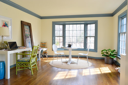
We’re excited to be thinking about the office because it’s one of our favorite full-of-raw-potential spaces in the house (so much space! so much light!). And with the baby’s impending arrival (six weeks!) we’re feeling the urge to consolidate our business life so it’s less likely to infiltrate family time. You know, like making “no more laptops on the diner table” rules. Another example of our completely not-contained work spread is that all of my accounting stuff currently lives in a kitchen cabinet because my desk wall lacks storage (but apparently not holiday cheer).
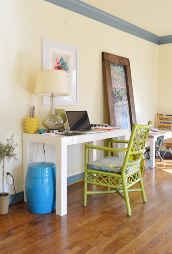
This is a room where we’ll skip the Phase 1 stuff and jump right to Phase 2 (like we’ve done in the sunroom, for instance) because it doesn’t require the amount of planning/saving/splurging that a kitchen or bathroom makeover does (no pricey appliances, new counters & tile, etc) and we’re fairly confident that we can end up with a space that works for us for the long-haul (the kitchen & bathrooms tend to take more percolation time – we’re still changing our minds everyday). Note: There’s more on how/why/when we tend to do Phase 1 updates here.
We actually think this space has a ton of potential to not only be functional, but to be beautiful, thanks to the fact that it’s one of the most light-filled rooms in our house, and it has that pretty bay window in the back.
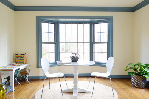
We want the bay window to remain a focal point, since it’s so nicely centered in the room – but we’ve thought it through, and officially nixed the idea of adding a built-in bench seat because:
- we don’t see a bench seat as being super functional for an office
- the window is actually really shallow so it would be a very narrow seat
- it might get in the way of our current Christmas tree spot (is that really my third X-mas mention? Geez) – although I’m sure we could find another tree spot if necessary, so the tree isn’t a deal breaker on its own

But what the room giveth with the bay window, it taketh away elsewhere. As in, we’ve got some other challenges to work around, like the less-than-centered doorway on the other side of the room. I guess we can only have so much symmetry in our lives…
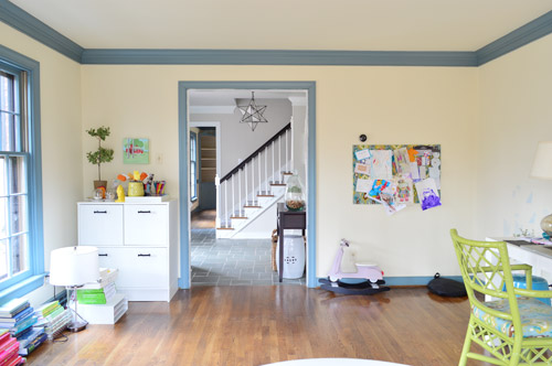
The front window wall is also great for light, but not so great for furniture placement. Since the windows are so close to the floor, they really make it hard to put anything on that side of the room without blocking a lot of light (and making for a strange view from the street).
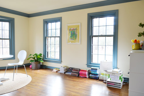
With those challenges in mind, Sherry and I brainstormed a list of priorities for our office. Some are just carried over from our last office, but some are new given the larger, more light-filled space.
- Two Desks: Duh, right? Sherry usually works at the kitchen table (more on that here), but we’d love to create a dedicated space in here for her to really spread out. And my small parson’s table could definitely be improved by more space and more drawers. So there’s a lot we can do to improve on this.
- Storage: We don’t have a ton of paperwork, but we’d love to expand our file storage. Mostly to bring in some of the stuff that we have shoved into other rooms – like tax documents and side gig paperwork – rather than having that stuff spread randomly around the house.
- A Big Meeting / Craft Table: We don’t have a ton of meetings here, but we’ve had enough recently (mostly showhouse related) that we’d like to stop having them in our kitchen or dining room. Plus, it would serve the double function of an area for completing/shooting smaller projects (with all the natural light in this room, it’d be a great spot for photography).
- Whiteboard / Pinboard / Magnetboard: We want a nice big wall where we can organize our to-do list, calendar, future project ideas, etc, etc. where we can both see everything. Right now we both keep ourselves organized on our own phones and notebooks, so some communal organization is needed to get us both in the same loop again. We’re not sure exactly what this looks like yet, but we’re already brainstorming a few options that we could implement.
- Doors: Partly because this room seems made for some nice french doors, but also because it would be great to get some added soundproofing in here – especially during conference calls or other times that one of us really needs to concentrate.
- Kid-Friendly Space: It’s been nice to have Clara’s drawing desk in here (so we have the option to “work” together during less intense moments of the day) – so we’d like to create a flexible little area that works for smaller kids but also can transition to work for bigger kids (so it’s not something that we outgrow in a few years).
With priorities set, we started floor planning (I took a few new apps for a spin to plan the room, so I’ll share more on those in another post). Here’s a rough representation of the current furniture plan. Yes, it’s pretty sad.
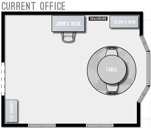
We started by just expanding on our current layout to include the things we wanted and bring things up to scale for the room. We’ve liked having the table centered in the bay window, so maybe just upgrading to a bigger table and some curtains could work? And then we could wrap an L-shaped desk around that corner to give us some built-in desk storage (kinda like our last office) and make room for both of us to sit.
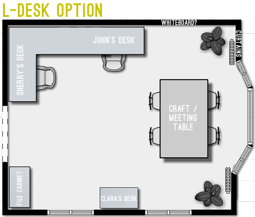
But we weren’t crazy about the corner-desk in that option since it seemed kinda cramped. And since that’s where we’d likely be spending most of our time, it felt weird to not give it more priority in the room – and to take advantage of all the windows by actually getting to see out of at least one of them.
Then we went crazy and tried making the desks “the stars” of the room by keeping them symmetrical with the bay window. The most logical version of this was two separate desks sort of flanking the window. But even that attempt wasn’t very logical because it put one desk right in front of a too-low window (so you’d see the side of the desk from the street) – and it also would require us weaving around the big table every time we wanted to get to our seats.
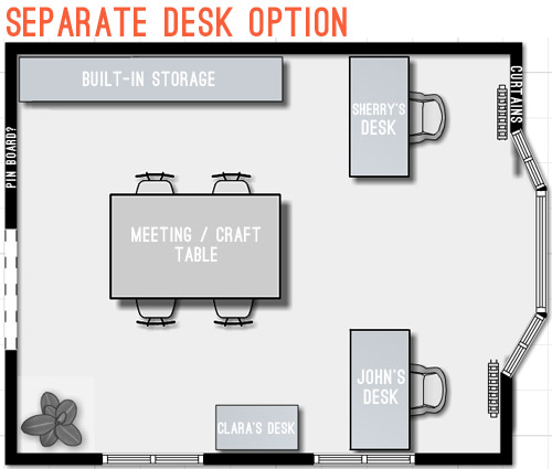
So next we tried mocking up an idea that was actually our original concept for this space. It includes office storage along the entire back wall, with desk areas that are integrated into them. Here’s our inspiration picture, complete with a friendly looking feline.
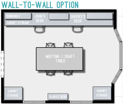
We originally discarded this idea because we thought it’d screw up the symmetry of the window – which was something we really liked about the room. But as we played around with the floor plan, we realized we could maintain the symmetry by putting something in the bottom right corner too, so the bay window still feels centered. Plus this plan would leave the middle of the room pretty open for a big table, which we could move around – or even move completely out if the need arose. We also could move our laptops to the meeting/craft table to get a nice view out the window if we ever feel too wall-locked at our desks (Sherry currently unplugs and works at the kitchen table everyday, so that shouldn’t be too much of an adjustment).
Update: We’re getting some questions about where the Barnacle will go, but Clara’s desk actually has two chairs and is long enough for two kids (we’ve even had four kids at it if we pull it away from the wall) so it’ll accommodate the bun as well as the bean.
Update #2: We’re also getting questions about window glare from working along that back wall, but John has worked there for the past 9 months without an issue (the sun streams in but the room is wide enough for it to hit the floor about 5′ from his chair – so it’s not up at screen level).
We’re still letting the concept simmer in our heads, but we’re fairly confident that we’ll start heading in that last layout’s direction since it feels like it makes the most sense for the way we work. Although “start heading” involves painting a whole lot of blue trim first (sixty six window mullions to be exact). And it takes four coats… so that’s a whole lot of painting.
What’s on your priority list when it comes to a home office? Do you have a desk tucked into the corner of your den (we totally did that in our first house)? Is there a little work area in your kitchen with a laptop hookup? Or do you have a dedicated home office? Does anyone have work stuff in the bedroom? Growing up Sherry’s dad had a computer and all of his paperwork in there, but that doesn’t seem to be something most people do anymore.

Manddi says
I work from home and we are expecting a baby in just 12 weeks so we are transitioning my office into a nursery. I am not sure how no longer having a room for a office will work. I debated a small desk in the bedroom but I frequently work while my husband is sleeping. We decided that I am getting shipped to the unfinished basement for now with hopes of finishing it soon with a playroom, craft area, den and a small office corner. I will certainly miss being on the main floor and having an office door that I can shut. You are so fortunate to have a such a beautiful and expansive office space to work with.
Beth says
If you want to retain symmetry – why not do you desks facing each other where the current craft table is? Either with one persons back to the bay window and one persons back to the French doors or one person facing the front or the house and the other the back.
I just loath having my desk against a wall. Even in a big open bright room it feels too cubical-y.
Or you could get crazy and have a “T” desk on the front wall — a common area coming out between the windows and then turning both ways
YoungHouseLove says
We just want to have a separate desk zone from the craft/meeting area since our desks get cluttered with paper and it would save us a ton of time to have a table that’s clear and ready for a craft or a meeting instead of making something do all three of those things (which would mean a lot of constant cleaning to switch functions). We’re definitely still debating things though, so we could end up doing something else entirely. Will keep you posted :)
xo
s
Jess Bosman says
My husband and I use the Wunderlist app on our phones to keep lists accessible to both of us.
YoungHouseLove says
Smart!
xo
s
Jessica says
What program or website do you use for floor plans?? My fiancé and I just bought a house and would love to be able to see the floor plans like this!!!
YoungHouseLove says
John’s planning a post for you about that since he tried some new apps and people seem interested!
xo
s
Erin @ The Impatient Gardener says
Hmmm, I see what you mean about a few things to work around in that room. I think that last option does work the best of the three, but are you really OK at facing a wall? I mean you’re in a room with all those beautiful views and you’re looking at a wall all day. Or maybe that’s a “work while we’re at work” effort so as to not be distracted when you’re supposed to be working. Would a partner’s desk type thing work at all? What about a partners desk sticking out into the room from between the two windows (where Clara’s desk is in your designs)? That way you both get a bit of a view. Not sure how the rest of the stuff fits in, but I’m sure you’d figure it out. Plus that way you’d have a good view if the kids were playing on the floor in there while you were working or whatever. Just a thought.
YoungHouseLove says
That would be fun too! I was thinking I’d just put my laptop on the craft table if I wanted more window view, but a partners desk could be another answer!
xo
s
Alexandra says
Oooh I love the wall-to-wall option! It makes the best use of the space, and you get a lot of storage that way – because paperwork just grows and multiplies!
It’s soothingly symmetrical, which the L-shape desk layout isn’t. If you’re like me, this would make you feel antsy and sort of wonky down the line, and believe me, that just puts you off your stride in your office.
Also, I think the flow is best in this layout; in the one with the separate desks you’d have to walk around the big table, and to me that just seems … weird.
Anyway, yes, I am instantly smitten with the wall-to-wall option and I am totally rooting for it! Go WtW! :D
JoAnne says
Hi John and Sherry!
I’m excited to see your office space come together. Just an idea but what if you do your built-ins on that large wall but instead of facing the wall you turn your chairs out to face the windows (and the littles) and incorporate your desks/meeting table to be one or some type of modular configuration? I know this creates electrical challenges but it gives you the opportunity to stay connected with your littles while working. When they look up they see your faces not your backs. And when you look up you might just get to see something you could have missed if you were facing the wall. Like a tender moment between siblings – or a giant chicken named Beyoncé out your window (that was one funny story!)
Best of luck!
JoAnne
YoungHouseLove says
Love all the ideas everyone! Thanks for sharing!
xo
s
Jenn @ HomeStyleReport says
I love how balanced the rooms looks in the third option! I think I saw another comment mentioning desk facing each other…that would be cool too! Can’t wait to see what you pick and what works for your family!
Sara says
We recently moved our PC to another room (in a corner) to open up so much space in our living room that we were not using! The room feels amazingly bigger! We sure were cutting it short! I can’t wait to get rid of our PC (and use a laptop only) and just get a nice storage cabinet for our printer and more space for filing. But the PC is still in good shape, so we hate to do anything with it until it croaks.
annika says
For both my home office and studio I designed a desk plan and had desks custom made that I love. I wonder if something similar would remove your face the wall issue?
Mine are similar to this style: http://www.pinterest.com/pin/59461657549603997/, but larger/more substantial, with a huge butcher block top. On one end I have cubbies and on the other I have knick knack drawers and hanging file drawers. The middle drawer is one GIANT drawer that slides both ways. It isn’t on a track, just an oiled piece of wood underneath to help it slide. This desk allows a person to sit on each side, facing each other, with iMacs back to back in the middle. I also had a hole cut in the top with a special cap that the chargers fish through and come out the bottom to reach the plug-in. I have a weird cord OCD/phobia. They have to be out of site for me!
If you only work from laptops you could also use this as a “craft table” space if you set them aside.
I LOVE my giant desk. It sits in the middle of the room and is a beauty!
Just an idea! Good luck.
YoungHouseLove says
That’s a fun idea too Annika! Thanks to everyone for sharing links and suggestions today! So many options to mull…
xo
s
Emily says
I was mentally gunning for an octagon shaped table to go in front of the bay window.
Our office was a formal living room and joins the dining room. We’re just not formal living room people, so that is our office. I have a craft area and an almost 6ft desk that is usually covered in paperwork.
I’m thinking that the 6ft desk is just too large for the space, something I never would have known/acknowledged before reading your blog. Free = best, right? But it’s probably time to sell that bad boy and buy something more suitable for our space.
Best of luck, I will be following with interest!
YoungHouseLove says
Thanks Emily! Good luck with yours too!
xo
s
Amy says
I like the separate desk option the best!
Sherry, how many more weeks til the Barnacle gets here?
YoungHouseLove says
Six more weeks! Ahh!
xo
s
Lindsay says
Love that inspiration picture! My mom was a seamstress and had a similar layout to her workspace in my childhood home.
As an accountant, I don’t need quite that much space but did recently remove a closet in our spare bedroom in favor of a dedicated place to work and study.
Here’s the before and after:
http://townhomefortwo.blogspot.com/2013/12/out-of-closet.html
YoungHouseLove says
So nice!
xo
s
Britt F. says
My husband is a med student… and we definitely have his office/study area set up in our bedroom. We have a 3 bedroom house – and our extra bedrooms are small, so just enough room for our babe’s nursery and the guest room (which we really need for visiting family since we live away from our families).
Our living room/kitchen didn’t really have the space, but our master is roomy, so there the office went! We’ve got a parsons style desk with basket storage underneath for his books… then a great white board with hanging cups for markers and an eraser, as well as a pin board with pretty fabric that goes with our room hung on the wall above.
It works surprisingly well and I like that even when the hubby is studying super late, I can go ahead and go to bed and still feel “connected” with him since he’s in the same room, lol.
Laura Sinnwell says
If you go with the wall of desks/storage option and may be adding french doors, are you considering moving the opening to the room a few inches/feet so that it is centered with the bay window?
YoungHouseLove says
Sadly can’t do that since it would cut into the hall bathroom. That doorway is sandwiched and has to stay right where it is unfortunately.
xo
s
Paula W. says
Love your wall-to-wall option. Looking at your large table and bay window from the entry seems like the more peaceful view. This may have been mentioned in the hundreds of comments above, but my first thought was the pros and cons of your desk chairs facing the wall. Great to keep focused on work instead of the great outdoors, but what a beautiful view you have from your office windows! Last thought; since you’re not doing a lot of “big” renovation work, why not expand the door making it centered and fitting for double doors? It’s a fairly easy not-too-structural-fix. Definitely easier than the deck at your last house ;) Whatever you do will be fantastic!
YoungHouseLove says
Sadly we can’t move the doorway because it would cut into the hall bathroom.
xo
s
Lori Anderson says
I can’t wait to see how your office space takes shape. I caught your reference to trying to contain all the paperwork like tax documents in one space. How do you remain so paper-free? How do you organize/go through day-to-day paper messes like the mail, magazines, etc. I would love to see a post on that if you’ve got tips to share.
YoungHouseLove says
That would be a fun post! Generally we just try to deal with mail right when it comes in, and we recycle/shred/scan whenever we can.
xo
s
Stacey says
I think you should try an option where you’re back is facing a solid wall and you’re able to look out the window while you work, if you choose. Just a thought. But, if not, I like the L-desk option. :)
Jen Rayder says
In my home office I have to turn around to see out the window while sitting at my desk. I really hate that, nothing better than being able to just raise your head and be looking outside. Seems like the wall-to-wall option would be great for a view out the beautiful bay window you have. Plus as your business grows you can use that wall for added boards, shelves etc. I saw a great home office that used pieces from Ikea that enabled them to move the pieces around easily if they wanted to change. I’m pretty sure they used free standing kitchen furniture instead of standard office furniture.
YoungHouseLove says
So many fun ideas! Thanks to everyone for sharing their thoughts!
xo
s
Karen J says
Interesting project to tackle. Those “to the floor” windows do make things more difficult; ALL the windows in our house are that way. Will your french doors open into the office or out to the hallway? Darn, I figured you would put a barn door in that room (and I wanted to see how that would work with a more traditional home!).
YoungHouseLove says
They’d open into the office I think, just to free up foyer space.
xo
s
Amy says
Thanks for this post! I have been looking forward to hearing about your office situation since I’m trying to find a solution for myself at home. I work from home on occasion, but I am trying to find an attractive solution for paperwork storage. Like you guys, I have papers all over the house, kitchen, entryway, spare bedroom. Somehow I can keep track of where things are, but it’s super cluttery and clearly I can use my brain power for something more useful than remembering where I put the tax stuff that I need for next year!
I will confess that this is the first post where I’ve read ALL the comments so that I can get some ideas for myself! Thank you again!
Barbara says
I apologize if someone else has already asked this, but what about built-ins along the entrance wall with the desk coming out like on the wall-to-wall option? It looks like maybe the built-ins would be symmetrical once you subtract the needed depth of the wall-to-wall desk. That would really anchor that wall and give you storage. It would also give you the whole wall behind your desk to have a pinboard – kind of like in Little Green Notebook’s white board wall. http://littlegreennotebook.blogspot.com/2014/01/diy-white-board-wall.html
YoungHouseLove says
Fun ideas!
xo
s
chrissie lynn says
i’m sure whatever you decide will look fabulous – always does! but i won’t lie – would have loved to see an option where your desks were facing that beautiful bay window somehow.
as i sit here in my corner facing cubicle, feeling like i’m in timeout, i’m VOWING that if i ever get an at home office it will include a view of the outside world.
just a thought!
Debbie says
What materials are you considering for the desk surfaces, no matter where those desks end up? :)
Just wondering what might be durable and pretty.
YoungHouseLove says
We have a few ideas I think (stained wood, painted wood, some sort of surface like zinc or some other stone- which might be better for the meeting table). Will keep you posted!
xo
s
Miyeko says
Great options in a beautiful space – I’m with you on the simple functionality and balance of the long desk version. A few more ideas:
– Galvanized sheet metal for a dual-purpose marker and magnet board (inexpensive, custom sizes, paintable – for calendar template or just a splash of color).
– Add a floor outlet under the craft table – for Sherry’s laptop, craft projects that may need power (like a hot glue gun or a slow cooker for melting wax), iron, etc.
– Framed mirrors along your desk wall – strategically placed (maybe next to artwork for another eye break from the computer) to frame window views and/or Clara’s desk (and probably not straight-on so you’re staring at yourself all day!).
Can’t wait to see the final results!
YoungHouseLove says
Love those ideas too!
xo
s
Brittany says
Absolutely the wall-to-wall option looks the best! Looks the most functional too!!
Theresa says
Have you thought about making the open doorway into the foyer larger so that it would be centered to the wall? That would help with your symmetry problem. Also, it would look nice if you added French doors there. Makes the space seem more seperated from the foyer.
YoungHouseLove says
Centering that doorway unfortunately wouldn’t work unfortunately because it would cut into the half bathroom in the hall, so the foyer/office doorway placement has to stay right where it is. As for the french doors, they’re in the bulleted plan (just forgot to add them to the renderings).
xo
s
Jeanna says
I love option #3!! I pinned that image some time ago, and I’ve been lusting after a room just like that, so I’m so looking forward to seeing it come together :) And don’t you just hate having stuff spread all over the house? It’s going to be so great having it all organized and in one place.
sarah says
didn’t have time to read through all the comments, but what about you and john having desks facing each other in the center of the room? you could even do a cool crafting type of desk like PB or Crate and Barrel sell? then you could do skinny bookcases along the long wall and they wouldn’t stick out as far and maybe not take away from the bay as much……you would lose your table, but with two desks pushed together back to back, it almost would be like a table…..
YoungHouseLove says
That could be fun too! The only thing we’d hate to lose is the separate desk area and craft/meeting table, because our desks get full of clutter but it would save us so much time to have a table that’s ready for crafts or meetings without having to clear it and also use it as a desk. Just feels like we’d constantly be clearing it to switch functions.
xo
s
Karen says
Have you thought about having your desks face one another – coming out of the top wall perpendicular to a full wall of storage? I just think staring at the wall all day would drive me crazy!
Like this: http://imgur.com/JWHcuxo
I know whatever you all decide to do will be great!
YoungHouseLove says
That could be fun too! Not sure if the meeting table would be able to be big enough to seat a good amount of people if it had to share the width of the room with a desk/peninsula but it’s something to think about for sure!
xo
s
Melissa says
I was wondering if you’d like something a little different so that you could see out of the windows from your desks.
I don’t like working at a desk that is up against a wall, especially when there are pretty windows behind me.
What about a wall of builtins/book cases on the wall as you show them in your floor plan, but don’t include a desk there and maybe make the builtins a little shallower than you would if they included a desk. Then place your desk(s) with your back to all that storage. Your desks could be rather airy because you’d have all of the storage behind you. I’ve worked in offices like this a couple of times and really like the layout.
This would also put you in a position to better see anyone entering your office. Just thinking about some of my favorite work settings with desks facing out instead of ‘in’ makes me smile. Although not your style, here are a few pins that show something like this. http://www.pinterest.com/pin/249949848042492256/
http://www.pinterest.com/pin/194428908883803968/
http://www.pinterest.com/pin/41447259042646815/
http://www.pinterest.com/pin/54817320434155530/
http://www.pinterest.com/pin/405324035183256252/
YoungHouseLove says
Love all the links! Thanks for the ideas Melissa!
xo
s
Laura says
My 18 month old son goes to daycare three days a week, but is home with me while I work the other two days. Right now I have my desk perpendicular to the wall (so I can keep an eyeball on him while I’m at the computer), and I have one of those corral-type baby gates set-up for him to play in (otherwise he tries to pull on my computer cords and would get a laptop bonk on the head- not good!).
I see that your set-up has you facing a wall with the kiddo area behind you. I’d love to face the wall so (1) my office doesn’t look so awkward, and (2) so he could have more freedom to roam since my computer cords would be between the desk and the wall.
So, that’s the long way of asking: How are you able to keep an eye on Clara with this set-up? I’ve seriously considered setting up a “rear view mirror” so I could arrange my office better. haha
YoungHouseLove says
I think I’d just pop my laptop over to the meeting table if Clara was in there (or the bun) so I’m more open to the room instead of facing the wall.
xo
s
Jamie D says
I am SO excited about this next project! We have a dedicated home office with the same long windows. Our L-shaped desk does sit in front of the window but it doesn’t bother us since there is a lot of window above it and doesn’t look weird from the street (in my opinion!). You could put a piece of furniture there and then see what it looks like from the street as a test run.
One fun little project I see Sherry enjoying- the trapezoidal shaped “roof” of the bay window! Maybe some fun stripes or a stencil there? Not sure what it is like in person, but I see some potential for fun!
YoungHouseLove says
That’s fun too!
xo
s
Stardancer says
Wow, there are some great ideas in the comments here as well as in the main post. I’m adding my vote for the one-big-desk option, but I love some of the other ideas that people have added. A reading nook, for instance, with a comfy chair by one of the windows (although maybe not, since this is an office space). Or having some or a lot of the furniture on castors for easy rearranging. I also liked the idea of having an oval or round table, both to add a round element to the room and also because you can squish more people around it without worrying about corners.
Kate from Plush Rugs says
A great set of plans to start with, keep it up.
kathyg says
Did you consider building the desks right into the bay? You can google *desk built into bay window* for some awesome pics.
That – with a large round table in the centered under an overhead light fixture. Then kid desks – file cabinets, etc. on the sides to balance the room. Do google it if you haven’t. Just for fun eye-candy!
YoungHouseLove says
Those are really pretty too! I think we liked leaving the bay open for the tree, but it’s not a necessity, so we could end up there!
xo
s
Cristina says
I’m really digging the L-Shape and Wall-to-Wall options. The W2W gives both of you more elbow room, so that might be the best option. Either way, I like how the conference table is the focal point.
Michelle | Birds of Berwick says
I love the layout you chose (or are headed toward)! It was exactly where I was going when I saw your layout too (and I’m sure you need my approval – JK). The option to move around and unplug is great and it’ll make the space feel so versatile. Pendant lights over the table would be really nice too so long as they don’t detract or conflict with that awesome star pendant in your foyer! I agree with another commenter about putting your white board on the wall that backs to the foyer. I’ve struggle on where to put my org. center for just that reason – it can be a mess!
Alison says
Have you considered to take down the closet next to the front door (currently known as the “toy closet”), and to open up the doorway to your office? I know it will not help the symmetry of the room, but the office will be more inviting and “transparent” in a way.
I really like the idea of using french doors for non-bedrooms, and notice that french doors look better when it is wider. Hence my suggestion. What do you think?
-A daily reader
YoungHouseLove says
I think that could work, although it might feel even more off-center and we do use that closet a ton right now so it would be sad to lose that function.
xo
s
Ashley says
Forgive me if someone already suggested this but I really like the round table in front of the bay window, so maybe consider keeping the meeting/craft table round and just getting a bigger one than your current one. The roundness seems to soften the office, and might make it easier to get around the table to get to Clara or the other cabinets.
YoungHouseLove says
That would be pretty too!
xo
s
Janey says
I am so excited for this! We have a lovely family room with a horrible layout (two high-ish windows, huge french doors, an fireplace on a weird angle in one corner, an giant archway into the kitchen plus one ordinary doorway, all off center. This room has NO symmetry, but it’s big and has lots of light!). We’re trying to use it as an office, family room, and playroom, and it really needs help. Can hardly wait to see your opinions of the floor-planning apps. Plus the inspiration of whatever you decide to do for your desks, of course.
And thank you so much for sharing your planning process and the various ideas you consider and discard along the way. It’s super helpful in guiding us through our own process, since obviously we can’t just go the easy route of using your solutions in our totally different layout. :-)
Anna-Katrin says
I think I would leave the space between John and Sherry’s desks open (both on the floor and on the wall). The wall space would be great for communal calendar/pinboard/etc, and with the whole space open below you could easily roll chairs over to one another to collaborate, etc. I would also possibly make the meeting/craft table a smidge smaller, rotate it 180 degrees, and move it closer to the bay window, similar to the situation you have now with the smaller round table. That would clear some nice floor space in the center of the room for the Barnacle and Clara to play, and if the table was on casters you could always roll it back to the center of the room for meetings if you wanted.
YoungHouseLove says
That’s a fun solution too!
xo
s
Kelly says
So fun to play around with different options! What if you did built-ins on the wall with the french doors? Instead of having the desks face the back wall, bump them out more and place your chairs on the other side so you’re facing the windows. Clara’s desk could pretty much stay as is and the work table could remain centered between your windows but a little closer to them to allow for more space. You could have a vertical whiteboard/pegboard/whatever in between your two windows so it’s really close to the work table.
YoungHouseLove says
That could be fun too!
xo
s
Amanda says
Not sure if you saw this white board wall from Little Green Notebook, but this looks awesome and might be a solution for your white board need.
http://littlegreennotebook.blogspot.com/2014/01/diy-white-board-wall.html
YoungHouseLove says
She’s a genius! I love that thing.
xo
s
Jill says
What about this? http://i.imgur.com/2PEYhHv.jpg
For the built-in bookshelves that go around the door, I’m picturing something like this: http://housetohome.media.ipcdigital.co.uk/96/000011a4c/2e98_orh550w550/Built-in-bookcases-around-double-doorway-in-study.jpg
If you get airy furniture for the desk in front of the window (like this: http://ts3.mm.bing.net/th?id=HN.608031669685389690&pid=1.7), it’ll barely block any light.
The round table here is much larger than your current one, and it’d look great with a ceiling lamp hanging over it (also centered on the bay window).
And you’ve already shown that Clara’s desk fits perfectly under the bay window: http://images.younghouselove.com.s3.amazonaws.com/2013/06/office-main.jpg
This way, the room isn’t too heavy/cramped on one side of the bay window, and the symmetry of everything makes that window even more of feature.
YoungHouseLove says
That could work if one of us wanted to be in the window, but at night when it’s dark out with us working on our laptops we both fear that person would be glowing in the window, sort of like a display at a department store. Haha!
xo
s
Jill says
Curtains?
YoungHouseLove says
Hmm, so then the desk would float in front of curtains and we’d have to lean over the desk to close them? Not sure I can picture that, but I’ll chat with John to see what he thinks!
xo
s
Jill says
Another option: http://i.imgur.com/bOGwFqF.jpg
And the same thing with an octagonal table that echoes the shape of the bay window: http://i.imgur.com/abYBTef.jpg
And the same thing with an oval table because ovals/circles have nice flow in terms of walking around them and feeling like that’s easy (plus it adds a rounded curve to the room, which is added interest): http://i.imgur.com/qwBdsfD.jpg
This is similar to what you were already thinking, except:
1) There isn’t any crowding of the bay window on either side. When it’s given some room to breathe, it looks bigger/easier.
2) Having three sets of floor to ceiling bookcases flanking your windows will have a cool, dramatic effect like this: https://encrypted-tbn3.gstatic.com/images?q=tbn:ANd9GcQ3C3A0Q_iDrX0D5gHuyA0NgbmKw7rqKZuUCzlN5VRnNBEl9iU_
Or this: https://encrypted-tbn0.gstatic.com/images?q=tbn:ANd9GcRVoOXJgTS8XuLXlUJ4VoUxc6ct7JFFZORKQxaAAYD8cOIKc_iOww Plus it’s a little more intentional/cleaner-lined than having a variety of furniture (cabinets/little desk) in those same spaces.
3) The big table is centered on the doorway and on the two tall windows, and the two-person desk is centered on the big table and the two tall windows, making everything feel intentional/symmetrical, which is always nice.
4) This way, when you want to set up the Christmas tree, the only thing that needs moving is Clara’s desk, which should be easy enough.
YoungHouseLove says
That’s fun too! Thanks for all the fun ideas guys! We wish we had a few dozen offices to try them all out!
xo
s
Jill says
May I suggest, before you build high things next to the bay window, make a mockup in cardboard & try it out for awhile.
Also, when you said “2 desks”, I thought of the old fashioned double desk table (2 desks face each other in 1 piece of furniture). Don’t know if room is big enough, but I could see one of those in center of room — in line w/ conference table in line w/ window, if that makes sense.
Have fun!
YoungHouseLove says
Love that idea! I even mentioned a bunch of comments back that I want to tape stuff off and use cardboard to help picture things. It works!
xo
s
Laurie says
I like this plan a lot. I like how the craft/meeting table will be what you primarily see from the door so it can be a pretty little focal spot.
Something to think about is raising some outlets along your desk so they are desk surface high and don’t require crawling under the desks all the time. I love when they did that for us at work.
Also, since the table in the center is a craft table, it might be an interesting project to bring an outlet to that part of the room somehow. I’ve seen outlets in the floor.
YoungHouseLove says
Great ideas!
xo
s
Neyir says
So this is probably crazy and/or has already been suggested but have you thought about a wall of storage (not as deep overall though, to the ceiling or not) on the same wall and then pulling out the desks and having them independent of the wall floating in front of it (so the storage is behind you)? The main disadvantage I can see is that it would be hard to keep the meeting table centered on the bay. You could use glass/plexi desks to keep everything feeling light and keep the focus on the bay. I just know I would want to face the windows, I have a fab desk built into a closet and almost always end up at the dinning room table because I like the view so much better, I may in fact be working at the dinning table as I write this…. :-).
YoungHouseLove says
A few others have mentioned this too! Something to think about for sure!
xo
s
Annie Ziak says
Hey guys,
What do you think about putting an extra long cork board across the back of the desk area? So instead of shelves breaking up the back wall, it would look like one continuous Pin/inspiration board. Then, put shelves on the ends which would mirror the storage cabinets. It would allow the two work zones to feel like one. Jon could pin up his inspiration on his side and Sherry on hers. Then maybe joint pin ideas in the middle? I hope that makes sense… :)
Best,
Annie
YoungHouseLove says
That could be fun! I think we’re tempted to use the wall with the foyer doorway on it for our planning/brainstorming wall since even if it’s a cluttered mess it’ll be hidden from the foyer. Will keep you posted though!
xo
s
Sayward says
No shame. The giant DIY chalkboard canvas hanging in my stairwell still says “Oh Come Let Us Adore Him.”
Maybe “put a year long Christmas quote on it” can be a thing. We’re obviously trend setters.
YoungHouseLove says
Haha!
xo
s