It seems our excitement for the plans that we’ve been cooking up for the showhouse office has spilled over to our own office. Well, that and the fact that ours is looking pretty sad lately, having recently pilfered both its armchair and Expedit for the nursery. It doesn’t help that our chalkboard still says “Merry Christmas” on it. So basically, yeah, this office screams “I’ve got my ish together.”
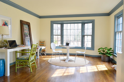
We’re excited to be thinking about the office because it’s one of our favorite full-of-raw-potential spaces in the house (so much space! so much light!). And with the baby’s impending arrival (six weeks!) we’re feeling the urge to consolidate our business life so it’s less likely to infiltrate family time. You know, like making “no more laptops on the diner table” rules. Another example of our completely not-contained work spread is that all of my accounting stuff currently lives in a kitchen cabinet because my desk wall lacks storage (but apparently not holiday cheer).
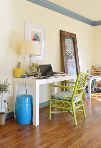
This is a room where we’ll skip the Phase 1 stuff and jump right to Phase 2 (like we’ve done in the sunroom, for instance) because it doesn’t require the amount of planning/saving/splurging that a kitchen or bathroom makeover does (no pricey appliances, new counters & tile, etc) and we’re fairly confident that we can end up with a space that works for us for the long-haul (the kitchen & bathrooms tend to take more percolation time – we’re still changing our minds everyday). Note: There’s more on how/why/when we tend to do Phase 1 updates here.
We actually think this space has a ton of potential to not only be functional, but to be beautiful, thanks to the fact that it’s one of the most light-filled rooms in our house, and it has that pretty bay window in the back.
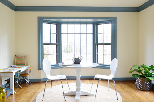
We want the bay window to remain a focal point, since it’s so nicely centered in the room – but we’ve thought it through, and officially nixed the idea of adding a built-in bench seat because:
- we don’t see a bench seat as being super functional for an office
- the window is actually really shallow so it would be a very narrow seat
- it might get in the way of our current Christmas tree spot (is that really my third X-mas mention? Geez) – although I’m sure we could find another tree spot if necessary, so the tree isn’t a deal breaker on its own

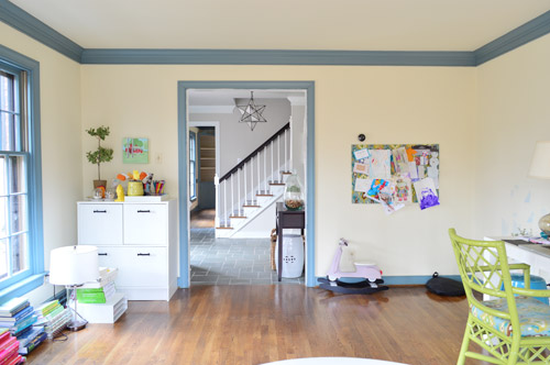
But what the room giveth with the bay window, it taketh away elsewhere. As in, we’ve got some other challenges to work around, like the less-than-centered doorway on the other side of the room. I guess we can only have so much symmetry in our lives…
The front window wall is also great for light, but not so great for furniture placement. Since the windows are so close to the floor, they really make it hard to put anything on that side of the room without blocking a lot of light (and making for a strange view from the street).
With those challenges in mind, Sherry and I brainstormed a list of priorities for our office. Some are just carried over from our last office, but some are new given the larger, more light-filled space.
- Two Desks: Duh, right? Sherry usually works at the kitchen table (more on that here), but we’d love to create a dedicated space in here for her to really spread out. And my small parson’s table could definitely be improved by more space and more drawers. So there’s a lot we can do to improve on this.
- Storage: We don’t have a ton of paperwork, but we’d love to expand our file storage. Mostly to bring in some of the stuff that we have shoved into other rooms – like tax documents and side gig paperwork – rather than having that stuff spread randomly around the house.
- A Big Meeting / Craft Table: We don’t have a ton of meetings here, but we’ve had enough recently (mostly showhouse related) that we’d like to stop having them in our kitchen or dining room. Plus, it would serve the double function of an area for completing/shooting smaller projects (with all the natural light in this room, it’d be a great spot for photography).
- Whiteboard / Pinboard / Magnetboard: We want a nice big wall where we can organize our to-do list, calendar, future project ideas, etc, etc. where we can both see everything. Right now we both keep ourselves organized on our own phones and notebooks, so some communal organization is needed to get us both in the same loop again. We’re not sure exactly what this looks like yet, but we’re already brainstorming a few options that we could implement.
- Doors: Partly because this room seems made for some nice french doors, but also because it would be great to get some added soundproofing in here – especially during conference calls or other times that one of us really needs to concentrate.
- Kid-Friendly Space: It’s been nice to have Clara’s drawing desk in here (so we have the option to “work” together during less intense moments of the day) – so we’d like to create a flexible little area that works for smaller kids but also can transition to work for bigger kids (so it’s not something that we outgrow in a few years).
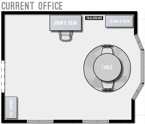
With priorities set, we started floor planning (I took a few new apps for a spin to plan the room, so I’ll share more on those in another post). Here’s a rough representation of the current furniture plan. Yes, it’s pretty sad.
We started by just expanding on our current layout to include the things we wanted and bring things up to scale for the room. We’ve liked having the table centered in the bay window, so maybe just upgrading to a bigger table and some curtains could work? And then we could wrap an L-shaped desk around that corner to give us some built-in desk storage (kinda like our last office) and make room for both of us to sit.
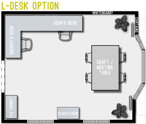
But we weren’t crazy about the corner-desk in that option since it seemed kinda cramped. And since that’s where we’d likely be spending most of our time, it felt weird to not give it more priority in the room – and to take advantage of all the windows by actually getting to see out of at least one of them.
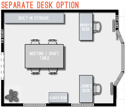
Then we went crazy and tried making the desks “the stars” of the room by keeping them symmetrical with the bay window. The most logical version of this was two separate desks sort of flanking the window. But even that attempt wasn’t very logical because it put one desk right in front of a too-low window (so you’d see the side of the desk from the street) – and it also would require us weaving around the big table every time we wanted to get to our seats.
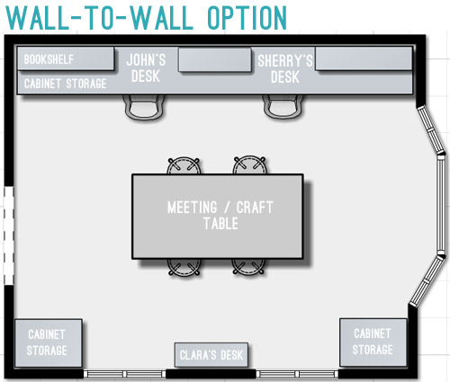
So next we tried mocking up an idea that was actually our original concept for this space. It includes office storage along the entire back wall, with desk areas that are integrated into them. Here’s our inspiration picture, complete with a friendly looking feline.
We originally discarded this idea because we thought it’d screw up the symmetry of the window – which was something we really liked about the room. But as we played around with the floor plan, we realized we could maintain the symmetry by putting something in the bottom right corner too, so the bay window still feels centered. Plus this plan would leave the middle of the room pretty open for a big table, which we could move around – or even move completely out if the need arose. We also could move our laptops to the meeting/craft table to get a nice view out the window if we ever feel too wall-locked at our desks (Sherry currently unplugs and works at the kitchen table everyday, so that shouldn’t be too much of an adjustment).
Update: We’re getting some questions about where the Barnacle will go, but Clara’s desk actually has two chairs and is long enough for two kids (we’ve even had four kids at it if we pull it away from the wall) so it’ll accommodate the bun as well as the bean.
Update #2: We’re also getting questions about window glare from working along that back wall, but John has worked there for the past 9 months without an issue (the sun streams in but the room is wide enough for it to hit the floor about 5′ from his chair – so it’s not up at screen level).
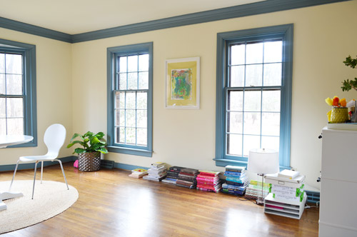
We’re still letting the concept simmer in our heads, but we’re fairly confident that we’ll start heading in that last layout’s direction since it feels like it makes the most sense for the way we work. Although “start heading” involves painting a whole lot of blue trim first (sixty six window mullions to be exact). And it takes four coats… so that’s a whole lot of painting.
What’s on your priority list when it comes to a home office? Do you have a desk tucked into the corner of your den (we totally did that in our first house)? Is there a little work area in your kitchen with a laptop hookup? Or do you have a dedicated home office? Does anyone have work stuff in the bedroom? Growing up Sherry’s dad had a computer and all of his paperwork in there, but that doesn’t seem to be something most people do anymore.

Amanda says
And now I want to redo my home office! :)
I have wall-to-wall bookshelves that I love along one wall and a great desk and reading chair along another. I almost never sit at the desk though. I’m an unplug and work from the couch type of person. The desk is great for storage and gives me a designated place to charge the laptop though so it works for me. Can’t wait to see how your office progresses!
Amanda says
Love, love, love the last option! It is most definitely the most efficient use of the room and gives you so much storage! The other options just seem like you are TRYING to make something work that doesn’t. The wall-to-wall option just feels right. Can’t wait to see the finishes result!
Angie says
For planning we use a web based calender at cozi.com. You set up a family calendar where you can each log in and see/add/change appointments. They even have an app you can download to your phones.
YoungHouseLove says
Thanks Angie!
xo
s
Sherri says
I enjoy reading some of the comments because your readers are totally looking out for you. We all live our design visions vicariously through you! People sincerely care that you won’t be able to look directly out of the window or that your Christmas tree looks too perfect not to be in front of the bay window. Camaraderie in blogland is pretty special!!
YoungHouseLove says
It is, isn’t it?! Best readers ever.
xo
s
Timothy says
i like the second option third option. it makes the most sense to me because the second option to me looks just a little choppy and random and the first option looks like a small cramped desk like you said. although something i was thinking is what if where Clara’s desk is you had a desk come out from the wall that was about 5 or 6 feet long maybe? and you could be on one side and john on the other and you both have a window view and a view of your other half! and its not in front of the window so no downgraded curb appeal. and i didnt think about the rest of the room but i figured you guys appreciate ideas although you already have a good one :)
YoungHouseLove says
That could be fun too!
xo
s
jalbe says
Personally, I’d go for the separate desk option where your backs are against the wall. That way you can see everything that is still going on (keep children in eye view or knowing no one is going to sneak up on you :) ). That craft table idea is great!
Geri says
Hi guys! Option 2 and 3 are great! Great either way! Just wondering what program you use for drawing up your plans. I am sure you have mentioned it before (sorry!). Is it google sketch up or cad? Many thanks!
YoungHouseLove says
John tried out a few floor planning apps, so he’s going to write up a post about those for you guys soon!
xo
s
Nicole S says
I really like the last arrangement, nice choice. Interesting that the desk is going to be a full-wall built in just like the last house.
Maggie says
Throwing another option in the ring… instead of building in the actual desks, what about a wall of shelving with desks *in front* of the shelves (you could even just get a second Parsons desk). You’d have to move Clara’s desk to the bay window to scoot the table closer to the windows, but you’d get MORE storage, and the space would be flexible if you someday didn’t work from home and/or sold to someone who wanted to use it as a formal living room again.
Cause I know you guys need more suggestions ;)
YoungHouseLove says
That’s a fun option too!
xo
s
Leigh says
I can’t wait too see your office progress. Is it sad that I have been really excited for you guys to start working on this space? It is my dream to have an office space in our home. We have a desk in our living room and one in our master bedroom. The one in the living room is supposed to be my space, but my husband tends to take it over most of the time. He works from home and during the day he uses my desk and when we’re all home, he works from our bedroom since he can close (and lock) the door. It’s definitely not ideal hence the dreaming about a home office!
Dennis says
I think the facing desks idea would work really well; it would also be a completely different dynamic than the setups that you have shown so far…
sarah says
Could I just ask, if you know it, what kind of plant is that in the corner opposite Clara’s desk? I love its big leaves and how low and wide it is! Thanks :)
PS. Love the layout you’ve settled on too, and looking forward to your views on the apps you tried.
YoungHouseLove says
It’s a fiddle leaf fig from Ikea! So far I have managed not to kill it. Just needs weekly waterings and a spot in the sun.
xo
s
Sarah says
Thank you! I wonder if I can even find one in England…! The hunt begins.
Sidenote: some of these comments you’re getting really rile me – as always I am super impressed with your restrained, diplomatic responses! ;)
Carly says
I want to curl up on the rug in front of the bay window! (Is that weird? I must be sun-deprived this long winter). Symetry isn’t always great, all the doors and windows in half our house are exactly lined up, so you can see into and straight through if curtains and doors are open.
Marina says
Have you considered combining the craft/meeting table and your desks by using a larger table (double the size of the suggested table)? Creating a huge workspace and using the end of the table by the bay window as your desk space, facing each other? I’m thinking something in the line of this:
http://www.pinterest.com/pin/252131279110363693/
You could paint the desk “section” in a different colour to create a distinct difference between the craftspace and deskspace. And on the back wall both concealed storage as well as open shelving. It’s probably a more stimulating workplace than facing the wall.
YoungHouseLove says
Love that image too! Thanks for the inspiration everyone!
xo
s
Monica says
I like the wall to wall best. And I’m another with lovely, low windowsills. So pretty, but so challenging.
If it were me, I’d expand the doorway opposite the bay for double, centered, french doors.
YoungHouseLove says
We’d love to extend that door but it would cut into the half bath in the hall, so it has to stay where it is.
xo
s
kk says
What software did you use to create the plan?
YoungHouseLove says
John’s planning a post about that since a bunch of folks have asked. He took a few floor planning apps for a spin and took lots of screen grabs for you guys!
xo
s
Courtney Hollander says
These are all so great – it looks like any option will work and be beautiful.
Have you ever thought about using your current dining room as your office? And then opening this room up to your family room eventually?
YoungHouseLove says
We did think about that, but we actually really like a cozy family room (our first house had one and we missed it when our second house had a big room that never felt as quaint to us). So I think we’d rather have a cozy living room as-is (which faces the back of the house for more privacy at night) along with a designated dining room and office.
xo
s
S says
Well I hate working so closely with my husband, so when he’s in the office, I try to stay clear, and do my work when he’s out of the house. But you guys seem to like working together. lol So I’m wondering if you thought of making a big enough desk so that you could be facing each other, rather than side by side or backs facing each other like in the L shaped desk situation.
Also, I love the idea of an “island” in the middle of the room. I think that will serve you well.
YoungHouseLove says
That’s another idea too!
xo
s
Ellen says
Hi Guys!
My two cents (for what it’s worth). Do the L Shape, put a round table in the middle of the room (try it out with the ones you have) and get a futon/couch to put in front of the windows. Then you can lounge while the kiddos work on crafts etc. We are lucky to have a few big windows in our house and I always find I want to sit in the sun when I’m home. You should make it comfy!
Soffia says
Love the last layout!
I wanted to share our home office with you: http://www.skreytumhus.is/?tag=skrifstofa-2
We used the expedit from Ikea as almost “built-ins”, and the Ribba-shelves as a “childrens library” ;)
YoungHouseLove says
That’s a really smart solution too!
xo
s
Erica says
I love your office! I wish I could read the post, though! :-)
Erin says
Have you ever considered getting rid of the wall between the lounge and study… possibly making it a combined open plan dinning/ lounge area and possibly using the room to the left of the front door as your study instead? Coming from Australia where we seem to have more open planned living areas, this makes more functional sense to me. Just an idea. Love your blog by the way!
YoungHouseLove says
We actually did think about that, but we actually really like a cozy family room (our first house had one and we missed it when our second house had a big room that never felt as quaint to us). So I think we’d rather have a cozy living room as-is (which faces the back of the house for more privacy at night) along with a designated dining room and office.
xo
s
Jacqueline says
Hi J&S,
I’m not sure I really like any of these floor plans and I think it’s because I don’t understand the objectives – as in, what tasks or considerations you want to accommodate in this space. I think it’d be interesting to hear more about the custom choices the nature of your business and projects require. I saw your bullets but since this is a phase 2 plan, I expect you to be designing your dream office, and I think your inspiration picture is definitely the thing dream offices are made of – I’d love to know what your dream office looks like!
Are you planning to keep the craft closet in the guest room? That doesn’t make much sense to me with a craft table in the office. Why not make the craft table more of an island with cabinet storage underneath for the paints/supplies you’ll be using on the table? (Or are you planning for that already?) And what will the shelves/cabinetry against the wall contain? Do you want a place for your fabrics, candles, other decor items? Don’t you want a special place for your camera equipment? Do you need a white surface to take pictures up against? Do you need a certain width of table for viewing blueprints/floor plans?
Also, I noticed your plan doesn’t have a placeholder for a large flat screen tv on the wall or larger set of monitors – if you plan to use the office for conference calls – wouldn’t this be a nice thing to have eventually? Having two monitors to project off of is sometimes the only reason I’ll opt not to work from home and host Webex meetings from my office instead. Given a large part of your work is presenting web content, I’m surprised you wouldn’t consider more options that are available these days.
I’m looking forward to hearing more about this space and am glad it’s moved up in your list :)
Best,
Jackie
YoungHouseLove says
We picture this office being a lot like the inspiration image that we referenced, so the craft/meeting table will most likely have supplies right in the base, or they’ll be nearby in the wall-to-wall cabinets. I’ll leave my sewing & gift wrapping stuff upstairs though, since I like the idea of doing that in the guest room without Clara busing in on me. We’ll also use that wall of office storage for decor items, photoshoot props, photography stuff, etc (some of that’s already in our corner storage cabinet). The upper shelves of the built-ins will house books, baskets/bins of office supplies, a few decorative items, etc – and we’re planning to use the craft table as a backdrop for small project photography (John mentioned that in the post, there are just a lot of words to read ;). We’ve sized the table to accommodate blue-prints & large book layouts, and we’ve just never used large monitors before, but if we want to work them in someday the open area above each desk should hopefully work. Of course we’re still in our early planning stages, so I’m sure stuff will evolve as we go, but we’ll definitely keep you posted!
xo
s
Ceri says
My friend recently introduced me to the awesomeness that is your site. I really like the wall to wall option. It has ample space for everyone, and good access to natural light at the craft/meeting table for when you need it. Can I ask, what software do you use for you floorplan layouts? Or are you just a bit of a whizz with Illustrator? TIA!! :D
YoungHouseLove says
John’s actually planning to do a post about that since so many people are asking!
xo
s
Ceri says
I look forward to that post! :D At the moment, I am using Sketchup to plan renovations and layouts. While it’s good to have a 3D idea of how it might look, it’s very clunky to use.
Craig says
I like the long desk but I think the focus of the room is the bay window. The L desk option seems to highlight the bay the best. I am excited to see the end product!
heyruthie says
I know I’m late to this party but I have a question about the meeting/craft table. I apologize if this was already asked in the comments! Here goes: is there a special reason that you need to have 3 tables all on one floor of your house? I don’t mean to be impertinent! I’m just wondering–it seems superfluous to have so many tables all on one floor. I know it’s easy to say, “Well, the kitchen table is for everyday eating, and the dining room table is for special occasions, and the craft table is for crafts,” but I’m just wondering if you could “consolidate” in some way. (Use newspaper on the dining room table, and get to use that room more often? That room seems to just “sit” there, unused, but you use the office all the time, and it looks like it would be a bit crowded with all the many desks/tables.) I’m just wondering!
YoungHouseLove says
That’s definitely a great question! I think after having meetings in the dining room and the kitchen, it just feels weird and not super professional since we work from home full time, so we’d love to use the dedicated office space that we have to create a proper meeting table, complete with doors that we can close off to take care of business. I have thought about making the dining room into more of a casual play space for the kiddos since we have a big dining table in the kitchen, but John thinks that’s not as functional since we work play zones into multiple rooms and we have a big family (so two tables is usually par for the course when we host holiday parties & b-day gatherings).
xo
s
heyruthie says
Awesome! That makes perfect sense–you all really do have special considerations running a business out of your house. It makes sense to have “extra tables!”
Ryan says
As far as a door is concerned, with that off center doorway, a sliding barn door would be pretty cool.
Something like this: http://theturquoisehome.com/2013/11/diy-simple-sliding-barn-doors/
YoungHouseLove says
That’s a fun idea too!
xo
s
Jennifer says
Long time reader but first time to comment. Love the wall to wall option and the inspiration behind it is my dream office. I work some at home mostly after hours. I’m in a 1 bedroom apt and have my couch floating and my desk behind the couch. Both face the window and TV.
The inspiration photo looks to be counter height. Is that something your considering? I’m a fan of counter height but I know it’s not for everyone.
YoungHouseLove says
I think we are leaning slightly towards table height (just so kids can get up there with us more easily, and so we have the flexibility to use regular ergonomic chairs for office, etc) but we’re not 100% sure, so we could sway the other way too!
xo
s
Susan says
Why not do the complete wall of storage but have your desks perpendicular to the wall, face to face? Put the meeting table closer to the Windows and the doorway.
YoungHouseLove says
We have definitely debated two floating areas (facing desks and a meeting/crafting table) but we’re not sure if that will just feel too cramped. I think it’ll be really helpful when we tape things off and try to really picture it!
xo
s
Jacqueline says
SO excited reading your reply and can’t wait to see how it turns out! :)
YoungHouseLove says
Thanks Jacqueline!
xo
s
Tasha says
We have a long desk and love it! We went to lumber liquidators and purchase a wood butcher top counter. The hubby stained, added clear coat, and used hairpin legs. :)
YoungHouseLove says
Sounds gorgeous!
xo
s
Erica says
I can’t wait to see what you come up with. I love rooms with tons of light- the 3 windows in my kitchen are some of the reasons I fell in love with my house. :-)
I desperately need a home office makeover! My current “office” consists of a yucky desk shoved into the corner of my spare bedroom/craft space/office space room. The computer sitting on top if it is currently broken, too. I just started my own business with Pampered Chef, so I really need a good place to keep my stuff without it being spread out all over the house. Which it currently is. :-) I need some good storage space! I really want a white Parson’s desk, but I can’t afford one right now. :-( So I will just make do with what I have!
Erica
Megan says
My first comment is really a question! Do you guys use an app or just photoshop (well beyond me) to plan out room configurations? I’m looking for a personal project and would love to know! Thanks a lot.
PS – You guys are awesome! I got turned on to your blog a few months ago and enjoy it so much. Keep doing exactly what you do!
YoungHouseLove says
Aw thanks Megan! John actually tried out a bunch of floor planning apps so he’s planning a post about them for you guys!
xo
s
Adrienne says
I think the idea of the desk against the well is the best. Also if you get the table at the same height as your desk then you can use it as a T desk if needed so you can see what’s laid out and not need to move computers. Have you considered adding a another chair in the corner for nursing? With both my kids it was nice to have a comfy chair to feed in and still be able to work/chat/bounce ideas.
YoungHouseLove says
Someone else has suggested that and it sounds awesome! I definitely think John and I are on board to add a comfy chair into the mix – and it’ll take away from the “rectangles on lots of walls” thing too!
xo
s
Steph Nelson says
Whoa~ lots of comments~~ :)
I would spray that blue trim! Plastic off the doorway and send John in there! I saw on rehab addict some stuff you paint on window glass that peels right off when you are done painting. Might be worth looking into to save sanity.
YoungHouseLove says
Someone else mentioned that! It’s definitely tempting us! Might have to give it a try. I’ll just be holding my breath that we don’t hurt our wood floors! I’m going to tape & paper like my life depends on it.
xo
s
rachel says
I’m sure you’re just going to skim my comment and respond with, “That could be a fun idea too!” :) But here’s my idea that I think you should seriously consider.
I know you think you can’t have/wouldn’t use a window seat at the bay window, but you may want to rethink that. If you put built-ins on either side of the bay window, that would effectively make the bay window area deeper by 12 to 18 inches. Voila — a deeper window seat! You could put file drawers on the lower parts of the built-ins for document storage and cabinets on top so that the bay window remains the focal point and our eyes aren’t distracted by tchotchkes on shelves.
And the window seat area itself could actually be extremely functional! You could build a couple deep/wide drawers under the window seat that could be used for files, craft supplies, or even toys for your kids. And I can imagine that Clara would love to sit on the window seat to play… unless Sherry is sitting there with her laptop responding to blog comments!
YoungHouseLove says
Thanks Rachel! We’re not only reading, but rereading every comment together later to consider every last idea. We definitely thought about adding something to those bay window sides to beef up the depth of the window seat and add storage along that wall, but we keep coming back to how much we like the Christmas tree tucking in there – and in general how we like that window open and flexible. So a meeting table (especially on casters) just feels a lot more movable/adaptable than something that’s fixed/installed back there. John really feels like we’ve packed a ton of must-haves in here already (meeting spot, photography surface, crafting area, work space for two, kid space for two, brainstorming area) – and as much as I love a window seat, I have to agree that leaving the lounging/reading for rooms like the living room and the bedrooms seems to make sense so this office doesn’t turn into a room full of stuff on every wall. Who knows where we’ll end up though. Perhaps once we tape everything off to picture it we’ll have a giant change of heart!
xo
s
rachel says
I would strongly caution you against designing your home office around a Christmas tree. A window seat would add charm, interest, and beauty (and would still be a perfectly suitable backdrop for your Christmas tree if you insist). And you don’t have to give up the craft/meeting table idea in exchange for a window seat. You can have both! I guess I’d just encourage you to keep working on the design of the office. In your final design you showed, there really IS something on almost every single area of the wall, which is something you said you wanted to avoid.
Also, if you know you have a problem with clutter, adding more desks and tables may not be a wise move. You’ll never solve a clutter problem by creating more surfaces. The solution is to work on being more organized! I know you THINK you’ll keep that craft/meeting table clutter-free so that it’s always ready for a meeting, but if you struggle with clutter, that meeting table will just be one more surface to clutter up.
Sorry if it sounds like I’m lecturing you — I just think this room has so much potential to really work for you AND look good, so I’m just trying to help!
YoungHouseLove says
Thanks Rachel! We truly appreciate everyone’s thoughts. Even John and I aren’t 100% on the same page (we’re going back and forth on a few things) so whenever we land on something that we both love we’ll make a move, and not a moment sooner. I can completely see how a window seat would add charm and it definitely sounds like you’d choose to add one, but John is certain that it’s not the most functional choice for our family, and I have to admit that I’m with him (not only for Christmas tree reasons, but the others we mentioned). We’re rethinking other layout tweaks though – and will continue to mull, debate, and re-mull while we work on the blue trim. That should buy us some serious thinking time!
xo
s
Amanda says
I love the wall-to-wall option. Which is what I pictured when I first saw the room and you said it was going to be the office! Which is very similar to your old office, but it seemed to work well. I LOVE LOVE LOVE your inspiration picture. It’s awesome! I think rather than have spaces for your “desks” you should put the bookshelves up a bit higher but all the way across so it doesn’t feel cut off and is consistent (similar to the inspiration folder). Does that make sense?
YoungHouseLove says
Yes, we were thinking about that too! Maybe with lights running along the top? Still pondering…
xo
s
laurel says
I am so excited for this room! I understand that it’s the room that needs to be the most functional and well thought out, so I get that the planning stages are so important! It makes sense that you guys waited and really thought it out over time. I love the third option! I think your inspiration image is so beautiful as well! I cannot wait to see what you guys do! I did have one thought on a detail though. Since the symmetry of the room is almost there, you might consider putting bookshelves/storage over the cabinet storage you’ve located across the room from your desks. It would balance the look of the storage across the room and maintain the same profile. I love the idea of the planning/white/pin board filling out the rest of the entry wall! Smart to hide the clutter in planning. I think above Clara’s desk you need a big dynamic piece of art that you’ll love looking at everyday! Something fun, a conversation starter in all these meetings perhaps?
YoungHouseLove says
Thanks Laurel! I’d love to add some height on the other side as well for balance. I think over the kids desk we’ll do a giant bulletin board for bun and bean art!
xo
s
tosha says
totally digging the wall-to-wall option – I think it will keep the room feeling bigger and will present well from the hallway to have a central table. So excited to see what yall choose!
Megan says
I’ve noticed in a lot of your house 3 posts that it’s taking you four coats of paint to get good coverage over the blue trim. Have you thought of trying BM’s Aura paint on the trim? When we bought our current house our family room was dark royal blue everywhere, including trim, and we painted it white in just two coats with perfect coverage and surprisingly thin paint layers.
YoungHouseLove says
Wow, that’s awesome! We use BM Natura, so maybe Aura is thicker? This time we’re finally leaning towards taping everything off and spraying though. 66 window panes are too many! Haha!
xo
s
Maggie says
Whiteboard as tabletop!!
YoungHouseLove says
That’s a fun idea too!
xo
s
HMC says
We have a narrow sunporch we turned into an office off our Master. We did a wall to wall desk on a long wall like yours with his and her cabinets and we LOVE it. It’s 16′ long and windows all along the desktop. The room is only 8′ deep so it’s pretty efficient and have low file cabinets along the back wall, where french doors also are. Good luck!
YoungHouseLove says
That sounds awesome!
xo
s
Amy @fordgredial says
I love the separate desk option but why not spin them 90 degrees and face each other?
Amy x
YoungHouseLove says
That could work too! In the layout it looked strange to have three desks all running vertically in the room (sort of like a movie theater with varied rows of seating) but we’re hoping to tape things off on the floor to picture them and really mull things over before pulling the cord!
xo
s
gina says
I didn’t read all the comments so don’t know if this was discussed but you could totally make something like this to meet your needs.
http://knockoffdecor.com/wp-content/uploads/2013/06/pottery-barn-bedford-desk.jpg
YoungHouseLove says
Very pretty!
xo
s
Elaine W says
Hi Sherry and John,
Being a woman of great age and experience, personally I would go for door number 3, the last one. We are getting ready to build our retirement home and an office is one of the things we are going to need. In our current home we lack space for storage and this new home we’ll make sure we have it. I just think it would be more functional. Good luck on your decision.
Amy says
I love the wall-to-wall option for it’s built-in look leaving the rest of the office open. Plus, that table is in a great spot for moving your laptops to when you need a change of scenery.
Christine says
Option 3 is definitely the best use of space, and I know you guys will do something great with that big wall! I think it also provides a little separation between your work space, and the kids workspace. The others felt a little choppy, and this one has a nice open concept that will be sure to provide plenty of work space, and has a natural flow.
We have a dedicated home office in our house, but it’s much smaller than yours, maybe 8×10, or 10×10? It has these great built ins on the back wall with a window right in the middle. It was a huge bonus feature when we looked at the house and I really enjoyed the thought of having a dedicated place for all those grown up things like bills and taxes, etc. It has been a life saver in keeping paperwork from filtering into the rest of the house!
Amy J. says
If you are building/hacking your craft table, I think it would be amazing to have outlets for laptops/glue guns/etc. underneath/on a table leg, maybe just a power strip that has been installed, and run the cord under a rug or something. Then, no hazardous laptop cords being yanked out when someone trips over them (speaking from way too much experience).
YoungHouseLove says
Ooh, that would be amazing! Although I think if we have outlets in the actual table/base it wouldn’t be as easily movable as something on casters that we could change up and move out if need be. Something to think about though!
xo
s
jeannette says
love to hear your considerate and painstaking thought processes. i know i’d feel crowded jammed against the short wall. may sherry needs less S P A C E than i do in a workspace.
that said, i’m still stunned by the enormity of your williamsburg blue woodwork thruout the house. whoa.
Ana says
Is that the last of the blue trim?!
I’d love an updato of your McListy, you’ve done so much progress since the last time you posted it.
YoungHouseLove says
Oh yeah, we owe you guys an update! Sadly we still have blue trim in the dining room too (along with lots of blue molding and corner built-ins), but we’re just down to two rooms and it used to be throughout the house, so we’re getting there!
xo
s
Lise-lotte says
Hi
We all know how you love your built ins, and they are lovely, but if I had what you have *, I would go for a face-to-face desk /turns conference table when needed in the centre of the room. Maybe something like this: http://www.flickr.com/photos/beachbrights/6083916080/
Or why not in the shape of a grand piano?
(* what you have is a beautiful room and a good looking colleague to be face to face with. )
YoungHouseLove says
We love the face-to-face desk idea, but also think we need a separate meeting/craft table (our desks are always cluttered, so a spot that’s clear and ready for meetings/crafting/photography without needing to clean our desk every time to change the function is ideal). So we’re not sure if two floating tables/desks are too much for the room – but we’re definitely still pondering!
xo
s