It seems our excitement for the plans that we’ve been cooking up for the showhouse office has spilled over to our own office. Well, that and the fact that ours is looking pretty sad lately, having recently pilfered both its armchair and Expedit for the nursery. It doesn’t help that our chalkboard still says “Merry Christmas” on it. So basically, yeah, this office screams “I’ve got my ish together.”
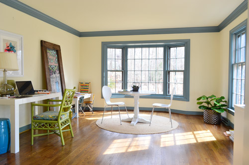
We’re excited to be thinking about the office because it’s one of our favorite full-of-raw-potential spaces in the house (so much space! so much light!). And with the baby’s impending arrival (six weeks!) we’re feeling the urge to consolidate our business life so it’s less likely to infiltrate family time. You know, like making “no more laptops on the diner table” rules. Another example of our completely not-contained work spread is that all of my accounting stuff currently lives in a kitchen cabinet because my desk wall lacks storage (but apparently not holiday cheer).
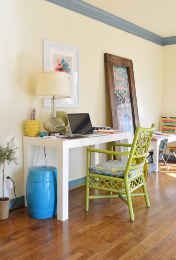
This is a room where we’ll skip the Phase 1 stuff and jump right to Phase 2 (like we’ve done in the sunroom, for instance) because it doesn’t require the amount of planning/saving/splurging that a kitchen or bathroom makeover does (no pricey appliances, new counters & tile, etc) and we’re fairly confident that we can end up with a space that works for us for the long-haul (the kitchen & bathrooms tend to take more percolation time – we’re still changing our minds everyday). Note: There’s more on how/why/when we tend to do Phase 1 updates here.
We actually think this space has a ton of potential to not only be functional, but to be beautiful, thanks to the fact that it’s one of the most light-filled rooms in our house, and it has that pretty bay window in the back.
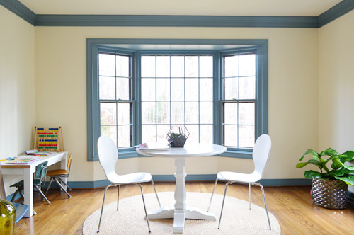
We want the bay window to remain a focal point, since it’s so nicely centered in the room – but we’ve thought it through, and officially nixed the idea of adding a built-in bench seat because:
- we don’t see a bench seat as being super functional for an office
- the window is actually really shallow so it would be a very narrow seat
- it might get in the way of our current Christmas tree spot (is that really my third X-mas mention? Geez) – although I’m sure we could find another tree spot if necessary, so the tree isn’t a deal breaker on its own

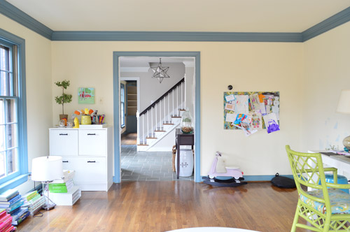
But what the room giveth with the bay window, it taketh away elsewhere. As in, we’ve got some other challenges to work around, like the less-than-centered doorway on the other side of the room. I guess we can only have so much symmetry in our lives…
The front window wall is also great for light, but not so great for furniture placement. Since the windows are so close to the floor, they really make it hard to put anything on that side of the room without blocking a lot of light (and making for a strange view from the street).
With those challenges in mind, Sherry and I brainstormed a list of priorities for our office. Some are just carried over from our last office, but some are new given the larger, more light-filled space.
- Two Desks: Duh, right? Sherry usually works at the kitchen table (more on that here), but we’d love to create a dedicated space in here for her to really spread out. And my small parson’s table could definitely be improved by more space and more drawers. So there’s a lot we can do to improve on this.
- Storage: We don’t have a ton of paperwork, but we’d love to expand our file storage. Mostly to bring in some of the stuff that we have shoved into other rooms – like tax documents and side gig paperwork – rather than having that stuff spread randomly around the house.
- A Big Meeting / Craft Table: We don’t have a ton of meetings here, but we’ve had enough recently (mostly showhouse related) that we’d like to stop having them in our kitchen or dining room. Plus, it would serve the double function of an area for completing/shooting smaller projects (with all the natural light in this room, it’d be a great spot for photography).
- Whiteboard / Pinboard / Magnetboard: We want a nice big wall where we can organize our to-do list, calendar, future project ideas, etc, etc. where we can both see everything. Right now we both keep ourselves organized on our own phones and notebooks, so some communal organization is needed to get us both in the same loop again. We’re not sure exactly what this looks like yet, but we’re already brainstorming a few options that we could implement.
- Doors: Partly because this room seems made for some nice french doors, but also because it would be great to get some added soundproofing in here – especially during conference calls or other times that one of us really needs to concentrate.
- Kid-Friendly Space: It’s been nice to have Clara’s drawing desk in here (so we have the option to “work” together during less intense moments of the day) – so we’d like to create a flexible little area that works for smaller kids but also can transition to work for bigger kids (so it’s not something that we outgrow in a few years).
With priorities set, we started floor planning (I took a few new apps for a spin to plan the room, so I’ll share more on those in another post). Here’s a rough representation of the current furniture plan. Yes, it’s pretty sad.
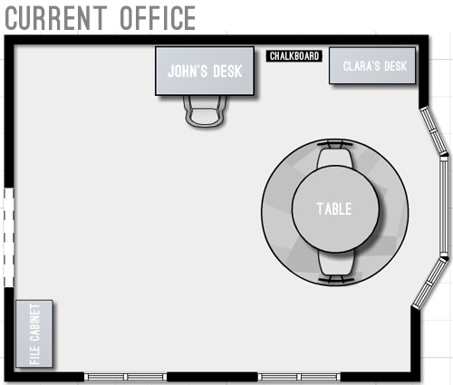
We started by just expanding on our current layout to include the things we wanted and bring things up to scale for the room. We’ve liked having the table centered in the bay window, so maybe just upgrading to a bigger table and some curtains could work? And then we could wrap an L-shaped desk around that corner to give us some built-in desk storage (kinda like our last office) and make room for both of us to sit.
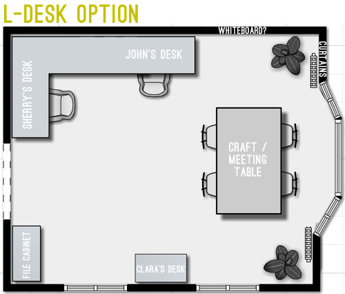
But we weren’t crazy about the corner-desk in that option since it seemed kinda cramped. And since that’s where we’d likely be spending most of our time, it felt weird to not give it more priority in the room – and to take advantage of all the windows by actually getting to see out of at least one of them.
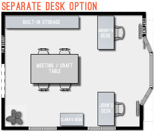
Then we went crazy and tried making the desks “the stars” of the room by keeping them symmetrical with the bay window. The most logical version of this was two separate desks sort of flanking the window. But even that attempt wasn’t very logical because it put one desk right in front of a too-low window (so you’d see the side of the desk from the street) – and it also would require us weaving around the big table every time we wanted to get to our seats.
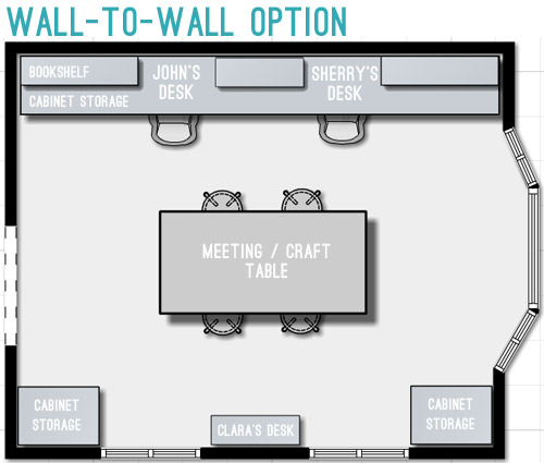
So next we tried mocking up an idea that was actually our original concept for this space. It includes office storage along the entire back wall, with desk areas that are integrated into them. Here’s our inspiration picture, complete with a friendly looking feline.
We originally discarded this idea because we thought it’d screw up the symmetry of the window – which was something we really liked about the room. But as we played around with the floor plan, we realized we could maintain the symmetry by putting something in the bottom right corner too, so the bay window still feels centered. Plus this plan would leave the middle of the room pretty open for a big table, which we could move around – or even move completely out if the need arose. We also could move our laptops to the meeting/craft table to get a nice view out the window if we ever feel too wall-locked at our desks (Sherry currently unplugs and works at the kitchen table everyday, so that shouldn’t be too much of an adjustment).
Update: We’re getting some questions about where the Barnacle will go, but Clara’s desk actually has two chairs and is long enough for two kids (we’ve even had four kids at it if we pull it away from the wall) so it’ll accommodate the bun as well as the bean.
Update #2: We’re also getting questions about window glare from working along that back wall, but John has worked there for the past 9 months without an issue (the sun streams in but the room is wide enough for it to hit the floor about 5′ from his chair – so it’s not up at screen level).
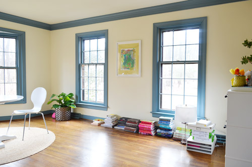
We’re still letting the concept simmer in our heads, but we’re fairly confident that we’ll start heading in that last layout’s direction since it feels like it makes the most sense for the way we work. Although “start heading” involves painting a whole lot of blue trim first (sixty six window mullions to be exact). And it takes four coats… so that’s a whole lot of painting.
What’s on your priority list when it comes to a home office? Do you have a desk tucked into the corner of your den (we totally did that in our first house)? Is there a little work area in your kitchen with a laptop hookup? Or do you have a dedicated home office? Does anyone have work stuff in the bedroom? Growing up Sherry’s dad had a computer and all of his paperwork in there, but that doesn’t seem to be something most people do anymore.

Nicole D says
Definitely looking forward to hearing about those apps! Currently starting planning for a small house build and graph paper just isn’t cutting it!
Kati @ This Wandering Life says
Hee hee one more comment on this mega post! Did you guys answer the question of what about doing only the floating desk in the middle, and no two other dedicated desks? Then havnig storage around the sides of the wall somewhere, but that way you could face whatever direction you felt like. I know you’re going to re-do the floors, you could put an in-floor outlet beneath it if you built it in like an island. Just a weird idea. Excited to see where it ends up!
YoungHouseLove says
We really feel like we need a dedicated desk/charging area because it gets really cluttered up with lists and receipts and stuff (we’re not neat desk people) and we always want the craft/meeting table to be clean (it would save us so much time not to have to also make that a desk and then clean it off every time we want to photograph something or do a small project or have a meeting).
xo
s
Chetna says
I second the idea of a standing desk or conference table. It takes time to get used to, but I found that my back problems were lessened and my posture was better. It’s probably less of a concern for you since you don’t sit at your desks 8 hours a day, but it’s something to think about.
Joan says
There are about 30 people who have asked which program you used. Why are you keeping it a big secret? He can still do a post about it, but it seems like kind of a neener-neener-we’re-not-telling kinda move to not share that information when people ask for it.
YoungHouseLove says
Really? John mentioned that he’s writing a post about the various apps that he tried right within the post – and I feel like we say “there’s a post coming all about that!” a lot when we get a common question that we’re planning to address. In this case, John used a combination of floor planner and two apps that I honestly don’t know the name of, and one worked somewhat well and one tanked, so he’s the man with that info and I couldn’t relay it if I tried. Sorry if it sounded like we had some giant floor-planning secret though!
xo
s
Caren says
I loved option three, but after reading the comments I’m kind of digging the island idea. A three piece island on casters made up of a table and two facing desks would be super flexible. For meetings you could just push the messy desks out of the way and move the chairs around the table. Since it’s one big unit, it wouldn’t crowd the room like separate floating areas.
Such a pretty room – can’t wait to see how things turn out!
ali thompson says
the last option looks gorgeous and seems to have the best flow, storage, meeting option. go for it!
Denise Armbruster says
I am drooling over the amount of light that you have in that room. If it were mine, a photography studio would be set up pronto!!!
Mimi says
I hope you go with the wall to wall option. I think it is the best floor plan of the 3!!
~~~~~Mimi~~~~~
Sydney says
After reading one of your posts about painting your window trim I was watching an episode of Rehab Addict. To paint some outside window trim she bought some sort of stuff she painted directly onto the windows before painting the trim and then when she was done she just peeled it off of the windows. It was pretty neat. Not sure where you get it, what it’s called or how stinky it is, but it may be worth looking into before you start hand painting all that window trim, then you could spray them like the rest of the trim.
YoungHouseLove says
Thanks Sydney! We tried to track some down and it’s around 40 bucks and has to be ordered (wish our Home Depot had some – and for cheaper) since it looks awesome to try!
xo
s
Barbara L. says
still loving your blog…
I like the wall to wall desk plan the best..
looks cleaner…no mess showing from door…
your home is looking great
Shannon says
I like the last option, but also thought of another alternative that would be beautiful – and maybe look less office-y when you walk in. What about a wall of built-ins on the long wall with a large dining-type table floated in front of it that you work at with your laptops? You could add a couple of chairs and small table in the bay that could be pulled up to the big table if needed for meetings. Then you’d face the front windows and the kids’ desk. Everything with wires could be housed in the built-in (even charging stations for the laptops). That way could still very easily use the room as an entertaining space (think parties, not so much family dinners) if needed.
Something kind of like this: http://cdn.freshome.com/wp-content/uploads/2013/09/formal-dining-room-turned-office.jpeg
or this: http://2.bp.blogspot.com/-qzaZ2JWNdAE/UGXZ_iRa50I/AAAAAAAABd4/K_Zt74B35jc/s400/ins+5.jpg
Just a thought. Excited to see the end result!
YoungHouseLove says
Love those ideas! We’d still need desks that are seperate from the meeting/craft table since we don’t want to clear our desk clutter for every craft session /photography project /meeting, so we’ll have to see if there’s room for two things to float!
xo
s
deb says
I like the long wall-to-wall idea, but I think the bookcases between the desk areas would make you feel hemmed in while at your computers. What about no bookcases on top, and all storage below? The upper space could be perfect for white board and art. Or perhaps you could do something like in the Pinterest photo, wherein the whole wall is storage, and a large chunky table in the middle could work as your work spaces. You could then move your laptops when the table is needed for crafts/photo shoots/meetings.
I don’t have a designated work space. The papers stay in one spot, but my laptop and I move all around the house (but somehow never make it to the bedroom).
YoungHouseLove says
Love that too. Thanks for all the ideas everyone!
xo
s
Briel K. says
I definitely like the last option the best. It seems the most balanced and looks the best for the space. Can’t wait to see what you come up with!
Mary says
My husband and I both have home offices – separate rooms! I started first years ago when we still had a child home. I took the extra bedroom for privacy and to be able to “leave” it at the end of the day. I couldn’t take facing a wall so my desk is an L into the room. I look out into the room. My husband took the front room of the house (would have been a formal living area but seldom used). He has a wall of built in bookcases and filing system with his desk floating in the middle.
I like your full wall option for the storage solution but if the space allowed I’d place a small rounded L at each desk so the user doesn’t face the wall – John’s back would be to the wall and Sherry’s to the bay window – with you facing each other. We also like multiple monitors and chairs built for daily use of computer tasks since we spend so much time online.
Can’t wait to see your finished room – good luck with all the painting!
YoungHouseLove says
Thanks for the ideas Mary!
xo
s
Kara says
Loving the wall to wall layout! Seems like the most feasible as you have more storage, more symmetry, less space eating up the floor and you can still move your conference table to wherever you please and have lots of access to the bay window. Love your home! Such a blessing to have a space (and lots at that!) all your own. :)
Carrie says
What app do you use for the room layouts? I’m struggling with the layout of my living room and would like a good app! The online thing I’ve tried doesn’t cut it for me.
YoungHouseLove says
John has a post planned with all those details for you early next week! It was a combo move (floorplanner plus he tried a few apps with varying success) so he hopes to share all the details and screen grabs soon for ya!
xo
s
Megan Frank says
If you opted for the seperate desk option, you could squeeze a plant or something between John’s desk and the window. Then it might look okay from the outside view. You’d lose a little space in the middle by scooting over for the plant, but maybe it’d be a nice compromise.
YoungHouseLove says
Another idea to consider. Thanks guys!
xo
s
Megan Frank says
Ultimately though, I think in terms of friendliness for Christmas tree time, the wall-to-wall seems best.
Susan says
I can’t wait to hear about the floor planning apps you tried. I’ve been looking for a good one!
Rocky says
I like the last layout, it’s similar to what my husband and I have done in our shared office. Have you thought of using layout 3, but rotating the craft table 90 degrees and placing it between your desks? It would end up being a T-shape.
I saw this layout in a few inspiration photos and thought it was a great idea. Just a thought, can’t wait to see what you do.
P.S – I just finished repainting our entire houses baseboards, door trim and 40 window mullions with two coats of paint…it is by far one of my most hated jobs. I’m sorry in advance. Books on tape and a steady stream of good music helped me through it.
YoungHouseLove says
Oh my gosh, that painting sounds crazy! Congrats on getting it done! And thanks for the T-shaped tip. We will definitely give that a try too!
xo
s
Brittany says
wall to wall for sure!
Nicole B says
LOVE the final layout!! You are guys are going to make it so awesome!! Can’t wait! And holy cow on painting those windows! Wish I could come over and help. But I live in Washington. The state. :)
YoungHouseLove says
Come on over! Haha!
xo
s
Alison says
We converted our formal dining room to a home office with something similar to the separate desk option and have been very happy with the layout. Some benefits that come to mind include that we have declared the area behind the desks kid free to the best of our ability, and sometimes a multitasking chair gets put on the opposite side of the desk from where I am working and one of my kids sits across from me and colors etc.
Emily @ Life on Food says
I like the third layout. It seems to be the most balanced and have the most working space. Right now our desk is in a corner but I would love a larger working space.
Tara says
I love the third option. It just seems so balanced and nice. I cannot wait to see what you guys do. This also is inspiring me to do something a little more permanent in my office/art studio. I really love your blog and I look forward to your posts because you always get me thinking :)
Rebecca says
I’m kind of psyched to see the design you chose, because as I was studying your “current layout” picture, I was thinking that a big long desk along that back wall and a floating table for meetings would look really nice and be super functional. Maybe one day I’ll actually be able to design a nice-looking home! ;-)
Karen Schravemade says
I love your final choice – I think the layout looks perfect! Can’t wait to see how it turns out. One thing’s for sure, it will look amazing, as all of your projects always do!
I have an office nook right off the kitchen, in the walkway really. That design wouldn’t be for everyone, but I’ve absolutely loved the convenience of having my work space right in the heart of the home. I’ve actually just finished making it over and posted a few shots on the forum. So happy with how it turned out!
YoungHouseLove says
That’s awesome Karen! Congrats on getting ‘er done!
xo
s
CONNIE says
I’d choose The wall-to-wall option. totally would make that uneven door opening appear more symmetrical. Leaves the bay window along also, so it won’t interfere with the Christmas tree.
Meire says
Hi guys, all options seem interesting but the third one is my favorite. I really like the way you distributed the storage areas in the room. We just bought a fixer upper and we are fairly new to everything related to construction.I was wondering, which program do you use to create these floor plans? It seems very helpful in the renovation process. Your blog has been extremely helpful in our process, especially your post on removing carpets.
thank you.
YoungHouseLove says
Thanks Meire! John used Floorplanner in combination with a few new phone apps. I don’t know the names or the details on those, but he’s planning to write a post all about that soon!
xo
s
Tara says
Testing testing 1-2-3
Tara says
Problem solved! Anyhow, the comment was, You have inspired me by this post to get working on my office! Also, I love option 3 above.
YoungHouseLove says
So glad it’s working now! And good luck with your office :)
xo
s
Danielle says
My priority is 100% storage. Since I’m lazy about putting things away, it has to be as easy to store something as it is to stew the items about the room. Once storage is maximized I can live with everything else.
Heidi says
Hmmm… what about french POCKET doors? http://www.pinterest.com/pin/150729918753236614/
Or… a sliding barn door? http://www.pinterest.com/pin/96545985732381355/
Then my house will truly be envious :)
YoungHouseLove says
That would be amazing!
xo
s
Amy says
I like the separate desk option. Mostly because the chairs are on the backside of the room and you face out. I finally rearranged my office because my son told me he only saw my back all the time. :-(
Charlene says
I love the last option for the whole wall. I work from home and my office is in the bedroom. at first I loved it. my desk is under a high window (live on the 1st floor condo half underground) only spot to put it. its in a nook. but now I want a separate spaces. A place to relax and a separate place for work. We are moving this summer so im looking forward to find a place with a spare room. Or bigger living room. Right now its 3 adults with computers. But handy thing is my husband monitor is a tv too so that saves space… just needing to build a smaller computer tower to hide in the tv stand. What ever your out come of your office its going to look great! You guys have awesome taste!
YoungHouseLove says
Aw, thanks Charlene! Good luck with your move!
xo
s
Christine aka The Stampin' Ninja says
Hi Petersiks!
As usual, there are so many pluses to all three of your concepts; genius I say, pure genius. That said, I’m not embracing the second option as much, the separate desk option, only because the two of you are SUCH the team – that’s what I love most about you two! Sure, I guess it’s “just” desk placement but the two of you work so well together that I think we should keep your work spaces connected to keep that energy easily flowing between the two of you (not to mention simply making it simpler to check out something the other is doing without having to get up & cross the gap between your two desks in option B) Lol! But that’s just my totally “naive/complete wanna be DIYer” opinion though… ;0)
Hugs,
Christine aka The Stampin’ Ninja
YoungHouseLove says
Aw, thanks Ninja Christine!
xo
s
Emily G. says
I apologize if it’s been said already, but you may want to consider a rounded table (or at least, rounded edge) for your center-of-the room table. Not only does it flow more smoothly, but with little children, they’ll be less likely to bang their heads on the corners as they run around/play/toddle in there. Looks like you have a great concept otherwise! Can’t wait to see it!
YoungHouseLove says
Thanks for the tip Emily!
xo
s
Anto says
Hi, have you seen this option for the pinboard/wall planner?
http://www.designsponge.com/2013/06/biz-ladies-profile-lucy-feagins-of-the-design-files.html
btw I’m all for the wall-to-wall solution :-)
YoungHouseLove says
Love it all! Thanks for sharing the link!
xo
s
Scott says
Shoot, I used John’s image to create a mock-up but now realize there is no attachment option.
I am a fan of windows and seeing the outside as much as possible. My mock-up had two desks (like “Separate Desk Option”) but facing the window. John’s desk is between the 2 front windows (touching the trim of the left window). Kids table could be to the right of the front window. Storage along the entryway wall behind you. NEW PROJECT TIME – the craft/meeting table could be something you custom make. A table with casters and a “long-ways leaf”. The table would live along the wall in front of Sheri’s desk. It can be moved to the center of the bay window for meetings and photo shoots. That way there is a lot of space for the 3 kids to play on a rug in front of the window.
YoungHouseLove says
Ooh, just upload it to pinterest or flickr (free, set on public) and then link to it. We’d love to see it!
xo
s
Scott says
I’ve never used flickr so let me know if this image doesn’t display for you.
https://www.flickr.com/photos/36079443@N06/13066495924/
Casters and a “long-ways leaf”…I’m sure that’s the industry term for that :)…could make that table less in the way when not in use. Maybe make the not shown seating a bench so it can be stored under the table when not in use too?
Probably won’t matter since you guys are great at making stuff awesome but I realized a table in the center of the office would mean 3 of the 3 rooms you see from the foyer will have a table in the center of it.
YoungHouseLove says
Thanks Scott! That’s a really fun idea too. Will have to show John and see what he thinks!
xo
s
Maria says
Would a 2-person desk like this one work on the wall between the 2 windows, so you both could face each other but each would have a window to look out of on the side too?
http://www.ballarddesigns.com/tuscan-double-pedestal-desk/furniture/category/home-office/desks/270882
YoungHouseLove says
Ooh I love that! Thanks for sharing the link!
xo
s
Maura says
I’d love to see a post about how to bring style to a work office. Did you do anything back in the day before working from home to bring a little pizazz to your company-provided desk. Cubicle crashing, anyone? :)
YoungHouseLove says
That would be fun!
xo
s
Kate H. says
Hi Sherry & John, love the plans in the making for the new office space … it just needs a few poufs!! Then you guys have an easy, fun, modern and colorful way to rest your feet … and Clara and baby #2 have a new chair and toy, too! :-)
Michaela says
Where did you get the white table that you were using a desk in the office? I was scrolling through old posts but couldn’t find it!
YoungHouseLove says
That’s a parsons table from West Elm about 7 years ago (was a wedding gift from my best friend Cat). It was my desk in our first house :)
xo
s