Paint can pretty much be chalked up to a learning experience around Casa Petersik. From painting all of our home’s trim with flat paint right after we moved in (baaad idea, use semi-gloss!) to picking a different color of the rainbow for each room (not the way to make a small house flow!) we’ve pretty much made every mistake in the book. And over the last almost-four years our walls have definitely “evolved” as we learned what we liked (and a whole lot of what we didn’t).
We decided to use a handy little floor plan (created thanks to Floorplanner) to demonstrate three “stages” of our home’s ever changing color scheme to show that homes don’t usually “magically come together” overnight. Sometimes it takes some experimentation and a bit of repainting (and repainting again) to get ‘er done. But with every little change that you make you’ll be inching towards the home of your dreams- and just like the right dress can theoretically make you look slimmer and bring out your eyes, the right wall color really can turn any house into a dream home (all for about $30 a room and an afternoon of your time).
Here’s what we meant when we mentioned that we picked nearly every color in the rainbow for our house’s original color scheme right after we moved in…
Color Scheme: THEN

From an orangy-yellow in the den to an easter-egg-ish pastel green for the living room, our choices really ran the gamut. And we even went with a bright robin’s egg blue for the third bedroom (which was formerly the dining room) and the half bath. Of course looking back those were odd choices for two of the smallest rooms in our house. In short: when this color scheme was in effect, it felt like you were entering a different house every time you stepped into a different room instead of feeling like there was an overall cohesion and flow to our modestly sized ranch home.
The funny thing is that the only color that we chose to use twice was the bold turquoise color in the 3rd bedroom and the 1/2 bath. Now we understand that in a small house you want continuity and rooms that feel like they flow- and not like they’re chopped up with different color schemes- so we routinely repeat colors or slide a shade or two darker or lighter to keep things feeling related throughout our entire home’s floor plan. Then we chose to repeat the soft blue-gray bedroom color in the kitchen while keeping the rest of the house subdued and neutral, and stood back and admired how the creams, sandy tans, and soft gray-blues worked together to create spaces that felt varied and interesting without evoking that chaotic and unrelated vibe.
Color Scheme: MIDPOINT

Only our bedroom and the sunroom escaped the repainting spree that took us from the “then” paint color breakdown to this “midpoint” diagram above. And while it may not look exciting on screen – it totally made the house feel bigger, more connected and a lot more grown up. What we had done was accomplish a more toned down and agreeable whole house palette, but we still ached for something a bit more interesting and textural (nothing too high contrast, but just a few unexpected paint color applications to keep things feeling fresh) so we did a few things to take our house from serene and soft to serene and soft… with a bit of a twist.
Color Scheme: NOW
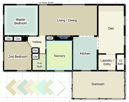
It wasn’t anything too major, but we definitely made a few noteworthy and fun little tweaks none the less (and the few changes that we’re about to list earn us BY FAR the most paint color compliments, so it really does pay to go that extra mile):
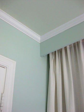
1. We painted the ceiling of our blue-gray bedroom a softer more subtle blue-green tone to create a dreamy ambiance that far surpasses the magic of a white ceiling. Read more about this project here.
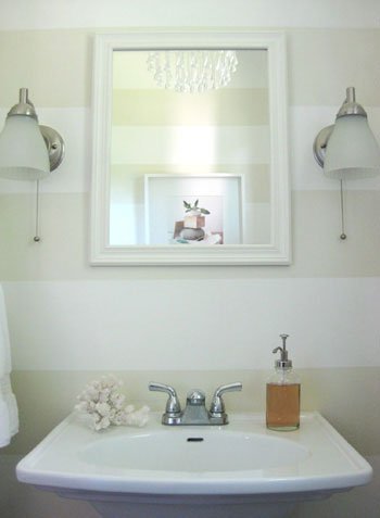
2. We added playful tone on tone horizontal stripes to the half bathroom in a few hours one evening (for under five dollars). Best time and money we ever spent. Read more about this project here.
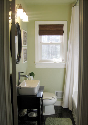
3. We took the full bathroom from the same color as the living room and guest bedroom to a soft khaki green color (since they were all in such close proximity this added a nice varied feeling to a layout that was feeling a bit tan on tan on tan before). And we even carried the same wall color right up onto the ceiling for a seamless effect. Read more about this project here.
4. We chose a cheerful pear color for the walls of the newly created nursery and added a splash of soft aqua on the ceiling (the blue ceiling tied into our bedroom and the kitchen while the green walls related to the nearby khaki green bathroom and a slew of green accessories throughout the house). Read more about this project here (and see additional photos here and here).
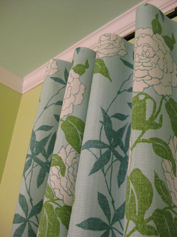
And we’re not done yet. Homeownership is an ever evolving process, I tell ya. Next on the agenda: nixing our white ceilings. We know they’ll feel higher and a lot less stark and jarring when they’re better integrated into our home’s palette. In fact, we’re planning to paint almost every single one in either a lighter tone of the wall color (they’ll still feel lifted but not quite as stark), the same exact hue as the walls (if the walls are light enough this really blurs the bounds of the room and makes it feel a lot more expansive), or even a contrasting or complementary color (we’ve always wanted to paint our tan sunroom’s ceiling sky blue).
So that’s where we are at the present time when it comes to our home’s state of paint affairs. And since we know you guys love all the dirty details, here’s a quick rundown of our casa’s current colors:
- Our Bedroom: Glidden’s Gentle Tide (walls) and Glidden’s Cool Cucumber (ceiling)
- Second Bedroom: Glidden’s Sand White
- Full Bathroom: Benjamin Moore’s Dune Grass (color matched to Olympic’s Premium No-VOC paint)
- Nursery: Mythic’s Autumn Bloom (walls) and Mythic’s Adanna Aire (ceiling)
- Living Room: Glidden’s Sand White
- Kitchen: Glidden’s Gentle Tide
- Den: Glidden’s Water Chestnut (fireplace accent wall) and Glidden’s Wishes (other three walls)
- Laundry Nook: Glidden’s Wishes
- Half Bathroom: Glidden’s Wishes (walls) and Valspar’s Honeymilk (stripes and ceiling)
- Sunroom: Glidden’s Water Chestnut
- All Trim & Interior Doors: Freshaire’s No-VOC stock white semi-gloss paint
Note: Some of the Glidden colors listed above are no longer available, but they can supposedly look up the formulas on the computer and whip them up for you. If not, Glidden’s Wishes is now called Eloquent Ivory (it’s the same exact formula), Benjamin Moore’s Quiet Moments is very similar to Glidden’s Gentle Tide and Benjamin Moore’s Ashen Tan is very close to Glidden’s Sand White.
And why stop now when there are more things we can add bullets to? Here are few of the major paint discoveries that we made along the way. Here’s hoping they help you sleuth out the perfect color palette for your casa:
- Never select a color without checking it out in morning light, afternoon light and evening light- just to be sure it doesn’t mutate from serene to scary when the sun sets.
- Paint colors look completely different in different spaces, so don’t blindly paint your room a color that you liked on the walls of Restoration Hardware since their lighting sitch is nothing like yours. Instead bring home the paint chip, tape it up on your wall and check it out in your lighting at all times of the day.
- Always look at a paint swatch on the plane that it’ll be on (don’t put it on a table and look at it horizontally if it’ll be on the wall- actually tape it up on the wall and evaluate it there- the same goes for ceilings).
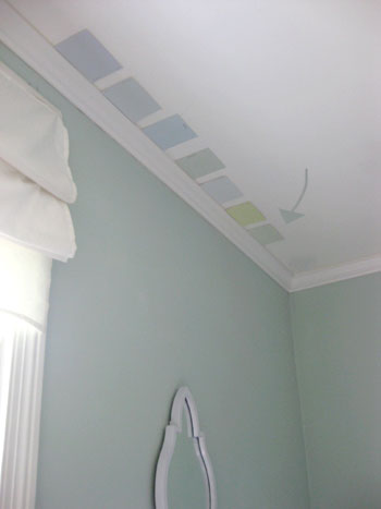
- Taping up a few paint chips at a time can help you select the perfect shade (since you can compare them to one another, you can much more easily weed out anything that’s “too yellow” or “too peachy” thanks to the other swatches beside it).
- We usually gravitate to the bottom two swatches of every paint chip (since our house is modestly sized we like how lighter tones and shades of each color make our house feel more airy and expansive).
- Neutrals can be written off as boring, but with crisp white trim and a range of furnishings, accessories, and textiles layered into the space they can be anything but.
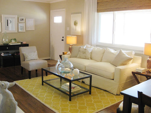
- Repeating a color across the house isn’t weird- it’s smart. Making your bedroom the same color as your entryway is a great way to take your house “full circle” so things feel like they’re part of a bigger picture. We use 80% of our home’s colors in at least two spaces (sometimes three) and the result is a nice layered and serene feeling.
- When you don’t want to repeat the same exact color, sliding one tone lighter or darker on the paint swatch is a great way to guarantee that rooms will feel related and airy (ex: go a shade lighter in your attached bathroom than you did in the bedroom for varied interest that still feels cohesive).
- There have to be colors that you always gravitate towards (in our case, green and blue) so using muddy and subtle variations of those tones along with a nice liberal dose of neutrals is a pretty foolproof formula.
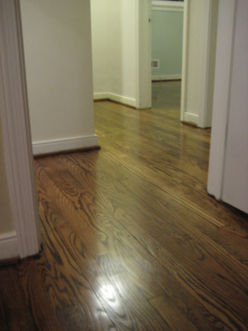
- Keeping the flooring (ex: mocha hardwoods) or the trim (ex: crisp white) consistent in as much of your home as possible will really help to unify any home’s color scheme.
- Even smaller items- like a leafy green plant in each room- or similarly colored wall frames- ours are all white- can really tie disparate rooms together for a nice easy flow.
- Don’t forget that tan and beige aren’t the only neutrals! Cream is a gorgeous alternative for a hallway (especially if you have a bunch of rooms branching off of that space and want something unifying and not too bold) and there are many light platinum gray tones that are luxe and chic without being too dark and brooding.
- In general (although definitely not in all circumstances) we like accent walls that are subtle as opposed to jarring and high-contrast (since the later can break up a space and define the boundaries of it, thereby making it feel fractionalized and disturbing the easy flow).
So that does it for our yeah-we-make-mistakes-too-and-learn-as-we-go-and-repaint-rooms-a-few-times-to-get-things-right post. It definitely helps to remember that paint is the cheapest mistake you can make! So stop being paralyzed by indecision and just dive in. If you pick the right color you’ll be over the moon, and even if it’s wrong you’ll learn what you don’t like so you’re closer to scooping up the perfect shade… and you’ll only be out around $20-30 bucks. Happy painting to you and yours!
Update – Wanna know where we got something in our house or what paint colors we used? Just click on this button:


katie says
This makes me feel SO much better about painting our rooms over and over again… we’ve only had the house for a few months and have already become master repainters.
Jessica @ How Sweet says
I truly love each of your rooms! I want to totally change my own home after seeing this!
Ashley M says
My whole house is a color similar to Wishes. Although, I think YHL has inspired me to branch out… I love LOVE Gentle Tide and that may be my next project.
Christin says
Thank you SO much for this comprehensive tips n tricks page on painting! My husband and I are hoping to buy a house in the next year or 2 (woohoo!) and thinking about actually being able to paint and decorate how we want is SO exciting! Yet, at the same time, daunting. This is my go-go website for info on home decor and DIY and this posting in particular is a HUGE help. Thanks!! :)
Ann says
Any recommendation for a specific color blue for the ceiling of my foyer? Something with just a hint of blue?
YoungHouseLove says
Hey Ann,
We’re adding a link to the end of our post all about a bunch of our favorite paint colors so you can just grab a bunch of our recommended swatches and hold them up in your space to see what looks best. Hope it helps!
xo,
s
Pam @ Design Fanatic says
Very informative post. The colors in your home are beautiful!
Ann says
I really like the colors you have in your house. It all seems to flow so well.
When we moved in to our home, we picked a neutral beige color and quickly painted every wall the same color, just to get some cohesiveness. Almost every room was a different color or had wallpaper: white, mauve, pink, bright yellow, and sage green! I would like to add some color, but for now I will probably leave it as is.
I liked the tips about the frames, floors, and trim!
Rebecca says
I can understand painting the ceilings a color to make them seem bigger in an 8 ft house, but do you also recommend that technique for 10 ft ceilings as well?
YoungHouseLove says
Definitely! Painted ceilings feel a lot warmer and more enveloping when you’re dealing with 10′ tall rooms, so they actually contribute to a less stark and cold effect. Hope it helps!
xo,
s
Aleta says
Hi there! I love reading your posts and have gotten so many useful tips for our home. I’m kind of nervous that we have done it all wrong in our home after reading this post! We have a roomy home (5000 sq feet) and a pretty open floor plan, so we’re not really too concerned with making our home feel bigger. We ended up painting rooms that open up to each other different colors because I thought I was giving the spaces more definition and didn’t want to be caught with one giant room in the same color. (I love color!) Any advice?
YoungHouseLove says
You’re right on. Your house is amazingly large and the different colors that you chose for different areas certainly keep things feeling more cozy and defined (instead of reading as one big football field of a home). Great instincts. Our advice above is really just for keeping smaller casas with 8 foot ceilings (like ours) feeling a smidge more open and expansive. Hope it helps!
xo,
s
Leigh says
Thank you for this post! My husband and I have been staring at swatches forever. It’s time to make a decision and move forward. I don’t know what it is about painting that scares us both so much.
Leah@Storybook Ranch says
Seems like we’re forever painting rooms in our home. We have a very open floor plan & wanted to distinguish rooms by giving each it’s very own DARK color. Bad idea. But, now we’re working on changing that. ;) half of our 8 ft ceilings are textured glitter, I’d love to paint those away, some day.
P.S. I’m happy I found your blog, I really enjoy it!
Jessica Lynn says
i just painted 1/2 of my office “gentle tide” and i’m LOVING IT! cannot wait til the other 1/2 is done. thank you so much for the recommendation!!! :)
ESBlondie says
Are all your ceilings flat? Would paiting a textured ceiling work as well? (ours is a knock down texture)
Thanks!
YoungHouseLove says
Yup, we love flat paint for the ceilings because it hides imperfections and goes on nice and smooth. Hope it helps!
xo,
s
sara h says
Why do you think flat paint is so awful? It’s actually been my savior- touching up small spots is a dream, you can’t even tell the difference between the existing paint and the new paint. This has been a life-saver as we’re working to sell our house, one less major thing on the to-do list. I’m curious why you think it’s so horrible? I guess to each his own! Thanks!
YoungHouseLove says
Wait what? We love flat paint! It’s in every room of our house except for the nursery (which is eggshell) and the kitchen and bathrooms (which are semi-gloss). I’m confused! Where do we say that we hate flat paint?
xo,
s
Rebecca says
You said that painting TRIM was a bad idea in flat paint in the first line of your post.
sara h says
Ohhh my bad! You said the TRIM was a bad idea! Somehow I missed that. Glad we agree! I was definitely the one confused!!
YoungHouseLove says
Ohhhhhh that explains it! No worries. Glad we figured it out.
xo,
s
Jennifer says
Love this post..it came just in time too. I have already painted my entire downstairs and am planning on going to the paint store this weekend to look for colors upstairs. My house is a good size (almost 3000 sq ft) and my downstairs kitchen and dining room are a burgendy red while my foyer and living rooms are a kahki tan. It looks amazing and warm but my upstairs doesn’t get nearly as good light as my downstairs and I was hoping to keep it a little bit lighter (my upstairs consists of a gaint second living room, master bed and bath, hallway and guestrooms). Any suggestions to coordinate with the red and kahki theme downstairs without it being too jarring? Maybe painting it the same tan color but use a nice blue-grey accents?? or blue-grey ir the dune grass green you have in your bathroom in the master bedroom and bath? Really could use your help!
YoungHouseLove says
Just take home some swatches and see what looks best up there. Since every lighting situation is unique we encourage people to trust their own eye (since they’re actually standing in the space and we’re here on a computer in Richmond). Remember you can always slide lighter on the paint swatch that you used in another room for a cohesive and airy effect. Or you can go with creams and neutrals or even the Dune Grass or the Gentle Tide that we used for a bit of subtle color. There’s not one right answer so just look at everything on the walls of your home and go with your gut!
xo,
s
jennifer says
thanks! so you don’t think dune grass and or gentle tide would clash with a downstairs that’s more warm with reds? Maybe if I paint the downstairs office one of those colors it would seem to connect to the upstairs? I just don’t want it to look too spastic…like 2 different houses upstairs and downstairs.
Also, do you have a benjamin moore color that’s close to gentle tide?
YoungHouseLove says
Yup, BM’s Quiet Moments is very similar to Glidden’s Gentle Tide, but we actually think that Dune Grass (since it’s a khaki green tone) will tie in more with the hues that you have going on downstairs. Red looks great with neutrals and soft sagey-sand colored greens- especially if you keep things like the trim and the doors consistent and add some touches of green downstairs and some touches of red upstairs. Hope it helps!
xo,
s
Amy says
It’s so nice to hear how your house has evolved over time…it makes me feel better about the paint blunders I’ve made in our house over the past year! I’m already planning on repainting the master bedroom and the 3rd bedroom…but at least I like the neutral I picked out that flows through most of the house- that would be a ton of work to repaint all of that. Great post!
Jill says
Awesome post! Thank you for all of the great tips, and for sharing the colors in your home!
DemMom says
My current painting question: Our Richmond 1960 ranch has a million things we want to update/change. My latest obsession stems from your most recent “house crashing,” and the chalkboard wall. Our kitchen has 2 walls with metallic wallpaper (that’s right). I want to turn one entire wall into a chalkboard. Do you ever recommend painting over wallpaper? Metallic wallpaper? Or should we just rip it off, prime it and paint w/chalkboard paint? I looked for any tips on this in your tutorials, etc. but didn’t find anything. If I’ve missed it, just point me in the right direction. I couldn’t really find answers in a general net search either. Any thoughts?
YoungHouseLove says
We never recommend painting over wallpaper. In the long run it’s not a short cut at all and the paper will bubble and peel but be super hard to remove since it’s been painted over. Definitely do the work up front and remove it. So worth it. And just google around for a wallpaper removing tutorial- there are tons out there to peruse. Hope it helps!
xo,
s
candace says
Love this post – it hits ‘home’. :) The big joke amongst my friends is that I’ve painted my downstairs 5 times over the years (everyone rolls their eyes!) because I’ve been trying to figure out the right color. So, I’m relieved to know that even your house has evolved and continues to change.
Maria says
Is there any other color from another brand comparable to glidden’s wishes?I ventured out to homedepot and did not find it. I was looking for the swatch to bring home but found nothing. Any suggestions?
YoungHouseLove says
Hey Maria,
Glidden has since discontinued it but they can look up the formula on the computer for you and whip up a batch. As for something similar, Benjamin Moore’s Muskoka Trail 974 is super similar. Hope it helps!
xo,
s
Handy Man, Crafty Woman says
and if you just don’t like it after a while, change it! Its fairly easy to repaint. I made a mistake on the paint color in our kitchen (too dark), but I actually left it there for a while to “make sure.” STILL didn’t like it, even after getting used to it. Repainted it a whole new color and now it’s great!
Amanda says
I so wish we could paint our ceilings. Alas, they are that nasty spray/stippled paint stuff. Having to touch up any white spots (like when we ripped out kitchen cabinets) is hard enough.
I love love love that Lowe’s and Home Depot have $3 take-home samples of any color paint. I have splotches of 6 colors on our master bedroom and bathroom walls to gaze at in different light before we decide.
I literally had to prove to my husband via labeled paint chip that one color is actually the same one in both rooms – they look like two different colors in the natural light in our bedroom vs. the artificial light in the bathroom! (PS – we’re the ones doing the same bathroom vanity as you. Nightstand came off of backorder and we’re doing demo this weekend!)
I love how your house is migrating from neutral to a blue/green – but still cohesive, and not glaringly BLUE and GREEN. Thanks for the inspiration!!
Amy says
Anyone have thoughts on super-low ceilings? Our house is a story-and-half so our bedroom is basically in the attic. Not sure on the exact height, but I can easily put my palm flat on the ceiling and I am only 5’6″. The room only has one window, so it always seems dark to me. The ceiling is flat white and I’m dying to change it, but I’m not sure what to do! So many options and me indecisive. Grrr….
YoungHouseLove says
We would pick a light color for the walls and bring it up onto the ceiling so it’s less of an obviously low plane (and it blends in with the rest of the boundaries of the room to look more expansive). Hope it helps!
xo,
s
Meredith says
Thank you for posting this. I can’t tell you how much better this makes me feel. Just yesterday I had resorted to facebook to recruit friends to come over and help us pick out colors! I do have one question… We have an over 120 year old house. It still has the original door frames, window ledges etc. We don’t want to paint them because we feel they give the house character. Yet we can never find any images (in magazines or on-line) which show rooms with wood. Has anyone seen any (that aren’t country themed)??
YoungHouseLove says
Here’s a Reader Redesign that we featured with lovely wood trim: https://www.younghouselove.com/reader-redesign-one-rockin-family-room/
Hope it helps!
xo,
s
Kristi @ Life at the Chateau Whitman says
I love all the neutrals you’ve used! People give me a hard time for not wanting bold and bright colors on the wall, but I just really like neutrals. That’s not so bad, right? :)
But this is a good post with really good advice that I know we didn’t realize when we first started painting our first home. Our house currently has a slightly yellow toned taupe in the kitchen, dining room, and one bedroom. Another bedroom has a creamy yellow that matches that paint in the bathroom. So the main level is pretty good, but then we went and did a really dark chocolate brown in the bedroom upstairs. I love the color but it doesn’t seem to match the rest of the house at all. Bummer!
Briar Oak Wife says
This post is so timely for us as we are currently re-painting every single room in our house, including the trim! It is a lot of hard work, but you are right – it is so worth it! My go to color for trim in BM Decorator’s White – so crisp yet creamy and not too stark white. Your previous posts on choosing paint definitely inspired me and our palate is blue-grey, soft creams and warm tans. I don’t care if people call us boring – I love neutrals! I def agree with you about different lighting – our house has tons of natural light and it brings out colors in paint swatches I never thought it would. Thanks so much for these amazing paint posts – they are my favorite so far!
Kate says
My husband & I love your home & get quite pumped with your creative ideas and the way you convey such enthusiasm & passion for home renovation & decorating! Hats off to you both. The pics of you guys from your last post yesterday are darling!… you’ve totally got the beautiful prego glow goin’! (Due in May, right?) We are due in May with our 3rd & house projects have certainly taken longer once kiddos came along – but we will likely always love a good DIY project & can’t get enough. We’re on our 3rd renovation house & this one is the one we see ourselves in for the long haul. It’s nice to be taking our time, and getting a feel for the house before we dive in & go with what’s simply familiar & “safe.” ;) Loved your take on painting and creating cohesion throughout a home. Couldn’t agree more. We’ve used some of your same colors in our house too, and are gearin’ up for a basement bathroom makeover with your striped half-bath as the inspiration. Thanks much & I’ll keep checkin’ your blog. (It’s my fave!) :)
Marilyn says
I noticed that you use paints with gray under tones. Do you have any problem with them at night? In my house the paint with gray undertones don’t look good at night so I have to go to clear tones.
YoungHouseLove says
Good question! Nope, that’s totally a lighting thing. In our house paint colors actually look warmer (even at night) but some people bring home swatches that we’ve used, like Sand White, and say that it almost looks grayish-purple in their home. Crazy, eh?
xo,
s
Lindsay says
One more tip, which I read somewhere and then promptly didn’t follow (whoops!): If you’re painting over a “weird” color (when we bought our house, it was full of paint colors with REALLY really strong pink undertones), consider getting a white piece of poster board/foam core/etc and painting some sample paint on the center part of that.
When we did it, we painted the sample right on the wall for our master bedroom, and while our choice looked GREAT compared to (or maybe reflected against?) the weird existing color, it actually took painting the ENTIRE room before I realized the color looked much more blue and less gray than I was hoping for. Ah well, it’s just paint! ;)
YoungHouseLove says
Awesome tip Lindsay! Thanks for sharing.
xo,
s
Karrie says
Great post! It’s interesting to see how your house has evolved over time. In fact, I have to thank you for the first post you wrote on the subject. My husband and I were having a hard time deciding on paint choices for our first house and were working with a kitchen with blue tile floors that couldn’t be changed any time soon (and said kitchen floor could be seen in the living room and dining room). So, paint-buying day had arrived (after about a week pondering over color choices) and no decision was made. I had seen the post where you updated your home with more of a neautral color scheme and asked my husband to look at your living room and asked him if he like it, he said yes and off we went to Home Depot and bought a 5 gallon bucket of it. Risky, yes! Was it worth is? Yes! We have it in a portion of our kithcen, our living room and dining room, hallway and guest bedroom. We’ve received a ton of compliments on it and it works so well with that blue tile floor. So, thank you, thank you, thank you!
Sandy says
I love all the soft blue, green and yellows that you’ve used. May I ask, where did you get that patterned yellow rug for your living room? I’m a huge fan and would like one for my basement, please!!! =)
YoungHouseLove says
It’s the Moorish Tile Rug from Pottery Barn but it has since sold out. Maybe you can find it on ebay? We happily scored it as a floor model when it was on clearance. Whew!
xo,
s
Michelle Kersey says
If I can’t pick between two colors after taking home swatches and staring at them against the wall for weeks… I buy the sample cans and paint a square on the walls next to each other to decide. I’ve painted square of our color choices in every room, which is how I found out I gave the paint mixers the wrong swatch choice before painting the entire kitchen! After putting it on the wall, in real paint, I saw it was much pinker than I wanted, went back to the chip and saw it was the wrong one! Whew! Glad I didn’t wait until it was time to paint to put a test square up!
YoungHouseLove says
Such a great tip! Thanks for sharing.
xo,
s
Melissa says
I’m looking for a nice warmish gray paint shade. I’m really worried about it turning pinkish or greenish or looking really cold. I have a quilt in our master bedroom that is a very citrusy green with a tad of gray. Our walls are currently a beige shade and it’s not a good compliment. I have a recessed ceiling too, that I could paint a shade darker or lighter.
YoungHouseLove says
Just click the link at the end of the post to go to a write-up about our favorite paint colors. Then grab a bunch of swatches in the “gray” category and hold them up in your house. We’re not sure what will look warm in your lighting sitch, so the best bet is to grab a bunch of options and compare them in your room on the wall. Hope it helps!
xo,
s
Danielle@Newlyweds Paradise says
No way! We were thinking of painting our ceilings a color also! Our ceilings and walls are paster and have a neat curve in them. So we thought we would highlight them with a little color. Can’t wait to see it!
ann says
Love the colors. Not I may be stealing these for my own home. we are having the hardest time deciding… the light is not very good here and every color swatch I bring home looks so blah. i will try your colors next!
Lisa in Seattle says
I wish we had your lovely open floor plan! In our 1968 bi-level (a big box separated into smaller boxes), you can’t see any room from any other room (except living room + dining room). So we’re taking the opposite approach! Each room will have a very different feel (Craftsman/Arts & Crafts in the bedroom with soft, historic red/green/gold tones; nature-inspired blues and greens in the office; etc.). I know some people would find the effect jarring, but I love opening a door and being surprised and delighted by the differences within.
Sami says
I love the idea of painting the ceiling, but guess who doesn’t? Yup, my better half. He thinks using “ceiling paint” in white is the ONLY way to go (he said he saw it at Home Depot in one of the aisles), but I totally disagree and I want to paint the ceiling a lighter blue we have on the walls. I guess my question for you is how should I explain to my lovely better half that painting the ceiling is a GOOD idea instead of a “stupid” one and we don’t HAVE to use special “ceiling paint”, or do we? Ugh…men….lol
YoungHouseLove says
Hey Sami,
Here’s a post all about convincing your hubby to agree with your decorating decisions. Our favorite tip is just showing him photos of rooms that work (so google around or use ones from our site to help persuade him). Good luck!
xo,
s
Amanda says
I laugh everytime you mention the flat white…we did the same thing and are still in the processing of getting all white trim from flat to gloss…We have also repainted rooms a few times now and are still in the process of repainting rooms. I think thats what makes homeownership fun! Always changing it up
CatherineW says
Thank you so much for this post! I’m a fairly new reader to your blog, and although I ALWAYS feel inspired by your posts, I also often feel jealous since everything always seems to go so smoothly for you. Like yesterday’s faux sheepskin rugs. In those posts you mentioned being worried that the rugs might unravel; all I could think was that if I were trying it, they would unravel, and I probably wouldn’t be expecting it. Every project I try seems to have major snafus or at least a couple hiccups. I’m relieved that you two sometimes make mistakes too. :)
Bravo on working through them!
Chloe says
Hey YHL-ers, I was wondering if you (or any helpful readers) have seen textured ceilings painted? I LOVE the look in your house, but I’m wondering if this treatment looks funny when the ceiling isn’t flat. Our ceilings are more of an ultra bumpy knock-down texture (not popcorn) and I was hoping for some feedback before committing to a weekend of rolling!
YoungHouseLove says
Hey Chloe,
You can probably google around to see if you can find any photos of textured ceilings that have been painted, but our advice would be that as long as you keep the color subdued (ex: a lighter tone of the wall color, a soft cream, a gentle gray, etc) and don’t try to make the ceilings a focal point (like painting them sky blue with tan walls) then it should look great. Hope it helps!
xo,
s
Beth says
OK, I have a comment and a question.
First, I noticed there was someone asking about painting over wallpaper and your suggestion was to remove it. While I am in total agreement that you should never paint over wallpaper, I used a different method for getting rid of it – I just textured right over it. I have heard so many horror stories about how hard it is to remove wallpaper. Home Depot (and probably other hardware stores) has buckets of texture that comes ready-to-slap-on (no mixing water or anything involved). I’ve done my kitchen and both bathrooms, so if there ever were rooms to have problems with this, it would be those, but there’s been no issues at all (and it’s been about 6 years for the bathrooms and just a few months now for the kitchen). So I can totally recommend this way for dealing with wallpaper.
Now for my question. The walls in my living room are Behr’s Restful (it’s a green). When I painted my ceilings white a few months ago I thought about going with a slightly lighter shade of green, but decided against it because I have beams (which I painted the same shade of white as the ceiling). My beams are not like yours are, going straight across the ceiling. Mine run from each corner of the room up to another beam across the top (in other words, the ceiling is higher in the middle and slopes to the walls). So, color-wise, each white beam runs from the top of the white ceiling down to each corner of the green room, crossing white trim as it does so, which is not a big deal since the trim, ceiling, and beams are all white. But would it look really non-cohesive if I painted the ceilings lighter green? Because then I would have light green beams that cross over that white trim and end in the corners of walls that are darker than they are. Weird? Or workable? (Or did I not explain that well at all and you have no idea what I’m trying to describe?). :-)
YoungHouseLove says
Hey Beth,
There really is no right or wrong answer here. We definitely would suggest that you keep your beams the same color as your trim (white) but you could add some color by painting the ceiling and leaving those beams white so they really pop (we’ve seen this look in a variety of magazines). We also have beams in our den as you mention and we like the look of the white ceiling with the white beams in that case because it’s an 8 foot ceiling so we don’t want the contrast between the color of the beams and the color of the ceiling to make that plane of the room the focal point (we’d rather keep the attention on the fireplace in that case). It’s other rooms that we think the stark white ceiling really feels less warm and finished looking so we’ll probably always leave the den ceiling white along with our beams while adding soft and subtle colors to our other rooms with flat and less-integrated stark white ceilings. Hope it helps!
xo,
s
Gin says
Such a timely post I commented a while back that your blog was such an inspiration to me as my husband and I were preparing to start the house hunt. Well fastforward a few months and we’re set to close on our first place on 03/26/2010. and we’ve been talking and thinking about paint colors in the last few days and I remembered your advice about a cohesive color scheme. We do have one question though our house is a bi-level and the stairs are the first thing you see on the left as you walk in the door we want a cohesive flow to the house but we’re not sure how to accomplish the transition between up and downstairs. Any thoughts?
YoungHouseLove says
If it were us (and there’s definitely more than one way to skin a cat so this is just our personal opinion) we would keep the stairs and the hallway/foyer both upstairs and downstairs (as well as the walls going up the stairs) the same soft and neutral tone (like a nice cream). That way you enter to see a nice clean and unfractured visual without anything that breaks up the expansive feeling. It’s also a great option because the rooms off of this creamy neutral hued space (both the downstairs entryway, the stairs and the upstairs hallway) can be the ones with color and that area can “bridge the gap” between all those other rooms and tie everything together. Hope it helps!
xo,
s
Ericka says
I absolutely love the colors you’ve picked for your house! I wish I had the time and energy to repaint. I have a busy toddler who still isn’t sleeping through the night! I hope that needs no further explanation:)
QUESTION: I noticed you used Freshaire Choice paint for your trim. Did you find that it was easy to use and covered well?
YoungHouseLove says
Yup, we love it. We use it all the time.
xo,
s
Sarah Sarniak says
I like all of them. I’ve been recently actually thinking about going neutral in my whole house and add the color with accessories. I’m not sure though. I’ve been more into the neutral/whites/shabby chic lately. I love your color palette though. Even the greens and blues are a nice calming shade.
Cyndi says
Hi there Sherry and John! I have to say – I have become absolutely obsessed with your site. I went back and am reading it from the very start and getting so many fantastic ideas! I recently received a “Beautiful Blogger” award and am supposed to pass it on to my seven favorite bloggers and YOU are definitely two of them! You can read more about it on my site. I apologize if you already have this award, I just wanted to let you know you’re at the top of my must-read list!
YoungHouseLove says
Thanks Cyndi,
Off to check it out!
xo,
s
sonya says
Great post, this couldn’t have come at a better time for me, as I have a new home that I’m currently painting and selecting colors for. Sometimes I just want to crawl under a rock and not think about it b/c it can be so frustrating to figure out. But it’s good to hear some additional “reassurance” that it is a constantly evolving process, and really worth it when you finally find the perfect color to make your room really come alive!
jessica says
I love the fact that you stay within a few colors for your whole house. I have to admit that I fell into the “let’s paint each room a different color” trap, & we also have a teeny house. You’ve really inspired me to think of ways to make things flow throughout the house, including, sticking with a few colors. I found my favorite neutral(at the moment), & after painting our living room/kitchen(we have one long wall that encompasses both), I’ve decided to paint our entire basement that color as well. We’re going to put in some sheet vinyl flooring that looks similar to our laminate upstairs, so I’m hoping it will help the upstairs flow into the downstairs. So thanks for the inspiration! BTW my favorite neutral right now is Wasabi Powder by Behr, cut down 75%. It’s the perfect gray/yellow/beigey green. It really changes depending on the light!