Paint can pretty much be chalked up to a learning experience around Casa Petersik. From painting all of our home’s trim with flat paint right after we moved in (baaad idea, use semi-gloss!) to picking a different color of the rainbow for each room (not the way to make a small house flow!) we’ve pretty much made every mistake in the book. And over the last almost-four years our walls have definitely “evolved” as we learned what we liked (and a whole lot of what we didn’t).
We decided to use a handy little floor plan (created thanks to Floorplanner) to demonstrate three “stages” of our home’s ever changing color scheme to show that homes don’t usually “magically come together” overnight. Sometimes it takes some experimentation and a bit of repainting (and repainting again) to get ‘er done. But with every little change that you make you’ll be inching towards the home of your dreams- and just like the right dress can theoretically make you look slimmer and bring out your eyes, the right wall color really can turn any house into a dream home (all for about $30 a room and an afternoon of your time).
Here’s what we meant when we mentioned that we picked nearly every color in the rainbow for our house’s original color scheme right after we moved in…
Color Scheme: THEN

From an orangy-yellow in the den to an easter-egg-ish pastel green for the living room, our choices really ran the gamut. And we even went with a bright robin’s egg blue for the third bedroom (which was formerly the dining room) and the half bath. Of course looking back those were odd choices for two of the smallest rooms in our house. In short: when this color scheme was in effect, it felt like you were entering a different house every time you stepped into a different room instead of feeling like there was an overall cohesion and flow to our modestly sized ranch home.
The funny thing is that the only color that we chose to use twice was the bold turquoise color in the 3rd bedroom and the 1/2 bath. Now we understand that in a small house you want continuity and rooms that feel like they flow- and not like they’re chopped up with different color schemes- so we routinely repeat colors or slide a shade or two darker or lighter to keep things feeling related throughout our entire home’s floor plan. Then we chose to repeat the soft blue-gray bedroom color in the kitchen while keeping the rest of the house subdued and neutral, and stood back and admired how the creams, sandy tans, and soft gray-blues worked together to create spaces that felt varied and interesting without evoking that chaotic and unrelated vibe.
Color Scheme: MIDPOINT

Only our bedroom and the sunroom escaped the repainting spree that took us from the “then” paint color breakdown to this “midpoint” diagram above. And while it may not look exciting on screen – it totally made the house feel bigger, more connected and a lot more grown up. What we had done was accomplish a more toned down and agreeable whole house palette, but we still ached for something a bit more interesting and textural (nothing too high contrast, but just a few unexpected paint color applications to keep things feeling fresh) so we did a few things to take our house from serene and soft to serene and soft… with a bit of a twist.
Color Scheme: NOW
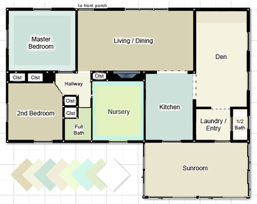
It wasn’t anything too major, but we definitely made a few noteworthy and fun little tweaks none the less (and the few changes that we’re about to list earn us BY FAR the most paint color compliments, so it really does pay to go that extra mile):
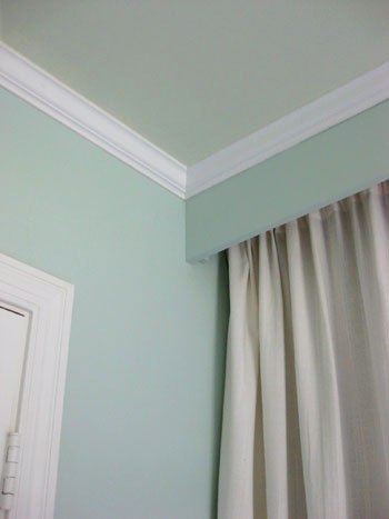
1. We painted the ceiling of our blue-gray bedroom a softer more subtle blue-green tone to create a dreamy ambiance that far surpasses the magic of a white ceiling. Read more about this project here.
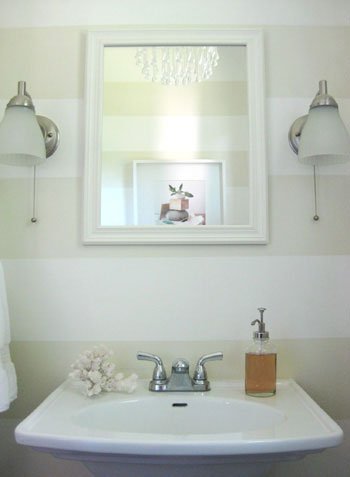
2. We added playful tone on tone horizontal stripes to the half bathroom in a few hours one evening (for under five dollars). Best time and money we ever spent. Read more about this project here.
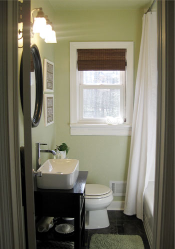
3. We took the full bathroom from the same color as the living room and guest bedroom to a soft khaki green color (since they were all in such close proximity this added a nice varied feeling to a layout that was feeling a bit tan on tan on tan before). And we even carried the same wall color right up onto the ceiling for a seamless effect. Read more about this project here.
4. We chose a cheerful pear color for the walls of the newly created nursery and added a splash of soft aqua on the ceiling (the blue ceiling tied into our bedroom and the kitchen while the green walls related to the nearby khaki green bathroom and a slew of green accessories throughout the house). Read more about this project here (and see additional photos here and here).
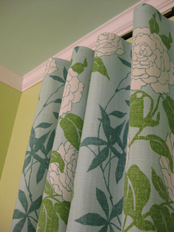
And we’re not done yet. Homeownership is an ever evolving process, I tell ya. Next on the agenda: nixing our white ceilings. We know they’ll feel higher and a lot less stark and jarring when they’re better integrated into our home’s palette. In fact, we’re planning to paint almost every single one in either a lighter tone of the wall color (they’ll still feel lifted but not quite as stark), the same exact hue as the walls (if the walls are light enough this really blurs the bounds of the room and makes it feel a lot more expansive), or even a contrasting or complementary color (we’ve always wanted to paint our tan sunroom’s ceiling sky blue).
So that’s where we are at the present time when it comes to our home’s state of paint affairs. And since we know you guys love all the dirty details, here’s a quick rundown of our casa’s current colors:
- Our Bedroom: Glidden’s Gentle Tide (walls) and Glidden’s Cool Cucumber (ceiling)
- Second Bedroom: Glidden’s Sand White
- Full Bathroom: Benjamin Moore’s Dune Grass (color matched to Olympic’s Premium No-VOC paint)
- Nursery: Mythic’s Autumn Bloom (walls) and Mythic’s Adanna Aire (ceiling)
- Living Room: Glidden’s Sand White
- Kitchen: Glidden’s Gentle Tide
- Den: Glidden’s Water Chestnut (fireplace accent wall) and Glidden’s Wishes (other three walls)
- Laundry Nook: Glidden’s Wishes
- Half Bathroom: Glidden’s Wishes (walls) and Valspar’s Honeymilk (stripes and ceiling)
- Sunroom: Glidden’s Water Chestnut
- All Trim & Interior Doors: Freshaire’s No-VOC stock white semi-gloss paint
Note: Some of the Glidden colors listed above are no longer available, but they can supposedly look up the formulas on the computer and whip them up for you. If not, Glidden’s Wishes is now called Eloquent Ivory (it’s the same exact formula), Benjamin Moore’s Quiet Moments is very similar to Glidden’s Gentle Tide and Benjamin Moore’s Ashen Tan is very close to Glidden’s Sand White.
And why stop now when there are more things we can add bullets to? Here are few of the major paint discoveries that we made along the way. Here’s hoping they help you sleuth out the perfect color palette for your casa:
- Never select a color without checking it out in morning light, afternoon light and evening light- just to be sure it doesn’t mutate from serene to scary when the sun sets.
- Paint colors look completely different in different spaces, so don’t blindly paint your room a color that you liked on the walls of Restoration Hardware since their lighting sitch is nothing like yours. Instead bring home the paint chip, tape it up on your wall and check it out in your lighting at all times of the day.
- Always look at a paint swatch on the plane that it’ll be on (don’t put it on a table and look at it horizontally if it’ll be on the wall- actually tape it up on the wall and evaluate it there- the same goes for ceilings).
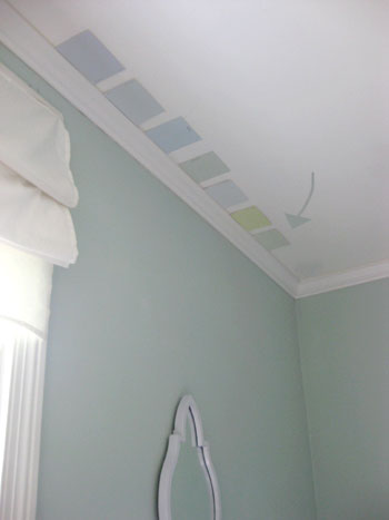
- Taping up a few paint chips at a time can help you select the perfect shade (since you can compare them to one another, you can much more easily weed out anything that’s “too yellow” or “too peachy” thanks to the other swatches beside it).
- We usually gravitate to the bottom two swatches of every paint chip (since our house is modestly sized we like how lighter tones and shades of each color make our house feel more airy and expansive).
- Neutrals can be written off as boring, but with crisp white trim and a range of furnishings, accessories, and textiles layered into the space they can be anything but.
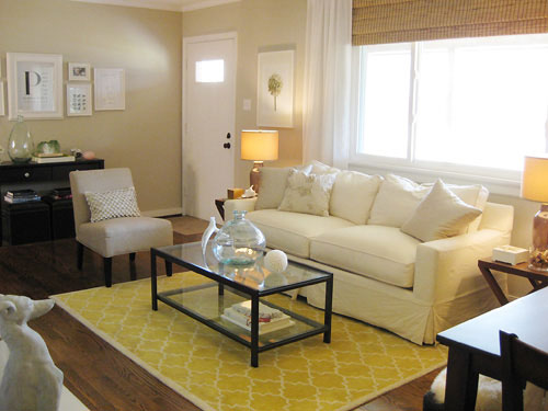
- Repeating a color across the house isn’t weird- it’s smart. Making your bedroom the same color as your entryway is a great way to take your house “full circle” so things feel like they’re part of a bigger picture. We use 80% of our home’s colors in at least two spaces (sometimes three) and the result is a nice layered and serene feeling.
- When you don’t want to repeat the same exact color, sliding one tone lighter or darker on the paint swatch is a great way to guarantee that rooms will feel related and airy (ex: go a shade lighter in your attached bathroom than you did in the bedroom for varied interest that still feels cohesive).
- There have to be colors that you always gravitate towards (in our case, green and blue) so using muddy and subtle variations of those tones along with a nice liberal dose of neutrals is a pretty foolproof formula.
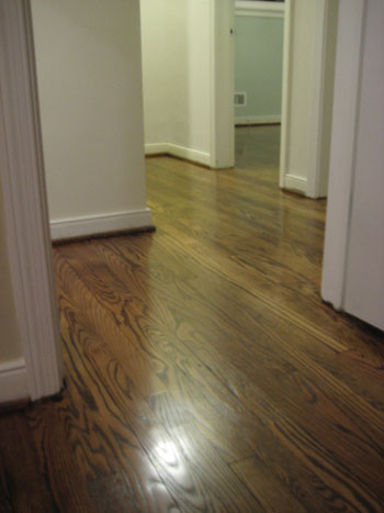
- Keeping the flooring (ex: mocha hardwoods) or the trim (ex: crisp white) consistent in as much of your home as possible will really help to unify any home’s color scheme.
- Even smaller items- like a leafy green plant in each room- or similarly colored wall frames- ours are all white- can really tie disparate rooms together for a nice easy flow.
- Don’t forget that tan and beige aren’t the only neutrals! Cream is a gorgeous alternative for a hallway (especially if you have a bunch of rooms branching off of that space and want something unifying and not too bold) and there are many light platinum gray tones that are luxe and chic without being too dark and brooding.
- In general (although definitely not in all circumstances) we like accent walls that are subtle as opposed to jarring and high-contrast (since the later can break up a space and define the boundaries of it, thereby making it feel fractionalized and disturbing the easy flow).
So that does it for our yeah-we-make-mistakes-too-and-learn-as-we-go-and-repaint-rooms-a-few-times-to-get-things-right post. It definitely helps to remember that paint is the cheapest mistake you can make! So stop being paralyzed by indecision and just dive in. If you pick the right color you’ll be over the moon, and even if it’s wrong you’ll learn what you don’t like so you’re closer to scooping up the perfect shade… and you’ll only be out around $20-30 bucks. Happy painting to you and yours!
Update – Wanna know where we got something in our house or what paint colors we used? Just click on this button:


Loren says
Since Glidden’s Wishes is no longer available (at least on a paint chip), can you please suggest a paint color that is similar (like you did for Glidden Sand White)? I need a light, neutral color for a condo that has no side windows. The windows are at the front of the condo and the rear sliding glass doors. In your pictures of your den, Wishes appears to reflect light well. Just discovered your site recently and have really enjoyed exploring all your great ideas. Thanks!
YoungHouseLove says
We just learned that Glidden’s Wishes now goes by the name Eloquent Ivory but it’s the exact same formula! Hope it helps.
xo,
s
lauren says
Curious- how long does it take to have paint color matched? If I want to paint on a Friday can I take a chip in that morning and leave in a few minutes? Or do I need to take it in that Monday?
YoungHouseLove says
Good news! Color matching only takes as long as mixing up any gallon or quart of paint does (less than ten minutes). So they can definitely do it for you while you wait. Just bring in your swatch and they’ll scan it into the computer in about ten seconds and then get to work mixing your paint for you (which is the part that takes around five to ten minutes). Hope it helps!
xo,
s
Lissa says
Ok, I just went to my local BJ’s store. For those of you in Canada (like me), Canadian BJs don’t have the same names like Quiet Moments or Ashen Tan. You can ask them to find for you in the their database or FYI.
Quiet Moments = smokey green (cc-700)
Ashen Tan = dufferin terrace (cc-456)
Hope this helps.
YoungHouseLove says
Thanks so much for the tip Lissa!
xo,
s
Anna-Katrin says
Speaking of painting trim, any tips for not getting paint on wall-to-wall carpet when you’re painting baseboards? (I know you guys have all hardwood now but wondered if you had dealt with this issue in the past?)
YoungHouseLove says
You can use a piece of stiff cardboard or even a large metal putty knife to block the carpet and just move it with you along the baseboard (right above the carpet) as you go around the perimeter of the room. Using painter’s tape (sometimes with a plastic dropcloth) to tape off the carpet as you go is also another helpful method. Hope it helps!
xo,
s
Anna-Katrin says
Thanks so much, I’ve got a bunch of painter’s tape hanging around so I’m going with that option!
Amy L says
I love your color scheme! We are turning our family room, kitchen, and living room/dining room into a “grand room”. There will be no full walls in between the rooms so should we leave them all one color? I’m afraid that will look so plain but I can’t think of another option. Thoughts?
Thanks so much!
Amy
YoungHouseLove says
Definitely leave the walls neutral since it could break things up and make the rooms feel interrupted if you paint them a bold color. Then just do as we did in this mood board and allow the accessories (art, lamps, pillows, vases) to introduce the color and interest to the space. Rooms can definitely feel vibrant and alive without a bold hue on the walls- just layer in interesting and bold accents!
xo,
s
Sarah says
Thanks so much for all the paint advice! My fiance’ and I are in the process of buying a house that’s mid-renovation (it doesn’t have a kitchen or flooring). We have a contractor all lined up and I’ve chosen the cabinets, flooring, counter tops etc. but I’m stuck on paint!
The house has wood everywhere – bamboo floors in toast, pine cabinets (I wanted white but my other half wouldn’t go for it), and tongue and groove ceilings (in almost every room). There are tons of windows that are south facing so we get lots of sun. With all these wood tones to deal with, where would you go with the paint?
YoungHouseLove says
Tones of green (sage, celedon, pear, etc) always look great with wood tones, as do tans, creams and warm wheat hues (like burnt umber or even a warm orange). Just grab a bunch of swatches in those colors and see what you like!
xo,
s
Jos says
Love all your ideas & inspirations!
We are updating our family room and are having a hard time deciding what to do with the walls. We just ordered a new couch from Room & Board that is Charcoal and I’m leaning towards painting grey but don’t want the room too dark or dull. We want to paint at least one wall that is currently a green. This wall also has a large grey stone fireplace that we have to deal with. I like the crispness of white, but this room attaches to the kitchen which like the rest of the house is off white. All of our baseboards & trim are natural wood-as is our coffee table etc… So basically trying to decide if we should paint grey or color. I kind of like subtle walls with pops of color being in the accents. But again, don’t want the room to be drab…
Do my rambles makes sense?! To grey or not to grey?
YoungHouseLove says
Try Benjamin Moore’s Light Pewter. It’s a gorgeous soft gray- like the inside of a cloud. So neutral yet chic.
xo,
s
Talysa says
Boy do I wish you were my neighbor. :-)
I have a typical colonial floorplan…walk into foyer with staircase going up on right…sitting room to left, kitchen straight through foyer on back of house, living room to right..half bath under staircase. All connecting in a circle, yet defined as separate rooms with lots of beautiful crown molding and wainscotting. Our living room is “crabapple” by ralph lauren. Don’t really want to change that. Very nuetral..had it for years and still love it. The foyer is the same. BUT we just recently painted our country oak cabinets white. BM masarpone. Now I’m trying to figure out how to get all these rooms (that are visible from one to another) to mesh…I’ve always been a “green/red/yellow” schemed gal…not digging that so much anymore. I am drawn to blues and browns and oranges and reds. BUT I don’t want cold colors. I’d still like a warm feel. Any suggestions for the kitchen (dark green corian countertops with a reddish brown big tile floor) and the sitting room? I’d love to paint the sitting room “wedgewood gray” by BM…but I can’t figure out a color that would match in the kitchen…would blue work in the kitchen as well with the green countertops?
Do you offer a service for multiple rooms at once that need to flow together?
Thanks.
Talysa says
I actually have a picture of my kitchen here pre painting the cabinets white. You can see into the living room with the crabapple walls.
http://mcmanuspartyoffive.blogspot.com/2010/03/help-me-paint-my-kitchen-cabinets.html
YoungHouseLove says
Hey Talysa,
We actually used to offer a color consultation service but there just aren’t enough hours in the day so we sadly had to discontinue it. Of course if we ever figure out how to clone ourselves and can re-offer that service we’ll be sure to make a big announcement on the blog. Until then we just suggest bringing home a ton of paint swatches and mixing and matching them to see what looks best in your house with your lighting.
xo,
s
Sally says
Any suggestions for a color?
The family room (BM Dried Basil) goes into the kitchen (white cabinets, white everything, with butcherblock countertops and green accents), which goes into a half room that contains our daughter’s easel, play kitchen (from 1974!), play table, a white bookcase with cookbooks and an art deco dresser from the 50s which we use for storage, which goes into a half bath that has beadboard on the bottom, painted a blue/green (custom mixed by the previous owners so we don’t know the color, but it looks like seaglass), with white walls above the beadboard.
So – we need a color for the room off the kitchen – it’s northfacing so doesn’t get a lot of light… I’m leaning towards some kind of green but don’t want it to overshadow the BM Dried Basil (which I love) and don’t want it to be too somber…
Any suggestions would be great! Love your blog…
Thanks!
YoungHouseLove says
We would actually carry the same Dried Basil color over (or slide a shade lighter on that paint swatch) for a seamless and open look that’s guaranteed to work with your color palette. Good luck!
xo,
s
Celestte says
Hi Sherry + John!
Found your blog a little more than a week ago. You have done an amazing job – on your house, your blog, your references. You keep it fresh and new and very interesting.
I love the Floorplanner you referenced above and will try my hand at using it as we are doing some DIY work around our home now. After 3 years of living in it (my husband bought before we met), it’s time to put my touch in it. My question is how did you get your actual paint colors into the diagram? I may be jumping ahead here, but were you able to input your exact colors from Home Depot? Thanks…
YoungHouseLove says
We actually dragged the image into photoshop and adjusted the colors. We know not everyone has that program, but it really comes in handy for us when it comes to mood boards or visuals like this. Hope it helps!
xo,
s
Keren says
YHL,
Congrats on little Clara! I’ve read this post and the one where you mention other colors by hue; my question is I’m looking for a gray that works with the Gentle Tide color. My master bath is going to be Gentle Tide and it is open to the master which I want a complentary light grayish color (nothing too dark). Any guidance is much appreciated!
YoungHouseLove says
Try Benjamin Moore’s Light Pewter. It’s an awesomely serene light gray that would look gorgeous with Gentle Tide. Good luck!
xo,
s
Tammy says
Wow do I need to take this on. I love all the colors in my home (4400 square feet), but not together…just doesn’t all flow….how do I even begin to fix it? Which color do I start with? I have a Red dining room (I know outdated, but I love red there), gold halls, different golds in the kitchen and living room, and a medium brown in the family room…..how do I get everything to “jive”? I am willing to repaint, but I don’t know where to start…and do I just need to make sure I have the same tones to make colors work? I need some serious help!
YoungHouseLove says
Just be systematic and take it one room at a time. We’d suggest getting a ton of paint chips (the ones you have and a slew of new ones) and deciding on your new color scheme before even picking up a paint brush. Just put each swatch combo out on the table to see which ones work for you. You’ll know when you see combos that you love and when you see a color that doesn’t fit just pluck it out and try other options. Once you settle on the perfect pairing of paint chips, you’ll easily see which rooms can stay the same color (if their chips are in your pile) and which rooms you’ll need to change (if their paint chips are no longer in your pile, just pick other paint chips that you’ve added and tackle those spaces one by one). Good luck!
xo,
s
Katie says
I love the color scheme you guys used through out your house! The colors are so peaceful and relaxing, just what I am aiming for in my newly purchased home! Thank you for the great tips and ideas. Your blog is the best :)
Jennifer says
Hi! Just found your blog and am now OBSESSED with it. I think I’m going to paint my bedroom your fave “Light Pewter.” I recently got a very nice quilt/sham set from Macy’s that’s a dark pewter (it’s their Hotel Collection). My conundrum is that I can’t for the life of me figure out what color curtains to choose! I’m having trouble finding ANY standard curtains in any shade of gray, but maybe that’s not the right color, if the walls are light gray and the bed is all dark gray? Would white work, or would that be too stark a contrast with the bedding? There are two windows in my bedroom. Any suggestions?
YoungHouseLove says
Definitely go white! It’ll look fresh and hotel chic in there. Love it!
xo,
s
Mikala says
Love your website, thanks for all of the great tips!! I had a few questions and I am sure you have already answered then some place:
1.) What color did you stain your wood floors? I have been looking for a dark floor color and I really like the ones in your home.
2.) In the half bath how many inches apart do you space the stripes?
Thanks again!
Mikala
YoungHouseLove says
Hey Mikala,
Here’s the link all about how we made our bathroom stripes (and how far apart we spaced them): https://www.younghouselove.com/2009/06/walking-the-line/
And as for the floors, it was actually a mix of walnut stain and another color (we can’t recall the name, but since we were trying to match the hardwoods in the den, we mixed them to come up with the closest match). So sorry we don’t have that second stain name – it was just sort of a spur of the moment “formula” that we went with. Hope it helps!
xo,
s
Keren says
YHL,
I’m going to be embarking on some interior painting soon and my problem is the previous homeowners painted all the moulding/trim/doors/wainscotting in an oil-based high gloss white. I hate the extreme high gloss shine it gives off and the color is a white grayish..not my fav. I’d like to avoid the extreme amount of sanding I’m envisioning its going to require due to my son’s allergies. What is the best way to paint over this oil-based glossy paint? I want the trim to be a semi-gloss decorators white. Any ideas are much appreciated!!
YoungHouseLove says
No sanding necessary! Just prime with oil-based primer (of course keep the rooms well ventilated and even do this step while your son is at a friend’s house). Then follow that with regular latex paint (in a less glossy finish and a new shade that tickles your fancy). Hope it helps!
xo,
s
Adrienne says
I love your house, especially the soft, subtle paint colors. Any suggestions for a silvery grey for my bathroom? The fixtures are white and silver. I have been looking a thousands of shades and can’t find the right one.
thanks,
Adrienne
YoungHouseLove says
We looove Benjamin Moore’s Light Pewter. Definitely check it out!
xo,
s
Rachel says
I Love all your paint colors in your home! do you have any suggestions on what color to paint a finished basement? It’s not a walkout and only has one tiny window, so its very dark.
Thanks
Rachel
YoungHouseLove says
Anything light, like a soft and lovely cream color! Here’s a post with all of our favorite paint colors so you can grab them and see which ones work for you: https://www.younghouselove.com/2009/06/email-answer-picking-the-perfect-paint-color/
Hope it helps!
xo,
s
Rebekah says
I’m thinking of painting my guest bedroom, and once again ended up on your site for inspiration :)
Do you prime before painting your walls? We tend to get gallons with the primer mixed right in with the paint, and we usually end up doing only one coat, but wondering how you all approach the options! My bedroom walls are a very light tan, so I’m wondering if I even need primer at all (& maybe saving a few $$)!
Thanks for all that you do!!
YoungHouseLove says
Nope, we don’t prime (unless we’re going over a very dark color with a light one) and just do two coats of affordable Glidden, Olympic, Behr, or Valspar paint. Your walls definitely don’t sound like they need primer, although they might need two coats of paint (our walls are plaster so they always call for two coats). Hope it helps!
xo,
s
Kristen says
I love your website and your decorating style and am need of some advice. We just bought a house and it’s time to paint! I noticed that you have white trim but the house we bought has all light colored wood trim. I would like to keep everthing pretty neutral and accent with pops of color in the rooms that can easly be changed out? Any advice for us with wood trim? Also, the kitchen has light wood (pine?) cabinets, what color would go best with that?
YoungHouseLove says
Just like we have white accessories around to work with our white trim, it would be nice to layer in some similarly toned items to work with your light wood trim (like a light wood bowl on the coffee table, etc). As for wall colors that go great with wood trim and light woof cabinets, celery and sage green always look lovely, as do honey toned tans and goldy-taupes. Hope it helps!
xo,
s
megan says
I am on a mission to change the colors in our house to match and repeat. The previous homeowner had different color walls AND trim in EVERY room. I’ve already removed most of the wallpaper (including the stuff on the ceiling!).
C.C. says
The BHG tip about painting ceilings and your successfully painted ceilings has me thinking – what would you suggest for a cathedral ceiling in a master bedroom? I intend to paint our master bedroom a very light blue-gray, should I continue onto the ceiling with a lighter shade of blue, or keep it traditional white. Decisions, decisions… I’d be happy to hear your opinion/suggestion!
YoungHouseLove says
For cathedral ceilings we love bringing the wall color up onto the ceiling so it looks less fractionalized and broken up. The entire room will feel enveloping and cohesive. Hope it helps!
xo,
s
Michele says
I love everything you have accomplished in your home–good job! I was just curious what you think about feng shui, and if you have incorporated any of that philosophy in your decorating?
YoungHouseLove says
We definitely believe in a few basic principles of Feng Shui (like removing clutter, fixing things that are broken, etc) but we haven’t studied it deeply enough to implement many of the floor-planning or material-usage ideas. We do know that a mirror across from the bed is supposed to hurt your sleep but we sleep like babies in our master bedroom (with a giant floor mirror across from the bed). I guess it’s fair to say that we don’t intentionally follow many Feng Shui principles but a lot of them make sense and therefore make it into our house!
xo,
s
Kay says
Question! Where did you whip up that handy little floor plan?
Read you guys daily, religiously. love it!
YoungHouseLove says
Kay,
We made the floor plan using Floorplanner.com and then edited the colors for each room in Photoshop. Hope that helps!
-John
Erika says
Having a hard time deciding on colors and making them cohesive. We have a hallway that branches off the living room and 3 bedrooms and a full bath break off of that-similar to your layout actually. What is the hallway color you used? I plan to do wainscoting in one bedroom with 2 ft of orange around the whole top of the room (above a ledge) in my boy’s bedroom, and plan to use orange accents throughout the other rooms, but I am worried about making it all seamless-but I am also sick of super neutrals. sorry for the long post…any hints or tips and how you chose a hallway color? Thanks in advance.
YoungHouseLove says
We used our lightest color in our palette (Wishes by Glidden) in our hallways so they wouldn’t feel dark and disconnected. Hope it helps!
xo,
s
Jennifer says
Love your ideas… what would you do for coved ceilings? We have a 60s home with textured, coved walls/ceilings (no molding). Should the wall/ceiling be the same colour? Or wall one color, celing another?
YoungHouseLove says
Yup, wall and ceiling the same color for a cohesive and open look!
xo,
s
Jennifer says
Thank you:) Also, we have this cool built-in linen cabinet w/3 lower drawers and an upper cabinet, in the hallway outside of our bathroom, next to the kitchen. Kitchen is retro w/50s restored appliances and funky green/red/yellows. Would you go with the same white gloss trim color as the trim in the rest of the house? Or something different/funkier? What about knobs/pulls? thank you, love & SO appreciate your suggestions! xo-J
YoungHouseLove says
Yup, we’d keep things simple and cohesive with the same white gloss trim color. As for knobs and pulls, just check out places like Home Depot/Lowe’s and local shops (even Ikea.com has some great offerings) and go with what you love! There are definitely a ton of things that would look great so it’s all about personal preference!
xo,
s
Selina Chambliss says
The majority of the rooms in my house have chair rail. They always throw me through a loop when it comes to painting. The railing makes me feel obligated to do something different on the top than what’s on the bottom. Any thoughts on this? Maybe it would just be better to rip them out?
YoungHouseLove says
Hey Selina,
The “new” thing that many people have been going is keeping the chair rail but using the same paint color on the top and on the bottom (which can make the room feel more seamless and modern instead of broken up and traditional). You can keep the rail white (or wood toned) or even paint it the same color as the walls (along with the other trim and molding in the room) for a really modern look. Martha Stewart actually did that in one of her homes (all the trim, molding and baseboards are the same color as the walls) and it’s a pretty cool look. Hope it helps!
xo,
s
Rhonda says
o. m. g.
I have been reading YHL since the beginning and i have always been impressed. then today, I find out that we may be inheriting my dad’s old home that needs a LOT of work… and very soon.
So I just read the entire house tour and began reading the entire blog more in depth. Let’s just say, I’m super overwhelmed, but so grateful to have this as a resource!
Selina says
Thanks for your advice, that is what I have done in one room and will probably do in my next room!
MitsyLoo says
I love your color layout (so helpful) but especially your half bath. Here in AZ, we have textured walls, but I would love something like this. However, I feel trapped with the Spanish/SW decor this inspires. Although, I love the idea of Spanish inspired decor, I’m a New England girl at heart and want something a bit more colonial/traditional. Do you think it would work and look good in a small half bath with textured walls?
YoungHouseLove says
We definitely in giving it a try! You’ll never know until you try, and with paint you can always paint right over it! Good luck!
xo,
s
Julia says
Hello you two!
First of all, I love your blog, and refer to it all the time. And I have to congratulate you on taking the big step to sell, and cannot wait to see your future projects!
A question for you:
I am painting my stairwell (leading up to my third floor flat, with my front door being on the second floor). It has a moulding running through the middle of the wall all the way up on either side. My flat is all B. Moore ballet white with Cloud white trims. And I was thinking of doing the same in the stairwell, but wondering what you thought of painting one color below the moulding, and another above (including the ceiling). Is that dated? And then, I was also toying with B. Moore’s Pear green. For light reference, the bottom of the stairwell gets light from the front door, but the top isn’t really exposed to natural light.
Thanks so much in advance, I appreciate your help!
Best wishes,
Julia in Montreal, Canada.
YoungHouseLove says
No way, it’s not dated at all! We’ve seen it done amazingly! We would definitely recommend grabbing a test pot of that BM green and painting a big test square at the top and bottom of the stairs to see what you think. Good luck!
xo,
s
Julia says
Thanks so much Sherry, really appreciate you answer!
Julia
alli says
We’re finally moving after beginning our search last spring. We decided on an we’d continue renting but wanted to find something with more character.
We are renting the second floor of a house with early 1900s molding, so we can’t paint the cherry colored molding. However, the landlord is willing to pay for the paint if we want to paint. So, here I am looking for the perfect color scheme for the apartment.
Glidden Sand White for our bedroom, Glidden Gentle Tide for the bathroom and Glidden Wishes for the hallway but I need a grey tone for the guest room. The living/family room and kitchen have already been painted, but I may use Sand White in the living room too. Do you have a grey suggestion that would work with this color palette? Also, thoughts on a kitchen color that would match but isn’t as light as Gentle Tide?
YoungHouseLove says
We love Benjamin Moore’s Light Pewter as a soft gray that will work with that palette. And Restoration Hardware’s Silver Sage is sort of Gentle Tide-ish but darker in most lighting situations. Good luck!
xo,
s
Lisa says
Hi! I have similar color on my living room walls, but with a coffee–colored couch. I’ve been debating whether to do a greenish-yellow on my walls (BM mellowed ivory?) but I love your idea of bringing the brighter color in with the rug. Can I ask where it’s from??
YoungHouseLove says
Hey Lisa,
BM’s Mellowed Ivory is gorgeous- and the rug is the Moorish Tile Rug from Pottery Barn (they no longer sell it but maybe try eBay?). Hope it helps!
xo,
s
tara says
do you know the name of the paint color in this bathroom (#3). i LOVE it. you guys did an awesome job. you can email me at [email protected]. Thanks, Tara
YoungHouseLove says
Hey Tara,
That’s Benjamin Moore’s Dune Grass. Hope it helps!
xo,
s
Shauna says
I’d love to know what the thought process was behind painting your skirting boards and door frames white?
I’m struggling to get my husband to agree to white, he’s very into the ‘natural tones’ but we have wooden floors and wooden trim – I think it could be too much? Especially when some of, maybe even most of the furniture is wooden. We are laying floating floors in the near future, and I intend to go more of a lighter distressed timber look, which means I’ll be sanding back and no doubt restaining door frames and skirting boards.
Do you have any examples of the trim being the same colour as the floors?
YoungHouseLove says
Hey Shauna,
That’s totally a personal preference thing! We just love white trim and in a lot of our rooms it was already painted, but we’re so glad because we like the look! As for rooms with natural wood trim and wood floors, there are tons of them and they can look amazing too! It’s all about what you like. Maybe try googling “craftsman wood trim” to see what comes up? A lot of them have gorgeous natural wood tones. Hope it helps!
xo,
s
Lindsay says
I LOVE your color palette…especially Glidden’s Eloquent Ivory. Question – My valted ceiling living room is a light gray color (in satin sheen – sheesh!) but I don’t want to paint it. Would Eloquent Ivory go with gray? Other rooms are cool cucumber, and a light green blue so far….I want another neutral color besides gray. Thanks! Ya’ll are my inspiration!
YoungHouseLove says
Yes! It’s so neutral and soft it should fit right in.
xo
s
Carol Maryott says
I can see why this blog won. I will be back to take it all
in. Great work!
Brooke says
Can you recommend a good house palette with warmer tones? We love natural colors and have used “Terra Cotta Trail” and “Cowboy Boots” before (both Valspar). I loved the rooms with those colors! I would love for our house to flow like yours. We also have a 1 year old son, so I’d want some blue kind of color for his room. Is there a way to have the warmer (reddish undertones) and still have a blue on the palette?
BTW, I just found your blog and DH and I are on here constantly. He’s a contractor and we are moving into a 1955 house next week. Y’all are our inspiration!
YoungHouseLove says
All paint swatches look different in different lighting situations so we’d recommend bringing home a ton of swatches and just playing with pairings in your lighting to see what combinations you like. Maybe cream and tan and amber and greeny gold? Or celery, sand, warm pumpkin, and chocolate. So many options!
xo,
s
Amy says
We finally closed on our house and we were wondering if we could paint our living room and kitchen the same color aqua blue, but maybe one shade lighter to separate the rooms. The two rooms are not open to each other but are connected. We didn’t want the house to be overwhelmed with blue. We were planning on painting the hallway and dining room (also downstairs) a greyish tan. Just wanted to know your opinion. :)
YoungHouseLove says
We would definitely do that- especially the one shade lighter thing. It’ll tie them together and feel cohesive. Just be sure to break up all the blue with other things (white curtains or bamboo blinds as opposed to blue curtains, etc). Oh and my tip would be to choose a blue tone that has more gray in it than you think you want (almost looks muddy) since any blue tones without gray in them usually end up looking like a baby boy’s nursery. Some of our favorites are Benjamin Moore’s Quiet Moments and Restoration Hardware’s Silver Sage (both of which you can get color matched to any paint you want). Good luck!
xo,
s
Callie says
I loved finding this post!! I had heard that for small houses one should use no more than 3-4 colors throughout the house so that it feels more open and connected. We have been painting our first house from last August through this January, and went with 4 coordinating colors for our 1200 sq ft house. It works really well, especially since we did white semi-gloss trim. And the house is from the ’40s so most of the rooms are small and boxy (I’d love to knock out a few walls or half-walls!). I had to convince husband that reusing one color but in a lighter shade on another room would still work – and it does, especially because the color wouldn’t even look exactly the same in both rooms, as others have mentioned!
However, I’ve been skeptical of painting ceilings! I’m kind of intrigued now though..We just remodeled our little galley kitchen from ugly old non-functional red cupboards and yucky linoleum to white Ikea cupboards, copper knobs, refinished original wood floor, muted light-but-not-pastel green and gorgeous ceramic countertops that we scored on a sweet sale at Lowes (gray granitey-looking).
My question is – it’s only an 8 ft ceiling and a small room, with no windows to the outside (one window above the sink to another room). I plan to tile the backsplash with a neutral tone tile, beige or cream or something (I’m afraid white tile with white cabinets and white trim and white appliances will be too many colors of white). Would you recommend painting the ceiling in this case? With a lighter shade of the green, perhaps?
(The rest of our house is a yummy tan neutral with white trim; another shade of similar green in the master bedroom, and a muted darker periwinkle blue in our office that gets lots of sunshine so it looks rich rather than too dark)
YoungHouseLove says
We love soft colored ceilings (even in tiny room like bathrooms) so we’d definitely recommend giving a half-tone color of the wall a try. That’s always safe and looks sweet- especially since you have crown molding. Lucky lady!
xo,
s
Callie says
(Oops, of course I meant painting the ceiling a shade other than white, of course. We do have crown molding in most all our house, including that room.)
Katie says
Just came across this in the archives… how did you make those layouts? I would love to be this organized!
YoungHouseLove says
We used floorplanner.com. Hope it helps!
xo,
s
Katie says
Thanks so much!
marta says
oh my goodness. am so absolutely delighted to find your blog. i’ve been up all night reading it!! so much inspiration.. we are (hopefully) buying our first home within a matter of weeks. i’ll be browsing often!!
Natalie says
What kind of paint should we use on old radiators that need to be touched up? Should those just stay white, do you think? We’ve only painted one room (our nursery) so far, and the guy at Home Depot gave us ceiling paint for the ceiling, but you guys say you just use flat paint? Did I get ripped off? What is ceiling paint?
YoungHouseLove says
Ceiling paint is usually the same thing as flat paint – a low sheen high coverage paint that hides flaws. Assuming it wasn’t a lot more than a can of flat paint I think you’re good (and if it was, maybe there’s a built in primer which might make the coverage better?). As for old radiators, we have never tackled those but I think you need high heat paint for that. I would ask at a specialty paint store if you can.
xo,
s
~Maria~ says
Thanks so much for all the inspiration you’ve provided. This site is a gem for all of us in a decorating funk or not knowing where to start. Never before have I given much consideration into the way the colors from one room flow into the next but after seeing what worked and didn’t work for you I think I’m on the right course. Thanks!
Nancy says
Every room in your house is gorgeous! Every room!!! I am new to YHL and I was very pleased to have found it. Can you tell me where you got your slipper chair? It’s just what I’ve been looking for for my tiny ranch home. Thanks!
YoungHouseLove says
Aw thanks! It’s from Target a while back. Called the dolce lounge chair. Hope it helps!
xo
s
Patty Everett says
Any tips on what color pairing you would do if it was an open layout and our main color was Southern Blue by Behr (http://www.homedepot.com/p/BEHR-Premium-Plus-8-oz-S-G-590-Southern-Blue-Interior-Exterior-Paint-Sample-S-G-590PP/202177622#.UXavpsozGVI) I have painted our kitchen this color, and the living room connects. Currently it is a light khaki paint. But I am looking at other options.
Thanks!
YoungHouseLove says
I love Benjamin Moore’s Alaskan Skies. It’s a soft sandy color. So cute!
xo
s