*We updated this post to add additional pics & a video, so if you see something here that you don’t remember when you first read it, that’s why. You’re not going crazy ;)
We shared this space three weeks after we moved in and now we’re back with a six month update. Much like we said in that first post, we have some long term plans for this room, so this is just what it looks like as of this moment in time (I highly recommend photographing rooms to see how they evolve because it’s so much fun to look back on).
Since that three-weeks-in post, we did a series of inexpensive updates that have really made this room so comfortable and useful for our family (first we made these 5 small changes, then we painted the cabinets, and here’s a post about how our much smaller kitchen is organized for anyone who likes to peek behind cabinet doors & drawers like me).
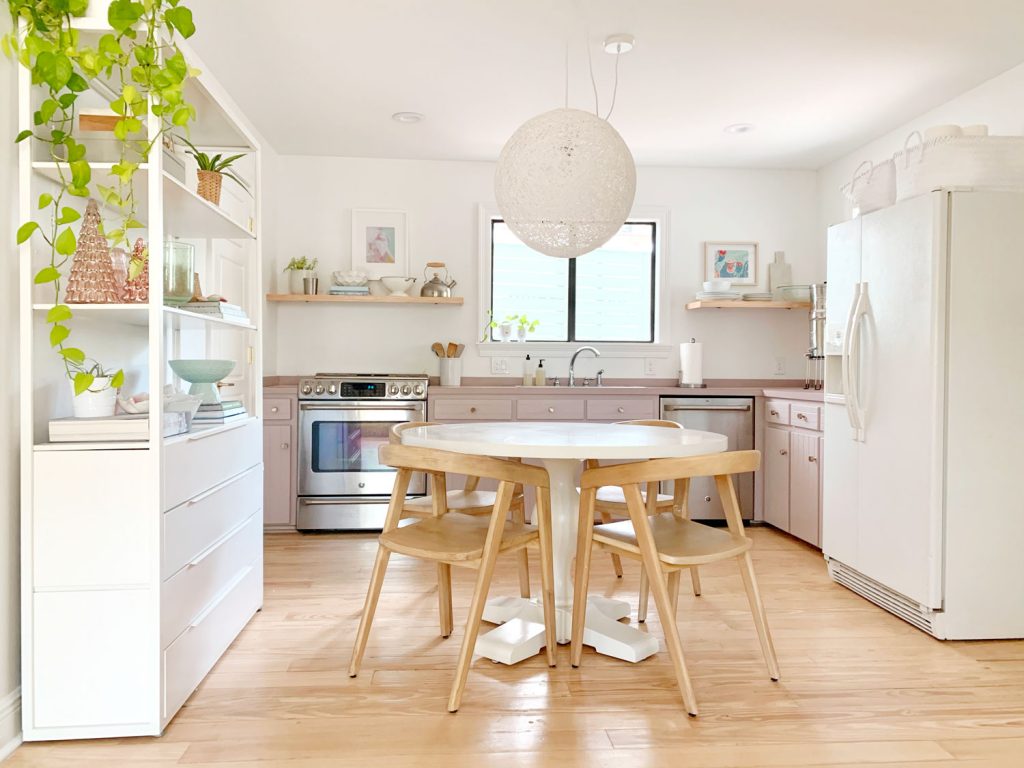
We have plans to fully renovate the kitchen down the line, but thanks to our updates, nothing about this current kitchen is spurring us on to get to that sooner rather than later – which is a nice feeling. We like to live in a house for a few years before any major updates like that whenever possible (we were in our last house for 4 years before we redid the kitchen). It just seems to lead to a better result when you live with it for a while and make sure you know exactly what would be the most useful, efficient, etc. Plus you can save up over time.
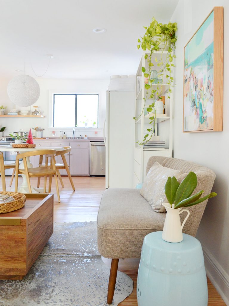
You might notice a few new changes in that photo above – mainly, some room-rearranging (we moved a bookshelf & scooted the table more towards the center of the room). And some new appliances! Can you hear my excited dolphin noise from here? (I have an extremely accurate dolphin noise that I make when I’m extra happy.) We got them secondhand for a steal – and a counter-depth fridge was included too, so that’s coming soon! I mean, look at this stove.
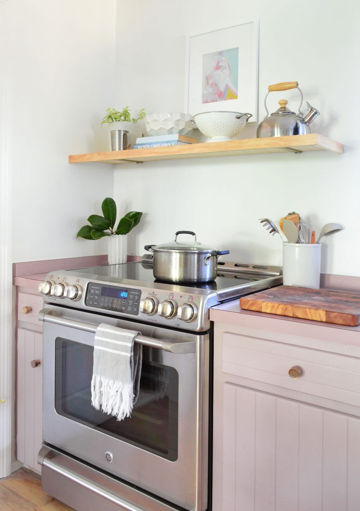
We’ve never had such nice appliances, and it was $500 for the entire suite of Café appliances that we got secondhand (fridge is still coming!). They’re only a few years old and in perfect condition. I pinch myself every morning that I walk into this kitchen and make myself tea on the new stove.
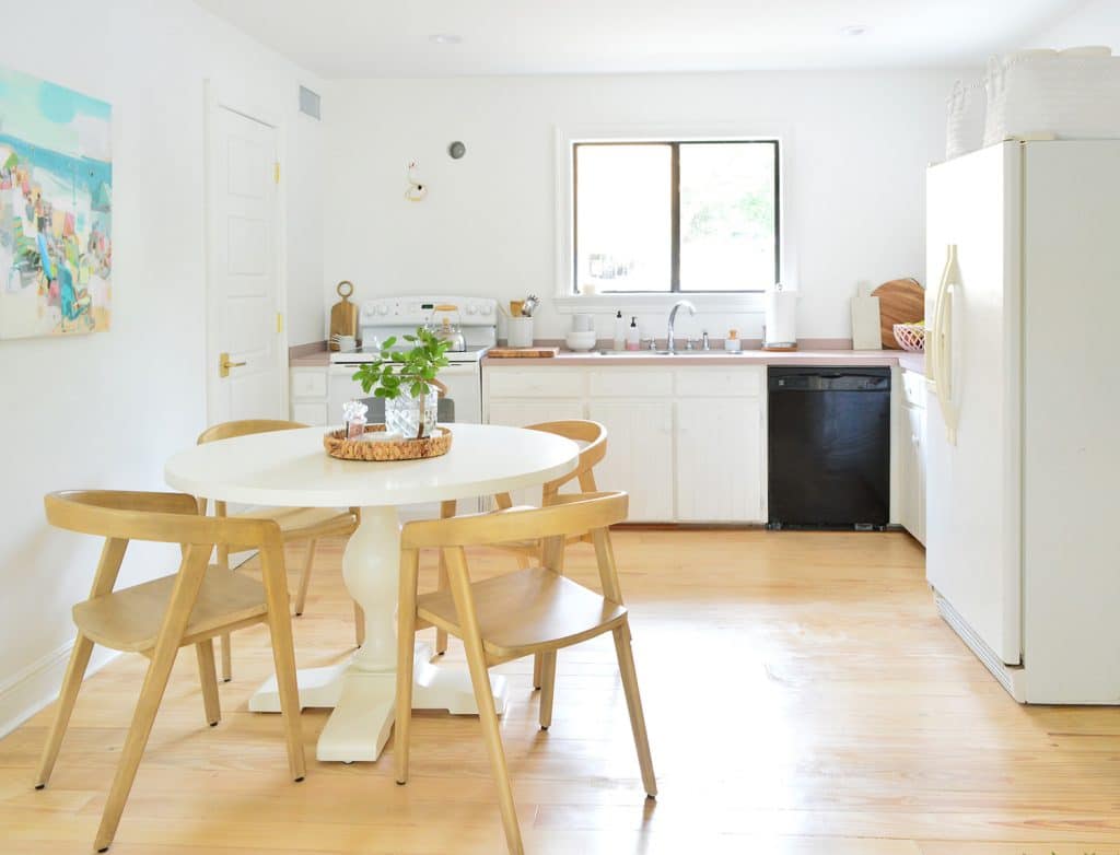
After starting out with an older white stove and a black dishwasher, it feels like a huge upgrade to have appliances that match – and they actually function better too (the dishwasher is extra quiet!). Here’s the original appliance situation a few weeks after moving in, for comparison:
The impetus for moving one of our two Ikea bookshelves across the room (and more into the “kitchen” area) was to free up more room in the sitting area – and to make the room feel more balanced with a more central table (like some of these inspo photos with a table in the middle of a kitchen). But we only wanted to stick with the new layout if it didn’t feel too tight in the kitchen (remember I married a very practical man who lets me get away with zero impractical furniture layouts because he’s basically The Efficiency Grinch). But instead of trying this and pushing everything back, we anchored that shelf on that left wall & rehung the art, which officially means it passed John’s we-can-leave-it-like-this test.

That photo above makes the table look weirdly close to the fridge from that angle, but here’s how much clearance there is when you see it head-on:
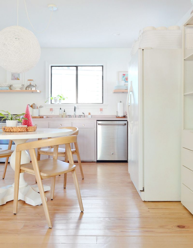
It’s by no means a football field of space around the table, but thankfully it works for us without feeling annoying. We can still get into these drawers on the left, which hold tools because that’s who we are (the shelves across the room are the ones that hold our pantry items).
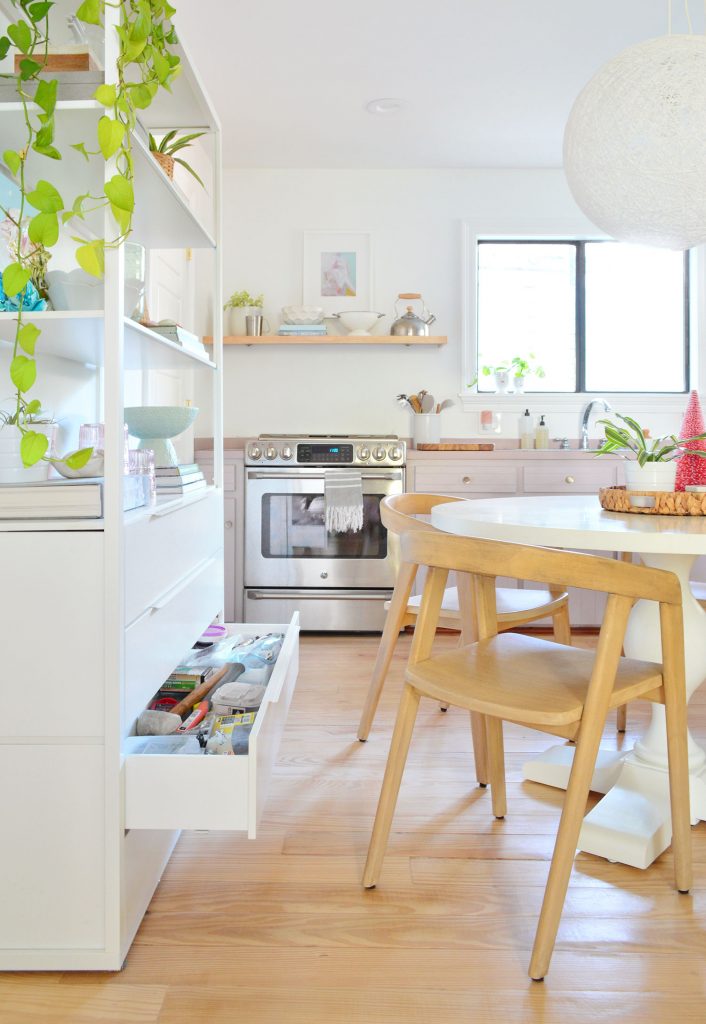
Here’s a shot with the drawer closed. When there are people sitting around the table you can’t get into them as easily, but we haven’t needed tools while sitting down for lunch or dinner yet so I’d say it’s a non-issue.

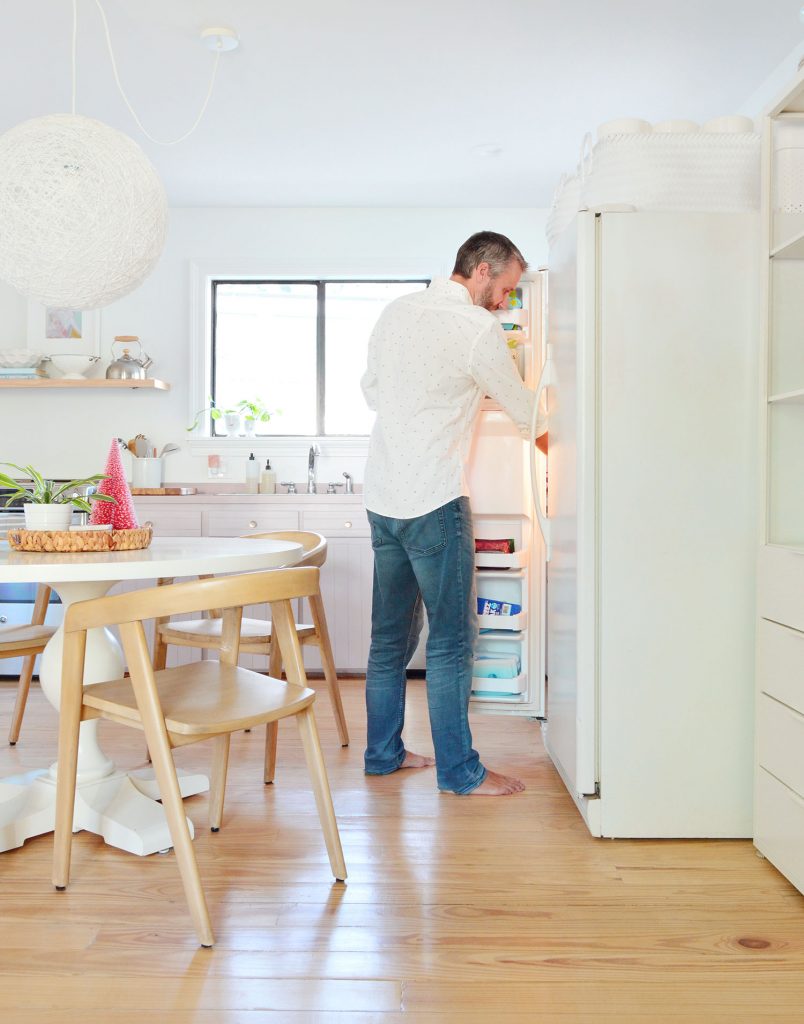
And now, let’s move back over to the side that John loves most of all. See how the fridge sticks out into the space a little more on this side…

… well, remember that we got a counter-depth fridge as part of that secondhand appliance suite that we bought. So that will be coming soon and it’ll shift back a bit to give us a little more clearance. But John actually loves this new setup even as it is right now because he can grab something like ketchup from the fridge if we’re eating. Without getting up. While sitting at the table his go-go-gadget arm shoots out and opens the door and grabs the soy sauce or the butter. I know. I wish I had a picture of that in this post.
You can see from this shot that there’s still plenty of room to get stuff from the fridge when people aren’t in the chairs – but when they’re in them… well, that’s when John’s magic ketchup-retrieving arm really enjoys the new layout. Maybe I’ll make a video demo for InstaStories for you. It’s hilarious how happy it makes him. It’s the little things.
Ok now back to the seating area. Having this chill space down here is so nice because when we all want to lounge and watch a movie we head upstairs to the family room, but when someone’s cooking or doing dishes and the kids just want to be nearby and read or do a puzzle or have a snack or whatever, this bonus little informal hangout zone is so nice to have.
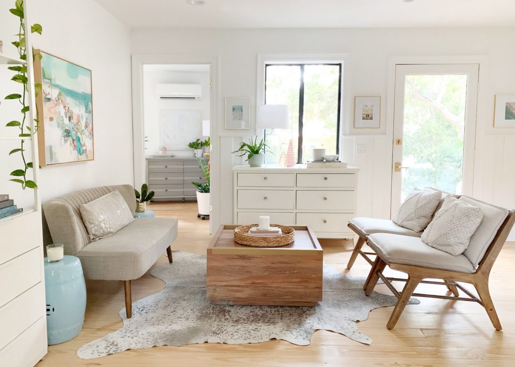
One perk to moving that second shelf more into the kitchen zone is that it freed up more space for a little settee in this area. So now we legitimately have seating for four, which feels great! Technically we could get a much larger rug to define this whole zone (an 8 x 10′ would fit with room to spare if that gives you a better idea of the size), but I love our existing rug for now. Here I am petting the cutest dog in the world for scale:
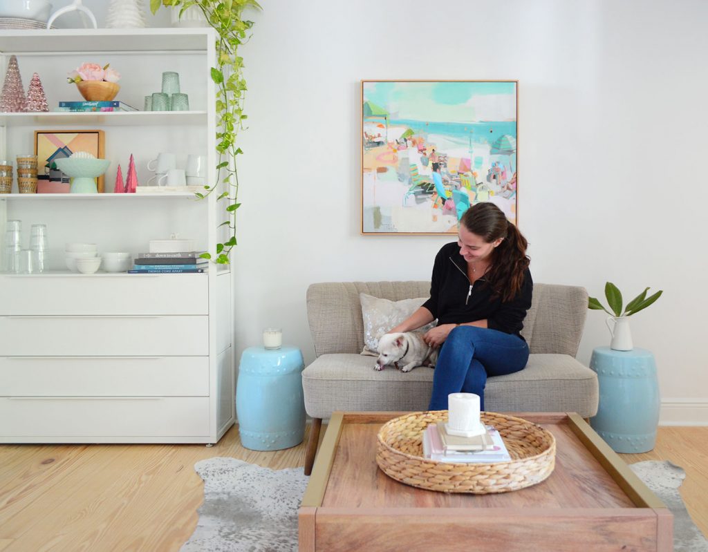
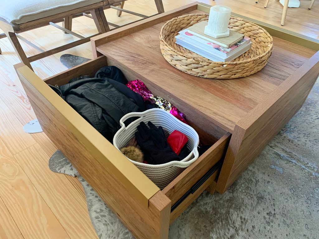
Oh and we got a new coffee table! We especially love the brass hardware and the large surface area on top – and best of all, it’s FULL of hidden storage! Two huge drawers that pull out. It’s such an improvement! I recently shoved a bunch of winter stuff in there in case we want to grab a hat or gloves or a jacket when it’s frigid out (aka: under fifty because we’re wimps). And the other side has all of our tool batteries & charging stuff (once again, because we’re those people).
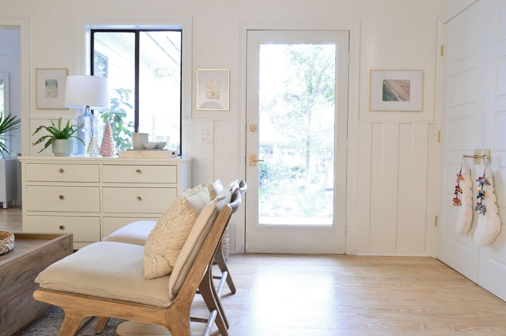
I just noticed that this wider photo of that sitting area makes it look like the chairs block the door, but it’s just the angle…

… here’s a shot from the other side to show you the big landing we have at the bottom of the stairs and in front of the front door (which also gives us lots of clearance to open those laundry closet doors on the right):
*Update: This all makes a lot more sense in 3-D (aka: on video, which is the next best thing to being here) so we filmed this quick video walk-through to give you a real feel for the space. Please enjoy a few loops around our kitchen:
Note: You can also view this video here on YouTube
*In the video we added above, you might notice that the table base was spun so the chairs didn’t nest over the pedestal base, they sort of terminated at the sides of it, like the do in this photo:
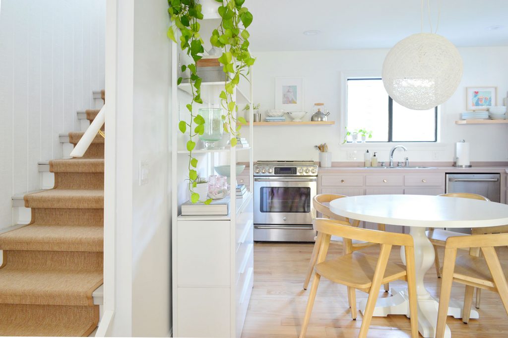
… versus the way the base is spun in the rest of the photos where the pedestal base slides between the chairs and sort of nests that way:

Debating the merits of each setup led to a pretty amazing Instagram Story rabbit hole (involving polls, some live walking around the room, more polls, a copious amount of GIFs, etc). It was QUITE THE FRIDAY NIGHT. Essentially we’ve tried it both ways, and at first we were leaning towards the setup in the video, but other pedestal table owners pointed out that it’s easier to push the chairs in when the legs “are hugging” the base (seen in the photo above) as opposed to them sort of hitting the feet of the pedestal. So for now, we’re going with that. But I’m known to spin this table around depending on my mood, so we’ll see where we end up. #WildWoman
Anyway, back to the sitting area. That six drawer dresser under the window is CLUTCH (is that what all the cool kids are saying?) because it holds all of the things we grab when we go in and out like doggy bags, Burger’s leash, sunscreen, umbrellas, chapstick, sunglasses, etc, etc, etc.
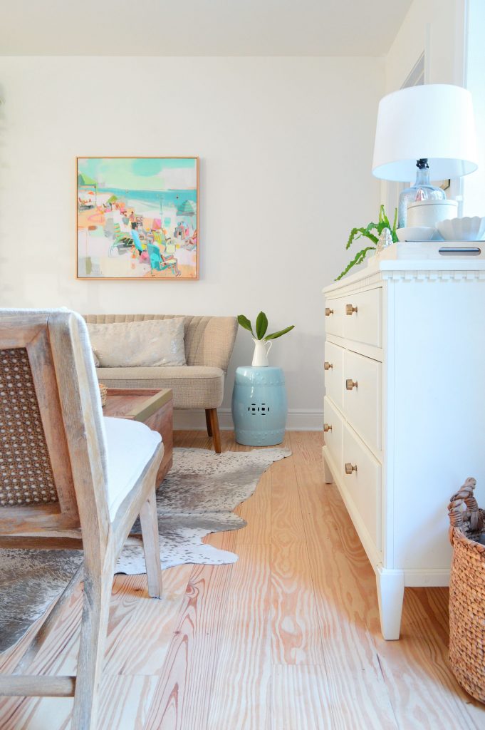
So it makes for the perfect entryway dropzone, and it was necessary to still be able to pass through here easily (and to be able grab whatever we need from the drawers).
And since we’re thorough, here’s the view from our bedroom.
The camera was too close to really give you an idea of how far that blue side table is from the door in that shot above, but this angle gives you more context.
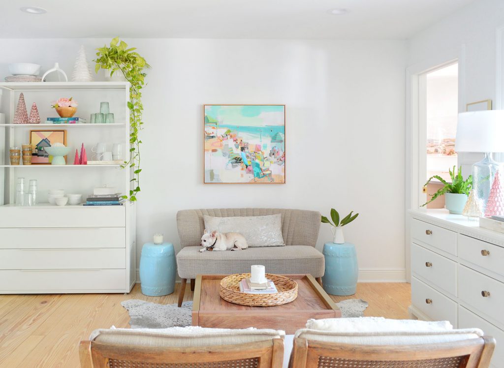
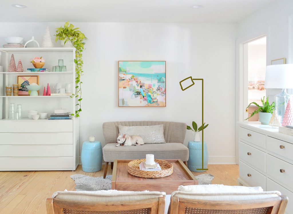
We definitely think this little zone will evolve over time as well. For example, a floor lamp could be really nice to fill that empty space and illuminate any reading or puzzle-making that goes on:
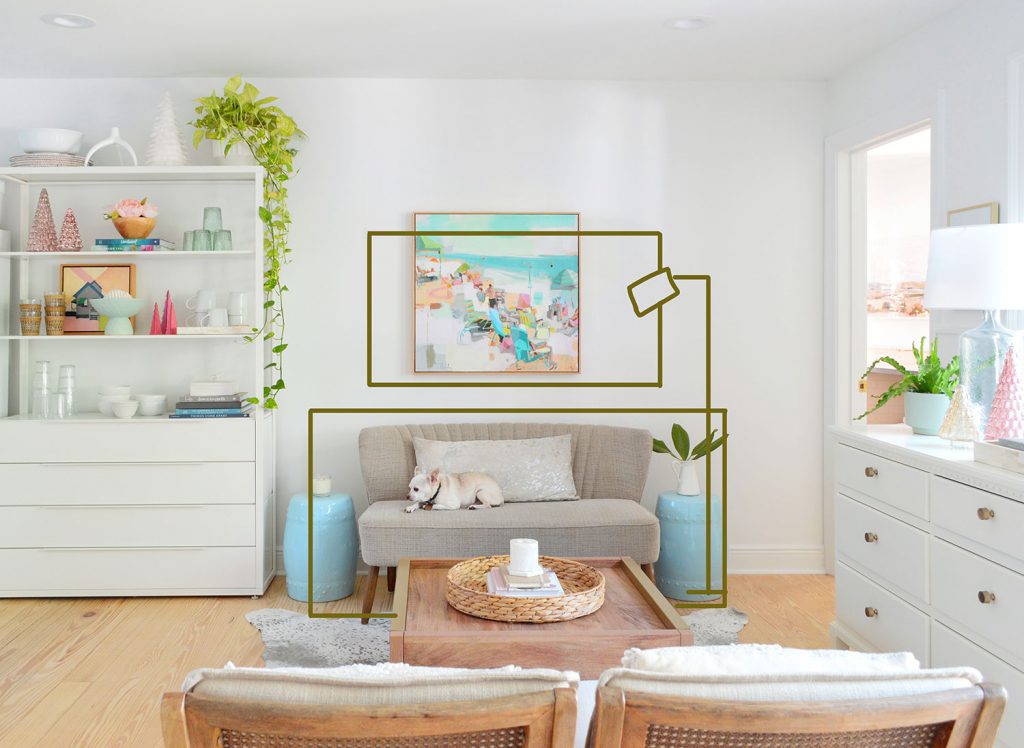
And once we got this settee in the space we realized that the room could probably handle something even bigger down the line – like a more substantial chair-and-a-half or maybe a small loveseat (it could absorb the area that the side tables take up, since they aren’t needed due to now having a nice big coffee table). And a larger loveseat or double chair might benefit from some bigger art above it. So maybe that’s how this area will evolve over time…
Even exactly as it is right now, it’s comfortable and functional for our family. So we’re extremely happy with “the journey” when it comes to this room. I think small tweaks like this often have to occur in order to get you to the best possible end result, so embracing those little changes means they can lead to the best possible room in the end.

So that’s how this sweet room of ours has been coming along so far. It’s pretty amazing to realize that many of the major components in here are still what came out of our moving pod back in May (both Ikea bookshelves, the kitchen table, the kitchen chairs, the two armless sitting area chairs, the rug, the entryway dresser, and all of our art and accessories). Also let’s take a moment to appreciate how much Burger and all of my plants love Florida. Never been happier.
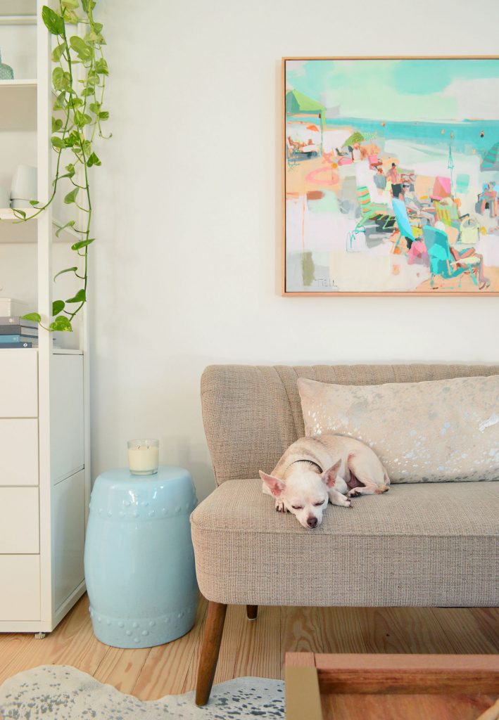
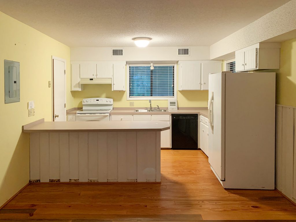
Let’s end this with a few before photos for comparison. This one was taken on the rainiest day ever so it’s especially gloomy looking:
And here’s the “right now” shot from the same angle:

If you turn around and face the other way, here’s that before:
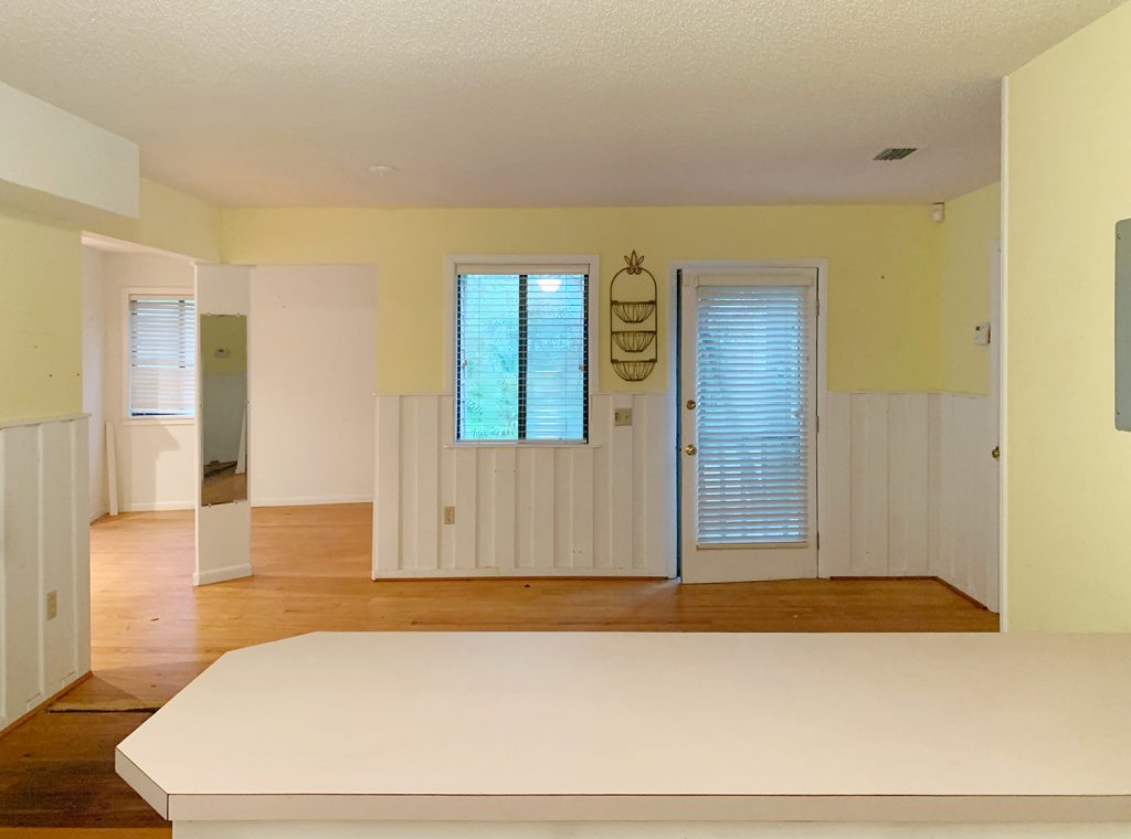
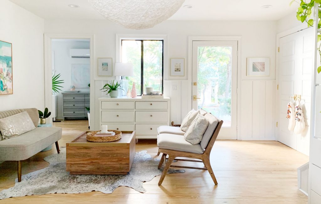
And here’s a similar current view. Ah. Feels good.
If you have questions about how we renovated things like the bulkheads & stuff, this post has all of that info. And if you’re wondering how we redid the floors, here’s a post about that. We still get the occasional question about how we like having all of our bedrooms on the main floor and the family room upstairs, and the bullets in this post really quantify how we feel about this floor plan. There’s also this archive about our Florida house that covers every single change, listed chronologically for anyone who wants a deeper dive. Now if you’ll excuse me, I’m going to await John’s ketchup arm and try to catch it on video…
*This post contains affiliate links, so we may earn a small commission when you make a purchase through links on our site at no additional cost to you.
