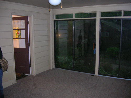
After giving our floor stencils a full seven days to dry (it’s humid here!) we finally moved all of our furniture back into the sunroom and snapped a few photos of the whole room after our three phase mini makeover (see phase one here, phase two here, and phase three here). First let’s take a look back at what that room looked like when we purchased the house four and a half years ago. Yeah, it had a thin matted rug that smelled like dog. Enticing, we know.
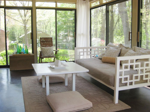
So we pulled up the rug (the very first day we moved in) and stained and then later painted the concrete floor. It was definitely a slow evolution in there, but the great views made it one of our favorite places to hang out pretty much from day one (after that stinky carpet was gone of course). Here’s the room as it looked about a month ago before our mini makeover began. There’s no denying that it was serene in there, but with tan walls, a tan rug, tan floor pillows, a tan daybed cover, tan pillows, a tan ceiling, some brown furniture, a brown floor, some white curtains, and some white furniture it was feeling a little flat. So we wanted to keep most of those neutrals but add a little color and fun (without spending over $150).
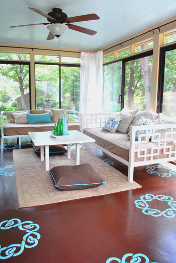
Now here’s the room as it looks today, after we added a dresser from another room, painted the daybed, hung sleek looking curtain rods, painted the ceiling, and stenciled the floor (read about those projects here, here, and here). Note: This room definitely looks different in person than it does in these photos. It’s hard to explain, but the floor is just one plane, and the view out of the glass doors is three planes, so the view is definitely is a lot more emphasized in person than the floor stencils (but in the pics the view is sort of diffused thanks to the reflective glass and the stencils are extremely high contrast for some reason). We’ve had friends and family members over (even extremely “reserved” ones) and they all love the floor- going as far as to describe it as a subtle change and the entire room as a soothing space. Sometimes things are just hard to capture in photos!
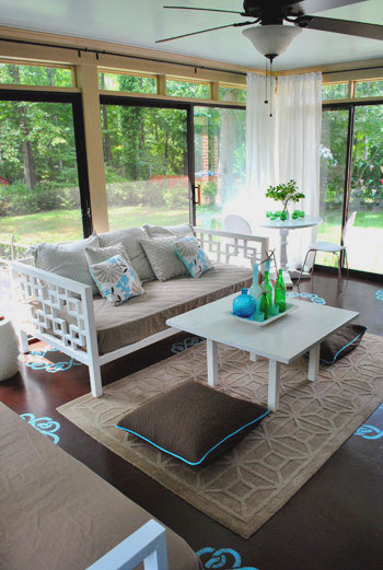
We love how the splash of aqua on the floor complements the sky blue ceiling (which really makes the room feel much more open and airy). We love the look of a blue ceiling, which is a popular choice (especially in the South). It’s sometimes called “haint blue” and we’ve written a whole post about it.
We also love that we gained tons of storage (for everything from board games to baby toys) thanks to this dresser that used to live in our guest bedroom before we turned that into an office/guest bedroom/playroom (see that transformation here).
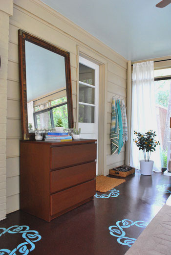
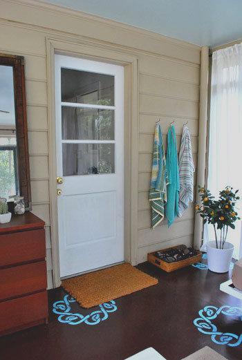
In the small tweaks category, we tossed a few colorful beach towels on our towel hooks (read more about why we need those here) and moved our fun faux orange tree over into that corner near our shoe basket. I DIYed that tree over five years ago in NYC when I needed greenery in my apartment but everything kept dying, so thanks to a few fake stems from Pier1 I was in business (I actually “planted” them in real dirt inside of a cheap Ikea planter). I know it’s odd to be attached to a strange little faux orange tree but it definitely has a special place in my heart. Although in my defense many people think it’s real and don’t believe me when I say it’s fake- maybe it’s the real dirt, haha.
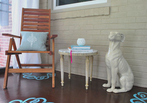
And we can’t forget our corner with the cheap-o marble table that we snagged a while back (read about that here) and my beloved ceramic pooch, which I still consider to be a major steal (learn more about him here).
We really like how the floor stencils peek out under the doormats, the area rug, and even the daybeds (thanks to the fact that they’re both on legs, so you can see the stencils running under them). And thanks to the fact that the majority of the furniture and accessories are still tan and white, the touches of blue and green that we added really feel playful and add dimension without being too much (especially in person, again, photographing a room with three glass walls was tough for us). We also love that we can change them all out if we ever tire of them. The floor and ceiling are just paint, which is cheap and easy to redo- while the accessories are even easier to swap out on a dime and in a moment’s notice.
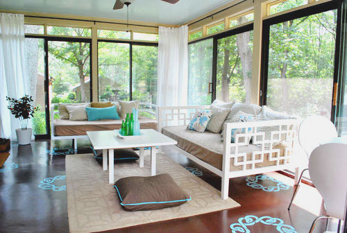
Oh and speaking of small accents, we picked up two $6 floor pillow covers (snagged on clearance at Bed Bath & Beyond, down from $19 each- they’re actually just square Euro shams that happened to fit right over our old floor pillows from Target).
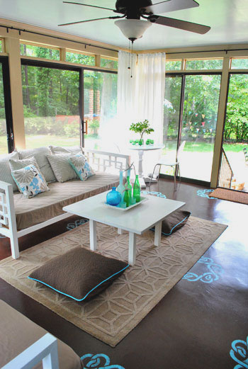
We figured that $12 upgrade added a bit more subtle contrast to the middle of the room (see how the old ones blended in a lot with the rug in the before picture?) so we’re happy we switched those out at the last minute. And should we ever want to take them back to the more neutral looking pillows of yore that’s a nice easy swap, which we appreciate. Speaking of $12, here’s the budget breakdown for this mini makeover of ours:
- $0- Dresser and mirror (leftover from old guest bedroom)
- $0- Second daybed (leftover from third bedroom which is now Clara’s nursery)
- $0- primer and paint for daybed (already owned- see that painting tutorial here)
- $20- Ceiling paint (Tide Pools by Behr in semi-gloss for sheen)
- $40- Curtain rods from Ikea (these without the finials)
- $20- Glidden oil-based porch/floor paint for stencil (color matched to Martha’s Lagoon)
- $30- Ceil stencil purchased from a local paint hero of ours
- $7- Sponge for stencil project
- $12- Floor pillow covers (clearance square Euro shams from BB&B)
- Total budget: $129.00
Not too bad considering that we updated everything from the furniture to the ceiling and even the floor. And small changes like those new curtain rods and the painted daybed really make all the difference. Surprise, surprise- we find ourselves out in the sunroom even more these days. Just soaking up the view out the window and taking in the scenery inside, too. We also find Clara staring at the stencils like she’s hypnotized. Kind of making this face. Hysterical. Apparently the girl already appreciates fun home decor. And if we ever tire of anything we can always paint it/replace it in a few quick phases without breaking the bank- just like we did these past few weeks. Woo hoo for inexpensive changes that make you smile.
What about you guys? Do you have any mini makeovers in the works? Are there any sunroom transformations going on at your house? Have you ever plated something faux in real dirt? Spill it.
Psst- Wanna follow along with our sunroom mini makeover from day one? Here’s the first phase, the second phase, and the third phase.

Ashley M. [at] (never home)maker says
What I like best about your recent transformation — new look or not — is the price tag.
You two really keep in mind the budget. That’s something I appreciate sincerely. You need not have a huge bank account to mix up your space. Thanks for continually sharing that way of thinking (and creatively saving) with the blog world.
<3
Sally says
I think my favorite part is the curtain rods. That was something that I never would have thought of and it looks fab! I’m sure it is very hard to capture the essence of the room with so much light coming in from three walls of windows. I can definitely imagine how the stencils could appear more dominant in the room than they actually are. Actually, the brown floor has always come through to me as fairly dominant in pictures when I’m fairly sure it’s not in person. I really like the stencil concept. It’s so much fun. I’m glad you guys are willing to put your necks out and try new things. It helps the rest of us think a bit outside the box. :) Thanks!
Lisa says
You two are amazing! I love using dressers for storage in rooms other than the bedroom (though I don’t have it going on currently :)) Great colors…it does have a very airy feel (but love the grounding provided by the dark brown).
Eryn says
I really like the addition of the white daybed, and the pops of teal in the pillows. (And that thing about he fake orange tree is an awesome idea.) On the other hand, – and maybe it’s just the lighting – the colors aren’t really doing it for me. The floor seems reddish brown, the teal stencil so bright, the walls a yellowish-neutral, and the blue celing – it feels a bit too mish-mashed to me.
Allison says
I love the pops of the stencil peaking out from under the furniture and rugs. It looks so polished in this room! Am also pleased with the new floor pillow cover to give a little more contrast. Like many other readers I thought the room was great before but love it even more after some tweaks!
Julie N says
Looks Great! I just bought some new curtains and the same rods from IKEA. I HATE the finials, I left mine off too. : )
– Julie
Cynthia says
Your “new” sunroom is delightful! I love the pops of turquoise, from the Celtic knotwork stencils to the piping on the new pillow covers (great buy!) to the repurposed glass bottles. We don’t see many screened-in back porches here in the NW corner of the United States, but I’m going to keep these ideas in mind for our about-to-be finished daylight basement!
Jen @ The Decor Scene says
I LOVE IT!!!!! Gorgeous!!! And I really like the room with the rug. I wasn’t sure if it would look good or not, but I think the rug warms things up just right. I love the stencil and the color. Love brown & acqua together. This room is inspiration for our sunroom. But we are going to probably paint out walls a blue/green color and the ceiling is white. We have white rafters with white plastic roofing (you usually see it on greenhouses I think, it’s waving material. We like it, it lets great light in to the sunroom and the rest of the house. I can’t wait to finish our sunroom now. Hopefully next year we will be enjoying our sunroom the way you enjoy yours. Congrats on the amazing makeover.
Jen @ The Decor Scene says
Actually have you thought about taking pictures at night time too? I would love to see a picture of the room when it’s dark outside. I wonder what the floor looks like then. Just a thought. ;)
YoungHouseLove says
Hey Jen,
Thanks for the suggestion! It gets pretty dark in there at night (since there’s just one light source in the whole room) so we’re not sure if the photos would come out well at night. Something to think about though!
xo,
s
Sarah@StyleandCentsability says
Looks great. I love turquoise and brown together, so this is my kind of sunroom. I am amazed at how much of a difference the floor cushion covers make. It really brings everything together so perfectly.
We just started our basement makeover and phew- There are going to be a lot of phases!!
http://styleandcentsability.wordpress.com/
CarMaj says
LOOKS GREAT!!! Awesome job!!!
Jen @ The Decor Scene says
I didn’t realize there was only one light source. Do you have a external flash on your camera? If you do you could point the flash up to the ceiling and that should give you the light you need for night time, I think. I have one and I love playing around with it. Just a thought. :D
YoungHouseLove says
Thanks Jen! We have a little pop up flash but we don’t have a nice add-on flash that we could redirect to the ceiling. But thanks for the tip! That would definitely lighten things up in there!
xo,
s
Heather says
Hey Guys! This looks soooo great! I love the blue and brown together! My hubby and I love to do room makeovers. We do little upgrades here and there and its so much fun. We just recently started working on our living room. We painted our coffee table and side table white which looks great and brightened up the room like crazy and we got a great little retro lampshade from Wal-Mart for $6! We also have a great place in Nashville called Pre to Post Modern that we are in LOVE with and you guys would be too! Next time you are in the Nashvegas area you should stop by! Its off of 8th Ave! Anyway, thanks for this post! I know the hubs is getting tired of me saying “but they do it this way on YHL” but I don’t care! LOL! Love ya!
Shellie says
Hey guys!
I too just bought my first house with my fiancee. I am so inspiried by your entire site! My fiancee thinks I’m nuts because whenever we are working on a project I say “Well John and Sherry do it like this….”
I love your site and am so glad I found it. I have read your wedding page 3 times and am SO stealing some ideas for mine :)
Thank you for being such an inspiration!
Tamara @ Etcetorize says
Wow! The transformation is great! I’m so inspired. I have a front porch that is badly in need of a makeover but I’ve been so busy with the rest of the house that I haven’t bothered. Maybe I’ll move it a little higher on the priority list~
Elizabeth says
I agree with the comment that the new floor cushion covers are my favorite! It makes me want to rush out to BB&B to see if they have any clearance euro shams in my colors as I have two similar cushions that I like to throw on the living room floor.
Thanks for the inspiration and info!
MelissaOklahoma says
I love your sunroom! We look here and there at buying a house and I’m always drawn to a home with a sunroom! I just love the floor to ceiling windows and having a room that feels like your outside, but not. It’s a great place to put “real” furniture (ie: not patio) furniture in a place that feels outdoors. Do you guys hang out in your sunroom at all during the winter, or is it too cold?
Also just wanted to say, we’ve come across several homes that have that outdated wall to wall wood paneling that really darkens up a room. My first reaction is to say “NO! and NEXT” but then I remember how your house had the wood paneling and how you painted and totally brightened and transformed the room (your whole house in fact).
Anyhow, just a long winded comment to say thanks for the inspiration!
YoungHouseLove says
Hey MelissaOklahoma,
It’s usually too cold out there during winter, so we enjoy the sunroom from March through October. Hope it helps!
xo,
s
Angela says
I have to agree that I’m not in love it and liked the before better. The simple, neutral color scheme allowed you focus on the view and was relaxing. Now it looks busy and even a little matchy matchy (i.e. the floor and the pillows), which I used to feel you did a great job staying away from.
I do like the blue ceiling and the curtain rods though.
Tana says
Love love love the blue ceiling. Makes me wish I had a screened/glass porch just so I could paint the ceiling blue. Not loving the stenciling, however. Liked it the way it was before. I thought it was so serene before.
Lindsay@Tell'er All About It says
Naysayers be damned – I love the floors! And it’s just paint – if you get bored, you can always paint right over it – ahhh….the glories of paint!!! Besides, a good designer takes a risk! LOVE it! So jealous and wish I had a sunroom/porch!
Katie says
I LOVE IT! The final product looks absolutely amazing. GOOD WORK!
Stacey says
WOW. Just. WOW. I love it! Ya gotta love much style for so little $$$!
I don’t currently have a mini makeover in the works — everything I want to do would be considered major (at least to my hubby ;o) — but I REALLY want to update my boys’ bedroom ASAP since it’s looking too young for 9 & 11 yr olds and you’ve inspired me to do it on as “mini” a budget as possible.
In the past, I would have just bought things w/ little forethought and, in the end, the room would fall short of that “put together” look I covet. With the help of some of your make-overs and mood boards, I’m planning it all out ahead of time and doggedly searching for the best bargains. I have to say that I’m finding the challenge of trying to come up w/ stylish options for as little $$ as possible kind of exciting! Hopefully, I’ll have a reader re-do to share with you in the near future (need to pad the coffers a bit first ;o))
Melissa @HOUSEography says
Hi guys,
This really makes me think about doing a stencil on our porch floor soon. I am going to check out the possibilities!
How many months of the year do you use that room? I cannot seem to remember whether it’s heated or not.
Melissa
http://www.houseography.net
YoungHouseLove says
Hey Melissa,
Our sunroom’s not heated or cooled, so it’s a three season room (we usually use it from March to October). Hope it helps!
xo,
s
Melissa says
Well I was also very skeptical of the floor when you first debuted the concept, but now that I see it all together, I think it looks fan-freaking-tastic!! I think it all totally, totally works. Nice job!
Also, I have always loved that little orange tree in your room. And I always thought it was real. Since it’s handmade, I would love a post on how you made it.
Great job!
xo,
M
Anna says
Oh my! Love it!! I want to steal all your ideas (remember, imitation is the most sincere form of flattery)! I wonder if I can talk hubby into building on a sunroom before the weekend?
Lindsay says
LOVE the whole thing…including the price! I wish I had your creativity…what a great look.
Christine says
Love it! The first thing that I did when we moved into our house was tear up the carpet in the sunroom. Why do people put (glued down) carpet in places like porches and sunrooms? I will never know!
Jocelyn Stott says
Really looks beautiful. And, can I just tell you that every time I see that white dog it makes me smile.
Suzie @ cupcake monkey says
Yay!! I have been WAITING for the finished product post!! You guys were killing me! :) It looks fantastic! I would LOVE a sun room like that! That dog is awesome!
ps says
Love the floor and stencil and the light blue ceiling….admire the energy and dedication you two have to complete project after project. Just one question, doesn’t the wall color feel out of place to you after all the upgrades?
YoungHouseLove says
Hey PS,
We love the wall color – it might be one of those things where the photos aren’t doing it justice and you just have to see it in person. It’s a creamy neutral tan (which we would definitely have changed if we didn’t like it!). It must just be the pics- it’s really hard to shoot a room with three walls of glass in an accurate way! Hope it helps!
xo,
s
Christine B says
I like how you comment that the pictures just don’t do the room justice. I can totally relate to that. We just finished our home office and it looks amazing but due to the lack of natural light it is comming out horrid in photos. Oh well. Nice room!
Sammy says
I’m still not sure if I love your stenciled floor or not. Don’t get me wrong, I love the stencil you picked, the way the stencils are placed and the whole rest of the makeover.
But the color seems really bright. I think a darker and greener turquoise… teal would look awesome (especially with the mocca as an earthy contrast to the lovely airy ceiling) – it would definitely add interest, but in a more subtle way :)
(Maybe I’m just too much into teal. I recently discovered that I have only ONE t-shirt that isn’t teal or grey-ish… is it weird I didn’t even notice that earlier?)
Emily @ The Happy Home says
sherry, you have such a knack for color! this room is gorgeous. well done! just added a sunroom to the list of musts in my first house.
cailen says
awesome stencils! i love the pop of blue – it totally “makes” the room : )
Alice says
I am pea green with envy at your sunroom! I live in a condo/townhouse (connected to other condos on the back and both sides with a patio in front). Unfortunately, condos just don’t come with a sunroom (or “Arizona rooms” as we call them in AZ). Thus, I will just have to enjoy yours vicariously from way afar!
Sheila says
Usually I love everything you guys do…you’re hip, very talented and thrifty. What’s not to love! But I have to say that I’m just not digging the aqua stencil. Though I really like stencils and pattern and vivid colors, I think the contrast between the brown and the aqua is too great. Maybe a lighter shade or a glaze over the aqua would look better, at least to me!!! But what do I know??? I’m not the expert.
jessica says
Love it! I can’t wait to do an aqua ceiling in my house. And the floor looks amazing, especially with those aqua trimmed pillows. Are yall going to do over the dresser and mirror though? It seems a little out of place, maybe with the style of the sunroom rather than in the area. Just curious!
YoungHouseLove says
We originally planned to grasscloth the dresser but we couldn’t find the right color and pattern that we liked for the room. Our eyes are still open though so we’ll keep you posted if we tackle that makeover!
xo,
s
Vonda says
LOVE LOVE LOVE IT! I love the pops of turquoise and green and love the ceiling color with it. I think the floor is fantastic and you have me wanting to run to Sunny’s and pick up a stencil!!
Katie says
I had a hard time figuring out how to reduce the glare while still capturing the colors in these photos: http://hellotruelove.tumblr.com/post/1121210693/console-conundrum . I remember you writing that glare was an issue in taking the sunroom photos. Any tricks you learned from the process?
The sunroom looks fantastic; I’m sure the full effect of seeing it in person is even better. I live in NYC and (as you guys well know) it’s a very lucky person who has a sunroom here;) I love your blog. Thanks for doing what you do!
YoungHouseLove says
Hey Katie,
Thanks! We didn’t really learn any tricks, we just took a ton of pics in different times of day and tried to capture the room (which admittedly, we still don’t think we mastered). Hope it helps!
xo,
s
rachael s says
everything about this is just perfect. i love it! the curtains really add a little something to the whole room and the stencil on the floor looks great with the pillows and glass bottles on the table.
mary says
love it! wish we had a sunroom like that.
where did you get the chair by the ceramic dog? are they good for outdoor use?
YoungHouseLove says
We got that from Ikea and yes, it can be outside too (it’s teak). Hope it helps!
xo,
s
Dave says
I love the transformation it looks great, dont’ think I’d have the guts to do that on the floor…the wall i would, but much less to move out of the room when i change my mind. Maybe it is just how the light is catching the floor but I would have the painted pattern on the floor to be a slight shade lighter then the field color (the main floor color)….but that is just my personal taste.
Lauren E. says
I like the ceiling and new pops of color but I’m not sure I would have done the stencil on the floor. But as long as you guys love it.. that’s all that matters! :)
Beth says
I think you guys did a fantastic job…. very thoughtful and you managed to tie that bright aqua color together… it looks super creative and relaxing. I’m not entirely sold on the floor tiles, though… I think if you would have stenciled the white curtains with the aqua that would have worked better… but love that you guys are so adventurous! You’ve certainly inspired me!
Cassie says
I have to say this is the first project that you two have done that I don’t really care for (I feel bad even saying it). One of my favorite things about your house is how neutral and airy it looks. I feel like the stencil blue is too bold and jarring. Same with the floor pillows. I kind had the same feeling about the den rug, too.
I do, however, think the painted daybed looks amazing! And the ceiling is awesome! I think it really contributes to the softness of the room. Glad you guys are enjoying your new room. :-)
RachelS says
I follow your blog every day & love everything you two do. However, I have to admit (& I am sorry!) that I was skeptical of the aqua stencils. At first, it just didn’t seem to fit.
Today, I can see the light! This is an awesome room. It is hard to convince my husband at times to “Wait until the project is finished! It will all come together!” with our house projects. I should have taken my own advice with your sunroom.
Great job! :D
Sarah says
This looks great! I wish I was there!…but in each picture I can’t help but think the trim would look great a crisp white…though all that trim might take some time.
Handy Man, Crafty Woman says
Love it! Love the aqua touches…such a nice, fresh color.
nic says
I like most parts fo this re-do, but I don’t really like the floor (I too feel bad even saying it).
Usually you are more into “crisp and airy” but the stencil blue is so bold and (IMHO, in the pics anyway) kind of clashes with the brown on the floor.
I think it would have been more serene and clean looking without the floor stencil, or a less contrasting colour of stencil. Two shades of aqua maybe?
It is cool to see your tastes evolving from neutral to more graphic and colourful, and I like a lot of the graphic prints you’ve been bringing in. It strikes me that your recent colour choices (aquas and greens) and the graphic fabrics are probably similar to things that were in style when your house was built, so it is very well suited to this style.
Carolyn says
I like it, but then again I really liked how it was before. It just seems a little too ‘busy’ now. Nonetheless, it’s your house, so well done for being so industrious and completing your transformations on such a small budget. That is very inspiring!