After giving our floor stencils a full seven days to dry (it’s humid here!) we finally moved all of our furniture back into the sunroom and snapped a few photos of the whole room after our three phase mini makeover (see phase one here, phase two here, and phase three here). First let’s take a look back at what that room looked like when we purchased the house four and a half years ago. Yeah, it had a thin matted rug that smelled like dog. Enticing, we know.
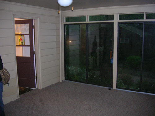
So we pulled up the rug (the very first day we moved in) and stained and then later painted the concrete floor. It was definitely a slow evolution in there, but the great views made it one of our favorite places to hang out pretty much from day one (after that stinky carpet was gone of course). Here’s the room as it looked about a month ago before our mini makeover began. There’s no denying that it was serene in there, but with tan walls, a tan rug, tan floor pillows, a tan daybed cover, tan pillows, a tan ceiling, some brown furniture, a brown floor, some white curtains, and some white furniture it was feeling a little flat. So we wanted to keep most of those neutrals but add a little color and fun (without spending over $150).
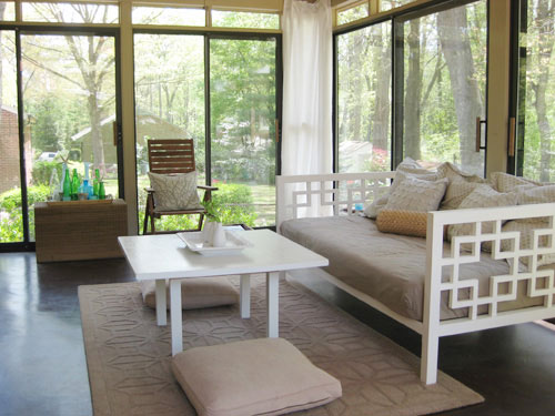
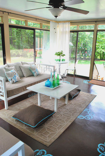
Now here’s the room as it looks today, after we added a dresser from another room, painted the daybed, hung sleek looking curtain rods, painted the ceiling, and stenciled the floor (read about those projects here, here, and here). Note: This room definitely looks different in person than it does in these photos. It’s hard to explain, but the floor is just one plane, and the view out of the glass doors is three planes, so the view is definitely is a lot more emphasized in person than the floor stencils (but in the pics the view is sort of diffused thanks to the reflective glass and the stencils are extremely high contrast for some reason). We’ve had friends and family members over (even extremely “reserved” ones) and they all love the floor- going as far as to describe it as a subtle change and the entire room as a soothing space. Sometimes things are just hard to capture in photos!
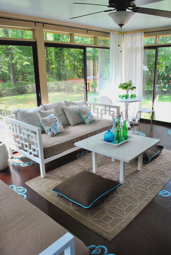
We love how the splash of aqua on the floor complements the sky blue ceiling (which really makes the room feel much more open and airy). We love the look of a blue ceiling, which is a popular choice (especially in the South). It’s sometimes called “haint blue” and we’ve written a whole post about it.
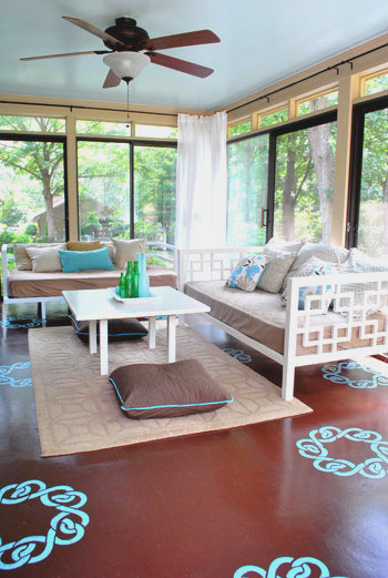
We also love that we gained tons of storage (for everything from board games to baby toys) thanks to this dresser that used to live in our guest bedroom before we turned that into an office/guest bedroom/playroom (see that transformation here).
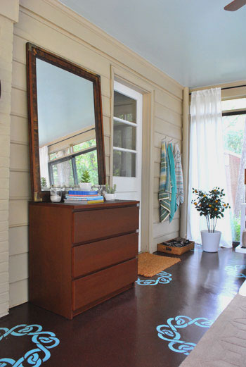
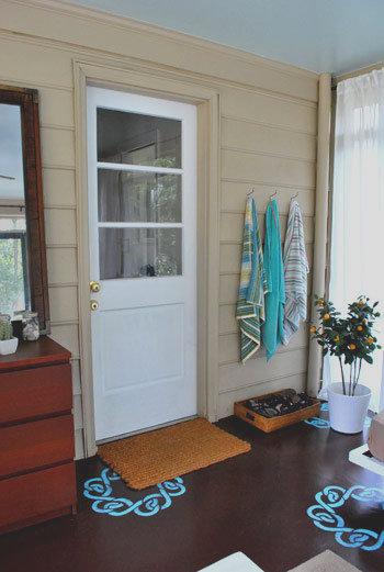
In the small tweaks category, we tossed a few colorful beach towels on our towel hooks (read more about why we need those here) and moved our fun faux orange tree over into that corner near our shoe basket. I DIYed that tree over five years ago in NYC when I needed greenery in my apartment but everything kept dying, so thanks to a few fake stems from Pier1 I was in business (I actually “planted” them in real dirt inside of a cheap Ikea planter). I know it’s odd to be attached to a strange little faux orange tree but it definitely has a special place in my heart. Although in my defense many people think it’s real and don’t believe me when I say it’s fake- maybe it’s the real dirt, haha.
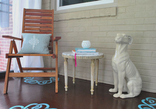
And we can’t forget our corner with the cheap-o marble table that we snagged a while back (read about that here) and my beloved ceramic pooch, which I still consider to be a major steal (learn more about him here).
We really like how the floor stencils peek out under the doormats, the area rug, and even the daybeds (thanks to the fact that they’re both on legs, so you can see the stencils running under them). And thanks to the fact that the majority of the furniture and accessories are still tan and white, the touches of blue and green that we added really feel playful and add dimension without being too much (especially in person, again, photographing a room with three glass walls was tough for us). We also love that we can change them all out if we ever tire of them. The floor and ceiling are just paint, which is cheap and easy to redo- while the accessories are even easier to swap out on a dime and in a moment’s notice.
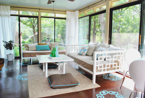
Oh and speaking of small accents, we picked up two $6 floor pillow covers (snagged on clearance at Bed Bath & Beyond, down from $19 each- they’re actually just square Euro shams that happened to fit right over our old floor pillows from Target).
We figured that $12 upgrade added a bit more subtle contrast to the middle of the room (see how the old ones blended in a lot with the rug in the before picture?) so we’re happy we switched those out at the last minute. And should we ever want to take them back to the more neutral looking pillows of yore that’s a nice easy swap, which we appreciate. Speaking of $12, here’s the budget breakdown for this mini makeover of ours:
- $0- Dresser and mirror (leftover from old guest bedroom)
- $0- Second daybed (leftover from third bedroom which is now Clara’s nursery)
- $0- primer and paint for daybed (already owned- see that painting tutorial here)
- $20- Ceiling paint (Tide Pools by Behr in semi-gloss for sheen)
- $40- Curtain rods from Ikea (these without the finials)
- $20- Glidden oil-based porch/floor paint for stencil (color matched to Martha’s Lagoon)
- $30- Ceil stencil purchased from a local paint hero of ours
- $7- Sponge for stencil project
- $12- Floor pillow covers (clearance square Euro shams from BB&B)
- Total budget: $129.00
Not too bad considering that we updated everything from the furniture to the ceiling and even the floor. And small changes like those new curtain rods and the painted daybed really make all the difference. Surprise, surprise- we find ourselves out in the sunroom even more these days. Just soaking up the view out the window and taking in the scenery inside, too. We also find Clara staring at the stencils like she’s hypnotized. Kind of making this face. Hysterical. Apparently the girl already appreciates fun home decor. And if we ever tire of anything we can always paint it/replace it in a few quick phases without breaking the bank- just like we did these past few weeks. Woo hoo for inexpensive changes that make you smile.
What about you guys? Do you have any mini makeovers in the works? Are there any sunroom transformations going on at your house? Have you ever plated something faux in real dirt? Spill it.
Psst- Wanna follow along with our sunroom mini makeover from day one? Here’s the first phase, the second phase, and the third phase.

Laura says
I’m just relieved to see that someone with an eye for design uses a ceiling fan…they are a MUST down here in Alabama (even though, contrary to popular belief we DO have air conditioning!) Most shows I see on HGTV involves a designer ripping down a ceiling fan on the first day. Thanks, Sherry and John for embracing the fan…cute one, I must say. :) Love your blog!
Jamie says
I would take so many afternoon naps on those daybeds. Mmmm.
But my favourite is the corner with your ceramic dog. I really like that chair.
Michelle says
Wonderful turn out! Love the pop of aqua. Your sunroom transformation is one of the best i’ve seen. Great job guys!
Rosanne says
Such a happy room! Make me happy just looking at it, I can only imagine how happy you feel to be in there. Great job!
Emily says
I love Tuesdays at YHL! It is so fun watching your progress on whatever room you are tackling. Great job on the sunroom! But now I just have to ask…what’s next on the docket?!
YoungHouseLove says
Hey Emily,
Our to do list is as long as ever! Some outdoor makeovers, tiling, and building projects are all on the horizon along with a not-our-house makeover that we’re working on. Oh and some fun seasonal decorating. Stay tuned!
xo,
s
Mandy June says
I love the stencils on the floor! And then on top of that, the blue outlines of the accessories in the room really enhance the floor, too! It’s beautiful. Definitely looks like a place to lounge around in at the end of the day.
Katie @ Katie Beth Interiors says
I am in the love with how the floor turned out. It almost looks as if they are dancing about as if the shadows from lights above…so cute and fun!
Lisa G. says
I’m with Cassie on this one. Although in the past I have LOVED what you have done, I think that the floor is a little jejune and unsophisticated, and I liked the before pictures better than the after. (I also didn’t love the Clara rug) I am still a HUGE fan of you guys and love your blog!
anna see says
Ack! I am in love! Your sunroom is so inviting. That floor rocks, and the ceiling is PERFECT.
Linda says
The color of the stencils clashes. I usually love your still…but I really like the before color scene much better….sorrrryyy!!
Heather j. says
I love it. Crisp and fresh.
Glad to hear that you have some good seasonal decorating ideas on the horizon. I love fall, but sometimes, the decor is so cheesy. Can’t wait to see your ideas!
Crystal says
I am DYING for this stencil and the blue and brown of your floor. Simply DYING.
Lindsay says
The floor stencils are the first project of yours that I’m not crazy about. So overall your batting average is still amazing and far better than I could aspire to.
I think the stencils make the room feel too “done”, if you know what I mean. I loved the effortless, breezy style of the original room. And the neutral palette made it feel more like a three season room as opposed to a summer hangout.
Melissa F says
This is great! I love the floor…blue and brown is one of my favorite color combinations.
Nikki says
Your before shot looks so calm and serene – doesn’t detract from the great outdoors. I’m a huge aqua fan and while I almost always love a great pop of color, this one looks forced. Seems to detract from the views outside. I do like the blue on the ceiling and the addition of plants (though real would be better!) The pillows would probably work better if the floor wasn’t stenciled.
Larissa says
When I saw the post I questioned how it could be any better. Boy was I mistaken. The stenciling in the floor, the new ceiling color, and the updates to the outdoor daybeds just really up the beauty of this room. Your design work is truly an inspiration and it is so obvious that both of you have found your passion.
foo says
I don’t know if anyone already mentioned it, but to me the blue ceiling and the buttery yellowish “walls”? “trim”? are clashing. I know you probably can’t paint the trim of the sliding doors, but I think if you paint the walls/trim white it would be perfection. Otherwise, I love the stencils. It’s not too much, just enough of a pop of color. And something you can restencil another color if ever you feel the urge. Good job!!
foo says
Oh, and one more thing. I don’t want to push my luck, but I have a problem with the size the rug. It is way too small. When you have something that small, it cuts up the room and makes it look smaller. That rug right now I would call a “half floater”. lol. It’s only anchor is the two legs from the one day bed holding it down. Otherwise, it’s floating in the middle of the room. What is that one, 5 x 7? 6 x 9? You should have something much larger. I’m thinking 9 x 12 or 12 x 15 depending on the size of the room.
Yeah, I know, that cost money, but if you do that, I guarantee this room will look much larger and more complete.
YoungHouseLove says
Hey Foo,
We definitely have kept our eyes out for a bigger rug (we agree that the space could use an 8 x 10) but the 5 x 8 that’s in there is leftover from our living room (free!) so we can’t lie- we like that price tag. If we ever see a giant rug that can work in our often trafficed sunroom without giving us heartburn (and for the right price) we’ll definitely jump on it thought! And as for the walls, they’re just reading that color in the pics but they’re actually a soft and totally neutral tan. Just like our guest room and our living room. It was really hard to photograph that room (three walls of window, lots of glare, colors not reading as they do in real life, etc) but we definitely would have painted the walls in a heartbeat if they looked clashy in real life! You know we love to paint!
xo,
s
Tawnya says
You guys just amaze me. I find myself stumped at how to take the first step in doing these kinds of projects, even though with great bones, that’s all my house needs…it looks like nobody lives here because I can’t put one foot in front of the other for decorating. If you have any advice to share on that front, please do so. Your home feels warm and welcoming and has personality, and I’m just deflated that mine, all 3600 square feet of it, feels like a shell. Help!
YoungHouseLove says
Hey Tawnya,
Not to worry- you can do it! It’s all about breaking things down into manageable phases and taking things one step at a time! Things like paint and accessories can easily be changed, so instead of being paralyzed, just make one choice and go for it. Then follow that choice with another one and so on. The rooms will start to take shape and you’ll gain confidence as you go! Just remember our house took over four years to get where it is today- so it’s definitely nothing magical that happens overnight! Check out our Projects page which has a category called Where To Start that should help you gain some momentum! Good luck!
xo,
s
Tiffany says
Great work – looks like a very fun room! I don’t have a sun room, so I don’t know, (downtown high-rise dweller) but is that room climate controlled? You mentioned it is humid – is it usually humid in that room? Because for me, I would remove that door and door mat (by the orange tree) and have it just be an entry way like it’s any other room rather than an “I’m going to the garage” kind of feeling. Is that possible? It would open it up a bit more too. ? Beautiful work :) :)
YoungHouseLove says
Hey Tiffany,
Sadly that room isn’t heated or cooled, so it’s actually a three season room. For that reason we can’t remove that exterior door since it’s what keeps the hot air in our house during the winter and the cool air in during the summer. Hope it helps!
xo,
s
Julie at www.downtimeweblog.com says
Hey John and Sherry. Love all your decorating skills! I’m sure you’re mad busy and don’t have a lot of time, but if you have a sec…Can you tell me what kind of interior wall paint is your fav to use when you’re on a tight budget?
YoungHouseLove says
Hey Julie,
Behr! It’s great stuff!
xo,
s
Sammy says
After looking again at the pictures, I noticed that the decoration is really (but that’s just my opinion) matchy – and now I wonder how the room (esp. the floor) would look with more off-the-blue-color-scheme items…
So, if you’re going to change the decor for late fall (maybe some small pumpkins on the table, fun gumboots next to the door and bottle green/grey/brown pillowcases? You’ll have some awesome ideas, I’m sure…), please post some pictures! :)
YoungHouseLove says
Hey Sammy,
We actually went to three flower shops in search of orange tulips for the pedestal table in the corner and hit up TJ Max and Marshall’s for some orange pillows for the daybeds (the faux orange tree inspired us to add more splashes of that color) but we didn’t have any luck at any of those places so we kept things aqua and green and white and tan and chocolate (you know we love working with what we have to save money anyway).
Of course it’s a really easy change, and if we ever find pillows/flowers/accessories that we like in a different color scheme we’ll be sure to share pics!
xo,
s
Paula M. says
I really like this color combo and how the stencils look. I was slightly skeptical at first, from the looks of the initial stencil post by itself — but, true to form, you two have really tied it all in together so expertly, with the scattered dashes of acqua, turquoise, other blue shades, throughout the room (in the form of pillows, towels, etc.), that I think the blue stencils against the brown flooring work Really Well. And, as you say, there’s also the pale-blue ceiling that ties in with all that.
And the fact that you repurposed or reused so many pre-existing items or used up leftovers in such a savvy way is icing on the cake. (seeing the financial breakdown and the sum-up post of changes really hammers that home) Especially with a bunch of us still having the economic shakes and seeing our homes lose value (eeek! don’t get me started!), it’s heartening as can be to see how feasible it is to have High Style on a Low Cash Outlay.
Julie at www.downtimeweblog.com says
I love your color scheme! The floor really makes the whole room pop. Beautiful job for so little money!
Destiny says
Gorgeous … this makeover, mini or not, is special and substantial!
Sammy says
Hey Sherry (and John),
Wow, that search for orange sounds exhausting! How sad you didn’t find anything… still, what you did with what you had is really nice (and way better than I could – love the leafy cushions on the daybed, btw)!
& thanks! You brought back some sweet memories about orange tulips… My parents have a bunch in their backyard and I have some photos of primary school-me posing between orange tulips :)
Sammy
Sarah says
such a nice space! where’s the white pedestal table in the corner from?
YoungHouseLove says
We actually built it ourselves with a pedestal base that we got at a thrift store and a new tabletop that we got from Lowe’s. Then we just primed and painted it. Hope it helps!
xo,
s
Devin says
hey guys! really inspiring work as usual, but i’m with the gang that’s distracted by the floors. what’s super interesting to me is to see all the comments for-or-against. it got me thinking…how much do you think about resale when you make a home improvement? i’d imagine given the responses that the floor could be a strike against your home value (lol, but probably the only) because it’s so personalized. i could see non-diy’ers coming into the sunroom and getting pretty freaked out about having to repaint a floor. do you think if you ever sold the house, you’d paint over the stencils?
YoungHouseLove says
Good question! We definitely believe in personalizing your space and doing what works for you and makes you happy! That’s why we don’t hesitate to paint brick or paneling! And thankfully the bulk of our home improvement undertakings have elevated the value of our house by tens of thousands of dollars (we got our home refinanced a while back and it came in around 30K higher than what we paid for it, even though we bought before the bubble burst and got it appraised in the middle of a recession).
Needless to say that was music to our ears! So I guess we have learned to trust that our aesthetic and our projects largely increase the value of our home, so we wouldn’t change a thing about the floor before selling (honestly we also believe 99.9% of the naysayers would love it in person- it looks so different than the pics). And you know what they say: you only need one person to love your house enough to buy it. So instead of staying safe and decorating for the masses we like to do things that are fun and different that make us happy (cause we’re sure someone out there may come along and fall in love with those touches just like we have). Buying a house is an emotional purchase, so sometimes it’s those personal touches that grab people. Gone are the days of painting all the walls white and removing all the family photos to sell your house. Long live individuality!
xo,
s
Monica says
It looks amazing! You’ve got a great eye for putting everything together. I’m jealous! I wish I had your creative talent, but for now I’ll just take the inspiration ;]
Katie says
Thanks! Perhaps I’ll have to do morning, noon, and night photos;)
Debbie says
Love the makeover. It looks great. I have a screened back porch that has that aweful outdoor carpet too. I have painted and personalized but nervous about pulling up that carpet. I have been wanting to stain the concrete but afraid of what may be under the carpet, glue, etc. Did you have to sand the concrete after pulling up the carpet? I’ll send my before and after pictures if I can attach to this email.
Thanks for sharing!
YoungHouseLove says
Hey Debbie,
Your best bet is to pull up the carpet and take some photos of the concrete underneath. Then bring them (printed out or still on your digital camera) to your local home improvement store and ask them what they recommend since we’ve never dealt with glue before. Good luck!
xo,
s
angela says
FYI – Pier 1 has the BEST artificial fruit! I’ve had guest sneak off with the apples on my dining room table on more than one occasion only to return them with their heads hung in shame! LOL It’s hilarious!
I LOVEEEEE this room!
Amy Cameron says
Hi,
I know this is kind of an older post…I was wondering though if I could paint or stain my basement floor that is kind of crumbly. I have swept up and scrubbed the crumbles away but there are a few spots with pits and holes.
Any advice?
Thanks so much.
Amy
YoungHouseLove says
We’d ask around at a home improvement store. Maybe some self leveling cement or a skim coat of cement filler will work? Good luck!
xo,
s
Haute Chocolate says
Omg! I just came across this site and i am so inspired! My hubby and i will be celebrating our 4 year anniversary in july and we have yet to conquer our basement (among other areas lol) . I have some ideas now – thanks so much you have a reader for life now
:-)
Donna in TX says
Hi, Just found your blog and really like it. You guys are a real inspiration! I was wondering if you can answer a question about your painted concrete floor. We would like to do the same, but we were curious about weather the painted finish makes for a slippery floor, especially if there is a spot of water or something. We have ceramic tile in our kitchen and I know it can be pretty slick if you step in a drop of water that splashes on the floor from washing dishes. Even more so if you are barefoot.
YoungHouseLove says
We used that room to enter our house in the rain for years (before we moved) and never had an issue with slipping (even in wet flip flops or bare feet). Although we did have some door mats so we wiped our feet before dragging in lots of water. Since it’s made for floors it hopefully won’t be slick on your floor either. Hope it helps!
xo,
s
kate says
your blog is such a great source of inspiration. love how you budget these makeovers so well. I just had a question about your sunroom white chairs… they look similar to ANT chairs and I just was wondering where you purchased them!? Love them!
Take care,
Kate
YoungHouseLove says
I actually got those on ebay in college! They were orangy-brown at the time and I think I got four for $80 or $100 or something amazing! It was the best deal ever!
xo,
s
Marion says
What are the approximate dimensions of the sunroom?
It looks great – thanks for posting all the details
YoungHouseLove says
It was 18 x 13. Hope it helps!
xo,
s
Kathy says
Hi,
I love the make over you did with this room! I have a sunroom with very similar windows as this room. I’m interested in doing these light airy curtains as you have done around yours. I’m looking at your pictures and I can’t figure them out! The side windows I think I have down pat; however, the front windows it doesn’t seem as those the curtain can go all the way across (or I guess half way from both sides) to meet in the middle. Are you having to use more than one curtain on both sides to cover the front? And do they pull across the extra support bar you have up in the front? I’m having a hard time trying to put into words what I’m trying to ask so I apologize!
YoungHouseLove says
If you click the link about hanging the curtains in this post it’ll take you to a post with more details!
xo,
s
Kiki @ Choosing to Cherish says
I was looking for a sunroom inspiration and found yours. What a lovely work. Thanks for the inspiration!
YoungHouseLove says
Thanks Kiki!
xo
s