When an event called Homearama invited us to help design & decorate a house from the ground up as part of a seven-house showcase for people to tour, we were crazy excited about the opportunity (and thrilled to donate our fee to Richmond’s Habitat for Humanity). Planning an entire house design at once was a whole new challenge for us, but we had a ton of fun and learned so much. You can read more about the inception of the project and how the budget & the assignment worked, but ON WITH THE TOUR!
Update: We recently made it possible for you to Shop The Showhouse! Right on this page (under all of the before & afters) you can check out a bunch of product images to see (or even buy!) some of the exact items that we used in the showhouse.
The Exterior
The front porch is one of the defining features of our showhouse. We had fun pairing rough character-filled wood (stained with Sikkens in their “Cedar” color) with navy siding (which is Newburg Green by Benjamin Moore) and crisp white trim (Steam by Ben Moore).
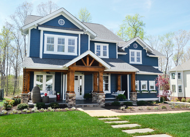
Then we added some landscaping and a limestone pathway (the builder cut big 2 x 4′ slabs from the same material as the porch’s stone column caps, and laid the sod around them) in addition to the aggregate driveway and front pathway.
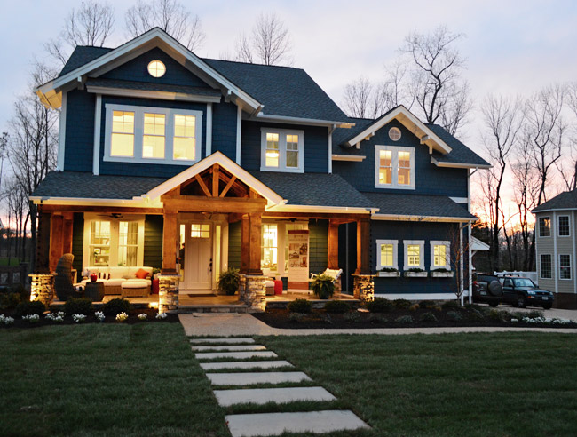
Here’s what it looks like all lit up at night:
*You can see our original post about the exterior here.
The Front Porch
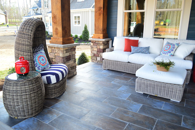
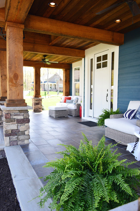
The front porch is nice and spacious, with a large 14 x 11′ area to the left of the door, which is where we created the main seating area with a sofa, ottoman, chair, and a few side tables. Most of the outdoor furniture is the Wyatt collection from Arhaus, including the sofa, the ottoman, and the swivel chair on the other side, which they kindly donated for the show. Most of the smaller accessories out here were stuff that we bought at Lowe’s (like the red metal garden stools and the medallion pillows) or Target (like the bolsters). They brought in some nice color, while the dark 12 x 24″ porcelain tiles that were donated by The Tile Shop grounded the porch. There’s also a swiveling egg chair and side table from Green Front Furniture.
The other side is around 11 x 12′, which means there was room for a porch swing, a swivel chair, and another red side table (that’s hidden behind the chair in the photo below). The porch swing was a purchase from Hayneedle.com, but we had to spray paint the gold chain black to make it blend better with the rest of the porch. Clara was that bench’s biggest fan.
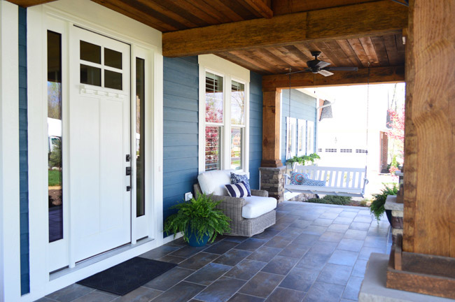
The chair nearby is part of the same Arhaus collection, and it swiveled like the egg chair on the other side of the porch, which made the arrangement feel more flexible (someone sitting there could swivel towards the porch swing or towards the seating area on the other side). The rest of the porch was filled out with random potted ferns (we bought the pots & ferns at Lowe’s), just to add some greenery.
We also had the carpenter build window boxes to liven up the trio of windows on the right side of the house (that’s actually the garage, but it has side access).
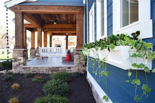
On the front porch we added dark bronze rain chains instead of traditional gutters, since we can probably all agree that downspouts aren’t the most charming architectural detail out there. These decorative chains help guide the water from the gutter down a drain to the ground and look pretty darn cute doing it.
*You can see our original post about the front porch here.
The Entryway
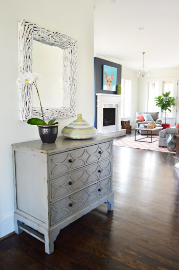
Here’s the foyer area, which sports a big white driftwood mirror from HomeGoods and a gray chest under it from Green Front Furniture. To the right is the living room, the office is just around the corner beyond this mirror/chest, and the living room is straight ahead.
*You can see our original post about the entryway here.
The Living Room
The walls in both the living room and the kitchen are Simply White, and then we layered in some colorful paint/textiles/art/accessories (like a navy fireplace column, a kitchen island in the same color, a breakfast nook full of colorful accessories, some bold art in both spaces, and a colorful rug and pillows, etc).
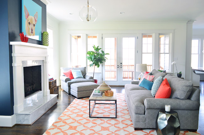
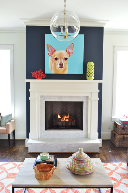
We had always wanted the fireplace to be the focal point of the living room, so we went with Hale Navy by Benjamin Moore to anchor that wall. And our awesome friend Lesli Devito painted a big portrait of Burger to bring a little cheekiness to the space (the TV will most likely hang there when the real family moves in, we just couldn’t resist an ode to Burger for fun during the show). The coffee table and 9 x 12′ rug are both from West Elm, and that colorful basket is a HomeGoods find. The gray sofa, chair, and ottoman are from Green Front Furniture – it’s this model in the “smoke” color.
We selected the white wood mantle and marble surround/hearth through a local company and yes, the fact that the gas fireplace turns on with the flick of a switch on the side of the fireplace makes us crazy jealous. Updating our own fireplace may have climbed up our priority list after seeing how nice that is…
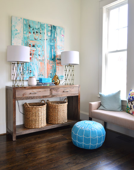
If you spin around to the area that’s to the left of the fireplace above, you see this console, which was a HomeGoods score – as were the lamps – and the baskets on the bottom are from Target. The large scale art is on loan from Lindsay Cowles (it’s for sale, btw, and you can get 15% off with code YHL15), and the bench under the window is also from Green Front. The blue pouf is ours (bought on Joss & Main a while back and stolen from our own house in the name of filling this one up for the show). We took these photos before all of the white custom window shutters got installed throughout the house, which really finish off each room.
The side table was a last minute buy from World Market and the gold-based lamp was a project from our book (once again stolen from our house in those final make-it-work hours). That red planter for the fiddle leaf fig is from Lowe’s.
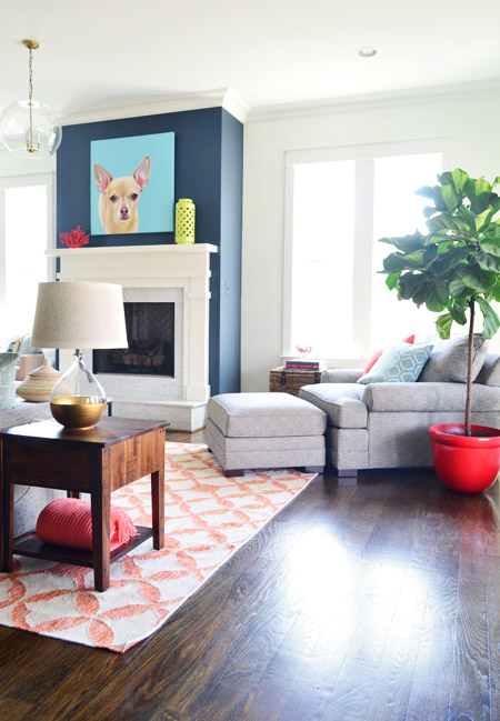
The living room light fixture was one of the last pieces we selected, since we were having trouble finding something that didn’t compete with the gold accordion lights in the adjoined kitchen. It wasn’t until we saw the Clear Glass Chandelier hung up in the ensuite bathroom that we realized another one would look great down here, but instead of using silver hardware like the one in the bathroom, our friends a the Decorating Outlet were able to modify one to include gold hardware so it tied into the kitchen pendants.
*You can see our original post about the living room here.
The Kitchen
The cabinets are from a local shop called Affinity. Most are in a stock gray color they offer (which is similar to Benjamin Moore’s Gray Timber Wolf) and the island is painted Hale Navy like the fireplace column on the other side of the room.
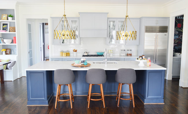
One thing we heard a few times when we met people who saw it in person was “oh my gosh on your blog this kitchen looked about half the size – it’s huge!” – so while we had our tripod set up John threw his body atop the counter as a reference point (you know, as any normal person would). The island is over 11ft long, so there’s plenty of space to spread out.
The stools are from West Elm, the gold accordion lights are from Shades of Light, the Wolf/Sub-Zero appliances are through a local company called Cline, and the cabinet pulls are from Liberty Hardware. One of our favorite storage areas in this whole kitchen are the big 30″ x 18″ cabinets on either end of the island. We used them a lot for stashing things out of the cleaning crew’s way and they were awesome. The island also houses the dishwasher, a roll-out double trash can cabinet, and tons of other storage spaces.
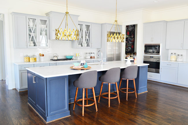
The counters are a White Moura marble that’s leathered (so it’s not a glossy, smooth finish) that we got through a local place called Eternal Stoneworks. To keep the glass cabinets from looking too busy, we just filled them with some white dishware from Target and HomeGoods.
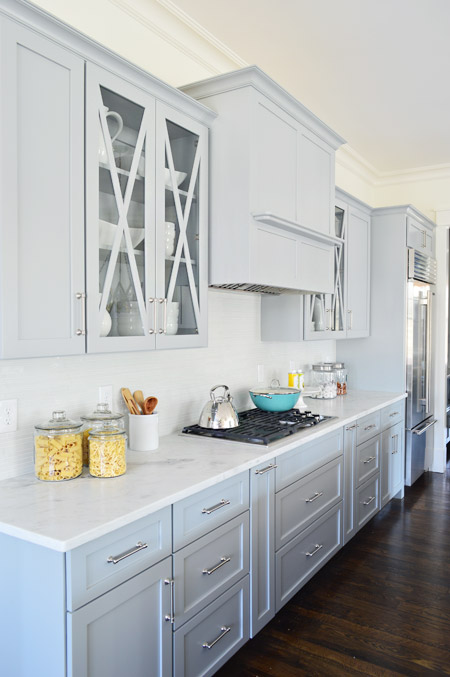
We had fun working with Affinity to design the cabinet layout. We knew deep drawer-bases seem to be more coveted than cabinets with deep shelves since they pull out for easier access, and the cabinet experts also suggested ways to take advantage of narrow spaces – like a roll-out spice rack and a vertical cookie-sheet organizer.
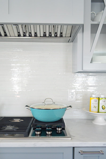
The backsplash brings some nice polish to the space, it’s called white blend waterfall glass tile from a local company called Mosaic. The aqua pan was from World Market and the oil cans and cake stand were from HomeGoods.
*You can see our original post about the kitchen here.
The Breakfast Nook
Looking to the left of the kitchen is the breakfast nook, which we turned into a built-in banquette. We wanted to do something a bit bolder than your average table-and-chairs for the breakfast nook, so we worked with the builder’s carpenter (also named John) to construct floor-to-ceiling bookcases on either side and include a wraparound bench. The nice thing about the shelves is that when you stand on the banquette you can easily access everything (even that top shelf) so they’re pretty easy to clean/reach.
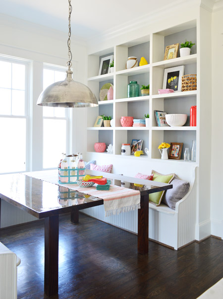
In addition to being a cozy space for family to gather, we pictured it almost being a casual spin on a china cabinet in a way. Instead of housing all of your fine china behind glass, you could display your everyday kitchenware, cookbooks, and framed art & photos in a less fussy setting.
The backs are painted Timber Wolf Gray to mimic the gray on the nearby cabinets. A big thanks to John’s sister (who works at Random House) and our publisher at Artisan who were able to provide some pretty cookbooks for us to use. Oh, and after we took these photos we had the show’s resident seamstress make some cushions for the bench. They’re deep gray like the backs of the stools at the island, so they tie in nicely (you can see them in the video tour at the bottom of this page).
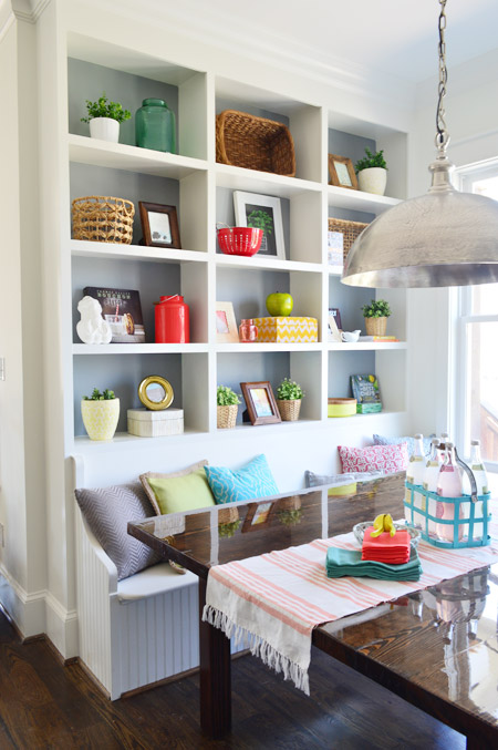
The light fixture is the Large Simple Dome from Shades of Light, and we thought it referenced all the stainless steel and silver finishes in the kitchen (like the appliances, cabinet hardware, faucet, sink, etc) without going too crazy with gold everywhere. Our take on mixing metals is that as long as each finish occurs a few times throughout the space, it looks intentional and layered – so one isn’t the odd man out.
The table itself was a custom build by John the Carpenter. It’s 5′ deep by 6′ wide, so it’s definitely not a size you can find in stock in most places – but we needed it to fit the nook exactly. We were initially going to get one built by a local timber company, but after two trips out there and a flurry of emails it turned out to be out of our budget. But we love how this one turned out, especially the stain color (we used the same tone as the hardwood floors – Jacobean) and the glossy bar coat on the top.
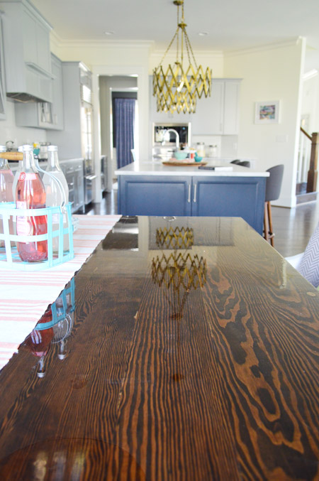
*You can see our original post about the breakfast nook here.
The Pantry
The shelving was built by John the Builder’s carpentry team and they made sure the frosted french doors we selected didn’t interfere with any of the storage or block the hallway flow (by choosing short double doors instead of one large door, and having them open into a recessed area before the pantry shelving begins, they don’t block anything that could be stored in the pantry or block the hallway flow from the mudroom). The glass prism flushmount light is from Shades of Light, and it’s also in the nearby hallway and mudroom.
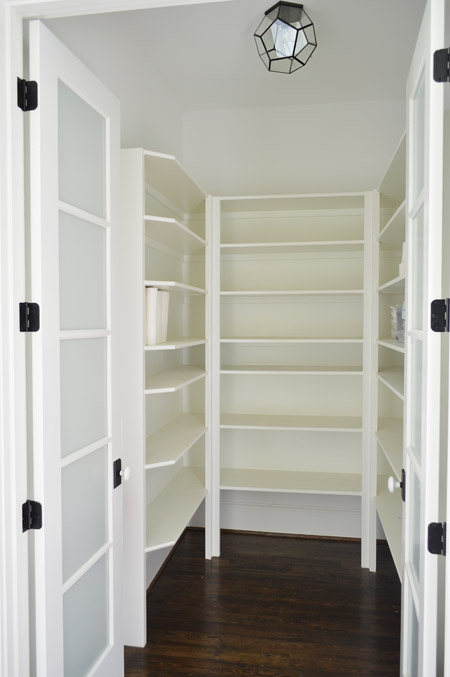
We chose not to “style” the pantry and instead took reader suggestions to turn the room into a collection space for donated canned goods. It was amazing how many Homearama attendees brought cans to benefit FeedMore (it’s our region’s hunger-relief charity organization). We loved seeing the shelves fill up! There’s an updated shot of them at the bottom of this post.
*You can see our original post about the pantry here.
The Mudroom
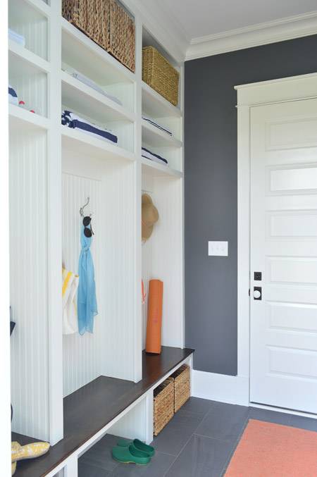
The mudroom is painted Kendall Charcoal like the dining room, but again all of the white (this time from the built-ins and two big doors) helps to keep the room from feeling too dark.
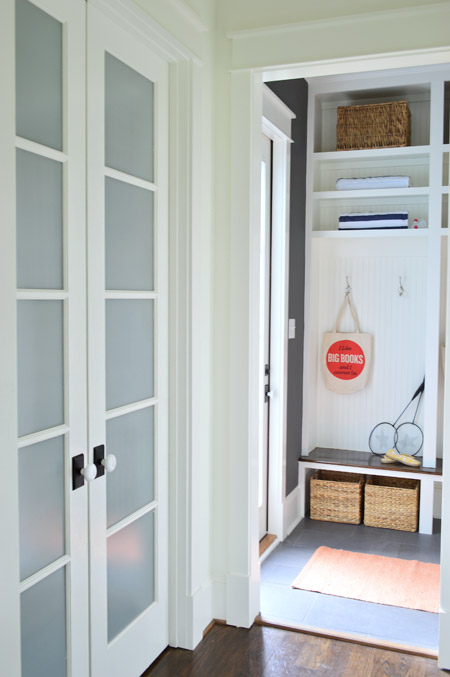
We gave Carpenter John some direction – like the beadboard backs, the stained wood bench, etc – and then he executed everything. The prism light is from Shades of Light, the tile floor is from Mosaic, the floor runner is from HomeGoods, and the baskets and styling accessories are mostly ours, though the “I Like Big Books And I Cannot Lie” bag is from Fountain Bookstore.
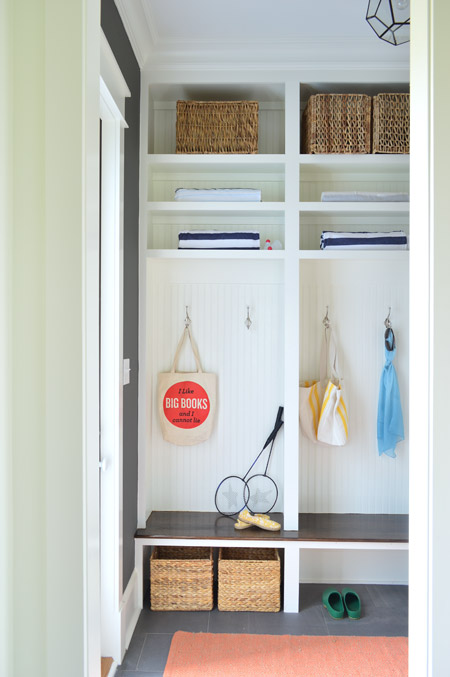
As shown in the video, the glass door on the left leads down to the back patio while the other door (shown below) goes out to the garage.
*You can see our original post about the mudroom here.
The Half Bathroom
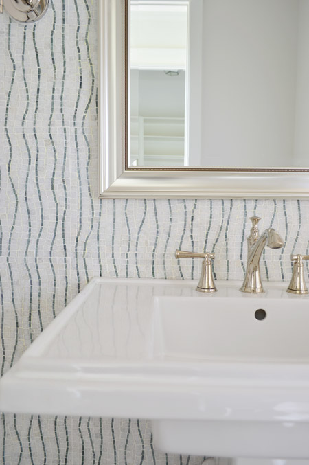
Across from the pantry is the half bathroom, which we thought would be interesting with a big back wall full of accent tile from the floor to the ceiling. The tile we landed on is called Snow White Seaweed Wave from Mosaic.
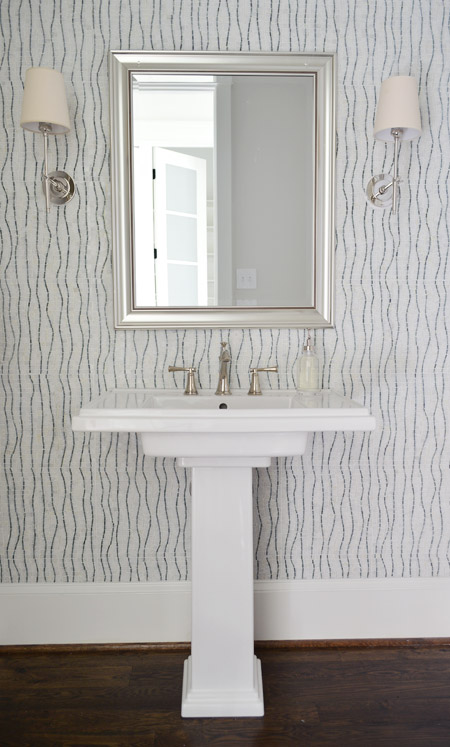
The pedestal is the Kohler Tresham (the same line as the toilets in the house), the faucet is Brizo Baliza in polished nicked, the mirror is from Target, and the sconces are from Shades of Light.
*You can see our original post about the half bathroom here.
The Butler’s Pantry
That’s kind of a fancy title for the small hallway between the kitchen and dining room. We pictured the big chalkboard wall serving as a fun spot for a family to write out meals for the week, jot notes to each other, or even scribble up a drink menu for a party if they want to use the small space as a makeshift bar – but we wanted to set it up as a fun little coffee/wine station with a bolder look for the show.
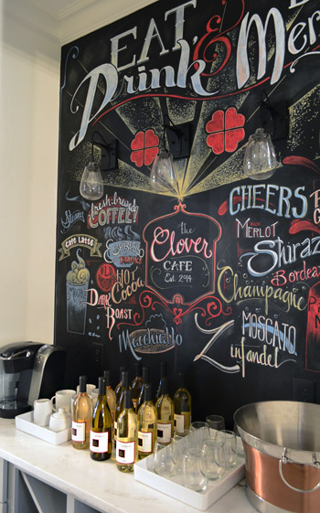
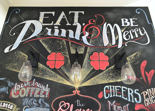
So we called up a local restaurant called Urban Farmhouse who is known for their chalkboard menus and signs (heck, we even Instagrammed one last summer). A few days later Li was there creating this masterpiece for us, all of which she hand lettered (any locals who want to hire her for signs and chalkboard art can email her at [email protected]).
It’s all done in chalk marker (so it’s not dusty and can’t be smudged) but it can be erased with a magic eraser (or just painted over if the eventual owners don’t want it). But for the purposes of the show, it was a fun surprise to cap off our little coffee/wine set-up in there. It was awesome to see how many people were taking their photos in front of it.
*You can see our original post about the butler’s pantry here.
The Dining Room
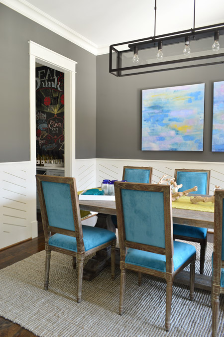
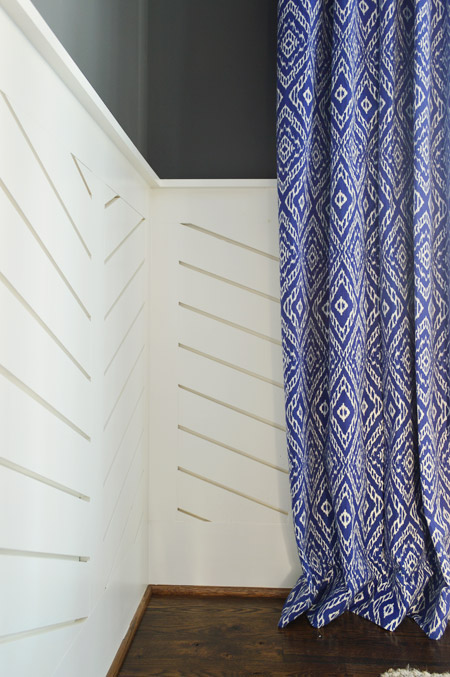
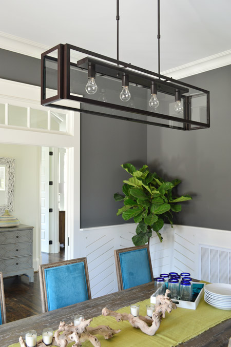
We really like dark wall colors in a dining space, so for this room we chose Kendall Charcoal, which we balanced out with white trim and linear wainscoting that we had John the Carpenter build (you can read more on that – and what inspired it – here). Then we added in some color with everything from the chairs and the art to the curtains.
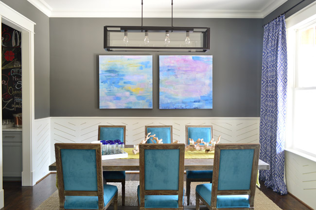
The peacock chairs were donated by World Market, the weathered trestle table was from Green Front Furniture, the art is from HomeGoods, and the rug is from West Elm.
The curtains were made by U-Fab in this fabric.
The light fixture is from Shades of Light, the (slightly wrinkled) table runner and those blue rimmed glasses are from World Market, and the rest of the table decor is from HomeGoods.
*You can see our original post about the dining room here.
The Office
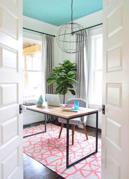
Here’s a shot with the double-doors pushed fully out of view. The rug and chair were donated by West Elm, the table is from a local furniture purveryor called Green Front Furniture (I think the manufacturer is called Barkman, but I don’t have a link), the light is from our Shades of Light collection, and the curtains were made by U-Fab, in this fabric (the curtain rods are from Lowe’s). The walls are BM Simply White and the ceiling is Skydive (both by Benjamin Moore).
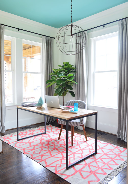
We wanted to stage a more feminine office than what we’re used to seeing in other showhouses (they usually feel sort of study-ish and masculine), so Sherry had a blast planning a little spot she’d love to call her own.
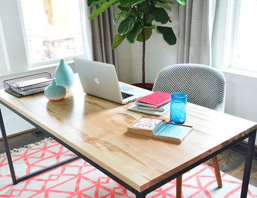
The metal tray and vases are from Target, and the big fiddle leaf fig is from a local nursery. Tucked along the inside wall is a bit of open storage to help keep this fictional work-at-home mom organized. It’s this whitewashed wood & metal shelf from West Elm.
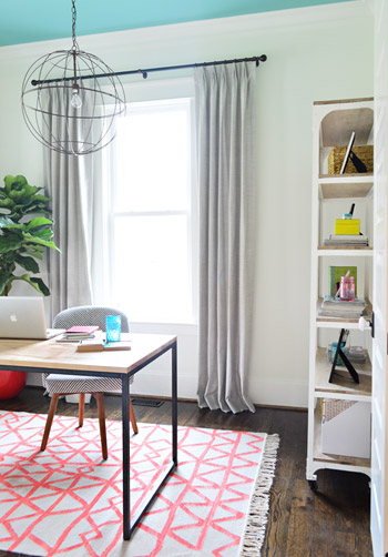
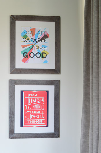
Once the curtains were hung and that metal shelf came into the room we had less wall space to hang the two larger prints from Help Ink that we originally planned to put in here (we ordered large 24″ x 36″ prints) but they kindly sent along some smaller extras for us, which we were able to frame at the last second (literally minutes before we snapped these photos yesterday) and hang next to the other window in this room. So yeah, the fictional gal who works in this study has pretty much zero excuse not to be motivated.
We were going to have the electrician add a floor outlet (for plugging in desk items, like the computer charger) based on our final furniture placement. But instead he’ll probably just do it for the eventual owner so it can be customized to their furniture layout, and not ours.
*You can see our original post about the office here.
The Main Bedroom
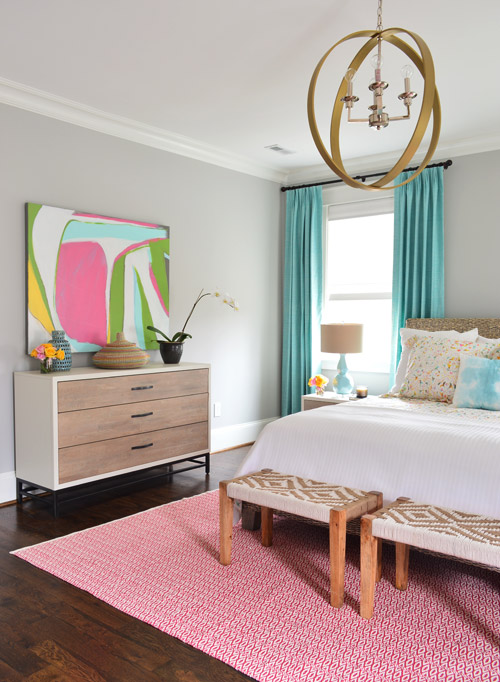
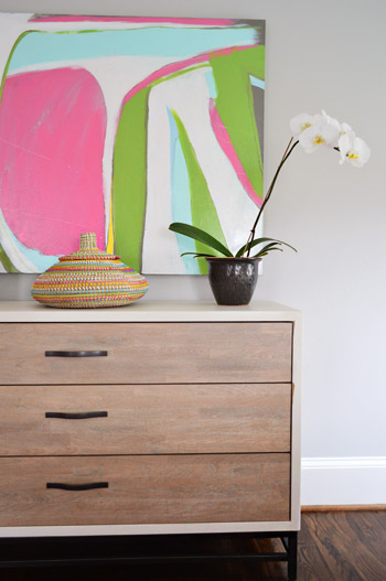
This room’s color palette was inspired by an awesome painting that was donated for the duration of the show by Lesli Devito (all of her art is for sale by the way, and she’ll ship it anywhere in the US). The king bed is a woven banana leaf frame from Green Front Furniture, which is also where the wood nightstands hail from, along with the dresser made by Universal. The curtains are the same fabric as the office ones, just in aqua (also made by U-Fab) and the walls are Stonington Gray by Benjmain Moore. The wood ring chandelier was donated by Shades of Light. Two woven benches (clearanced down to $33 from Target) sit at the foot of the bed to round out the texture-heavy space (we love how they tie into the woven headboard).
The rug is this Fair Isle 9×12′ donated by Dash & Albert and the bedside lamps are HomeGoods scores.
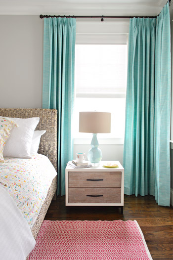
We kept the night tables simple, kinda like the cleaner version of what ours usually look like. Sherry picked up some inexpensive jewelry from World Market along with a simple mug and a plate (also from there) to casually hold the things that our imaginary lady takes off before bed.
The bedding’s from Pine Cone Hill and we love how it relates to Lesli’s art.
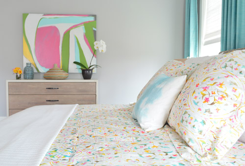
Our first instinct was to put more lamps on the dresser, but that made the room feel kinda lamp heavy (with two on the side tables already), so we went for plants and baskets.
*You can see our original post about the main bedroom here.
The Vestibule
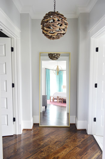
The en-suite bath and closet sit off a corner of the bedroom and are separated by this small space, which features a brass floor mirror donated by West Elm, a driftwood light from Shades of Light, and walls that are painted Stonington Gray by Benjamin Moore just like the bedroom.
*You can see our original post about the vestibule here.
The En-suite Bathroom
When you turn to your right, through the double doors you’ll see the space that we most want to pick up, stuff in a suitcase, and put in our own house.
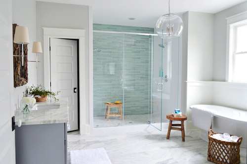
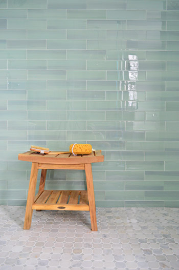
It felt fitting to aim for that spa-like effect in such an airy space (the house’s floor plan meant we knew that this room would be spacious with a big window over the tub). So pretty early on we decided we wanted a light color scheme with a wash of color on the back wall of the shower. We actually considered a more intense cobalt blue tile at one point, but it was out of stock. We love the calming aqua glass tile that we ended up with, (it’s the 3 x 12″ New Haven tile from The Tile Shop) so it was just one of those “happy accidents” throughout the room’s evolution.
The sides of the shower are basic 3 x 6″ white subway tiles, also donated by The Tile Shop, which we picked because they were the same height as the bolder back-wall tiles (so the rows would line up), as well as feeling nice and simple – to keep the attention on that green glass tile. It’s considered a double shower since it has Baliza showerheads on both side walls, which were donated by Brizo. At the suggestion of our local Ferguson rep, whom we worked through to select plumbing fixtures, we included a handshower on one side (we learned that new builds frequently include them, just to give people options like spraying off their feet or a pet).
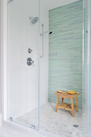
The floor tile in the shower pan is the Tile Shop’s Evanston series in Frost Snow, which featured some small aqua glass accents between the marble squares which help tie the big accent wall together with the marble floor (that’s 12 x 24″ Tempesta Neve marble) throughout the rest of the room. You can check out a detailed photo of our tile pics (and more clearly see those little green glass squares in the floor) here. We also really like how the tile installer wrapped the white subway around the shower threshold.
I’ll be honest that as the glass tile was being installed I was certain we had made a big mistake (three different tile choices for the shower walls and floor felt like they didn’t really “mesh” yet) but as soon as it was all grouted with the same white grout throughout, it tied everything together. It ended up being one of our favorite things.
The driftwood mirrors and Soho sconces were donated by Shades of Light, the faucet is Brizo Baliza just like the shower fixtures, and the subtly green-veined counters are Lady Onyx which were purchased through a local company called Eternal Stoneworks. The onyx counters have a hint of the same seaglass color that’s in the shower tile, so we thought they’d be a nice counterpart to the more traditional marble on the floor. The little woven baskets are from HomeGoods.
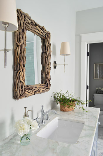
But let’s step out of the shower for a second and talk about the vanities (you don’t get to say that everyday), which came from the same local cabinet company (Affinity) that did the kitchen. They’re also painted in their stock gray color, which we’ve discovered is close to Benjamin Moore’s Timberwolf Gray. The walls are Moonshine. We added a little more interest to the vanities by selecting mirrors with a soft patina effect that we placed behind the x-frame doors (similar to the clear glass ones that we chose for the kitchen). We also went with arched trim along the base of each vanity to give the built-in cabinet a bit more of a furniture feel (you can see that better two shots up). The giant bathmats are from Target.
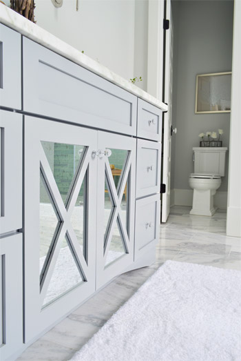
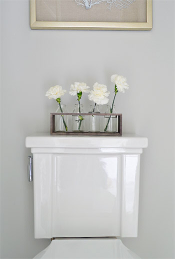
And now, let’s get weird for a second. We have to take a moment to talk about this toilet. We’ve never given toilets much thought, but when our builder urged us to pick something more stylish than a basic model we both fell in love with this one (the Tresham, donated by Kohler). And now we have this crazy case of toilet envy. So I guess that’s a thing. The little vases on the top are from World Market and the framed sea fan art is from HomeGoods.
Speaking of envy, this tub is the York from Victoria + Albert, and the cool thing is that lots of people paint the outside an accent color. We considered it, but decided that we wanted to leave the shower as the main accent in the room – but we thought we’d toss that tip out because it could be a fun idea for your space.
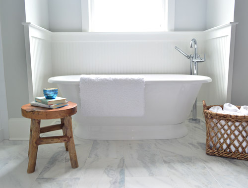
The stool and basket are both from HomeGoods, and the floor mount tub filler is the Trinsic, donated by Delta. You can see that we also had the carpenter add some beadboard wainscoting around the tub area as an accent, and to provide some extra protection from splashing, bubbles, and whatever else your particular tub fantasy entails. Maybe nachos?
The main light fixture in here is the Clear Glass Chandelier from Shades of Light.
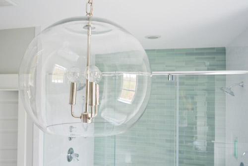
*You can see our original post about the en-suite bathroom here.
The Closet
The main bedroom closet is equally envy-inducing in size and it sports two sections (which make it convenient for a couple) thanks to a little partition in the middle that carves out two sides. We can’t claim much credit for how this turned out, since we mostly just nodded along as the builder and his carpenter told us their plans, but we’re happy to show off their handiwork and our light styling (closets typically get a few outfits, bags, and shoes for these shows, so you get the idea but don’t have to see them stuffed with an entire wardrobe).
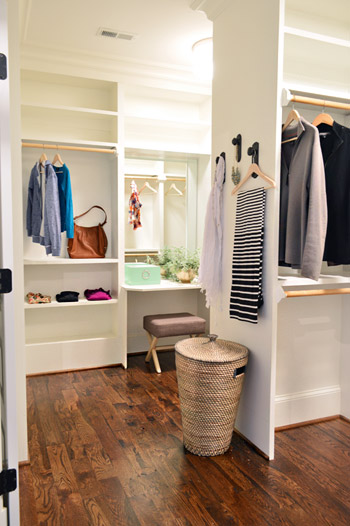
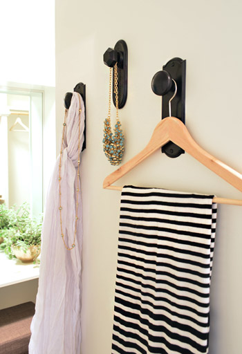
We hung a trio of our new doorknob hooks (two large ones and one small one) to create a little display space on the partition that separates the two sides of the closet.
Speaking of that little vanity space, the stool is from Target, the green lacquered box is from HomeGoods, and the gold bowl with the plant in it is from World Market. The bags and clothes are mostly ours, along with some thrift store items and few scarves from Target.
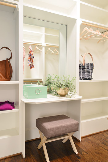
The vanity sits in the back half of the closet, which in addition to bars and cubbies, also sports this wall of angled shelves for shoes. I tell ya, Carpenter John knows whats up.
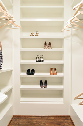
*You can see our original post about the en-suite closet here.
The Laundry Room
Heading upstairs, the laundry room is one of our favorite spaces thanks to the wallpaper along the back wall. It’s MissPrint’s Pebble Leaf, and it was donated by WallpaperDirect.
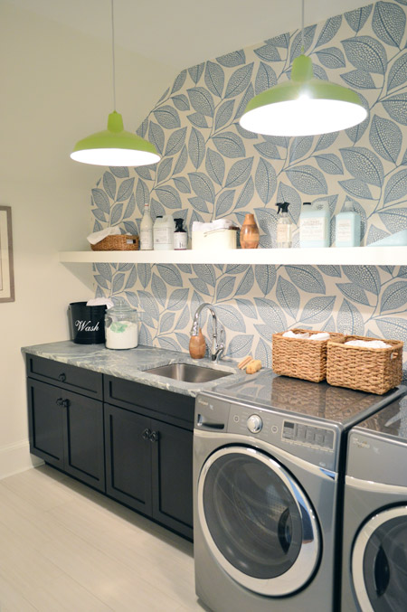
The lights are our farmhouse pendants from Shades of Light in a happy lime color. We thought a random pop of citrus would be fun since the room’s palette is otherwise pretty subdued with black, white, gray, and blue. The non-wallpapered walls are painted Steam by Benjamin Moore, which is just slightly warmer than the Simply White that we used everywhere else (it matched the back of the wallpaper better, so that wall didn’t look yellowed by comparison).
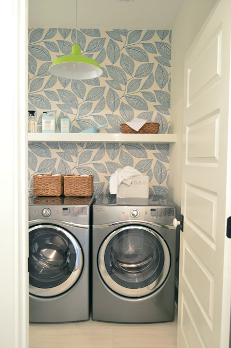
The floors are big 12 x 24″ tiles called Travertino White Field Sunrock found locally at Mosaic. Again, we choose some lighter elements to balance out some of the darker things in the room like the deep wood-toned cabinets and the steel gray appliances. The counters are soapstone and, like the kitchen, we went with a nice deep stainless steel sink and a pull-down faucet (this ones is the Leland faucet from Delta). We’d love a work sink like this in our house (we’re always moving dishes to wash our paint brushes).
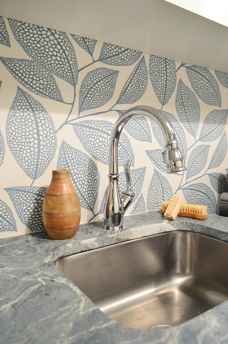
As we mentioned in this post, we made an 11th hour call to have the carpenters build a wall-to-wall floating shelf which does two things: it fills the visual void above the counters/appliances, and it also provides a lot of convenience and function since it can house everything from dust pans and laundry soap to baskets full of washcloths and other cleaning supplies. We tossed various things from HomeGoods and Target up there to demonstrate.
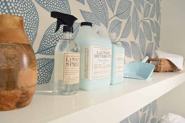
*You can see our original post about the laundry room here.
The Guest Bedroom
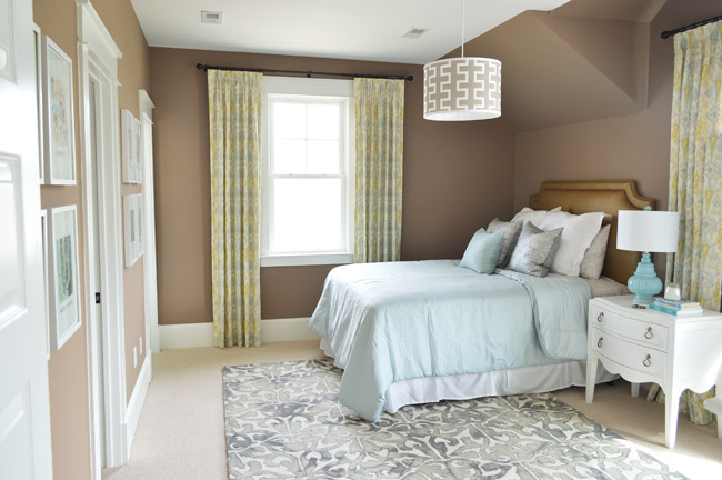
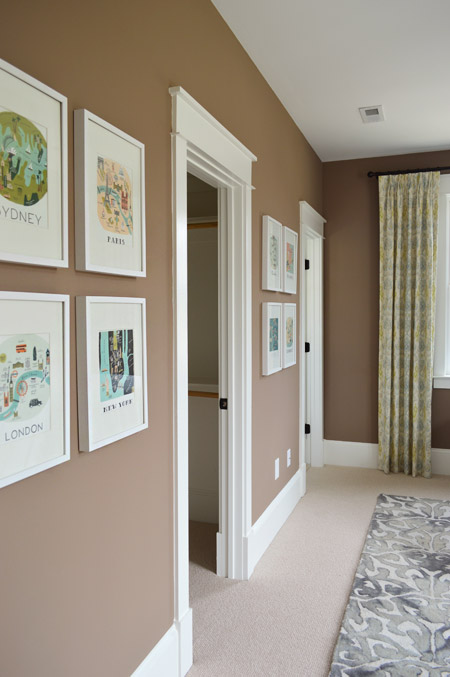
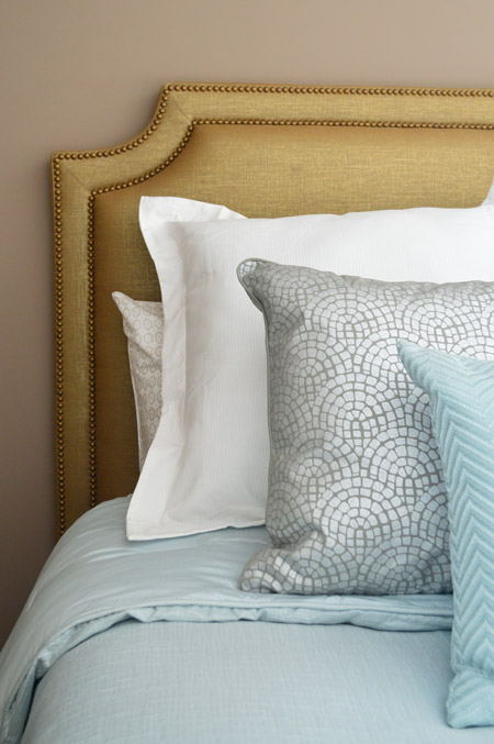
The walls of this room are Taupe Fedora by Benjamin Moore, and you might recognize this calendar-turned-art from our old hallway.
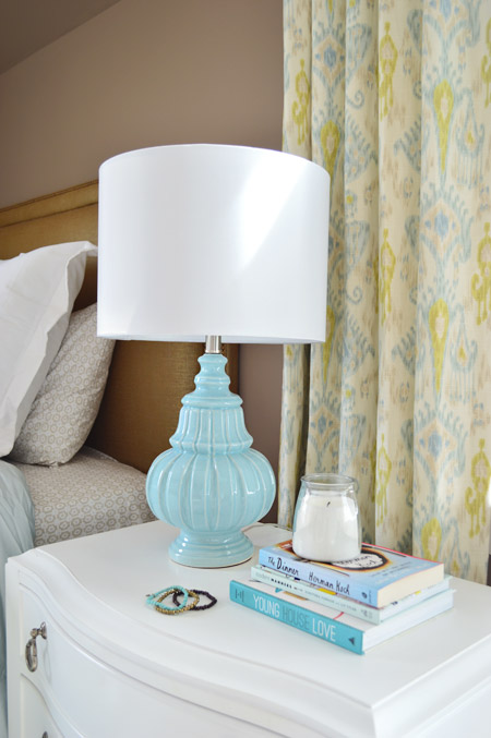
The curtain sare from U-Fab, the lamp is from HomeGoods, and the nightstand is from Green Front Furniture.
The queen-sized headboard is also from U-Fab (it’s upholstered in a metallic fabric with gold nailhead trim). The bedding is from Target and the pillows are from HomeGoods.
On the opposite wall is a dresser from Green Front Furniture with a colorful armchair, which was from World Market and the rug/art/vases are from HomeGoods.
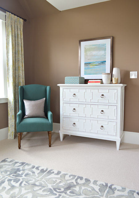
*You can see our original post about the guest bedroom here.
The Guest Bathroom
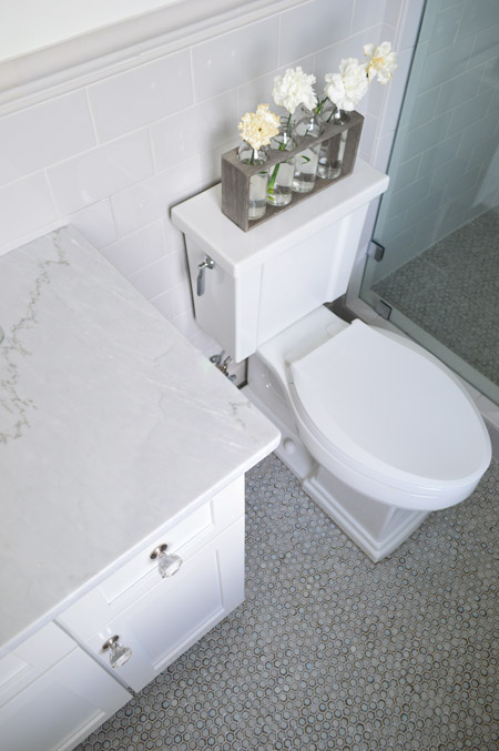
We were going for something simple, classic, and light for the guest bathroom (it’s not nearly as big as the main bedroom’s attached bathroom) and we thought a little hint of “vintage” would be fun in here, so some of the details subtly nod in that direction.
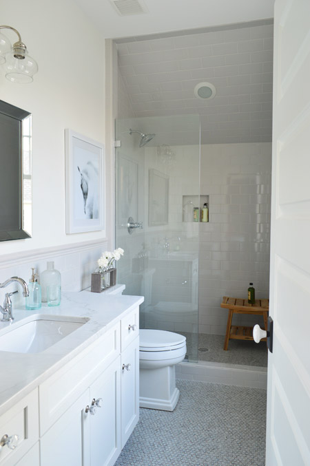
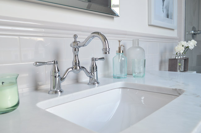
We went with a tile wainscot through the main part of the bathroom, using a family of tile from The Tile Shop called Imperial Ice Gray Gloss. It’s our favorite part of the bathroom – well, that and the bridge faucet from Brizo. The counters are classic carrera marble, the mirror is from Target, the light fixture is from Shades of Light and the bud vases on the toilet are from World Market.
There’s a Tresham toilet from Kohler along with the hex version of the penny tile that we used in our last kitchen on the floor, which is from The Tile Shop. We also added glass knobs to the cabinets (donated by Liberty Hardware) and a seamless glass shower door. It’s not an open shower – it has a door on the right that swings shut to seal the water in (which you can see better in the video tour at the bottom of this page).
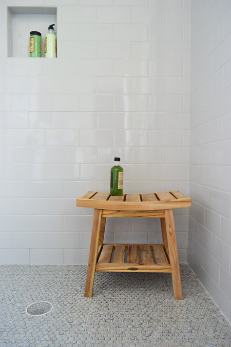
We were originally going to use the same tile in a different color in the shower, but decided that might be too jarring for such a cozy bathroom. So we continued the same stuff that we used on the wainscoted walls into the shower, which we really ended up loving once the clear shower door went in. The wood bench is from HomeGoods.
*You can see our original post about the guest bathroom here.
The Boys Bedroom
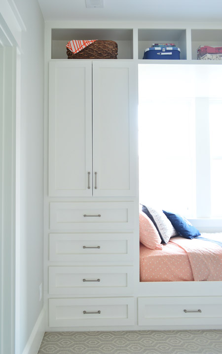
The walls in here are Moonshine by Benjamin Moore and the major focal point of the room is the built-in bed area. This built-in fits a twin bed, which we covered with Target bedding, plus a couple of pillows from Ikea. If the future homeowner eventually wants a larger bed, a full or a queen could stick out into the room with the addition of a simple platform – and some rolling under-bed drawer storage could be added to offset those two drawers under the twin mattress that would no longer be accessible.
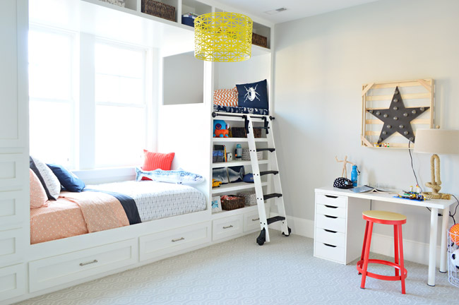
This desk is from Ikea but we scored it second-hand thanks to craigslist. The orange stool and wire basket are from Target (we wish the stool were a little shorter, but since it’s for an imaginary kid and we loved the bright color we let it be). The rope lamp and the star light are both HomeGoods finds – and the Legos throughout the room are from John’s own childhood collection (how awesome is his mom for saving them all these years?!).
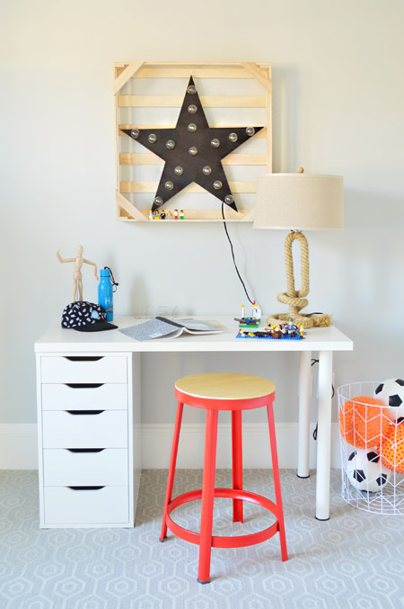
The wood crate around the star was actually just its packaging from HomeGoods, but when we held it up we liked it there so we kept it. It filled out the space more and created a little ledge for a Lego meeting.
Our favorite part of the built-in bed was this raised nook area, which we all started calling the “Crow’s Nest” for some reason. We brainstormed these built-ins with John the Builder and John the Carpenter (not to be confused with John the Lego Hoarder) and they were instrumental in making it happen. Seriously, John the Carpenter and his crew are amazing. In fact, he found the rolling library ladder online somewhere and even used some old pipe fittings when we learned that top rail was going to put us over budget. The bug pillow and blue fabric up in the nook are both from Ikea. We didn’t have a chance to get something custom upholstered for that space, but a dog bed at HomeGoods miraculously fit the area nearly perfectly (which we wrapped in that Ikea bug fabric). The overhead light is from our Shades of Light collection.
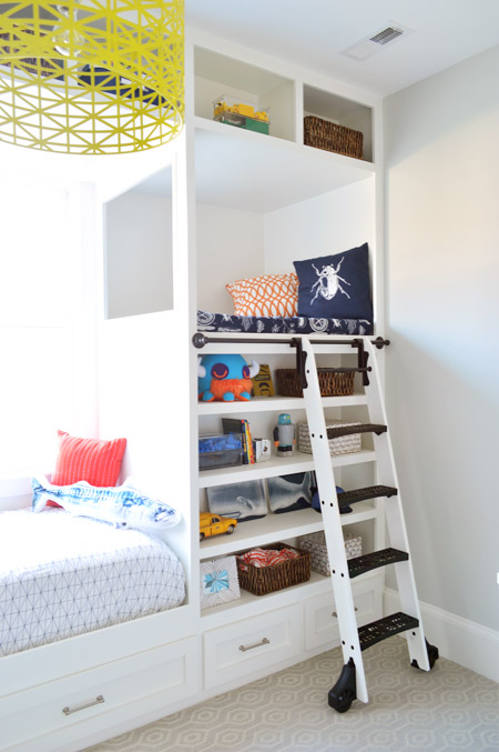
We stocked the bookshelves with random stuff, but our favorite was the “Viking Octopus” plush toy that was loaned to us by our friend Phil Barbato. Because why wouldn’t an octopus also be a bearded viking?
You can see our fun patterned carpet pretty nicely in this shot. It’s from a local place called ProSource, but the style is Stanton’s Revere in Silver. We thought it’d be fun to do something interesting with the carpet in at least one of the rooms since most of the spaces had hardwoods except for a few of the bedrooms (John the Builder said his average buyer seems to prefer that mix).
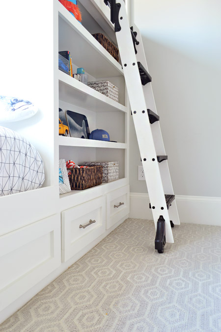
On the other end of the bed there’s more drawer storage, plus a big wardrobe. We left it empty so the future owners could decide if they wanted more shelving in there or an extra clothing bar. There’s a closet on the other wall, so it’s bonus storage space either way.
*You can see our original post about the boys bedroom here.
The Kids Bathroom
The two kids bedrooms are connected by a shared Jack-and-Jill bathroom, which is pretty light/neutral itself (so that it flows between the two distinct bedrooms without feeling too disjointed). The walls are Simply White, the floors are a white lantern tile (found locally at a Mosaic tile) with gray grout so they hold up to kids a little better, and our colorful “moment” in here was the big vanity cabinet which was painted Courtyard Green by Benjamin Moore.
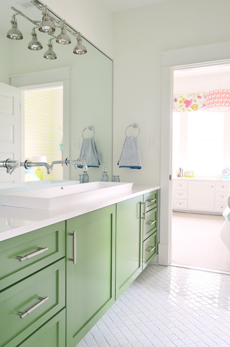
There’s also a wall-to-wall mirror with the light fixture and faucets coming through it. The faucets sit above a double trough sink that’s recessed into the white corian counter top (which makes it look shallow in this photo, but it’s plenty deep). It was awesome to hear from a bunch of show-goers that the big sink and those mirror-mounted faucets were their favorite things since they were definitely one of the more specific choices we made. Oh and the towels and bath accessories are from Target.
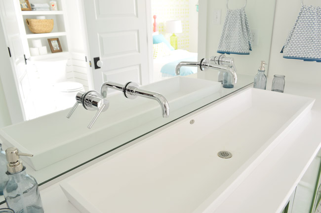
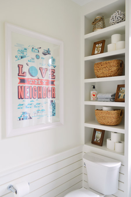
As you can see reflected in the picture above, behind the sink area is the bath/shower/toilet part of the bathroom, and we added some bonus storage via this shelf above the toilet. Once again, it was built by John the Carpenter (way back when the house was being roughed in last fall we had to plan for this shelving and have them set the toilet plumbing further from the wall to make room for it). The framed poster is from Help Ink.
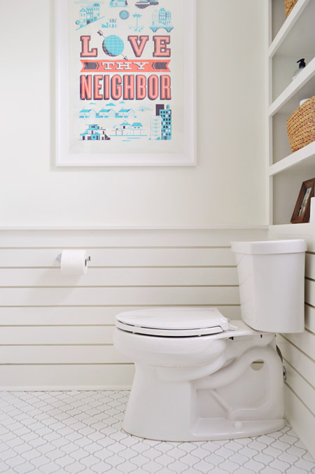
John the Carpenter also added this slatted wainscoting for us, which we thought contrasted nicely with the more ornate tile floor.
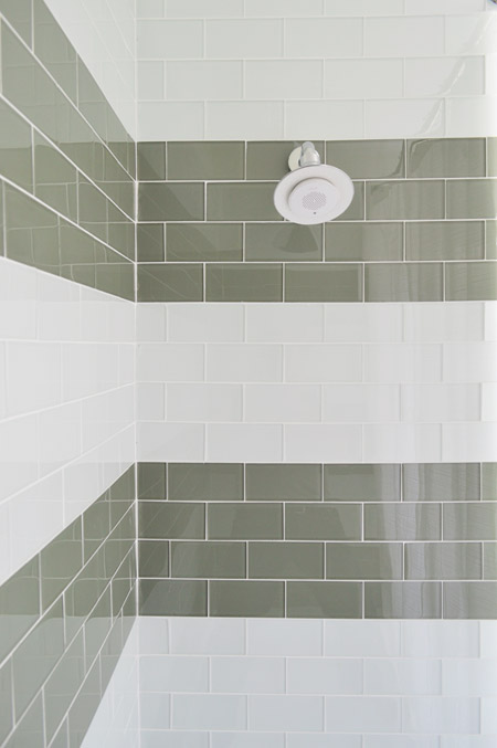
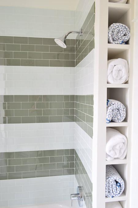
In the shower we used two colors of glass tile to create chunky stripes (Snow Glass and Glass Winter from The Tile Shop). The showerhead is one of these bluetooth connected speakers from Kohler since we figured kids would get a kick out of that. Heck, now we want one.
Here’s the other added sliver of storage that we worked into the room: a little towel nook behind the shower that we filled out with some rolled Target towels.
*You can see our original post about the kids bathroom here.
The Girls Bedroom
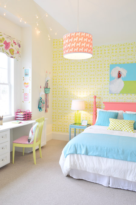
We got our big window cornice installed, which was built by U-Fab in this fabric. We also mixed up the beside table situation (going for a blue Target side table and a yellow garden stool from HomeGoods), scooted the bed further into the middle of the room, added more pillows and a blue throw to the bed, hung some casual art, and even added some surprise string lights (more on those in a second).
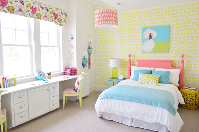
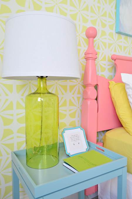
We can’t forget “Princess Truthful” (the chicken painting loaned by our friend Lesli Devito) who is perched above the thrift store headboard (painted Hydrangea Flowers by Benjamin Moore), which is all against the Royal Design Studio stenciled wall (it’s Hibiscus over Simply White walls). Here’s a closer shot of the wall pattern, plus a glass based lamp from Target.
Now let’s shift over to our double desk. Not only does it add some nice concealed cabinet storage to the room (along with a big double closet that’s on the wall across from the bed) but it’s a nice big work surface. A lot of you weighed in on which two stations we should style it with (people tossed out things like a makeup area, a spot for art, a sewing zone, a homework area, etc) and we settled on an art station on one side (complete with a terrible tree painting by yours truly) and a homework side with notebooks and room for a laptop or desktop monitor but it’s really flexible so we’re interested to hear how the future owners use it down the line. The chairs were rescued from a thrift store (we painted and upholstered them) and the pillows were from HomeGoods.
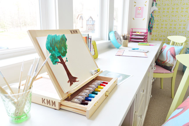
Now let’s get into the string lights. We wanted to do something with the small vaulted area of the ceiling above the desk, so we ordered a 50-foot strand of white cafe lights and strung them up on white cup hooks.
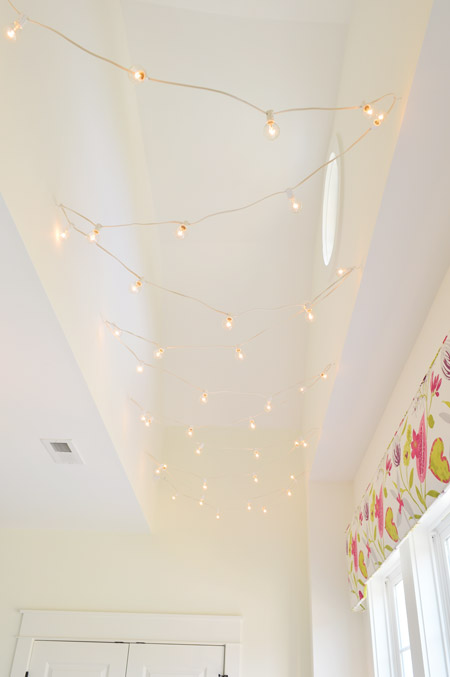
We had the electrician add an outlet up there for them to plug into, which connects to a switch by the door. They’re barely noticeable when they’re off, but are a fun surprise when they’re turned on. It was awesome to hear people’s reactions when they stepped into the room and noticed them during the show.
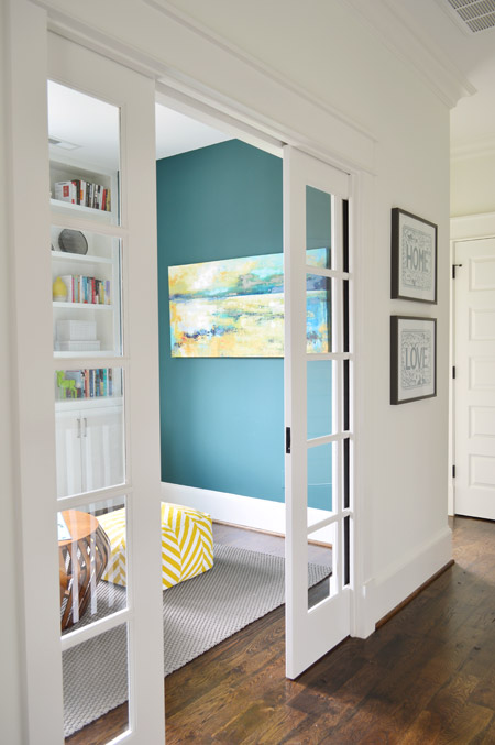
When you walk back out of this bedroom, you end up back in the hallway near the playroom / reading room which sits behind two sliding french pocket doors. That way it can be an open family space when needed, or it can be closed off for quiet reading.
*You can see our original post about the girls bedroom here.
The Playroom / Reading Room
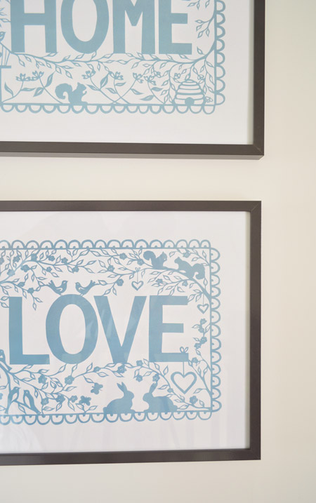
The prints in the hallway next to the door are from Ikea (they came in a pair).
The playroom walls are painted Dragonfly (by Ben Moore) and we originally planned to have the built-ins that were made by John the Carpenter painted that color too, but the painters missed that memo and they ended up white. When we walked though we decided the room felt good that way, so in the end it was a happy accident. The art on the wall to the right is from World Market and the wood plaque on the left is a thrift store find.
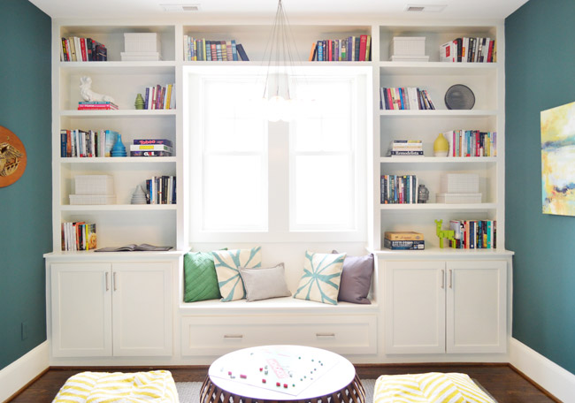
We also contemplated staging this space with a media console to look like a video game room, but decided to keep the layout a little simpler – just a low table (this one donated by West Elm) and two poufs that we bought from Target for playing games of the non-video variety. The rug in here is from Dash & Albert.
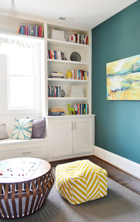
Fun fact: we actually crazy glued the Monopoly pieces down after worrying that small kids might end up swallowing them (a prospective buyer with four kids came through before the show and her youngest daughter “taught” us that lesson – thank goodness she didn’t actually succeed in her mission to digest a few houses).
*You can see our original post about the playroom / reading room here.
The Back Patio
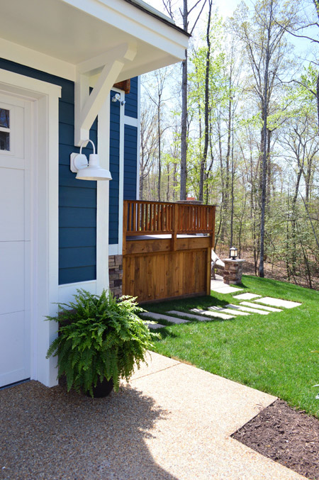
If you walk around the side of the garage, we continued the same limestone slabs that lead to the front porch around the back to the patio.
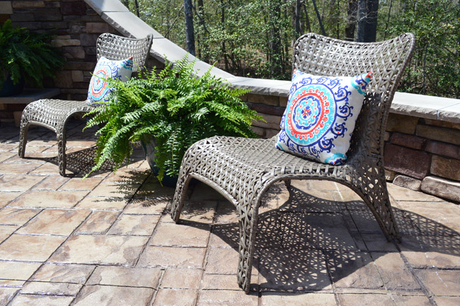
The stamped concrete patio is almost literally “hugged” by the outdoor fireplace. Most of the design credit for this area goes to the builder and his team. We gave input on the type of stone and a few details, but John and his guys built it seemingly overnight while we were tending to a few other spaces. Then we walked out back and said “yeah, we could get used to this.”
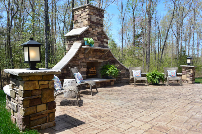
We kept the “styling” pretty light out here, since we were running out of time and wanted the focus to be on the fireplace anyway. There’s an outdoor dining area on the back porch (which we’ll get to in a minute), so we didn’t think another table made sense down here, so we landed on a casual seating arrangement. The woven outdoor lounge chairs, pillows, and planters are all things that we bought from Lowe’s.
*You can see our original post about the back patio here.
The Back Porch
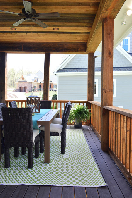
This area has the same exposed wood look on the ceiling as the front porch, but instead of tile this space has a Trex floor. The french doors lead into the living room/kitchen area, so this was a natural spot for an outdoor dining area.
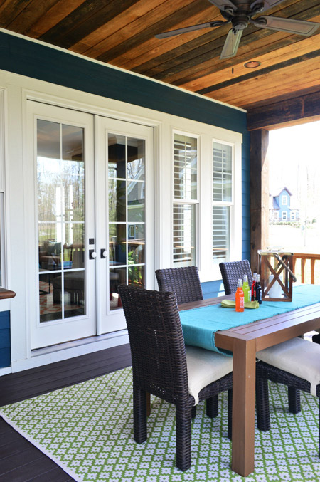
The dining table and chairs were from Green Front Furniture, the indoor/outdoor rug is from Dash & Albert, and the runner & sodas are from World Market. All of the other styling accessories are HomeGoods (like the planter, the lantern on the table, etc).
*You can see our original post about the front porch here.
We also made it possible for you to Shop The Showhouse! Just peruse the images below to see some of the exact items that we purchased (or that were donated), as well as similar items if the original option is no longer available:
It’s hard to put into words how much we’ve learned from this year-long experience. It has been such an honor to be involved.
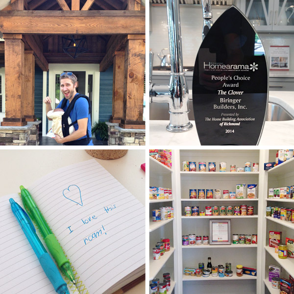
We also made this video tour of the showhouse, so you can see how everything flows (and so we’ll never forget this labor of love of ours):
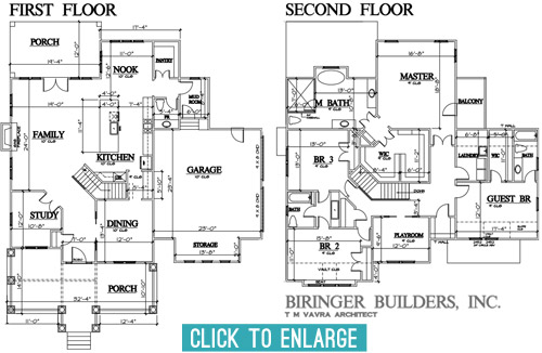
And if you’d like to check out the floor plan, you can click the image below to enlarge it, or purchase the full plans from Biringer Builders here (with a portion of the sale going to Richmond’s Habitat For Humanity).
Hope you enjoyed the tour!
*This page contains affiliate links*

