Q: Hi guys! I was snooping around your blog to try and find a floor plan of your new home with the colors you used for each room (like you did in the post from Feb 24/2010) but I didn’t find one! I would L-O-V-E to see what your new house looks like now, with a visualization of the color scheme per room. Is this possible, or am I asking way too much? HAPPY NEW YEAR by the way! – Danielle
A: Oh yeah – we’re way overdue on that! So when Danielle submitted that comment here, we officially bumped it to the top of our to-do list. We did one of them for our first house, and it was fun to see how our paint colors have evolved over the years. So without further ado, here’s our current house’s color palette as it stands now (we still have to paint the guest bathroom and the spare room). It’s not too easy to see all of the colors (ex: the back of the dining room built-ins are dark teal, but it’s not as easy to see those little slivers of color in the image below as well as the office stencil and Clara’s closet stencil) but it was fun to play around in photoshop and make an updated floor plan for this house’s paint picks so far. Note: click here for a full list of these paint colors.
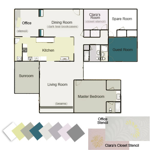
The cool thing we’ve realized is that most of our rooms with brightly colored walls tend to have a few more neutral choices to balance things out (ex: our greeny-yellow walled kitchen has white cabinets/counters and a soft gray backsplash with brown cork floors). And our rooms with more neutral colors on the walls tend have more color added in with brightly patterned curtains & pillows, geometric rugs and bold art, painted furniture, etc. But we’ll get to that a little more in a second.
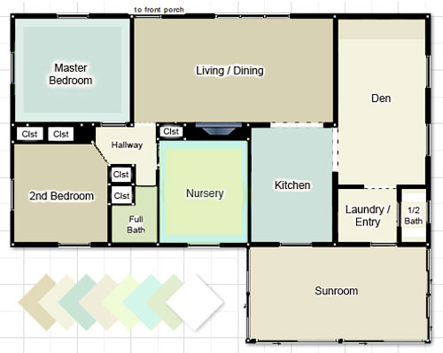
First, just for fun, here’s our first house’s color palette. We still seem to love blues and greens with a fair amount of neutral tones, but we traded in the creams and tans for soft and taupey grays and added plums, pinks, and warm yellow-y green to keep it from feeling too cold. We’ll always have a special place in our hearts for the “sea glass” colors of our first house though. Especially in a smaller home with some pretty tiny rooms, keeping things flow-y and neutral was really helpful when it came to making it feel open and airy. Our current house is larger, so a few hits of color among the other more toned down walls make us happy (and don’t seem to chop things up as much as they could in a smaller floor plan).
We’ve actually seen lots of pretty homes with the same exact color on every wall of the entire house (whether it’s a crisp white tone, a soft tan color, a taupey-gray, or even something more daring like celery, yellow, or a muted blue-gray tone everywhere). Meanwhile we’ve also seen a ton of gorgeous homes with a different paint color in every single room. We tend to fall right in the middle of that spectrum, preferring to use a handful of colors in a few different spaces.
I think we like to reference a few over-arching wall colors in a few different places just so there’s some sort of flow and relation among the spaces, but not too much straight up cloning going on (thanks to varying other items like rugs, art, pillows, curtain fabrics, etc). For example, we have the same soft grey tone on the walls in our living room and our dining room, but the dining room has deep teal paint on the back of the built-ins to differentiate it, and also has colorful curtains and a bright yellow door…
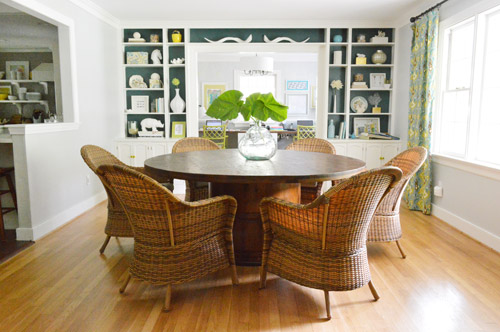
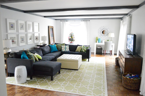
… meanwhile the living room has a green geometric rug, colorful pillows, and softer tone-on-tone curtains with dark painted beams. So we’ve found that in rooms where we have softer or more neutral walls we layer in more patterns and colors than the rooms with brighter walls (like our kitchen).
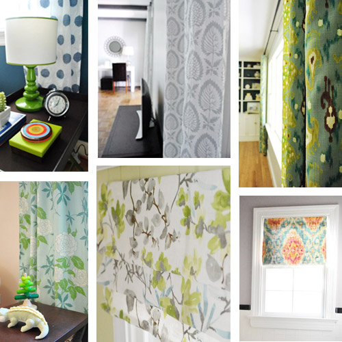
Maybe the biggest change? Our first house had white curtains in every. single. room. except for Clara’s bedroom. So one major difference here has been that we’ve embraced more colorful and patterned curtains in nearly every room.
Bold color was definitely less present in our first house. Comparing our color-coded floor plans above might make that pretty clear, but it’s even more evident when you actually look at room shots. While our first living room was softly layered with tone on tone colors…
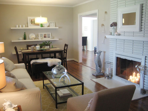
… our current living room (the pic above this one) definitely has more pattern and color going on (bright pillows and vases, a larger geometric rug, etc) as well as more high contrast choices (dark beams and a dark sofa).
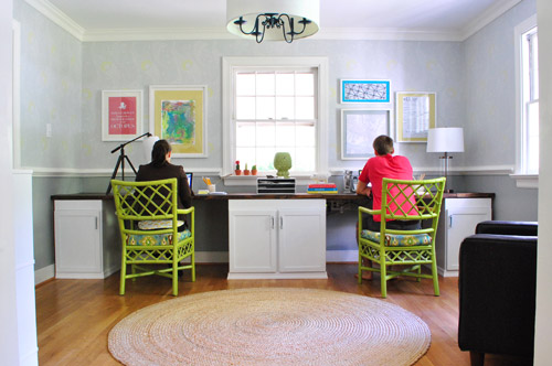
Another place we tend to bring bright color into our current house would be art and painted furnishings. See how the green chairs and bright wall of art in the office really liven things up? Yet we have neutral tones in there to add balance, like the white cabinets, wood counter, and natural jute rug.
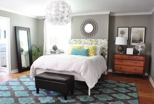
And of course things like the homemade headboard in our bedroom – and guest bedroom – add some interest, pattern, and color along with a few more bold and geometric rugs:
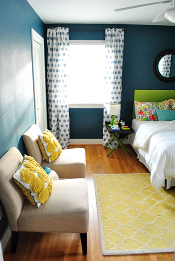
The green headboard from our guest room above was also in our first guest room, so we were inching towards our current color preferences back then, but we definitely kept it more toned down in there with neutral tan walls, plain white roman shades, no rug, etc.
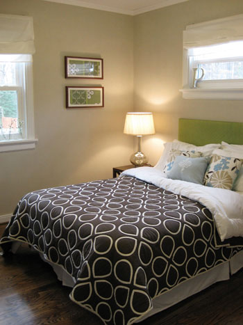
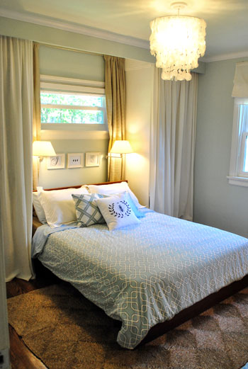
Just for fun, here’s a picture of our first bedroom to compare with our current bedroom shot three pictures up. It appears as though our love of cozy bedrooms has remained (especially with pretty chandeliers and breezy white curtains) but we’ve definitely turned up the dial with brighter pillows, a patterned headboard, and a bold rug in our current house.
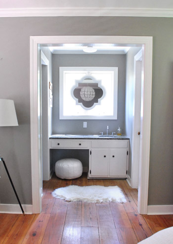
We still have moments of calm tone-on-tone color here though, just to balance those hits of bright hue that occur almost everywhere else. For example, there’s our sink nook…
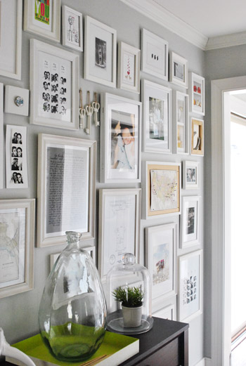
… and our hallway of frames…
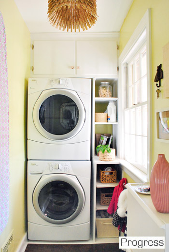
… and our laundry room. There’s some soft avocado color on the walls, but the rest of the room is pretty neutral (white cabinets and shelves, a natural-toned light fixture, white appliances, cork floors, etc) since it’s such a small space and we didn’t want it to feel cramped.
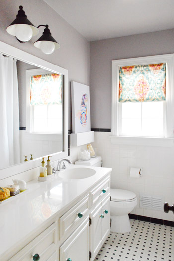
Actually if you look back at the commonalities among those three spaces that I just mentioned, they’re all small – so I think that’s definitely a factor when it comes to how much color and pattern we add. And then there are rooms that are a bit larger, like the hall bathroom, which got a plum undertone in the grey paint (it’s subtle but definitely noticeable in person) and some bright art along with a colorful window treatment and some teal knobs on the vanity.
So there you have it, a meandering brain dump with a much overdue floor plan of our house’s color palette. It’s nice to stop and examine these things occasionally because then we can look back on them (posts like this are essentially a time capsule for us, since pages like our House Tour are constantly being updated – so all the in-the-middle stuff gets bumped out). Welcome to our time capsule.
How do you guys like to decorate? Do you prefer one or two paint colors throughout your entire home? A different color in every room? Or a handful of colors that reoccur in a few places? There’s definitely not one right answer, so we’d love to hear how you guys like to color your world!
Psst- For a more exhaustive tour of our first house followed by all of the before & afters of our current house, click here and then here.

Jennah says
We just painted our bedroom orange(!) and our kitchen is bright green, but the rest of the rooms are neutral (save for a dark brown accent wall in the living room). Our house is smaller than your first one, so we’ve learned along the way that some neutral is necessary so everything doesnt’ feel crazy.
Gabriella @ Our Life In Action says
I am so glad you did this. I absolutely love your colour scheme and although I am doing my best not to be a full on copy cat ;-) this post makes it so much more difficult. :-D
YoungHouseLove says
Aw thanks Gabriella!
xo
s
Anele @ Success Along the Weigh says
I love that you guys did this and it’s neat to see that the colors work so well together. Our styles are different depending on which level you’re on. Upstairs is a light gray and white trim with French influence in our room (I hesitate to call it French Country) and the studio is a fusion of french and industrial. Main floor, completely different vibe. Medium green on the walls to mimic the green of Kauai’s mountains, painting of Hawaii, rich honey woods designed to look like koa wood with neutral carpet and couch. The lower level? A lovely combo of cement block and exposed joists to reveal PVC pipes.
YoungHouseLove says
Hahah! The lower level palette sounds tres sophisticated.
xo
s
Meghan says
How serendipitous! My brother was just talking about maaayyybe painting his kitchen gray, and I told him to check out the grays in your house. Forwarding post now!
Petra says
Amazing transformation as always. When and why did you jump into the Benjamin Moore train?
YoungHouseLove says
We’ve been using Benjamin Moore colors for 3-4 years (a few rooms in our first house are BM colors color matched to Olympic or Glidden paint) but we didn’t dive in and actually buy BM paint for a while because we worried it was too expensive and we’d rather just use cheap paint and apply a few more coats if that’s what it took. Then we tired Benjamin Moore paint when painting our office built ins two years ago (we didn’t want to cheap out and have them chip/flake/peel) and it was awesome. Which led to using it on our kitchen cabinets, our master bathroom walls, a few secret book projects, and then we just couldn’t stop! It’s addicting. But it’s definitely one of those budget things (if you don’t have the money, using cheaper paint and applying more coats can work… but once you get that awesome coverage in one coat instead of three with BM it’s hard to turn back- haha!). And it’s extra scrubbable and durable, so we love how it has held up as compared to cheaper paints.
xo
s
Elizabeth says
Would you be willing to add the names of all the paint colors to this post? Or does that already exist somewhere?
YoungHouseLove says
Oh yes, here’s that page for ya: https://www.younghouselove.com/about-2/our-paint-colors/ I’ll update the post with a link too!
xo
s
Ashley@AttemptsAtDomestication says
Love this! Such a great idea to show all of the colors in your house and how they flow and fit together!
Janelle says
This is such a helpful post. Before I first started reading your blog a couple of years ago I had no idea people even thought about their overall colour scheme for their home. And now? I can’t wait to buy our first home so I can pick a colour scheme! At least we were able to paint 2 room sin our apartment. So lucky!
YoungHouseLove says
So lucky!
xo
s
gemma@thesweetestdigs says
It’s so fun to see how style and tastes evolve and change, and to compare old houses to newer ones! We have definitely done the trial-and-error thing in our first house – I painted every single room in the beginning, only to later realize that I hadn’t been thinking about an overall scheme and it was waaay too bright and bold. A few years later, and every room except one has been re-painted!
leah says
I love your pallete. I may have to take a cue if we buy a new house! Cross your fingers, ours just went on the market and we are hoping it will sell pretty darn quickly!
YoungHouseLove says
Good luck Leah!
xo
s
robin @ our semi organic life says
In my 28 years I’ve never once had a single room/house/apartment that’s ever been painted. I long for the day I’m allowed to paint…
YoungHouseLove says
Oh man, we were like that in NYC! We were dying to paint walls when we moved to Richmond! Haha!
xo
s
Chelsea @ Riding Escalators says
Isn’t it funny how your tastes and preferences change over the years? When we first bought our home, we were SO excited to paint rooms for the first time – and we wanted them to be wow-y. So a green living room and a pumpkin-y dining room, and a yellow guest room, etc. And now when I sit in our living room, while I still love the green, I start picturing it with moody grey walls that would allow me to bring in more pops of color in the furniture… And I picture a lighter color in the dining room… and… and… but I doubt the Mr. is going to let me redo those rooms – at least with his help. Maybe I’ll have to surprise him while he’s away sometime! :)
YoungHouseLove says
Yes, it’s so funny how things change! When we first got our first house we basically painted it every color of the rainbow! We thought that’s what you do – pick some wow-y colors (love that term that you just made up, haha) and went for it. Then later we were like “but this isn’t really what we like… oops!” – hah! Good luck with everything Chelsea!
xo
s
Erin says
We have a lot of neutral tones in our main living/dining/kitchen area. The master bedroom is a darker rusty brown and the kids rooms are bright and fun. I think a whole home plan like you posted would make it look cray-zay and disjointed but it works for us!
YoungHouseLove says
I think it sounds awesome Erin!
xo
s
Megan @ Rappsody in Rooms says
This is a fun look through your two homes. It inspires me to think of the home as a whole, instead of each room on its own. Our house has a lot of blue, tan, green, and red…a little random but we are getting more “whole” as we go along. Fun way to share a look at your house’s color scheme!
Tania says
Love it!! I’m switching out all my old solid curtains for patterns too! So fun!
Ade@fortheloveofpainting says
I love the subtle color on the walls…I am trying to choose more calming colors in our house at the moment, although I stole the yellow door idea for our pantry in the kitchen. I too am trying to bring in some fun drape patterns…
Julia @ Chris Loves Julia says
When we first moved into our house (just under 2 years ago) we went color crazy. First house! First house!! We painted our family room blue, our living room purple. Greta’s room green! And then I guess we got it all out of our system, because things are much more toned down now as far as paint colors go. We really really like moody darker paint colors that feel cozy balanced out with a light gray in the open areas.
Amy @ This DIY Life says
At our last place I had purple and green stripes on the wall in my craft room. SW Leapfrog & Mesmerize – not like Barney purple and green. Hubs kinda forgot our anniversary so I got to paint the wall the way I wanted it. I think it may have been worth it. So, if you ask what I like I think it’s every room a different color. But marriage is about compromise right? Most of our rooms are pretty subdued colors now. I love the way our bright red end table or my green canvases (http://thisdiylife.wordpress.com/2011/08/02/challenge-i-brought-it/) stand out against our Latte (SW) walls. I’m actually getting ready to paint our upstairs hallway the same as most of our first floor because I over bought paint. That’s a good reason right? I agree that it’s boring to look at a color floor plan when it’s your accessories that make everything rock!
Amanda K says
When we bought our house 6 years ago, it was in desperate need of new paint in every room, so I just picked colors I liked without much of a plan – a green kitchen, orange bedroom, red dining room, etc. Since then, I’ve repainted both bedrooms, the master bath, and the hallway to make things flow a little better, and I’ve chosen mostly grays and blues.
Ashley P says
I am dying to see what kind of rug you pick for your dining room!
Dulce says
Hey guys! I’ve never really commented on here before, except for giveaways, but I found this post to be too coincidental not to. Last night, before going to bed I was thinking about what color to paint our new bedroom and looked to your book for inspiration (love it, btw!). I guess since I fell asleep thinking about paint & your book it triggered a dream in which you guys had repainted your office! Don’t really remember the exact combination of colors (it was two-tone, top & bottom were different shades) but remember thinking: GENIUS! Now I wish I could remember to a) tell you & b) paint my room that color. ;)
YoungHouseLove says
Haha, no way! I love it! I’m glad it looked good in your dream (in my dreams we always do things that look really really bad! – haha!).
xo
s
Lindsey d. says
I find it fascinating that y’all have about four different shades of grey in your home now, all with different undertones. It’s basically your new neutral, instead of the more yellow-toned tans and beiges from House 1. Which makes sense; it’s in keeping with today’s style.
But I’m not really one to talk about different greys…I have four colors working in my 1150 sq. ft. cottage and three are in the grey family.
– Pale blue with grey undertones in the living room, guest room, hall and bath. (Behr’s Light French Grey, which is much more blue than grey).
– Plum-grey in my bedroom (Glidden’s Dolphin Grey).
– More pure grey in the kitchen (Behr’s Silver Screen).
– Deep navy in the back TV room (BM’s Spellbound – inspired by this post – https://www.younghouselove.com/nice-package/).
I think I plan to repaint the blue-grey front rooms and the plum-grey bedroom to the more pure grey when I prepare to rent or sell the house, in part to keep things cohesive. It took me a while to find the right grey for my home (Behr’s Silver Screen, btw). All rooms have bright white trim, although in some rooms it needs repainting.
YoungHouseLove says
Haha, love it! Your palate sounds awesome.
xo
s
Kathryn says
I love your colours and how you kept things a little nuetral but then jazzed them up with awesome print curtains! Jazzy!
YoungHouseLove says
Thanks Kathryn!
xo
s
Elyse Danielle says
We just moved into our home a few months ago and while I love the open floor plan, it makes it difficult when deciding how to paint the walls. I’d like the kitchen and the living room to be different colors but the walls just meld together…there is no wall separation…does that make sense? Do y’all have any suggestions with how to handle painting different spaces different colors within an open floor plan?
YoungHouseLove says
I would totally go with the same color in both rooms and then add just an accent wall of color somewhere that’s nice and differentiated (like the back of the built-ins in our dining room, etc) or just use curtains and accessories/rugs/pillows/art to differentiate with the same paint in both spaces. Hope it helps!
xo
s
Beryl says
Did I miss the post when you changed the master bedroom curtains and duvet cover white?
YoungHouseLove says
Hmm, the white duvet cover post is here. And the white curtains post is here.
xo
s
Ashley S. says
I love this! It’s crazy how much you’re style can change between houses. In our first house, our paint in every room was very colorful (soft green living room, bold blue bathroom, bright green bedroom, ect.) Now in our second home, we’ve drifted more towards neutral walls (mostly with what I like to call Griege :P) with colorful accents. Still different colors in each room, but It’s really only different shades of one color. It’s great to see how your style and home evolve with you! :)
Sandy says
This is so fun to see! I esp love the shot of all of your curtains together. Was that brown duvet from your first guest room a subliminal inspiration for your YHL logo? It looks familiar! :)
YoungHouseLove says
Haha, it does doesn’t it?! We still have (and love!) that quilt and hope to bring it back someday, somewhere!
xo
s
Kristi - SimplePrettyThings says
We have different paint colors everywhere. I’m starting to make changes here and there with color so eventually we might be using the same colors in a few different areas of the house. Our colors all pretty much flow but I’m going to make it flow better. Here are our 2013 updates that we want to make to our kitchen and the paint I chose is already in our hallway off the kitchen…so I know I like it: http://www.idlepress.com/simpleprettythings/?p=118
YoungHouseLove says
Fun!
xo
s
Cate says
Amazing to see this entry today since this morning I had the random thought “I should post on YHL to see what colours people would recommend for a basement bedroom”. And here is a whole entry on room colours!
So even though I know you guys don’t have basements in the south, I thought you (or your readership) might have good ideas for what to paint a room, below grade, with two small windows (so a reasonable amount of light, but still a basement), so that it feels soft and warm and inviting.
Or is there a house crash that has a basement that I could snag ideas from?
Cheers!
(Cate in Canada)
YoungHouseLove says
Ooh, I would go with a soft warm tone like Ashen Tan by Benjamin Moore (an old favorite). It looks awesome with white trim.
xo
s
Krystle @ Color Transformed Family says
I love both color pallets but find myself using your current house colors as an inspiration for the color changes in my house. It’s do refreshing to find little pops of color here and there.
Britt F. says
Love this, thanks for sharing! How many of your patterned curtains are actually store bought as curtains versus fabric that you turned into curtains/shades yourself?
YoungHouseLove says
Just the gray and white ones in the tip middle were store bought (Ikea) and I made the rest (most without sewing a stitch thanks to iron on hem tape).
xo
s
Laurel says
I love how you guys have repeated similar posts like this over time! It really helps to understand everything fom te layout, to the color choices, to the transformations of your house over time! It reminds me of that post you did a while ago about how items in your house were holding up over time. You rated your printer and a few other things! I’d love to read another post similar to that! For instance I’d love to hear how you feel about Karl the couch, your bed, how the desk you built has worked out, maybe how you like your kitchen appliances and laundry machines, chairs, rugs, and everything else!! I feel like John might have fun coming up with a good rating system! :) Maybe similar to the style of the one in your book that rated time, cash, and sweat? It would be cool to see a post like this with some regularity (maybe every six months?), even repeating items as your opinions of their quality and cantankerous-ness (new word!) changes!! Anyways, just a thought! I know you’re hella busy with a million other things! This might be the kinda post you could do reusing pictures while you’re traveling all over on your tour!! :D
YoungHouseLove says
That would be fun! Love the idea Laurel! We’ve been meaning to do another update post about how things are holding up since that last one was over a year ago! Man time flies…
xo
s
Zynp says
Every time I see your living room pictures I cannot stop thinking that your bedroom carpet would suit better there :)
YoungHouseLove says
It’s too small by a few feet on all sides. Our giant sofa wouldn’t work with it (and the living room rug’s too large to go in our bedroom). Hope that makes sense!
xo
s
Megan @ Moxie Design Studio says
Great post! I think your design style has really evolved. It makes me wish I had started out the basics of my house with a cooler palette, but I’m making it work with what I have. My open living space has mostly neutral walls so I can bring in lots of colors without it being too crazy. I did talk my hubby into painting the wall behind the TV a dark, dark olive green though. I think it will help make the TV disappear though, and the lime green record cabinet in front of that wall should look awesome.
Great job on your house!
YoungHouseLove says
That sounds awesome!! Send pics!
xo
s
Jayme @ Keeping Up With Myself says
What happened to the cute DIY benches at the foot of your bed? Are they still there and you just used an older picture of the bedroom?
YoungHouseLove says
Oh yes, oops! Old picture!
xo
s
Jill says
I’m not sure if it’s accidental or not, but as we’ve painted rooms we’re actually using a color scheme similar to your house (warmer greys, subtle yellows, & blues). I’ve stumbled across a problem though: I have found my absolute favorite paint color EVER (Behr’s Cathedral Gray) and now I just want to paint every room that color. For serious.
We used it first in our spare room upstairs, and will be using it for the upstairs bathroom (in progress!) too. I also used it in our office downstairs, and may want to have it in the downstairs loo as well. I feel like I’m developing a problem, but how could something that feels so right be wrong?? haha
YoungHouseLove says
Ooh it sounds awesome!
xo
s
Taya says
I love seeing your color palate in one Image. Also, am noticing some new formatting on the sidebar of your page and that in the yellow title bar “life” has been swapped out for “our family blog.” Sneaky sneaky! Lol. It looks great!
YoungHouseLove says
Haha, oh yes we cleaned up the links under the header and the sidebar a little so you guys could hopefully find your way around a little easier :)
xo
s
MegS says
Your wall colors were perhaps your biggest influence on me when we bought our first house 3 years ago (yes, I’m in the 3+ years YHL club!). I am a color LOVER but you inspired me to go neutral on the walls when I probably would’ve painted each room a different (bold!) color, left to my own devices. I even did the all-white Ikea curtains in each room– SO DREAMY! It looked fabulous. When we bought a rental property, I did what I had originally wanted to do and painted every room a BRIGHT BOLD color– all variations of blue or green. That was fun, and the college kids that rented it didn’t mind, and I actually fell in love with two of the colors, but I will NOT be doing that again! It felt kind of like a Dr. Seuss house. Or Crayola vomit. And now as we’re contemplating a new house (!), I’m very, very excited to get to experiment with color again! It will probably a nice blend of neutrals and brights this time– maybe some painted ceilings and white walls?! We’ll see :)
YoungHouseLove says
Aw, that’s so sweet Meg! Good luck with everything – and have fun!
xo
s
Brandy says
Not a post specific comment, but I just wanted to say that you guys are doing an awesome job juggling everything in your lives right now with the book signings and holiday madness and everything else while still keeping up with your readers and their requests and questions. If you’re anything like the rest of us, you might feel like you’re doing a horrible job balancing it all and not sure how long you can keep up the charade – but from an outsider’s perspective you’ve got it all together! :) Hang in there and just keep doing what you’re doing and sharing it with your readers because we love it, and you!
YoungHouseLove says
Aw thanks so much Brandy! You’re so sweet! And we love you right back. We are definitely looking forward to the middle of February when we’re back from all the tour stuff and life gets to go back to normal, but it’s also really fun and exciting to get to meet you guys at tour stops and stuff, so we’re trying to hold on for the ride and enjoy it while we can!
xo
s
Nicole @ Liberty Belles says
Have you guys considering mounting your TV to the wall above the new, awesome media cabinet? I know it’s something a lot of people do…curious what your thoughts on it are.
YoungHouseLove says
We think we’re happy with it sitting on the media cabinet for now, but who knows where we’ll end up down the line!
xo
s
Rebecca @This Nest is Best says
I forgot to tell you about how being a YHL reader helped me out this weekend…we were playing Battle of the Sexes with our neighbors and the question for the ladies was “The well known brand name of a small, rotating tool.” (I’m paraphrasing, I’m sure!) I said “Hold on a second, I know this because John talks about it…Dremel!” My husband, and most of the men there, were in shock! So…Thank you, John for prepping me for trivia night!
YoungHouseLove says
LOL – that’s awesome. Congrats on getting the point!
-John
Cindy says
So glad I stumbled on your blog this morning – I LOVE everything you’ve done and can’t wait to explore more! When I read your resources post I recognized the names of the shops and thought “My, those sound familiar….”. I moved to Richmond as a young married adult in 1980 and (sadly) I recently had to move away. The closest HomeGoods(and pretty much any good shopping)to me now is an hour away, and I have a new house to decorate! I was in Richmond last week and did a mad dash to many of my favorite shops. So go outside right how hunny and kiss the ground at your feet! I hope you get to stay and raise your lovely daughter in Richmond, like I did. I am very thankful for all my wonderful years there!
YoungHouseLove says
Haha, I’m going to finish this comment and run outside and kiss the ground! Haha. Thanks for the sweet comment. So glad you found our blog.
xo
s
Brenner says
I’m planning to paint my kitchen cabinets white. Do I need to use the same color on my trim also? Thanks!!!
YoungHouseLove says
It definitely can’t hurt! It will keep things feeling cohesive and nothing will be too yellow or clashy. Hope it helps!
xo
s
Natalie says
I love the greys in your house!
I read your blog everyday…like I have an YHL addiction! Its currently 3am in Australia and im doing university homework , but checking your blog for new posts is way more fun!
Have you got any tips on painting window trim, do you tape off the glass or do you go all free hand on it?
– Natalie
YoungHouseLove says
Aw thanks Natalie! You’re so sweet! As for trim, we used to tape it off but after years of doing it we can now freehand it (well, I can). It’s not too bad with a short handled brush, and much faster than taping once you work up the skill :)
xo
s
Christina @ Homemade Ocean says
Oh la la….I like this! I love that you all are embracing color. And the floorplan surprised me because I always think of your house as so colorful.
Amanda says
Love posts like this! Most of our common areas (the living room/dining room and hallway) are beige, but our kitchen is pretty much lime green, and our basement bathroom is a really bright teal/turquoise. I have an easier time painting a smaller room a bolder color, only because if I get bored with it, it takes less time to change. :-) Most of the colors we use are beige, grey, green, and teal/turquoise, with black furniture. Looking forward to repainting the study on Friday so it fits in the our house colors a bit better!!
YoungHouseLove says
Happy painting!
xo
s
Cathryn says
We’re finally getting around to painting some more rooms in our house! The previous owners layered browns and dark beige (badly) over some kind of terra cotta orange color, which peeks through the bad paint jobs all over the house. It’s pretty awful, but our biggest problem is picking colors! I love to use muted neutrals while my husband seems to be drawn to anything pretty saturated (unless it’s gray or yellow, which are favs). At this point I’m ready to settle for anything but what’s on our walls now, but do you have any tips for working with 2 different tastes?
YoungHouseLove says
Hmm, John and I have a Full Agreement Agreement. Basically, we both have to fully agree on things before we do them/buy them. It slows us down but it actually results in us holding out to find a color/furniture item/accessory that we both love instead of settling for something that one only of us loves. For example, maybe you and your husband will walk into a store or restaurant and you’ll both LOVE the color on the walls, and then you can happily paint a room that color. Also showing him inspiration photos of rooms with a color you like and trying to help him see “the whole picture” might help :)
xo
s
Rebecca S says
I always love how fun your new house looks…but I tend to go for a palette closer to your old house. I love a peaceful tone on tone room with lots of white. I thought it was funny when you pointed out which places in your new house are still more like your first house (master bathroom nook, laundry) because those are my very favorite! Our home has lots of creamy linen white, bright white trim with splashes of pale aqua, silvery pale blue and soft leafy green. Very calming :)
Jen@The Decor Scene says
I love all the colors you picked for your second home. Let me see, we have 10 different colors in our home. Beige, slate blue, light sage, yellow, teal & blue/green. I think the beige color in our Great Room is going to become gray some time over the next year I hope. I’m done with Beige for now. ;)
Is BM Advance a low or no voc paint? I love BM, but haven’t used this line yet. I have some paint projects coming up, so I would love to know. Thanks! :)
YoungHouseLove says
BM Advance is low-VOC (it’s awesome for cabinets and really helps them hold up for the long haul) and then for walls we like BM Natura (it’s no-VOC).
xo
s
Jen@The Decor Scene says
Thanks Sherry!!! :) One other question would be, can or should you use BM Advance on walls? Sounds like great durability for walls as well. I love the BM Natura, we started using that the last time we painted. Really has no smell to it, loved that!!! :) Thanks much! :)
YoungHouseLove says
It’s formulated especially for cabinets and furniture so I’d stick to Natura on the walls (it might be too thick for walls). Hope it helps!
xo
s
Jen@The Decor Scene says
Much appreciated. Thank you Sherry! :)
YoungHouseLove says
Of course!
xo
s
Shauna says
Your choices have evolved beautifully through time. Is is just an impression, or are you two are becoming more proficient at both the theory of your design AND the DIY part of it?
I love understatement, and grey is becoming my neutral(like you sort of). But to get our newly constructed home done on budget, we had the entire interior painted the same colour: Swiss Coffee (a warm white). It can be painted over, and it’s important to keep things bright in the cloudy Pacific NW. You have inspired me to put in punches of colour with furniture and accessories, sometimes totally different colours than what I thought I liked! Tastes change…
My, this is a ramble. Mostly to say I love this post.
YoungHouseLove says
Aw thanks Shauna! Haha, I still think we don’t know what we’re doing 80% of the time, so we’re no where near “proficient” in design theory. Haha! We just use good ol trial and error most times! But sometimes it’s funny when we look back at things and notice accidental patterns (like rooms with bright walls tend to have more neutral “other stuff” to temper them).
xo
s