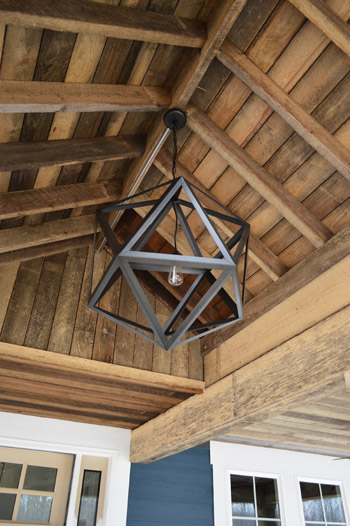
Things are moving at warp speed these days at the Homearama Showhouse, so we have tons of updates to share since last week (especially since more fixtures, cabinets, and counters are now officially installed). Let’s start on the front porch, where the centerpiece of our rustic, vaulted ceiling has been added. It’s from Restoration Hardware, so it was definitely a splurge (our team joined their trade program to save 20%) but we think it’s an awesome thing to see up there before stepping into the house for the first time.
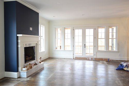
As we snapped these photos yesterday, they were just beginning to pull up the protective floor coverings, but the hardwoods were still really dusty (they’re putting a final sealant coat on them today – so we’re all banned from the house). Dust and all, this picture captures that pretty wall of windows and doors at the back of the living room that leads out the covered porch.
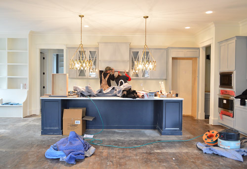
Even though the kitchen is still a work in progress – literally, you can see the vent hood getting installed below – we couldn’t resist sharing a wider shot of the navy island with those brass accordion fixtures that we shared last week above it (the island is Hale Navy by Ben Moore, the same color as the fireplace column across the room, which you see in the shot above). Speaking of the island, the builder made one a bit smaller than this in his last house and everyone’s feedback was “go bigger!” – so by jove he did. We can’t wait to get four stools in there to fill things out.
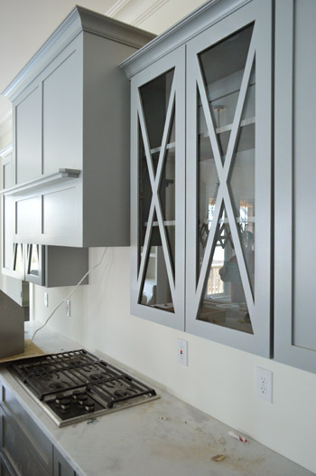
It was cool to see things come together that we had only seen in showrooms and vendor booklets months ago when we chose them. Like these glass x-fronted doors that flank the range hood. We didn’t do any open shelving in this kitchen, but thought it would be a nice touch to add a few cabinets where someone could display their nice dishes, bowls, and glasses.
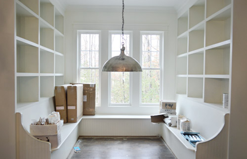
To the left of the kitchen is the breakfast nook, which has been quite the adventure to accomplish. Carpenter John (not to be confused with Builder John or me, Blogger John) did us a solid in making this space cozier after it ended up being bigger/wider than we all originally planned (other considerations like how things lined up in the kitchen and how things looked from the back of the house inched it up from our initial dimensions). There’s still a big table to be constructed and plenty of shelves to be filled, but it’s getting there – especially now that the silver dome light (donated by Shades of Light) is in.
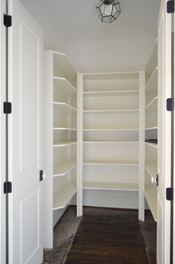
Just one wall away from the breakfast nook is the pantry. Excuse me, I mean walk-in pantry. It has me and Sherry green with envy. Is it wrong that we kinda want to fill it with candy like the store in the opening of Willy Wonka? The prism flushmount light is also from Shades of Light. It’s made of up pentagons, but we like to pretend they’re hexagons so it’s kind of a nod to our bee love.
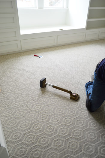
I probably shouldn’t force the hex thing there, since the carpet that we chose for the boy’s room has actual hexagons in it. We thought it’d be fun to do something a little different than plain carpet (we have hardwoods throughout the house except for the two kids rooms and the guest room), so this Revere pattern by Stanton (selected at a local place called ProSource) seemed fun without being too crazy. And as you can see, the installation was also in progress when we were there yesterday.
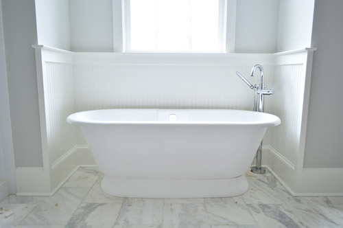
Now on to the en-suite bathroom, which is a bit of a mess at the moment, but still manages to get us excited. We’re taking this as our chance to do that luxe & light, hotel-like bathroom that I’m not sure we’ll ever have the space to execute in our own home. So we’ve chosen lots of tone-on-tone whites and grays with a few unexpected hits of color – some of which we’ll reveal today, and some that’ll come in later with art/accessories. Of course we went for a big freestanding tub that’s probably a pipe dream (plumbing pun!) for our own bathroom. You should see Sherry look at this thing lustily.
Since we couldn’t just leave the room totally colorless, we did a nice big plane of spa-like color on the back wall of the shower, which is still semi-floorless, totally doorless, and inexplicably has a mirror leaning in it at the moment.
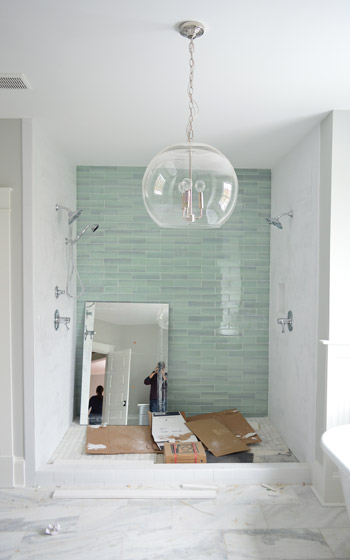
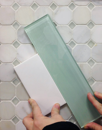
Those bluey-green glass tiles are this 3 x 12″ New Haven tile and the sides are 3 x 6″ white subway tiles, both donated by The Tile Shop. Here’s a shot from back in December (!!) when we picked it out. The shower flooring is the one in the background of this tile shot, which is their Evanston series in Frost Snow. The little glass squares mixed with marble help tie everything in the room together.
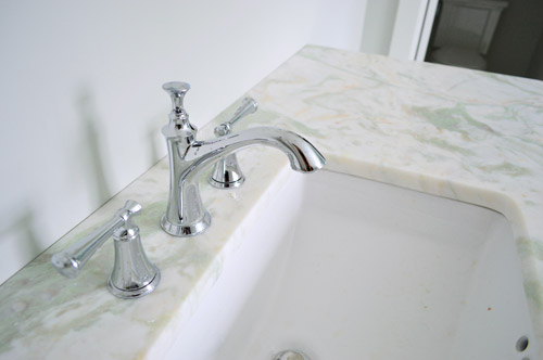
In the interest of trying to take some risks in the name of a good show and stretch outside of our comfort zone, we resisted the urge to go with all-white marble for the vanity counters, and selected something a little less common (it has soft seaglass colored veins, which tie into the shower tiles). All of the fixtures are polished chrome, including the glass chandelier from Shades of Light, and the sink faucets and shower trim were donated by Brizo (Delta donated the tub filler).
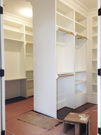
Across from the bathroom is the closet, which is another jealousy inducing space for the lady-wife. We gave the carpenter a couple of suggestions, but pretty much just let him do his thing. The layout is hard to wrap your head around, so this post with a floor plan might help (there’s a his and hers area with a storage-saturated divider).
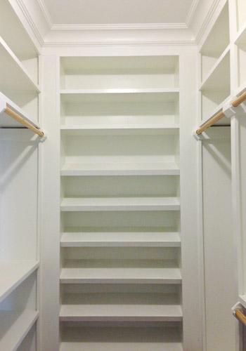
He packed it with awesome features like this angled shoe rack that’s sure to get all the Charlotte Bradshaws out there excited. No wait, Carrie Bradshaw. Oh geez, I’m such a Miranda.
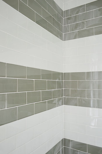
The last space we’ll share today is a peek at the shower in the jack-and-jill bathroom (this is the same kids room that has the green vanity in the adjacent sink area that we shared last week). We planned on taking a bunch of panned out shots of the whole room for you, but a headboard that’s waiting to be painted for the girls bedroom is actually sitting in the middle of the bathroom, along with a spare toilet – so we just couldn’t get those shots yesterday. But check out that shower tile! We chose two different types of colored glass subway tiles and had the tile guy (surprisingly not named John) install them in fat, 12″-ish stripes up the wall.
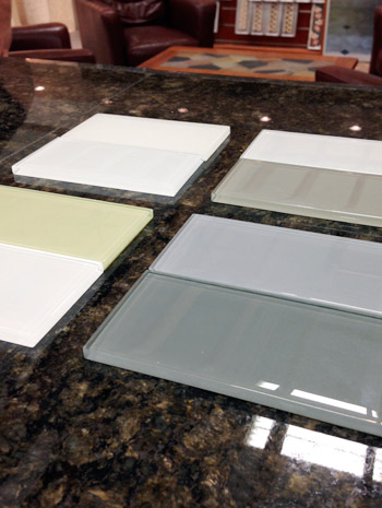
We picked these at The Tile Shop by laying out a few different combinations, including a frost white & gloss white version, a gray & white version, a green & white version, and a blue & gray version. Ultimately we picked the combination in the upper right corner of this picture, which is Snow Glass and Glass Winter.
And last but not least, since we wanted to have some fun in the kids bathroom, we went for this cool Moxie showerhead (donated by Kohler). It has a waterproof bluetooth speaker in it that stays in place magnetically, while the shower still sprays water around it. Somewhere my high school self is feeling quite embarrassed by the shower radio with spotty reception that I was addicted to at the time.

We’re scheduled to begin moving furniture in next week, so hopefully the next update we have for you will have this place looking even more like home. We’re supposed to have the whole place furnished and decorated by early April, so consider us completely 100% freaked out by this. Cue the cold sweats!
Psst – Wanna see more showhouse info & photos? Click here for Our Full Showhouse Tour, which includes final pictures of every room, the floor plan, budget info, a video walk-through, and shoppable showhouse furniture & accessories.

Hope says
It’s looking fantastic guys! I was wondering what material you chose for the kitchen countertops? Have you shared that info yet and I just missed it? Thanks!
YoungHouseLove says
They’re a really cool finish called “leathered” – we’d love to share more details and pics when they’re cleared off enough to shoot. Hopefully in the next update!
xo
s
Kim says
OMG- LOVE!!!! And seriously….who makes a breakfast room accidentally bigger? In my world things are always accidentally smaller. But those shelves the carpenter made above the benches – swoon! I’m just loving the entire feel of the place and cannot wait to see it put together. I am so jealous of everyone who gets to see it in person! Every time I feel tired and unmotivated I think of you guys and try to suck it up! Can’t wait to see it all done! (and that master closet – seriously….that is to die for…and bigger than my master bedroom!)
Stephanie says
OMG, I’ll take one of everything including a Sherry and John to come do the same thing at my place. I’m in awe of your talent, you should be very proud. And Habitat is such a great cause, job well done!
Megan says
This house rocks! I would be so attached and so sad that it wasn’t mine!
YoungHouseLove says
I was laughing with the builder because I said “Aaand it happened. We have officially reached the point where I’m jealous.” For so long I was all “I can resist this, and now I’m all “doooon’t leave me house! I just can’t quit you.” But thinking about a family living here still gives me the warm fuzzies. I have big dreams of house crashing them so we can see how they really live in it. Wouldn’t that be fun?
xo
s
Vica says
I want to move to Richmond and buy THIS HOUSE! Gorgeous and just my style. We are remolding in May and I might be copying as much of this as possible. I was already planning on a navy island and seeing it in your pictures confirms my plans.
Ok I’m done rambling. Love everything keep up the good work.
Jenna says
Love, love, love, love, love! I never thought i wanted the hassle of building a house before but now I think I will just rip off everything you have done and be very, very happy!
Cynthia says
Can you give a little more detail about the marble bathroom vanity with seaglass veins? It is gorgeous and has a similar look to marble.
YoungHouseLove says
It’s called Lady Onyx (through Eternal Stoneworks here in Richmond).
xo
s
Reenie says
WOW!!! Beautiful!!
See Emily Shop says
I love it! I want that breakfast nook…
yaelks22 says
What brand and/or model number of the stand alone bath tub in the master bath did you use?
YoungHouseLove says
The brand is Victoria + Albert, and it’s called the York Tub. We got it through our local Ferguson showroom.
xo
s
Evelina says
Also, HAPPY BIRTHDAY SHERRY!!!!!!!!!
I hope your birthday is filled with tons of Clara giggles, John hugs, and Burger snuggles. And zero preggo sickness. And maybe abother fab free curb find? Xoxo!
karen says
WoW! looking so stunning guys…that nook with that light!
Sara says
Absolutely beautiful! You guys have really done such a great job with this project. Quick question, what is the floor tile? Thanks so much.
YoungHouseLove says
In the master bathroom that’s marble from The Tile Shop called Tempesta Neve (12″ x 24″).
xo
s
Lindsay O. says
Thanks for asking! I was wondering the same thing. I’ve been wanting to see what the tile we just purchased will look like when there’s a whole floor of it. I’m so excited, because we actually are getting the Tempesta Neve in 8×20! It’s so beautiful, I think I’ll just want to lay down on the floor to stroke it lovingly! :)
kristen f davis says
soooo cute, y’all! love all your choices, and that “Striped” look in the shower is genius!
i can’t wait to see the exterior either – i just chose a similar color for a client’s exterior, and it hasn’t gone up yet!
Heidi says
When everything is said and done, I would love to see some super close up detail shots of the tile work in the bathrooms. I’m always curious how professionals take care of the fine details, like corners, transitions to walls, etc. Help us bridge the gap between DIY and PROFESSIONAL. Thanks guys – everything looks amazing!
YoungHouseLove says
Love that idea!
xo
s
Maya says
It’s looking wonderful, and I can’t wait to see it styled! It’s fun to see what you guys do when you splurge– makes me realize just how frugal you are most of the time.
Just had a random idea– what if you ask readers coming to the show to bring in canned goods to fill up that gorgeous pantry (and donate to charity after the event)? Could be fun!
YoungHouseLove says
THAT’S THE BEST IDEA EVER!!! Doing IT!!!
xo
s
Robin says
cool idea!
Emma says
Wish there was a like button for comments. This is my virtual “LIKE” of the idea.
Izzy says
LOVE this!! Makes me wish I lived closer EVEN MORE!
Ang says
I am not exaggerating when I say that you guys are building my dream house. There needs to be a copy and paste function to drop another one in South Jersey. It’s looking amazing so far and can’t wait to drool over, er, see the finished product!
Rachel says
The showhouse looks ABSOLUTELY STUNNING – congrats guys. So incredible. I’m thinking of cajoling my hubs into driving from MD to Richmond just to see it in person. Gorgeous! Quick question: Do you by any chance know how big that master shower measures? We’re looking to do that exact double-headed shower layout in our (hopefully soon) upcoming addition and I wanted to get a sense of size. Thanks so much for any help!
YoungHouseLove says
It’s giant! 7′ wide by 6′ deep. We couldn’t resist adding double shower heads since it’s so big.
xo
s
Rachel says
Thanks for the info! Sadly ours will only be 5′ wide by 3′ deep (not enough room for 2 showerheads – womp womp). Maybe one in the traditional place and one on the side? Thanks for the info!
YoungHouseLove says
That sounds awesome! 5′ wide by 3′ deep is still big I think! We’re used to tub/shower combos in our houses which are super narrow, so that sounds nice!
xo
s
Rachel says
Oh yay, thanks for making me feel better about the shower space! (Still dreaming of the 7×6 you designed though!) ;) Thanks S!
Tessa says
We did a standard shower head and a ceiling / rain shower head in our slightly smaller shower, Rachel. <3 it :)
Cat @ MaryMarthaMama says
I want that breakfast nook so badly. The rest of the house is great too, but I love a good built in breakfast nook.
Erin says
Fantastic choices!Great floor plan, wonderful materials and excellent storage (who doesn’t love more storage!) Everything is looking perfect. It’s amazing how “simple” little things like good lighting, accent paint and a pattern on wall to wall carpet can turn a home from nice to amazing. It’s giving me lots of ideas for my house again!
Cammee says
It is so beautiful! I’m obsessed with all if the lighting!
a. green says
Hi, I’m curious as to how you acquired the credentials to join the trade program for RH? As a young designer in the field, I’ve been looking into joining several trade programs and know that you have to provide specific documentation to qualify. Did RH just extend the offer to you as your blog garners a lot of attention, or did you have to produce the qualifying documents? It would be interesting to know if you have taken the steps to become NCIDQ certified, for example. Thanks!
YoungHouseLove says
They just asked what the light was for on the phone when our builder ordered it (he’s the man with the money) and he said “a showhouse” and they gave him the trade program info. I think places like RH like to “hook” people with that, since they know they’re more likely to make repeat purchases if they have a special discount.
xo
s
a. green says
Ah ok that makes sense. Thanks for clarifying. The original wording made it seem like you yourselves had joined the trade.
YoungHouseLove says
Sorry, I just updated the post to explain that better too! We say “we” a lot when we mean the design team (builder, architect, carpenter, etc), but the builder is the buyer for everything that conveys with the house (fixtures, tubs, appliances, etc) and we purchase the accessories and decor stuff from a budget he provides to us (we pay for it and then submit receipts and get reimbursed).
xo
s
Megan Clark says
That striped shower is the cutest thing I have ever seen!!! The house looks outstanding, well done.
This has probably been asked a million different times… but is your design take on this project a direction you would go if you could start from scratch in your own home or based more on the masses/trends (builder encouraged)? Obviously, you would never put anything in the show home you don’t like… but even John mentioned some less-safe choices. I’ve seen in the comments a few people suggest more warmth/color in your current house… does going a bit bolder here make you rethink any choices at home? Or is it the best of both worlds??? :-) The whole process seems like such a cool and interesting journey.
YoungHouseLove says
Thanks Megan! I definitely think the showhouse is inspiring us in ways we hoped that it would when we took on the project (we love doing other spaces, even a bathroom for John’s Granny, just to stretch our brains and see what we can learn from them). We’ve enjoyed making some bolder choices in our own home too (like the big star light in our foyer along with the bold blue front door, the striped stair runner, and the rope chandelier in the kitchen) but the showhouse is definitely reinforcing how much power a few “personality” picks can add to a space over something basic.
xo
s
Melanie | Mailbox Journey says
I actually love the show house. You guys have done a great job with it and I’ve been debating making the 4 hour drive to see it in May!
Anele @ Success Along the Weighn says
LOVE the blue glass tile! I swoon.
Don’t even try to shrug off the spotty reception shower radios from back in the day. They were AWESOME. Own it, I do. ;-)
Mark A. says
Everything looks great! I have been thinking of Hale Navy for the exterior shutters on my red brick ranch because it seems to be more muted, but in you pictures it seems brighter. Are your pictures more in line with reality?
YoungHouseLove says
It’s definitely a muted navy color (the fireplace pics are usually more true to life – we think it’s the artificial lights being on in the kitchen that are throwing off how it photographs).
xo
s
Bridge13 says
The house looks fantastic! Do you have an inspiration pic for the breakfast nook by chance? I’m trying to picture how you envisioned the shelves being used? One more question (if you don’t mind), why did you decide not to take the kitchen cabinets all the way to the ceiling? We’re contemplating a kitchen redo and thought that we may want to extend the cabinets so I’m wondering what you think.
YoungHouseLove says
We loved the look of this nook, which we shared in one of our first showhouse planning posts as inspiration, although with ours ending up being wider and deeper than we originally hoped, we went with a U-shaped seating area and built-ins on both sides to cozy things up so we didn’t end up with an enormous table. And as for the cabinets, this house has 10′ ceilings on the first floor, so taking them to the ceiling wasn’t an option, but we love that look with standard height ceilings!
xo
s
Bridge13 says
Thank you so much for responding! You are so thoughtful to take the time to reply to your readers. I think your larger nook may actually be more functional in the long run. You mentioned the high ceilings but I wasn’t thinking about that. Oh to have 10′ ceilings!
YoungHouseLove says
I know, right?
xo
s
rachel says
Just for future reference, you CAN take cabinets all the way to the ceiling, even with 10-foot ceilings. It makes quite a statement!
http://s1195.photobucket.com/user/jillfrawley/media/100_0810.jpg.html
YoungHouseLove says
Thanks for the image Rachel! That really is gorgeous!
xo
s
Paige @ The Room Kit says
This is going to look SO DOPE. I mean, it already does, but the awesome factor is going to go up to 11 once there’s furniture in there.
It totally looks like you guys, but I can also tell you’re branching out. And I mean that as a compliment!
YoungHouseLove says
Thanks so much Paige!
xo
s
Emylee says
OK OK OK. Thanks for the belly laugh this morning. I almost couldn’t finish reading after your “I’m such a Miranda” comment. Like laugh out loud, but I’m the only one in the room awkward feels. Love it.
Frannie says
OMG I’m obsessed. How beautiful!! I love all of it and could move right in. :)
Robin says
Cannot wait to tour it! I wonder if we could buy these plans one day down the line and build this house ourselves when ready??
YoungHouseLove says
The builder is selling the plans on his site (it’s called The Clover) with a percentage going to Habitat! Here’s his site for ya: http://www.biringerbuilders.com/
xo
s
Robin says
wow thanks! I think one link on their site is broken however to view the plan, plus it doesn’t list the price, but thanks for this! I was not expecting it!
YoungHouseLove says
So sorry Robin, I’ll let them know the next time we see them so they can hopefully fix that for ya!
xo
s
Angela N says
Wow! I just love how it is all coming together. I want to live there!!! :-) You guys did an amazing job.
Ashley says
I don’t know how to tell you how desperately in love I am with the inside of this house. I must pin every picture. The kitchen colors are to die for.
Katharina says
I cannot believe this was only a “side gig” for you guys – with all your other projects going on, plus having a baby on the way! You rock!
Meredith says
John (and john and john) and sherry,
This post could not come at a better time. It appears your show house living/family room has craftsman esque millworker around the fireplace, maybe windows, and has a “regular style” crown moulding. I spend yesterday pulling out all the wimpy builder grade trim and started swapping out for more clean crisp craftsman style (1×6 poplar baseboards, 1×4 surround on the double French door leading to patio) etc. We also started a cabinet/shelf built in pair that flank the window. It BEGS to be wrapped in crown like your nursery. So my question…can the craftsman look blend with the more traditional crown….as it appears to be happening in your living room at the show house?
Anxiously awaiting your reply,
Ridding the world of crappy and wimpy trim
YoungHouseLove says
Yes! We’ve looked at a bunch of other showhomes and inspiration pics and love that look. I say layer them in there if you love the mix, because it certainly seems common in the homes we’ve seen :)
xo
s
Samantha @ Fabulous Fabris says
OMG this has me drooling. What a dream home!
I LOVE the turquoisy tiles in the mast bath. Beautiful. I’d like to win the lottery now.
Gauri says
Swooning over that master bath! And everything really! It’s starting to look amazing! Congratulations :)
Callie says
Pretty sure you have designed my dream house!
Justine says
You guys are killing it! I love EVERYTHING. That breakfast nook is my ultimate dream. Not to mention that pantry, and master closet…I seriously may have to move in.
Theresa says
That guy named John, the one that constructed all those built ins, WOW!
You had me at the breakfast nook. Sometimes things are meant to be and that is one fantastic error…
When I scrolled on down to the MBR walk in closet. I just froze as a little tear ran down my cheek. Then I instantly wanted to start filling it with all the amazing clothes I would have because I was living in that gorgeous house. Job well done!
YoungHouseLove says
Haha! I was standing in there saying “here’s where I’d put my tall boots, and my sweaters would go here” – it was a pretty fun exercise…
xo
s
Lindsay says
I want to go to there.
Tiffany says
“He packed it with awesome features like this angled shoe rack that’s sure to get all the Charlotte Bradshaws out there excited. No wait, Carrie Bradshaw. Oh geez, I’m such a Miranda.”
I died! Haha
Roxine says
It’s not even completely finished, and I WANT this house. So beautiful. You’ve done a great job. Think I could find jobs for both my husband and me in Richmond; and then talk all my kids (young adults) in to coming to visit me once a month? All the way from the Intermountain West?
YoungHouseLove says
Haha, come on over!
xo
s
Jeannette says
If the house looks this good now, and it is not even done, I can’t wait to see it complete. Hats off to you guys for making some fabulous choices. I especially love the master bath. And kudos for keeping your head above water despite all the plates your spinning. And good luck in the home stretch – of both the show house and pregnancy! Go Mama! (and John, too of course ;-)
Kalin says
So sorry if this is posted elsewhere, but what is the paint color in the master bathroom? Everything looks great in this house.
YoungHouseLove says
That’s Moonshine by Ben Moore. It reads as more of a soft green-blue-gray in this house (we had it in our last house and it was more of a platinum/gray without much green or blue there – so it’s interesting to see how different homes/lighting make it read differently!).
xo
s
Sarah Mitchell says
You guys have the best taste! My sons room is hale navy, still looks great after 6 years too!
Can you tell me more about the countertops in the kitchen? It looks like Carrara marble but that is not very family friendly and I know there are many alternatives out there now. Sorry if I’ve missed this in a prior post!
YoungHouseLove says
They’re a really cool finish called “leathered” – we’d love to share more details and pics when they’re cleared off enough to shoot. Hopefully in the next update!
xo
s
Brittany M says
It looks amazing! I especially love everything! Can I hire you to design my house? lol
-Do you think it will be hard leaving the finished product behind since you’ve put so much of yourselves in this house/project?
-Knowing what you know now would you ever want to build your own completely custom home someday?
<3 Brittany
YoungHouseLove says
I think I’ll definitely sniffle a little when we close that door for the last time, but my dream is to get to go back and house crash the folks who buy it. How much fun would it be to see how a family actually lives in this house down the line? I think it’ll be one of those beautiful full circle house moments. Haha!
As for building, we are just so enamored with our current house and neighborhood that we have no plans to move anytime soon (we’d love to see Clara and her little brother grow up here) but building is pretty exciting! We’d love to be involved in another charity build or something someday.
xo
s
M says
Thanks for the update. You’ve made some nice choices, like the Hale Navy island (one of my go-to colors!) and the lovely bathroom tiles.
I have to mention a pet peeve of mine, though. When you refer to a “lofted” ceiling, I think you mean either a vault or cathedral ceiling. A loft is something different. I noticed this a lot in your discussion of the covered patio, and here when describing the front porch.
YoungHouseLove says
Thanks M! All fixed!
xo
s
Tara says
I have that shower head and absolutely LOVE it! Nothing like jamming out to Adam Levine while you shower! The house looks beautiful and I can’t wait to see the finishing touches!
Krissy says
What color are the upper cabinets? Love it all!!
YoungHouseLove says
They’re a light gray color (stock from the cabinetry place we used called Affinity).
xo
s