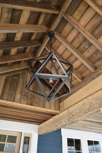
Things are moving at warp speed these days at the Homearama Showhouse, so we have tons of updates to share since last week (especially since more fixtures, cabinets, and counters are now officially installed). Let’s start on the front porch, where the centerpiece of our rustic, vaulted ceiling has been added. It’s from Restoration Hardware, so it was definitely a splurge (our team joined their trade program to save 20%) but we think it’s an awesome thing to see up there before stepping into the house for the first time.
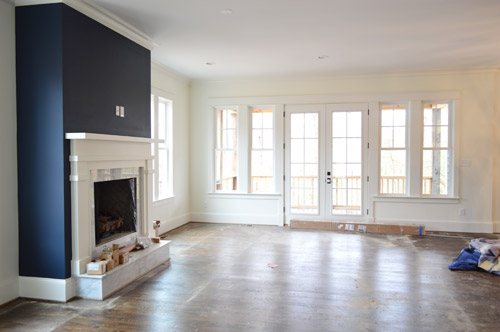
As we snapped these photos yesterday, they were just beginning to pull up the protective floor coverings, but the hardwoods were still really dusty (they’re putting a final sealant coat on them today – so we’re all banned from the house). Dust and all, this picture captures that pretty wall of windows and doors at the back of the living room that leads out the covered porch.
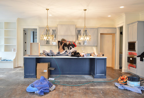
Even though the kitchen is still a work in progress – literally, you can see the vent hood getting installed below – we couldn’t resist sharing a wider shot of the navy island with those brass accordion fixtures that we shared last week above it (the island is Hale Navy by Ben Moore, the same color as the fireplace column across the room, which you see in the shot above). Speaking of the island, the builder made one a bit smaller than this in his last house and everyone’s feedback was “go bigger!” – so by jove he did. We can’t wait to get four stools in there to fill things out.
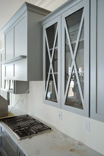
It was cool to see things come together that we had only seen in showrooms and vendor booklets months ago when we chose them. Like these glass x-fronted doors that flank the range hood. We didn’t do any open shelving in this kitchen, but thought it would be a nice touch to add a few cabinets where someone could display their nice dishes, bowls, and glasses.
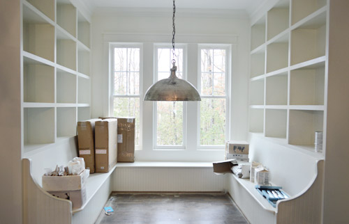
To the left of the kitchen is the breakfast nook, which has been quite the adventure to accomplish. Carpenter John (not to be confused with Builder John or me, Blogger John) did us a solid in making this space cozier after it ended up being bigger/wider than we all originally planned (other considerations like how things lined up in the kitchen and how things looked from the back of the house inched it up from our initial dimensions). There’s still a big table to be constructed and plenty of shelves to be filled, but it’s getting there – especially now that the silver dome light (donated by Shades of Light) is in.
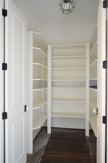
Just one wall away from the breakfast nook is the pantry. Excuse me, I mean walk-in pantry. It has me and Sherry green with envy. Is it wrong that we kinda want to fill it with candy like the store in the opening of Willy Wonka? The prism flushmount light is also from Shades of Light. It’s made of up pentagons, but we like to pretend they’re hexagons so it’s kind of a nod to our bee love.
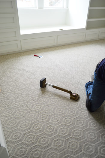
I probably shouldn’t force the hex thing there, since the carpet that we chose for the boy’s room has actual hexagons in it. We thought it’d be fun to do something a little different than plain carpet (we have hardwoods throughout the house except for the two kids rooms and the guest room), so this Revere pattern by Stanton (selected at a local place called ProSource) seemed fun without being too crazy. And as you can see, the installation was also in progress when we were there yesterday.
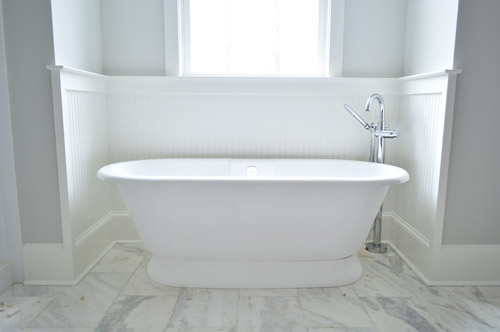
Now on to the en-suite bathroom, which is a bit of a mess at the moment, but still manages to get us excited. We’re taking this as our chance to do that luxe & light, hotel-like bathroom that I’m not sure we’ll ever have the space to execute in our own home. So we’ve chosen lots of tone-on-tone whites and grays with a few unexpected hits of color – some of which we’ll reveal today, and some that’ll come in later with art/accessories. Of course we went for a big freestanding tub that’s probably a pipe dream (plumbing pun!) for our own bathroom. You should see Sherry look at this thing lustily.
Since we couldn’t just leave the room totally colorless, we did a nice big plane of spa-like color on the back wall of the shower, which is still semi-floorless, totally doorless, and inexplicably has a mirror leaning in it at the moment.
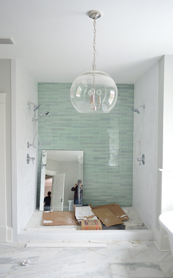
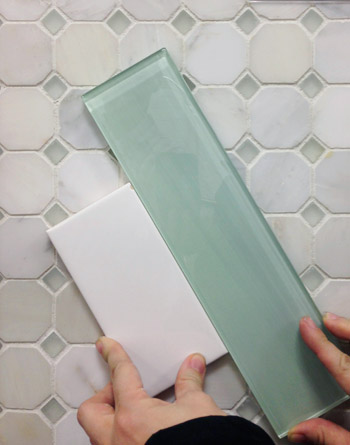
Those bluey-green glass tiles are this 3 x 12″ New Haven tile and the sides are 3 x 6″ white subway tiles, both donated by The Tile Shop. Here’s a shot from back in December (!!) when we picked it out. The shower flooring is the one in the background of this tile shot, which is their Evanston series in Frost Snow. The little glass squares mixed with marble help tie everything in the room together.
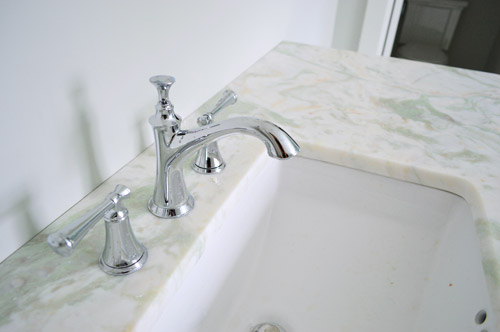
In the interest of trying to take some risks in the name of a good show and stretch outside of our comfort zone, we resisted the urge to go with all-white marble for the vanity counters, and selected something a little less common (it has soft seaglass colored veins, which tie into the shower tiles). All of the fixtures are polished chrome, including the glass chandelier from Shades of Light, and the sink faucets and shower trim were donated by Brizo (Delta donated the tub filler).
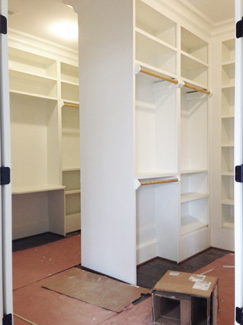
Across from the bathroom is the closet, which is another jealousy inducing space for the lady-wife. We gave the carpenter a couple of suggestions, but pretty much just let him do his thing. The layout is hard to wrap your head around, so this post with a floor plan might help (there’s a his and hers area with a storage-saturated divider).
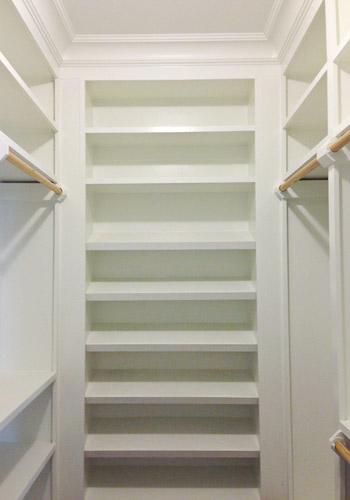
He packed it with awesome features like this angled shoe rack that’s sure to get all the Charlotte Bradshaws out there excited. No wait, Carrie Bradshaw. Oh geez, I’m such a Miranda.
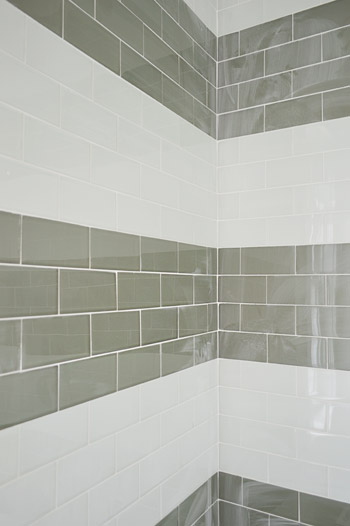
The last space we’ll share today is a peek at the shower in the jack-and-jill bathroom (this is the same kids room that has the green vanity in the adjacent sink area that we shared last week). We planned on taking a bunch of panned out shots of the whole room for you, but a headboard that’s waiting to be painted for the girls bedroom is actually sitting in the middle of the bathroom, along with a spare toilet – so we just couldn’t get those shots yesterday. But check out that shower tile! We chose two different types of colored glass subway tiles and had the tile guy (surprisingly not named John) install them in fat, 12″-ish stripes up the wall.
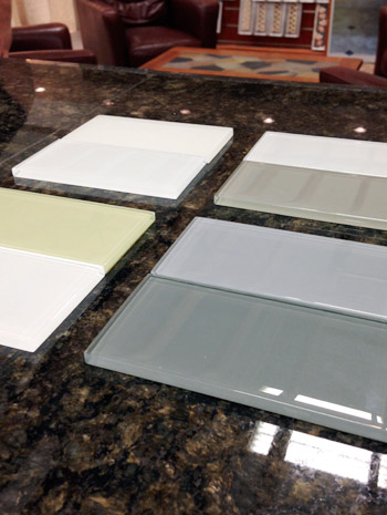
We picked these at The Tile Shop by laying out a few different combinations, including a frost white & gloss white version, a gray & white version, a green & white version, and a blue & gray version. Ultimately we picked the combination in the upper right corner of this picture, which is Snow Glass and Glass Winter.
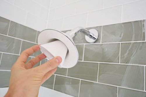
And last but not least, since we wanted to have some fun in the kids bathroom, we went for this cool Moxie showerhead (donated by Kohler). It has a waterproof bluetooth speaker in it that stays in place magnetically, while the shower still sprays water around it. Somewhere my high school self is feeling quite embarrassed by the shower radio with spotty reception that I was addicted to at the time.
We’re scheduled to begin moving furniture in next week, so hopefully the next update we have for you will have this place looking even more like home. We’re supposed to have the whole place furnished and decorated by early April, so consider us completely 100% freaked out by this. Cue the cold sweats!
Psst – Wanna see more showhouse info & photos? Click here for Our Full Showhouse Tour, which includes final pictures of every room, the floor plan, budget info, a video walk-through, and shoppable showhouse furniture & accessories.

Grace says
I am blown away. You guys are always amazing, but you have really outdone yourselves! It makes me want to move back to Richmond. so. badly. I cannot wait to see the finished product. Thanks for the continued inspiration.
Karyl says
Simply gorgeous! Love the selections! What color is the carpet you chose? (ecru, silver, champagne)? We are nearly done with our build so I know firsthand how crazy it is to make all those choices! Well done :-).
YoungHouseLove says
We went with the silver color. All of them were pretty though!
xo
s
Martin says
I might have missed it, but what’s that wonderful grey-greeny color in the master bathroom? We’re looking for something just like that!
YoungHouseLove says
That’s Moonshine by Ben Moore. It reads as more of a soft green-blue-gray in this house (we had it in our last house and it was more of a platinum/gray without much green or blue there – so it’s interesting to see how different homes/lighting make it read differently!).
xo
s
Martin says
Maybe it’s the tile? It looks pretty similar in the picture that features that gorgeous wall of tile. :)
YoungHouseLove says
Totally could be!
xo
s
Alicia says
Hi guys! Everything looks great. Quick question- what did you use on the master bath floor? We’re redoing ours and trying to do a similar style with marble and subway, and I’m having a hard time finding the perfect flooring. I like the veining in whatever you used!
YoungHouseLove says
In the master bathroom that’s marble from The Tile Shop called Tempesta Neve (12? x 24?).
xo
s
Necole@seriouslysassymama says
Holy crap I love the shower tile!
jordan says
You two are bringing it, once again. Does YHL have any plans to slow down once the baby comes?
YoungHouseLove says
We definitely look forward to readjusting when the baby comes, but we’re going to play it by ear since we have no idea what kind of kiddo we’ll get!
xo
s
Miranda says
I am DYYYYYYYIIIINGGG over that breakfast nook!I can’t wait to see how y’all style it! #cubbyholedreamsreallydocometrue
Tyra says
So dreamy! Wouldn’t it be nice to afford a house like that????
P.s. Happy birthday sherry! I think it’s today-but know it’s soon ;)
Raylan says
You guys should totally add some of your new hooks from Target on that bare closet end-cap/wall! They would be perfect for hanging a big floppy beach hat or even fun as a way to display a prized closet item (like a designer dress). Just a thought!
YoungHouseLove says
Thanks Raylan! We’re definitely excited to work a few lights from our collection and a few hooks from the new line in there!
xo
s
Christine says
Oh my goodness…that master closet is amazing!
tia says
Wonderful light fixtures. The whole house is incredible and I want to move in.
Kelly @ Kansas City Mamas says
I’m a new commenter…but a stalker for a long time. We are in the process of planning our kitchen remodel and I love the grey color of the cabinets. I’ve looked and looked and can’t find it. And I’m DYING….can you tell me what it is?
YoungHouseLove says
Thanks Kelly! It was a stock light gray option for cabinetry that we ordered through a local place called Affinity. Not sure if it has a true color name, but I’ll ask and see!
xo
s
Dania says
Blogger John, you ARE such a Miranda! That comment made me LOL! Love the progress – obsessed with all the light fixtures. Love your eye for all the geometric details.
I want to buy this home. Oh wait, I’m a broke grad student… oh well, a girl can dream. Can’t wait to see the finished product!
Suzanne says
Hey guys,
I have a question for you – I am so torn on the issue of built-ins. I think these ones look amazing and I love the white and the seamless look, but I am also kind of terrified of them becoming dated. I have these visions of those eighties built-ins around master beds (which also bothered me because they dictate the size of the bed!) and I just feel they are such a commitment, but what if they look dated and you are stuck with them. How do you approach this, considering they are not as easy to change as accessories etc?
PS, the house looks amazing!
YoungHouseLove says
That’s a great question! We approached this showhouse by checking out a bunch of other new construction homes on the market, other inspiration images online, design books/mags, etc – and one thing they all had in common were built-in customization (cabinetry, window seats, banquettes, bookcases, etc) to add function, personality, architecture, etc. That just seems to be par for the course when you work with a custom builder these days, so they seem to be more of the rule than the exception. In planning ours out, we definitely tried to choose classic colors and shapes. Things like a basic built-in banquette or a clean-lined built-in desk beneath a window feel timeless, like you could find them in magazines and books from 30 years ago or now, so I think that was comforting, along with bouncing things off of the team (the architect, the builder, the realtor, etc) to make sure they thought they weren’t crazy.
xo
s
Suzanne says
Thanks!
Kim says
Everything looks awesome! Can you tell me the color or kitchen cabinets manufacturer?
I’ve been thinking about painting my cabinets grey.
Thanks,
Kim
YoungHouseLove says
They’re a stock light gray color provided by the cabinet maker (a local place called Affinity). Not sure if they have an actual paint color name associated with them, but we’ll have to ask the next time we see them!
xo
s
Isabel says
First off, happy b-day Sherry! Second, this house is going to be beautiful to the nth degree! I don’t know what I want more, the tub, the closet light fixture, the shower tile, the built-in shoe rack (holy crapola that shoe rack!), the bluetooth shower head (totally need to get hubby that!), the office ceiling, the dining room wainscoting… ok, I want it all! Cannot wait to see this house in person! I recently painted an accent wall in the kitchen BM Mysterious but now I’m considering repainting it Hale Navy, what a beautiful color! Not sure how I missed it since I probably now own every single blue paint swatch out there!
Danielle says
Nothing short of breathtaking!
Sara wutzke says
I love everything about this house! Storage galore!!!
Vanessa R says
This looks so great! I Can’t wait to see the finished house! One question…in the post it says the tile in the background of the picture is the tub floor tile. Is that supposed to be shower floor tile?
YoungHouseLove says
Yes! Off to fix that!
xo
s
Alison says
I just LOOOVE how this house is turning out! You guys are so talented. Seriously. At some point in your lives you need to start a design business. And also make sure you move to Michigan at the same time so that I can use you ;)
Jokes aside – what is your theory on mixing metal finishes? I notice you have what looks like ORB door hardware, but have various different finishes on the fixtures in the kitchen and bathrooms. Do you just focus on what will look good within the room and who cares about what’s on the doors or other rooms in the house? That’s the approach we’re currently taking in our home, and a few people have said that it can come off as “discombobulated”… I totally disagree though! And now I will cite your amazing show house as evidence ;)
YoungHouseLove says
Thanks Alison! We just try to have things occur in more than one place – so if there are two gold pendants over the island and a silver dome light in the breakfast nook, we might have a silver sink faucet layered into the kitchen area and a few gold items on the built-ins in the breakfast nook. That layering makes it feel intentional and things relate back to each other instead of having one man out (something that looks mismatched while everything else is another finish).
xo
s
Kate says
Amazing! You guys have me dreaming of things to do to a house when my husband and I start looking to buy one next year!
Diane says
I love every thing so far. I feel like you’re building my dream house!! I love the master bath especially the shower that is a dream of mine. I also love the tile design in the kids bathroom. Definitely filing that arrangement for future projects here.
Melanie says
This house is absolutely gorgeous. When can I move in????
Mallory says
This is STUNNING! I’m hoping for a complete home reno in my future and would love to see the layout of the whole house. Will definitely be taking some cues from you! For now though – I’m sticking to simple upgrades like painting. What is the gray paint in the bathroom?! It is exactly the color I’ve been searching for!!
YoungHouseLove says
That’s Moonshine by Ben Moore.
xo
s
MikeLove says
Just curious.. I think I may have missed it from your prior blog posts. Did the builder give you guys a budget to design? The geeky numbers person that I am, just calculated the accent wall in the master bath to be $1600+taxes in addition to all the other AMAZABALLS features in the home(I know the tile was technically donated.)
I absolutely love what you guys have done. Just like the other commenters, I started to draft out my future home, using your design. LOVE LOVE LOVE. I can’t wait for the final reveal. I wished I lived closer so I can graze my hands on everything in this home.
YoungHouseLove says
Good question! We covered that in this post (there are a few paragraphs in the middle with a lot of specifics). The donations and discounts from vendors are definitely helping us to stick to the budget while hopefully making for an interesting show. The more we hustle to get for free (or at a discount), the more the builder can donate to Habitat when he sells the house (along with our design budget, which we’re donating in full).
xo
s
Arati says
I want that master closet! And that glass tile shower wall! And that kitchen!
Melissa@TheChicDream says
I bet it feels so cool to be able to put a house together from start to finish without having to stop and save like you (and most of us) have to! And to not have many budgetary restrictions. Cool indeed. I am loving the light fixtures that you have chosen. I am hoping to use the fixture that you put in the pantry in my kitchen or foyer so I can’t wait to see in person. You guys are rocking it out! Here is how I am hoping to use that fixture:
http://www.thechicdream.com/2014/01/moody-monday.html
YoungHouseLove says
Love that!
xo
s
Kristin says
I am drooling over this house!!!! I think that island with those accordion lights has got to be the most beautiful thing I’ve ever seen, for reals. This house even has me planning a ship down from Pennsylvania because I just must touch every surface and swoon in person, picture big cartoon hearts in place of my eyes.
Kristin says
*trip, not ship, although I will do whatever it takes to get there, ha :)
Andrea says
Wow, this looks stunning!! It has a very “Sarah Richardson” feel with the spa like, elegant, muted blues and greens. And I am freaking in looooove with that kitchen. The island, gold pendants, cabinets. You guys are killing it. I can’t believe it will be in the 500k range – that’s nuts! That’s like a condo/townhouse where we are (Vancouver area, BC).
Stefanie says
Why do I have a creeping suspicion that you two are going to end up buying / moving into the show home?! ;)
YoungHouseLove says
Haha! I wish! It’s definitely out of our budget and we love our house/neighborhood, but I move in mentally whenever we shop for it, which I have to say is a good time!
xo
s
Cindy says
Dang! What a house! Doesn’t it just make you want to live there??? Nah, your house has plenty of DIY character and is lovely :)
Kaelyn says
Oh golly. This home is seriously incredible. I love the repeat of the hexagons throughout the home. How fun and clever! Definitely having pantry/closet/built in storage lust as well. That breakfast nook?! . . .and all the light fixtures. . I really could go on and on. This is SO fabulous you guys! Congrats, congrats! (Can’t wait until the next update!)
Diana says
Umm when can I move in?? I’d be happy with just living in the closet haha.
Mo says
OH. MY. That master bathroom. You have stolen my heart.
Fantastic choices all around!
Sayward says
Ahhhh!!!! I can almost taste it!!!!! (this comment seems creepier written out than it did in my head)
YoungHouseLove says
Haha!
xo
s
Kristin says
“He packed it with awesome features like this angled shoe rack that’s sure to get all the Charlotte Bradshaws out there excited. No wait, Carrie Bradshaw. Oh geez, I’m such a Miranda.”
You have completely made my day in these three sentences. Nothing else will matter all day. haha!
Angie says
It’s hard to believe this is a Habitat for Humanity home. I’ve been involved in several builds and it’s always been just the most basic of materials, floorplans, etc. This is definitely a custom builder type of house, easily $250+ per square foot cost range that is just so, so far out of the price range of what Habitat for Humanity qualifiers could afford, unless I’m severely mistaken. It just seems a bit misleading for the types of donations that a typical recipient could expect. Now, on the other hand, if this is the norm, I’m in the wrong city, and I’m also looking up qualification guidelines for myself … hahaha.
It is truly a lovely house!
YoungHouseLove says
Sorry for the confusion Angie! These seven showhouses are sort of upscale “inspiration homes” for Richmonders to explore and then they’re available for anyone to buy, but the whole event is also set up to benefit Habitat for Humanity. So a chunk of money from the sale of our house is going to Habitat (thanks to our awesome builder), along with a chunk of the ticket sales for the event, and we’re also donating our design fee to them (you can read more about that in this post). We hope they’ll have a lot of money coming their way to make a nice difference on the homes they’re working on!
xo
s
Jeanna Sanchez says
WOW! It is sooo gorgeous!! I love the contrast on the doors with the black hinges and knobs with the crisp white wood, makes me wanna rip all of my doors off and paint them! The master bath is GORG! I am thinking I wanna try and make my own fixture like the one in the front porch with maybe some dowels?? I am definitely inspired to do so now! Great Job Guys!
Nikki says
That master bath is A.MAZ.ING. Seriously, I want to live in it!
Brittany D says
I see a future in home design or builder consultations for you two. The house is PERFECT! I can tell that you spent a lot of thought in the design, making it not only beautiful, but livable. Well done!
Lisa says
HOLY WALK-IN CLOSET, I’M JEALOUS!
Excuse me while I wipe the drool off my face and shed a tear for the joke of a closet I have. I’m also in love with the big pantry. Oh, and the fireplace/island color…so gorgeous! Can’t wait to see the finished product!
http://fabulousfarmlife.blogspot.com
Bev says
Hey from Canada – love your blog! The house looks AMAZING!! I would live there in a heartbeat. Can you share the color of the paint behind the freestanding tub? It’s a gorgeous shade of grey.
Thanks :-)
YoungHouseLove says
That’s Moonshine by Ben Moore.
xo
s
Michelle says
The breakfast nook! *SWOON*
Danielle says
OMG, it looks amazing! We just re-did our kitchen (ok, it’s still not completely finished, womp womp) and those glass-front cabinet doors made me do a double take. They’re gorgeous!! I love the colors you chose, too. Our cabinets are white shaker-style with a navy-ish blue (BM – symphony blue if you’re interested)island.
I can’t wait to see the end result for the kitchen nook. My husband’s building ours and I’m sure it’s going to be the coziest spot in the house.
Jill says
Ummmmm, can I live here?!??!
Jeanna says
It is so fun to see it all come together! I love all the light fixtures, and I’m drooling over the bathrooms………… totally wish I had those in my own home. And that closet is really awesome……. the storage!
Theresa says
I want to live there! Amazing!!
Kristin M says
LOVE it. And I’m sorry but the math teacher in me can’t miss the opportunity to educate… the plural of polyhedron is actually polyhedra, not polyhedrons. But I know you guys were totally just doing that so the title rhymed ;)
YoungHouseLove says
Haha! Thanks Kristin!
xo
s
Meredith says
That breakfast nook is to die for! You guys are doing an incredible job with that place!
Tania // Run to Radiance says
Ok, sold. When can I move in?!?! :P