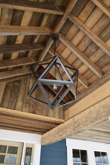
Things are moving at warp speed these days at the Homearama Showhouse, so we have tons of updates to share since last week (especially since more fixtures, cabinets, and counters are now officially installed). Let’s start on the front porch, where the centerpiece of our rustic, vaulted ceiling has been added. It’s from Restoration Hardware, so it was definitely a splurge (our team joined their trade program to save 20%) but we think it’s an awesome thing to see up there before stepping into the house for the first time.
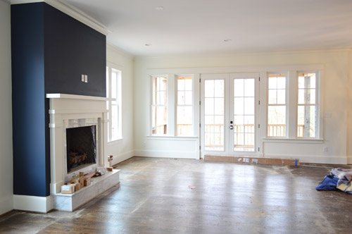
As we snapped these photos yesterday, they were just beginning to pull up the protective floor coverings, but the hardwoods were still really dusty (they’re putting a final sealant coat on them today – so we’re all banned from the house). Dust and all, this picture captures that pretty wall of windows and doors at the back of the living room that leads out the covered porch.
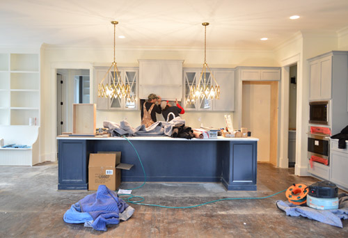
Even though the kitchen is still a work in progress – literally, you can see the vent hood getting installed below – we couldn’t resist sharing a wider shot of the navy island with those brass accordion fixtures that we shared last week above it (the island is Hale Navy by Ben Moore, the same color as the fireplace column across the room, which you see in the shot above). Speaking of the island, the builder made one a bit smaller than this in his last house and everyone’s feedback was “go bigger!” – so by jove he did. We can’t wait to get four stools in there to fill things out.
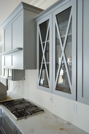
It was cool to see things come together that we had only seen in showrooms and vendor booklets months ago when we chose them. Like these glass x-fronted doors that flank the range hood. We didn’t do any open shelving in this kitchen, but thought it would be a nice touch to add a few cabinets where someone could display their nice dishes, bowls, and glasses.
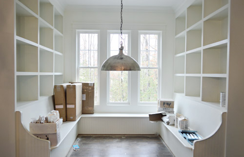
To the left of the kitchen is the breakfast nook, which has been quite the adventure to accomplish. Carpenter John (not to be confused with Builder John or me, Blogger John) did us a solid in making this space cozier after it ended up being bigger/wider than we all originally planned (other considerations like how things lined up in the kitchen and how things looked from the back of the house inched it up from our initial dimensions). There’s still a big table to be constructed and plenty of shelves to be filled, but it’s getting there – especially now that the silver dome light (donated by Shades of Light) is in.
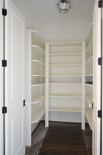
Just one wall away from the breakfast nook is the pantry. Excuse me, I mean walk-in pantry. It has me and Sherry green with envy. Is it wrong that we kinda want to fill it with candy like the store in the opening of Willy Wonka? The prism flushmount light is also from Shades of Light. It’s made of up pentagons, but we like to pretend they’re hexagons so it’s kind of a nod to our bee love.
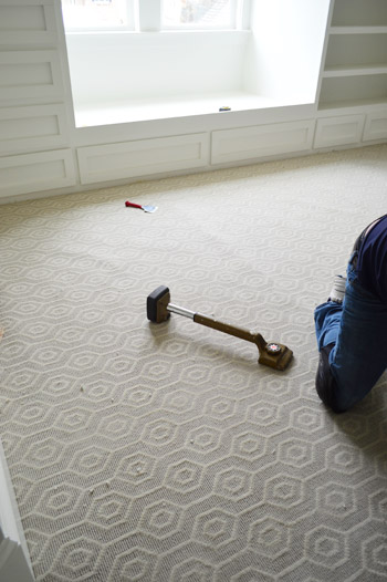
I probably shouldn’t force the hex thing there, since the carpet that we chose for the boy’s room has actual hexagons in it. We thought it’d be fun to do something a little different than plain carpet (we have hardwoods throughout the house except for the two kids rooms and the guest room), so this Revere pattern by Stanton (selected at a local place called ProSource) seemed fun without being too crazy. And as you can see, the installation was also in progress when we were there yesterday.
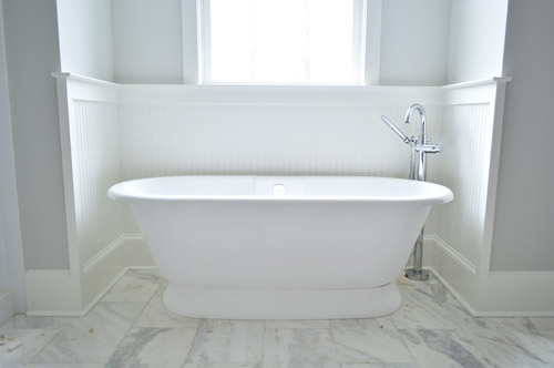
Now on to the en-suite bathroom, which is a bit of a mess at the moment, but still manages to get us excited. We’re taking this as our chance to do that luxe & light, hotel-like bathroom that I’m not sure we’ll ever have the space to execute in our own home. So we’ve chosen lots of tone-on-tone whites and grays with a few unexpected hits of color – some of which we’ll reveal today, and some that’ll come in later with art/accessories. Of course we went for a big freestanding tub that’s probably a pipe dream (plumbing pun!) for our own bathroom. You should see Sherry look at this thing lustily.
Since we couldn’t just leave the room totally colorless, we did a nice big plane of spa-like color on the back wall of the shower, which is still semi-floorless, totally doorless, and inexplicably has a mirror leaning in it at the moment.
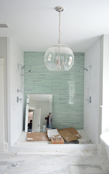
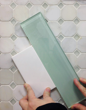
Those bluey-green glass tiles are this 3 x 12″ New Haven tile and the sides are 3 x 6″ white subway tiles, both donated by The Tile Shop. Here’s a shot from back in December (!!) when we picked it out. The shower flooring is the one in the background of this tile shot, which is their Evanston series in Frost Snow. The little glass squares mixed with marble help tie everything in the room together.
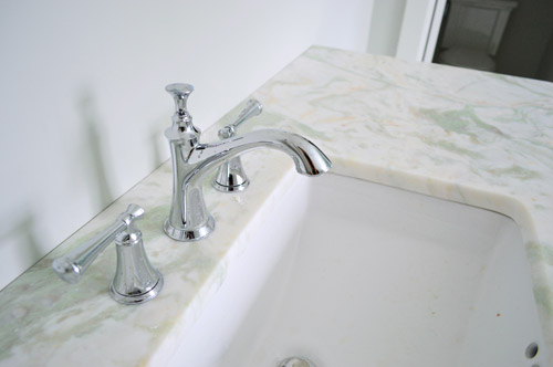
In the interest of trying to take some risks in the name of a good show and stretch outside of our comfort zone, we resisted the urge to go with all-white marble for the vanity counters, and selected something a little less common (it has soft seaglass colored veins, which tie into the shower tiles). All of the fixtures are polished chrome, including the glass chandelier from Shades of Light, and the sink faucets and shower trim were donated by Brizo (Delta donated the tub filler).
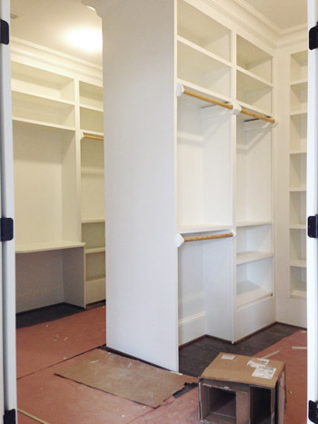
Across from the bathroom is the closet, which is another jealousy inducing space for the lady-wife. We gave the carpenter a couple of suggestions, but pretty much just let him do his thing. The layout is hard to wrap your head around, so this post with a floor plan might help (there’s a his and hers area with a storage-saturated divider).
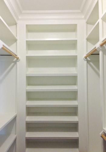
He packed it with awesome features like this angled shoe rack that’s sure to get all the Charlotte Bradshaws out there excited. No wait, Carrie Bradshaw. Oh geez, I’m such a Miranda.
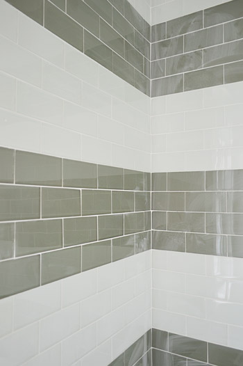
The last space we’ll share today is a peek at the shower in the jack-and-jill bathroom (this is the same kids room that has the green vanity in the adjacent sink area that we shared last week). We planned on taking a bunch of panned out shots of the whole room for you, but a headboard that’s waiting to be painted for the girls bedroom is actually sitting in the middle of the bathroom, along with a spare toilet – so we just couldn’t get those shots yesterday. But check out that shower tile! We chose two different types of colored glass subway tiles and had the tile guy (surprisingly not named John) install them in fat, 12″-ish stripes up the wall.
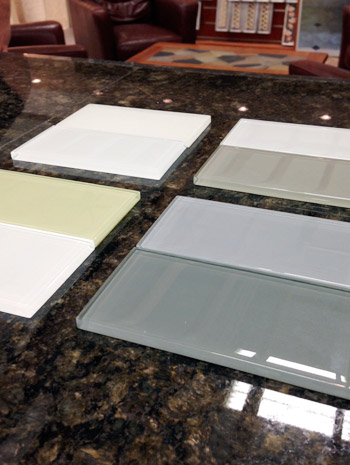
We picked these at The Tile Shop by laying out a few different combinations, including a frost white & gloss white version, a gray & white version, a green & white version, and a blue & gray version. Ultimately we picked the combination in the upper right corner of this picture, which is Snow Glass and Glass Winter.
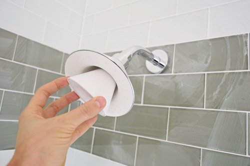
And last but not least, since we wanted to have some fun in the kids bathroom, we went for this cool Moxie showerhead (donated by Kohler). It has a waterproof bluetooth speaker in it that stays in place magnetically, while the shower still sprays water around it. Somewhere my high school self is feeling quite embarrassed by the shower radio with spotty reception that I was addicted to at the time.
We’re scheduled to begin moving furniture in next week, so hopefully the next update we have for you will have this place looking even more like home. We’re supposed to have the whole place furnished and decorated by early April, so consider us completely 100% freaked out by this. Cue the cold sweats!
Psst – Wanna see more showhouse info & photos? Click here for Our Full Showhouse Tour, which includes final pictures of every room, the floor plan, budget info, a video walk-through, and shoppable showhouse furniture & accessories.

Kim says
Can you help me understand how the nook ended up being built the wrong size? Is that something that is typical with home construction?
YoungHouseLove says
Sorry to be unclear, it was constructed according to the final plan (we updated that sentence to hopefully clarify). It’s just that originally the architect, builder, and John and I had all aimed for a smaller and more cozy eating nook – but as other things were considered (how elements lined up in the kitchen, how the bump out looked from the back of the house, etc) it evolved to be bigger than we all originally hoped it would be. So we just had to compromise on the size of the nook since there were other considerations that were also important. These days we’re looking at it like a happy compromise though, since the banquette & built-in combo is shaping up nicely!
xo
s
Mary Bence says
Didn’t see this in any of the comments, but I was scanning pretty quickly…..what color are the grey kitchen cabinets? I love them! We are going to do a kitchen remodel but I’m wondering whether grey would be too faddish? Love the house! It’s gorgeous.
YoungHouseLove says
They’re a stock light gray color provided by the cabinet maker (a local place called Affinity). Not sure if they have an actual paint color name associated with them, but we’ll have to ask the next time we see them!
xo
s
jbhat says
This is seriously the best show house I have EVER seen….and I have been on several tours. I think everything you guys and the other Johns have done in there is simply outstanding. What a lovely and functional and stylish home this is going to be.
jbhat
Kirby says
Loving the progress. Happy Birthday Sherry! Totally tagged you in my Facebook post of “Awesome People I share my birthday with” along with Andy Reid, Glenn Close, and Bruce Willis. Lol. Hope you have an awesome day!
YoungHouseLove says
Aw thanks Kirby! Happy birthday!
xo
s
Marianne says
Man, aren’t you guys a little sad that you won’t be moving in? I LOOOOOVE it. I love the blue island and the glass fronts on those cabinets in the kitchen. We have open shelving right now and I HATE it. It always looks so messy. What a great compromise.
And, seriously, please, whoever buys this house- invite me to breakfast. I’ll bring my favorite book and the coffee in a thermos. I just want to sit among those bookshelves. Lovely!
Nice work, Sherry and John. I can’t wait for the final tour!
Kristen B says
Wow, can you guys please build and design a house for me?! I love everything about the Showhouse!!!!!!!
CALI says
Im obsessed with this house. Amazing job!! Now let me move in!
Linnet says
What’s the color on the wall kitchen cabinets? Their combo with the navy is amazing!
Thanks,
Linnet
YoungHouseLove says
Thanks Linnet! They’re a stock light gray color provided by the cabinet maker (a local place called Affinity). Not sure if they have an actual paint color name associated with them, but we’ll have to ask the next time we see them!
xo
s
Jen says
What is the expected list price of the finished showhouse? Or if it’s more of an auction situation, what would be the approximate price if it was a usual listing from this builder?
YoungHouseLove says
They haven’t set the final list price, but last we heard it was going to be in the 500s. These seven showhouses definitely are “fully loaded” for the event, so the prices tend to reflect that (one of the houses is going to be in the 900s I think! It has a pool!).
xo
s
Jackie says
I’m drooooollling. Lol this place is totes amaze!
stephanie says
omg.. can i please HAVE THIS HOUSE?
you guys are so good.
Steph
Rachel says
Do y’all plan to have a source list available either at the house or on the blog? I was thinking it’d be really cool if paint colors, brands of light fixtures, retailers for furniture, etc. were all listed in one place… but I imagine it’d be a little bit of work to put that together. ;)
YoungHouseLove says
Yes, we’d love to make a page (like a house tour page that we’ve done for previous homes) full of paint color and source info when the whole house is wrapped up!
xo
s
Heather says
Is that the small, medium or large polyhedron light from Restoration Hardware??? Can you guys come up with one similar but cheaper and sell it at Target??? Please???
YoungHouseLove says
That would be awesome! As for the size, it’s the medium one. It’s giant so I can’t imagine a large one!
xo
s
Stephanie @ Whole Health Dork says
The house is looking amazing!!! I want to live there! So incredible how it’s transformed.
I just saw that showerhead advertised last night on TV (well, during Walking Dead On Demand). We thought it looked a little gimmicky and like it might break easily. Does it seem solid? Have you tried it out?
YoungHouseLove says
We haven’t tried it other than in the showroom but someone commented here to say they have it and love it! Was so glad to hear that!
xo
s
Lizzy says
In your original post about the house, you talked about the focal point of the kitchen being an exposed hood. Now I see it’s enclosed. Did I miss a post talking about the change?
YoungHouseLove says
Oh there have been tons of changes along the way! We loved putting the range hood in a centered position (we think the kitchen would have felt lopsided with it off to one side) but when we found those giant gold lights for over the navy island, we thought they’d be a nice focal point without an exposed range hood shining behind them, so we went with a covered one. Things are still changing with just a few weeks left to furnish the house, so each post is sort of a “we are here” check-in throughout the journey. That’s one thing that’s similar to decorating an older home vs. a new one – either way, things seem to evolve as you go! Although it’s usually at a much faster pace when you’re building :)
xo
s
Danielle says
hi – not sure if this was covered in another post perhaps, but what type of tile is used for the fireplace?
YoungHouseLove says
That’s an insert for the gas fireplace that was provided by the same guy who made/installed the mantel (and the stone surround) that we selected from a local company called Interiors 2K that our builder works with a lot. We love that textured herringbone pattern!
xo
s
Melody says
This house is turning out AMAZING! I love that you chose navy for the fireplace and island, but ABSOLUTELY LOOOOVE that breakfast nook! I’m picturing my family cozied in there playing board games and the shelves filled with fun family memorabilia. This would be the hang out spot. And it’s BIG enough for an actual family!! LOVE! Can this home please be built in California?!
Alicia says
I LOVE THIS HOUSE!!
I love the unexpectedness (is that a word) of it all!! That navy island and gold fixtures are da bomb!! and don’t even get me started about that closet in the master bathroom!! Because of your post last week I plan on painting the vanity in my boys bathroom green!! I just LOVE your eye for design.
Thanks for all the inspiration and “doin the dang thang” preggo and all (you too John)! Oh and congrats on the Target deal…you two are truly blessed. :-)
YoungHouseLove says
Thanks so much Alicia, you’re so sweet!
xo
s
Jessie W. says
The title of this post made me think of the epic Carlton vs. Kyle fight on RHOBH! Can’t wait to see everything done in the show house! Love all the fun new picks you guys are making. Keep up the great work!
YoungHouseLove says
Oh man, that fight was crazy!
xo
s
Karen says
You know the blue fireplace wall sort of matches exterior siding. I’m excited ill be coming from md to see the homes can’t wait.
Erica says
What a lovely house! Makes a girl drool and dream !!
sue j. says
Putting candy in glass jars in that pantry is brilliant.
We await the photographs.
Vanessa says
You guys – this is utterly fantastic! Can you tell me more about the kitchen cabinet color? Is it custom cabinets that come in that color? Or painted that color? Either way do you know what it’s called? Thanks!
YoungHouseLove says
They’re a stock light gray color provided by the cabinet maker (a local place called Affinity). Not sure if they have an actual paint color name associated with them, but we’ll have to ask the next time we see them!
xo
s
Leah M says
If my husband and I ever build a house, I want to do one exactly like this!
Megan says
How gorgeous! I especially love the tub (is it Victoria + Albert?). We recently added a kids’ bathroom and decided against a clawfoot/standalone tub because it wasn’t super practical in terms of bathing kids and the high step-in required for them to get in/out on their own. But I loved the V+A line of tubs. My husband mostly loved that they were made from volcanic limestone. How many people can say they bathe in volcanic rock? : )
Great work on the house- it’s really coming together!
YoungHouseLove says
Good eye! Yes, it’s Victoria + Albert. I had never heard of them, but it’s so nice! I was instantly smitten.
xo
s
Kristy says
Love all the selections you and Sherry chose. Can’t wait to see it furnished! Would it be possible to take a close up picture of the baseboards, beadboard and trim around the master tub? Our baseboards look similar but I am trying to figure out a way to add beadboard or wainscoting without removing the baseboards. We also have a corner involved so I would love to see how it wraps around. Thanks!
YoungHouseLove says
A few others have asked for detail shots of molding and trim stuff, so we’re trying to remember to shoot those the next time we go!
xo
s
Christina says
Gorgeous–as usual! I have been curious (and I apologize if you’ve already answered this) if working on a new-build has created any desire for you to have a new-build of your own. Do you think you will ever have a house built more to your preferences rather than fixing up pre-existing homes?
YoungHouseLove says
We’re so happy with our home and our neighborhood we have no plans of moving/building anytime soon (we’d love for Clara and the bun to grow up here) but it has been a really fun process. Maybe we can do more charity builds to get our fill :)
xo
s
KathyG says
I know you don’t want to move, but at the same time (and maybe it’s still a wee bit early), don’t you want to do it again right away (well you have a newborn in the mix, but you know what I mean). I built one a few years ago, and all I could think of afterwards was I wanted to do it again right away, because I felt like I had learned SO much, I wanted to put it into practice! I felt like I’d be so much smarter and more informed – and less overwhelmed – the second time.
YoungHouseLove says
That’s so funny! I think our reaction might be the opposite – just to take a breather since it has been such a whirlwind. But I know what you mean about thinking about how much you learn in a short time. It’s a crash course for sure!
xo
s
Tina says
Wow, the house is coming along great! It’s to die for! The master bath and closet are things that only exist in my dreams, haha. I want a soaking tub! *whines*
But seriously, it looks beautiful.
cassie {hi sugarplum} says
Everything looks amazing! It’s giving me ‘new house itis’ !!!
We used that blue/gray glass tile as our Kitchen backsplash and I love it more than my luggage. Not a single person walks in that doesn’t say ‘oooooh, love your tile!’
YoungHouseLove says
I love that!
xo
s
Lauren says
Storage overload!!!!!!!!!!!! I’m so jealous! Loving everything and can’t wait to see the final touches!
Lauren says
I like these show house posts. It’s interesting to see it coming together. I like all of the light fixtures individually, but they all seem to feature bare, exposed bulbs. Have you considered modifying any of them to soften the light?
YoungHouseLove says
We’re planning to use some frosted LEDs in a few spots and some lower wattages for a softer glow (these are just builder basic bulbs that were put in to pass a recent lighting inspection). We also have some fixtures with shades/diffusers/covered bulbs in the master closet, the powder room, the girls bedroom, the guest room, the guest closet, and the master bathroom (where there are also four sconces with shades and a flush-mount shade in the water closet). A bunch of table lamps with shades will also be coming in, so we hope it’ll be a nice mix.
xo
s
Lauren says
Ok, that makes sense!
Meghan Lopus says
I can’t wait to see this house in person!! I LOVE everything you have done to it so far…but of course!
Debbie C says
Ohhhh this house is making me so very weak in the knees. All those gorgeous built-ins and storage. And thank you for the bathroom tiling ideas…we need to reno our bathrooms and need to choose some tile, may just do those wide stripes! Looks amazing, such a great job designing!
Diana says
So I’ve been curious. Will the house be up for sale fully furnished? I know you’ve mentioned borrowed items, but would the buyer have the option to buy the house as is?
YoungHouseLove says
Many of the items that are being donated are either being returned (like some of the art for example) or donated to Habitat after the event (like some of the accessories, etc) – but some of the furnishings, like the items that were loaned out from GreenFront, are available for purchase.
xo
s
Ashley says
Oh my my my… I love this!
Ashley says
Happy birthday, Sherri!!!!
Melissa says
What kind of marble did you use on the bathroom vanity?
Everything looks great! Can’t wait for the show!
YoungHouseLove says
Thanks Melissa! It’s called Lady Onyx (through Eternal Stoneworks here in Richmond).
xo
s
Cait says
What color is the master bathroom gray paint?? Everything looks beautiful! :)
YoungHouseLove says
It’s Moonshine by Benjamin Moore.
xo
s
Kathryn says
Oh wow!
copy! copy! copy!
Sarah says
Is it wrong that that kind of carpet always makes me think of The Shining? I love the subtlety of the pattern though. Great choice. And that breakfast nook is drool-worthy!
YoungHouseLove says
So funny! Someone else said that too! I hope it’s a lot less creepy in a lighter tone ;)
xo
s
Paige says
Looks great, you guys! As someone who has builder grade light fixtures, I’m jealous. Quick question about the kitchen… are you putting in a backsplash or leaving as is? Just wondered since the wall plates are already installed.
YoungHouseLove says
It’s a-coming! They had an issue with the order so it’s going to be a last minute addition in the final weeks. Ahhh!
xo
s
Gnome Lover says
HOLY MOLY,!
That is THE best kitchen I have ever seen. I cannot wait to see what goes above the vent hood. And the breakfast nook. And the closet. This would be my dream home. GREAT job!
Jenni
Emily says
I saw in the comments above that you said the countertop in the Master Bath is called Lady Onyx but is that a granite/marble or solid surface? It’s gorgeous!
YoungHouseLove says
We believe it’s onyx (our photos of the tag say onyx where other samples said granite or marble) but we can double check. The folks at the stone yard said it was a great pick for a bathroom, and we loved the color/texture so we went for it.
xo
s
Kara says
The built-ins above the banquette nook area are a happy accident! I would LOVE that in my house. I would fill them up with all my bulky serving pieces/pitchers and appliances (stand mixer) that I don’t use every day but do use often enough that I want them handy. Of course there’s also that amazing pantry, too. Also: cookbooks.
You should add your show house to your house tour page eventually. I visit that page from time to time when I need motivation to clean my house. :)
YoungHouseLove says
We’d love to do that when it’s all done (along with a full source list for reference).
xo
s
Lisa Guimond says
Looking good! I definitely see a Sarah Richardson design influence – my fav designer.
Carolyn says
I’m so inspired to make some bold lighting choices in my next house! And I’m so jealous of the price of your show house! What a deal compared to what you get for $500,000 in the Seattle area. I’ll take my little fixer and invest in color and cool fixtures though. So happy for you guys! And always inspired.
Carla at Loves Moose says
I didn’t browse your 300+ comments, so sorry if it’s been asked already.
Is there any exposed wood elsewhere on the exterior of the house, or just in the vaulted ceiling above the front porch?
Has it been sealed in any way to protect the wood from termites? Is that even necessary? We bought a house that has half of the underside of the overhang painted and the rest is raw wood. We actually love the look of the raw wood, but we can see some damage that has occurred from rot and whatnot over the years.
Have your builders commented on the exposed wood? I’d love to know.
P.S. I found some outdoor light fixtures for $2 at a church sale and just finished ORB. I used Rustoleum primer and then the same Universal spray paint you used. I found I needed 10 days for the primer to fully cure. You could scratch through to the raw metal. When you moved from your last house, were the knobs still showing no signs of wear? Thanks!
YoungHouseLove says
There are thick rustic beams holding up the porch along with those wood ceilings going on. The back porch also has that wood on the ceiling again as well as the railing. It hasn’t been stained/sealed but that’s next on the list (it’ll get a bit richer/darker in color). I believe they’re using something by Sikkens. As for the knobs, when we moved they still looked great! Hope your lights hold up too!
xo
s
Madiha says
This all looks fantastic and is very exciting! Can’t wait to see more of the showhouse as it gets completed – I’m sure I will be completely blown away :)
Quick question on the master bath floor tile – could you pls share the details on that (sorry if you’ve done so already)? Thanks!
YoungHouseLove says
In the master bathroom that’s marble from The Tile Shop called Tempesta Neve (12? x 24?).
xo
s
Beth says
What an amazing master bath guys! What is the name of the floor tile (the grey & white marble). Also, are the vanity cabinets white?
YoungHouseLove says
Thanks Beth! The cabinets are a gray tone and the floor is marble from The Tile Shop called Tempesta Neve (12? x 24?).
xo
s
Sarah @ Sarah's Daybook says
um, GORGEOUS. Can’t wait to go see it in person in May!!
Sarah
http://www.sarahsdaybook.wordpress.com