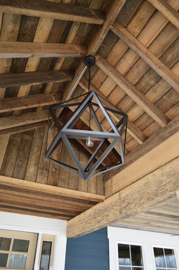
Things are moving at warp speed these days at the Homearama Showhouse, so we have tons of updates to share since last week (especially since more fixtures, cabinets, and counters are now officially installed). Let’s start on the front porch, where the centerpiece of our rustic, vaulted ceiling has been added. It’s from Restoration Hardware, so it was definitely a splurge (our team joined their trade program to save 20%) but we think it’s an awesome thing to see up there before stepping into the house for the first time.
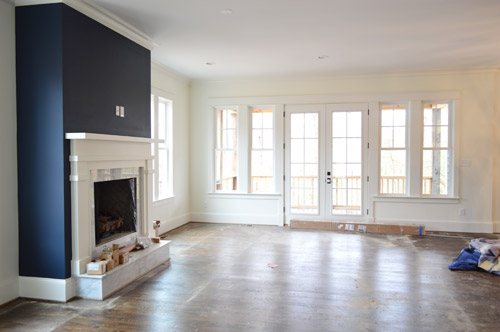
As we snapped these photos yesterday, they were just beginning to pull up the protective floor coverings, but the hardwoods were still really dusty (they’re putting a final sealant coat on them today – so we’re all banned from the house). Dust and all, this picture captures that pretty wall of windows and doors at the back of the living room that leads out the covered porch.
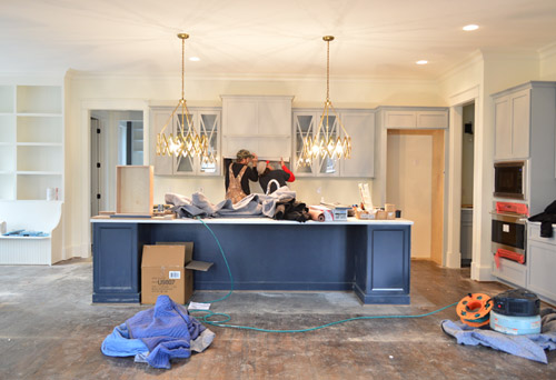
Even though the kitchen is still a work in progress – literally, you can see the vent hood getting installed below – we couldn’t resist sharing a wider shot of the navy island with those brass accordion fixtures that we shared last week above it (the island is Hale Navy by Ben Moore, the same color as the fireplace column across the room, which you see in the shot above). Speaking of the island, the builder made one a bit smaller than this in his last house and everyone’s feedback was “go bigger!” – so by jove he did. We can’t wait to get four stools in there to fill things out.
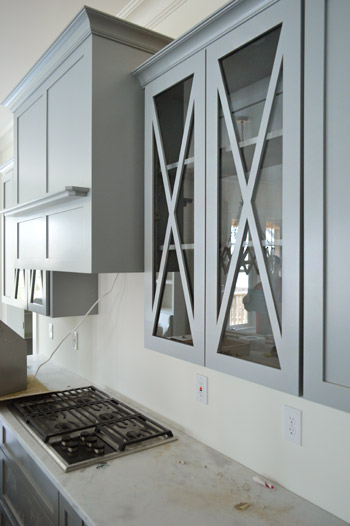
It was cool to see things come together that we had only seen in showrooms and vendor booklets months ago when we chose them. Like these glass x-fronted doors that flank the range hood. We didn’t do any open shelving in this kitchen, but thought it would be a nice touch to add a few cabinets where someone could display their nice dishes, bowls, and glasses.
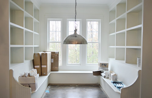
To the left of the kitchen is the breakfast nook, which has been quite the adventure to accomplish. Carpenter John (not to be confused with Builder John or me, Blogger John) did us a solid in making this space cozier after it ended up being bigger/wider than we all originally planned (other considerations like how things lined up in the kitchen and how things looked from the back of the house inched it up from our initial dimensions). There’s still a big table to be constructed and plenty of shelves to be filled, but it’s getting there – especially now that the silver dome light (donated by Shades of Light) is in.
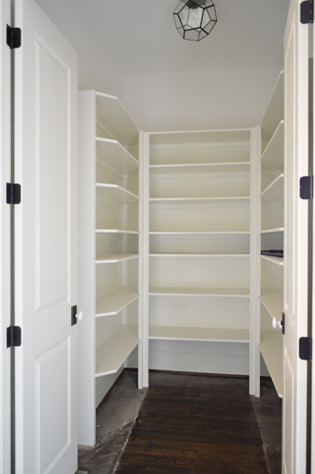
Just one wall away from the breakfast nook is the pantry. Excuse me, I mean walk-in pantry. It has me and Sherry green with envy. Is it wrong that we kinda want to fill it with candy like the store in the opening of Willy Wonka? The prism flushmount light is also from Shades of Light. It’s made of up pentagons, but we like to pretend they’re hexagons so it’s kind of a nod to our bee love.
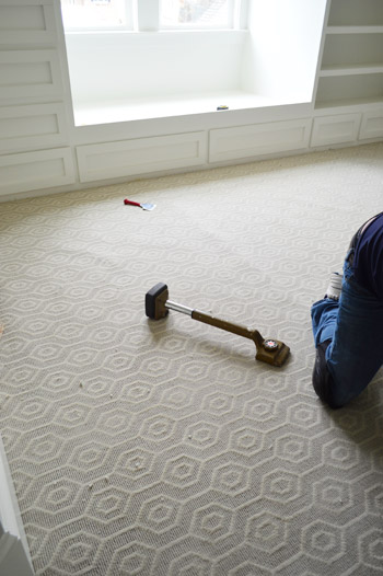
I probably shouldn’t force the hex thing there, since the carpet that we chose for the boy’s room has actual hexagons in it. We thought it’d be fun to do something a little different than plain carpet (we have hardwoods throughout the house except for the two kids rooms and the guest room), so this Revere pattern by Stanton (selected at a local place called ProSource) seemed fun without being too crazy. And as you can see, the installation was also in progress when we were there yesterday.
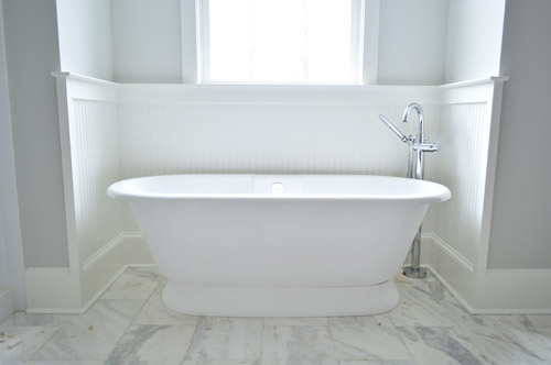
Now on to the en-suite bathroom, which is a bit of a mess at the moment, but still manages to get us excited. We’re taking this as our chance to do that luxe & light, hotel-like bathroom that I’m not sure we’ll ever have the space to execute in our own home. So we’ve chosen lots of tone-on-tone whites and grays with a few unexpected hits of color – some of which we’ll reveal today, and some that’ll come in later with art/accessories. Of course we went for a big freestanding tub that’s probably a pipe dream (plumbing pun!) for our own bathroom. You should see Sherry look at this thing lustily.
Since we couldn’t just leave the room totally colorless, we did a nice big plane of spa-like color on the back wall of the shower, which is still semi-floorless, totally doorless, and inexplicably has a mirror leaning in it at the moment.
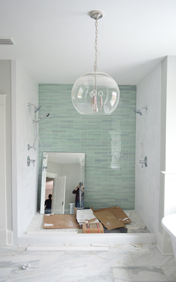
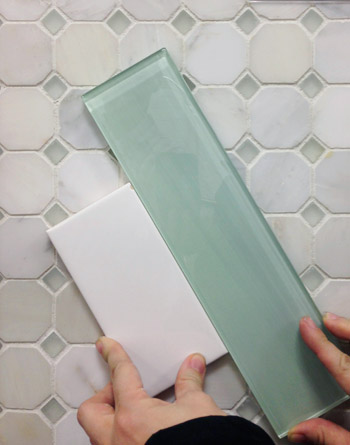
Those bluey-green glass tiles are this 3 x 12″ New Haven tile and the sides are 3 x 6″ white subway tiles, both donated by The Tile Shop. Here’s a shot from back in December (!!) when we picked it out. The shower flooring is the one in the background of this tile shot, which is their Evanston series in Frost Snow. The little glass squares mixed with marble help tie everything in the room together.
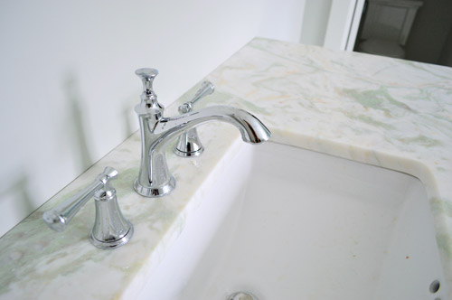
In the interest of trying to take some risks in the name of a good show and stretch outside of our comfort zone, we resisted the urge to go with all-white marble for the vanity counters, and selected something a little less common (it has soft seaglass colored veins, which tie into the shower tiles). All of the fixtures are polished chrome, including the glass chandelier from Shades of Light, and the sink faucets and shower trim were donated by Brizo (Delta donated the tub filler).
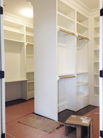
Across from the bathroom is the closet, which is another jealousy inducing space for the lady-wife. We gave the carpenter a couple of suggestions, but pretty much just let him do his thing. The layout is hard to wrap your head around, so this post with a floor plan might help (there’s a his and hers area with a storage-saturated divider).
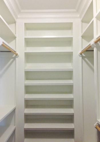
He packed it with awesome features like this angled shoe rack that’s sure to get all the Charlotte Bradshaws out there excited. No wait, Carrie Bradshaw. Oh geez, I’m such a Miranda.
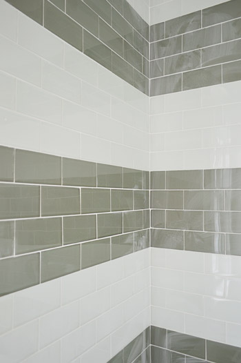
The last space we’ll share today is a peek at the shower in the jack-and-jill bathroom (this is the same kids room that has the green vanity in the adjacent sink area that we shared last week). We planned on taking a bunch of panned out shots of the whole room for you, but a headboard that’s waiting to be painted for the girls bedroom is actually sitting in the middle of the bathroom, along with a spare toilet – so we just couldn’t get those shots yesterday. But check out that shower tile! We chose two different types of colored glass subway tiles and had the tile guy (surprisingly not named John) install them in fat, 12″-ish stripes up the wall.
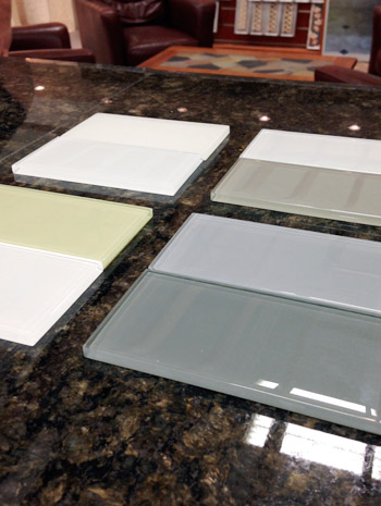
We picked these at The Tile Shop by laying out a few different combinations, including a frost white & gloss white version, a gray & white version, a green & white version, and a blue & gray version. Ultimately we picked the combination in the upper right corner of this picture, which is Snow Glass and Glass Winter.
And last but not least, since we wanted to have some fun in the kids bathroom, we went for this cool Moxie showerhead (donated by Kohler). It has a waterproof bluetooth speaker in it that stays in place magnetically, while the shower still sprays water around it. Somewhere my high school self is feeling quite embarrassed by the shower radio with spotty reception that I was addicted to at the time.

We’re scheduled to begin moving furniture in next week, so hopefully the next update we have for you will have this place looking even more like home. We’re supposed to have the whole place furnished and decorated by early April, so consider us completely 100% freaked out by this. Cue the cold sweats!
Psst – Wanna see more showhouse info & photos? Click here for Our Full Showhouse Tour, which includes final pictures of every room, the floor plan, budget info, a video walk-through, and shoppable showhouse furniture & accessories.

Nerd says
That gorgeous rustic light in the overhang is an icosahedron. To construct one, with straight edge and compass, you need to find the length of the sides of a pentagon, hexagon, and decagon that are circumscribed in the same circle. So it mathematically unifies your pentagon fixture (in the pantry) and your hexagon bee love carpet! You just need to find a decagon decorating element and you are good to go.
YoungHouseLove says
Love it! Go math!
xo
s
Barb says
Wow…Fabulous!
Who wouldn’t want to live here???!!’
Courtney says
I am COVETING that master closet!!!!!!!!!!!!!!! WHOA!!!!!!
Momcat says
Can.Not.Wait. I feel so lucky I am local and will get a chance to see this gorgeous house! I am just swooning over that tub & spa glass in the master bath. Also the blue/gray in the kitchen.
Emily @ Life on Food says
I don’t know what I am more envious of…the pantry, the breakfast nook shelves or the closet. Guess I have a thing for storage.
Allison says
Can you please share the name of that lovely gray color in the bathroom? Love it with the white!
YoungHouseLove says
Thanks Allison! It’s Moonshine by Benjamin Moore.
xo
s
Jewels L. says
Wow, this looks so amazing. I especially like the blue-green glass tiles in the bathroom and the lights in each room. As someone interested in renovations, it was exciting to see your project. Thank you for sharing!
Meleah says
The house is looks fantastic and I almost fainted at how gorgeous that vanity counter is!
Joseph says
We bought our Homearama tickets last month and are excited to see everything in person! Now, we just have to decide which day to go. It sounds like they have a lot of cool things planned. Will you guys be making an appearance at all?
YoungHouseLove says
We’re hoping to stop through sometime during the last weekend since I’ll be the most likely to be up and about after a c-section by then. So excited to see how the show turns out!
xo
s
Ashley says
Hi Petersik’s! I have been following you guys for years back when I lived in RVA myself. Love your blog! Did you guys know there was a Restoration Hardware Outlet in Leesburg, VA? May be a bit of a trip, but can be worth checking out, sometimes amazing deals on lighting and not quite perfect, but beautiful, furniture pieces!
YoungHouseLove says
Yes, it’s a lot of fun! We have been there a few times (fun fact, they’re the only store to tell us we couldn’t take pictures in their store, haha!).
xo
s
Kim says
I want to go to there.
But seriously, it’s beautiful even if it isn’t finished. Great job!!!
Alli says
I love all of the show house posts! It is coming along beautifully and you are making wonderful choices! We live in Williamsburg & have our Homerama tickets-looking forward to seeing it in person. We are finalizing our home design and will break ground this Fall, so needless to say, I’ve been pouring over the details in these posts-so fun!
Alli says
^whoops, meant “poring” :)
Britiney says
I love love love that you found a tub option that’s not acrylic or cast iron! I’m definitely going to look into the V&A tubs for our master bath remodel! Beautiful work, J & S!!! I think after all that work I’d be a little sad to not move in. :O(
Lily says
Honestly I can’t even. This place is going to be PERFECT.
xo Lily
http://whilemyboyfriendsaway.blogspot.com
Cara@ theprojectaddict says
Gorgeous! Did you go with an acrylic or cast iron tub? Trying to decide which is best
YoungHouseLove says
It’s cast iron. I waaaaant it.
xo
s
madison says
Hey guys. I had never heard of an event like this before you mentioned it but it sounds pretty awesome. My husband and I live down in NC adn were wondering if you thought it would be worth a drive (4ish hours for us). The website didnt seem to have too much info so I couldnt tell if it was more so just for locals or if it would be a good weekend trip? Thanks!
YoungHouseLove says
It’s definitely fun for out of towners too (some of my family will be dropping in to see the baby and the showhouse, haha!). There are drinks and entertainment and seven houses to poke around. Hope it helps!
xo
s
Janette says
I absolutely love everything about this house. Droolworthy.