Since a bunch of you guys have requested more details on what layout changes we’re pondering and what paint colors we’re currently leaning towards, we thought we’d share a giant brain dump about what’s flying around in our heads at the moments (which will change as we go I’m sure!). Y’all ready for this? Lots o’ words. Lots o’ diagrams. Lots o’ links. Please fasten your blog-reading seatbelts and be sure that your desk chair is in its upright and locked position.
This is what the first floor looked like when we bought our house (we’ve since removed the three sets of the double doors off of the kitchen).
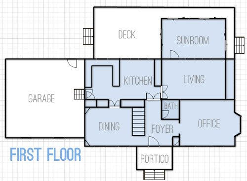
But here’s what we’re thinking we’d love to do over time with the first floor.
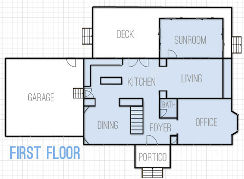
- Widen the doorway between the kitchen and the dining room for easier flow
- Create a wide centered doorway between the kitchen and living room with built-ins around it (sort of like the opening between the office and dining room in our last house)
- Change kitchen layout from U-shaped with a peninsula to an L-shaped area with an island (and add french doors to the eat-in area that lead to the deck)
- You can’t see this change in the floor plan, but we’d eventually love to convert the sunroom to an open covered porch with new columns and no more sliders (many of the sliders are bad and the posts are rotten) – we’re envisioning something like this
As for the second floor, this is what it looks like now.
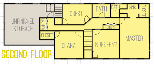
And we’ve thought about changing things up like this.
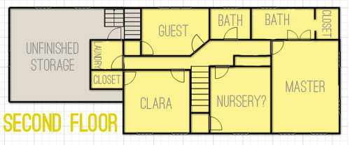
- The most major layout change will be opening up the sink nook and the bathroom area in our bedroom to create one big bathroom instead of having two single sinks separated by a wall
- In the hallway between the nursery and our bedroom there’s a double doored linen closet that we’d love to open up to make a built-in nook in the hallway, sort of like this (but with concealed cabinetry on the bottom and nice built-in shelves on top)
- You’ll notice there’s a door added to the end of the hallway where the laundry nook is. We briefly considered adding that to make it a legit room, but we actually think it’ll close things off more (and it will be weird to have to walk through a room to get to another room when we finish the unfinished storage area) so for now we’re unsold and plan to keep it open.
- And of course eventually we want to drywall the unfinished storage space to create a bunkroom/movie room that we think could come in handy for older kiddos and their friends.
As for color scheme ideas, here are a few swatches (they’re all Benjamin Moore) that we’ve been loving lately. They wouldn’t all be wall colors, so some might be the color of a bathroom vanity or a piece of furniture or even the color of a ceiling or another “accent” spot (like the back wall of Clara’s play-closet). *This is a first-thought paint palette (meaning there will be accessories, art, fabric with many other tones in it – and it’ll most likely evolve as we go).
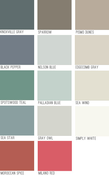
We think colors like Knoxville Gray or Black Pepper could be awesomely dramatic in the dining room with crisp white trim and built-ins, while many of the lighter neutrals will go in living and bathroom spaces and some of the deeper mid-tones might end up in bedrooms (we like the idea of Sea Star or Sparrow in our bedroom with lots of white furniture and linens). The brighter pops of color like Moroccan Spice, Milano Red, and Spotswood Teal are just for accents (like a piece of furniture, a bathroom vanity, or even a mirror or frame – most likely in a white or neutral painted room).
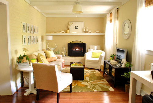
It’s fun to see how the new swatches compare to our first house’s palette (which was almost entirely tan, cream, and soft blue-gray)…
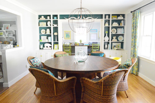
… and our second house’s color scheme (which had a bit more boldness like deep teal walls along with softer gray, pink, and taupe ones).
We feel like this palette will be a nice blend of our previous homes (more traditional and warmer than our last house’s palette with a lot of the neutral and classic feeling that our first house had, but with more happy hits of color). We’re excited that among the soft neutrals and rich moody hues there are also some warm accent colors like red and coral. We think we’ll like the mix of the warm colors (tan, coral, red, brown) with the cool tones that we’ve always been known to love (like blue, green, and gray). It’s also nice to have classic white trim and doors, mocha hardwoods, and gray slate flooring to temper things and keep things classy (Stay Classy San Diego!) as we go.
And now I’ll end this brain dump with some inspiration images that I’ve been pinning like crazy when it comes to the “vibe” of this house:
- a dark tailored bedroom like this might be nice
- we can’t wait to whitewash the brick in the living room like this
- we’d love an airy and open kitchen vibe like this (especially once we add our future french doors and built-ins)
- a dark dining room with bright white built-ins like this (maybe more navy like our swatches?) could be fun
- some chic wallpaper like this somewhere (maybe in the half bath downstairs) would be awesome
- this office feeling would be cool (love the wall of built-ins and the floating table for meetings/laptops)
- we’d like to make a nice cozy TV room and bunk-room like this in the unfinished storage space a while down the road
- this might be a pipe dream, but how boss would a closet full of built-ins like this be?
- this could be a fun look (wallpaper + wainscoating) in the foyer or the upstairs hallway someday
*update: here’s why we don’t post these photos on our blog instead of linking to them
We’re still working on just getting things back to a non-blue-trim-and-wallpapered state, so nearly all of those more major room transformations are probably a ways down the pipeline (big builds and furniture/fabric purchases will mean saving our pennies each time, so they’ll definitely be spaced out between cheaper and easier things over the next few years). But It should be fun to see where we actually end up down the line. And to have this post to look back on so we can see how close – or how incredibly off – these early predictions of ours are.
Oh and I thought it might help to say that since these are all half-formed first-thoughts, if you have specific questions about what will go where or how we’ll accomplish a certain future project, chances are we haven’t thought it through yet… but when we do we’ll just mumble about it to our beanie babies. Just kidding, you know we’ll blog all about it!

Kami says
I have a unfinished storage area in our basement but it would need to be dug out to the appropriate height, insulated, wired for electricity, etc. Is your unfinished storage area already dug out?
YoungHouseLove says
Oh yes, it’s framed and has electrical and ductwork (we currently have it closed off though so we’re not heating/cooling it). So all we have to do is drywall, add flooring, and hang light fixtures where the fixture boxes are.
xo
s
Kerry says
That Beanie Baby reference was kind of amazing, especially since you do have a baby that you call Bean.
Also amazing: that wallpaper/wainscotting sitch — do that. :)
Lori Moore says
It’s all so exciting, and I can’t wait for it all to unfold. It’s kind of more fun since it looked kind of crummy with all the blue and wallpaper to start with. A blank slate is much less dramatic! I will say one thing though. My kitchen is laid out like your “after,” and I’m saving all my pennies to transform it into the “U” that is your before! I think it’s so much less comfortable of a layout with the island, and I look forward to facing the family room when I do all of my prep cooking. I found your previous kitchen to be the bomb!
(Btw, your fireplace makeover inspired me to finally take care of mine. If you want, you can see a snap if the after on Instagram – loribell77.)
Lori Moore says
D’oh! I just read though the comments. Guess I’m not the only one pining for a peninsula kitchen. Let’s just pretend I was original, m’kay?
YoungHouseLove says
You’re always an original Lori! And as for the peninsula thing, we LOVED our last kitchen’s peninsula – the one here is just really tight (probably 3-5′ tighter) so it feels cramped and squished to one side of the room a lot more :)
xo
s
YoungHouseLove says
Thanks Lori! Off to check out your fireplace!
xo
s
Katelyn @ evanandkatelyn.com says
This post got me SO PUMPED to see where things progress for you guys!
Amy says
In a past post you mentioned maybe coffered ceilings. Is that still on the list? If so, which room(s).
YoungHouseLove says
Right now we’re leaning towards the living room since it already has beams so we’d just add framing in the other direction….
xo
s
Beth says
Love the color scheme and the planned wall rearranging! Your master bath plan totally makes sense, but you might also want to consider moving the closet entry from inside the bathroom to the bedroom. It may not bother you guys, but we lived in an apartment for 2 years with the closet in the master bath and hated it – we were always in each other’s way getting ready to go anywhere and no time in the bathroom alone! It might not be an issue for you, but we disliked it so much I had to mention it :)
YoungHouseLove says
I’ve been thinking about that too Beth! We can’t decide if it’s too many doors for one side of the bedroom (that would make it three along that wall since the entry door is nearby).
xo
s
Liz says
See, totally different here…my closet is a walkin through my bathroom and I love it. I can get totally ready without waking my boyfriend and I find it so convenient to go straight from shower to walk in closet. Plus there’s less doors in the bedroom so gives more wall space to work with and looks cleaner.
Definitely must be a personal preference thing!
YoungHouseLove says
So interesting!
xo
s
Stephanie says
I had a walk in closet in my bathroom in our last place and I miss it like woah! It was so nice to get completely dressed and ready for the day /undressed and ready for bed in one space. I always think if we could re-do our master bath in the new place I’d add the closet back to the bathroom (not gonna happen anytime soon though). But I don’t think it’s a one size fits all thing, it’s definitely a personal preference.
Kelly says
My parents’ master bedroom has three doors very close together (2 on one wall, 1 on a different wall, but super close by). They are able to put a dresser in between the two dressers on the same wall and it looks good – not too many doors at all!
Ash says
Love your color choices, as always! I’d love to see another room along the lines of house #2’s guest bedroom, the bold blue was so fun and cozy. :)
We have Edgecomb Gray as the neutral for our first floor and really like it. It’s a great warm greige. We used Glass Slipper for our little girl’s nursery…it’s very similar to Nelson, but with a bit more blue. I LOVE it, it’s my favorite paint color yet!
PS: In the realm of pipe dreams, have you seen Sawdust Girl’s vid of her walk-in closet build-out? It’s AMAZING. (“The Closet That Sandra Built” on Youtube)
YoungHouseLove says
YES IT’S AWESOME!
xo
s
Lindsey says
Oh wowie! You really liked that office inspiration pic I emailed to you a while back. *I feel special* (although, you probably had already seen it. I’ll just pretend you hadn’t yet and I gave you a good idea :) I would KILL for a space like that to work in! Love your color pics too! You guys have such awesome taste :)
YoungHouseLove says
Haha, it was all you Lindsey! I LOVE that picture. Thanks so much for sending it my way!
xo
s
Megan says
Edgecomb Gray is the Bomb! We have it as our main neurtral wall color through our house and we get so many compliments. A great color in any light! Love it!
Jenn @ Home Style Report says
I love the idea of adding a floating table to your office, your space could totally pull it off! I can’t definitely tell you style will be evolving with this new house – I LOVE IT (not that i didn’t like the old)!!!
Carrie Gail says
Can’t wait for you to whitewash your brick fireplace. I want to do the same thing, but you need to go first so I can learn from you!
Annelies says
Love seeing all these ideas and inspirational pictures! So would want to fast forward to the end result and then come back to this stage, but just a peek already would be nice!Would you make the build ins between the living room and kitchen double sided so you can put stuff in in each room?
YoungHouseLove says
Still not sure!
xo
s
Ann says
I am super excited for the new paint scheme. I’m a bit of a trad so my preferences are towards historic colors and neutrals but I know you’ll find a way to layer them so they’re fresh and fun. So looking forward to following along!
Katy says
I said I would not comment anymore since we had some misunderstandings my last comment, but I lied. At least I took a break.
Anyway, I love your new plans! You should checkout the kitchen done on a budget (is there any other way?) in “Better Home and Gardens”. They had a huge island that sat 6 people. I loved it since people tend to gather in the kitchen and it beats a breakfast table.
YoungHouseLove says
Heyyy Katy! I’ll have to check out that BHG – I think mine just came (magazine forwarding takes forever!) and it sounds awesome.
xo
s
Todd says
Have you guys thought about getting more slate tiles in the same sizes as your existing to continue that flooring through to the kitchen (in place of the faux brick linoleum) for a nice flow and only 2 different flooring types? I really like the natural and geometric look of those tiles.
Also, have you thought about adding a door from living room to office for a full loop in the downstairs floor plan?
YoungHouseLove says
We’d love the same flooring in the foyer, half bath, and kitchen for sure! And heating pads under it if we can get that fancy. Haha! As for the office, we like that being more closed off and private (seems to help with the whole work life balance a little if everything isn’t open and connected).
xo
s
Lauren says
Please see the link to the post I wrote when we tore down the wall between our kitchen and our living room. (We have the same layout more or less but flipped). We have not yet decided what to do with our kitchen layout, as we are months and a few thousand dollars away from being able to redo our kitchen. But…we already had a french door in the kitchen (where you guys have a window) and we also had a french door in the living room). Check it out: http://daveandlaurenmoneypit.blogspot.com/2011/11/wall-came-down.html
YoungHouseLove says
Holy cow that’s awesome!
xo
s
karen says
i really like your colours and inspiration pics!!
i have grey owl in my kitchen. it’s such a great colour. not in your face at all, and really sets off a nice ambiance.
Stephanie says
I love your color palette!
We used Gray Owl in our open kitchen / family room and I couldn’t be happier with it. It’s the perfect backdrop for pops of teal, turquoise, and coral that we’ve used, and to my surprise it even made the red brick fireplace in my family room look gooooood (I begged my hubs to let me paint the brick for six months but now I’ll fight off anyone who comes near it with a paint brush!).
Hudson says
We just recently painted our kitchen/dining in “Black Horizon” by Benjamin Moore. It’s a really dark navy with great undertones. I think it would be a great choice for your dining room with all the white trim. You might check it out!
YoungHouseLove says
Thanks Hudson!
xo
s
Angie says
Lots to love here. The paint colors are a great mix between your previous two houses. You still have a lot of fun colors in there, but you also have those nice muted tones that let the eyes rest. What I’m most excited about is to see what will become of that unfinished storage space. I know it’ll be years until you get to it, but I think it could end up being such a cool hang out. And I’m curious to see what you guys will do with a room that has nothing but beams at this point. I know you’ve gutted rooms before, but this is a blank canvas.
Manda Wolf says
Looks like a plan! It is always so interesting to see how plans start and how they end up changing either from changing tastes or unavoidable obstacles (oh crap there is plumbing in that wall!). I miss the planning stage. I can’t wait to do this all again – just don’t tell my hubby he doesn’t need to know this yet.
Manda Wolf @ Our Wolf Den
Lisa says
I love, love, LOVE your colors. When we bought our house two years ago, every room was painted some shade of a very dark Earth tone – chocolate, rust, pumpkin, baby poop brown, barn red, and some sort of green I can’t even describe, other than it’s like green grass with a shot of yellow mixed in. It somehow managed to be dark and bright at the same time.
I told my husband Earth tones are OK, as long as the part of the planet they’re mimicking is the beach. It took a long time, but we now are surrounded by lovely shades of blue, gray, cream and a little touch of a delicate seafoam green. I just finished painting the last room, the weird green bathroom, last week. Now it’s Seagull Gray, a huge improvement. I can’t wait to see how you transform your house.
Kara says
… Beanie Babies?
Jenna says
Have you considered closing the linen closet off in the hallway and opening it up into the nursery to create either a built-in bookcase/shelving unit or built-in bench, reading nook area?
YoungHouseLove says
That definitely could be another possibility. I think we like the idea of opening it up into the hallway so the hallway feels wider, but who knows where we’ll end up!
xo
s
Lauren @ The Highlands Life says
I love every time ya’ll reveal your color palette thoughts. It always gives me new inspiration! I can’t wait to see how everything starts shaping up when you slap some color on the walls.
Eri says
Fully enjoyed reading the percolating. Re re-configuring the floors, any idea if any of those walls in the current plan is load-bearing or not? Did you already talk with a structural engineer?
YoungHouseLove says
The wall between the living room and kitchen isn’t load bearing (wahoo!) but the smaller opening we want to make for the kitchen/dining room might need a header beam. We’re so thankful the big wall we want to open is fine though (liv/kitchen). We didn’t need an engineer since looking at ceiling beams in the attic tell you which walls are load bearing (they’re the walls that run parallel to any hardwood flooring that’s installed).
xo
s
Carrie says
I was so excited for this post! And even MORE excited to see that your color palate is pretty much the color palate for my house! Even the accents are my accents. Good call guys. ;)
I can’t wait to see what you do with this place!
Emma says
I love BM sparrow! We painted our open kitchen/living room area sparrow and
Diane McBee says
You will love changing the kitchen from U to L with an island. I did this in my last house and it was a wonderful change!!! The U always made me feel claustrophobic!!! And with an L you can reach all the cabinets. We updated the existing cabinets with paint and counters!
YoungHouseLove says
Wahoo! So happy to hear that! We love a peninsula but this one is really tight/cramped so it feels claustrophobic like you said!
xo
s
Mary says
Besides those images you pinned yesterday, are you mostly pinning to a secret Pinterest board now? Just curious about where you’re keeping your inspiration this time around. Thanks!
YoungHouseLove says
I’m weird and have a lot of images on my desktop (old habit die hard) and also do screen grabs on my phone (so the pics on my phone are like Clara, Clara, Burger, pretty room, pretty room) – and of course I have binders and binders of tear sheets. I’m all over the place!
xo
s
Erica says
Great color palette! We have Palladian Blue in our master bedroom, and we love it. We also just painted all of our neutral areas (the halls, foyer and stairways) Edgecomb Gray, and I think it is a great neutral…a little bit gray and a little bit beige depending on the light and time of day.
Casey says
I love the idea of Sparrow with white linens. I recently redid our mater bedroom (large room in a Cape Cod with very high vaulted ceilings) in Mink a Sherwin Williams Color and part of the Liveable Luxe palette. It’s very similar to the Sparrow color and while our furniture is all dark and oil rubbed bronze, our floors, linens and master bath are all plain, stark white. I LOVE it and it’s so calming.
Geralyn says
I painted our bedroom with grey owl and our kitchen with palladian blue and I LOVE how both colors turned out :) it’s always fun to see the same colors in other people’s houses!
Emma says
I love BM sparrow! We put it in our open kitchen / living room area and it’s amazing with neutrals and pops of lime. Also you should check out BM “regent green” for your bold dining room – the first coat goes on scary green but the second coat tames it a bit and everyone loves it!
YoungHouseLove says
Sounds pretty!
xo
s
Karen says
Love the bunkroom idea and the overall color palette. What about shifting the washer/dryer 45 degrees clockwise so that the hallway would go straight into the storage room? It looks like the laundry is over the garage so moving the plumbing/electrical might be do able.
YoungHouseLove says
Hmm, I can’t tell what you mean. If we turned the laundry 45 degrees it would either block the hallway off (so we walked into the side of the washer) or block the door to the storage room.
xo
s
Eri says
My first thought when reading Karen’s comment was she meant to say stack the washer/dryer as shifting them 45 degrees? That way another doorway could be opened straight from the hallway. Although, that would also mean there would be two doorways to the storage room (unless the existing one is closed), if I interpret her post right. Or maybe she meant to say close the existing doorway to the storage and open a new one straight from the hallway (and shift the washer/dryer 45 degrees without stacking them)?
The doorway straight from the hallway might be a good idea though, if someday down the line you finish the storage room and convert it to some actual room.
YoungHouseLove says
Oh yes, behind the washer and dryer are all sorts of vents and pipes in the storage room, so to make that a doorway down the line might be a bit involved, but you never know where we’ll end up!
xo
s
Shellie says
I think she means taking the appliance on the right and moving it to behind the appliance on the left, then rotating the opening to face the stairs to the attic. So the back of both appliances are against Clara’s closet and there is a wider opening from the hall to the bunkroom. Not a bad idea if you didn’t want that room closed off.
YoungHouseLove says
There are a lot if ducts and pipes behind the washer and dryer in the storage room there, so making a doorway there would be really involved I think.
xo,
s
Igor says
Thank you for you blog was interesting read about how you rebuild all inside your house and see photos about it!
Kate says
I’m excited to see how you will mix warm and cool tones. I gravitate toward warm colors but would love to incorporate more cool colors for the lightness they can bring. I’m also excited to see the open linen closet that has cabinets on the bottom. A fully open linen closet would intimidate me because then I would have to learn how to properly fold a fitted sheet!
erin says
amazing. can’t wait to see how you guys progress with your ideas. everything’s always an evolving process. I know that for sure! we’re lamenting about our bedroom because we have paint colors picked out, but truthfully we wish we could hire someone to pick the pieces for us and do it ourselves from that point only because we’re so stuck!
Dawn L says
I love the idea for the hall shelves! We have totally useless 8′ mirrored sliding doors in our hallway that open up to totally useless 4″ wide shelving. I’ve been trying to figure out what I could do with them and I love the idea of open shelving but I’m not sure it would be possible since the depth is only about 5″ total. What else could be done???
YoungHouseLove says
What if you used corbels or shelf brackets in the recessed area to make deeper shelves tucked in there? So even if it’s only 5″ total, with brackets you could make 10″ shelves in that nook that are functional.
xo
s
Lizzie McCarthy says
I would swap out the laundry room with the bathroom on the second floor.
It would make the laundry central to the work area of all of the bedrooms and the bathroom more accessible to the one day finished bunk room/family room area as well as the bathrooms. I like the idea of having a true laundry room vs having an alcove.
Of course this would only be an option for me if some source of natural light could be brought into the bathroom. Maybe a skylight?
Marissa@ohhhsolovely says
it’s incredible the way you guys are so organized…and with such big tasks ahead of you!
Katie says
Haven’t even read the thing yet, but I had to tell you that I love it when you tell me to settle in for a long post. : )
YoungHouseLove says
Get a nice hot cup of chai. Put on your slippers. Slide into your bathrobe. Wait a minute, this is sounding seductive all of a sudden…
xo
s
Katie says
I got up and made a cup of coffee first, no joke.
(Also, please build a tiny version of your house for Burger. I’d love that post so hard, even if he isn’t the doghouse kinda guy. Keep up the great work!)
YoungHouseLove says
Oh man, that would be fun!
xo
s
christina @ homemade ocean says
Ohhhhh I am counting down the days for sunroom demo! A big southern wrap around covered porch is basically my dream :)
I know it’s not a wrap around…but I think yours has all the dreamworthy potential!!!
Nina says
LOVE your new color palette. So grown up and sophisticated but not stuffy. Like you said, it’s a great blend of the opposite spectrums you used in the other 2 homes.
So looking forward to watching this!
Peggy McKee says
Of course, it’s a matter of taste. But…
1. I wouldn’t sell the doors you took down until you are finished with moving all the wall around. See 2 below.
2. Do you really want guests in the living room to look at a dirty kitchen? Open plan is good most of the time, but IMHO you should keep a way to close off a room (especially a kitchen) if necessary.
3. Have you considered pocket doors? I have them in my house (built 1905) and they’re great!
Good luck! Peg
YoungHouseLove says
Oh yes, we love open living rooms and kitchens! We’ve been in many real homes of friends and family members and we love the casual feeling. Many new homes are being built with kitchens that open to living rooms too – although it’s definitely a personal preference thing. As for pocket doors, I love them!
xo
s
K says
Sort of a beach-like feel with these colors. I think they are all really timeless except for the reds (those might be a little trendy but I still like them).
Tara says
It’s so fun to watch you guys DIY!! Can’t wait to see all the awesome things you do in this house:) it’s so inspiring!
Will you be doing a gallery wall too? I’m excited to see the office transformation!!
YoungHouseLove says
I’d love to do one somewhere, although we have no idea where we’d put it yet!
xo
s
Julie F. says
I have a feeling the wall between the dining room and the kitchen is part of the structureand supports the upper floor (since it continues through the entire house, between the office and the living room). That’s much more complicated to open than a simple division wall… And if you make a mistake, the entire house might come down!I’m curious to know your plan of action on this one. Will you hire a contractor?
YoungHouseLove says
Oh yes, that’s a load bearing wall so it would need a header. We have hired out those jobs in our past two houses :)
xo
s
Katie says
Love your color palette ideas. We have Palladian Blue in our Dining Room, and I love it. It’s a really interesting color and changes a lot throughout the day and in different lights.
YoungHouseLove says
Sounds really pretty Katie!
xo
s
Faith@The Stirring Place says
I love that you guys are so patient and thoughtful w your design ideas. I am THE WORLD’S WORST