Since a bunch of you guys have requested more details on what layout changes we’re pondering and what paint colors we’re currently leaning towards, we thought we’d share a giant brain dump about what’s flying around in our heads at the moments (which will change as we go I’m sure!). Y’all ready for this? Lots o’ words. Lots o’ diagrams. Lots o’ links. Please fasten your blog-reading seatbelts and be sure that your desk chair is in its upright and locked position.
This is what the first floor looked like when we bought our house (we’ve since removed the three sets of the double doors off of the kitchen).
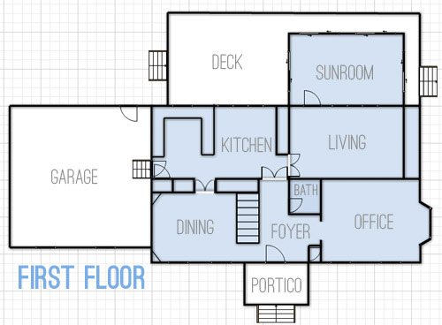
But here’s what we’re thinking we’d love to do over time with the first floor.
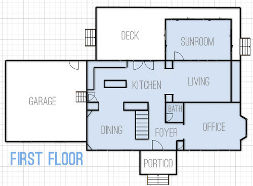
- Widen the doorway between the kitchen and the dining room for easier flow
- Create a wide centered doorway between the kitchen and living room with built-ins around it (sort of like the opening between the office and dining room in our last house)
- Change kitchen layout from U-shaped with a peninsula to an L-shaped area with an island (and add french doors to the eat-in area that lead to the deck)
- You can’t see this change in the floor plan, but we’d eventually love to convert the sunroom to an open covered porch with new columns and no more sliders (many of the sliders are bad and the posts are rotten) – we’re envisioning something like this
As for the second floor, this is what it looks like now.
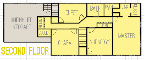
And we’ve thought about changing things up like this.
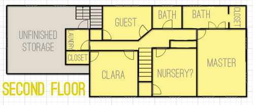
- The most major layout change will be opening up the sink nook and the bathroom area in our bedroom to create one big bathroom instead of having two single sinks separated by a wall
- In the hallway between the nursery and our bedroom there’s a double doored linen closet that we’d love to open up to make a built-in nook in the hallway, sort of like this (but with concealed cabinetry on the bottom and nice built-in shelves on top)
- You’ll notice there’s a door added to the end of the hallway where the laundry nook is. We briefly considered adding that to make it a legit room, but we actually think it’ll close things off more (and it will be weird to have to walk through a room to get to another room when we finish the unfinished storage area) so for now we’re unsold and plan to keep it open.
- And of course eventually we want to drywall the unfinished storage space to create a bunkroom/movie room that we think could come in handy for older kiddos and their friends.
As for color scheme ideas, here are a few swatches (they’re all Benjamin Moore) that we’ve been loving lately. They wouldn’t all be wall colors, so some might be the color of a bathroom vanity or a piece of furniture or even the color of a ceiling or another “accent” spot (like the back wall of Clara’s play-closet). *This is a first-thought paint palette (meaning there will be accessories, art, fabric with many other tones in it – and it’ll most likely evolve as we go).
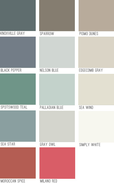
We think colors like Knoxville Gray or Black Pepper could be awesomely dramatic in the dining room with crisp white trim and built-ins, while many of the lighter neutrals will go in living and bathroom spaces and some of the deeper mid-tones might end up in bedrooms (we like the idea of Sea Star or Sparrow in our bedroom with lots of white furniture and linens). The brighter pops of color like Moroccan Spice, Milano Red, and Spotswood Teal are just for accents (like a piece of furniture, a bathroom vanity, or even a mirror or frame – most likely in a white or neutral painted room).
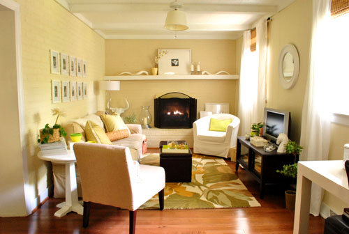
It’s fun to see how the new swatches compare to our first house’s palette (which was almost entirely tan, cream, and soft blue-gray)…
… and our second house’s color scheme (which had a bit more boldness like deep teal walls along with softer gray, pink, and taupe ones).
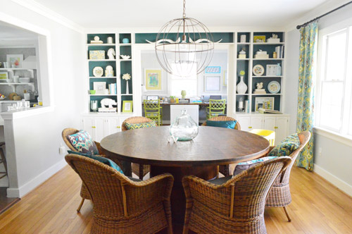
We feel like this palette will be a nice blend of our previous homes (more traditional and warmer than our last house’s palette with a lot of the neutral and classic feeling that our first house had, but with more happy hits of color). We’re excited that among the soft neutrals and rich moody hues there are also some warm accent colors like red and coral. We think we’ll like the mix of the warm colors (tan, coral, red, brown) with the cool tones that we’ve always been known to love (like blue, green, and gray). It’s also nice to have classic white trim and doors, mocha hardwoods, and gray slate flooring to temper things and keep things classy (Stay Classy San Diego!) as we go.
And now I’ll end this brain dump with some inspiration images that I’ve been pinning like crazy when it comes to the “vibe” of this house:
- a dark tailored bedroom like this might be nice
- we can’t wait to whitewash the brick in the living room like this
- we’d love an airy and open kitchen vibe like this (especially once we add our future french doors and built-ins)
- a dark dining room with bright white built-ins like this (maybe more navy like our swatches?) could be fun
- some chic wallpaper like this somewhere (maybe in the half bath downstairs) would be awesome
- this office feeling would be cool (love the wall of built-ins and the floating table for meetings/laptops)
- we’d like to make a nice cozy TV room and bunk-room like this in the unfinished storage space a while down the road
- this might be a pipe dream, but how boss would a closet full of built-ins like this be?
- this could be a fun look (wallpaper + wainscoating) in the foyer or the upstairs hallway someday
*update: here’s why we don’t post these photos on our blog instead of linking to them
We’re still working on just getting things back to a non-blue-trim-and-wallpapered state, so nearly all of those more major room transformations are probably a ways down the pipeline (big builds and furniture/fabric purchases will mean saving our pennies each time, so they’ll definitely be spaced out between cheaper and easier things over the next few years). But It should be fun to see where we actually end up down the line. And to have this post to look back on so we can see how close – or how incredibly off – these early predictions of ours are.
Oh and I thought it might help to say that since these are all half-formed first-thoughts, if you have specific questions about what will go where or how we’ll accomplish a certain future project, chances are we haven’t thought it through yet… but when we do we’ll just mumble about it to our beanie babies. Just kidding, you know we’ll blog all about it!

deb says
I LOVE the wallpaper Sarah Richardson put in the powder room in her season 4 house. It’s a Schumacher paper “A-Twitter”. Their website is fschumacher.com. I think that would look great in your powder room with wainscoating or beadboard on the bottom and the paper just on the top. Not that you need my input, of course! ;)
YoungHouseLove says
Sounds awesome! Off to check it out!
xo
s
Erin says
When I saw what colors you were thinking about for your dining room, I had déjà vu! A day or so ago a post popped up on my Facebook page with a very similar shade of paint. The post was a DIY on how to put up your own board and batten, but it’s a great visual for a dining room, since that’s the room they re-did. Here’s the link: http://www.makeit-loveit.com/2013/07/home-improvement-diy-board-and-batten.html
YoungHouseLove says
Looks gorgeous. Wow, what a pretty room!
xo
s
claudia williams says
might i suggest something for your dining room? if the wall common to the stairs is removed so that both sides of the stairs have railings, it really opens up the front of the house and all that light from the bay window in the office and the side lights at the front door would be wonderful. we made that change after seeing something similar and it was well worth it. food for thought in case you run out of things to do…!!
YoungHouseLove says
Oh yes, I love that! We’ve seen a few photos of others who did that and it’s great!
xo
s
Jen says
Since seeing the new floor plan for the first time I was hoping you guys would do a huge master suite with a bathroom and still have room for that swanky walk-in with built ins you linked! Just what I thought of when I saw the space:)
Allie says
Love all the ideas. So fun to dream and imagine what your space can be. I made my first “bold” color choice in our dining room much in the way you’re thinking about. I LOVE IT! http://pinterest.com/pin/191332684138808433/
YoungHouseLove says
SO pretty! Love those curtains too!
xo
s
Allie says
Thank you! I remember when you put those curtains up in your last house and was like, holy moly, i picked something Sherry and John picked! Design victory! Hahaa!
Maria@The_Brooklyn_Fig says
I’ve been thinking about going with navy in our dining room, but wasn’t sure if it was too dark. Thanks for posting those pics because it really gave me the push to just go with it!
Jannean says
Palladian Blue is a gorgeous color that I used in my 15 year old daughter’s room (BM’s 2012 color of the year). If you are looking for a deep, rich color you might want to consider Kendall Charcoal. I paired it with white wainscoting in a bathroom and it looks amazing!
YoungHouseLove says
Sounds gorgeous!
xo
s
Cathy C says
The stairs in between the unfinished room and the guest room, where do they go, and where is the bottom of them? I ask because I wonder if you could put the laundry room over there (not too much plumbing work to slide it over) and then you could have a laundry room and still have a straight shot into the unfinished room for later planning. Hope that makes sense?
I purchased a home last October, similar to you guys, with moving rooms, changing floorplans. It is a good year or more away from even being visitor ready, but I would love to eventually nominate myself for a house crash if you ever do them in NoVA.
YoungHouseLove says
Those stairs lead to the attic which is where we’re storing all of our Christmas stuff, baby stuff, etc. It’s really handy to have a staircase instead of a pull down ladder! As for making a doorway behind the washer and dryer are now, in the storage room there are tons of vents and pipes there, so to add a doorway down the line might be pretty involved – but you never know where we’ll end up! And as for a house crash- yes please! When you’re done send those pics our way!
xo
s
KathyG says
I do love floor plans! Did you always want all bedrooms on the same floor? I’ve never had a two story, but on House Hunters I always grin when one couple says “all bedrooms must be on same floor”, and the next one says “no way, I’m not living in a house with the master on the same floor as the others”. Such division on the subject is interesting!
YoungHouseLove says
Oh yes I think that’s funny too! We like them all being upstairs I think for now, just since the downstairs feels like entertaining/casual/public space, and then the upstairs feels more personal/private/quiet.
xo
s
Katie @ Domestiphobia.net says
You know what would be REALLY boss?? (Besides the fact that “boss” is back.) Hidden bookshelf passageway between the office and the living room. I’m not even kidding.
YoungHouseLove says
I NEED THAT!
xo
s
Theresa says
Wow- that last inspiration photo of the wainscoting and wallpaper is amazing! That would fit your house SO much- a more traditional look. Throw in one of your totally awesome burst mirrors and it would be perfect for that gorgeous house of yours. Wish they built houses like that where I live (inland northwest).
Christine says
Officially excited for you guys! I can see Clara and her little cousins running around that nice circular floor plan. I too love that kitchen in your link!
Brian says
Have you thought about closing the entrance into your closet when you enclose the sink nook, and putting a closet door directly into your bedroom?
I know my parents always complained about having a closet inside a bathroom because moisture issues. They went through lots of Damprid trying to fight the humidity.
I can definitely see the appeal of direct clothing access post shower, but if you’ve never lived with a damp musty closet, it may not be something you’ve thought about.
I love the new house, and how much you’re opening up the first floor! Can’t wait to see it.
YoungHouseLove says
Yes, we’ve thought about that as another option for sure! Not sure if three doorways in such close proximity will look a little busy (the door to the room is nearby) but we’ll have to see where we end up!
xo
s
Larissa says
Maybe all those door openings would be a good opportunity for a sliding barn door type thing?
Loving the color palate. We’re starting to casually look for a home to buy and I love that I can reference all these posts in the future.
Kelly says
We have a similar setup (at least based on the wall spacing) in our master bath. It is from the left: shower, toilet, wall, double sinks, wall, closet. So far the moisture in the closet hasn’t been a problem since the shower/toilet room on the left has a window over the toilet and the steam doesn’t travel that far. Not sure if that will change if we open it into one big room.
One thing that sucks in our space is that it seems like there is no good place to put the furniture. The bathroom opening is in the middle of the wall and there is a funky door in the middle of the wall opposite into a finished attic space. If the funky door wasn’t there it would be the natural bed wall. So maybe mock up where the furniture might go to see if the door in or out of the bathroom makes more sense.
Annie says
Yes! Black Pepper! We painted our guest bathroom (waaay up in the attic) in Black Pepper (with a bright yellow floor) and it’s my favorite room in the house. The one I use the least. Of course.
It’s a fantastic color. Depending on the light has has different hints of gray/blue/purple, really so pretty and interesting.
YoungHouseLove says
Love that!
xo
s
Meredith Jones says
So many fun plans! All of your future ideas a pictures and so chic and mature but still super fun and colorful. Love it! Can’t wait for even more inspiration from you guys. The foyer is lookin fab by the way. So crisp and clean :)
Cassie @ LittleRedWindow says
Does it bother you to walk through your master bathroom to get in your closet? What if, when you get around to changing things up in there, you move the closet door from the long wall where it goes into the bathroom now, to the short wall directly into your bedroom? Then you’d get more wall space (for shelves and/or a hanging bar) in the closet and also have more wall space to work with in the bathroom… Just an idea. :)
Cassie @ LittleRedWindow says
And, now I see someone else JUST suggested that same idea. lol! sorry!
YoungHouseLove says
No worries Cassie!
xo
s
Selina says
Such great ideas! Why do you guys now use Benjamin Moore paints exclusively? Didn’t you used to swear by a different brand?
YoungHouseLove says
We’ve tried almost every brand of paint over the last 7 years (a lot of Glidden in the beginning, then Behr and Valspar, and then Olympic which was followed by Benjamin Moore). Although BM is more expensive, so many commenters told us that once we tried it we’d never go back. It has great coverage and awesome colors (along with a No-VOC formula), so it’s just the one we’ve liked best for the past 3 years or so. We recently had our house painted with Sherwin Williams since the crew used that exclusively and so far we love that too! We also use Rustoleum spray paint & test pots of paint by Behr/Olympic if we’re at Home Depot and just want to grab some for a small craft.
xo,
s
CB says
This post has got me soooooo excited about the new house! I can’t wait until you get rid of that wall paper and we can see some of your awesome transformations! :D
You guys are so great at continually evolving your style without having to totally reinvent yourselves. Excited!
YoungHouseLove says
Thanks CB!
xo
s
Chris says
LOVE your new house – so inspiring. Sherry, just want to let you know that I think you are one of the kindest, most patient people! After reading all of the comments of your post and your responses – you deserve an award. Your positive attitude is inspiring and we need more people like you.
YoungHouseLove says
Aw thanks Chris, you’re so sweet! I think one of the main reasons we’re still blogging 6 years later is that we love the people. You guys are so much fun, and I for one, love to chat. Ha!
xo
s
Mara says
Love the ideas! Maybe consider a screened porch instead of an open porch for the future. We have one and it’s amazing to sit outside and eat dinner with ZERO bug interference! I’d love one with a roof that opens up to screens so you can see the stars.
YoungHouseLove says
That sounds awesome!
xo
s
Terresa says
So exciting to look at those paint color ideas — I love!! I’m just wondering how you will manage to whitewash reddish toned brick without ending up with a pink mess. I know you have lots more tricks up your sleave than I know about, but this will be interesting to follow. Sounds like an artistic challenge for sure. Maybe you can mottle the surface of the more reddish bricks with a more brown tone before whitewashing?
YoungHouseLove says
I’ve been reading up on a bunch of tutorials so as soon as I figure it out I’ll definitely share!
xo
s
Amy says
(here I go again with unsolicited advice! Take it for what it’s worth: probably not much…)
Your downstairs plans are solid, but when I look at your upstairs, I see some fundamental space issues that no amount of paint or furniture can address. The hallway is too narrow (at Clara’s end) and too wide (at your end) with awkward jogs and no natural light. The laundry is essentially in a cave and entry into the future bunk room is through a labryinth (aesthetics aside, it’s also terrible egress in case of fire). Here’s what I would consider:
1) remove the linen closet altogether and reconfigure the hall so that it’s a consistent width: a little more than the narrow part and less than the wide part. This would also necessitate that you move the doorway into your room over to the right.
2) reconfigure the existing hall bath into a (smaller than it is now) laundry room.
3) open an area directly opposite the stairs (plus a bit from the former bath) and add an exterior window to make a small (reading?) nook. This will bring needed natural light to the hall (and down the stairs, too) and create a pleasant, secluded-but-not-closed-off area, which is always welcome in a busy home.
4) make the guest room (minus the nook area) into a roomier hall bath, perhaps with a separate toilet room inside. Remember that this new room would be smaller than it is now since the reconfigured hall would take some of it’s space, as would the nook. Remember also that by the time this would be done, Clara would likely be old enough to move to the bunk room, thus freeing up her current room for guests.
5) remove the existing laundry to make a direct entrance into the future bunk room (which I think is a fantastic idea).
Ok, I’m done being pushy!
YoungHouseLove says
Love reading all the ideas guys! Thanks for sharing!
xo
s
Sarah @makingitmyhome.blogspot.com says
LOve the idea of finding a general color palette.
Elise says
Oh man, oh man, I’m so pumped about these colors! Can’t wait to see how everything turns out and grateful you guys let us come along for the ride! :)
Kayla says
LOVE the beautiful and classic color palette you have so far
Jackie says
Behind in catching up with your blog. You two have been busy! I have a question about front doors. I am thinking of painting ours-thank you for the inspiration. However, the caulking around the windows in our sidelights has yellow-brown caulking (ewwww). Not to mention it looks like a toddler caulked it-very messy and uneven. If I paint the sidelights white I think the caulking will look even worse. So, re-caulk? Can you do that to the sidelights?
YoungHouseLove says
I would try recaulking if you can! Just carefully cut out the excess caulk with an exacto and then go over what’s left with fresh white caulk.
xo
s
kelly @stayingonbudget says
Love the color choices for your new home! I live the ideas of opening up the floor plan with major wall knockdowns! I can’t wait to see you convert the window in the kitchen to a french door–seriously considering doing the same thing here in my house.
Harriet says
I love the direction you are going in – it’s going to be great. I wanted to share with you that I recently did a renovation and we used the Color911 app for our color inspiration. It comes complete with pre-made color themes, gives you colors that all work together so you can choose colors for everything from wall color to fabric accent colors. ‘Took it to the paint store and they matched all the colors we chose for our paints. All the colors flowed beautifully from room to room. I like what you chose for sure but I think it work checking out. We loved using it – made decorating so much fun!
YoungHouseLove says
That sounds awesome!
xo
s
Béa says
Hey guys,
I may have missed it in the comments, but I’m not sure I understand the ‘update ; here’s why…’
I guess it’s an explanation about picture rights but the link takes me to this very post…
Maybe it’s just me….
Thanks and good luck! it looks promising!
YoungHouseLove says
If you let it fully load it should jump to the comment section where we explain it. Might not work on a smart phone for some folks, so maybe try a laptop/desktop if yours doesn’t?
xo
s
Julia @ Cuckoo4Design says
Love the colors you picked and the sink nook and the bathroom area changes.
Eva says
I really like the vision for the new layout! It seems like the new flow, especially downstairs, will give the house a better purpose for how you’re going to use it as the family grows up and evolves over time.
Elizabeth says
I apologize if you’ve mentioned this before, but what do you use to draw out your floor plan? Is it something similar to Floor Planner or a CAD program?
YoungHouseLove says
We use Floorplanner.com to make them and then often adjust the colors and labels in Photoshop.
-John
JoDi says
Awwww, as I was looking at your new palette and the inspiration photos, I couldn’t help thinking that you guys are “all growed up” now. This has a much more sophisticated vibe than the last house. The last house was fun and I loved the colors you ended up with. It was like your teenage rebel years after the cool neutral palette of your first house, and this is like the classy adult evolution. It’s been fun watching you guys grow and change through the years. Warm neutrals are my thing so I’m really looking forward to seeing this house evolve especially since we’re hoping to move to a new place in the next year or so. Thanks for everything you share with us. I find the planning process difficult and I’ve learned so much from you. :-)
georgia says
maybe someone already mentioned this, but your link in the “update” paragraph about why you don’t post the pinterest photos you link to doesn’t work. it just takes you right back to this blog post on your blog. i’m interested to see what the reason is… i’m guessing it’s an article about copyright infringement or rules?? would love to see it.
clicked on all the other links, too. the ideas that involve the dark walls are perfect! we painted our bathroom dark… almost black. i love how it turned out. and not i’m inspired to paint the cabinets in there white.
YoungHouseLove says
Thanks Georgia! If you click that link it should fully load and jump to the comments section of this post with that info in it for ya (might not work on an iphone though, so maybe try a desktop/laptop?
xo
s
Sara says
Love the changes!
Hoping you can tell me what software you use for drawing your house plan / layout?
Thanks.
Sara says
Ignore that….I see you answered it already.
YoungHouseLove says
Floorplanner.com
xo,
s
Anne says
I went to ACE hardware and found a quart of Palladian Blue today in the mis-tint sale section!!!! I painted a test patch in my bedroom soon to be office and I LOVE IT!!! So funny that out of the 1000s of colors, I found this paint the same day you posted your color ideas! Can’t wait to see what you do with it.
YoungHouseLove says
So funny!
xo,
s
Béa says
Thanks for the explanation and being so patient!
YoungHouseLove says
Oh course Bea!
xo,
s
Elizabeth says
Sheesh, what’s the obsession with everyone wanting your laundry room bigger? I have a small laundry room too and if you put things right away, what’s the biggie?
Jenn V says
Love the changes you’re making! Overall I’m excited to see everything you do in the new house – just sent your kitchen redo post(s) from your old house to a friend for open shelving inspiration :)
My question isnt very sexy… what do you use to create your floor plans?! I’m known for obsessively hand-drawing on graph paper and cutting out tiny little furniture replicas and sliding them around on my paper. It’s not pretty…
Would love to know if you have a program or something that you use to create them. They’re gorgeous.
YoungHouseLove says
Thanks! We use floorplanner.com.
xo
s
Leigh Spence says
We painted our master bedroom in Black Pepper two years ago and we love it. Used the palest blue gray for the ceiling. People love it and one of my friends went home and painted her bedroom that color too.
YoungHouseLove says
Sounds gorgeous!
xo
s
Elisabeth says
I LOVE your new house! This one is truly a keeper. I am very excited to follow your progress of transforming this house into your home. Congratulations and much happiness!!!
Betsy says
In the first house we had that I really remember (age 5-12) we had a little open loft area that was really just a big chunk of hallway with a half-wall that looked out over the foyer. It was right next to my room, so it was great for me to play in and watch early Saturday morning cartoons.
Our next house had a “bonus room” (like what your unfinished storage could someday become!) and it was great for me as a teenager. I did my homework in there and my friends would all hang out in there. My parents loved that everyone always wanted to come over to our house because they felt good knowing my friends and I were safe, but they ALSO didn’t have to hide in their room to avoid teenage giggling during a terrible teenage movie.
In sum, I think it will be great someday down the line to have a space for Clara to hang out with friends that isn’t just her room. Though I have to say that I dodn’t totally understand the concept of a bunk room – isn’t the fun of a sleepover to all sleep NOT in a bed, next to each other on the floor? I myself would go for a couch instead. :-)
YoungHouseLove says
It’s a huge room, so we can have four bunks and a sectional with a nice big TV in a built in we think! Lots of places to relax/sleep/lounge/pillow fight ;)
xo
s
Angela says
I love that you guys are thinking of doing some dark walls with white trim and built ins! It’s such a great contrast and I think it can look so sophisticated.
Just today I shared pictures of my guest room on my blog – dark grey walls and all white furniture, white bedding, white picture frames, etc. it may be my favorite room in our whole house! http://blueistyle.blogspot.com/2013/07/HoneymoonInspiredGuestRoom.html
YoungHouseLove says
So pretty!
xo,
s
KZ Young says
I like the colors it blends well. I can already see the output in my mind, great choice! It’s a nice idea that the nursery room and masters are just side by side. Good luck and looking forward for the output!
Natalia says
I love those colors! We’re in the process of finishing our basement and those colors are making excited to start thinking of paint! Thanks
Kim says
Have you considered breaking out the left wall of Clara’s closet and making it a big walk-in? The space on the other side of the wall in the storage area looks a little wasted, and I bet Clara would love a big walk-in as she gets older.
YoungHouseLove says
That could be fun!
xo,
s
Janet says
In the dining room what do you think about using one of the darker colors (Knoxville Gray) below the chair rail and Simply White above the chair rail.
Cinnamon says
I usually paint my ceilings the same color as walls, but Edgecomb Gray is also AWESOME on ceilings. We used that color to paint brick as well around our fireplace, but to whitewash the brick with that color would be amazing…
YoungHouseLove says
I was thinking trying that too! It would cut down the orange brown undertones but I’d water it down so it looked whitewashed!
xo,
s
Elsa says
We painted our bedroom a similar color to Sparrow (Olympic’s Earl Gray). It is so rich and creamy and it looks just beautiful up against white trim. Who knew paint could be so delicious?!