Since Photoshop is our go-to tool around here for blog picture editing (and we get asked for a post with tips, tricks, or pointers pretty regularly) here it goes. But first, you should know a few things…
1. We’re not Photoshop experts: I took a digital photography course in college (in 2003) that taught me some basics and a few tricks, but it was by no means exhaustive. Sherry has a similar background, having used it a bit in art classes in high school and college. But both of us consider most of our skills to be self-taught. Basically just playing around and seeing what button created what effect on our photos. Sherry was a big fan of the “plastic wrap” filter back in the day. Seriously, she made a CD cover with her and Eminem on it with this filter to “cool things up” back in high school. Thank goodness she has matured, or else all of our blog photos would look like this:
2. We’re not photography experts either: Besides some of the basic classes we both took back in school, most of our photography is self taught as well (Sherry took a photo class in college but claims only to remember how to develop film and nothing about actually taking photos). We’re still not that great at it – or at least not as good as we’d like to be – which is partially why we’re grateful to have Photoshop, which helps photos that might not really capture how something looks in real life, look more like they do in person. Since we’ve yet to find a camera with a “capture this shot just like my eye sees it” function, we mainly use Photoshop to fix that (so you guys get an accurate picture of what a certain project/room looks like instead of being limited by our not-always-stellar photography skillz). Maybe someday we’ll be able to post photos straight out of camera (SOOC as the cool kids say), but we’re not stressing about that since just about all of the pro photogs that we’ve encountered do some degree of picture editing.
3. Photoshop is not the only photo editing option: We use Photoshop because it’s what we’re both comfortable with and by general standards, it’s the most comprehensive and professional-grade photo editing tool out there. However, it’s not cheap (aka $700-not-cheap). It was a business expense for us (and it was something we used for years beforehand and knew we liked) but there are definitely cheaper alternatives for those who aren’t ready to fully commit. Adobe sells “lighter” versions of it, like Photoshop Elements ($100), and there are other options like iPhoto ($15) or Picasa (free) that can do some basic adjustments too. We’ve also heard recommendations for free software like GIMP and Picnik, which is now apparently part of Google+. We haven’t used those others (except for iPhoto, which we rely on to organize our pictures and do basic functions like straighten and crop – see below) so I won’t provide advice on those.
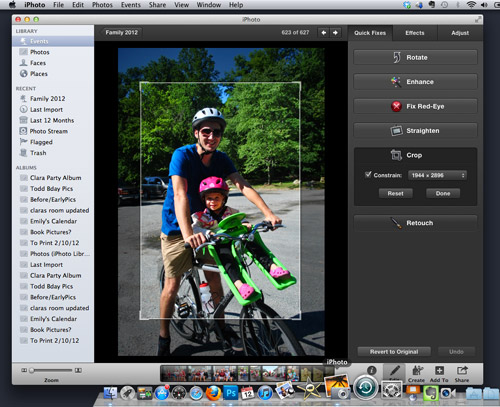
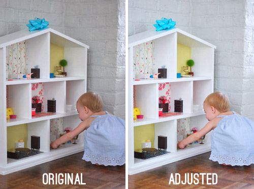
Now, on to the meat of this post. I thought I’d start off by showing you the basic editing adjustments that we use on just about every photo you see. Again, these aren’t major things like changing a wall color or removing Sherry’s sixth finger – they’re just the tweaks we make to what you see on screen look closer to what we actually see in real life. Let’s use Clara and her dollhouse as our subject. Here’s the SOOC shot:
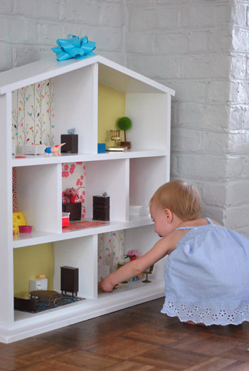
It’s not actually all that bad since our living room gets a fair amount of natural light and we remembered to white balance the camera before snapping the picture. But there’s still room for improvement so we open it in Photoshop.
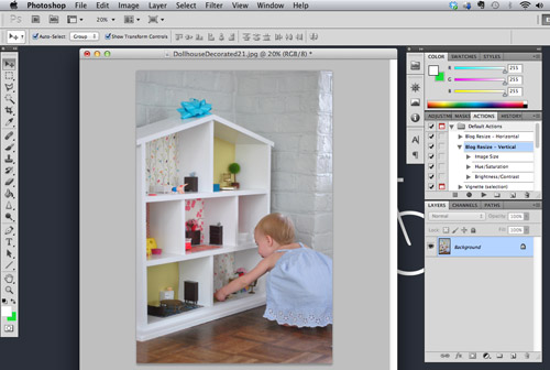
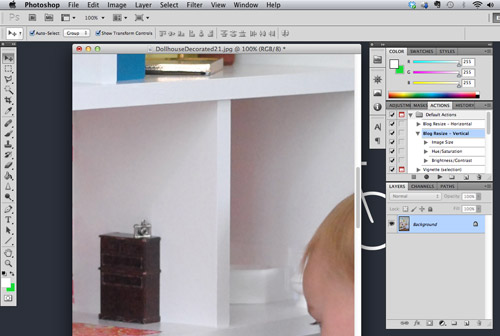
The first thing we have to do is resize the image, since what you see above is only 20% of the actual size. If we were to post pictures at 100% they’d look something like this and our blog would be slower than molasses.
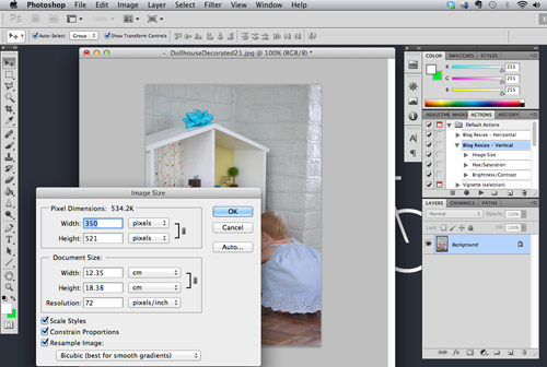
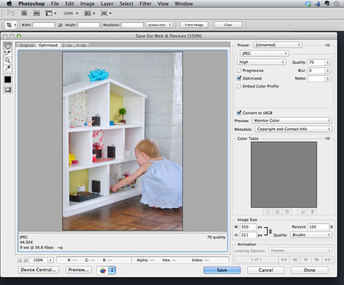
So we IMAGE > IMAGE RESIZE… (or Command+Option+I on a Mac) to resize it to 72 dpi (which is standard web resolution) and 350 pixels wide (which is the standard size we’ve chosen for vertical images on our site – horizontals are 500px). Be sure the “Constrain Proportions” box is checked so that Photoshop automatically adjusts both dimensions and you don’t end up with a weirdly stretched photo.
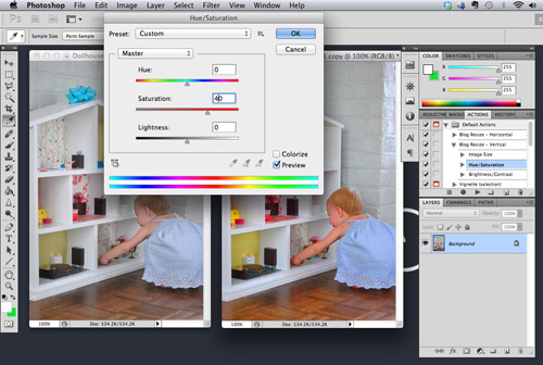
The next thing we do is up the color saturation a bit. This just makes the colors a bit more vibrant (they usually are flatter in photos and more vibrant in real life) and it can be found under IMAGE > ADJUSTMENTS > HUE / SATURATION… (or Command+Option+U). The adjustment shown below (+40) is more than we usually do (which is usually just +10) to help illustrate the difference. You can see the original picture at the left and the more saturated version on the right. But that’s way too saturated to look real, so we usually just do +10.
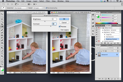
To keep the picture from looking too washed out, we also up the contrast which is found under IMAGE > ADJUSTMENTS > BRIGHTNESS / CONTRAST… (much to my annoyance, there’s no keyboard shortcut for this sucker). Again, we only do a +10 but I’ve shown a +50 below to make the effect more apparent. If you go too high the whites get washed out and corners get dark so again, just do what it takes to make the shot look more realistic, and don’t overdo it to make it look like crazyville.
We found that these two steps help counteract some of the washing out that seems to happen when we reduce the file size for the web (more on that later) so we do them to every single photo we post. To make our lives easier we’ve created a custom Photoshop Action to do it all (plus the resize) with the click of a button. So for every photo we open, we either click “Blog Resize – Horizontal” or “Blog Resize – Vertical” (depending if it’s a horizontal or vertical pic) and these adjustments happen on autopilot.
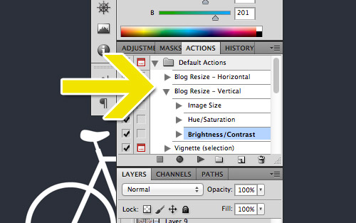
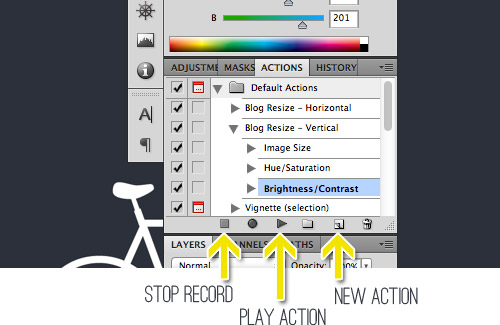
To make a custom action, find your ACTIONS window (make sure it’s checked under the WINDOW menu if you don’t see it). Click the New Action button, give it a name, and then hit the record button in the window that will pop up. Now proceed with the actions you’d like to record. It will record just about everything (even if you switch windows) so be sure to make sure you’re only performing the actions you want to perform. When you’re done, just hit the Stop button and your action will be saved (you can add new steps to your action by hitting the round Record button again). Then when it comes time to apply your action to a particular photo, just hit the “Play Action” button and watch it happen.
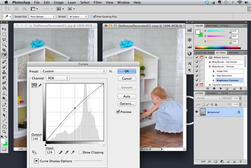
For about half of our photos, that’s all we need to do to make them web ready. Of course if we do an action and it looks less like real life we’ll just undo it and manually adjust, but most of the time it does the trick. We also might perform a couple of extra steps if the photo still doesn’t look as bright/balanced as it does in real life. The first thing we might do is adjust the exposure using the Curves function found under IMAGE > ADJUSTMENTS > CURVES… (or Command+Option+M). We just click and hold our cursor right in the middle of the diagonal line and drag it up a smidge (turning the line into a gently bowed curve). This adjusts the brightness of the photo while still keeping the darkest spots dark, which prevents it from washing out. That’s why we don’t use the Brightness function shown within the Contrast box mentioned above. Once again, you can overdo this if you pull too far, so we just go up a smidge and use “what it looks like in real life” as our guide.
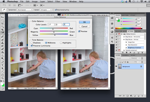
The other thing we like to do to some photos is balance the color slightly. As we mentioned in this post, I’m a bit of a stickler for a photo’s color “temperature.” I prefer a picture to look as natural as possible, so I don’t like when it looks too warm (yellow-y red) or too cool (blue-y green). White balancing within our camera takes care of a lot of this, but it’s not a perfect system. So instead, I use the Color Balance tool (IMAGE > ADJUSTMENTS > COLOR BALANCE… or Command+Option+B) to even things out. This particular photo was looking a bit warmer than I liked (although it might be hard to see see the pinkish undertone of the white dollhouse at this size) so I slid the dial a smidge closer to the cooler colors (cyan & blue). It’s definitely a very slight adjustment and it’s not perfect, so when we have a couple dozen photos per post I’m not always a stickler or getting things ready for a post could take all day.
So here’s a side-by-side comparison of what all of those adjustments achieved. In this case it’s pretty slight, but sometimes we upload a photo that’s way too underexposed / way too washed out / way too warm / way too cool and we have to make some more dramatic attempts at getting it closer to reality. For those who don’t see much of a difference, try looking at the top right corner of the dollhouse. See how it’s bright white and not gray or sort of pinkish? Also see how that bright yellow/green paper in that corner looks vibrant (like it does in real life) and less muddy? And see how Clara’s hair looks more blonde with some red undertones and some brown undertones instead of flat light brown? It’s just a bit more like real lift in the picture on the right.
Oh, and the other thing that happens to all of our photos is saving it in a compressed format so that they’re small enough to load quickly. We use Photoshop’s built in function (FILE > SAVE FOR WEB & DEVICES… or Shift+Command+Option+S) to save them as a compressed JPEG. This step tends to reduce the color contrast on a picture, which is why we make some of the above changes in the first place.
The steps above are by no means a perfect system – but they’re the system that we’ve developed to easily and comfortably get photos that we’re generally happy with. If you prefer your photos to have a different “feel” to them (maybe a warmer vintage look? maybe a more vibrant, high-contrast look?) then you’ll have to find the settings and adjustments that work better for you. Just play around and see what you like.
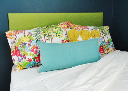
Now that you’ve seen the basic tweaks we make to just about every photo, let’s cover a couple of the more intricate things that we have to pull out of our bag of tricks on occasion too. The first is using Photoshop to help make design decisions. Let’s say, just for kicks, that we were contemplating a new headboard for our guest bedroom. We’d open a picture in Photoshop like the one below and start to futz around with it.
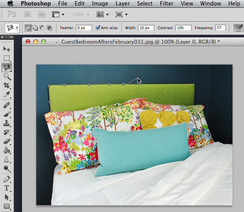
The first step is to highlight the area that you want to change. There are a few selection tools with Photoshop to do this, so I’ll start with the most basic lasso tool. This one is called the “Polygonal Lasso” because it draws straight lines between points you designate by clicking. It works well for the top part of this headboard because it’s simple straight lines. The goal is just to click to turn corners and sketch the line around the entire headboard perimeter so it meets up with itself (when it connects to itself on that last click it’ll flash and the area within it will be selected.
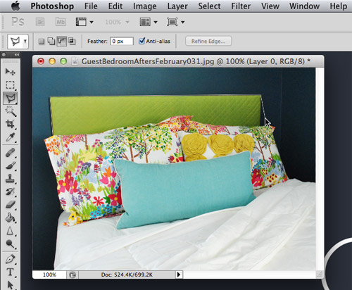
The Polygonal Lasso might get a bit tricky once you get down to the rocky edge of the pillows, which is why sometimes we rely on the Magnetic Lasso (which can be accessed in a drop down by clicking and holding over the same lasso icon on your toolbar). The “magnet” in this lasso is usually nice and smart about finding edges in your photo, so as you roughly trace the outline of your object it will snap to the edge. It’s not a perfect tool (especially in low-contrast areas) but I find it to usually be better and faster than free-handing it. So I’d just go around the whole perimeter, and meet up with my first point to select the entire headboard.
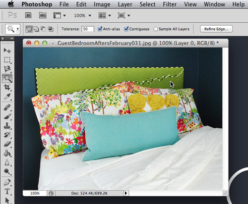
To demonstrate another tool, since our existing headboard is pretty much monochromatic, I can also use the “Magic Wand” tool to make my selection. It allows you to select an area of similar color (you adjust exactly how “similar” by moving the Tolerance number up or down). I kept it restricted to Contiguous color only, so it wouldn’t add greens from the pillows to my selected areas. One selection didn’t get it all in this case so I held down SHIFT and added the rest of my headboard with another click of the mouse in that area.
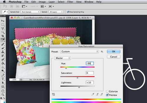
With the area selected, the fun can really begin! If we were debating a new color, we’d probably turn to the Hue/Saturation menu that was mentioned above (IMAGE > ADJUSTMENTS > HUE / SATURATION… or Command+Option+U). By dragging the cursor along the Hue bar you can shift the color to anywhere on the color spectrum. You can also use the Saturation bar to make the color brighter or duller and use the Lightness bar to make it darker or lighter.
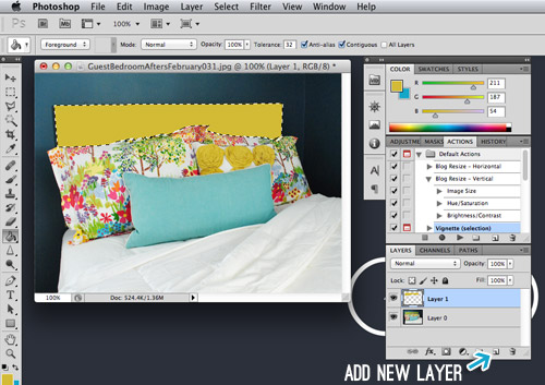
Another option is to create a new layer of color atop the existing headboard. This would make sense if our existing headboard was a crazy pattern or if we didn’t have any headboard at all. To do this I clicked the “Add New” button in the Layers tab (see bottom right below) and then used the Paint Bucket fill tool to add my new color. You want to do this in a new layer because if you tried to fill over the layer with your photo, you’d just end up filling any nearby pixels that matched the pixel you happened to click – instead of your full headboard area.
Now let’s say we wanted to add a pattern instead of just a solid color. I opened this photo of black and white stripes and dragged it into my headboard photo by clicking on the striped layer, holding my click and dragging it into the window with my headboard photo (you can see the ghosted icon of the stripe layer in the screen shot below, which shows until I release my click).
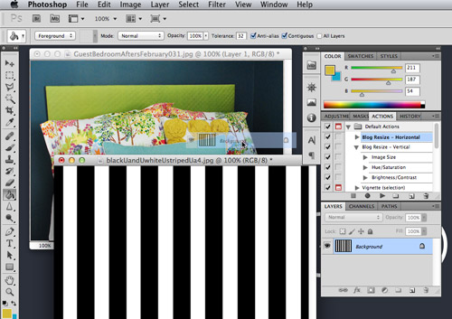
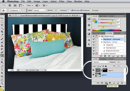
Doing the action above would just fill my entire photo with stripes. So to isolate it to the headboard area, we like using what’s called a Layer Mask. With my headboard area still selected, we just click the Add Layer Mask button (see the bottom right again) while having the striped layer active (sorry my screen capture shows the wrong layer highlighted). The Layer Mask basically hides all of the unselected areas and only shows the stripes in the area I had selected (aka the headboard). See the mostly black thumbnail added to the right of my stripes thumbnail in the bottom of the image below? That’s my Layer Mask – the black area is what’s hidden (or masked) and the white area is what’s visible to create the headboard shape.
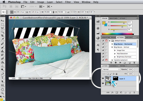
If you want to play with your pattern – shrink it, twist it, whatever – just “unlink” your image layer from the layer mask. You can do this by clicking the chain icon between the two layer thumbnails (where the blue arrow is pointing below). This allows you to transform your image while keeping only the headboard area visible.
The last trick we use when mocking up design decisions is to sometimes mess with the layer’s “Blending Mode.” There are a bunch of options that will appear in a drop-down at the top of your Layers menu. We just try a few to see if anything gives us an effect that we like. We find the “Multiply” tool to be most helpful because it tends to help your top layer blend with the bottom layer more naturally (for example, when doing Clara’s monthly photos we set the text layer to Multiply so numbers and the word “months” seems to be printed on the texture of her shirt more realistically than it does when it’s just placed on top).
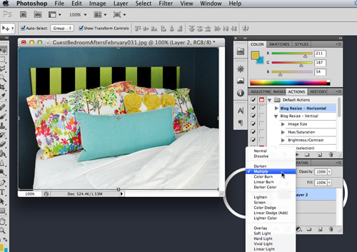
I’m not sure any of that exercise was really helpful in coming to a better headboard solution (we’re kinda cringing for the green and black guy above), but hopefully you get the idea of how you might be able to visualize different options within Photoshop.
This post has already been waaaaaay longer than I originally envisioned it, yet I feel like I’ve barely scratched the surface of what can be done within Photoshop. So perhaps if you guys have specific questions within the comments we’ll do a follow-up post with some additional information (probably can’t realistically explain much in the comments without visuals, etc). We probably won’t know the answer to everything though, so feel free to chime in to help each other (and us) out too. We’re always game to learn new things!

Jen says
Thanks so much for this post! I’ve also commented before that I would love to see a Photoshop post.
One thing I would love help with is a tutorial on how you design your paper products like Clara’s bday invites or your Christmas cards in Photoshop. In your spare time of course :-)
YoungHouseLove says
Oh yes, we’d love to touch on that a bit more in a future post. It’s so fun to make those invites and cards!
xo,
s
Jennifer says
Yes, I’d love to see one of those!! Great photo tips, but I’m looking forward to a graphic tutorial!
Amy says
Thanks for the ‘actions’ tip! I use Photoshop all the time for my biz too and that is going to save me so much time! Thanks John!!
YoungHouseLove says
You’re welcome!
-John
Jacque says
Love the tips and tricks! I love Photoshop (I use it daily for my job as a graphic artist) and I always LOVE seeing how other people use the program!
Just a thought for you guys – if you use the “brightness-contrast” quite a bit and are annoyed that it doesn’t have a keyboard shortcut, why not just create one? I almost always have to tweak a few of the shortcuts to suit what I do on a daily basis (Edit > Keyboard shortcuts). It might give you a warning that the shortcut you select was being used for something else, but hey, if you never use the original function, who cares? :) Just a thought! One of the coolest pieces of the Creative Suite (IMO) is how personal they become to each of us that uses them! Keep up the awesome work. :)
YoungHouseLove says
So smart. Never even thought of that option. Thanks!
-John
Nicole Lindquist says
I bookmarked this post right away –it’d be a good Pin for Pinterest too! And I wasn’t going to comment, but after I read Barb’s comment thought I’d chime in and say thank you! I’m sure it took awhile to put this together…much appreciated :)
YoungHouseLove says
Aw thanks Nicole!
xo,
s
emma says
Great post! I got adobe CS4 suite back in college at a suuuuper discounted rate for students. If you’re a student or have a connection to a college campus store you might look into it. I want to say it was $200 for the entire suite! It’s 5 years and still going strong!
(Or maybe your local library has it on a computer? Always looking for the save-money route!)
YoungHouseLove says
That’s amazing!!!
xo,
s
Karen says
I’m just here to second emma’s comment. I’m a college student and have CS3 – which I got at a super discounted rate as well. Right before I graduate next spring I plan to buy the newest version while my discount still works!
YoungHouseLove says
Love that plan!
xo,
s
Julie says
I’m dying to learn more about Photoshop but can never seem to find the time – thank you for this! My mind started to get a bit boggled at the end but I’ll pin it so I can refer back to it later when I need it! I still can’t even seem to adjust my white balance in my camera!
Ashley says
This was an incredibly helpful post. I don’t have Photoshop, but a co-worker recommended Pixlr (free) in place of it – apparently they have a lot of the same functionality. I’m going to have to go and explore and see if I can do some of what you guys talked about here!
Thanks for taking the time to write this out!
YoungHouseLove says
You’re welcome Ashley. Happy to help!
xo,
s
holly says
if this helps..for that brightness/contrast shortcut that “doesn’t exist” – just create the shortcut yourself!
i do this all the time (like an earlier commenter, i’m a graphic designer and use photoshop ALL DAY).
go to EDIT –> keyboard shortcuts
toggle to IMAGE > ADJUSTMENTS > BRIGHTNESS / CONTRAST .. and just type in the shortcut key you’d like to use! you might have to be a bit creative since a lot of those shortcuts are already in use but .. say… you don’t use the shortcut for Photoshop HELP, you can save over that one.
simple, yah? love your blog by the way. naturally.
~holly
YoungHouseLove says
Love that tip Holly! Thanks so much! Why didn’t we think of that?!
xo,
s
LMG says
Thanks so much for the tips! I wondered if you could maybe comment more on photo storage on your computer? I filled up an older MacBook Pro with too many photos and have yet to find a seamless solution for off-laptop storage. Do you use an external hard drive? How big? Thanks again!
YoungHouseLove says
We do have an external harddrive for personal pics and use amazon.cloud to host all of our blog photos since there are wayyyy to many to keep on our computer and even our harddrive. Uploading things to flickr is a nice backup too (we do that with personal pics of Clara or our wedding that we never want to lose).
xo,
s
Kristin H. says
Yes!! I’ve been reading all the comments to try not to double-ask cause I was wondering this too :) My current Mac book pro is completely full and after purchasing and copying to a 1TB external I still am terrified to delete pics off of my macbook!!! So do you guys upload to your computer/s, edit, upload to amazon cloud/flickr, and then delete from your computer’s hard drive? If so, when you need access to those pictures again (say, if you are writing a post with old pics, making an album, just need one old picture for something, etc..) is it difficult/annoying to get to those pictures without having them saved on a hard drive?
Thanks J&S.. sorry for the slightly unrelated question. You guys are the best ever. This post was amazing and so very much appreciated!!!
YoungHouseLove says
Thankfully it’s not too bad! We keep all of our family photos on the computer or the harddrive (and also on Flickr) so we can always access them, and as for the blog pics, most of them are on the cloud, so it takes a little while to find them, but if we just want them for another blog post we can just find the old post with them and relink to them in the new post so they show up there too!
xo,
s
Kari says
I skimmed over this post because I’m not much into photoshopping stuff. But I will say that one of the things I like most about your site compared to other home improvement blogs is the quality of your pictures–the lengths that you go to to make sure things are well-lit (or, at least, appear to be well-lit), that they’re clear and easy-to-follow in tutorials. In fact, I’ve stopped reading all the other blogs I used to follow because I got so frustrated with their pictures after being spoiled by you guys.
Jessica says
Awesome post – I’d love to see some more like this. I’ve been playing around with Photoshop since high school but haven’t upgraded since, um, Photoshop 7. I was super excited to be given access to the full CS4 suite at work but with no professional training I feel like my Photoshopping is still very trial and error. I love seeing the tricks and tips broken down in simple terms for non-graphic/non-photography types like me. I’d like to copy Jen’s request for “a tutorial on how you design your paper products like Clara’s bday invites or your Christmas cards in Photoshop.”
YoungHouseLove says
Thanks Jessica! Sounds like a plan. We’ll have to tackle a post like that for ya!
xo,
s
Jen @ The Decor Scene says
I loved this post guys!!! I have Photoshop Elements, so hopefully some of these tips apply there as well. I have no idea how to use it, but I keep meaning to sit down and play around with it.
I would love to know how to remove something from a picture? Like if you are trying to redo your garden and you want to move plants around first on the computer and see what looks nice. Is this really hard and can it be done in Photoshop Elements? Thanks YHL…I really appreciate these kind of tips. :)
YoungHouseLove says
I’m not sure how many tools Elements has, but you might want to use the clone tool or the band-aid tool (the rubber stamper or healing brush) to duplicate something next to the thing you’re trying to remove in another layer and move it over the thing you’re trying to remove. In other words, if there’s a bush next to grass and you want to see what grass looks like in the area that the bush is as well, clone some grass on a new layer, move it on top of the bush, and see if you can give it the appearance of being gone.
xo,
s
Erin says
It’s fun to see how others process their photos! So many different options.
I do have one question, though – why not use adjustment layers instead of applying the adjustment destructively to the background image? I would think the layers would be especially helpful in your actions so that you could go back and edit the layers rather than undoing the actions as you mentioned.
One other thing to note is that when you save the file, you probably want to save it with a different name so that you don’t lose the original large file :)
I’d love to see more of these “lessons”!
YoungHouseLove says
Oh yes, you can adjust layers too. Sometimes we find it easier to do it all in one layer because if we mess with something and then want to brighten the whole image we have to then merge layers to do that since things are layered, but it can work really well to keep things separate as well! And yes, so smart about saving with a different name so you can tell which file is original. The way “save for web” works for us is that the original file keeps its name and the new one that we save for web gets whatever new name we give it (ex:kitchen-after-for-blog.jpg).
xo,
s
Michelle N says
Before I bought Photoshop I used Photoshop Express. It surprises me that not many people have heard about it. It’s powered by Adobe and it’s a great free photo editing site. They give you 2GB of storage. http://www.photoshop.com/
They even have an app now! It’s pretty cool!!
YoungHouseLove says
That’s awesome! Thanks for all the tips guys – you’re smarties! Haha.
xo,
s
Sandra says
I don’t know if anyone has mentioned it yet, but lightroom (also made by Adobe) is really quick and easy (and cheaper) if you are just looking for basic picture editing.
YoungHouseLove says
Great tip!
xo,
s
Ashley F. says
Love, love this post!! Thanks so much for all of the tips. Now I feel inspired to go home and finish editing my not-so-recent trip photos, and maybe if I create my own action it will help speed up the process. Love the blog, thanks again!
cappy says
okay you guys totally rock! I have not had a chance to read this post yet, (shhh I am at work) but I was the one a few posts back that made the comment asking for a post like this and wanted to THANK YOU for giving us a quick tutorial on it! I really appreciate this and the fact that you read and reply to your comments! Thank you again!
YoungHouseLove says
Aw, you’re welcome Cappy! Hope it comes in handy!
xo,
s
julia says
Don’t know if this has been said already (apologies if it has), but instead of applying changes directly to your images try creating an adjustment layer. Layer -> New Adjustment layer -> Layer type.
Every time you apply a change directly to an image you are permanently changing the information of that image. Once that change is made the old information is gone and new info is there instead. Each time this occurs the info is lesser quality and numerous changes or generations result in poorer images.
(Julia – photographer/retoucher)
YoungHouseLove says
Oh yes, great tip!!!
xo,
s
Elizabeth says
Do y’all use the lasso tool for mood boards? I want to create some for my home, but before I buy PS Elements or something, I wanted to know if that is how y’all remove the backgrounds from things.
YoungHouseLove says
Yes, we used that to remove backgrounds all the time!
xo,
s
Elizabeth says
Thank you for your response. I love that y’all take time to respond to everyone. This blog is my favorite, and I can’t wait for the book!
About mood boards, have y’all thought about doing a post on creating them (the photoshopping and finding of items)? I thought y’all might have tips about how to pull one together.
YoungHouseLove says
Aw thanks Elizabeth. That could be really fun, and a few others have requested the same thing, so that might be something we’ll touch on in a future post!
xo,
s
Callie says
I am a avide shortcut user. When I use something regularly, like changing a RGB image to CMYK for printing purposes, I create my own shortcut. EDIT>KEYBOARD SHORTCUTS…
You can then set up ones for whatever you might need. And choose what you want them to be.
Also, without having to apply the mask to you texture, you can click Option and hover your mouse between the two layers. It shows a veen diagram looking symbol and then click. It makes the top layer appear in the bottom layer. Only where the bottom layer appears. I don’t know if this is helpful for y’all, but I use it all of the time.
Check ’em out.
YoungHouseLove says
Really smart tips!
xo,
s
Katherine says
The first pic made me LOL. “Plastic wrap”…*snork*! Coffee out the nose…thanks!
YoungHouseLove says
Haha, I’m glad it made someone else LOL. I was mostly laughing out of embarrassment. Man did I love that filter…
xo,
s
Joscelyn says
You should really consider Photoshop Lightroom. It will change your life and how much time you spend editing your photos! The work flow is easy. Your photos are “always open” so you edit, pick your favorites, set how you want to export them (for the web in your case) & done. My husband and I are both photographers & we use Lightroom on a daily basis. Only switch over to Photoshop when we need to get down to the nitty gritty details. Worth the investment for sure!!
YoungHouseLove says
Thanks for the tip, we hear great things about it!
xo,
s
Tiffany says
Just a little FYI, I’ve noticed people discussing the large Photoshop price tag, Adobe often offers a lot discounts to a variety of student and teacher types (I believe even grade school through college/university level). I’m a graphic design student and came upon this information and was able to purchase my Adobe Photoshop and Bridge for a much happier price ; ) hopefully some readers might also be able to benefit!
Also just wanted to say from a graphic design point of view you guys did a great job of breaking down the basic system operations and tools of this program clearly and without confusing the reader! Kudos!!
YoungHouseLove says
Oh yes, a great tip! And thanks so much for the kind words- off to pass them along to John!
xo,
s
Erica says
My husband and I have been looking at investing in Photoshop Elements 10, the other version is still a bit out of our price range/need for now. I found that Amazon.com has it on their site for $63.99 right now.
Just thought I’d throw that out there for the other readers. And thanks for a great and timely post on that subject.
YoungHouseLove says
Awesome price!
xo,
s
elizabeth says
Another tip for selecting things in Photoshop, particularly rectangular things, is to use the pen tool. It creates a much cleaner path than the lasso or magic wand ever could. You can even use it to select curvy things if you take the time to do it.
YoungHouseLove says
Great tip!
xo
s
Robyn in Chicago says
This is very off topic but….
How do you like the green bike seat that Clara sits in on John’s bike? :) Thinking of getting the exact one for my husband for father’s day! I was planning on going to REI this weekend to check out the options – how timely – of course, this always happens with your blog. What in the world would I do without you guys? ;) Thanks!
YoungHouseLove says
We really love it- Clara seems to have a great time!
xo,
s
Erica says
Oh and on the subject of photo-editing…..I’ve noticed that a lot of websites & blogs water-mark all their photos.
I notice that yours are not is there a preference for not doing this?
Just wondered if you encounter a lot of problems with other people not giving you credit for your photos or citing you as the source.
YoungHouseLove says
We just have never watermarked our pics so we just never hit a moment where we decided “let’s start now.” We have seen a lot of photos stolen even if they’re watermarked at the bottom (someone usually just crops the mark out) so we made a personal call to just say “if we see our pics used without a credit back to us we’ll just contact the person and ask for a credit” since a watermark doesn’t seem to fully guarantee that pics won’t be used without your permission anyway. Hope it helps!
xo,
s
Ainhoa@ALittleBite says
Love this post! Although for Mac users out there, I’d encourage them to check out Pixelmator. It’s price tag is much easier to swallow and it’s pretty similar. (I swear I’m not getting paid for this, I just like it a lot!)
YoungHouseLove says
Sounds awesome! Great tip!
xo,
s
Ainhoa@ALittleBite says
*Its, sorry
Dawn says
I’m a professional graphic designer so prefer to use Lightroom and Photoshop to edit since I have access and am very familiar with them, but I recommend http://www.picmonkey.com/ to my friends who ask how to edit without the investment. It’s online, free and actually really easy with good options.
YoungHouseLove says
You’re the second one to recommend that- sounds really cool!
xo,
s
sara v says
LOL at ‘Sherry’s 6th finger’
Lauryn says
Might already have been mentioned, but Lightroom is also offered by Adobe, and at around $150.00 its a much more affordable option. Its what I use (wedding photog here!) and as do most professional photographers. Takes the design aspect that PS is capable of, and just narrows it down to photo editing. Great GREAT program. Also, in case youre interested in streamlining your system, take a look at Blog Stomp. It super easy to use and gets images blog ready in seconds. You can do side by side images, pick your image size preferences, sharpening if any, etc… and then you choose the image and click stomp. Boom-blog ready. No need to resize in PS anymore! :-) Happy Editing!
YoungHouseLove says
Oh yes we hear awesome things about Lightroom!
xo,
s
Briana says
Oh, the memories… Plastic wrap was totally my favorite filter back in high school!
I follow pretty much those exact steps when I process photos, except I do it all in Lightroom now. It’s just simpler, especially when I’m dealing with a big group of photos. It also saves space — all those psd files can really add up!
I’ve never really used Photoshop to make design decisions; I’m gonna have to give that a try!
Lilly says
I was about to tell you how much I’ve enjoyed your posts about what to buy at Target and then World Market, and now this one, wow! Thank you for saving me money, time and giving me a lot of ideas to try!!
Sarah says
great post!! I use photoshop often and I use actions but never knew how to create my own action. I am sure this was a painful post to write (at least it would be for me) but it was really helpful, thanks!
Patti says
Thanks for the post, so informative. My husband and I took a photoshop course last summer and the teacher said it took him about 10 years to know the program inside and out … it’s a challenge to say the least. I really appreciate the time you took to post these tips for us!
Gabriella @ Our Life In Action says
Your pictures always look so beautiful. I love taking pictures but the colour isn’t that crisp and clean or even accurate for that matter. I took a picture of beautiful deep purple flowers and when I downloaded the pics the flowers were blue.
Anyways, I love love LOVE this post. Great info and something I will definately use in the futre. Thanks! :-)
YoungHouseLove says
One tip on that would be if your photo allows you to white-balance (sometimes it’s a setting you can turn on) it seems to help colors stay truer, or you can try to adjust them using saturation or color balance in Photoshop! Hope it helps!
xo,
s
Shelby says
Thanks for the tips! Photoshop is a beast, so this is super helpful in knowing what simple things I can do to make my photos look better. I think you touched on it in earlier comments, but just to clarify, what do you shoot in? RAW? High Quality JPEG? I, like another commenter, have almost filled my MacBookPro storage b/c there are so many images on it, and I usually only use a high quality jpeg, even though I know shooting in RAW gives you so many more options for editing.
YoungHouseLove says
Yes, we use high quality jpg since we don’t have room for so many RAW files.
xo,
s
Lesley says
I’m sure this was very helpful, but I was unable to concentrate after I realised you guys used computers in high school… I feel crazy old now, it was a big deal that I went to a new high school and they had ELECTRIC TYPEWRITERS for us to learn typing!
I’ll read it again after I stop looking around for my youth.
YoungHouseLove says
Haha, that’s so funny! We totally had typing classes and some programming/computer art classes. But they were those giant cream-colored monitors that looked like big cardboard boxes. Haha.
xo,
s
Angie says
So, not so much a question about photo shop, but I noticed in your second pic that you have an Ibert. I’m seriously thinking about getting one and wanted to know what you thought about yours? Does Clara love it? Do you feel like she’s safe in it?
YoungHouseLove says
Oh yes, we love it! We have gotten in at least 30 miles of riding since we got it! She loves it and John doesn’t mind pushing her around- haha. It feels really secure once it’s on, but of course you don’t want to leave her in it if you’re not on the bike (John gets on and we put her in and then they ride off and I follow).
xo,
s
Gwenalyn says
I *heart* photoshop! I’ve been using it since my sophomore year in high school (circa 2000). I was completely obsessed with it then, too. I wasn’t guilty of putting plastic wrap on everything, but I did use the texturizer far too often. We all have our vices, Sherry!
YoungHouseLove says
Haha, oh yes, texturizer! What about dust and scratches? Or tile mosaic? Hahahahaha.
xo,
s
Jessica F. says
Very nice! Photoshop is one of my favorites. :)
One of my favorite tools is “selective color” under the adjustment layers. It helps me whenever my scene is too red or too green to decrease only that color.
I always loves tips! Time to go play with color balance more now!
YoungHouseLove says
Love that tip!
xo
s
Shannon says
Where did you guys get the bike seat for Clara?? I have never seen one of those and would love one for my toddler. I didn’t want to opt for the seat on the back because the thought of that made me nervous.
YoungHouseLove says
We got that at REI. We love it!
xo,
s
Evan says
John, Sherry, what is going on with that deck? I’m dying of suspense through a whole other minor project and some other random posts.
As far as photo editors go, I suggest pixlr.com. It’s kind of like an online version of Photoshop. It’s free, and as someone who’s used to the real deal I find it less of an adjustment than either Elements or GIMP.
YoungHouseLove says
Alas, the deck is slow going! As we have tried to mention in each post about it, we only have about one or two days a week that we can work on it, so we’ll probably just share weekly updates (most likely on Mondays) with all of the progress as we go! Wish we could complete it in a week, but it’ll most likely be one or two months til we get there!
xo,
s
Crystal says
Love this post! I have photoshop elements and use it frequently but for some reason every time I hear the words “layer mask” I want to put a pillow over my face & hum to myself. But after your explanation I think I actually understand now!
I’d love to see more photoshop posts!!
YoungHouseLove says
Thanks Crystal!
xo,
s
Anita says
Youngsters/readers – Is there a video-editing program that you suggest to edit basic video from my flipcam to make videos like the ones you guys post? Sorry if this was already covered in a previous post.
And I have a tip using the same technique you used for the headboard – for my engagement pics I wore a solid colored dress, and then changed around the colors in photoshop (and changed the colors of my fiancee’s tie) so it looked like I had pics with several different outfits!
YoungHouseLove says
We love using iMovie (free with Macs) or Final Cut Pro (not free, but we bought it for a book video we made and really liked it). Hope it helps! Oh and I love that tip about solid colored clothing so it can be changed!
xo,
s
Heather Flint says
Few things:
1) Thanks for the post, and taking your time to explain things so well!!
2) I don’t think anyone has mentioned it yet, but I actually LOVE the pink headboard!!!!! I think it looks so good! I’m sure almost as much as John does, lol
3) laughed out loud when reading about Sherrys cd cover. Thats awesome!! :(
YoungHouseLove says
Haha, I love that pink headboard too! You’re right, John is not on board.
xo,
s
Yolande says
this is brilliant! I was just looking around for alternatives to Photoshop this morning and ended up with Photobucket, which is kinda cool and basic. So glad you offered alternatives and also showed how to use photoshop. Very tempted to get the light version of it!
Ally says
Wow, you learn something new everyday…there is a photo editing program called “GIMP”? While I was reading the rest of J-Booms awesome tutorial, all I could picture was the Gimp from Pulp Fiction *tries desperately to shake that image outta her head*
Think of beautiful PB shams….think of beautiful PB shams…think of beautiful PB shams…. :)
xox
Sonya says
John – making a macro to do your standard editing is a great idea, but if you find yourself still really wanting that shortcut, you can set one up yourself: http://www.photoshopessentials.com/basics/custom-keyboard-shortcuts/
YoungHouseLove says
Thanks for the link Sonya! So helpful!
-John
Cassie says
Great post, John. I am also a self-taught photoshopper and found your method of editing interesting. I never experiment with the curves function and will give it a try.
Also, I’ve noticed that John has been posting more frequently lately and I have to say that he is doing a great job. You both are wonderful writers and I always find myself looking forward to 10am to check out what YHL has going on. Can’t wait for the book, too!
YoungHouseLove says
Thanks Cassie! We have been doing lots of book proofing and Sherry has the better eye on that stuff, so she has been drowning in layouts! I’m trying to pick up the slack for her!
-John