Two weeks ago when John shared this post about the times that we’ve made bad painting decision, we received a bunch of requests for a follow up post in the comments:
Q: I guess I just have a hard time picking colors because I have a hard time telling which swatches have grey or brown undertones. Maybe you can show some swatches (of say the teal from the built ins). One that has a grey or brown undertone and one that is more saturated? It might be helpful to see them side by side! – Aubrey
Q: Thank you for this! I actually think tip #3 (pick a muddier color) surprised me the most because I’d never heard that or thought of that. But it rings so true in my experience! Although colors don’t show up perfectly on monitors, I would *LOVE* to see a post with color samples and explanations like, “We love this peacock blue, but we think it would be too garish on a wall. Instead, we’d try this color, and probably get the effect we’re looking for.” -Heyruthie
Sounded like a good time to us. Comparative swatches will probably demonstrate more than words ever could. So let’s just let the swatches do the talking.
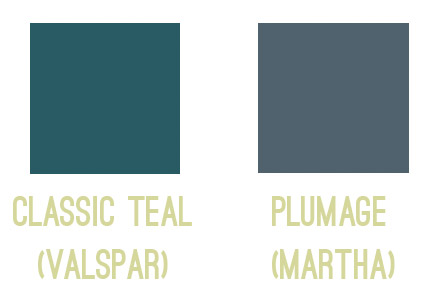
First we have the bold and fun color you might be going for on the left, so if you envision a deep teal tone, you might be tempted to use Classic Teal after seeing the swatch. But on the right, we put the swatch for Plumage, which is actually what we used in our guest room. See how grayed out the swatch looks?
Yet on the walls it’s every bit as bold as we hoped!
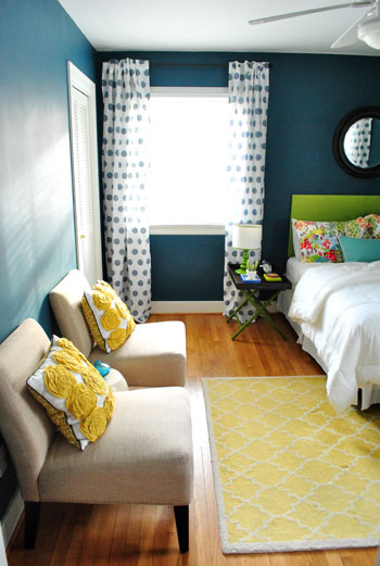
Colors in general – and especially dark ones – seem to amplify by a TON when they’re up on the walls, so we’ve had luck picking the ones that look a bit faded or grayed out, knowing that once they’re up on the walls they’ll look a lot more clear and bold. You can read more on the guest room here.
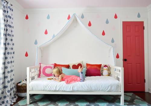
Next we have a swatch on the left that you might be tempted to pick if you want a bright and happy accent of pink – perhaps for the door of a kids room, like we used on Clara’s closet. But the swatch on the right is actually the one that we picked. A small square of it looks a lot more muted (sort of faded) compared to the bold and happy color on the left…
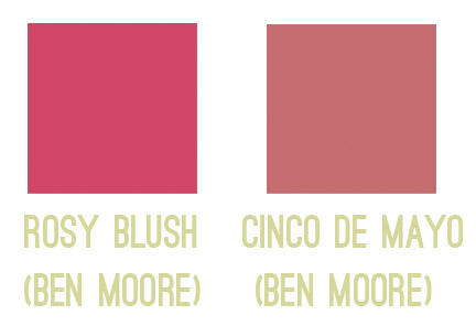
… but once it’s on a nice big area in the room (like the door), you can see how bright and clear that color reads. So even though the swatch on the left might be the pure and unfaded one you’re initially drawn to, in a nice large chunk it could almost read as neon. You can read more about Clara’s closet and those raindrops here.
Another coveted color seems to be a cheerful aqua tone, but in our re-painting-riddled experience it can be hard to get right. The color on the left is a peppy Tiffany Box blue… which is actually a color that seduced us when we moved into our first house… but once we had it on the walls of our dining room, well, it was a little overwhelming. Of course it depends on your room (someone with an amazing room full o’ light could make it look stunning) but in our experience, that color’s just not muddy enough not to get blindingly bright on the walls. So we’d be drawn to something like the swatch on the right, which should still clearly read as a pretty aqua tone in such a large quantity (here it is in a laundry room makeover).
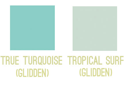
So my general rule is that for painting smaller items (like a tray, side table, accent chair, or lamp base), those more clear/unfaded/unmuted colors can be great. But for larger expanses (doors, walls, ceilings), we tend to prefer muddier tones of the same color – like a softer aqua with more of a gray-green undertone – just so it doesn’t go from chic-tiffany-box blue to punch-you-in-the-face-when-you-walk-in blue.
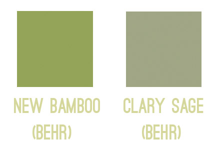
The same thing seems to ring true for greens for us. Something bold and clear can work really well on a piece of furniture or a bathroom vanity (but not necessarily all of them, ha!). But when it comes to the walls, the color on the left would likely turn most rooms into Kermit Theee Frog (I love when he says his name that way). Meanwhile, the one on the right might look dull by comparison, but on the walls it could be really pretty. Sage is always gorgeous with wood trim or cabinetry, so that could be a nice choice for a kitchen with wood cabinets or a den with wood trim.
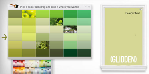
Here’s another way I thought I could attempt to illustrate the strange mystery of how a swatch with those muddy/muted undertones can almost look beige in your hand in some instances… but then when it’s on a bigger area, it’s very clearly a color. See how muted and almost wheat-toned the swatch on the left with the arrow next to it looks below? Yet when it’s in a bigger area (that’s the exact same color in a larger rectangle on the right) it definitely looks green and not tan or beige anymore.
Update: Someone asked if the muddy version of a color would typically be on the same swatch as the bright one (if you slide up or down) or if it’s on a different swatch. In our experience, it’s almost always on a different swatch, so there might be a whole range of clear tones on one swatch (from bright aqua to a light baby blue) but you’d want to go a few swatches over to the one that has a much grayer or muddier top color (like a deep blue-gray) and slide down to find those muddier counterparts.
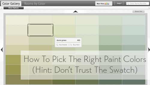
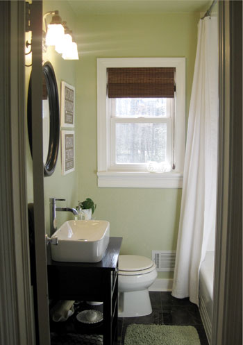
One last example would be Dune Grass, which we used in our first house’s bathroom. It looks almost completely cream/beige/tan in a small swatch (with just a tiny hint of green) – especially when it’s arranged with other green tones that are a lot less muted…
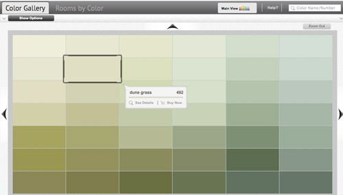
… but in our bathroom it clearly reads as a soft green color. Once again, when it’s up on the walls, there’s just a lot more of it, and it’s definitely amplified from the neutral-looking swatch. So if you’re looking for a light or subtly colored wall (be it green, blue, pink, yellow, orange, purple, etc) you might want to consider those lighter wheat or gray toned swatches that almost look like there’s just a drop of that color in them. The result can be a room that’s clearly that color, but a soft and subtle version of it. You can read more about that big bathroom reno here.
As Heyruthie mentioned, colors aren’t always great on monitors, but hopefully just seeing these comparisons might help. And when making a final choice, the best method we’ve found has just been to bring some swatches home, check them out in our lighting situation throughout the day, and then grab a test pot (or three) of paint if we’re still nervous. Those small sample pots are only a few bucks and they can save you a whole lot of re-painting trouble.
It’s also amazing how different the same paint color can look in a variety of rooms/lighting situations, so I’m sure there are folks who’ve used those bolder colors in the left columns above with great results – so it really does depend on your room, how much light it gets, and how you layer stuff in. Like this could-have-been-blinding bright blue paint color, which looks awesome in a lofted and light-filled studio – especially when it’s tempered with lots of tan texture in those pin boards and that over-sized mirror.

Oh and since we’re on the subject of buying paint, here are a few tips we’ve learned over the years about scoring a discount:
- “Oops paint” can be awesome (it’s someone else’s already-mixed paint that has been returned for some reason, but it’s usually extremely marked down as low as $1 for a whole gallon, so you can even get a few cans and mix them in the hopes of creating a color you like for a serious discount).
- If you have a favorite paint shop (ours is a local place called Virginia Paint), you might want to pop over to their Facebook page and click the Like button or sign up for their mailing list. By doing that you’ll often be alerted if they’re running sales or specials, and sometimes you can save $10 or even score 40% off.
- If you get paint from a big box store like Home Depot, you can hit up their website and check out their Paint Promotions page.
- You can also get 5% off any purchase at Home Depot or Lowe’s if you use your store credit card there (Lowe’s does it automatically, and you just have to ask for Home Depot to match the 5% off that Lowe’s provides when you’re checking out and they will).
- Sherwin Williams tends to run some great specials. In fact right now they’re having their big 40% off sale. And I’ve heard you can buy untinted gallons (like a whole bunch of them) for 40% off and then bring them back later to get them tinted at no charge (I’d check with your individual store, but that’s the rumor). So even if you’re not sure what colors you want right now, if you have a bunch of rooms to paint it’s a great way to save serious loot.
- It never hurts to click around on any paint website for promotion info. Right now Behr is having a $5 off promotion and Benjamin Moore is offering a buy-one-get-one-free deal on a quart of paint.
Do you guys have any other paint undertone tips to share? Or just some stories about going for the wrong swatch? Any other tips for getting paint at a discount?

Kate P. says
This was too funny to find as I sat down to rest after putting the first coat of paint on our mudroom – a very dark periwinkle. The lady behind me in line audibly gasped when the clerk took off the lid to put a drop of paint on the lid. :) I had gotten sample pots of three colors and painted large samples on foam core and looked at them for months before choosing. If you’re going to go bold, get samples and take your time. Now if I could just commit to a grey for the master bedroom…
YoungHouseLove says
That sounds AWESOME! Send pics!
xo
s
Allison says
I would caution on buying untinted gallons in advance. Different colors take different paint bases, so you might end up getting stuck with a base that does not work with the color you want, and paint is not always returnable.
Also, your link is correct for Home Depot above! $5 off Behr Ultra through the 13th!
YoungHouseLove says
That’s a great tip Allison! Someone else commented to say that as long as paint isn’t opened or tinted, it’s returnable or at least exchangeable, so it sounds like Sherwin Williams would swap it out with the right base as long as it’s not tinted or opened (someone else said they even swapped it out for another line they carried that was less stinky since they could just resell the untinted/unopened cans to another customer). Checking to be sure they’re cool with that before buying would be really smart though!
xo
s
Susan in Colorado says
Oh how paint scares me… So we are painting my teenage daughters room (standard size) grey and yellow… The room was my son’s until he moved out which was painted red/black (racing colors).. we primered (is that a right word? lol) it grey, two coats. Now we picked the grey and yellow.. we put the grey up and it looks like muddy brown. It matches the swatch but seriously looks icky. We wanted a traditional simple grey and not sure why this looks brownish. I think we should go ahead and put up the yellow and see what it looks like and if it still looks weird, change the grey again (assuming the yellow looks okay)… Aggggg… this is why I suck at this.. lol
YoungHouseLove says
Oh man! I would definitely add the yellow and even add in things you’ll be putting in the room (hanging curtains, art, adding bedding, etc). All of that can temper a color and change how it reads. If you changed your light bulbs from a warm yellow to a cool blue it could also bring gray tones to the paint in some cases! Hope it helps!
xo
s
su z y says
Plumage fav color to date….bold & makes a statement. Painted dining room this color & wow get so many compliments. Looks great with white trim/crown molding.
Pam Smith says
These are some really great tips! Honestly even in the side by side swatches I would prefer the muted colors. I will definitely have to keep all these lovely tips in mind when we go picking paint colors soon.
Pam @ Pam’s Life
Anne says
Wow! You guys are right. I just went back and looked at the swatches of our paint colors, and they are much muddier looking than the actual paint on the walls (which I consider pretty bright). I’m blaming it on dumb luck though. I had no idea what I was doing. Just thankful I love the colors, because I do NOT want to repaint my kitchen. It took 6 hours to tape that sucker off.
YoungHouseLove says
Haha, I love that Anne!
xo
s
Vanana says
WOW-what a great illustration. i can’t pick paint colors to save my life-i have to paint the whole room to really see it and then repaint (multiple times in some cases). will definitely apply your suggestions going forward. the color on a monitor has it’s own issues.i loved the color of your master in the fist house. i bought it, but it is sage green in my house, but looks a little bluer on the monitor. i bought a tester of a lt blue and kept adding until the color was spot on. I used anagalytpic paper in a bathroom with a linen look and painted it with the “custom” blue green-it is perfect. I have also heard you should pick the color that you think you want and go two shades lighter
YoungHouseLove says
I’ve heard that too! I think it can definitely work in some spaces. Someone else said she had to go two shades darker to get the right color (imagine how amazingly bright and light filled her home must be!).
xo
s
mary says
Your comment about a paint might look great in a studio… I used to covet paint colors on the walls of TV show homes then realized those homes always have the EXACT same lighting conditions– bright. That pretty blue or green or yellow would probably look like crap in a normal house, 95% of the time.
YoungHouseLove says
You’re so right! Those spaces have about a jillion lights hidden in the ceiling out of frame of the camera! Never thought about that!
xo
s
Nichole K says
Yes! Love this advice. After several color oops-es, I started picking colors with grey undertones for all wall colors and it has helped so much!
Lighting too, makes all the difference. When my then-boyfriend, now-husband said he wanted a “happy” bedroom, we painted it a lovely buttery yellow. He failed to mention that he likes to live in a CAVE and NEVER will open curtains or blinds willingly. So that lovely soft yellow with the sun streaming in ended up looking like a #2 pencil exploded everywhere since he shuts out all light. But I still married him and I’m in charge of the curtain opening/closing now :)
YoungHouseLove says
Oh man, your description of a #2 pencil is cracking me up!
xo
s
Melissa says
This is super advice! I have made the mistake a few times recently of getting too pure of a color for painting something big and having it look just wrong/in-your-face.
http://msgfun.blogspot.com/2013/09/the-most-painful-bed-ever.html
Maybe with this advice I can try again with choosing colors…
Liz says
Clara could be a soil scientist. My husband has his phd in soil microbiology and I have my master’s degree in soil chemistry. It’s fun!
YoungHouseLove says
I think she’d love that!
xo
s
Lyndsey M. says
Sherwin Williams does allow you to buy paint and then return later to tint it. We were closing on our house when they were running their 40% off sale — so we were able to stock up. It was such a lifesaver. Its been about 10 months, and we tint as we paint each room. They also will let you exchange a extra white base for a deep base without charging extra — so you don’t have to have the color or the base chosen before you buy. And they will let you return any unused paint for up to a year — after a year, it depends on the store. Sherwin Williams has allowed us to have decorating freedom at a great cost.
YoungHouseLove says
So awesome that they’ll let you exchange the base too! Someone else wondered that, so it’s good to know!
xo
s
Sammy says
Great tips! Will definitely be keeping this in mind for the future!
Katherine says
I am the unfortunate owner of a punch-you-in-the-face-when-you-walk-in blue guest room. My sister in law was going to move in and always wanted a Tiffany blue bedroom, so I painted it a light Tiffany blue… but it went so neon that it radiates into the hallway as if it were radioactive. She never ended up moving in, and I still have that shade on my walls. Just waiting to run out of projects before I get to paint over it.
YoungHouseLove says
Aw man, sorry you’re getting punched in the face by that paint so regularly! Haha!
xo
s
Heather D. says
Thank you so much for this post! We are thinking about painting our kitchen a bold colour, and I would have gone for the swatch that would end up looking neon! That would have been a costly and time consuming mistake, especially with three little ones running around underfoot!
Daria says
Ok. So I have been reading your blog forever, and this might be the most useful post ever. We painted our kitchen yellow few years ago. I wanted a soft, creamy yellow, but as I was comparing swatches at Home Depot my husband convinced me that my choice was way too soft, so we went for a slightly more saturated version. The result- our kitchen looks like we leave inside a giant egg yolk. Not fun. I was planning to change it right away, but three years later it’s still there and I still hate it. One day…
YoungHouseLove says
Oh man, I’m so sorry Daria!
xo
s
Monica says
Thanks for this post about paint: it is completely eye opening and helps make so much sense out of paint shades on swatches vs. large scale. We moved into our house a year and a half ago and I initially wanted to paint our living room a vibrant cool spring green and narrowed it down to 3 swatches, one of which that was completely grey and too dull in my opinion yet when family members would provide their input, the majority always gravitated towards the greyish shade. (We ended up getting small samples and painting large pieces of cardboard to help envision a larger swatch). While we still haven’t painted that living room (we just bought a lavender rug so might go with neutral walls), this post helps confirm and opens my eyes to why going with grey tones on walls actually works.
Thanks again!
Rachel says
I read your blog and every day, and don’t often comment, but I just wanted to say this was absolutely one of the most helpful posts you’ve ever published. Thanks so much!
YoungHouseLove says
Aw thanks Rachel!
xo
s
Sarah says
I LOVED this post and am so glad readers asked for visual examples…I got what you were saying when you wrote about it but I REALLY get it/ SEE it now…though I kind of feel an overwhelming sense of doom when I have to pick paint now…I just think it’s going to take me a few trial and errors ’til I get the hang of this..BUT hopefully a lot less since I’ll be starting off with your helpful tip!
Nikki Kelly says
Sherwin Williams is having a 40% off paint and stain sale this weekend too!
YoungHouseLove says
Woot! We love that! We linked to that in our little roundup of bullets at the bottom :)
xo
s
Krista says
For any Canadians out there, Home Hardware definitely does the buy now, tint later thing! I always load up on paint when they have a 50% off sale, and bring it back to get tinted later.
YoungHouseLove says
Thanks for sharing that for the Canadian readers out there, Krista!
xo
s
GreenInOC says
For me, when someone says, “with gray undertones”, they might as well be saying, “jlfk;l uojnvan; jlfsajdl”!!
This tutorial is PERFECT and makes so much sense.
THANK YOU!
YoungHouseLove says
Haha, so glad!
xo
s
Lauren S. says
This hit so close to home, since we’re repainting as I ignored the lighting situation in our house. I had thought I had our guest room figured out – I picked the quilt first, dutifully carried the matching sham to Lowes, found a lovely muted shade of medium to light blue (Cincinnati Hotel Lindner Blue by Valspar), it seemed to coordinate perfectly…. and as soon as the paint was up, the room looked like a dark, crowded cave. Turns out that when you’ve got one small window and absolutely zero direct light, you have to move a LOT lighter down the scale for the same effect.
So now we’ll have to go see how well that “Love Your Color” guarentee works :)
Heather @ Year Two and Beyond says
We’re painting our first accent wall in our office this weekend (using a dark blue) so these tips couldn’t have come at a better time, thank you!
Ellie B. says
Thank you for this post. I can imagine it being incredibly helpful when I am finally able to paint the walls somewhere. I would have absolutely leaned towards the more saturated colors but I love the effect of the less saturated colors. Thank you!
MonW says
I finished our thrifted guest bed frame recently. Picking the paint color for it was a trial. (I wanted a bed with more headboard surface above the mattress and box spring than 4 inches.)Bed was in truly horrid shape after exposure to excessive heat and cold and water to blister the veneer. After sanding the varnish, I realized the small undamaged veneer was bird’s eye maple- Had to be painted because of the damage. The wall color in that room looks lovely during daylight hours- a cheery yellow in morning, noon, and buttery yellow in western afternoon light.
My first bed color choice was a natural gray. At night, the gray turned filthy white against the neon yellow-green walls. We had the really big paint chips leaning against the wall on the old bed frame. Discussions with spouse and my Mom aimed us in the pecan brown paint colors. Hogging the light box for the paint chips in the store killed off many choices- they turned wacky in some lights. After bringing 3 brown chips home, we finally settled on Dark Truffle. [N.B.:you will crave chocolate when painting with this color.] Not what we had planned, but the color looks perfect against the odd walls, day and night, and becomes the neutral we wanted behind the bedding and the other furniture in the room. i’ll be painting the bookcase nightstands in the room to match next spring.
I’ll keep in mind the muddy rule for future brighter projects. That might explain my preferences in spray paint when I was changing the thrifted frames. The green is muddier than the popular ones, (Valspar’s Leafy Rise) but it reminds me of a copper green. I used Royal Garnet and Indigo Streamer from the same line. They are muddier than the other options on the shelf. Reminds me, that blue + copper leaf pen on thrifted frames =WOW! Same for that green + same copper leaf pen.
Summer says
Can you do another post on choosing light colours? My experience has been that the rules are different. At least, the last two light colours we chose looked more washed out on the walls than they did in the swatches (and we had the swatches up on the walls for a couple of weeks before we made the decision). Do light colours inside work kind of like colours outside? (thinking of what happened to you with the grey on your siding) I know no rule applies in every situation because rooms are all lit so differently… but, yeah… this post, but for light colours / neutrals would be amazing!
YoungHouseLove says
I think that means you have a nice light house, so yes it would be similar to what happened to us outside! Even light colors on the inside of our past homes and this one seem to read a bit darker and more colorful (like the Dune Grass that we used in the bathroom in this post, or even the Edgecomb Gray that we used in our foyer at this house). So in our case, whether they’re light or dark colors, the swatches always seem lighter and duller than they look on the walls. I’d imagine you have great light, big windows, or rooms that face north if paint looks lighter and more washed out on the walls!
xo
s
Tracy says
My middle son just turned 13 & is finally getting his own room! I’ve always used Behr paint, but the color he chose was by BM, so I thought I would give it a try. The Ace Hardware inside of my local grocery store was the only retailer around where I live. I walked in & only saw Valspar!?!? They are no longer carrying BM, but had a bunch of leftovers behind the counter at $10/ gallon & $5/quart! Score!!!
YoungHouseLove says
Holy cow, that’s the biggest score ever!
xo
s
oh Holland says
This post is worth a thousand do-overs! Maybe it will break my eternal loop of choose-paint-regret.
sarah says
My favorite tip that I learned the hard way is to always buy the paint from the same place you bought the samples. We found the perfect color sample at Home Depot then color matched the paint at Lowe’s and they were totally different. I’ll never do that again!
YoungHouseLove says
Great tip Sarah!
xo
s
Nichole says
I wish I would have had this info before! I wanted to paint my daughter’s room a sunny, cheery yellow and of course I went with what I liked on the swatch and it turned out to be neon once the paint job was done! Thankfully she was fine with it (she’s 2 and it is mostly a playroom)because I hate painting!
Miranda says
Most useful post. ;-) Seriously, thanks!
Lisa C says
Pictures are worth a thousand words as they say – extremely helpful. I wish I knew about the muddier color when I picked the pick for my daughter’s room years ago – I looked like Pepto Bismol on the wall. That is why last year I had it repainted a softer blue – so much calmer.
Nadine says
Great post!! In every single case, I would have picked the brighter color. This is why my spare bedroom is dayglow blue. I refer to “tropical” but we all know what it really is….
Jessica L says
This couldn’t have been timed more perfectly. I have been obsessed with that guest room paint color ever since I saw it and knew the moment I found out I was pregnant I was going to make it work for a boy or a girl (we have 10′ ceilings and a lot of natural light, so don’t be scared. Our daughter’s dark grey walls are awesome and calming.) I grabbed the swatches you called out plus some others in the same family from different brands and hung them on the wall and started to find myself wondering if some were too muted and started second guessing everything. While Plumage might not be the exact fit for our lighting, this post definitely made me more leery of going for a clear color. Thanks!
YoungHouseLove says
Good luck Jessica!
xo
s
Sabrina says
BEST.POST.EVER. My family moved into our 4th house this summer, and we have done a lot of paint-and-re-painting in all of our past homes. I love color on the walls, but those swatches are so misleading! This is the house we are staying in for the long haul, so we want to get it get it right and create our “home” on the first try this time around. This post couldn’t have come at a better time! We have been trying to pick a deep teal for our great room (kitchen/dining/living/play)—it is a big space with a big vaulted ceiling—to help cozy it up, but I realized we were going way too “happy” with it. Can’t thank you enough for these tips on choosing more livable colors.
YoungHouseLove says
So glad Sabrina!
xo
s
Sabrina says
I had to say thank you one more time for this post on picking perfect paint colors! We’ve picked out a great teal for our great room—Seaside Resort by Benjamin Moore. It is bold, but muted enough that it won’t burn our eyeballs once it’s covering this big space. We haven’t painted yet, but we’ve got a bunch of patches up on the wall from one of those pint-size samples. So excited to tackle the vaulted ceilings, maybe over Christmas vacation.
Over Thanksgiving weekend, we painted our boys’ room. We found the color Paradiso. It is the most perfect shade of pale, grayed-out turquoise. It is the color I had been searching and searching for (after 10 pint samples!), but I never would have found it if not for your suggestion to go grayer. It makes me want to go in and dance around, it’s so beautiful! (or at least smile when I catch a glimpse of it from down the hall)
Thanks again for the wonderful advice!
YoungHouseLove says
So glad!
xo
s
HOLLY O says
genius post!!! Thank you, thank you, thank you.
YoungHouseLove says
You’re welcome Holly!
xo
s
Landy says
A very important point about swatches and painting a swatch on the wall: prime the area first. The surrounding wall color can really affect how your sample reads. As we’ve systematically gone through and repainted every off-white, uneven, yellowy room in this house, we’v had cases where even a large sample on the wall reads as blue, despite the fact that it was a true gray (only black tint added to the paint). There have been other disasters as well, but anyway, the point is: make sure that the color behind your swatch isn’t affecting how the swatch reads to you.
As per your mention of Sherman-Williams paints: I bought a ton of paint on sale, and would systematically take them back and have them tinted as needed. No questions, no problem. But SW has so many sales, that it almost didn’t make sense to buy so much. You just have to keep an eye out, there’s always something on sale.
YoungHouseLove says
Great tips!!
xo
s
Kerri says
Thank you so much for this post! As someone who is just striking out into home ownership (~120 days until possession), this information will certainly come in handy in the spring. I will certainly be showing this to my fiance before we start paint shopping.
Christina says
Thanks a bunch for writing up a post on this subject. I had struggled with the same thing although so far in my painting adventures that color choice has worked out perfectly the first time I learned a lot about the muted or grayed tones that will be great information for me to refer to in the near future.
One great takeaway though is about using bold colors for smaller objects such as a mirror. I have been debating on picking a shade of teal(why are there so many variations?!) for painting a thrift store mirror. This advice will help me pick the perfect color.
Thanks as always for offering your DIY experiences and helping your readers to save $$. I have learned so much from your blog and am thankful that I can refer to your blog on each house project I tackle.
YoungHouseLove says
Aw thanks Christina! You’re so sweet, and you’re very welcome.
xo
s
Christy says
My cheap painting move is to obsessively stalk the Ace Free Paint Weekend sales. They give you a quart (I think) sized can of their Clark and Kensington line. Of course, it’s limit one per person, but I always strong arm family members into going in and then “donating” the can to me. LOL
I’ve painted my living room, dining room, master bedroom and breezeway (you don’t get to pick outdoor paint, but it’s held up pretty well. And for free, why not gamble?)all for free.
Though, maybe they’re on to me, because I haven’t seen any ads on HGTV for awhile!
YoungHouseLove says
I haven’t even heard about that promotion! Good to know!
xo
s
Jamie says
They usually do that promotion every few months or so! It is flat paint only where I am (VA) but such a great option- I’ve painted my lightly used closets (coat and linen) with free paint!!
YoungHouseLove says
That’s amazing!
xo
s
Jaime says
Hi, ho! This is Kermit Thee Frog reporting live from Sesame Street. It is currently raining cats and dogs!
YoungHouseLove says
Ok, so that comment made me happier than it should have…
xo
s
Claudia says
I really enjoyed this post and reading all the comments. Would love to see a similar post about choosing the right white.
YoungHouseLove says
Ooh that’s so hard! Thanks for the suggestion Claudia!
xo
s
Jamie says
Ditto if this is even possible to write about! Might be hard to explain. Or how do you match white trim when the builder didn’t leave behind the paint?
YoungHouseLove says
For matching existing white trim, I would bring home a ton of white swatches and hold them up to see which one matches (we did that to find the right white to match Ikea furniture). Also, you can pop off a piece of trim and bring it to Home Depot or Lowe’s and they can scan it to color match it for you, and hopefully find a formula that’s super close or even identical. Hope it helps!
xo
s
Callye Lawrence says
Perfect post!
Joy says
I lost a lot of confidence with this post because I’d never be drawn to the muddier colors but would so expect the brighter outcome. I don’t know how I’d pick the muddier version of what I like…is it on the same deck column as the brighter color or is it a few columns over. I’d like to see the spectrum of where these colors are in relation to each other on the palette grid in the same family. I might have to look that up. Meanwhile, I hired someone to pick my colors for my house 10 years ago and I’m so ready to repaint. Camel just isn’t cool anymore. I’m thankful to live in a country with test pots!
YoungHouseLove says
Hurrah for test pots! Haha! I did add an update to the post about the are they on the same swatch question since that came in a few times, and the answer is they’re almost always on a different swacth entirely. So check out the bold swatch with the gradient of, let’s say, blue – and then look on the wall near it for a swatch with similar colors but more gray (perhaps the bold marine blue on the top of the pure swatch will be a deep gray-blue on the top of the muddy swatch). Then just slide down that one to see what you like. Hope it helps!
xo
s
Suzi says
I only buy my paint from Sherwin Williams on sale, and then get it tinted later. Pro tip: they usually have a 60% sale during Memorial Day or 4th of July.
YoungHouseLove says
That’s amazing!
xo
s
Joy says
and I agree…one of the most helpful posts ever.
Bridget says
LOVE this post. The examples and updates from questions were really helpful.
Amanda says
Love this post! The visuals are soooooo helpful! I would have never guessed the results!
Liz S. says
Thanks so much for the tips, very helpful! I’m starting to enter the period of my life where purchasing a home is a real possibility and I feel like your blog is helping me to prepare for that, so thanks! My future house is very grateful :)
YoungHouseLove says
You’re so sweet Liz! All the best with everything!
xo
s