Two weeks ago when John shared this post about the times that we’ve made bad painting decision, we received a bunch of requests for a follow up post in the comments:
Q: I guess I just have a hard time picking colors because I have a hard time telling which swatches have grey or brown undertones. Maybe you can show some swatches (of say the teal from the built ins). One that has a grey or brown undertone and one that is more saturated? It might be helpful to see them side by side! – Aubrey
Q: Thank you for this! I actually think tip #3 (pick a muddier color) surprised me the most because I’d never heard that or thought of that. But it rings so true in my experience! Although colors don’t show up perfectly on monitors, I would *LOVE* to see a post with color samples and explanations like, “We love this peacock blue, but we think it would be too garish on a wall. Instead, we’d try this color, and probably get the effect we’re looking for.” -Heyruthie
Sounded like a good time to us. Comparative swatches will probably demonstrate more than words ever could. So let’s just let the swatches do the talking.
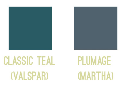
First we have the bold and fun color you might be going for on the left, so if you envision a deep teal tone, you might be tempted to use Classic Teal after seeing the swatch. But on the right, we put the swatch for Plumage, which is actually what we used in our guest room. See how grayed out the swatch looks?
Yet on the walls it’s every bit as bold as we hoped!
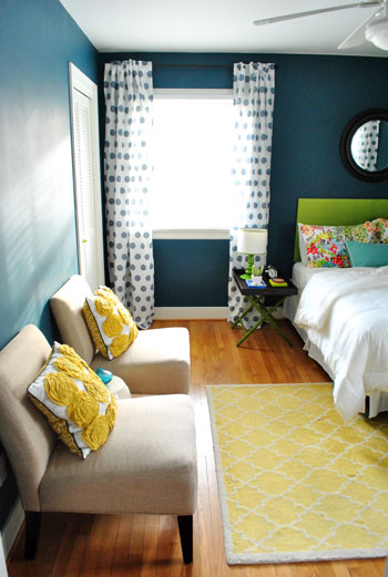
Colors in general – and especially dark ones – seem to amplify by a TON when they’re up on the walls, so we’ve had luck picking the ones that look a bit faded or grayed out, knowing that once they’re up on the walls they’ll look a lot more clear and bold. You can read more on the guest room here.
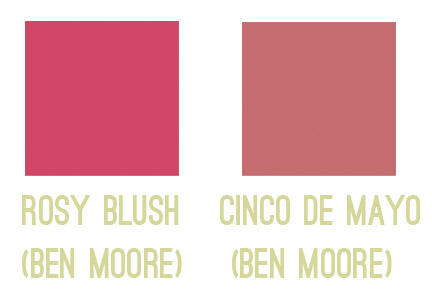
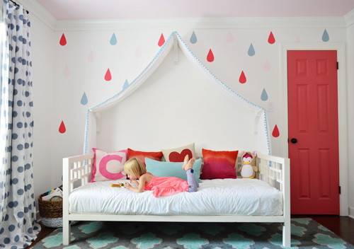
Next we have a swatch on the left that you might be tempted to pick if you want a bright and happy accent of pink – perhaps for the door of a kids room, like we used on Clara’s closet. But the swatch on the right is actually the one that we picked. A small square of it looks a lot more muted (sort of faded) compared to the bold and happy color on the left…
… but once it’s on a nice big area in the room (like the door), you can see how bright and clear that color reads. So even though the swatch on the left might be the pure and unfaded one you’re initially drawn to, in a nice large chunk it could almost read as neon. You can read more about Clara’s closet and those raindrops here.
Another coveted color seems to be a cheerful aqua tone, but in our re-painting-riddled experience it can be hard to get right. The color on the left is a peppy Tiffany Box blue… which is actually a color that seduced us when we moved into our first house… but once we had it on the walls of our dining room, well, it was a little overwhelming. Of course it depends on your room (someone with an amazing room full o’ light could make it look stunning) but in our experience, that color’s just not muddy enough not to get blindingly bright on the walls. So we’d be drawn to something like the swatch on the right, which should still clearly read as a pretty aqua tone in such a large quantity (here it is in a laundry room makeover).
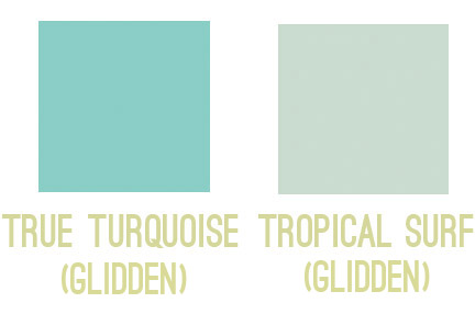
So my general rule is that for painting smaller items (like a tray, side table, accent chair, or lamp base), those more clear/unfaded/unmuted colors can be great. But for larger expanses (doors, walls, ceilings), we tend to prefer muddier tones of the same color – like a softer aqua with more of a gray-green undertone – just so it doesn’t go from chic-tiffany-box blue to punch-you-in-the-face-when-you-walk-in blue.
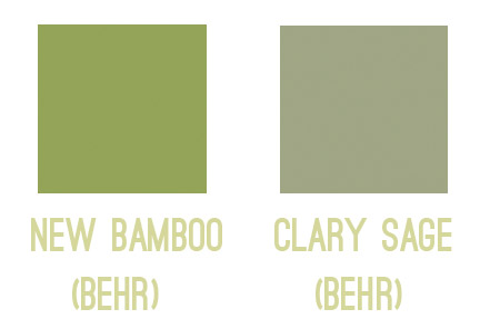
The same thing seems to ring true for greens for us. Something bold and clear can work really well on a piece of furniture or a bathroom vanity (but not necessarily all of them, ha!). But when it comes to the walls, the color on the left would likely turn most rooms into Kermit Theee Frog (I love when he says his name that way). Meanwhile, the one on the right might look dull by comparison, but on the walls it could be really pretty. Sage is always gorgeous with wood trim or cabinetry, so that could be a nice choice for a kitchen with wood cabinets or a den with wood trim.
Here’s another way I thought I could attempt to illustrate the strange mystery of how a swatch with those muddy/muted undertones can almost look beige in your hand in some instances… but then when it’s on a bigger area, it’s very clearly a color. See how muted and almost wheat-toned the swatch on the left with the arrow next to it looks below? Yet when it’s in a bigger area (that’s the exact same color in a larger rectangle on the right) it definitely looks green and not tan or beige anymore.
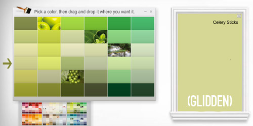
Update: Someone asked if the muddy version of a color would typically be on the same swatch as the bright one (if you slide up or down) or if it’s on a different swatch. In our experience, it’s almost always on a different swatch, so there might be a whole range of clear tones on one swatch (from bright aqua to a light baby blue) but you’d want to go a few swatches over to the one that has a much grayer or muddier top color (like a deep blue-gray) and slide down to find those muddier counterparts.
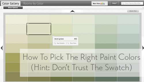
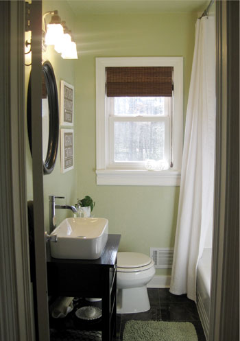
One last example would be Dune Grass, which we used in our first house’s bathroom. It looks almost completely cream/beige/tan in a small swatch (with just a tiny hint of green) – especially when it’s arranged with other green tones that are a lot less muted…
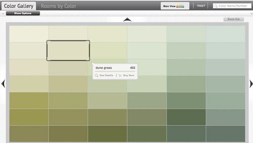
… but in our bathroom it clearly reads as a soft green color. Once again, when it’s up on the walls, there’s just a lot more of it, and it’s definitely amplified from the neutral-looking swatch. So if you’re looking for a light or subtly colored wall (be it green, blue, pink, yellow, orange, purple, etc) you might want to consider those lighter wheat or gray toned swatches that almost look like there’s just a drop of that color in them. The result can be a room that’s clearly that color, but a soft and subtle version of it. You can read more about that big bathroom reno here.
As Heyruthie mentioned, colors aren’t always great on monitors, but hopefully just seeing these comparisons might help. And when making a final choice, the best method we’ve found has just been to bring some swatches home, check them out in our lighting situation throughout the day, and then grab a test pot (or three) of paint if we’re still nervous. Those small sample pots are only a few bucks and they can save you a whole lot of re-painting trouble.
It’s also amazing how different the same paint color can look in a variety of rooms/lighting situations, so I’m sure there are folks who’ve used those bolder colors in the left columns above with great results – so it really does depend on your room, how much light it gets, and how you layer stuff in. Like this could-have-been-blinding bright blue paint color, which looks awesome in a lofted and light-filled studio – especially when it’s tempered with lots of tan texture in those pin boards and that over-sized mirror.

Oh and since we’re on the subject of buying paint, here are a few tips we’ve learned over the years about scoring a discount:
- “Oops paint” can be awesome (it’s someone else’s already-mixed paint that has been returned for some reason, but it’s usually extremely marked down as low as $1 for a whole gallon, so you can even get a few cans and mix them in the hopes of creating a color you like for a serious discount).
- If you have a favorite paint shop (ours is a local place called Virginia Paint), you might want to pop over to their Facebook page and click the Like button or sign up for their mailing list. By doing that you’ll often be alerted if they’re running sales or specials, and sometimes you can save $10 or even score 40% off.
- If you get paint from a big box store like Home Depot, you can hit up their website and check out their Paint Promotions page.
- You can also get 5% off any purchase at Home Depot or Lowe’s if you use your store credit card there (Lowe’s does it automatically, and you just have to ask for Home Depot to match the 5% off that Lowe’s provides when you’re checking out and they will).
- Sherwin Williams tends to run some great specials. In fact right now they’re having their big 40% off sale. And I’ve heard you can buy untinted gallons (like a whole bunch of them) for 40% off and then bring them back later to get them tinted at no charge (I’d check with your individual store, but that’s the rumor). So even if you’re not sure what colors you want right now, if you have a bunch of rooms to paint it’s a great way to save serious loot.
- It never hurts to click around on any paint website for promotion info. Right now Behr is having a $5 off promotion and Benjamin Moore is offering a buy-one-get-one-free deal on a quart of paint.
Do you guys have any other paint undertone tips to share? Or just some stories about going for the wrong swatch? Any other tips for getting paint at a discount?

Dena says
Thank you for this! I’ve had such trouble (historically, with yellows and greens) with picking paint and this will help us get through some upcoming choices.
Bailey says
This post is helpful on so many levels – thank you so much for posting it. I’m toying around with new colors for my blog design, and I found this helpful for that!
Bailey
YoungHouseLove says
So glad!
xo
s
Beth says
Unfortunately I don’t have time right now to read all the great comments, but I wanted to add a little information. Sorry if it is a repeat.
You all know that there are warm & cool colors, right? Warm sunny colors are red, yellow, orange. Cool colors are sea/sky – blue, green, violets.
Here’s the catch. Every color has BOTH warm and cool versions as well! Is that confusing or what?
The “muddy” versions that are you posting have been “desaturated,” usually by adding grey or black.
I personally prefer warm colors on walls and then use the cool versions for small things, as you have said.
Hope that helps!
Beth Lester
Color Consultant
http://www.hsdca.com
YoungHouseLove says
Love that! I studied color theory in college (I have a BFA) and found that class completely fascinating! Of course I forget about 80% of it, so I should brush up again. I remember the coolest thing was learning how animals see color (typically the ones closer to the ground don’t have great vision but the ones up high like birds have an amazing spectrum since they have to see predators on the ground from a long ways away). It was one of those classes I’d go home for Thanksgiving and be talking about at the table!
xo
s
Kal says
This post is such a huge help! All the info and comments are so great. I’ve never been able to paint anything but white walls before, so I am itching for bright, bold colors. But now I know to be a little more careful picking something too in your face… Thanks so much for posting this! :)
Ms. Mitten says
Sherry you seem to really understand color. Not sure if this comes naturally to you or maybe it is your fine arts degree? Anyways, your color choices almost always are great.
I am the opposite. I look at a few paint chips in the same family and cannot see a difference :) I have made tons of mistakes in picking colors!
Reading Maria Killiam’s blog has really helped me feel more confident with my paint color choices- http://www.mariakillam.com/blog/. She talks a lot about undertones and how they relate to one another in a space.
YoungHouseLove says
Aw thanks so much Ms. Mitten! Others have recommended her in this thread, so I can’t wait to check out her blog! Sounds awesome!
xo
s
Sarah G. says
We always buy the untinted gallons at Sherwin Williams. Then, I don’t feel pressured to hurry up and choose a color before the sale runs out. Also, they will give 40% on their quarts (they’re big) and nice for painting a small piece or putting samples on the wall. It is easier to spring for a $6 quart than $40 can of paint!
YoungHouseLove says
Great tips!
xo
s
Leslee says
Great post, guys! Very helpful!
Penny Smith says
(Since you brought up buying and not tinting) How long can you save paint without it “changing”. I just did some touch ups at a year and they were fine. But at three years some paint I saved at out old/new house the color dried differently on the wall. Kept say in the basement, not exposed to too much variation in temps, what’s the “real” number (not the suggested by the paint company that wants you to buy more paint. :))
YoungHouseLove says
Anyone know this? We’ve used touch up paint on our first house over 3 years later and it seemed to dry well and looked fine, so perhaps certain walls in your house get faded from sun over time (ours must not have) so that years later the paint might not have changed, but the wall lightened slightly so they don’t match up? Anyone have any more info on this?
xo
s
Sandra says
Great tips, wish I had found this site before my last painting experience. I painted my sons room what I thought was a lovely dove grey, looked great on the test patches I did. I even used a large piece of card for the test, so I could move it round the room to see it in different areas. Spent four hours painting on a hot day, woke the next morning to find it looked pale blue! The tint only had black in it, so I was stumped! I went to the store and they tried to help, but couldn’t explain it either. I think I may have had a bit of a cry at the thought of having to buy more paint and repaint the whole room again. The guy at the store was more inclined to help at that point! I bought a Grey that seemed almost beige and that worked much better, but even that tended towards blue when up on the walls. I won’t forget that lesson. Thanks so much for the muddier version tips!
YoungHouseLove says
Oh no! That’s so frustrating Sandra! Could it have been your lights (if they’re cool bulbs they might cast a blue tint, whereas replacing them with “warm white” bulbs might help.
xo
s
Julie says
Hi. I noticed that you all are no longer using the color match to higher-end paints, but are buying more Benjamin Moore. Do you see a big difference in the quality between Valspar/Behr and Sherwin Williams/Benjamin Moore?
Just wondering why the switch. We are color matchers, but it’d be nice to know what (in your opinion) the difference is between the two.
Thanks!
YoungHouseLove says
I think everyone has different favorites, but after trying a bunch of brands over the last seven years (Olympic, Behr, Glidden, Benjamin Moore, Mythic, Valspar), I think if you blindfolded us we could easily pick out Benjamin Moore paint from Glidden/Behr/Valspar/Olympic (I think anyone could, there’s just a thickness and faster coverage to it) – so we tend to prefer Benjamin Moore for that added coverage/durability if we’re doing a more permanent/major project (ex: painting cabinets, painting walls). We might be biased because we create a color collection with them each January, but we’ve used their paint since well before that partnership, and we always pay for our own paint, so we truly do like it best. If we’re doing a small crafty thing (like painting a plant pot) we might use a tester of Behr though, and we recently used Olympic on the stenciled floors in the bathroom (since we’ll be removing the subfloor to tile that space down the line when we do a full reno). Hope it helps!
xo
s
Alexandra says
When it comes to choosing a green color- I ended up trying over 6 samples before finding a color that wasn’t neon AND that didn’t look like horrible green-brown diarrhea in the late afternoon/early evening. If somebody was going for a bolder more cheerful green- (sage can be really blah and boringly neutral – thats what I have in my kitchen now and I’m sick of it) how would a person pick one? And what is your rule on accent walls? Can those be brighter?
YoungHouseLove says
That’s a tough one! I think I’d look at the dark teal swatch example (#1) and try applying that to a bold and cheerful green. In other words, find the bold and exciting green you think you want, and search around that for a swatch with a grayer tone but still a similar base color (just with more gray added). Hope it helps!
xo
s
Jen. says
I love this post. I keep looking at the examples and saying, “NO! Seriously, that’s the one in the picture?” The pink especially. Neat post.
YoungHouseLove says
Thanks Jen!
xo
s
Andrea A says
Seeing your color swatch “celery sticks” made me laugh out loud. Years ago, I had the bright idea to paint our office a green color with the same name. I painted at night and my husband and I thought it looked pretty good.The next day I realized I made the wrong choice for the room when the sun shined through the window and the room glowed! The color looked like it should be called “mountain dew”, not “celery sticks”. I re-painted the entire room a different color the next day. Good thing paint is an inexpensive way to update a room!
YoungHouseLove says
Oh my gosh, that’s so funny! Mountain Dew would be John’s favorite paint color. That or Dr Pepper…
xo
s
Sandra says
Hi ya, ,no, not the lights, as it was full daylight when I discovered the fact. However, I think it was just the size of the room. Once the colour was on all four walls, it just seemed to morph into blue! The problem is, I really would like to do some other rooms in grey and now I’m petrified of making that same error. However, armed with your tips and a new philosophical approach to painting, I’m gonna give it a go! Cheers from New Zealand!
YoungHouseLove says
Good luck Sandra!
xo
s
Renee Roush says
I JUST made this mistake in my daughter’s room!! Too Aqua. I wish you’d posted this a mere three weeks ago…. sigh. Trying to figure out if it’s *really* a color I can’t live with or if we can make it work. Luckily, I read this before buying paint for the two main living areas in our house, though! That’s happening this week and I’m inspired. I am seriously considering seeking advice on our ugly cold air return. I saw your post a bit ago giving advice to someone else for the same issue, but I’m not kidding when I tell you that our cold air return is about 700 TIMES UGLIER than that one. Checking out the forums this week to see if I can figure out how to post. Thanks for this blog. So amazing. We are DIY-ers, too, and I’ve gotten so much more creative since I started following Young House!
YoungHouseLove says
Thanks so much Renee! Good luck with your air return!
xo
s
Sara says
http://m.anthropologie.com/mobile/catalog/productdetail.jsp?id=27210285&catId=HOME-ROOM
Did you see this??
YoungHouseLove says
Isn’t that crazy?!?! Makes my breath catch in my throat every time.
xo
s
Cheryl L. says
We have wood trim and wood cabinets and my husband is absolutely positively in love with them and that look. Okay, fine, we will leave them but it makes finding paint colors so hard. I’ve made mistakes quite a few times. Love your tip above about the sage color. I know you all paint trim white but do you have any tips for those of us picking colors to go with the wood tones?
YoungHouseLove says
In general I just like to hold things up to see what looks nice with wood trim or look for inspiration images with it to see what they use. Soft greens and blues look pretty, and of course chocolate or tans or creams can look handsome too. Avoid anything too cool (ex: steely gray without any warm undertones, since that seems to clash with wood sometimes).
xo
s
Toni Bo-Boney says
I am the discount paint queen, lol.
Our current house is over 2100 square ft (with a heaping helping of vaulted ceilings and sky-high walls thrown in)–and I only paid regular price for 2 gallons of paint.
I got most of the paint from my local Habitat for Humanity; all H4H’s don’t carry paint, but when they do it’s a blowout steal. They only accept donations of paint from hardware and paint stores so it’s great quality. Some of it’s ‘Oops’ paint, but most isn’t. I got a 5-gallon bucket of Sherwin Williams Super Paint for $25 (retail price is roughly $175); I also got various really high-quality Ben Moore and Calvin Klein gallons for five bucks each. Woo-hoo!
Lowe’s also has the best mistint options for paint; they’re always $5 and such good quality, like that awesome but pricey Valspar Paint+Primer; it goes on like buttah and is normally about $47 a can:).
My husband and I also qualify for 10% military discount, so that adds up to even more savings. All-in-all, I only paid full price for my laundry room paint ($23 in a deep, mustardy color) and our daughter’s teen suite ($25 for a green granny smith apple color). Shop around and you can save hundreds on paint! :)
YoungHouseLove says
That’s amazing! Love those tips!
xo
s
Lindsay says
I am so happy to have come across this post. I am currently working on a nursery and was ABSOLUTELY settled on BM Revere Pewter. I have to be careful with paint choices as certain colors can pick up a pink undertone in our carpet. Anyway, I picked up a sample Behr color matched from the computer code. I was utterly discouraged as the color had a light blue undertone. I am no stranger to the fact that any color can look different in different lights, but there is something very off. I think it has to do with the computer formula at Home Depot as I came across this when I attempted to have BM Kingsport Gray from Home Depot. Has anyone had problems with colors being a bit off in the small testers from the computer formula matching?
Help!! I was so excited about Revere Pewter!!
Lindsay
YoungHouseLove says
Anyone have info for Lindsay? I’ve heard that color matching is never that perfect, so going to BM to get the real paint might be the closest bet to getting that true color. Or just pick something similar from Behr on their swatch wall and have them use that formula instead of matching, so you’re sure of what you’ll get!
xo
s
Jess says
One thing that’s helped me immensely is placing the swatch NOT directly on the wall where it will eventually be painted, and instead placing the swatch on other objects that go in the room. For example, when I was painting my kitchen, I put swatches on my cabinets and refrigerator, because that’s what will be against the walls every day. It works great for deciding among different colors!
YoungHouseLove says
Such a great idea!
xo
s
Megan says
Can you PLEASE help me find a “muddied” color version of Valspar La Fonda Ortiz Gold 3004-5A. It will be for our master bedroom. PLEASE HELP! :)
YoungHouseLove says
Hmm, I don’t have a Valspar deck, but Camel Ride looks like it could work from their website!
xo
s
Lori says
This is so incredibly helpful!! Thanks so much for taking the time to share your process.
statia says
All of this: Yes.
1. I can’t tell you how many people come into my store with a smart phone or tablet with a color they’re in love with and then look crestfallen when it doesn’t even remotely match. Monitors are all calibrated differently; even the monitors displaying the color to the tint machine. Pick out a few colors bolder when choosing online, and then come into the store and compare.
2. I get a good mix of people who come in and buy sample pints. Some balk at the price (7 buckaroos for a pint, if you’re not a DIYer who hoards them for future projects, gets to be a bit expensive). I feel like the price of a few pints is worth it. Buy the samples and paint a 12×12 (at least) swatch. Leave it there for a week. Look at it in all different lights. It’s imperative. You may love it in the daytime, but at night it may fill you with rage or tears. And for Pete’s sake, don’t wait until the day before your painter is going to start, to pick your colors. It’s just a recipe for disaster. Why pay money for someone to paint your house, when you picked out your colors in a rush, and you’re not sure if you love them?
Painting Tips says
Great post! Been reading a lot about tips for choosing the best colors. Thanks for the info!
Leah says
Revisiting this post now that I’m becoming a homeowner (with many walls to paint) in 2 weeks. I’ve read all these years without actually owning a home! Let’s see what happens when the rubber meets the road…
Question: do you prefer Olympic No VOC or Benjamin Moore Natura or something else?
YoungHouseLove says
Natura is thicker so the coverage is better but it’s more money so if you want to spend less Olympic is great too!
xo
s